
UI Viking
UI Viking is a fantastic example of taking what might look like a plain, boring design, and giving it a distinctive style. Now, I’ll admit that the button that says "HIRE ME, or I’ll find you and send you to Valhalla." gave me pause. I’m normally not one to begin the designer-client relationship with a death threat, joking or otherwise. The UI Viking makes it hilarious, though, by keeping all of the copy on the site consistently over-the-top. I was amused. And yeah, I’d hire him.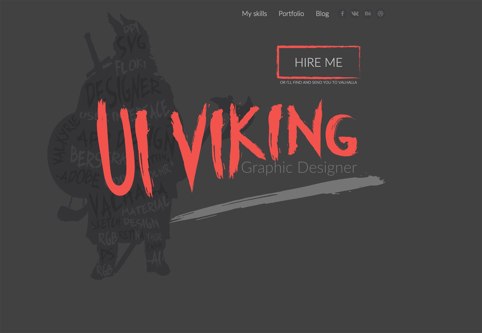
Vincent Guillevic
Vincent Guillevic’s portfolio, aims for less violent imagery, favoring of simplicity and sophistication. Once you click through to a project, the minimalism gives way to a wealth of information about the creative process behind every project.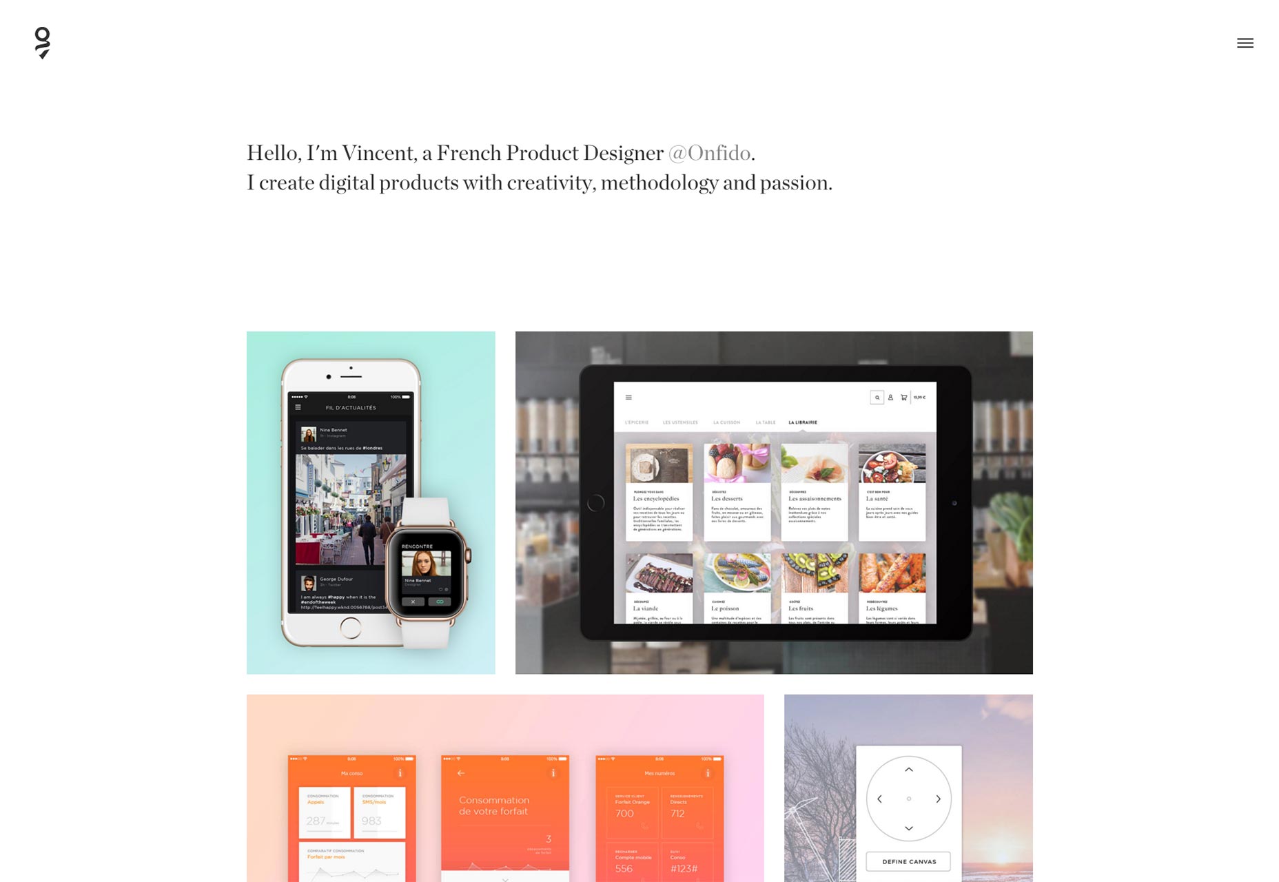
Fabio Muniz
Fabio Muniz’s portfolio drops the imagery altogether, on the home page. A text-only home page is always a risk, but it doesn’t hurt that the typography is beautiful. In keeping with the theme, there’s almost more text than imagery in the case studies. For anyone who loves a good story about design, this portfolio is a good one to check out.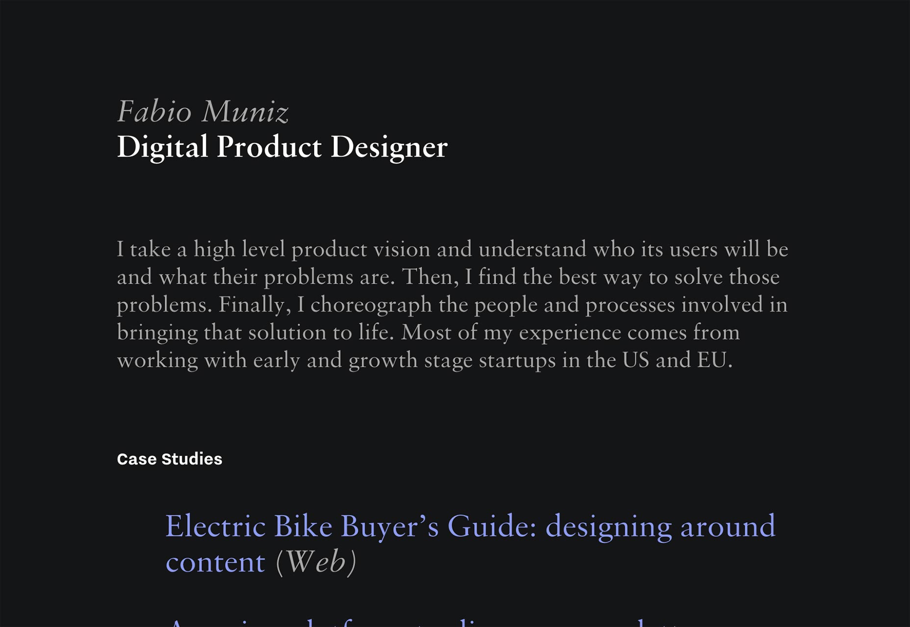
Alex Camp
Alex Camp’s portfolio is simple, pretty, and no-nonsense. It even (oh thank whichever-deity-you-like) works perfectly with JavaScript disabled. The lack of contrast on some of the text may come back to bite him, but overall, this is a great little portfolio site.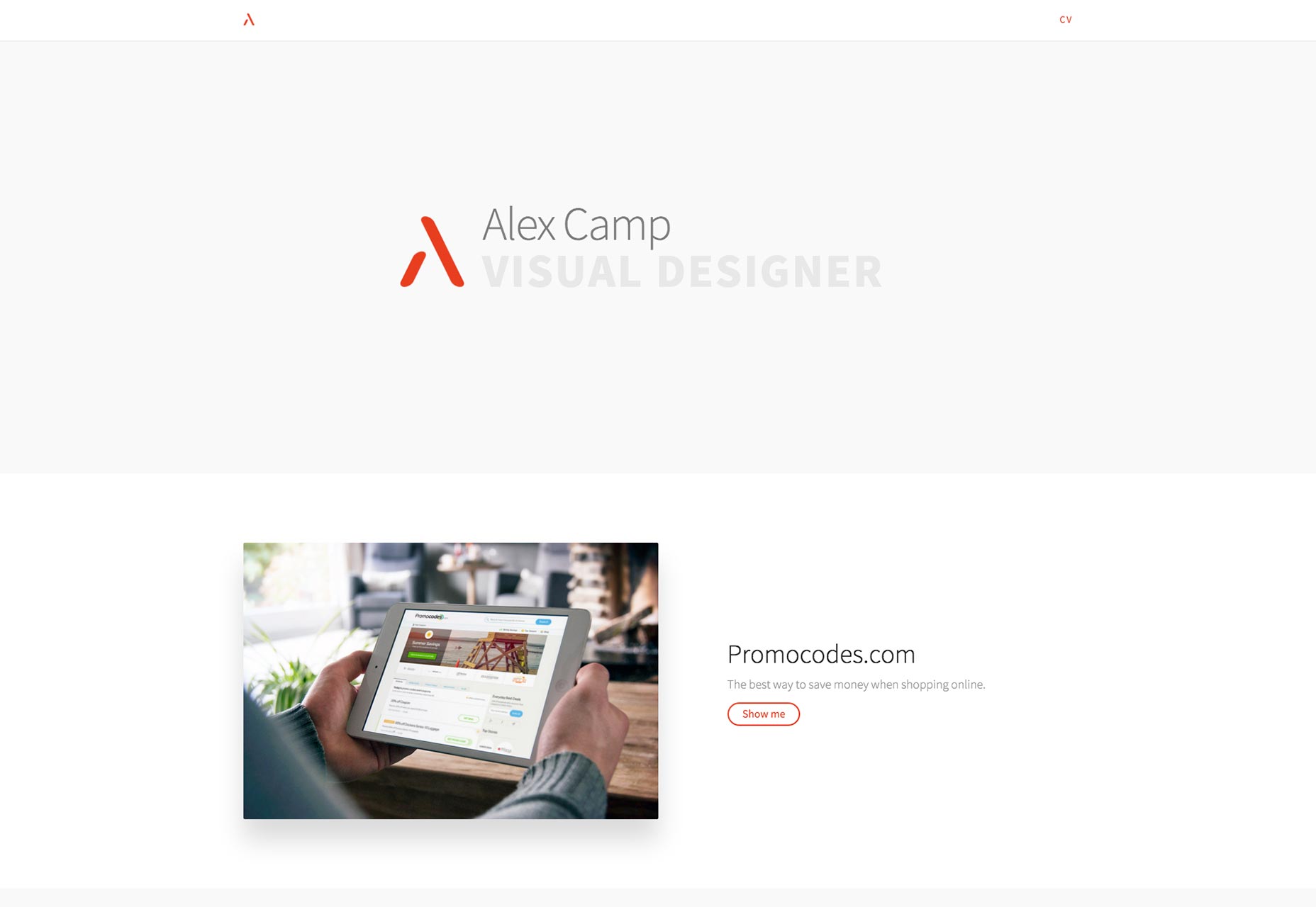
Studio Koto
Studio Koto has embraced the carousel as a way to showcase all of their work on one big single-page portfolio. It’s weird for me to say that a portfolio based on slideshows actually kind of works. But here I am, saying it.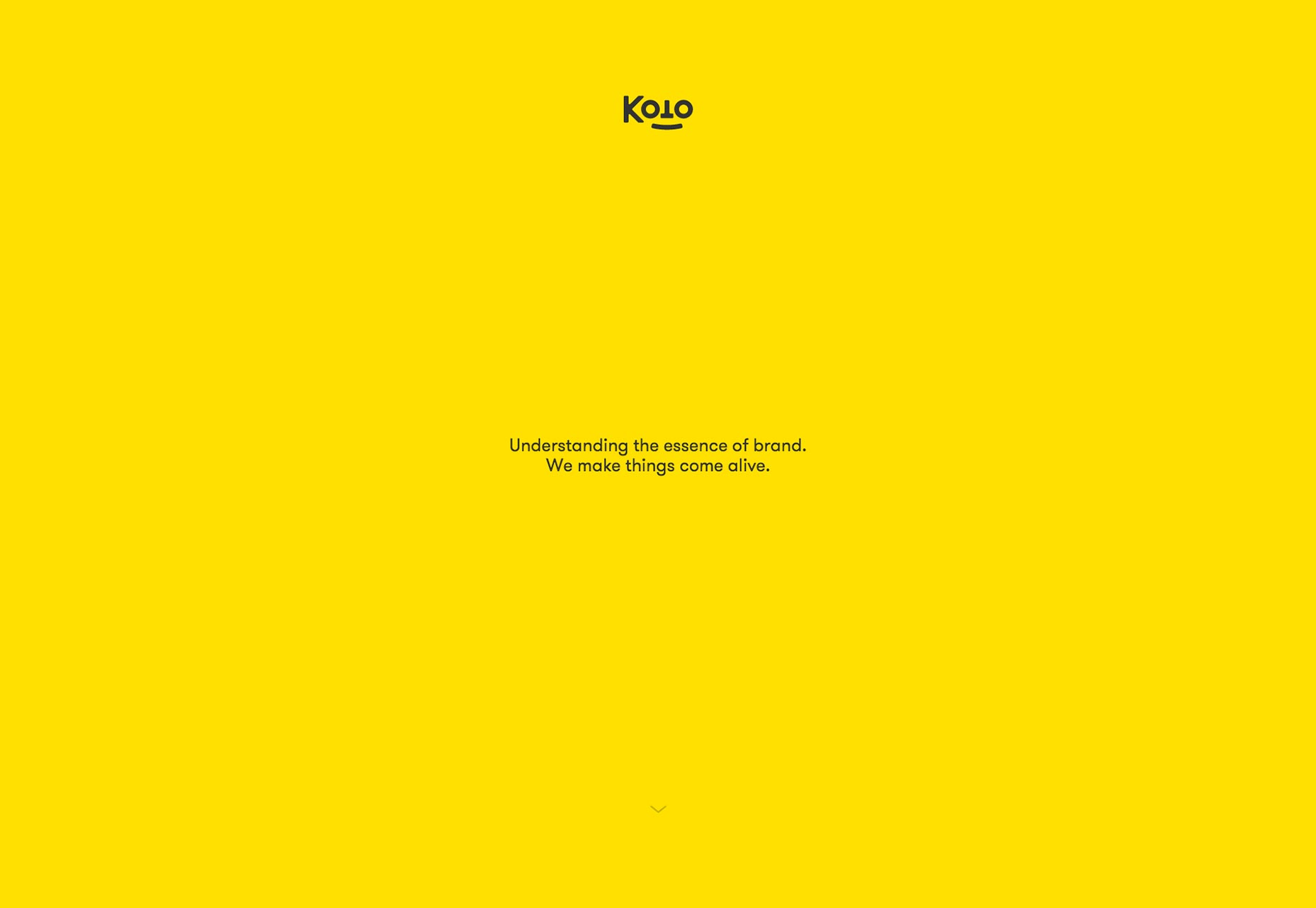
Rauzi Design
Rauzi Design has fully adopted the “single-page-app” metaphor for building their portfolio; and it’s interesting to see that in action. Aesthetically, it looks great. I am concerned that it’s not possible to share links to specific pages or projects. That could negatively impact them when people try to share something on the site with someone else.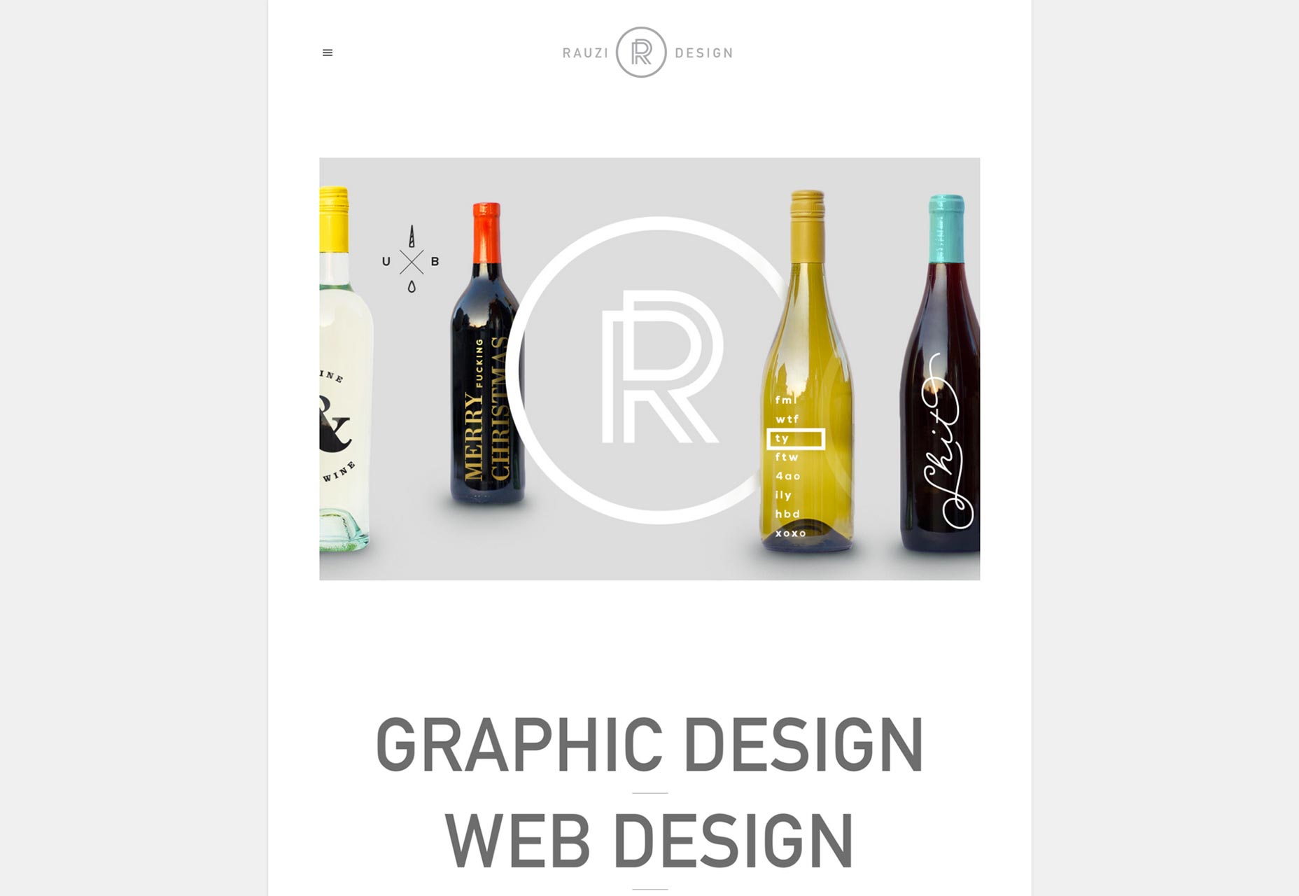
David Bastian
I couldn’t help myself on this one. I’ve always loved side-scrolling portfolio sites, and this one looks fantastic, even elegant. Using this site, it feels sophisticated, and smooth. Gonna have to take issue with the navigation on the desktop version of the site, though. You should be able to just scroll right without dragging on a red dot.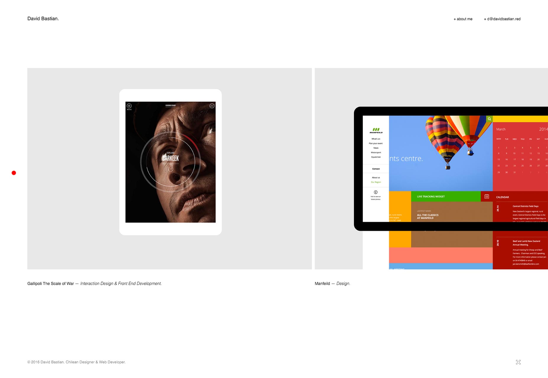
Camille Magnan
Camille Magnan’s site is another of those that takes an average layout and makes it shine with a distinct style. You’re unlikely to confuse her site with anyone else’s; and in this case, that’s a very good thing.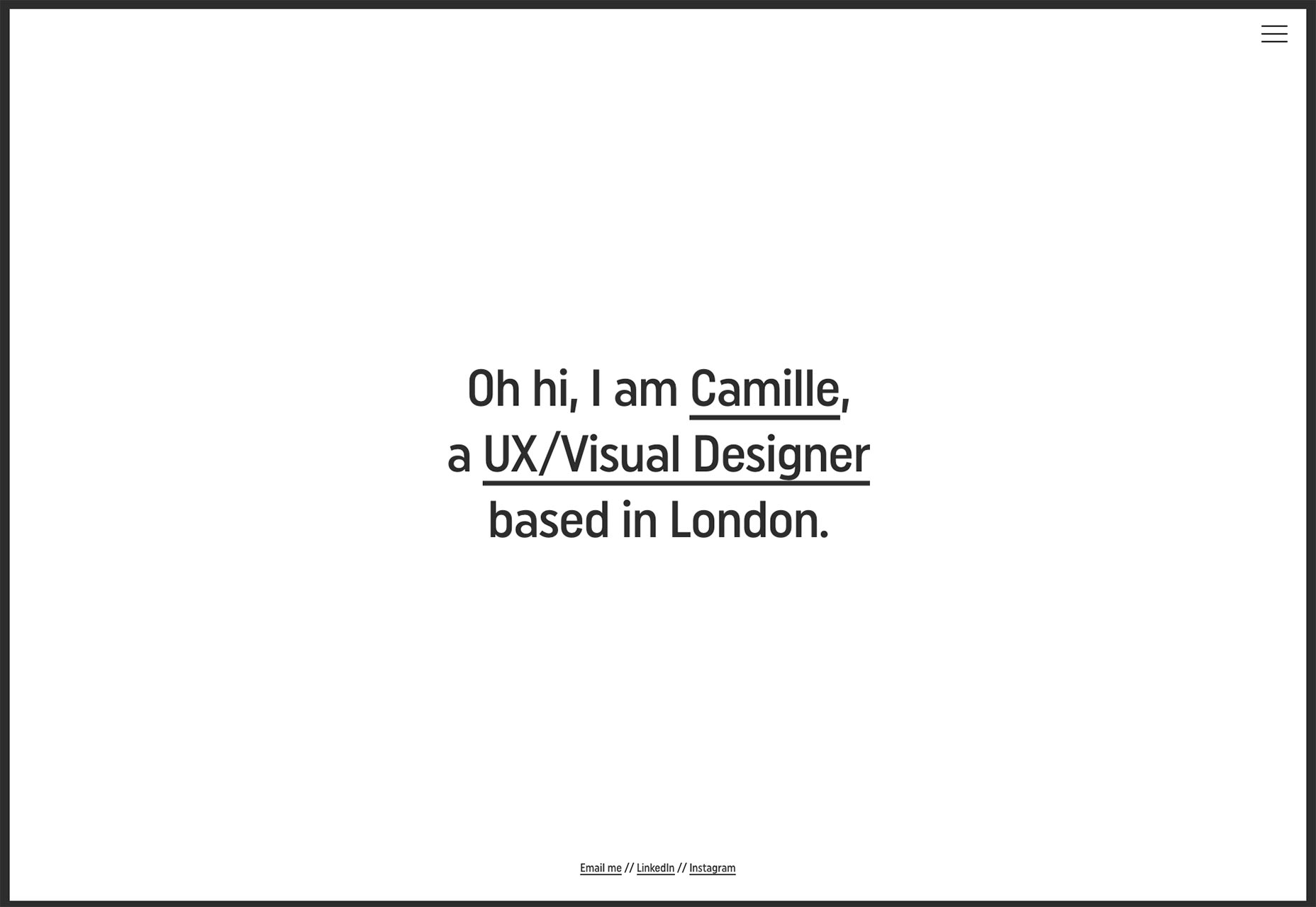
Jeffrey Peltzman
Jeffrey Peltzman’s portfolio is dark, relaxing, and kinda purple. Actually, it’s a testament to his use of this accent color that the whole site "feels purple" while there’s barely any on the page. Browse through his portfolio, and you’ll see how he does that with other colors too.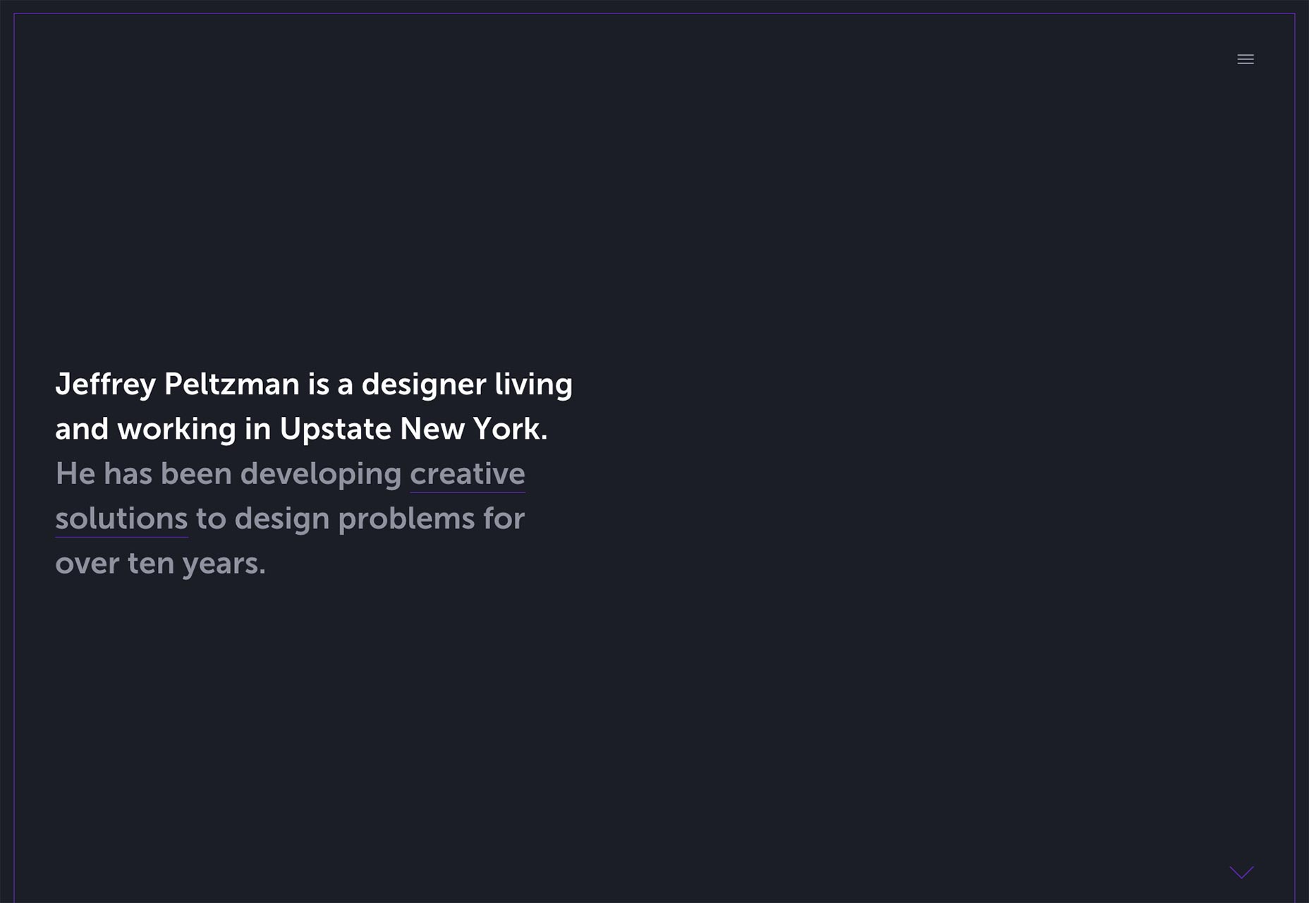
Heather Weaver
The thing I like most about Heather Weaver’s portfolio is that it is clearly targeted at her customers. If you look through her work, they’re all corporate-style clients. Her work is made up of corporate-style websites (you know the design flavor I’m talking about). The final touch is that her portfolio looks like it was made by someone who does corporate-style design. There’s not a hint of the all-too-common “I’m actually an artist but I also do corporate work” attitude; she knows what her strengths are, and she plays to them.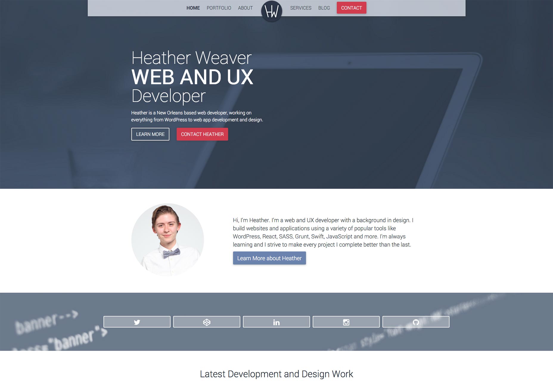
Patrik Huebner
Patrik Huebner’s portfolio is simple, elegant, and typographically strong. He doesn’t need anything more complex, because his algorithm-based animation does the rest of the sales work for him. I love his use of contrast, too.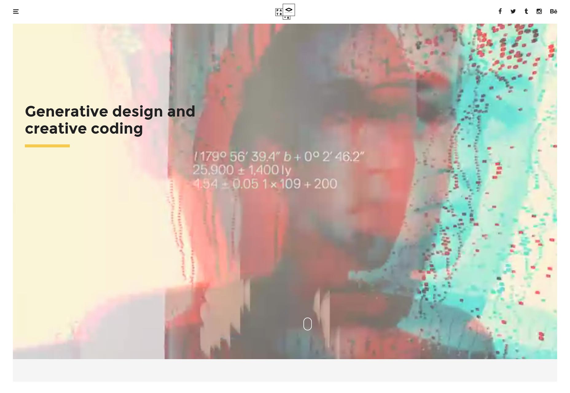
Aaron Porter
Aaron Porter is both a designer and a filmmaker. His site represents this with a minimalist design that uses a combination of animation and video footage to eye-popping effect. It’s probably a little bandwidth-heavy. However, if you need his services, you most likely have that bandwidth to spare.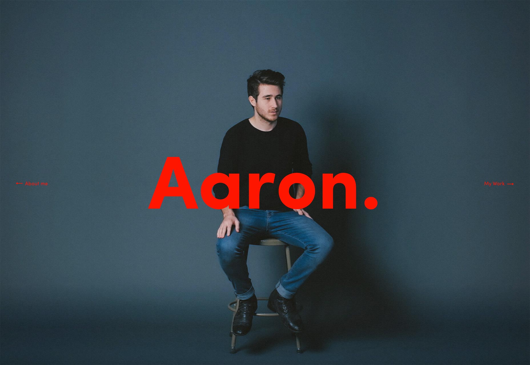
True
The people at True have achieved something remarkable. You know a designer is good when you’re not even sure what language the site is in, but it’s still fun, and easy, to browse. My only complaint is that they hid the language switcher until you hit the hamburger button. Those things should be front and (maybe) center.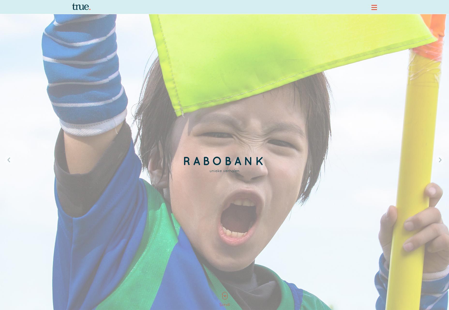
Villa
Welcome to another installment of “The Layout is Nothing Special, but that Style is Beautiful” featuring Villa! Gotta love any designer who can keep your attention with nothing more than an eye for color and good type.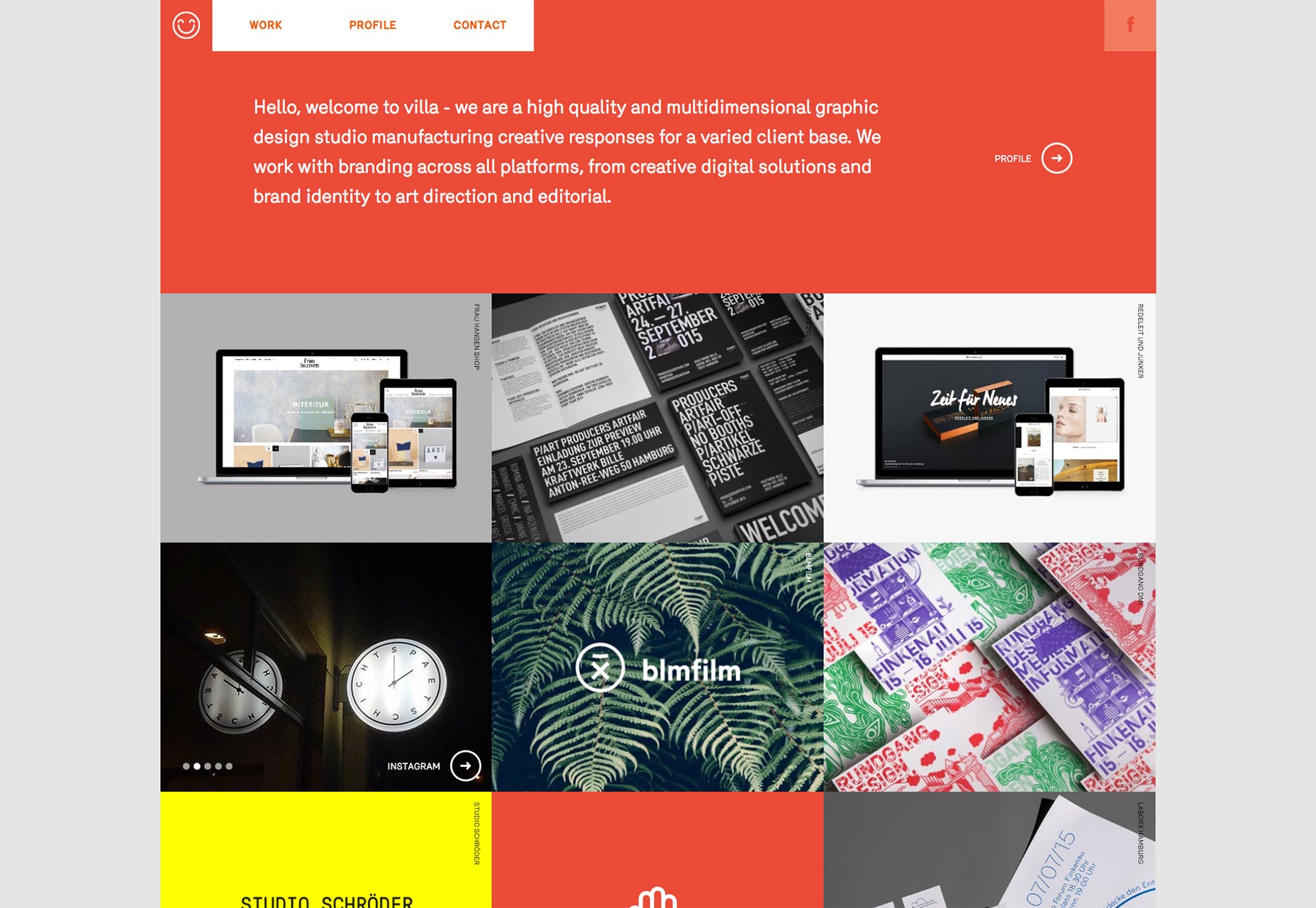
Kodo Nishimura
Kodo Nisghimura is a makeup artist, so his portfolio is naturally designed for the world of high fashion. Elegant typography, beautiful, professionally shot imagery, along with a light dose of UI animation make up this site.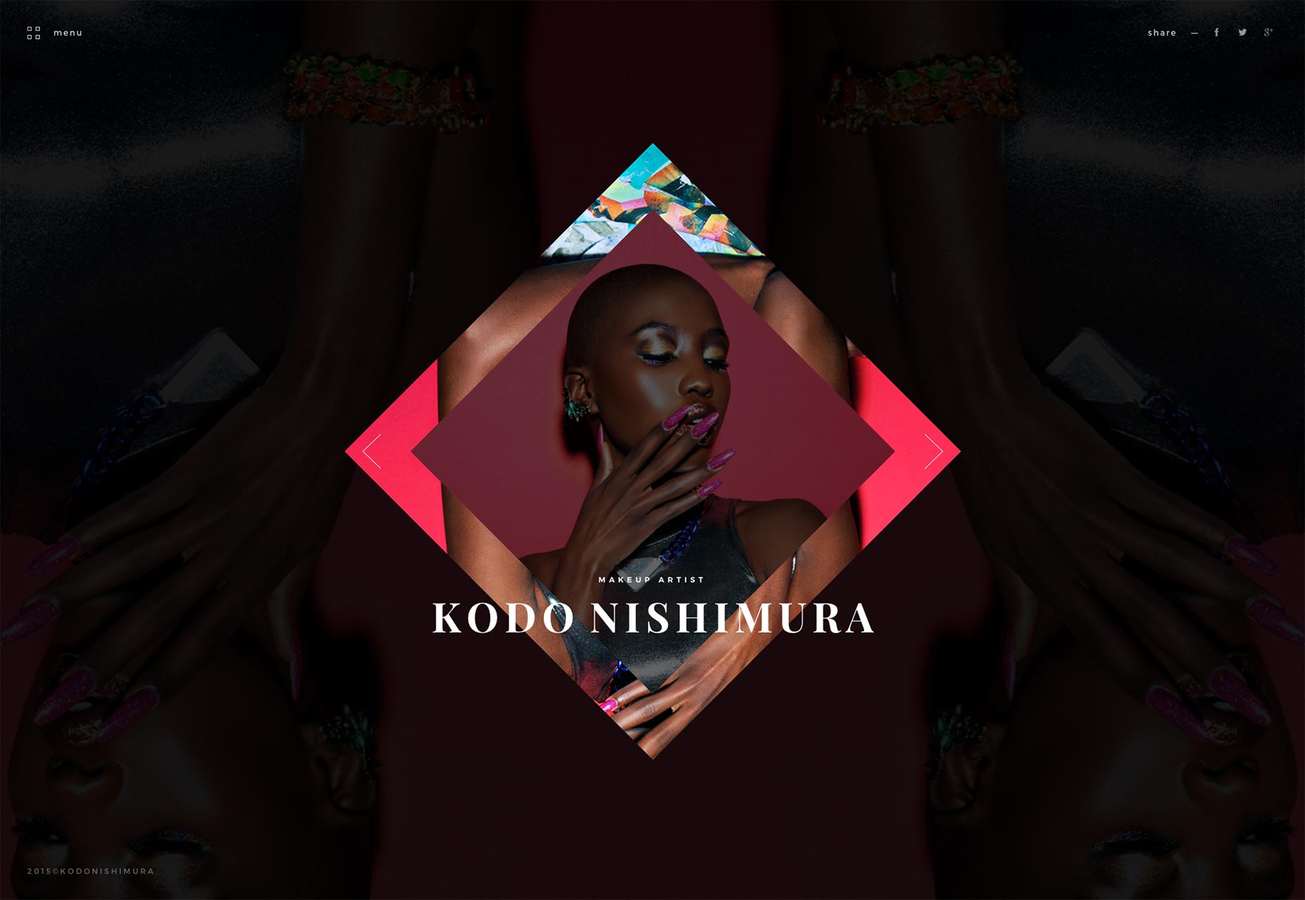
Pleid
Here’s a secret. You have a better chance of getting on this list if you can use the color yellow well. Yellow is tough. At Pleid, it’s a destaurated, light yellow that provides the backdrop for their work. This otherwise normal portfolio site is made remarkable by actually pulling off the color scheme they use.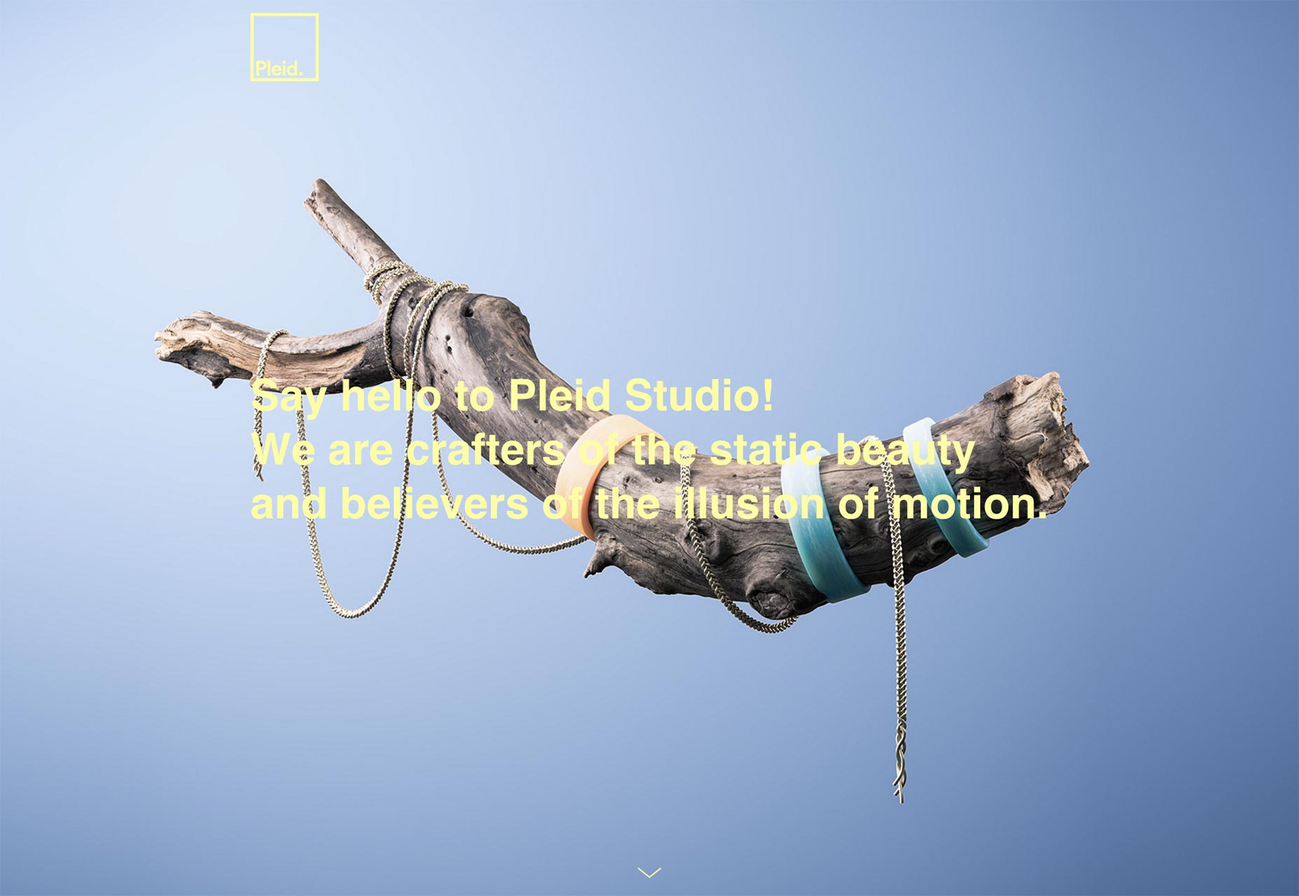
Akeo
The Akeo agency has brought back the sticky sidebar/header. Sort of. They mix minimalism with chaotic, half-grungy imagery to spice up what would otherwise be a serviceable, but rather plain portfolio.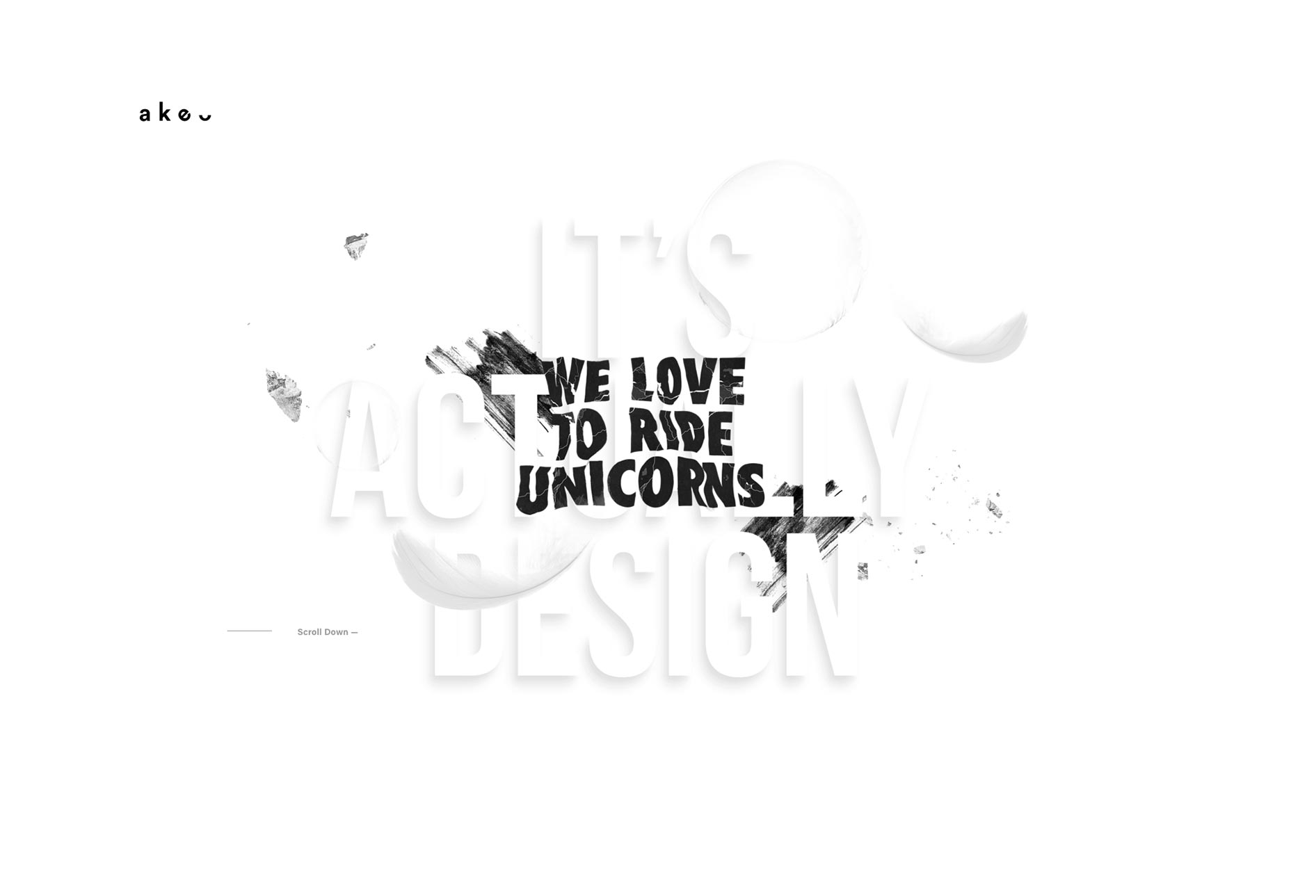
Karina Twiss
While I am forced to admit that the navigation on Karina Twiss’ portfolio is entirely unintuitive, the site is pretty. Instead of giving you thumbnails of her photography, the site starts off by throwing you headfirst into individual photos. The first thing you see is the beautiful details in her work. Then, if you want, you can zoom out and see the rest. It’s a novel approach, to be sure.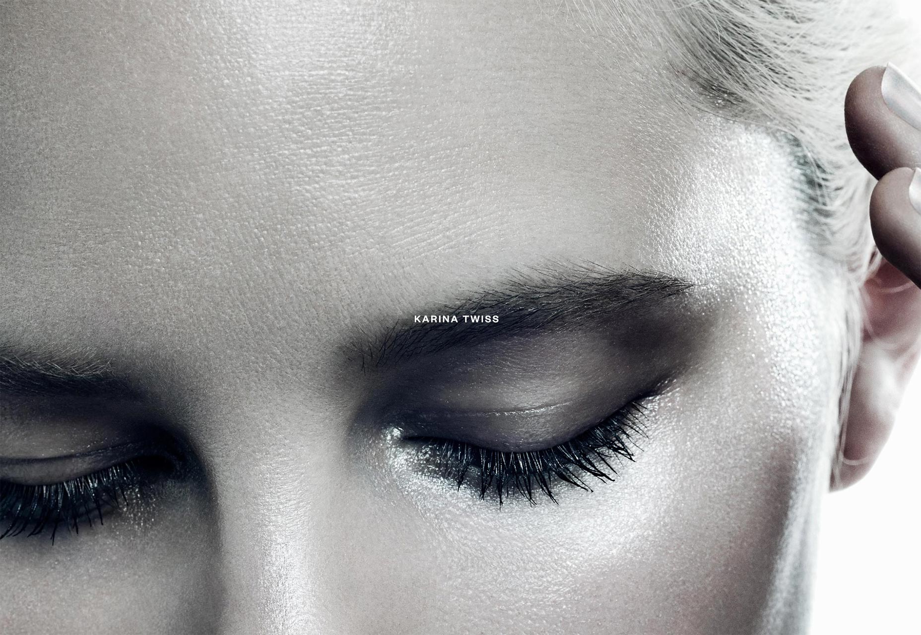
Meri
Meri, an agency, has adopted the split-screen style, combined with classic minimalism, and a modern aesthetic. Half website and half presentation, the site actually offers multiple ways to browse through their work. Click around and find out how they did it.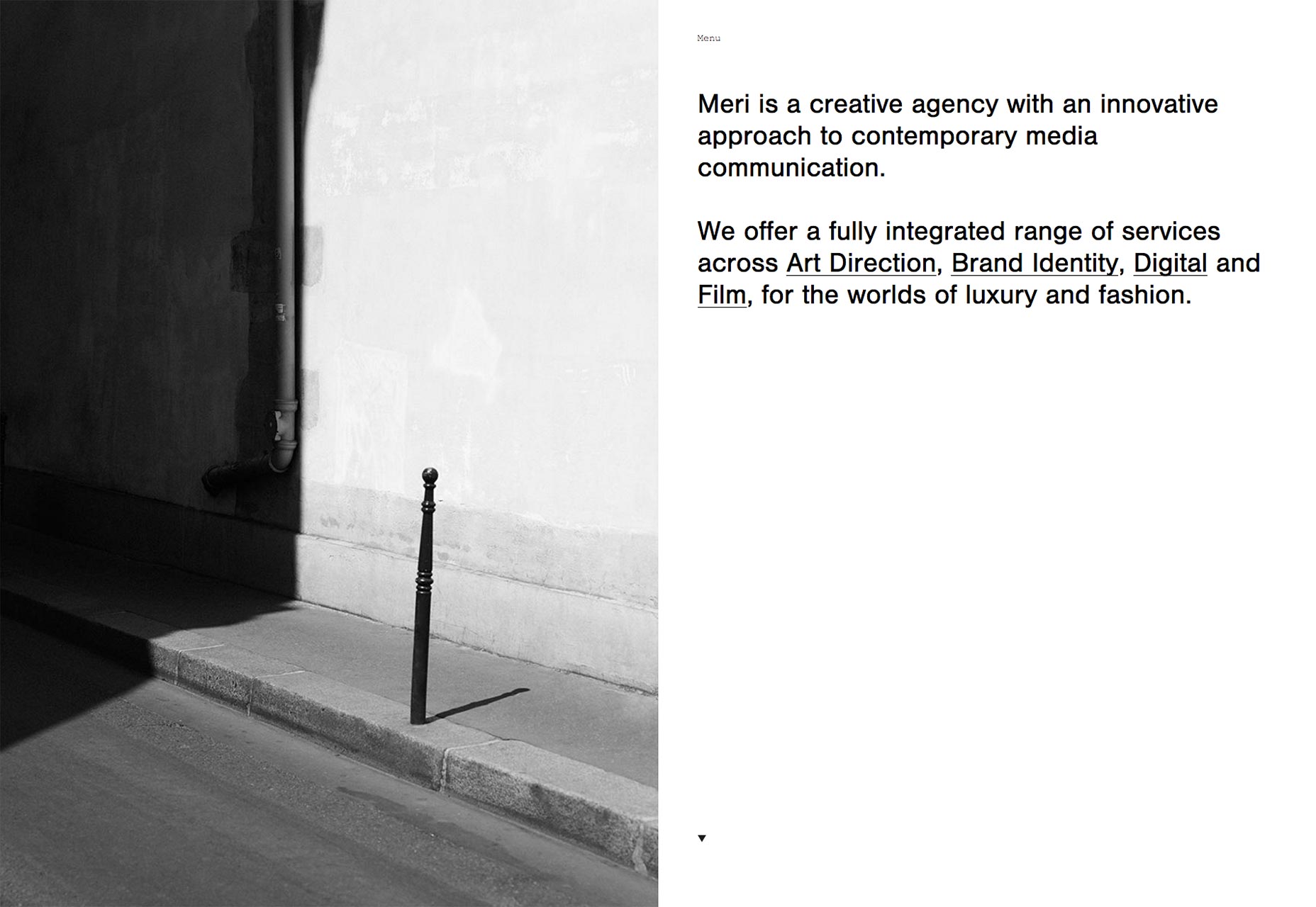
Elespacio
Elespacio’s agency site is vibrant, combining a minimalist design, bright colors, and big typography in a way that is both familiar, and unique to them. Every project page has its own art direction behind it, so the site is just plain fun to browse.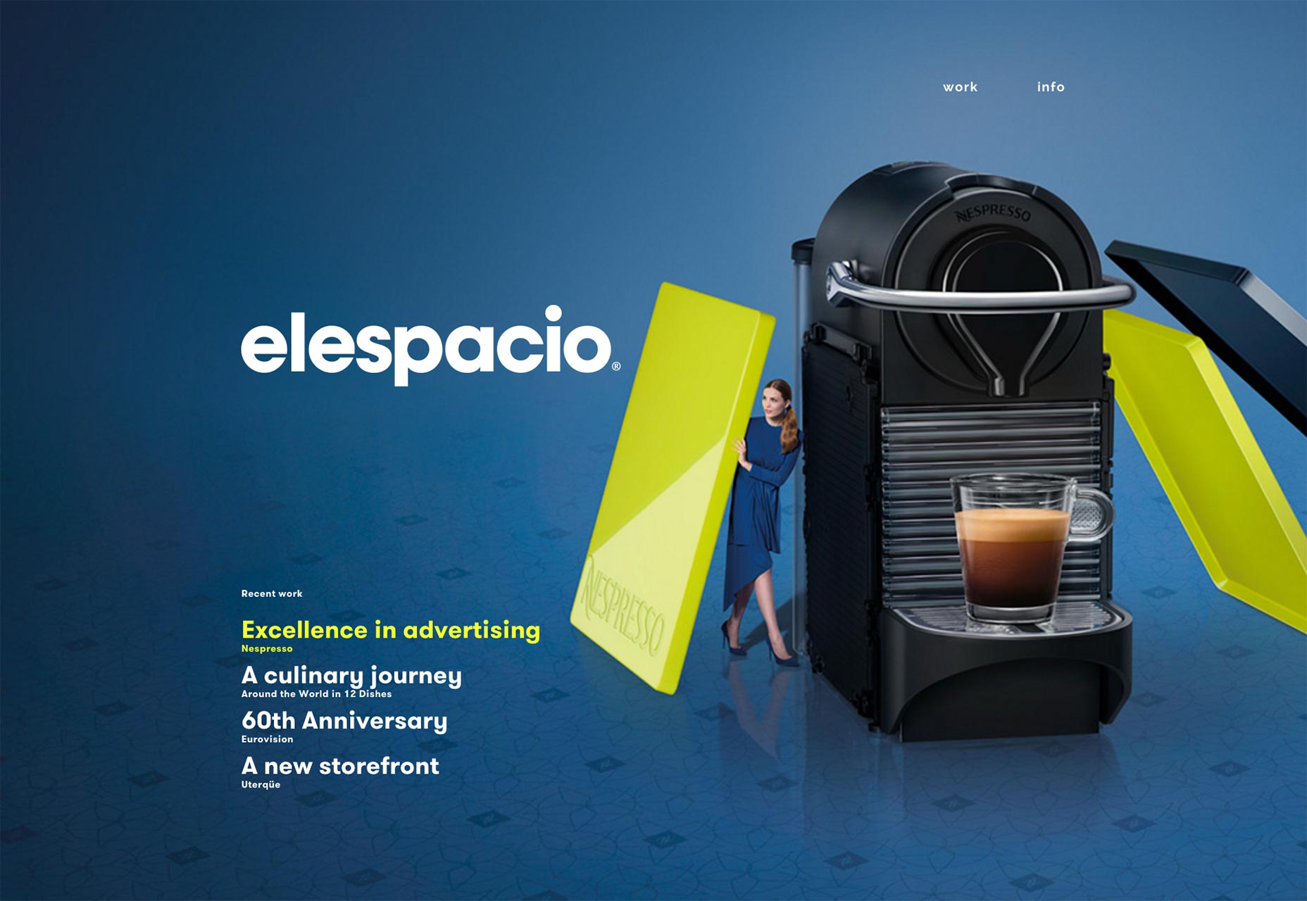
Myf Web Designer
Myf Web Designer uses the now-familiar polygonal style to great effect, alongside elegant typography. The subtle animation effect on the first part of this one-page portfolio is a nice touch.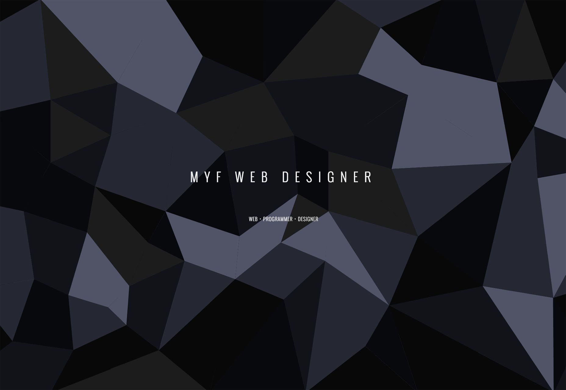
Flavien Guilbaud
Flavien Guilbaud’s site starts off with a simple, asymmetrical layout showing his work. Hovering over the thumbnail reveals the project’s name in big, center-screen type that you just can’t miss.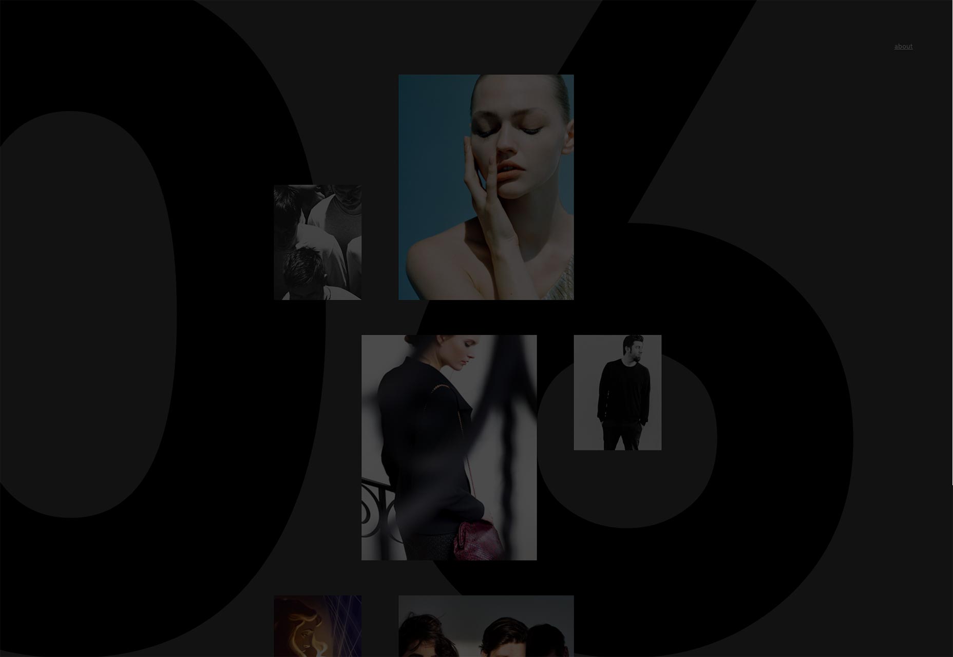
Benjamin Walton
Benjamin Walton’s portfolio wastes no time showing off his work, starting with a masonry-style layout and little else.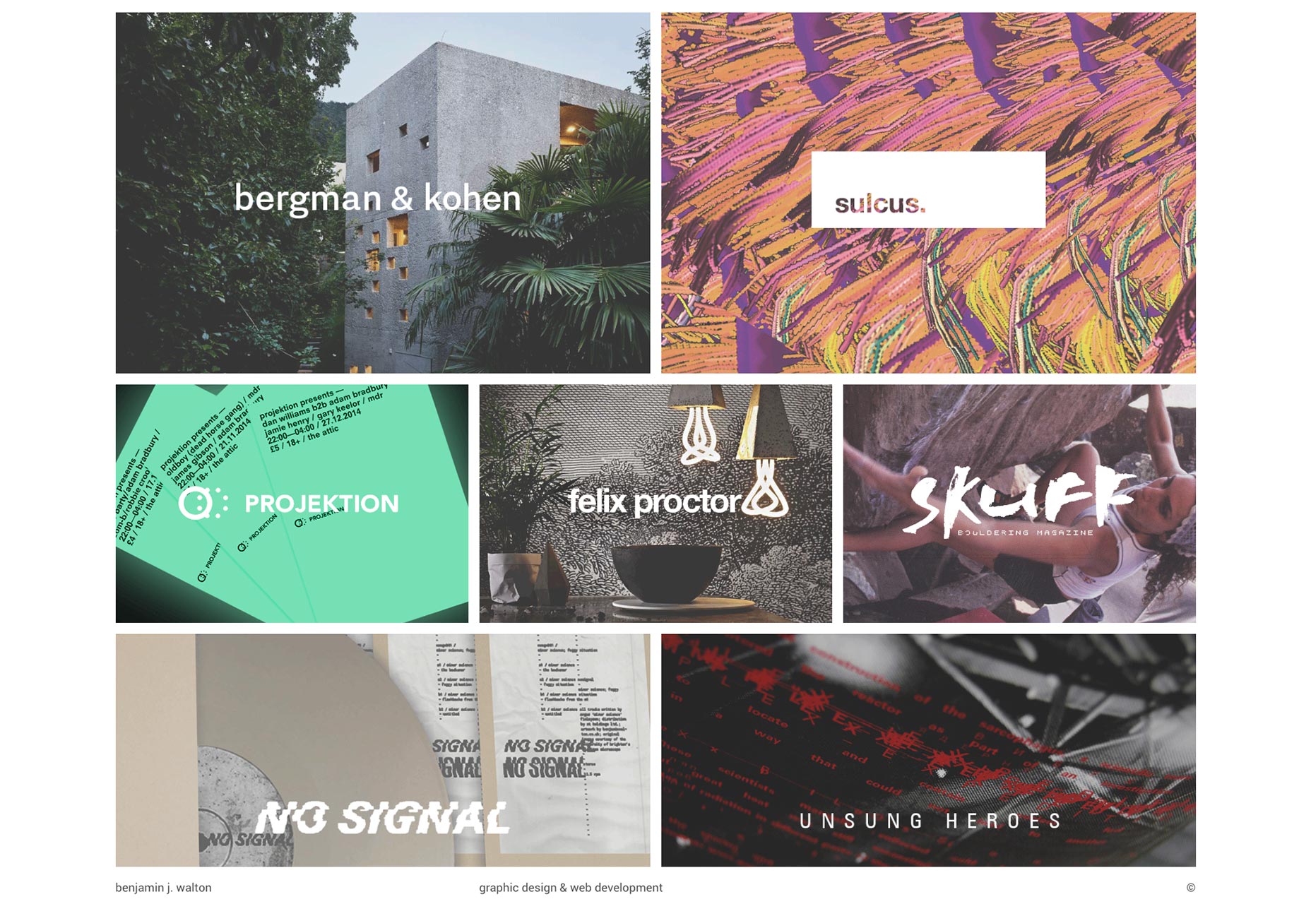
Alessandro Giammaria
Alessandro Giammaria is an Italian designer with an impeccable sense of style. He showcases that sense of style in a minimalist design that starts out monochromatic, and gets progressively more colorful as you browse through his work.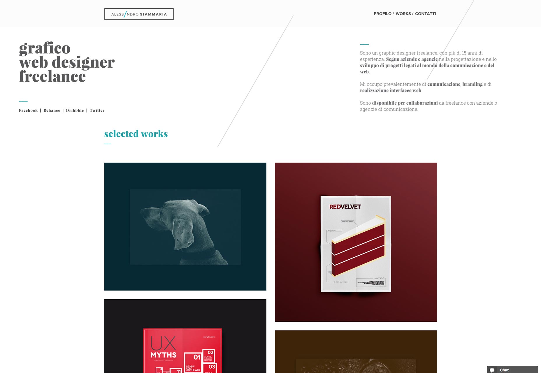
Ezequiel Bruni
Ezequiel Bruni is a web/UX designer, blogger, and aspiring photographer living in Mexico. When he’s not up to his finely-chiselled ears in wire-frames and front-end code, or ranting about the same, he indulges in beer, pizza, fantasy novels, and stand-up comedy.
Read Next
15 Best New Fonts, July 2024
Welcome to our monthly roundup of the best fonts we’ve found online in the last four weeks. This month, there are fewer…
By Ben Moss
20 Best New Websites, July 2024
Welcome to July’s round up of websites to inspire you. This month’s collection ranges from the most stripped-back…
Top 7 WordPress Plugins for 2024: Enhance Your Site's Performance
WordPress is a hands-down favorite of website designers and developers. Renowned for its flexibility and ease of use,…
By WDD Staff
Exciting New Tools for Designers, July 2024
Welcome to this July’s collection of tools, gathered from around the web over the past month. We hope you’ll find…
3 Essential Design Trends, July 2024
Add some summer sizzle to your design projects with trendy website elements. Learn what's trending and how to use these…
15 Best New Fonts, June 2024
Welcome to our roundup of the best new fonts we’ve found online in the last month. This month, there are notably fewer…
By Ben Moss
20 Best New Websites, June 2024
Arranging content in an easily accessible way is the backbone of any user-friendly website. A good website will present…
Exciting New Tools for Designers, June 2024
In this month’s roundup of the best tools for web designers and developers, we’ll explore a range of new and noteworthy…
3 Essential Design Trends, June 2024
Summer is off to a fun start with some highly dramatic website design trends showing up in projects. Let's dive in!
15 Best New Fonts, May 2024
In this month’s edition, there are lots of historically-inspired typefaces, more of the growing trend for French…
By Ben Moss
How to Reduce The Carbon Footprint of Your Website
On average, a web page produces 4.61 grams of CO2 for every page view; for whole sites, that amounts to hundreds of KG…
By Simon Sterne
20 Best New Websites, May 2024
Welcome to May’s compilation of the best sites on the web. This month we’re focused on color for younger humans,…


