

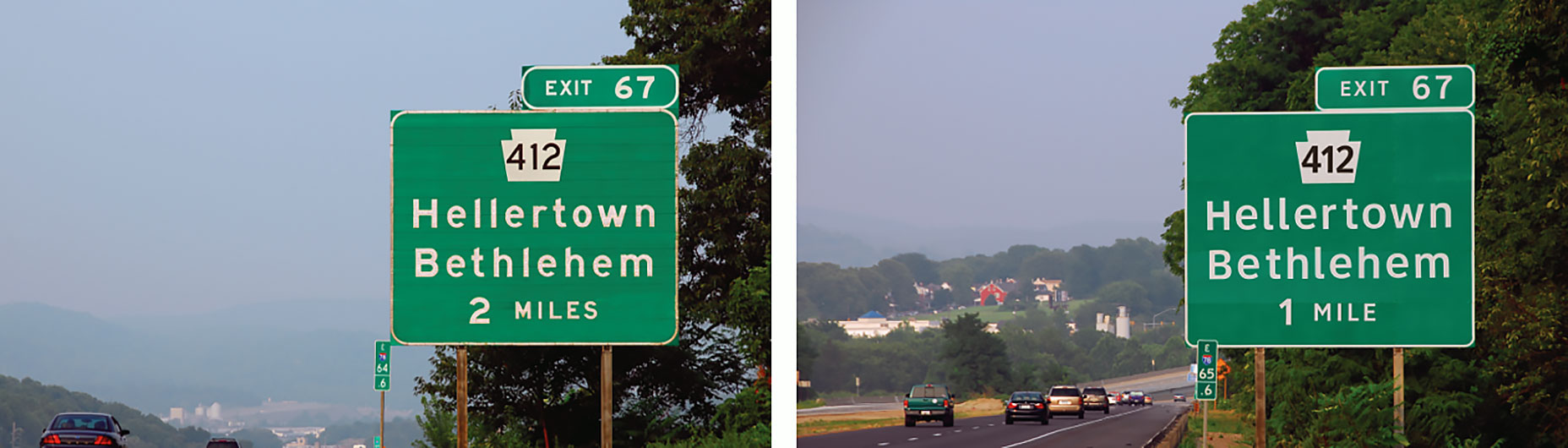
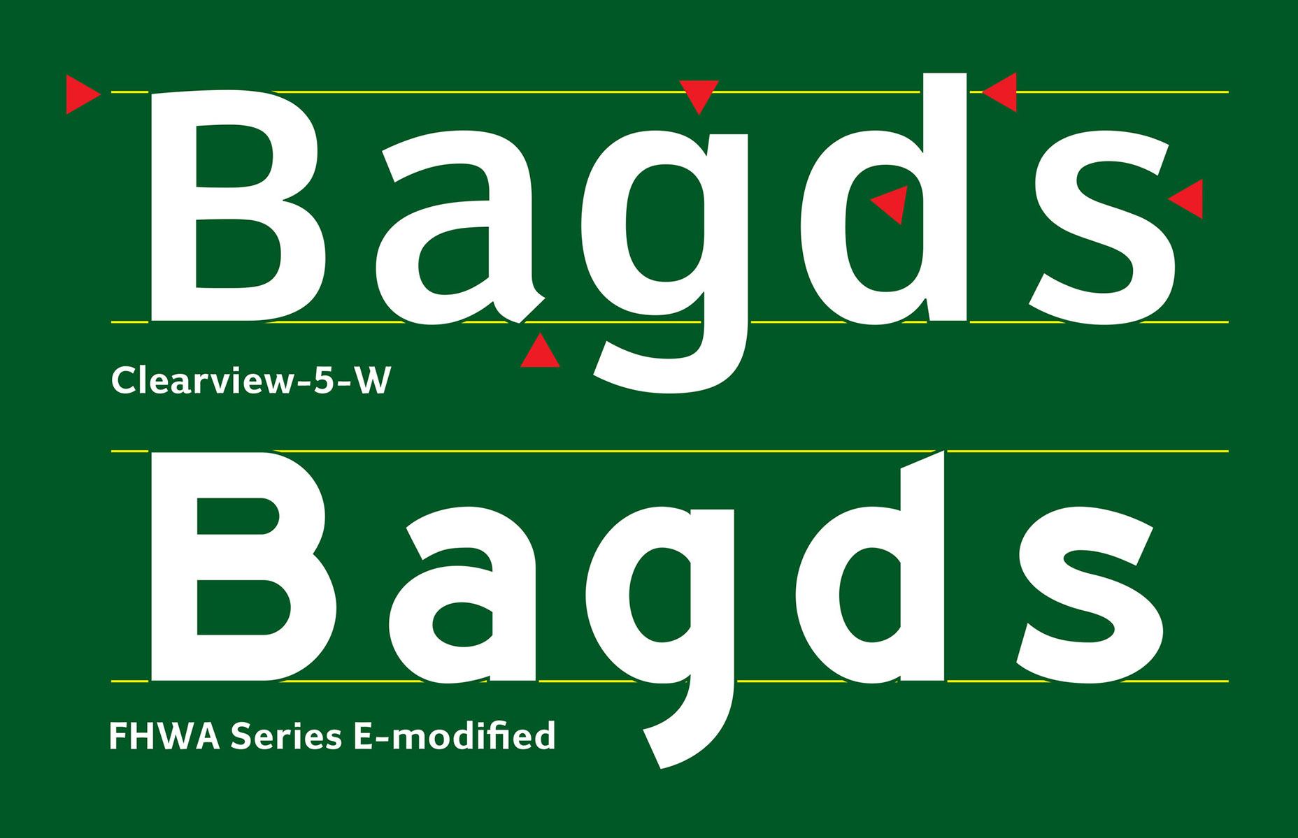
 Highway Gothic (left), and Clearview (right).
The face causing all the drama is called Clearview, and it was designed by Donald Meeker. He started designing it in 1991 after deciding that he wasn't happy with highway signs in Oregon. He worked with researchers at Penn State University to design a new face, hoping to increase the readability of signage.
Early studies indicated that he had been successful. In 2004, the Highway Administration gave his work their provisional endorsement. Many highway signs were changed or replaced.
However, further studies failed to support the conclusions that led the Highway Administration to endorse Clearview. In some cases, it was found to actualy reduce the readability of signage. Others posited that the initial increase in visibility had more top do with what the signs were made of, rather than the lettering.
The Highway Administration has since rescinded their endorsement, though they are not requiring the new signs to be replaced yet again. There just won't be any new signs featuring Clearview.
Clearview's proponents are disappointed to say the least, and have made their objections known. Naturally, with human lives in the balance, the argument is intense, for a debate about typefaces... as it should be.
Highway Gothic (left), and Clearview (right).
The face causing all the drama is called Clearview, and it was designed by Donald Meeker. He started designing it in 1991 after deciding that he wasn't happy with highway signs in Oregon. He worked with researchers at Penn State University to design a new face, hoping to increase the readability of signage.
Early studies indicated that he had been successful. In 2004, the Highway Administration gave his work their provisional endorsement. Many highway signs were changed or replaced.
However, further studies failed to support the conclusions that led the Highway Administration to endorse Clearview. In some cases, it was found to actualy reduce the readability of signage. Others posited that the initial increase in visibility had more top do with what the signs were made of, rather than the lettering.
The Highway Administration has since rescinded their endorsement, though they are not requiring the new signs to be replaced yet again. There just won't be any new signs featuring Clearview.
Clearview's proponents are disappointed to say the least, and have made their objections known. Naturally, with human lives in the balance, the argument is intense, for a debate about typefaces... as it should be.
Ezequiel Bruni
Ezequiel Bruni is a web/UX designer, blogger, and aspiring photographer living in Mexico. When he’s not up to his finely-chiselled ears in wire-frames and front-end code, or ranting about the same, he indulges in beer, pizza, fantasy novels, and stand-up comedy.


Read Next

15 Best New Fonts, July 2024
Welcome to our monthly roundup of the best fonts we’ve found online in the last four weeks. This month, there are fewer…
By Ben Moss

20 Best New Websites, July 2024
Welcome to July’s round up of websites to inspire you. This month’s collection ranges from the most stripped-back…

Top 7 WordPress Plugins for 2024: Enhance Your Site's Performance
WordPress is a hands-down favorite of website designers and developers. Renowned for its flexibility and ease of use,…
By WDD Staff

Exciting New Tools for Designers, July 2024
Welcome to this July’s collection of tools, gathered from around the web over the past month. We hope you’ll find…

3 Essential Design Trends, July 2024
Add some summer sizzle to your design projects with trendy website elements. Learn what's trending and how to use these…

15 Best New Fonts, June 2024
Welcome to our roundup of the best new fonts we’ve found online in the last month. This month, there are notably fewer…
By Ben Moss

20 Best New Websites, June 2024
Arranging content in an easily accessible way is the backbone of any user-friendly website. A good website will present…

Exciting New Tools for Designers, June 2024
In this month’s roundup of the best tools for web designers and developers, we’ll explore a range of new and noteworthy…

3 Essential Design Trends, June 2024
Summer is off to a fun start with some highly dramatic website design trends showing up in projects. Let's dive in!

15 Best New Fonts, May 2024
In this month’s edition, there are lots of historically-inspired typefaces, more of the growing trend for French…
By Ben Moss

How to Reduce The Carbon Footprint of Your Website
On average, a web page produces 4.61 grams of CO2 for every page view; for whole sites, that amounts to hundreds of KG…
By Simon Sterne

20 Best New Websites, May 2024
Welcome to May’s compilation of the best sites on the web. This month we’re focused on color for younger humans,…