

Pierre
I’ll be honest with you. I don’t know enough French to tell if “Leverrier” is Pierre’s last name, nickname, or some sort of adjective. I couldn’t find his full name in the site’s content. The confusion around his name aside, the site is good-looking, usable, though heavily focused on animation. The imagery is good, and the vintage video background on the homepage is a nice touch, style-wise.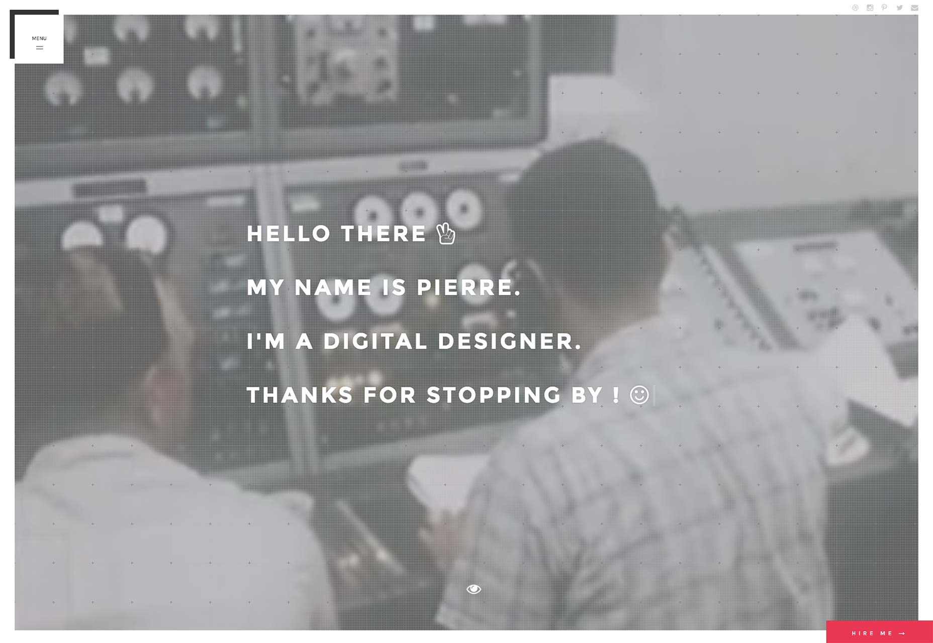
Zeh Fernandes
Zeh Fernandes has achieved the sort of minimalism that makes his one-page site calming to look at. Then again, I am maybe too easily calmed by black text on a white background. Still, Zeh is a master of both code and design, and it shows.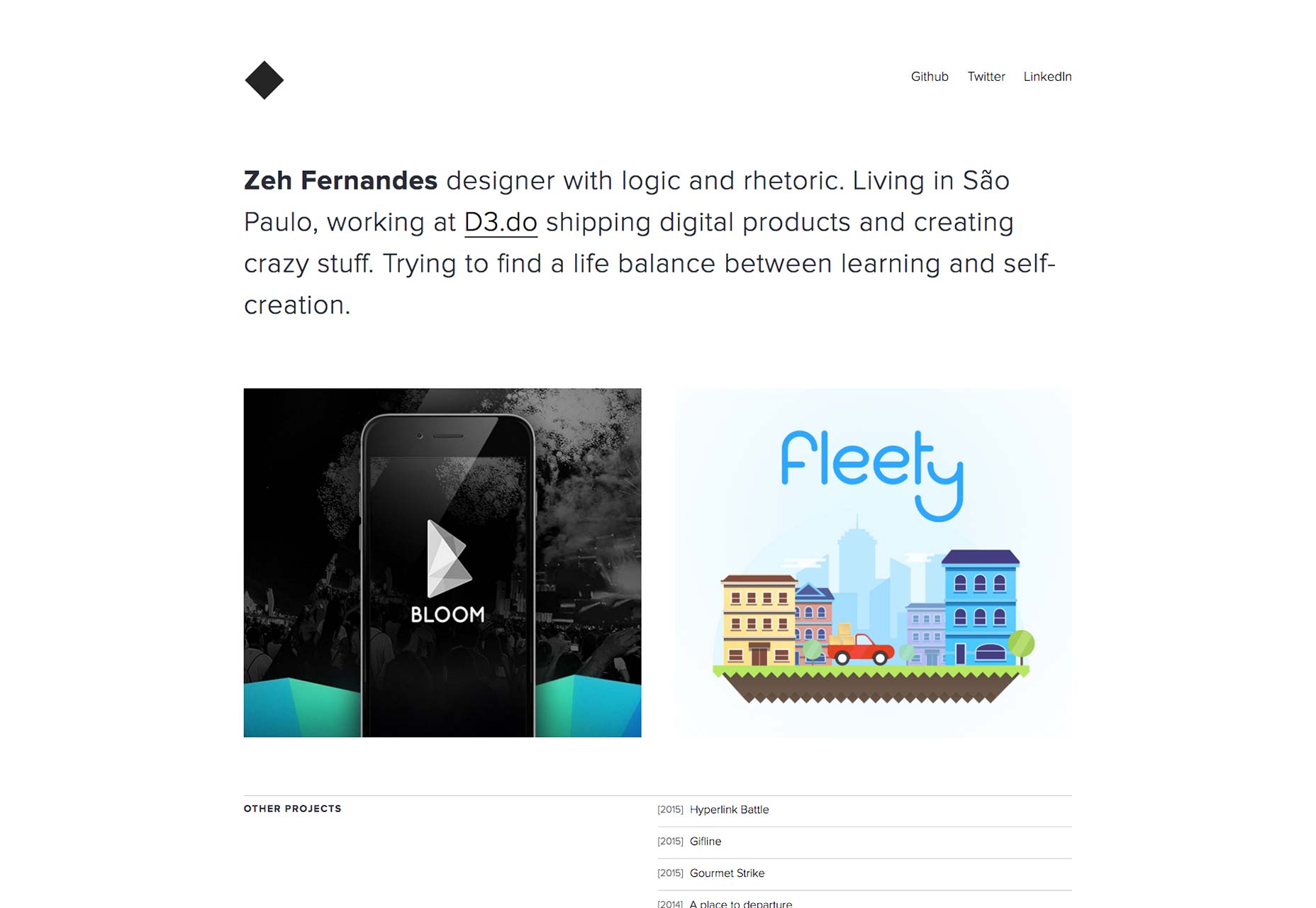
Matt Weller
Matt Weller is yet another designer who takes a big risk by making his portfolio just one big carousel full of his work. Still, his skills as a graphic designer and illustrator make the show a pleasant one.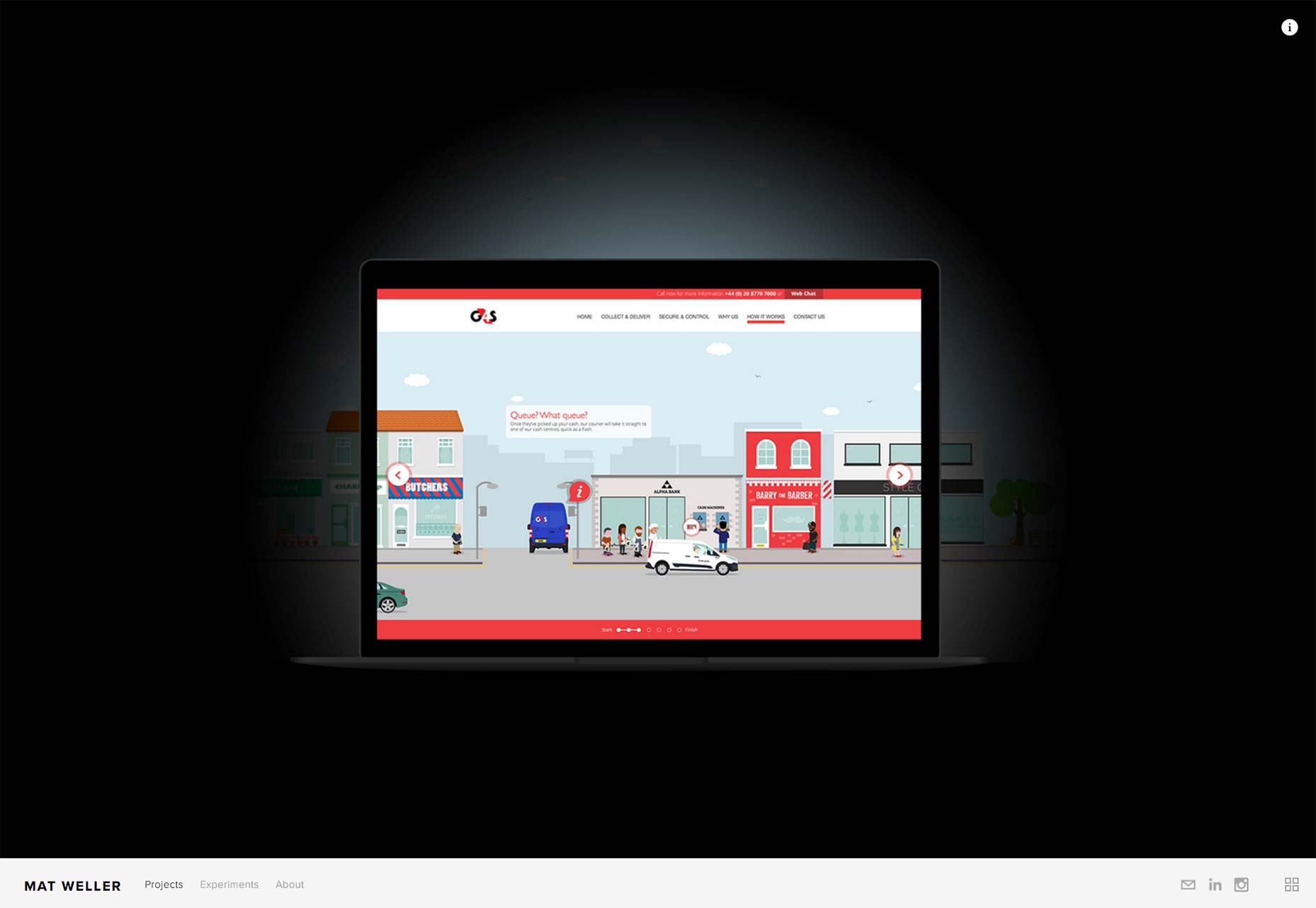
Matt Muirhead
Matt Muirhead combines an interactive sort of drawing toy, video footage, and animation into one rich, lovely, if somewhat distracting website experience. If a designer’s job is to draw the eyes in, and guide the user down a path, then Matt Muirhead knows his job well.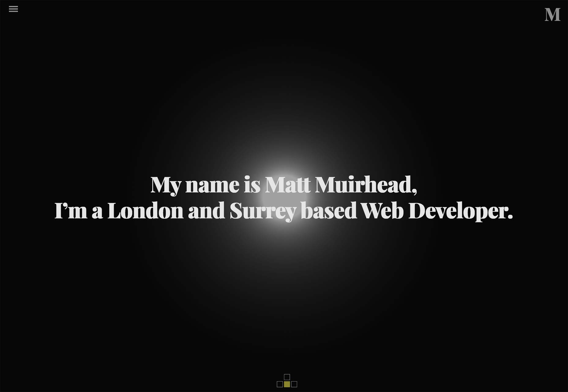
Dauntless
Dauntless’ website doesn’t do anything revolutionary with the layout or aesthetics, but it’s a Good DesignTM. That is, it’s usable, stylish, and pleasing to the eye. It is perhaps ironic that their slogan is “Be Dauntless”, but for their decidedly business-oriented customers, this is a near-perfect design.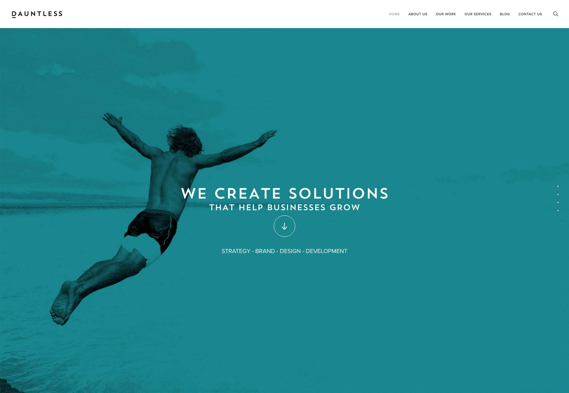
Jacob Stringfellow
Jacob Stringfellow takes a bold, rather risky approach to his portfolio. There’s no denying that the visuals are lovely (with yet another excellent example of a yellow-focused color palette), it’s the presentation. Specifically, he hides his previous work in lightbox carousels, and the copy directly states that this site is his best work so far, but you can look at bits of his older work if you really must. Despite that odd risk, the rest of his site is just plain beautiful.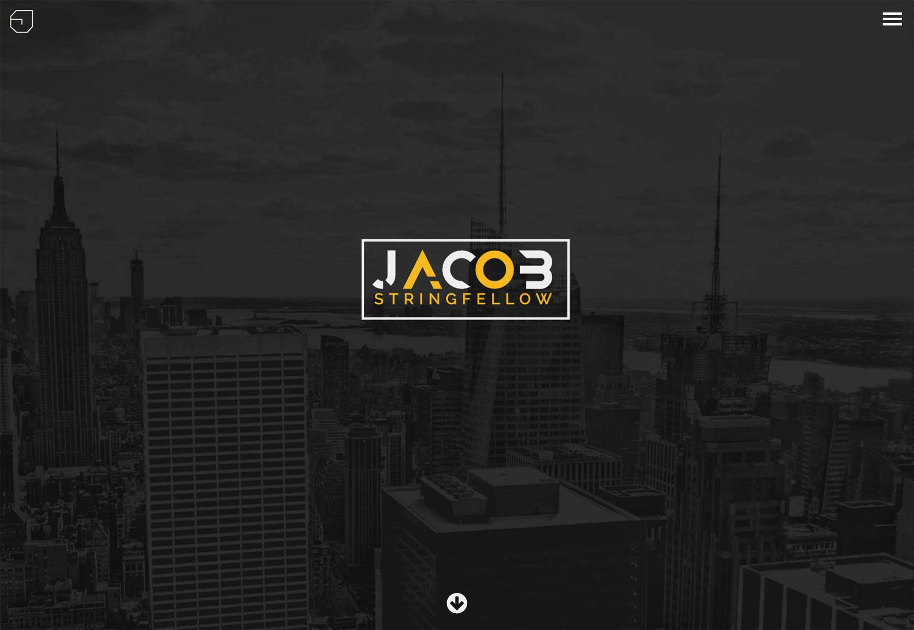
Paul Johns
Paul Johns’ site is another one that I find calming to look at. Simple, usable, pretty, decent typography, lets the work speak for itself. I can’t ask for more.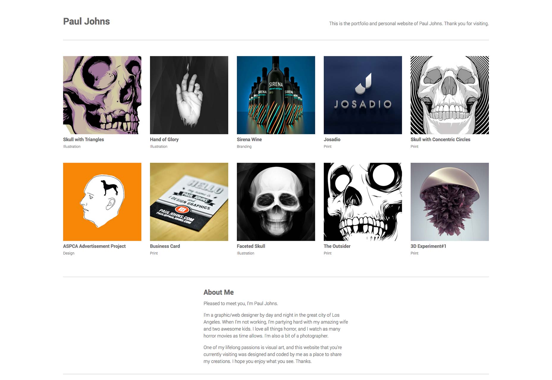
Ryan Gittings
I love Ryan Gittings’ site because it’s a great example of progressive enhancement on top of a usable, fast, and good-looking design. While the aesthetics and layout aren’t anything too original, turn off the JavaScript and watch how everything still works fine. All you lose is a couple of fancy animations. This is how it’s supposed to work! Plus, it really does look good, in a conventional way.
Rotate
Rotate is a studio that takes the opposite approach. The site is fashionable, even kind of elegant, but I hate to see what would happen if someone wasn’t able to load the JS for any reason. Still, I love the way they showcase their work, the “thumbnails” (click through, you’ll see what I mean), and the case studies themselves.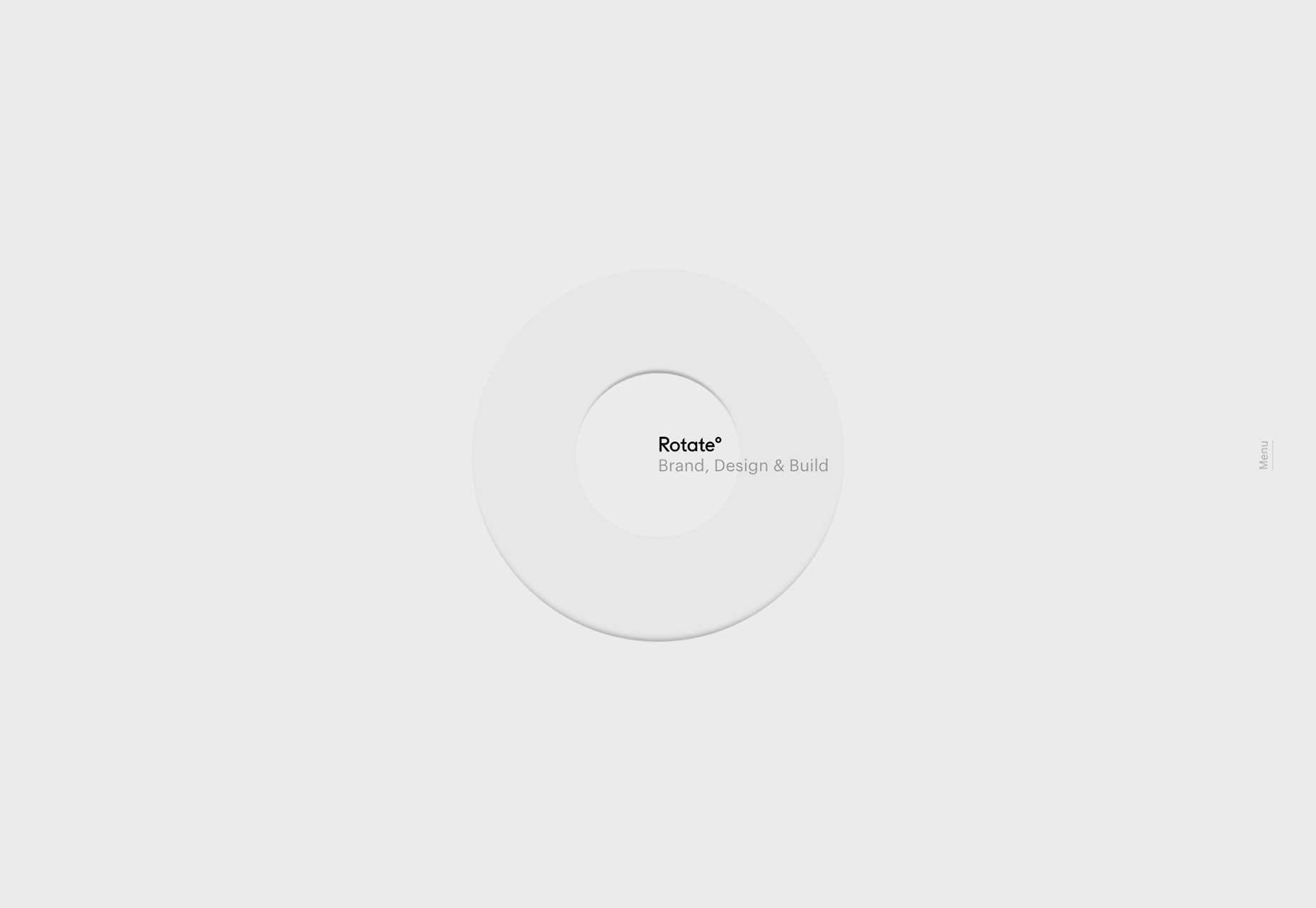
Mark Spurgeon
Mark Spurgeon is a 19-year-old up-and-coming designer, programmer, illustrator, and 3D artist. I’ll freely admit that he could stand to practice his use of white space and typography, but what caught my eye was the aesthetic. It’s a vintage, minimalist design. Vintage design tends to be simplistic, but not minimalist. It is usually dominated by large photos, stylistic flourishes, and so on. Seeing the two aesthetics combined is refreshing. With some tweaks, this could be the best portfolio of the month.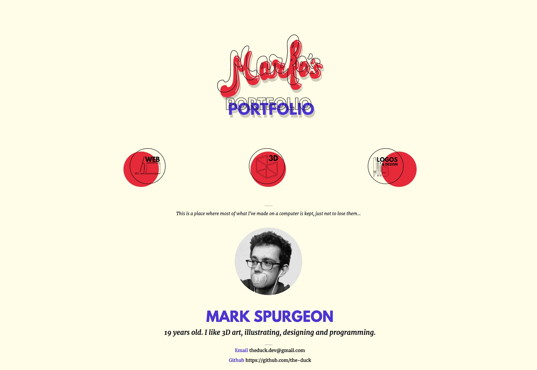
Nifty
It’s simple. It’s sleek. It’s Nifty! (Sorry, I had to.) It’s another one of those sites that does very little that’s new, but a lot that’s right. Click through, browse, enjoy the loads of great imagery.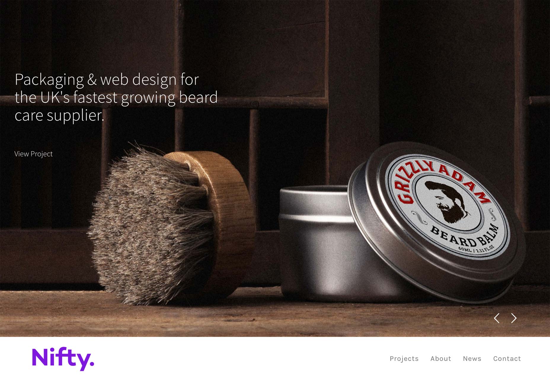
Thick
Thick is a design studio in Australia. [Don’t make an upside-down joke…Don’t make an upside-down joke…] They’ve managed to turn design trends upside down [Dammit…] by using monospace fonts with lots of color. No, really. Nearly every time I see people using monospace fonts, it’s in a monochromatic design. Either that, or a mostly monochromatic design, lightly touched with accent colors. It’s good to see that Thick has gone in a different direction, and made it look good.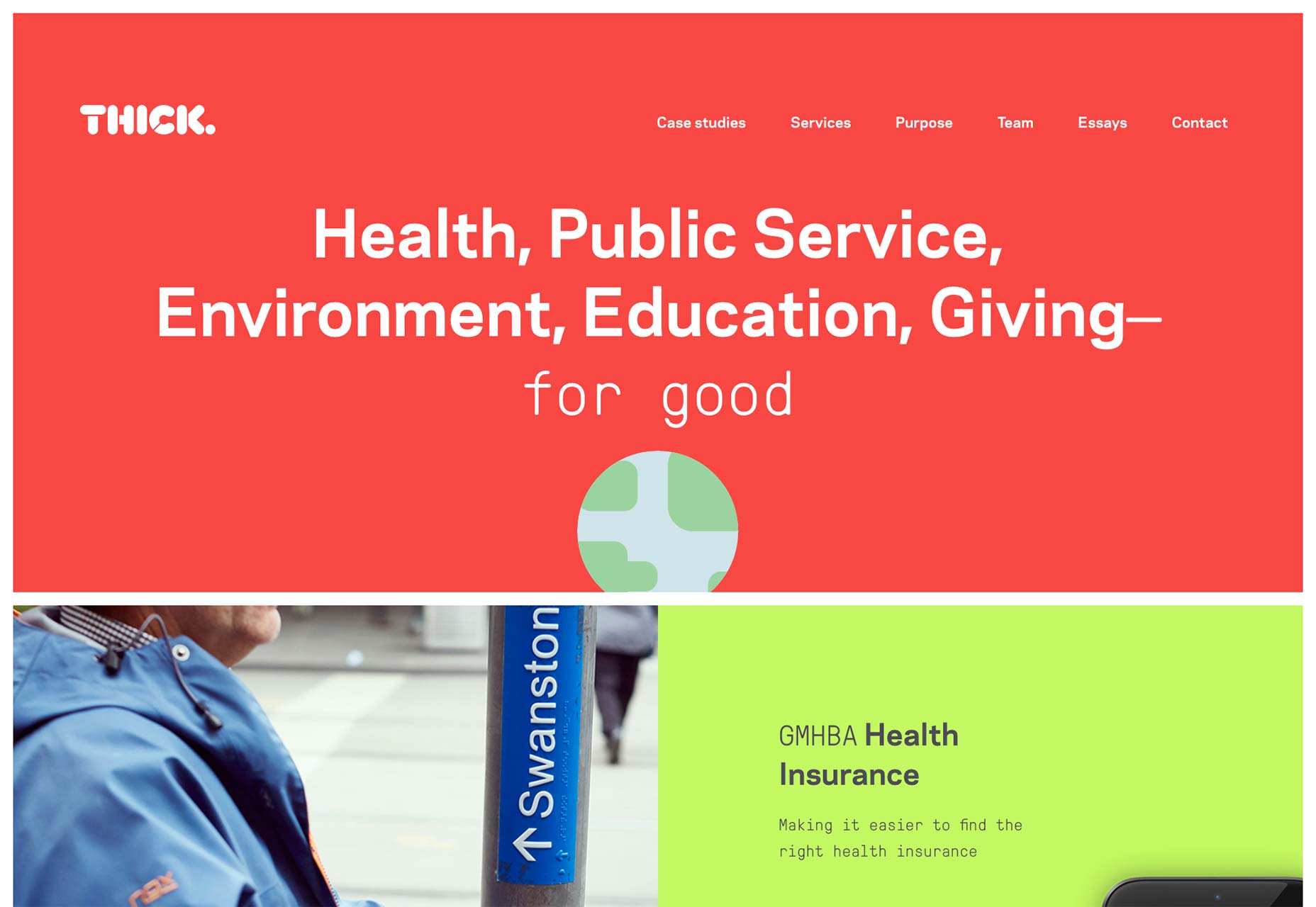
Iaia Ioio
Iaia Ioio has the sort of “wacky” design that makes one think of the ’90s, only imbued with a less colorful palette. I’ll admit, it always feels odd when I get to the landing page of a site and I can’t scroll. It’ll confuse more than a few users when they get there and they find out the navigation is in the four corners. Once you figure that out, though, the design feels classic, like back when the Bauhaus style first began to filter into web design. It comes complete with monospaced fonts and what I could swear is a little Helvetica.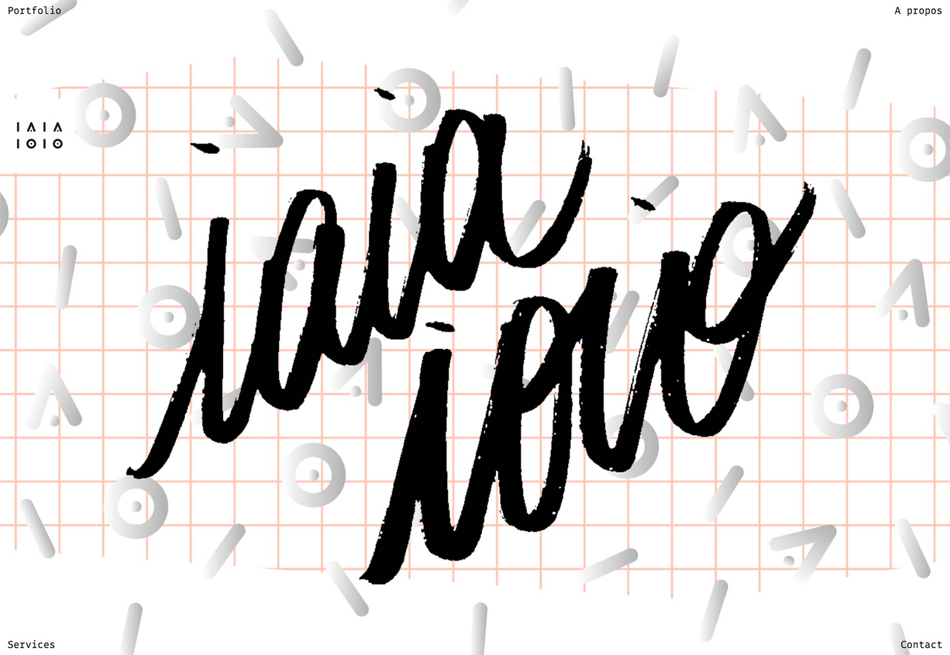
Ouur Media
Ouur Media has perfected an aesthetic that I’m going to call “Sepia Bauhaus” (not to be confused with the aforementioned “Vintage Minimalism”). Seriously, look at it. They’ve got that asymmetry thing going, and they ran the whole home page through a Sepia filter, and it’s working for them. They’re also the people who made that really cool series of photos with the matchsticks.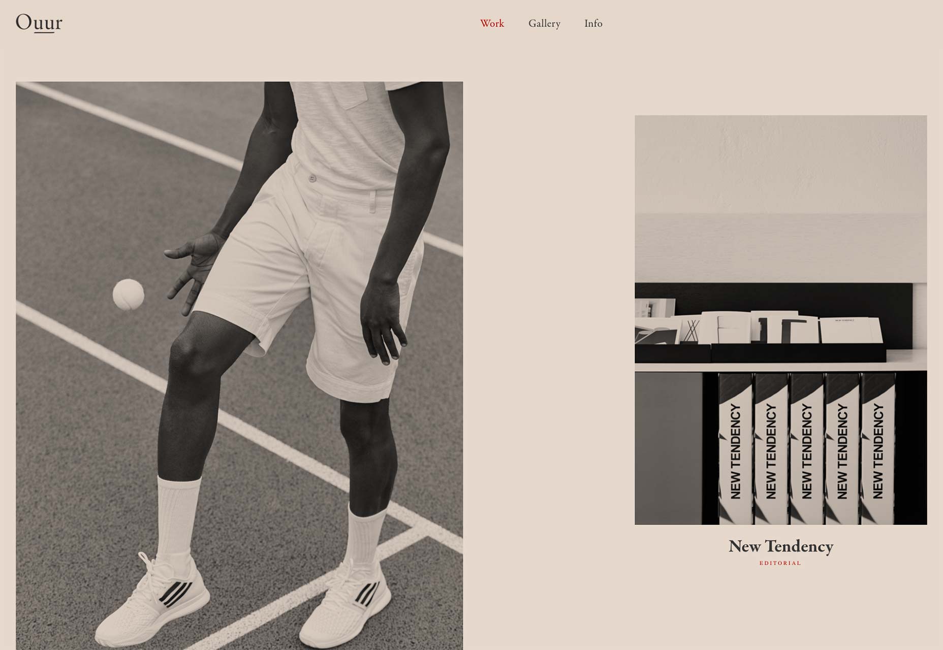
Finesse
Finesse is a design studio with a distinctly high-fashion style that is reflected in both their own site, and all throughout their portfolio. Plus, they make red and black look really good. (Fair warning, after the jump, there will be at least a couple of women in lingerie. Maybe don’t click this one while you’re at work.)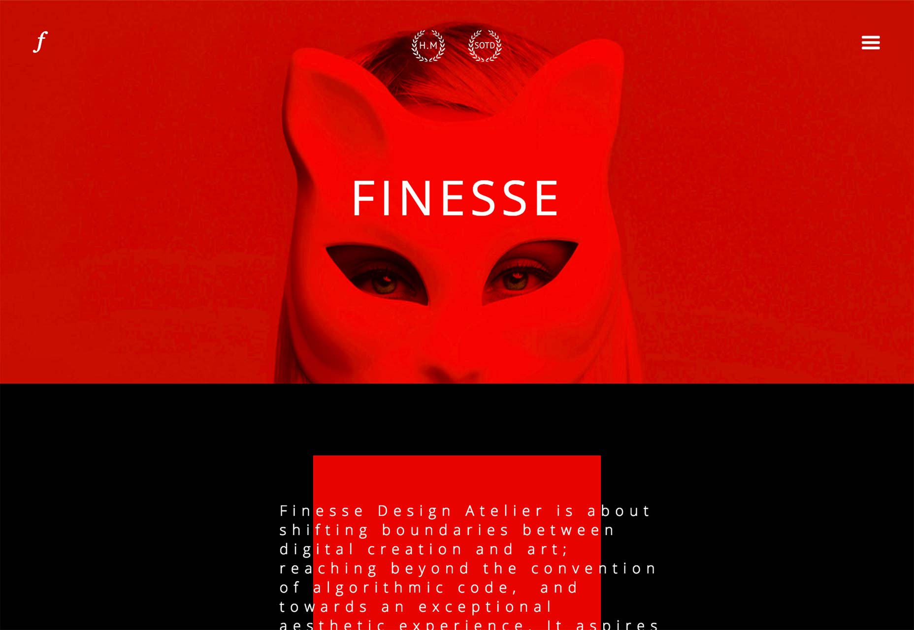
Mighty in the Midwest
Mighty in the Midwest is an agency in Michigan. Their site is practically a textbook on beautiful typography, the use of white space, and mixing unexpected stylized brush strokes and cursive script into an otherwise conservative design.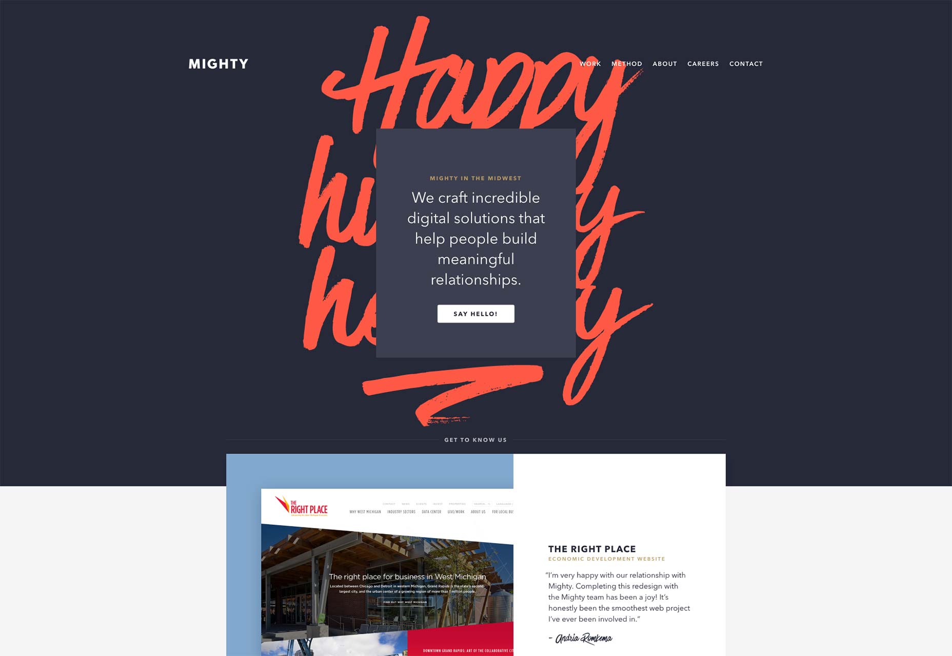
Sean Purdy
It’s rare to find a site as saturated with red as Sean Purdy’s portfolio and rarer to find one that looks this good. Now, there is one problem: after you get there, click on a project as fast as you can, ’cause those blinking .gifs hurt my eyes a bit. Once you get past that (and it is a pretty big usability issue), the work is beautiful, the typography is good, and the navigation, while unconventional, is obvious enough to be usable.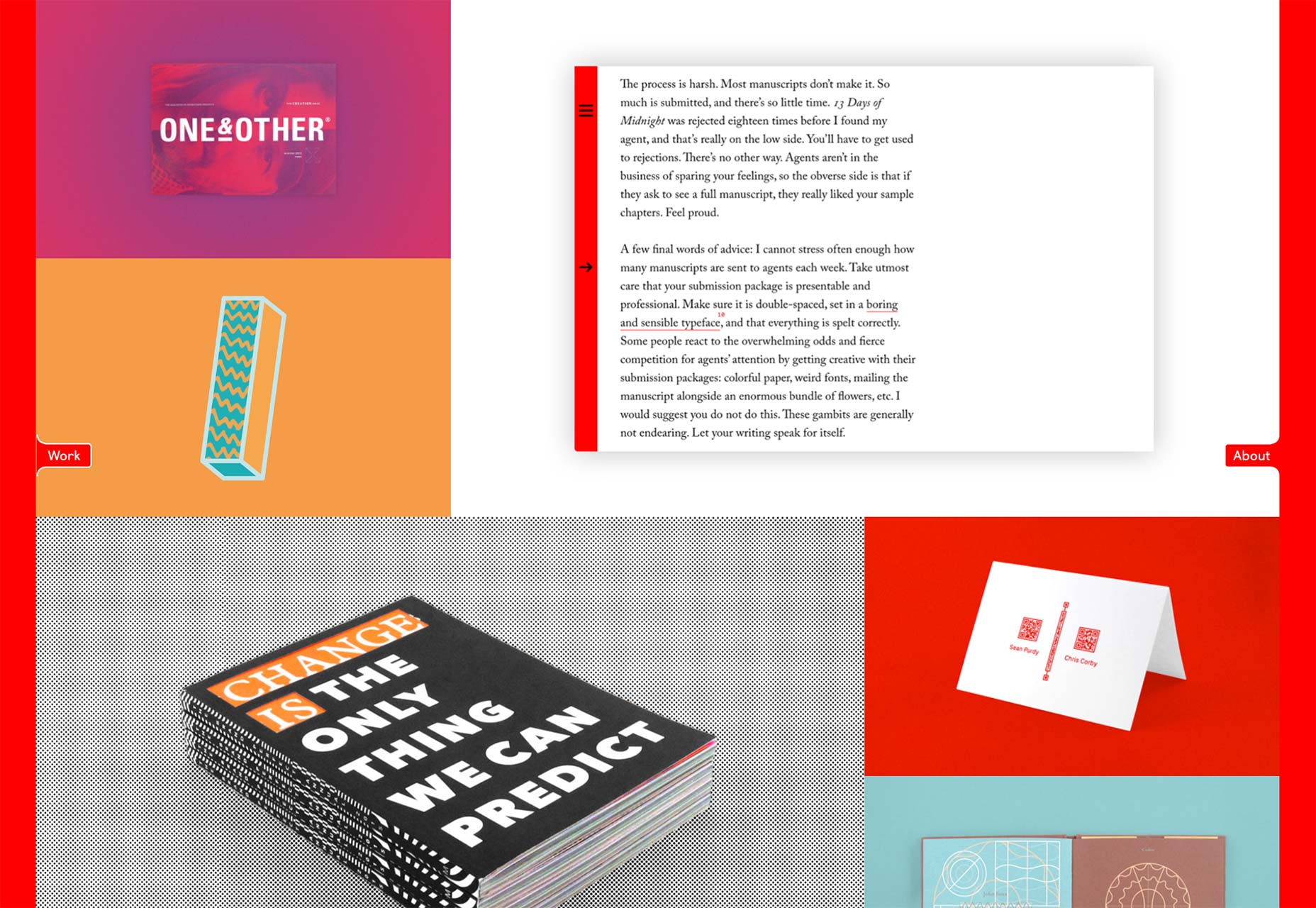
Hello Trio
The Berlin-based Hello Trio combines illustration with fantastic typography in a simple website that does what it says on the label.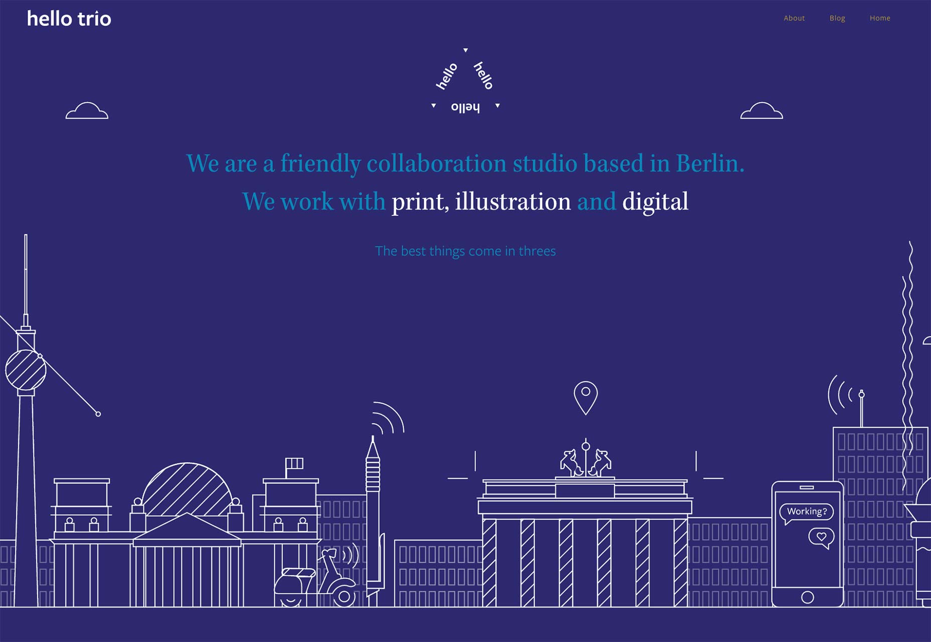
Groundswell
Groundswell uses their portfolio site to showcase their public relations case studies. They also use a lot of stock photography. But hey, if they couldn’t sell a concept with stock photos, I’m not sure I’d trust them to do my PR.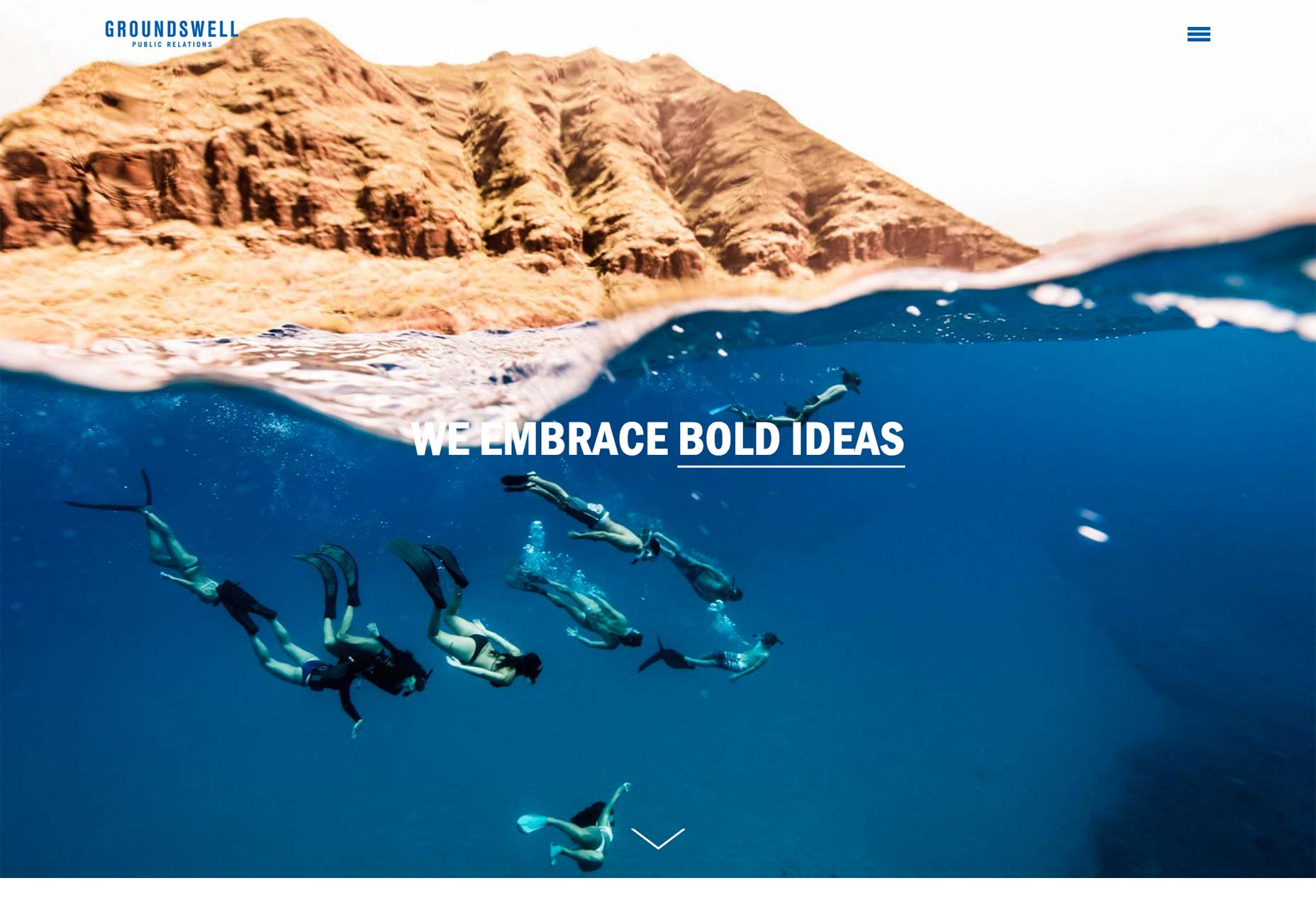
Tristan Gevaux
Using yellow well in web design is hard. Mixing yellow and blue and making it work is harder. Tristan Gevaux has managed this, along with great typography and a very distinct sense of style.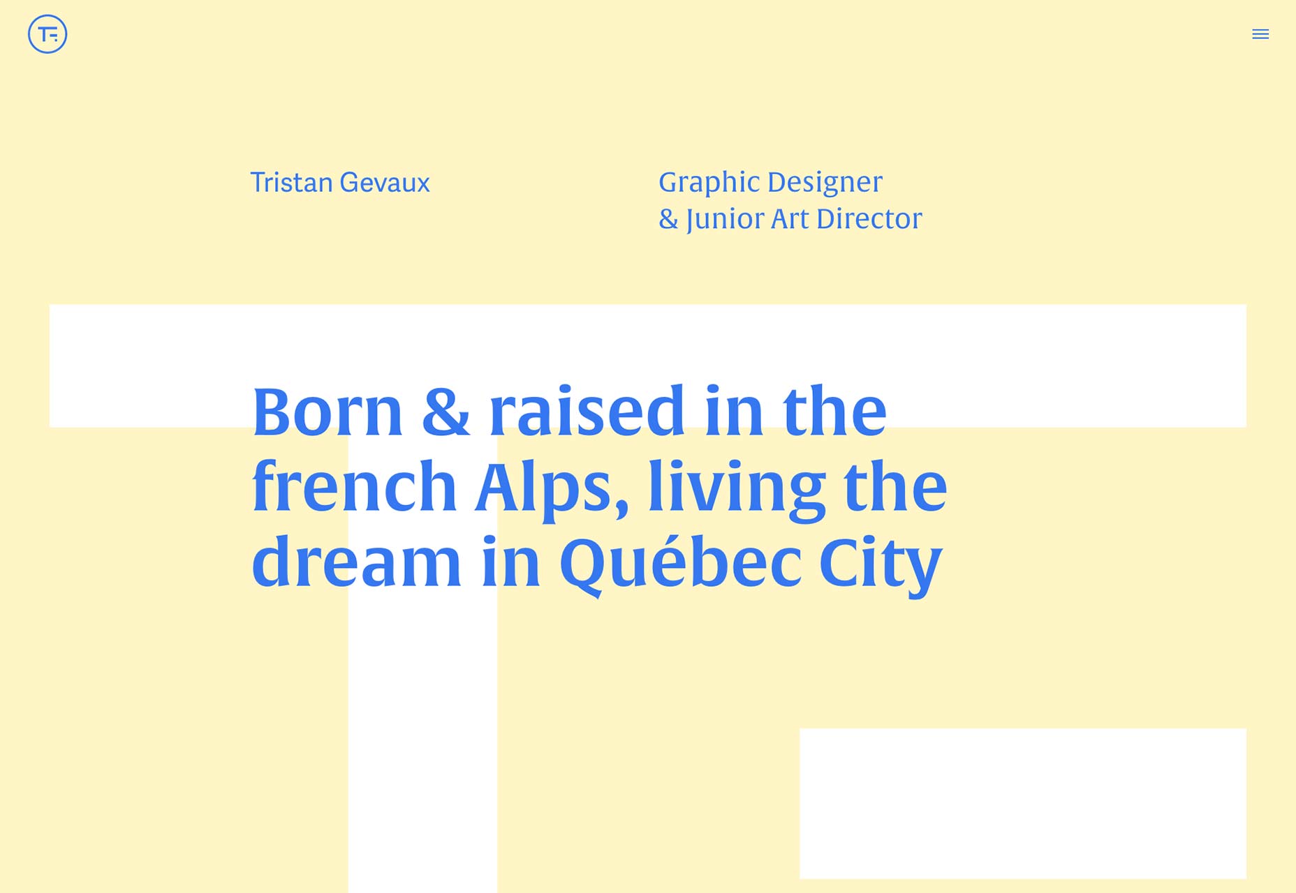
Bolden
Bolden is a design studio in Amsterdam. Their portfolio’s aesthetic uses animation and red and blue overlays to reveal information. It’s fairly distinct, definitely eye-catching, and very well-done.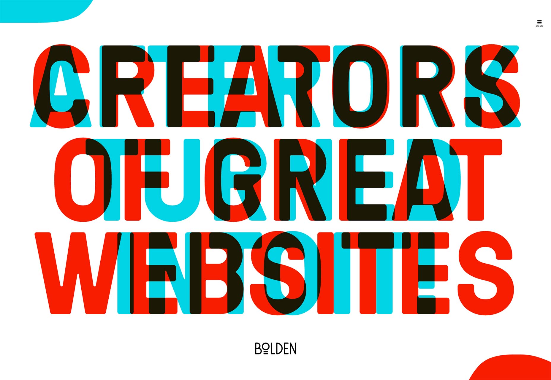
Josh Sender
Josh Sender’s site is simple, largely monochromatic, understated. While I have always showcased at least a site or two for their bold color choices, I must admit that this sort of design is my first love.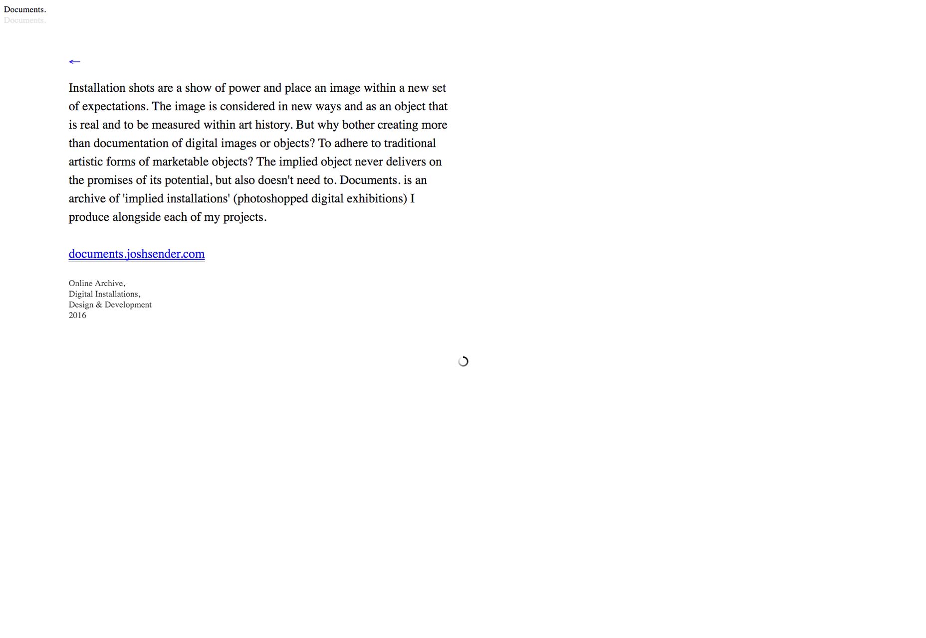
Explainer Videoly
And we jump right back into the vivid colors with Explainer Videoly, a studio that makes explainer videos. You can watch their explainer video about it on their home page, because they really like making them. Their site may not be prticularly unique layout-wise, and there’s no reason the text should be that small, but this site has personality, and a lot of it. Plus, it’s usable.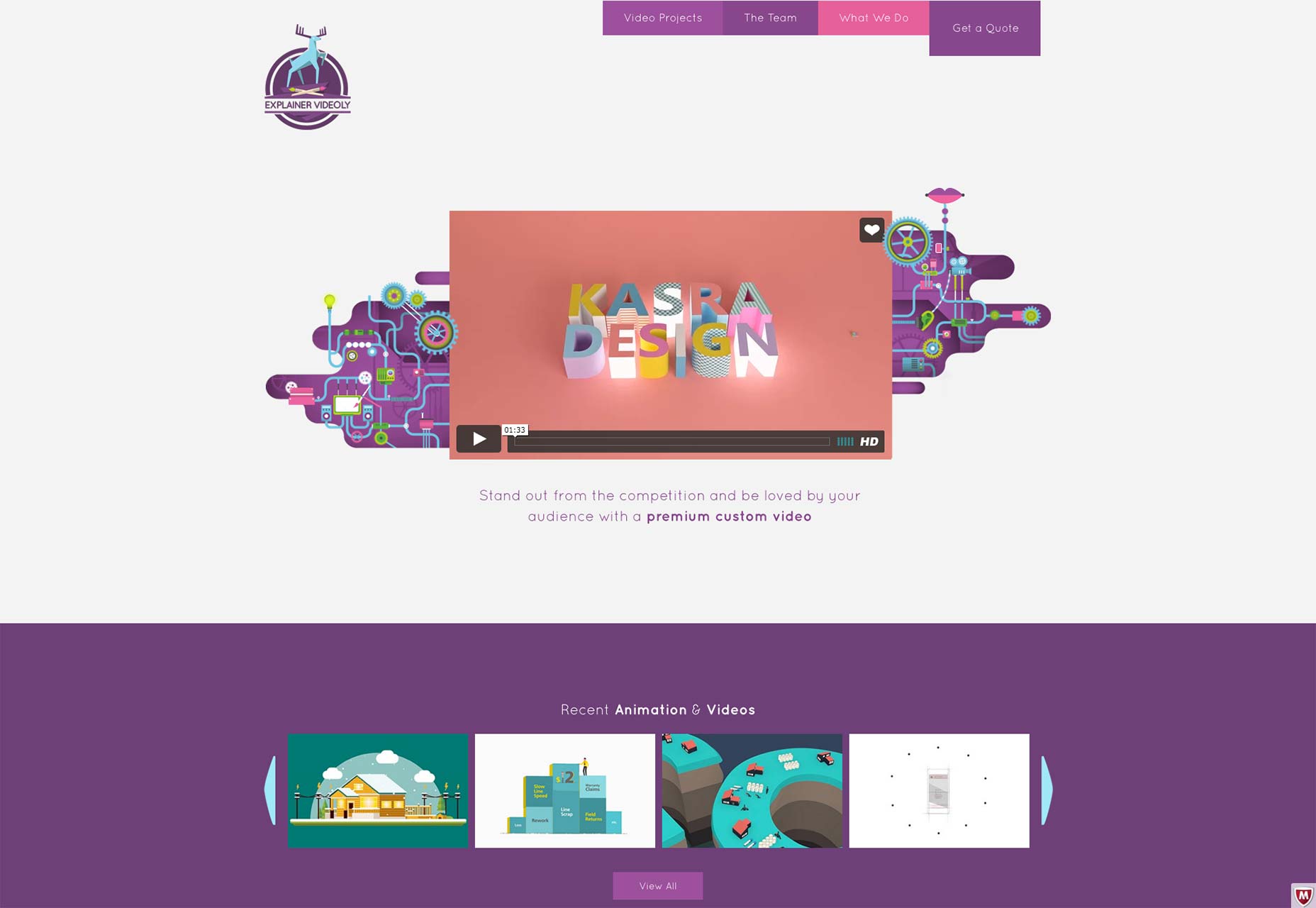
Darryl Snow
Darryl Snow’s site is another great one for showcasing personality. He doesn’t show so much of his work as he shows off the brands he’s worked for. Given the size of those brands, that’s probably enough for most clients. But I especially like the way he puts a twist on old concepts, like the curved borders between the screen-sized content sections. It’s the little touches like that which can make a standard layout feel unique.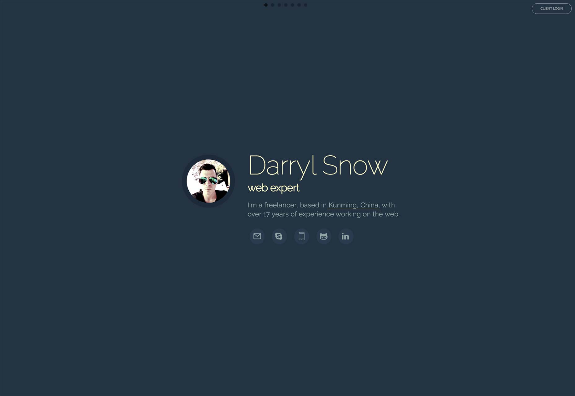
Ezequiel Bruni
Ezequiel Bruni is a web/UX designer, blogger, and aspiring photographer living in Mexico. When he’s not up to his finely-chiselled ears in wire-frames and front-end code, or ranting about the same, he indulges in beer, pizza, fantasy novels, and stand-up comedy.


Read Next

15 Best New Fonts, July 2024
Welcome to our monthly roundup of the best fonts we’ve found online in the last four weeks. This month, there are fewer…
By Ben Moss

20 Best New Websites, July 2024
Welcome to July’s round up of websites to inspire you. This month’s collection ranges from the most stripped-back…

Top 7 WordPress Plugins for 2024: Enhance Your Site's Performance
WordPress is a hands-down favorite of website designers and developers. Renowned for its flexibility and ease of use,…
By WDD Staff

Exciting New Tools for Designers, July 2024
Welcome to this July’s collection of tools, gathered from around the web over the past month. We hope you’ll find…

3 Essential Design Trends, July 2024
Add some summer sizzle to your design projects with trendy website elements. Learn what's trending and how to use these…

15 Best New Fonts, June 2024
Welcome to our roundup of the best new fonts we’ve found online in the last month. This month, there are notably fewer…
By Ben Moss

20 Best New Websites, June 2024
Arranging content in an easily accessible way is the backbone of any user-friendly website. A good website will present…

Exciting New Tools for Designers, June 2024
In this month’s roundup of the best tools for web designers and developers, we’ll explore a range of new and noteworthy…

3 Essential Design Trends, June 2024
Summer is off to a fun start with some highly dramatic website design trends showing up in projects. Let's dive in!

15 Best New Fonts, May 2024
In this month’s edition, there are lots of historically-inspired typefaces, more of the growing trend for French…
By Ben Moss

How to Reduce The Carbon Footprint of Your Website
On average, a web page produces 4.61 grams of CO2 for every page view; for whole sites, that amounts to hundreds of KG…
By Simon Sterne

20 Best New Websites, May 2024
Welcome to May’s compilation of the best sites on the web. This month we’re focused on color for younger humans,…