

Looking for a good example of simplicity in UX design? Google it
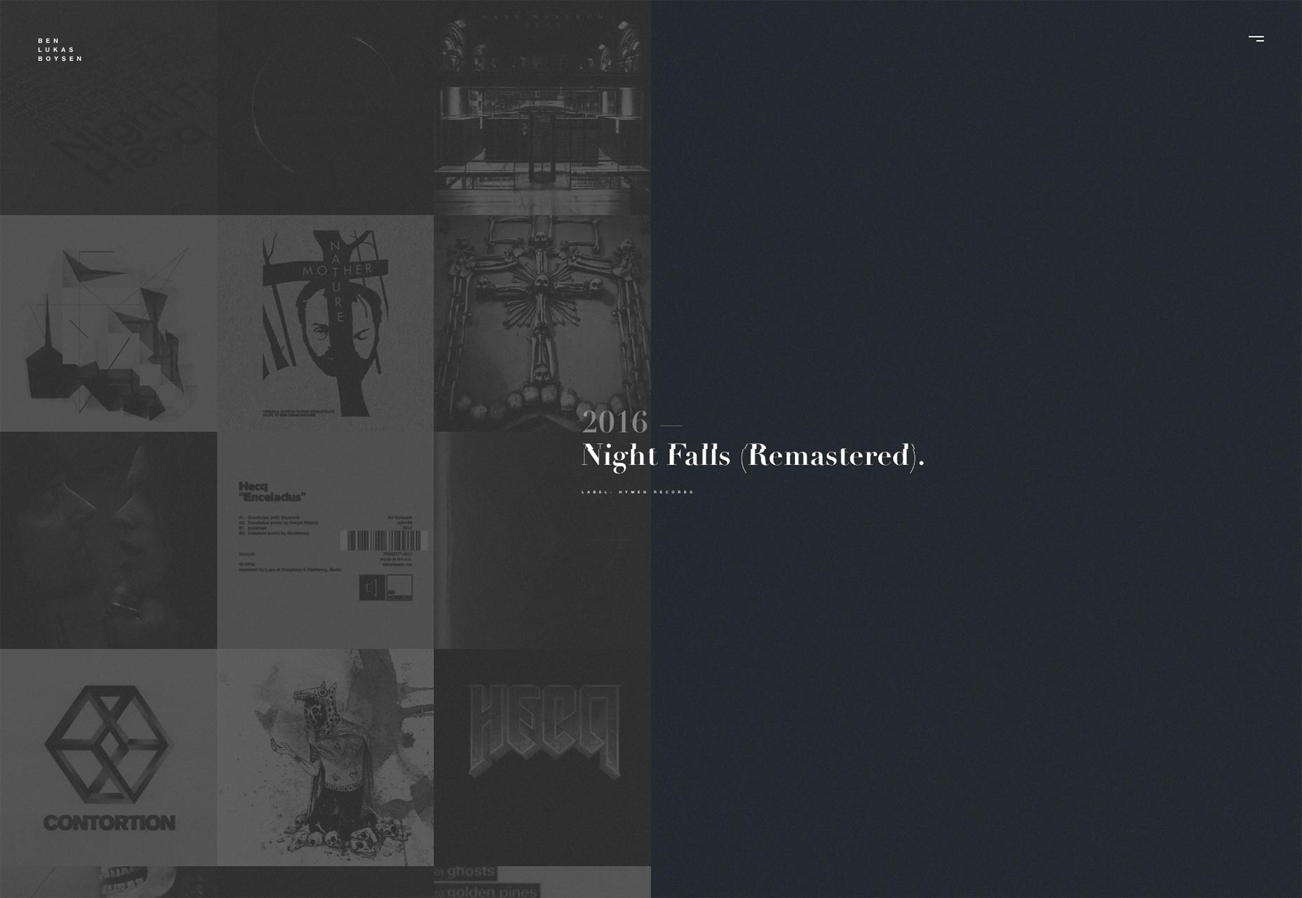
When defining simplicity by aesthetic, perhaps there is no more perfect an example than Google. When a user goes to the website, they are presented with only one input: the search bar. This search bar then auto fills possible search queries based on complicated algorithms before pulling a list of relevant search results. Compare this to Yahoo, where a user is bombarded with information and options. To the user, both Google’s interface and the experience are simple and self-explanatory even though the backend of the application is not.
“I think simplicity ties in a lot with intuition. That notion of whether the user experience is intuitive in nature makes the end result a very simple and delightful user experience,” said Dominic Wong, the head of experience design at Invoke. “Do I know instinctively what to do? And if I if I go out and do it, is it actually aligning to my behavioral expectations of an experience?”
The simplicity of Google is perhaps part of the reason why “Google it” became a part of our lexicon. The experience is designed in such a fashion that it is easy for a user to find what they are looking for—and find it quickly.
[pullquote][UX] is threatened when the simplicity of an interface design comes at the expense of usability[/pullquote]
User experience is threatened when the simplicity of an interface design comes at the expense of usability, such as when elements are buried, buttons are not labeled clearly, or the user is unfamiliar with the navigation. Even simple design needs to be strategic and take into account the users’ customs.
“Simplicity has to tie in with how to guide someone to intuitively make decisions,” Wong said.
To the user, both Google’s interface and the experience are simple and self-explanatory even though the backend of the application is not.
“I think simplicity ties in a lot with intuition. That notion of whether the user experience is intuitive in nature makes the end result a very simple and delightful user experience,” said Dominic Wong, the head of experience design at Invoke. “Do I know instinctively what to do? And if I if I go out and do it, is it actually aligning to my behavioral expectations of an experience?”
The simplicity of Google is perhaps part of the reason why “Google it” became a part of our lexicon. The experience is designed in such a fashion that it is easy for a user to find what they are looking for—and find it quickly.
[pullquote][UX] is threatened when the simplicity of an interface design comes at the expense of usability[/pullquote]
User experience is threatened when the simplicity of an interface design comes at the expense of usability, such as when elements are buried, buttons are not labeled clearly, or the user is unfamiliar with the navigation. Even simple design needs to be strategic and take into account the users’ customs.
“Simplicity has to tie in with how to guide someone to intuitively make decisions,” Wong said.
User experience in the age of instant gratification
When it comes to simplicity and functionality, maintaining consistency in what a user innately expects from an experience is perhaps equally as important as accounting for the fact that today’s users are also accustomed to getting what they want right away. Like it or not, we’re deep in the age of instant gratification and this needs to be taken into consideration when designing a user experience.
“People are expecting less flashiness and a certain level of utility,” Wong said.
“I think nowadays when the visual or stylistic elements become overbearing, it actually detracts from the experience.”
While there are opportunities to create lush user experiences and interfaces, they need to be appropriate to the end goal—both that of the user and of the design. You don’t want the user interface to distract from the user experience. Rather, you want to offer the user what they came for in a prompt manner that is easy to follow and understand.
“The best way to grab attention and build interest is to present a single core idea, fully fledged,” wrote Daniel Ritzenthaler on 52 Weeks of UX. “This allows the user to make a binary decision about it: ‘Am I interested or not?’ Introducing a feature in a way that people can instantly map it to a desired outcome will help them prioritize and be confident about their next step.”
Like it or not, we’re deep in the age of instant gratification and this needs to be taken into consideration when designing a user experience.
“People are expecting less flashiness and a certain level of utility,” Wong said.
“I think nowadays when the visual or stylistic elements become overbearing, it actually detracts from the experience.”
While there are opportunities to create lush user experiences and interfaces, they need to be appropriate to the end goal—both that of the user and of the design. You don’t want the user interface to distract from the user experience. Rather, you want to offer the user what they came for in a prompt manner that is easy to follow and understand.
“The best way to grab attention and build interest is to present a single core idea, fully fledged,” wrote Daniel Ritzenthaler on 52 Weeks of UX. “This allows the user to make a binary decision about it: ‘Am I interested or not?’ Introducing a feature in a way that people can instantly map it to a desired outcome will help them prioritize and be confident about their next step.”
Creating simple user experiences despite complex needs
One might think then that simplicity equates to minimalism, but it is more about giving users only what they need. When you give the user just enough, simplicity can prevail, even when dealing with complex applications.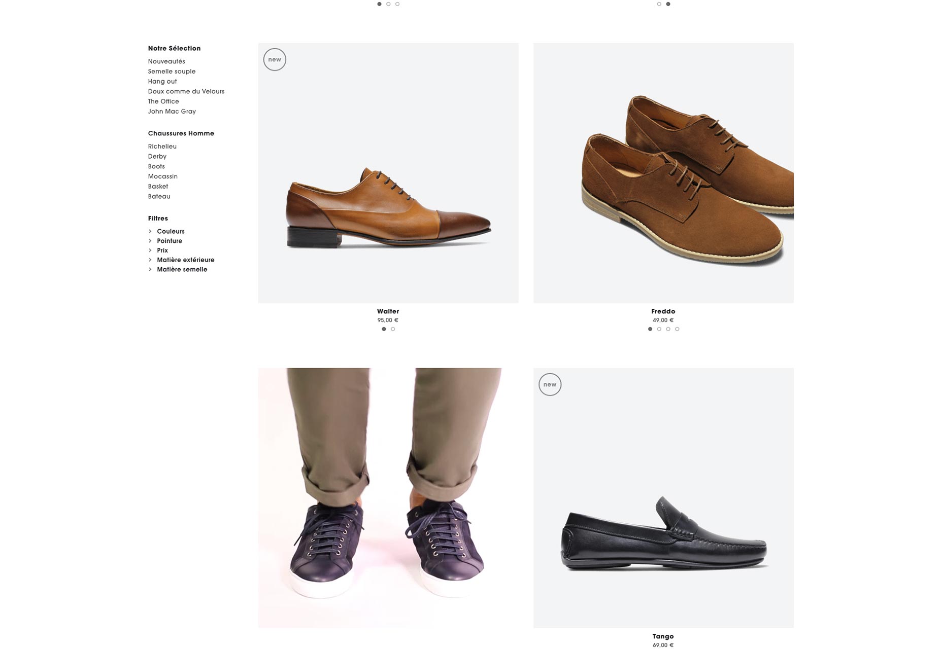 Wong spoke of a recent project involving the redesign of a dental application that required numerous complicated, but essential elements. The experience needed to be simple to use without sacrificing the complexity of the interface. The team had to design the experience so that the application contained all the necessary elements, but only showed the user what was necessary for the desired outcome at that moment.
You don’t want to include anything that will distract or require someone to put more effort into obtaining what they need to obtain—Dominic Wong
While much of simplicity’s semantics continue to be debated, Wong says in the end it’s really about this one very thing: serving users what they need, when they need it in the most straightforward way possible.
Tom Krcha
Tom Krcha is Senior Product Manager for Adobe XD CC.


Read Next

15 Best New Fonts, July 2024
Welcome to our monthly roundup of the best fonts we’ve found online in the last four weeks. This month, there are fewer…
By Ben Moss

20 Best New Websites, July 2024
Welcome to July’s round up of websites to inspire you. This month’s collection ranges from the most stripped-back…

Top 7 WordPress Plugins for 2024: Enhance Your Site's Performance
WordPress is a hands-down favorite of website designers and developers. Renowned for its flexibility and ease of use,…
By WDD Staff

Exciting New Tools for Designers, July 2024
Welcome to this July’s collection of tools, gathered from around the web over the past month. We hope you’ll find…

3 Essential Design Trends, July 2024
Add some summer sizzle to your design projects with trendy website elements. Learn what's trending and how to use these…

15 Best New Fonts, June 2024
Welcome to our roundup of the best new fonts we’ve found online in the last month. This month, there are notably fewer…
By Ben Moss

20 Best New Websites, June 2024
Arranging content in an easily accessible way is the backbone of any user-friendly website. A good website will present…

Exciting New Tools for Designers, June 2024
In this month’s roundup of the best tools for web designers and developers, we’ll explore a range of new and noteworthy…

3 Essential Design Trends, June 2024
Summer is off to a fun start with some highly dramatic website design trends showing up in projects. Let's dive in!

15 Best New Fonts, May 2024
In this month’s edition, there are lots of historically-inspired typefaces, more of the growing trend for French…
By Ben Moss

How to Reduce The Carbon Footprint of Your Website
On average, a web page produces 4.61 grams of CO2 for every page view; for whole sites, that amounts to hundreds of KG…
By Simon Sterne

20 Best New Websites, May 2024
Welcome to May’s compilation of the best sites on the web. This month we’re focused on color for younger humans,…