

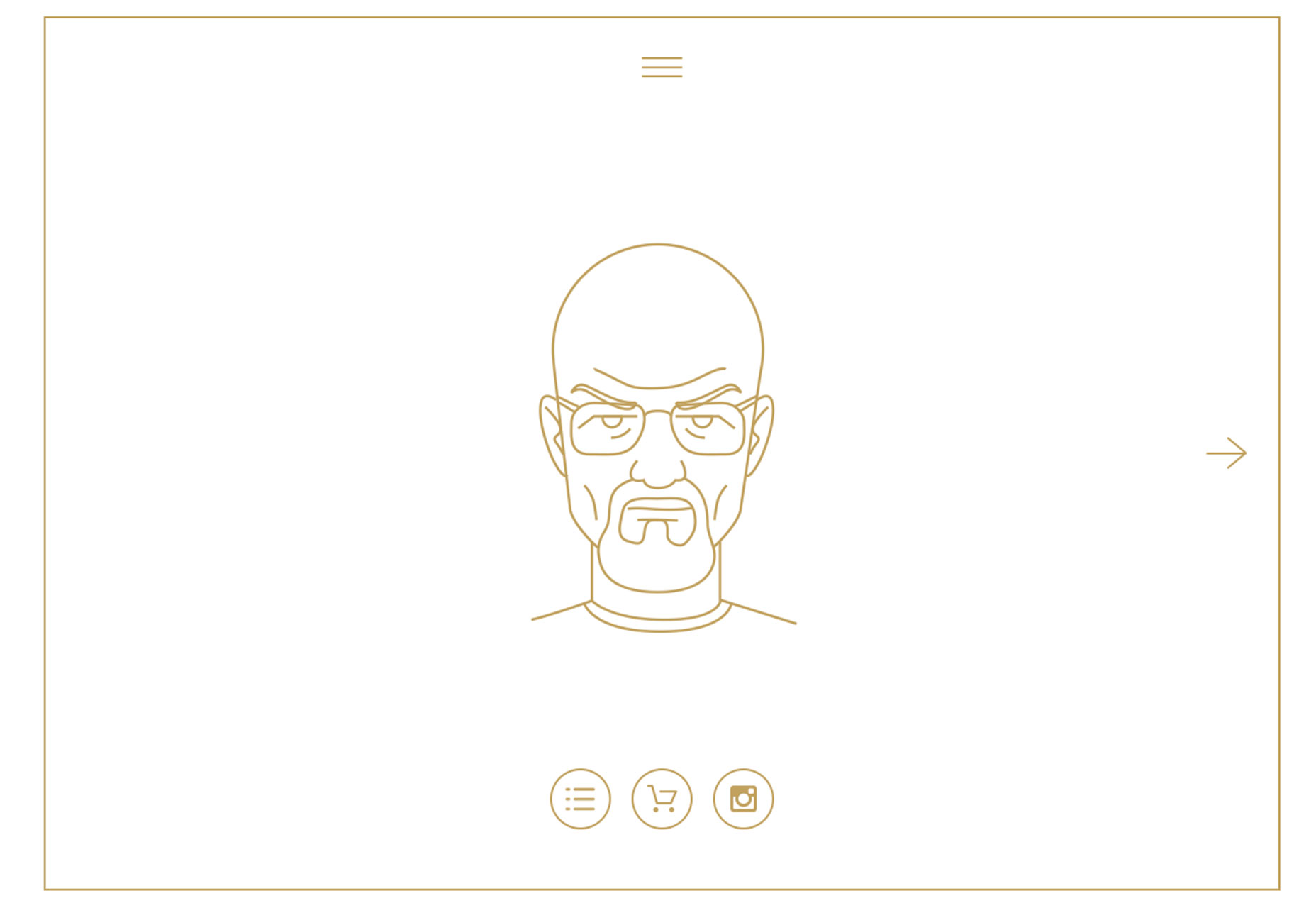
1) Icon-style illustrations
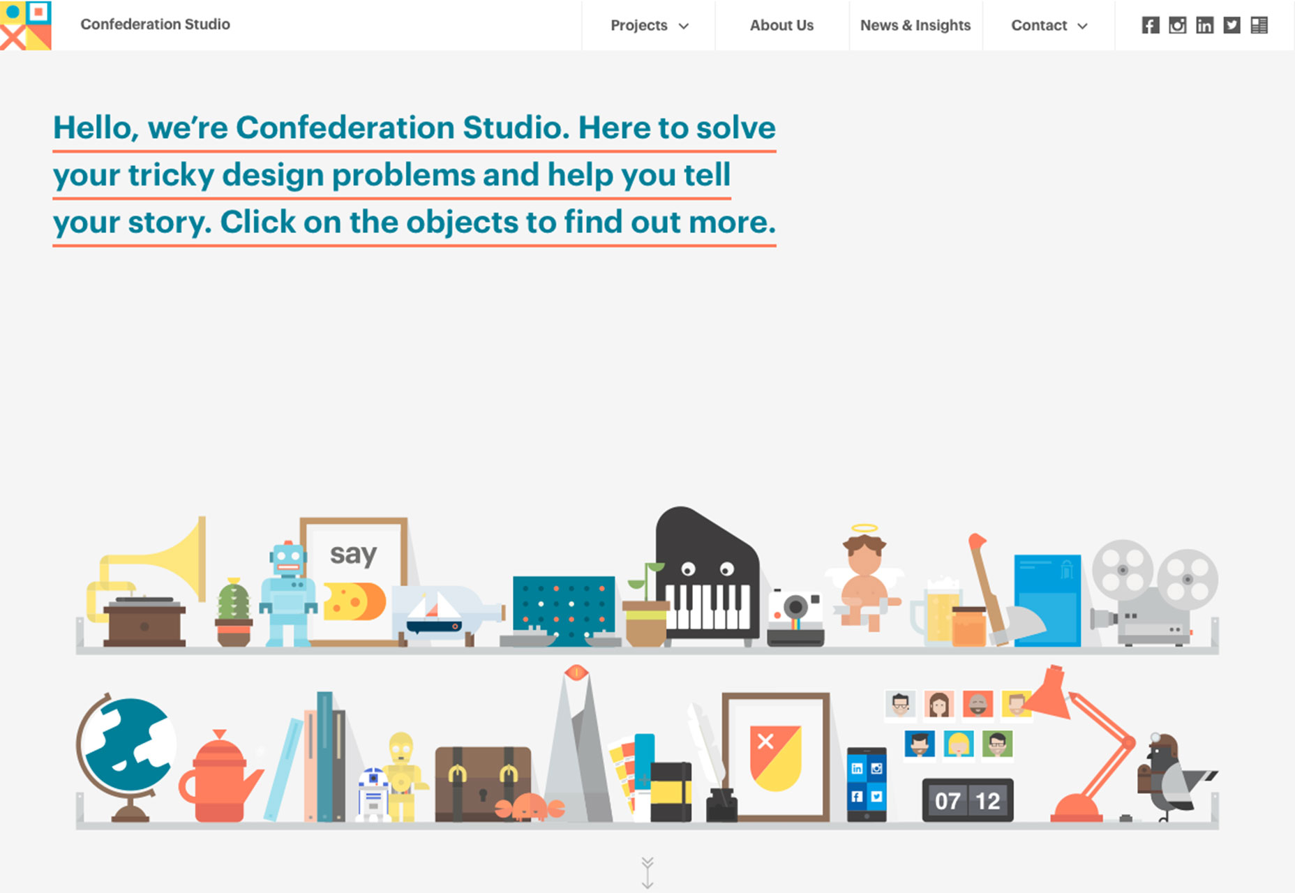
It’s hard not to love a great illustration. Some of the best illustrations we are seeing right now have more of an icon-style feel to them. The comes with a few key characteristics:- Flat and simple illustrated elements (note how all of the tiny illustrations are combined in the Confederation Studio site)
- Bright color or simple coloring featuring primary hues
- Geometric shapes with an interactive purpose
- Elements with the look and feel of the icon, minus the container, so visually you see it as a drawing and not a button
- Hand-drawn illustrative effects
- Elements that looks like icons, but take up considerably more space on the canvas than an icon
- Simple line-style drawings (such as the style from Draw a Better 2016)
2. Larger than life photography
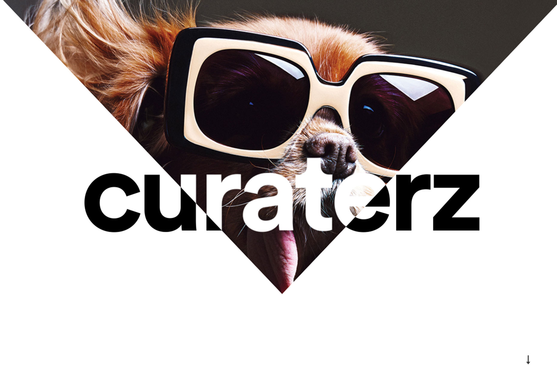
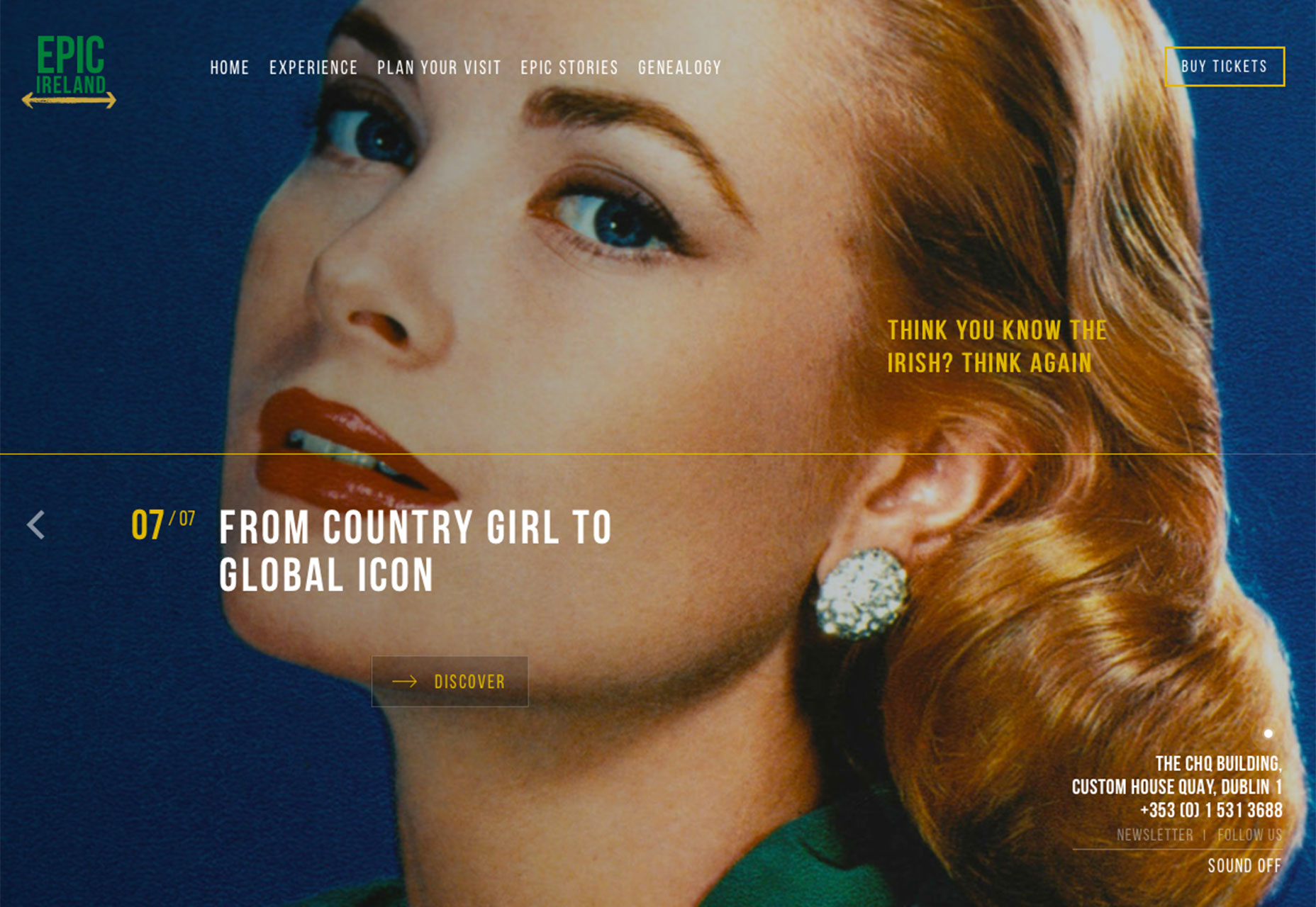
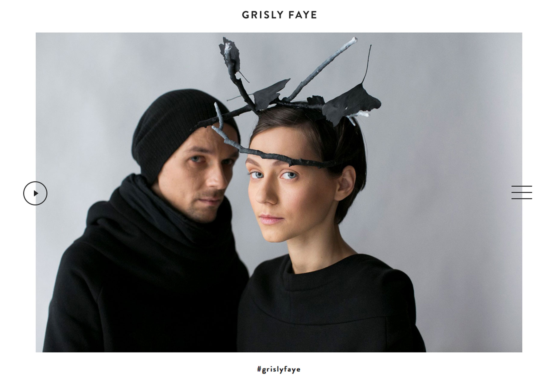
A big, bold photograph or image makes a stunning first impression. That’s why so many designers are selecting larger-then life images to draw users into their website designs. This design element can be surprising, interesting and be a great alternative if you have one or two great images, but not a large library to work with. But you have to willing to get a little uncomfortable to get there. To make the most of the larger-than-life photography trend you need to be willing to do one of three things with the design:- Crop a photo so tightly that it takes up a significant portion of the screen, so that the image is scaled to a proportion that’s larger than reality
- Zoom in to an almost uncomfortable level with images of people and faces to show every detail
- Stage a standard photo but add an element that’s different or interesting in a way that’s a little unexpected
3. Bright color choices
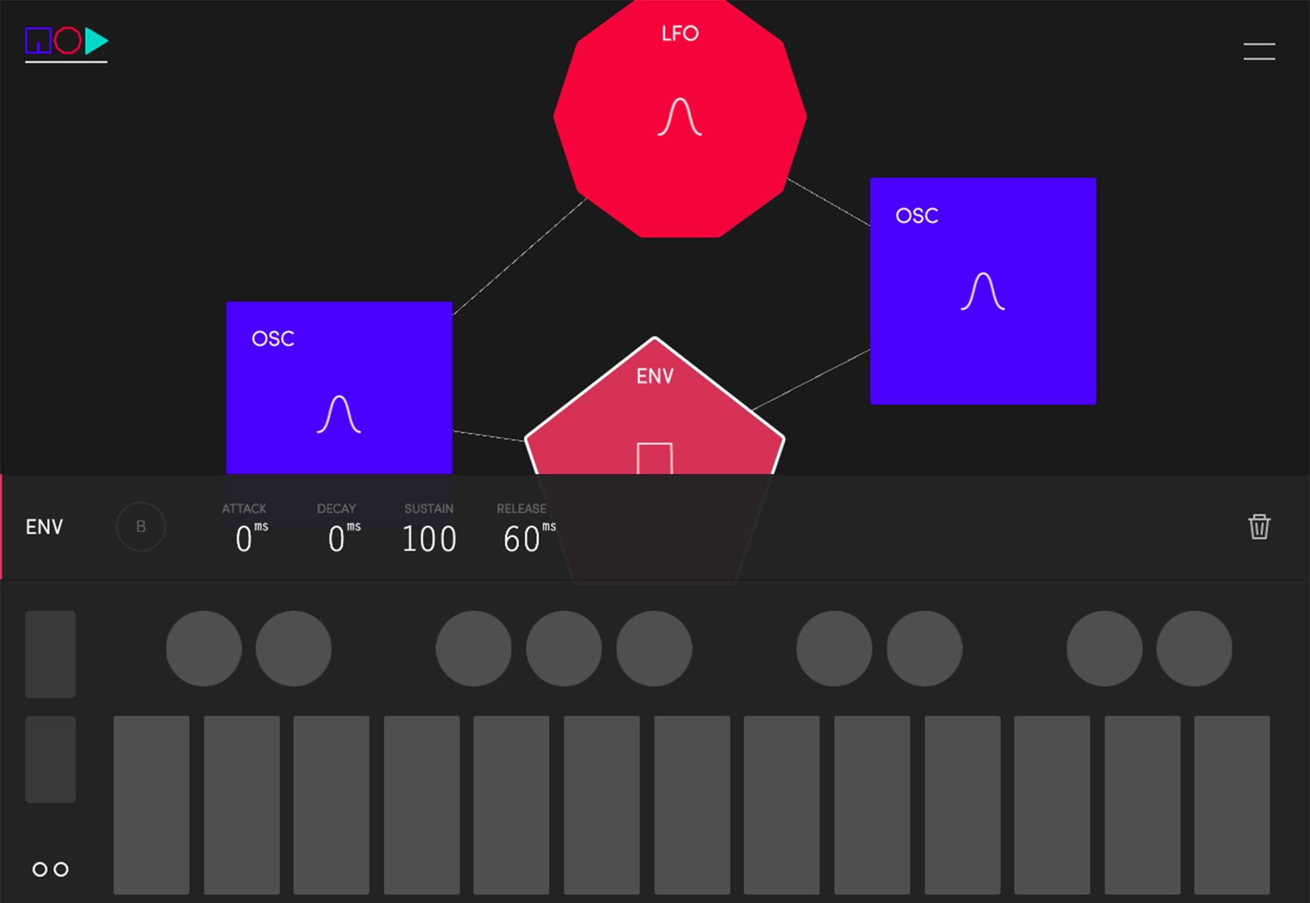
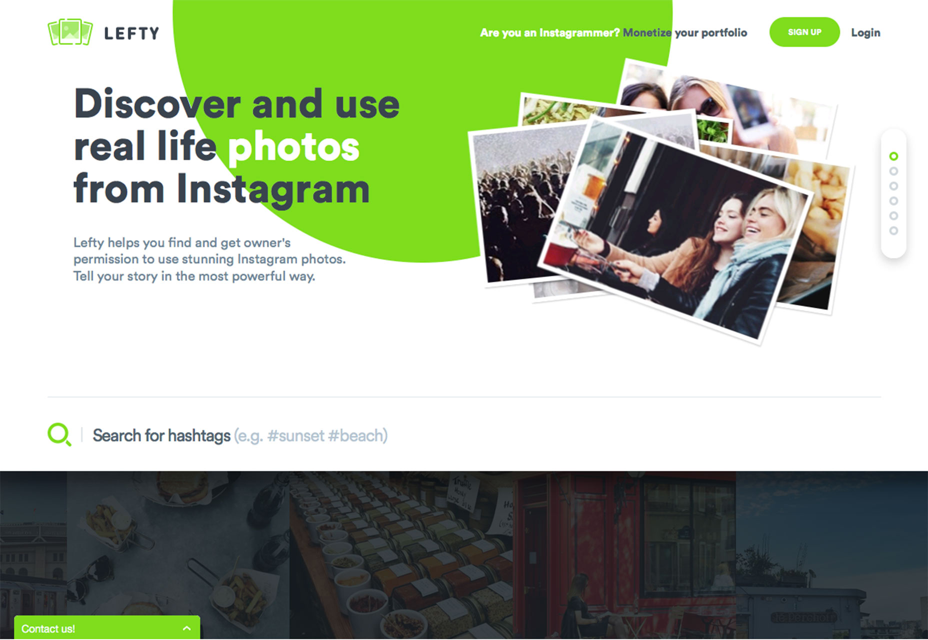
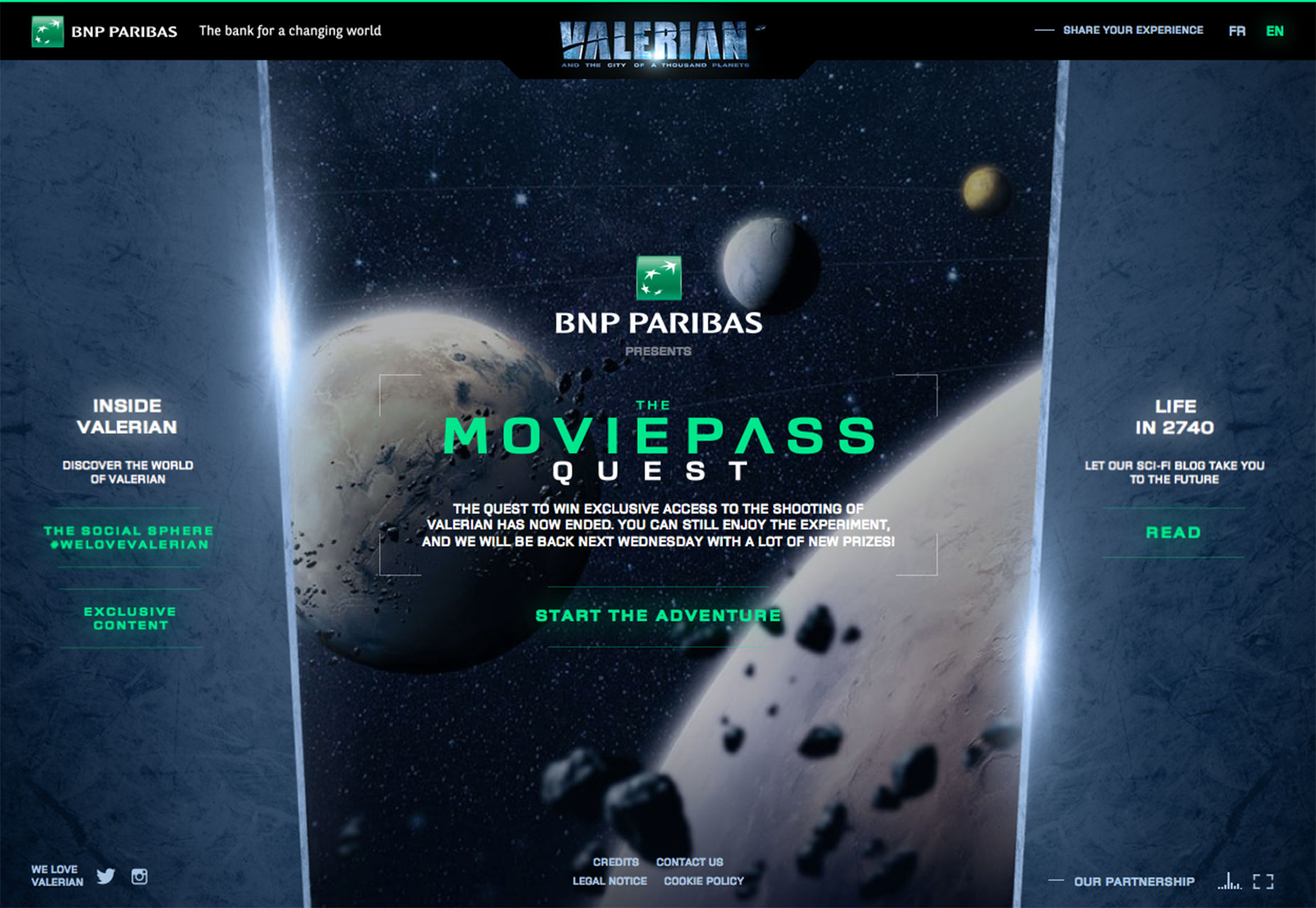
Bright, bold color is in. The trend has influences rooted in Material Design. Even though Material is an interaction-based design style, some of the visual components are gaining traction on their own. This applies to color in particular. Why use a Material-style color palette if the rest of the design is not Material? It’s a simple way to add a trendy element to a project without a full-scale redesign. You can almost add a bright color and leave the rest of the design alone with just a few tweaks to the CSS or imagery. What is Material color? There’s no perfect definition, but here’s how Google describes it: “Color in material design is inspired by bold hues juxtaposed with muted environments, deep shadows, and bright highlights. Material takes cues from contemporary architecture, road signs, pavement marking tape, and athletic courts. Color should be unexpected and vibrant.” - https://www.google.com/design/spec/style/color.html If you are interested in creating a Material-based color palette and need a starting place, try Material Palette. http://www.materialpalette.com/ The bold color options are beautiful and stand out against many of the more subdued minimal-style projects that have been popular. Bright blues, greens and yellows are especially popular as accents in the color palette. The trend seems to be focused on touches of Material color, not full-scale color palettes. For a project that really wows, it takes a more than just a bright color. The mood of the project should be equally bright.- Note how Lefty pairs bright green with images of happy, smiling people to create an overwhelming positive mood.
- BNP Paribas uses a bright green to bring users into a game-style interface that is set against a darker backdrop.
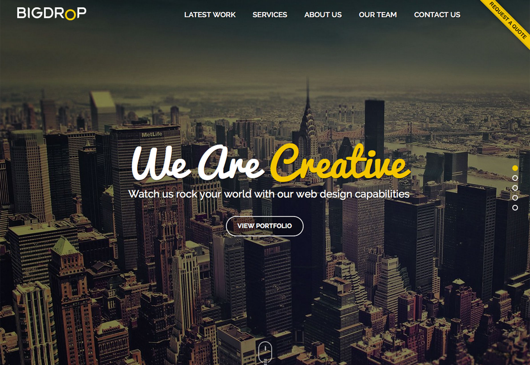
- Big Drop uses a bold yellow (and blue, red and green on the scroll) with light images and a fun typeface to draw users in, making the business site seem less formal.
Conclusion
It’s great when a few trends can just make you happy. That’s what this group does with color and with type choices and with imagery. Maybe it’s not just the influence of spring and we’ll continue to see these elements in even more designs in the months to come. What trends are you loving (or hating) right now? I’d love to see some of the websites that you are fascinated with. Drop me a link on Twitter; I’d love to hear from you.Carrie Cousins
Carrie Cousins is a freelance writer with more than 10 years of experience in the communications industry, including writing for print and online publications, and design and editing. You can connect with Carrie on Twitter @carriecousins.


Read Next

15 Best New Fonts, July 2024
Welcome to our monthly roundup of the best fonts we’ve found online in the last four weeks. This month, there are fewer…
By Ben Moss

20 Best New Websites, July 2024
Welcome to July’s round up of websites to inspire you. This month’s collection ranges from the most stripped-back…

Top 7 WordPress Plugins for 2024: Enhance Your Site's Performance
WordPress is a hands-down favorite of website designers and developers. Renowned for its flexibility and ease of use,…
By WDD Staff

Exciting New Tools for Designers, July 2024
Welcome to this July’s collection of tools, gathered from around the web over the past month. We hope you’ll find…

3 Essential Design Trends, July 2024
Add some summer sizzle to your design projects with trendy website elements. Learn what's trending and how to use these…

15 Best New Fonts, June 2024
Welcome to our roundup of the best new fonts we’ve found online in the last month. This month, there are notably fewer…
By Ben Moss

20 Best New Websites, June 2024
Arranging content in an easily accessible way is the backbone of any user-friendly website. A good website will present…

Exciting New Tools for Designers, June 2024
In this month’s roundup of the best tools for web designers and developers, we’ll explore a range of new and noteworthy…

3 Essential Design Trends, June 2024
Summer is off to a fun start with some highly dramatic website design trends showing up in projects. Let's dive in!

15 Best New Fonts, May 2024
In this month’s edition, there are lots of historically-inspired typefaces, more of the growing trend for French…
By Ben Moss

How to Reduce The Carbon Footprint of Your Website
On average, a web page produces 4.61 grams of CO2 for every page view; for whole sites, that amounts to hundreds of KG…
By Simon Sterne

20 Best New Websites, May 2024
Welcome to May’s compilation of the best sites on the web. This month we’re focused on color for younger humans,…