

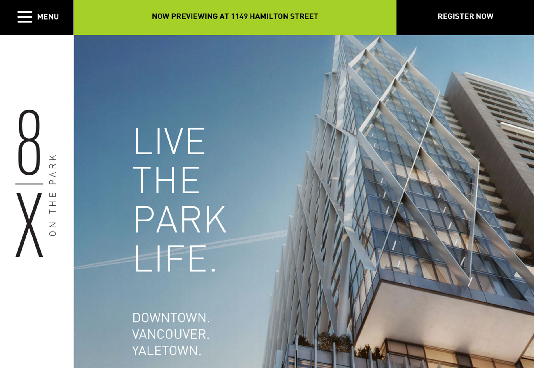
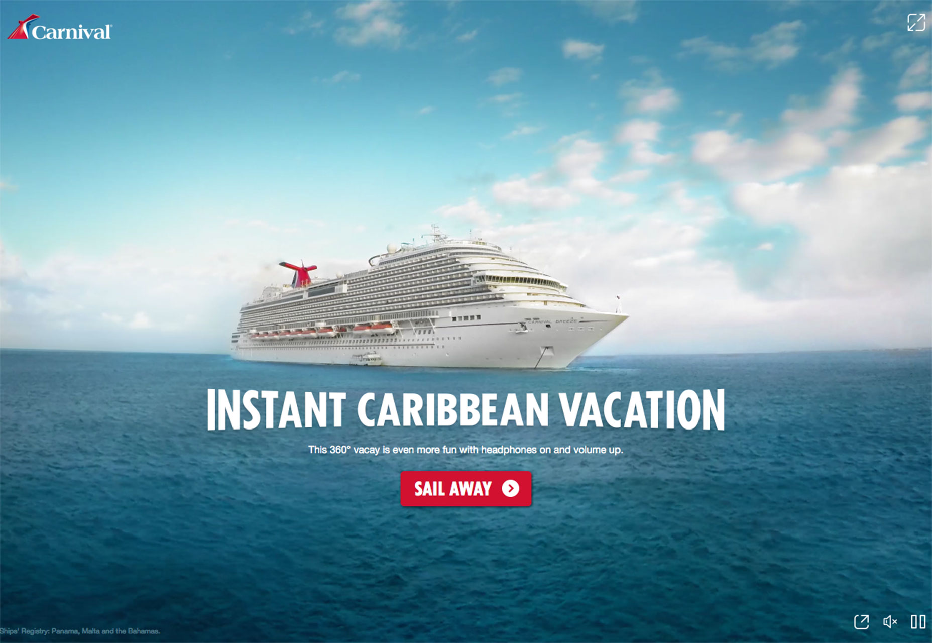
1) One big photo
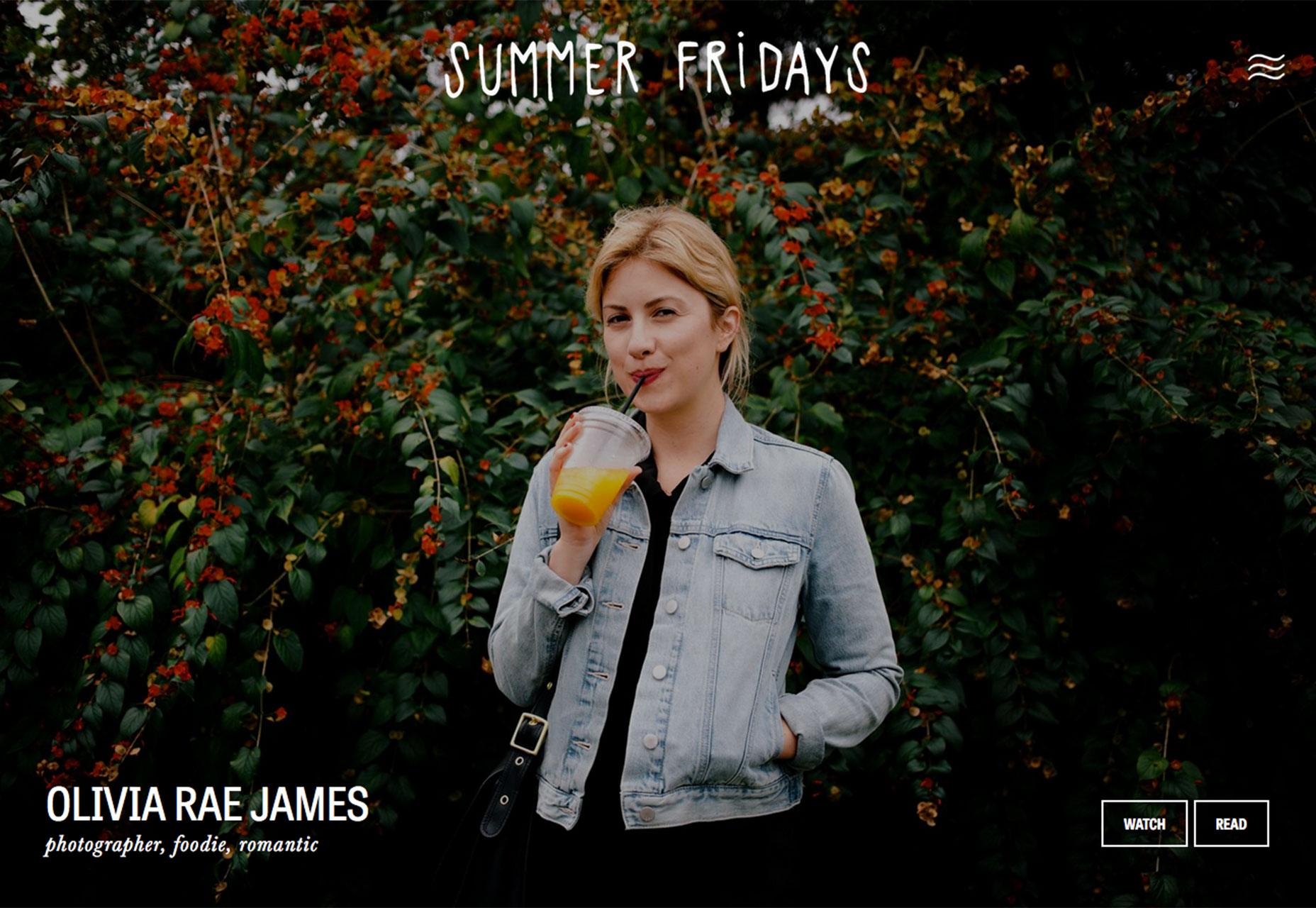
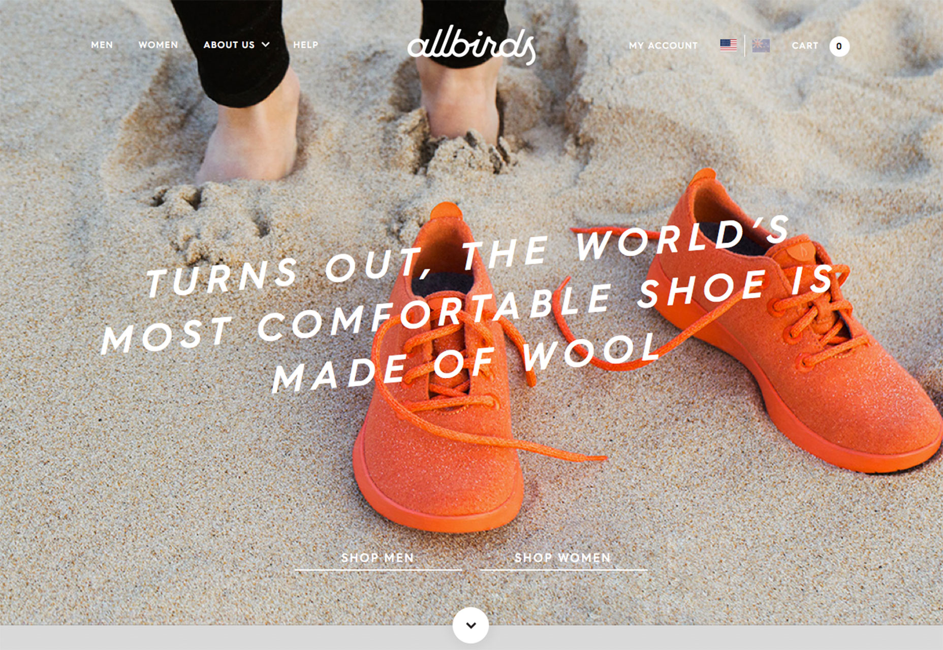
 While collage style websites with plenty of photos or video headers are popular options, one big photo is making a comeback in homepage design. Characterized by one striking image without a lot of other effects, one large photo can carry a lot of weight and introduce users to the site content.
But the photo has to be of the highest quality and very interesting to entice users to keep clicking.
This can be a tough formula to solve.
Here are a few solutions:
While collage style websites with plenty of photos or video headers are popular options, one big photo is making a comeback in homepage design. Characterized by one striking image without a lot of other effects, one large photo can carry a lot of weight and introduce users to the site content.
But the photo has to be of the highest quality and very interesting to entice users to keep clicking.
This can be a tough formula to solve.
Here are a few solutions:
- Start with a defining photo. It needs to be interesting and somewhat different. (Avoid the hand holding a phone images for app launches or a person on a solid color background shots.)
- Crop it tight.
- Edit and play with color settings. Go for something a little more extreme, such as black and white.
- Showcase your product or brand.
- Keep other elements to a minimum. Consider only using a brand identifier, such as a logo, and short headline.
- Move navigation out of the way.
- Provide a clue for users so they know what action to take next, such as the arrow encouraging a scroll.
- Make a dramatic photograph with the help of lighting, interesting backgrounds or stellar environments. (A professional photographer is likely required for this one.)
- Play up the drama with typography is that oversized, undersized or uses a novelty typeface. But only use one of these techniques.
2) Sidebar navigation
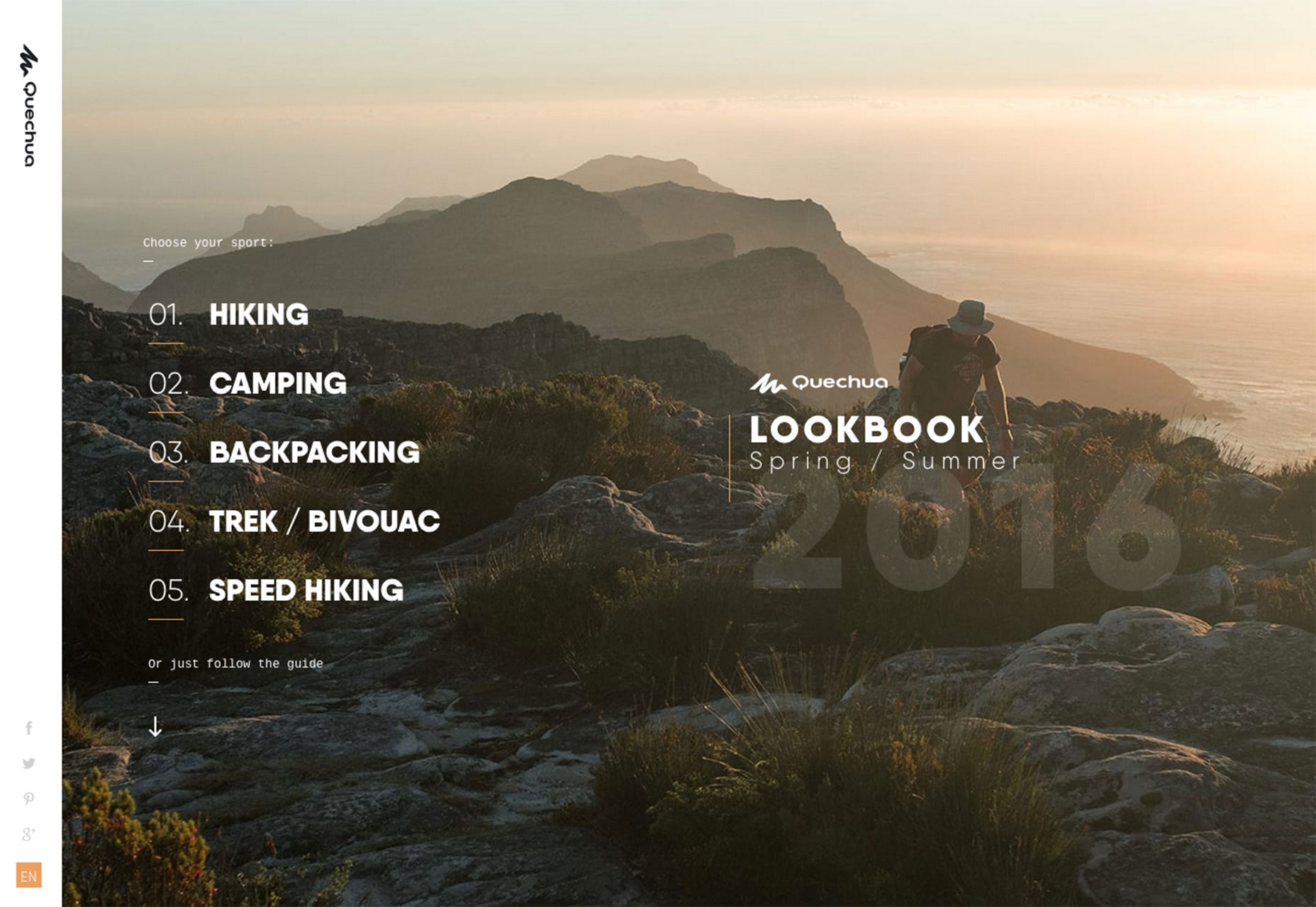 While the most common placement for navigational elements is along the top of a website, that’s not a requirement. As long as it is clear to users as to how to use a site, navigation can live in a number of different places.
Sidebar-style navigation, often on the left side of the screen, is one such popular option.
This is a trend that’s come on quite quickly and is on a number of sites. From thin, almost not there styles to wider, almost oversized navigational elements in a sidebar arrangement, this placement makes a lot of sense because users read from left to right. So, left-hand navigation elements could be the first thing users actually read on the screen after they glance at the main headline or other large copy.
The trend stems from mobile navigation styles and is a logical step for desktop websites as well. For a while, we’ve experienced pop-out navigation from the side on small-screen devices. Seeking out navigation from the side has become a pretty commonly accepted user pattern for this reason.
As part of a broader picture, we are likely to see even more techniques that were mobile-based solutions make their way to screens of all sizes. Extending a small screen solution to all devices can save time and provide greater consistency in the look of a project. It’s also part of the mobile-first design strategy.
When it comes to sidebar navigation on larger screens, there are a few specific elements to consider.
While the most common placement for navigational elements is along the top of a website, that’s not a requirement. As long as it is clear to users as to how to use a site, navigation can live in a number of different places.
Sidebar-style navigation, often on the left side of the screen, is one such popular option.
This is a trend that’s come on quite quickly and is on a number of sites. From thin, almost not there styles to wider, almost oversized navigational elements in a sidebar arrangement, this placement makes a lot of sense because users read from left to right. So, left-hand navigation elements could be the first thing users actually read on the screen after they glance at the main headline or other large copy.
The trend stems from mobile navigation styles and is a logical step for desktop websites as well. For a while, we’ve experienced pop-out navigation from the side on small-screen devices. Seeking out navigation from the side has become a pretty commonly accepted user pattern for this reason.
As part of a broader picture, we are likely to see even more techniques that were mobile-based solutions make their way to screens of all sizes. Extending a small screen solution to all devices can save time and provide greater consistency in the look of a project. It’s also part of the mobile-first design strategy.
When it comes to sidebar navigation on larger screens, there are a few specific elements to consider.
- Navigation needs to be somewhat obvious to users, which is why many sites still use the hamburger icon as a notation.
- Navigation can pop-out from the left or right, but it can also be a distinct design element with a static placement.
- Sidebar navigation can be part of the overall design rather than an aside to it. Note how the Quecha website integrates sidebar style navigation elements into the overall design.
- Provide plenty of space so that navigational elements are clear and easy to read. Users should know what these words or icons are and that they are a path to getting around the website.
- Be cautious of changing navigational styles between pages, unless you go back to a more standard top of the screen option on interior pages.
3) Interactive adventure
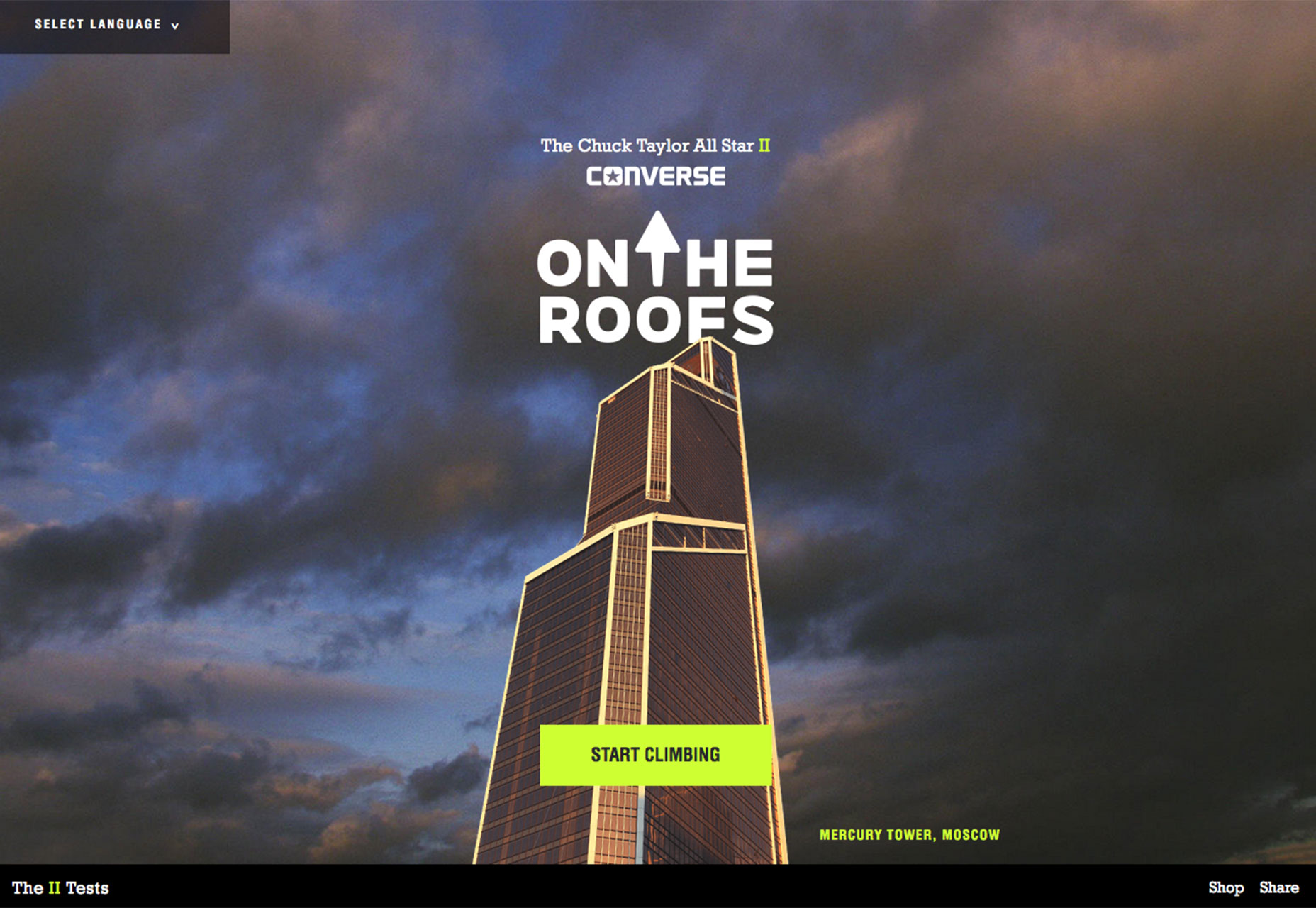
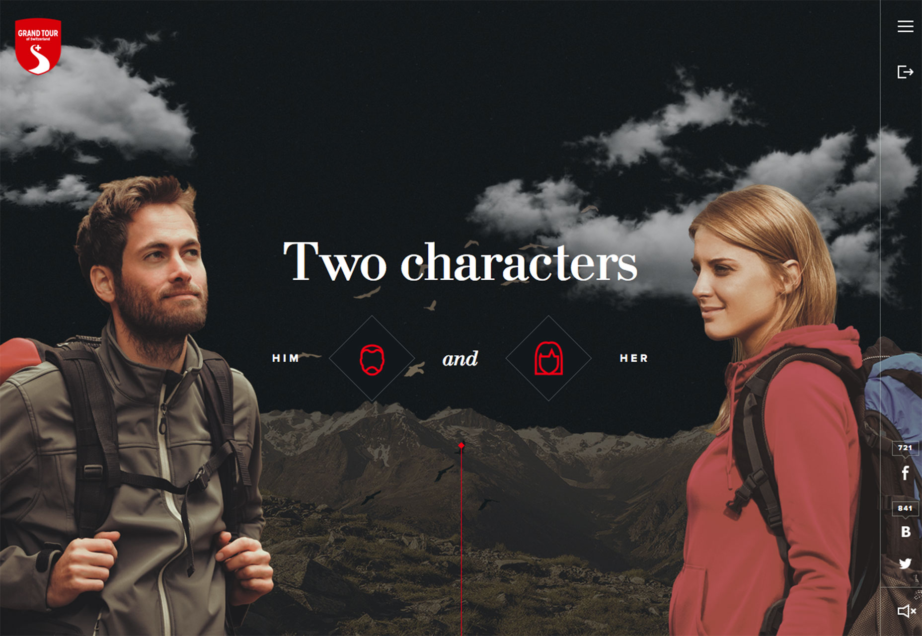
 Designers are taking video, animation and storytelling to the next level with fun websites that take users on an interactive adventure. These story-based websites are for brands and businesses of all kinds, as well as for sites that are simply informative.
Each interactive adventure site tends to look quite different and can use any number of techniques to engage users. The common thread is a storyline where the user controls the action on the screen. This works with clicks, typing in commands and scrolling to engage the user in the story and help determine outcomes.
This interactive story type of website design is good for users and good for you. A good story can keep users on your site longer and clicking through links, engaging with content. This will help you establish a better connection with your audience.
Users like interactive stories because they can be fun and interesting. The trick is keeping the story short enough that a user can play and complete the game in a sitting. If they have to turn away, you might lose them.
Also consider the outcome of the interactive experience. What happens at the end of the interaction? Is it only related to the game? Or are you highlighting a product or service that users will want to come back to? If the answer is the latter, make sure to include a bypass option for users who have already played (or don’t want to play) the game but still want access to the content.
Designers are taking video, animation and storytelling to the next level with fun websites that take users on an interactive adventure. These story-based websites are for brands and businesses of all kinds, as well as for sites that are simply informative.
Each interactive adventure site tends to look quite different and can use any number of techniques to engage users. The common thread is a storyline where the user controls the action on the screen. This works with clicks, typing in commands and scrolling to engage the user in the story and help determine outcomes.
This interactive story type of website design is good for users and good for you. A good story can keep users on your site longer and clicking through links, engaging with content. This will help you establish a better connection with your audience.
Users like interactive stories because they can be fun and interesting. The trick is keeping the story short enough that a user can play and complete the game in a sitting. If they have to turn away, you might lose them.
Also consider the outcome of the interactive experience. What happens at the end of the interaction? Is it only related to the game? Or are you highlighting a product or service that users will want to come back to? If the answer is the latter, make sure to include a bypass option for users who have already played (or don’t want to play) the game but still want access to the content.
Conclusion
The theme in trending design this month is big drama. It takes great art, a good story and plenty of planning to pull off one of these techniques because they are so singularly focused on grabbing users with a quick impression. Is it a style that you would consider? What trends are you loving (or hating) right now? I’d love to see some of the websites that you are fascinated with. Drop me a link on Twitter; I’d love to hear from you.Carrie Cousins
Carrie Cousins is a freelance writer with more than 10 years of experience in the communications industry, including writing for print and online publications, and design and editing. You can connect with Carrie on Twitter @carriecousins.


Read Next

15 Best New Fonts, July 2024
Welcome to our monthly roundup of the best fonts we’ve found online in the last four weeks. This month, there are fewer…
By Ben Moss

20 Best New Websites, July 2024
Welcome to July’s round up of websites to inspire you. This month’s collection ranges from the most stripped-back…

Top 7 WordPress Plugins for 2024: Enhance Your Site's Performance
WordPress is a hands-down favorite of website designers and developers. Renowned for its flexibility and ease of use,…
By WDD Staff

Exciting New Tools for Designers, July 2024
Welcome to this July’s collection of tools, gathered from around the web over the past month. We hope you’ll find…

3 Essential Design Trends, July 2024
Add some summer sizzle to your design projects with trendy website elements. Learn what's trending and how to use these…

15 Best New Fonts, June 2024
Welcome to our roundup of the best new fonts we’ve found online in the last month. This month, there are notably fewer…
By Ben Moss

20 Best New Websites, June 2024
Arranging content in an easily accessible way is the backbone of any user-friendly website. A good website will present…

Exciting New Tools for Designers, June 2024
In this month’s roundup of the best tools for web designers and developers, we’ll explore a range of new and noteworthy…

3 Essential Design Trends, June 2024
Summer is off to a fun start with some highly dramatic website design trends showing up in projects. Let's dive in!

15 Best New Fonts, May 2024
In this month’s edition, there are lots of historically-inspired typefaces, more of the growing trend for French…
By Ben Moss

How to Reduce The Carbon Footprint of Your Website
On average, a web page produces 4.61 grams of CO2 for every page view; for whole sites, that amounts to hundreds of KG…
By Simon Sterne

20 Best New Websites, May 2024
Welcome to May’s compilation of the best sites on the web. This month we’re focused on color for younger humans,…