

The purpose of the sidebar
The sidebar was never intended to be a site’s primary means of navigation. The navigation bar or menu typically goes horizontally across the top of the page, traditionally always leaving the sidebar as more of an afterthought of secondary navigation. Nonetheless, a sidebar is supposed to help users with navigation, mainly depending on the type of site. For example, a blog is going to feature a much better use for a sidebar in this regard than, say, a dating site. Sidebars are generally used to feature content that needs to be highlighted, as when you want users to take a specific action that lets them further interact with your site. For instance, a blog can round up its most popular or recent posts and then feature links to these in the sidebar. This not only helps users navigate the site more efficiently, but it also prompts users to perhaps read content that they otherwise would have missed if it wasn’t featured prominently in the sidebar.The placement of your sidebar
Sidebars can be put on the left- or right-hand side of the page, as well as, in some unique cases, on both sides of the page. Where you put the sidebar should be dictated by the user experience, as with all page elements.Left-hand sidebar
When you put your sidebar on the left of your page, know that it’ll basically have to function as your site’s main navigation bar. That’s because the classic usability study that established the F-shaped reading pattern on the Internet confirms that users spend most of the time looking down the left side of a page. Since this is where their eyeballs are, it should also be where the main navigation is if you’re going to position the sidebar here, just to help their user experience. Consider also that a horizontal menu bar across the top of your page may be too cramped to fit in all of your navigation titles or categories if you’re designing for a big store, organization or news site. A vertical sidebar/navigation menu down the left side of the page can be the solution. Wikipedia illustrates this design choice to a tee: It doesn’t have horizontal, top-of-the-page navigation, but instead has its navigation bar down the left side of its pages as a very long sidebar.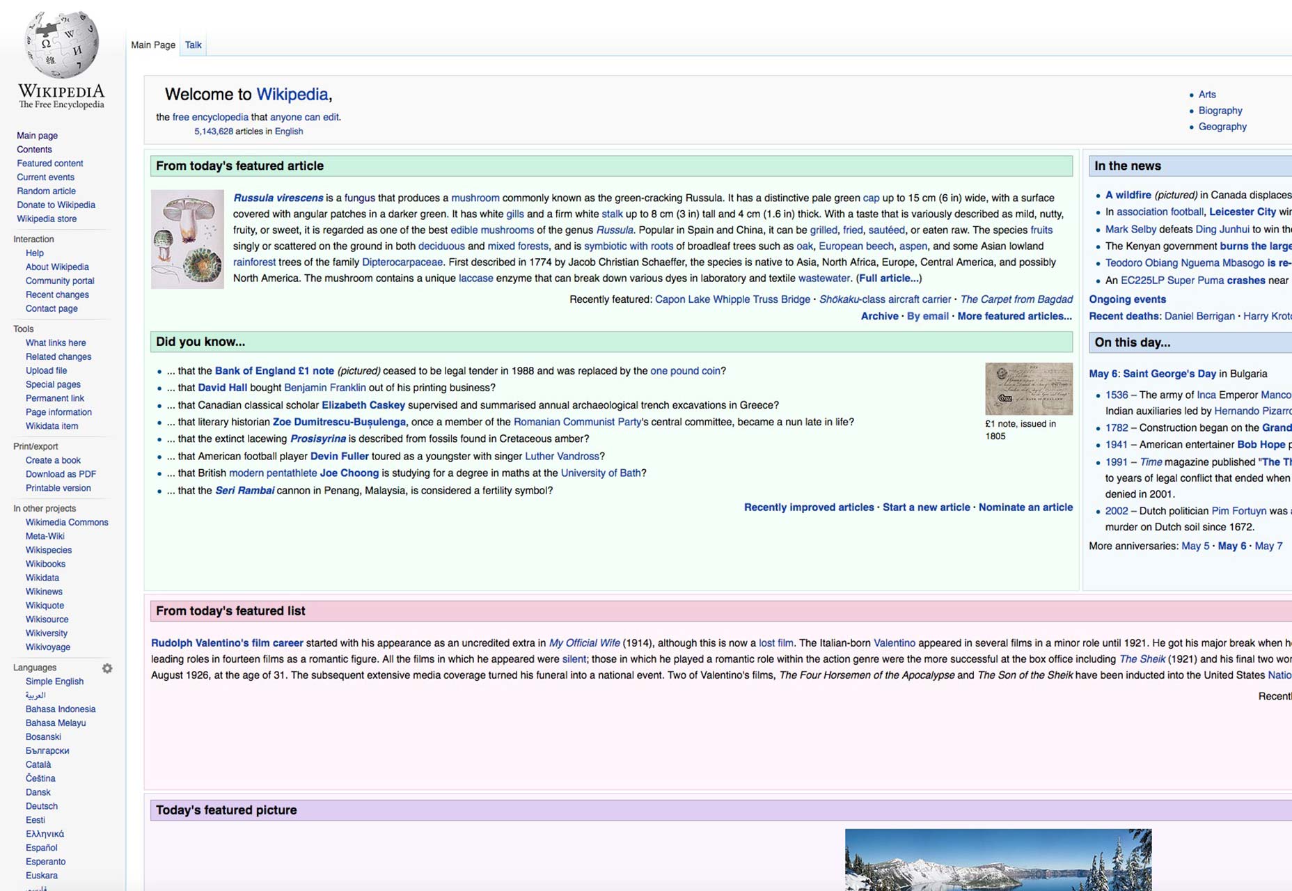
Right-hand sidebar
The right-hand sidebar is definitely more common; when it’s on the right side of the page, it doesn’t function as main navigation, but as secondary navigation. Again, this goes back to the F-shaped reading pattern and how your site visitors just don’t look at the right side of a page first or prominently. It’s like reading a book in English; we read from left to right. This means that there’s a good chance that the content in your right-hand sidebar will either be missed or won’t be seen by as many users as the content in your left-hand sidebar. Since this content is secondary, you shouldn’t place too much important info here. The right-hand sidebar’s secondary status explains why some sites’ pages, such as Match.com’s, actually place ads here, whether it’s ads for related Match.com services or from other brands altogether. Ads here also don’t have as much monetary value as ads in other places on a page. Of course, other sites use the right-hand sidebar differently, for example to highlight popular and related content for a reader of the site. Nascar.com’s right-hand sidebar features the top headlines of the day and any content related to the article on the page.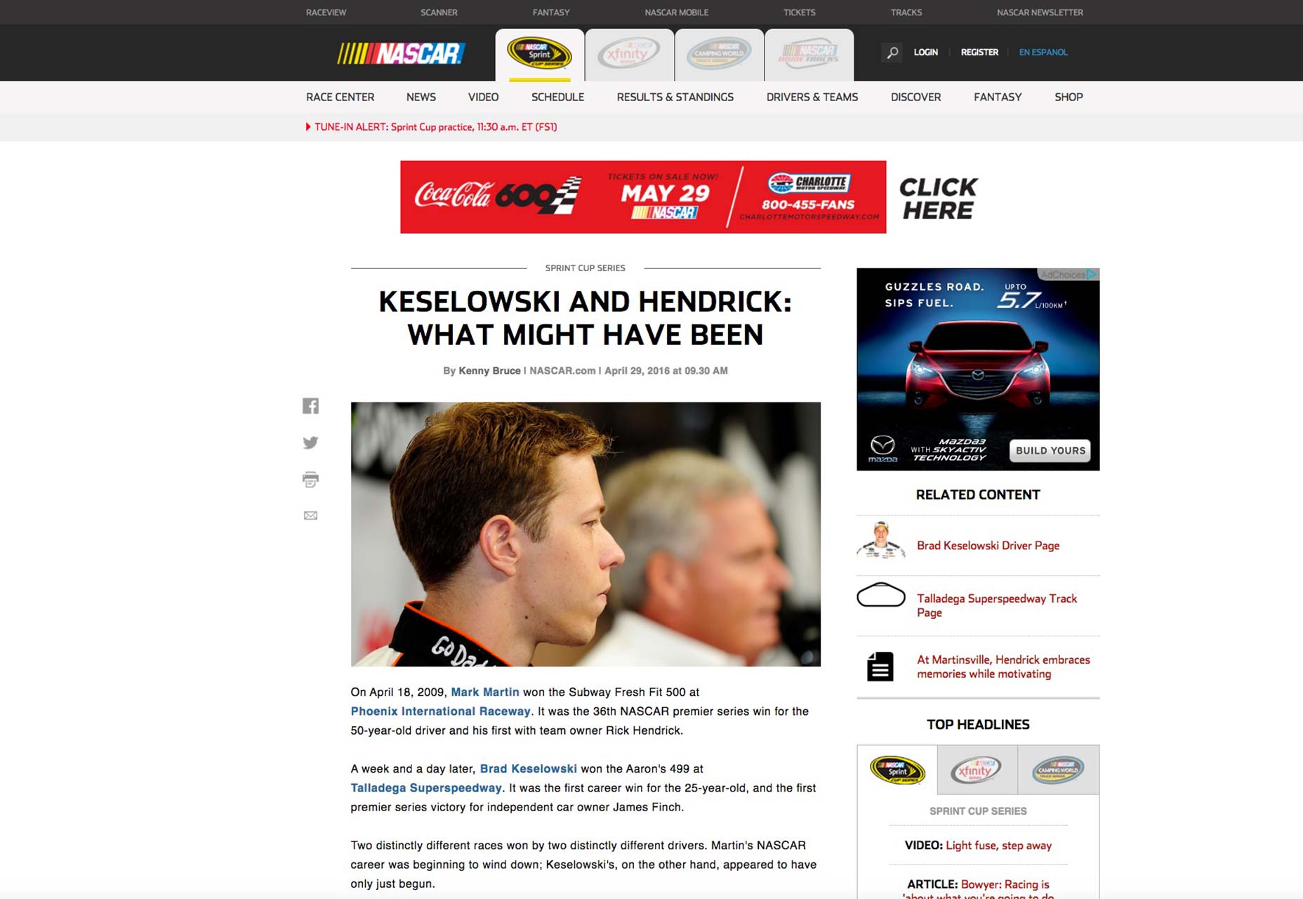
Dual sidebars
Some sites will actually use two sidebars, one on the left and right of the page. A concern of this approach is presenting the user with too much info on the page, thereby raising the risk of essential info getting lost in the shuffle, especially if that info is presented on the right-hand sidebar. Another concern is interchanging the important info between the left and right sides of the page without giving enough thought to what should be a priority. There’s a way to make this still work, though. You have to put the most important content on the left-hand sidebar because that’s where your visitors will look first and most. This means the navigation, the main web apps, etc. Then, on the right, that’s where you can place the secondary navigation items, elements like most popular articles, social media buttons, a search bar, and so on.Showcase of sidebars
Here’s a look at various types of sidebars from around the web.
Fox News
Fox News displays its additional and related content and its hottest, trending stories in the right-hand sidebar.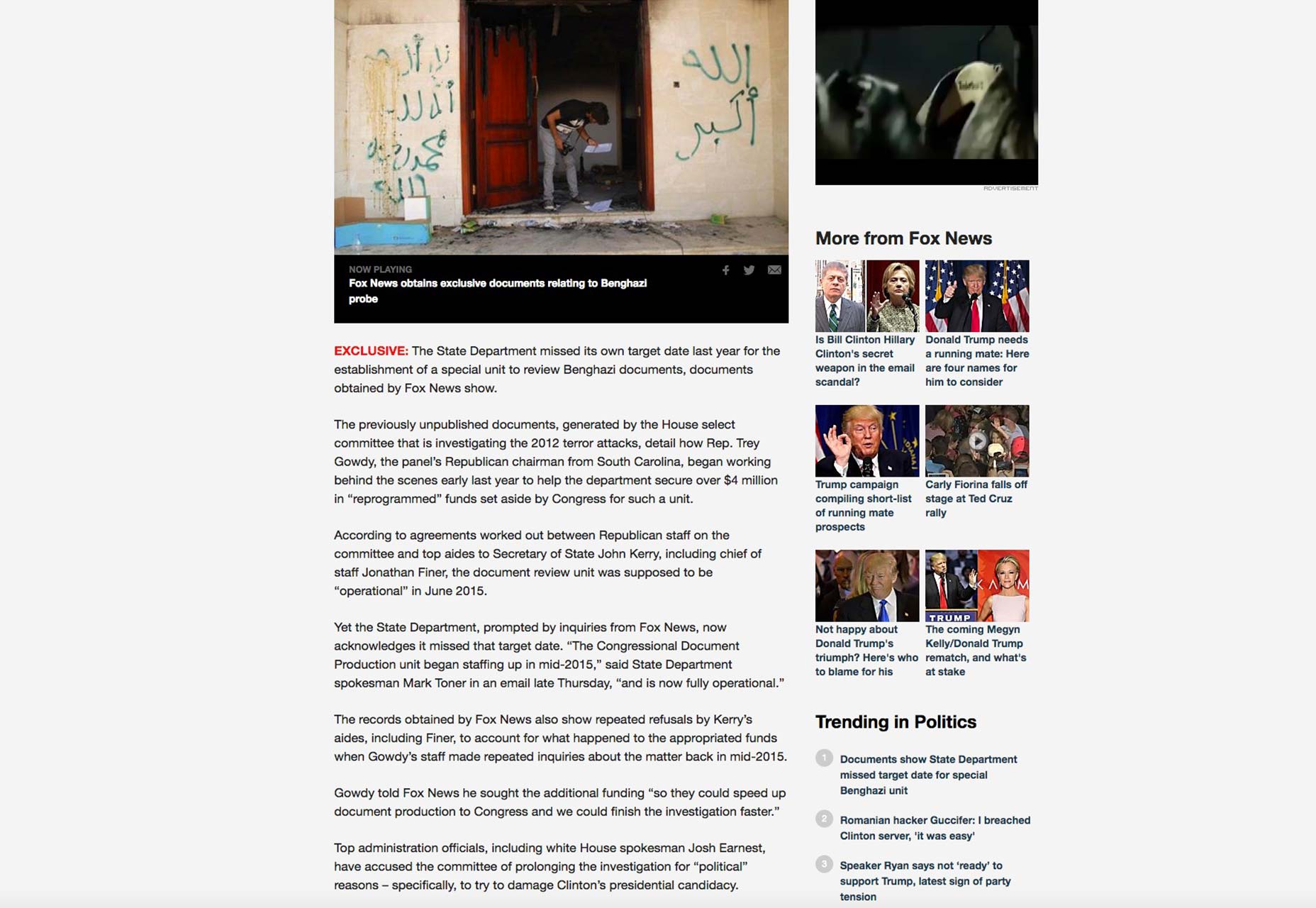
Still meaningful in 2016
There you have it. Sidebars are still relevant in today’s design world that’s seemingly dominated by news of one new design trend after another. It just goes to show you that, when something is as UX-centric as the sidebar, it can enjoy good longevity and remain a core staple of web design for a long time. The fact that it’s an unsung page element of sorts is perhaps the best testament to its high usefulness, though. Users have taken it for granted because they simply expect it to be there, as it is a classic element that’s been present for decades on the web. Without a sidebar, any site would simply be harder to navigate and use, which would cripple the UX. That’s never a good thing from any designer’s standpoint!Marc Schenker
Marc’s a copywriter who covers design news for Web Designer Depot. Find out more about him at thegloriouscompanyltd.com.


Read Next

15 Best New Fonts, July 2024
Welcome to our monthly roundup of the best fonts we’ve found online in the last four weeks. This month, there are fewer…
By Ben Moss

20 Best New Websites, July 2024
Welcome to July’s round up of websites to inspire you. This month’s collection ranges from the most stripped-back…

Top 7 WordPress Plugins for 2024: Enhance Your Site's Performance
WordPress is a hands-down favorite of website designers and developers. Renowned for its flexibility and ease of use,…
By WDD Staff

Exciting New Tools for Designers, July 2024
Welcome to this July’s collection of tools, gathered from around the web over the past month. We hope you’ll find…

3 Essential Design Trends, July 2024
Add some summer sizzle to your design projects with trendy website elements. Learn what's trending and how to use these…

15 Best New Fonts, June 2024
Welcome to our roundup of the best new fonts we’ve found online in the last month. This month, there are notably fewer…
By Ben Moss

20 Best New Websites, June 2024
Arranging content in an easily accessible way is the backbone of any user-friendly website. A good website will present…

Exciting New Tools for Designers, June 2024
In this month’s roundup of the best tools for web designers and developers, we’ll explore a range of new and noteworthy…

3 Essential Design Trends, June 2024
Summer is off to a fun start with some highly dramatic website design trends showing up in projects. Let's dive in!

15 Best New Fonts, May 2024
In this month’s edition, there are lots of historically-inspired typefaces, more of the growing trend for French…
By Ben Moss

How to Reduce The Carbon Footprint of Your Website
On average, a web page produces 4.61 grams of CO2 for every page view; for whole sites, that amounts to hundreds of KG…
By Simon Sterne

20 Best New Websites, May 2024
Welcome to May’s compilation of the best sites on the web. This month we’re focused on color for younger humans,…