

CIGA
CIGA is a branding, web, and graphic design studio. Their style of work is certainly familiar, yet it is also distinct. The same can be said of their site. It’s pretty, it’s simple, and it’s pretty good. The only real flaw I can find (besides the inevitable JavaScript dependency), is that the placeholder text for the contact form inputs doesn’t show up right in FireFox... at least not for me.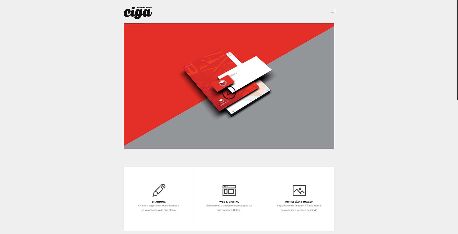
Slayter
This month will bring us a few lovely, minimalist, asymmetrical designs. Slayter is but the first. Though the low contrast could be an issue for some, the site combines typography and gratuitous white space in a way that makes me happy in my soul.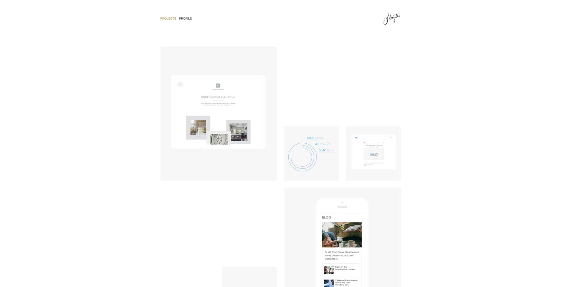
Brian Li
Speaking of white space, Brian Li’s site goes all out with a huge chunk of it right at the top of his one-page portfolio. And I do mean white space. There’s no background color, no imagery, nothing. The rest of his site is as professional as anyone can expect, but that big bunch of empty space at the top tells you a lot about his aesthetic style right off the bat.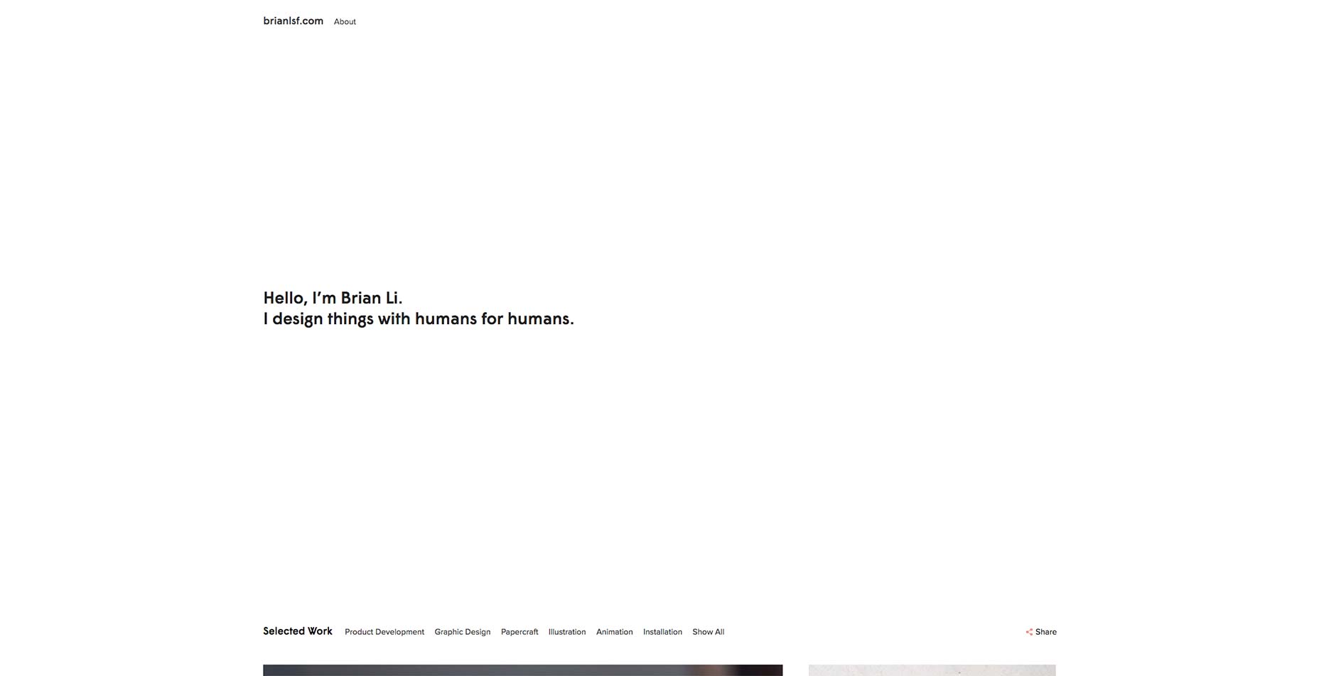
Sadok
Sadok’s portfolio is, in some ways, a list of trends. It has big text, big pictures, and horizontal-and-vertical-scrolling parallax portfolio (don’t ask, just check it out and watch your scrollbar). I find I don’t mind all of that, though, because it just looks that good, it runs smoothly, and his beard is lit with the light of the stars. No, really, I could watch that for a while.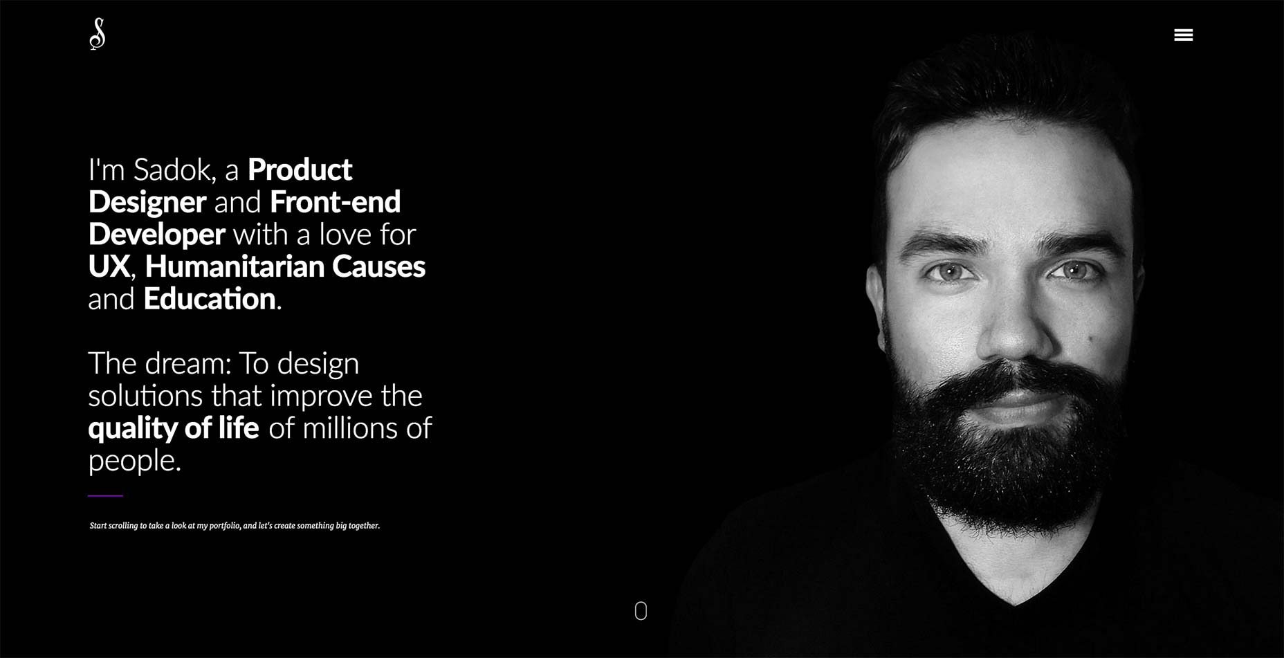
Splinter Teal
You can tell that Konrad, the designer behind Splinter Teal had a very specific theme in mind when he named his company, and designed its site. The layout, imagery, and copy all scream "professional web designer", but that heading font and animation says, "I’m probably a secret agent."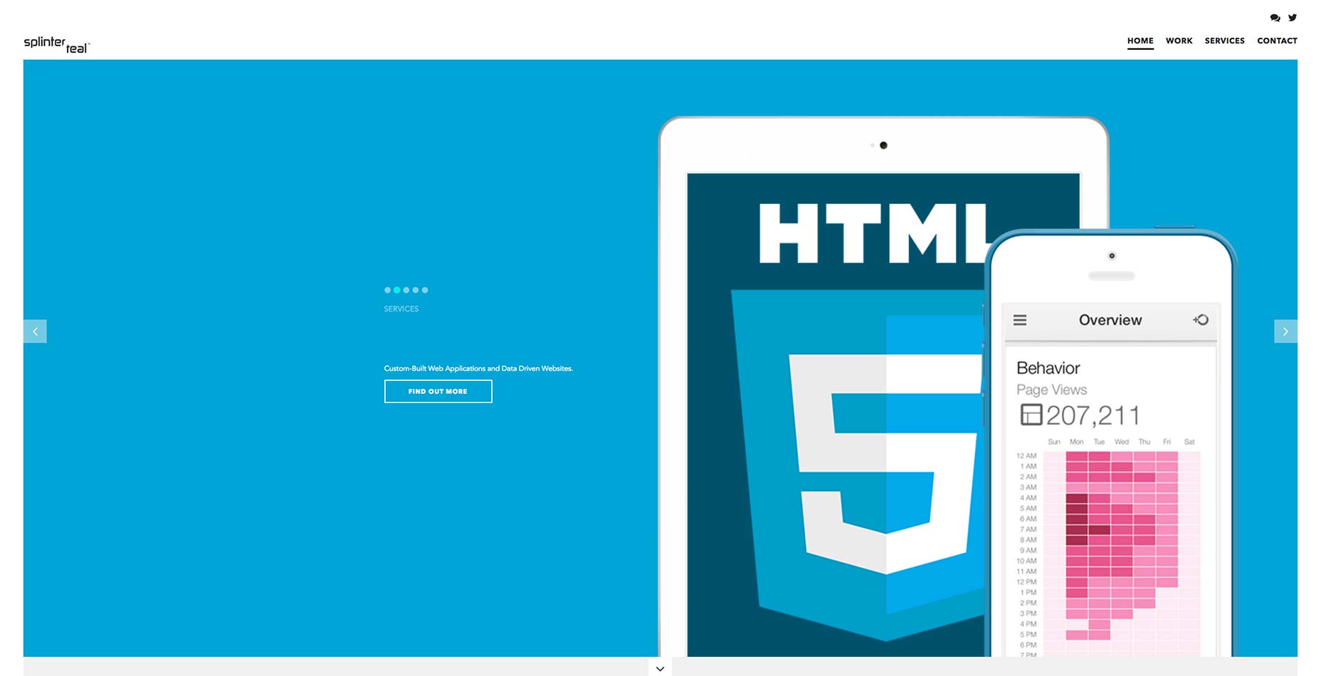
Xavier Bourdil
Xavier Bourdil’s site shows you previews of his work on the right as you hover over the title on the left. It’s an effect that, despite my aversion to depending on JavaScript for anything essential, I really like. Combined with elegant typography, animation that draws attention without being gaudy, and plenty of white space, I couldn’t help but like just browsing around this one.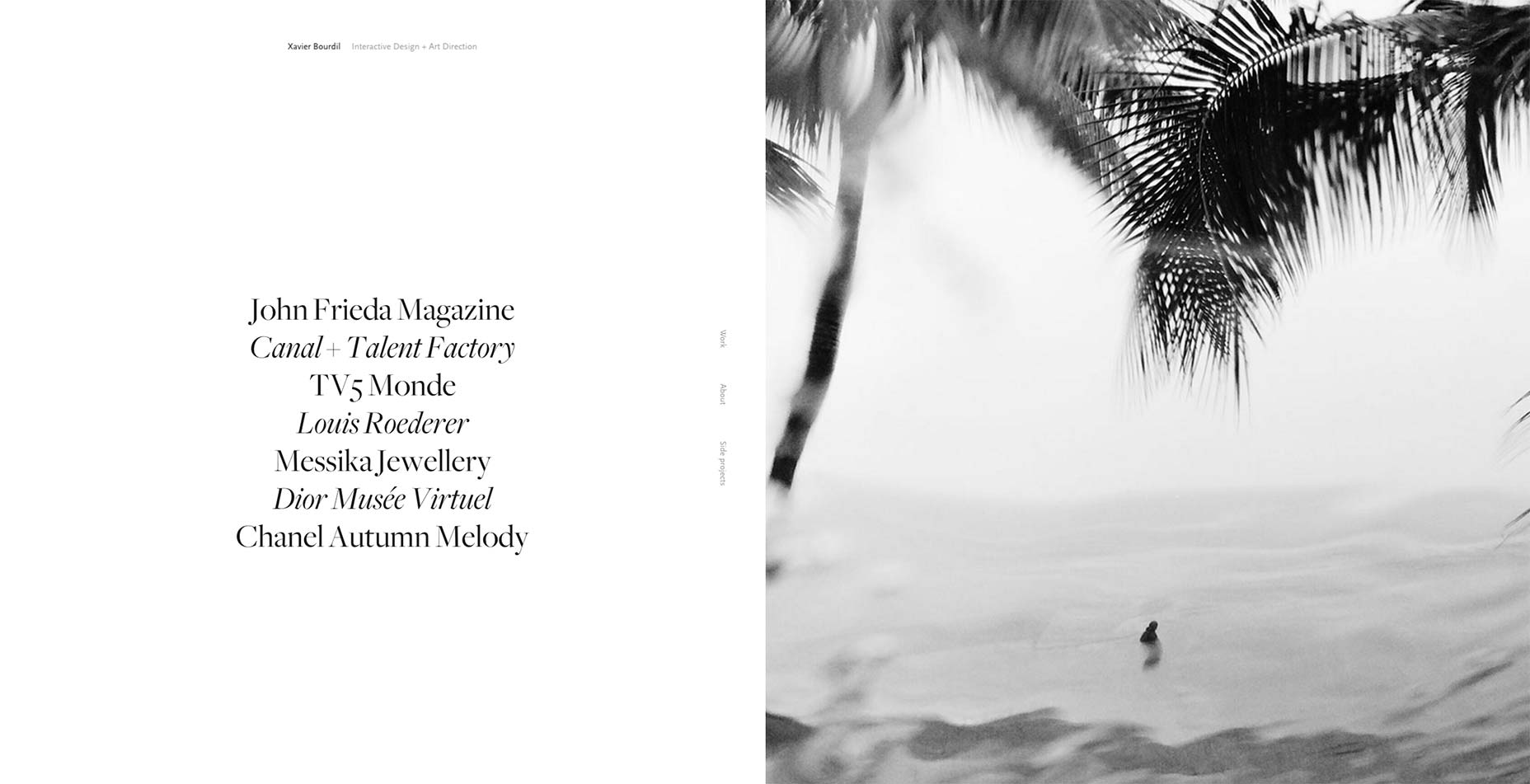
Eurodance
Eurodance is a photography studio with minimalist work, and a matching site design. The whole of the browsing experience is clicking on things you like, then scrolling down, as it should be. Instead of fighting this principle of the web, as many portfolio sites do, Eurodance has embraced it whole-heartedly. The only issue is the way they hid the contact info. You have to think of clicking on the logo to find it, and that doesn’t make any sense to me.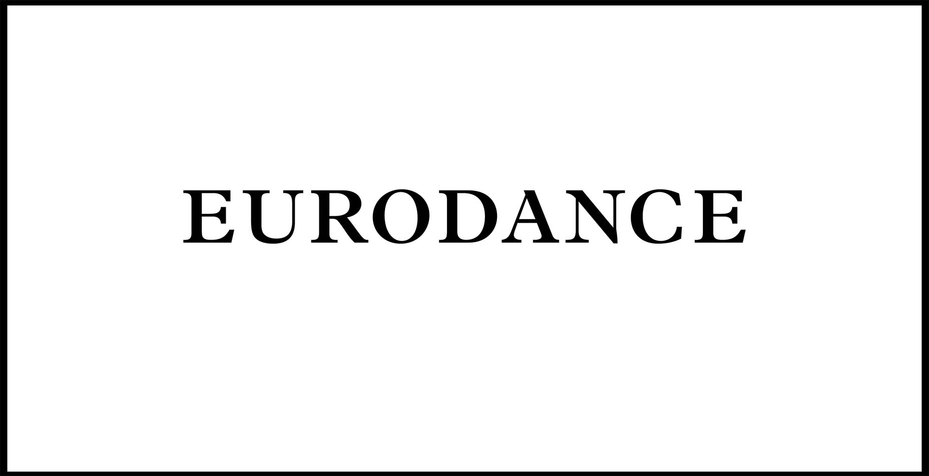
Nation Studio
Nation Studio’s site is simple, bold, and blue. Well, blue on white with some greenish... but whatever the case, there is a limited color palette at play, and it’s stylish. Even the imagery and animated backgrounds have had their colors pared down to the brand’s colors with one technique or another. Combined with a solid, full-screen responsive layout and big typography, it’s a good look.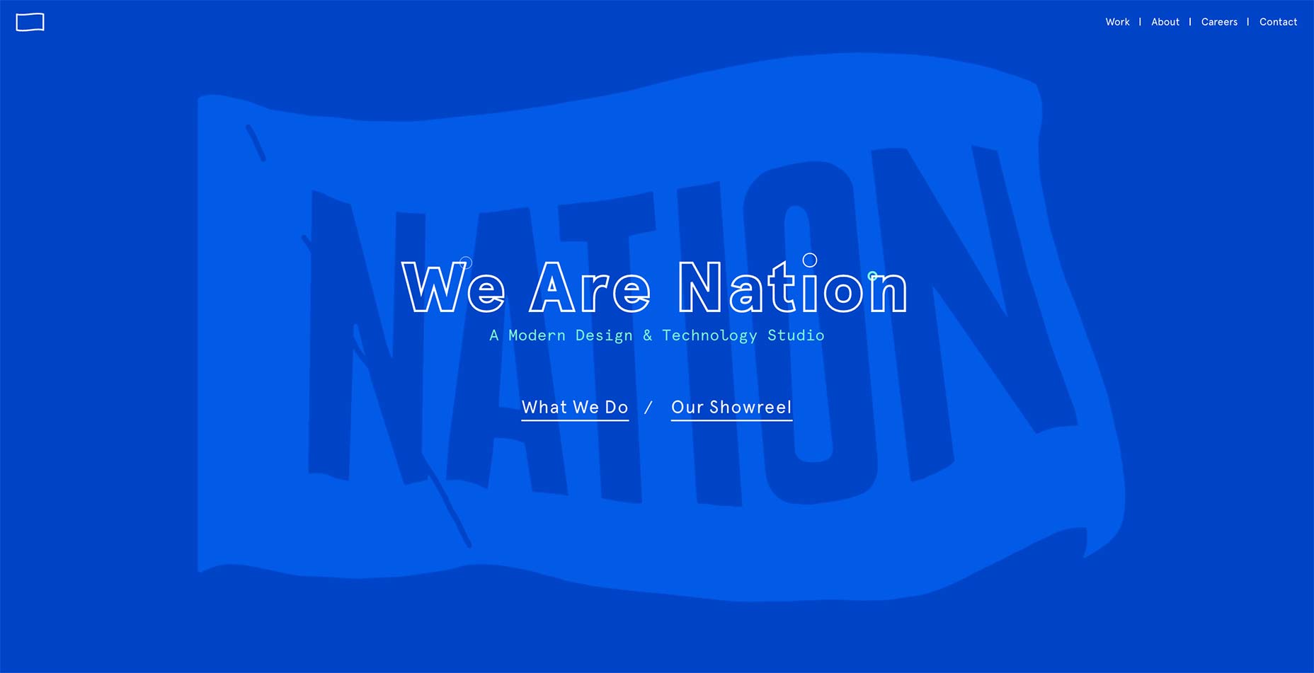
Prime Studio
“Cutting out” images of physical products and sticking them onto a plain background is one of the oldest graphic design trends... ever. But Prime makes it look great, and they should know how. Product design is kind of their specialty. The entire design of the site is geared toward giving the objects depicted an almost physical presence. They want you to feel like you could reach out and touch them. I’d say they’ve accomplished just that.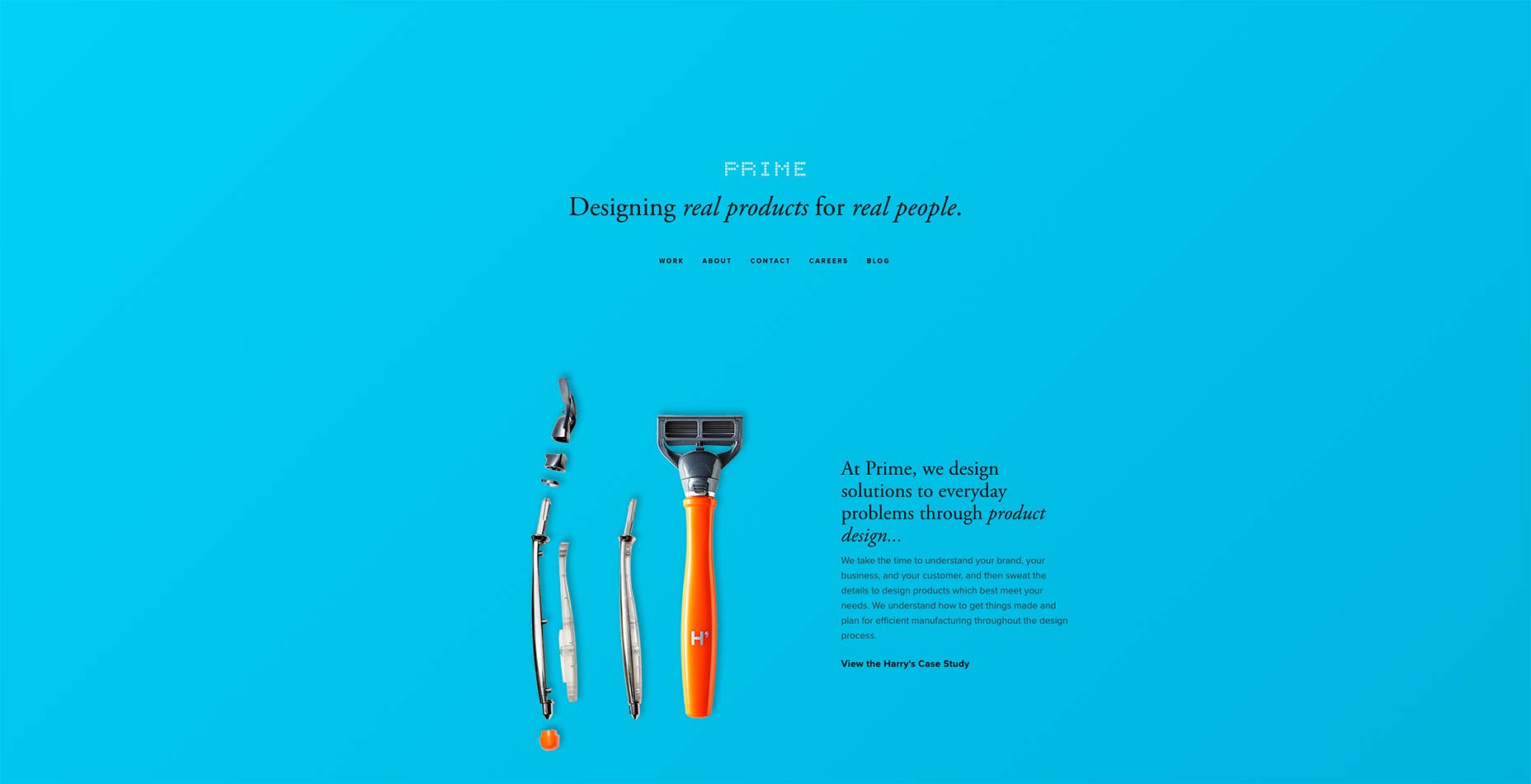
Confederation Studio
Confederation Studio’s site is big, simple, and beautiful. There’s nothing too unusual about it in terms of layout, but the imagery is good, the illustrations are better, and the whole thing is just… good. Also, they really do make pastels work for them.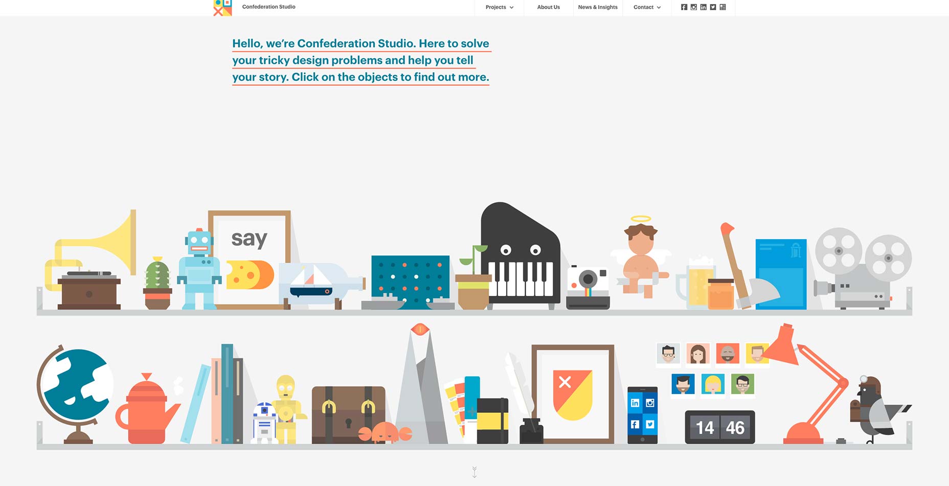
FCINQ
FCINQ is a collection of 30 designers, animators, and artists, and their expertise is clearly shown off in their own website. Things are, perhaps, a bit more cramped together than I’d usually like, and it can be hard to pick which of the many images to focus on first, but this is an excellent example of the way a company’s brand can and should permeate every aspect of a site.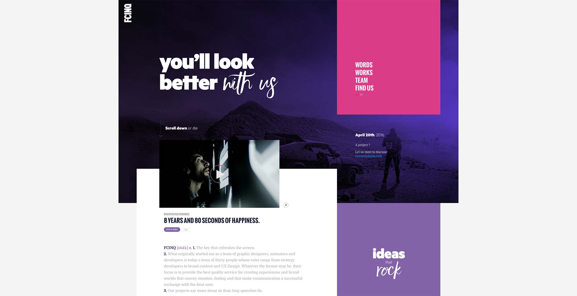
Woody Gooch
Besides having a name that’s really fun to say, Woody Gooch has a passion and a gift for taking photos of surfers in action. As you browse through the site, you are never shown more than one photo at a time (unless you choose the grid view specifically), allowing you to get the full effect of each one.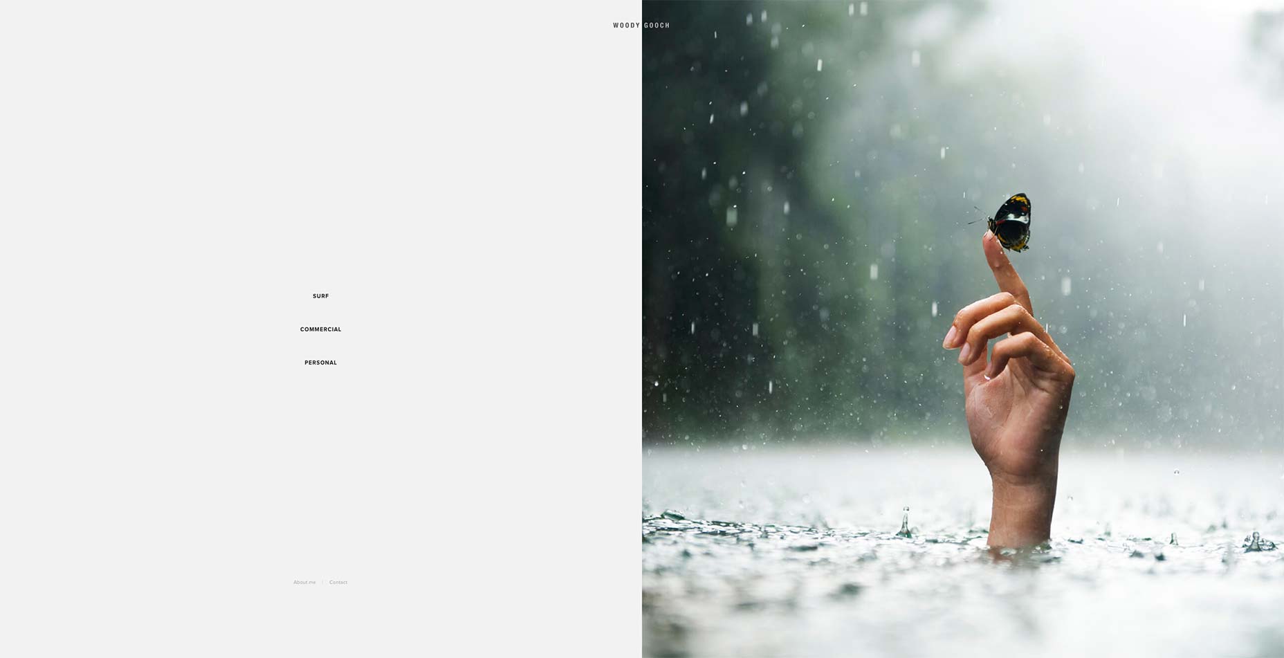
Snøhetta
Another beautiful example of asymmetrical design, Snøhetta approaches the portfolio as something of a collage. Mind you, this effect is reserved for the home-page only. They keep a good balance between their artistic sense and usability by providing a more structured overview of their work in the Projects section.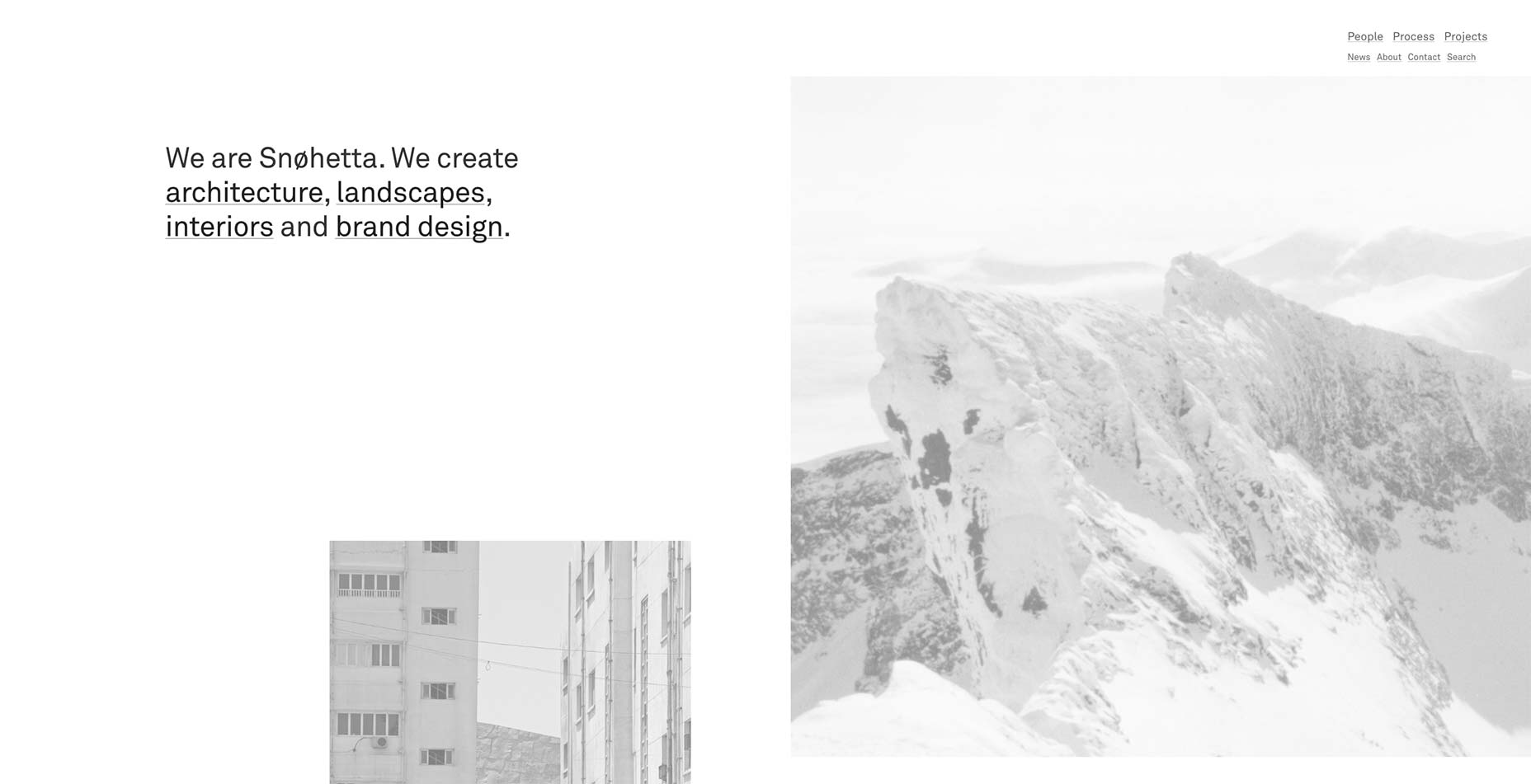
Irradié
Irradié brings us another full-page masonry-style, after the initial full-screen page section. This is another site that lets the imagery do the talking. I will note that the text in each of the four corners at the beginning of the home page might be mistaken for navigation links (I’ve previously featured a site or two where that featured navigation in the corners). Clicking on them only to have nothing happen gave me a moment of confusion. Otherwise, this site is a paragon of modern minimalist design.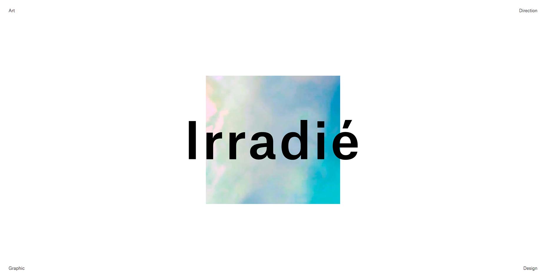
Mambo Mambo
Mambo Mambo’s portfolio is perhaps the most colorful site on our list this month. They complement their eclectic sense of style with bits of cursive writing, beach-themed imagery, and one picture of a chihuahua. One need only take a look at their work, however, to know that they are versatile and can handle just about any work.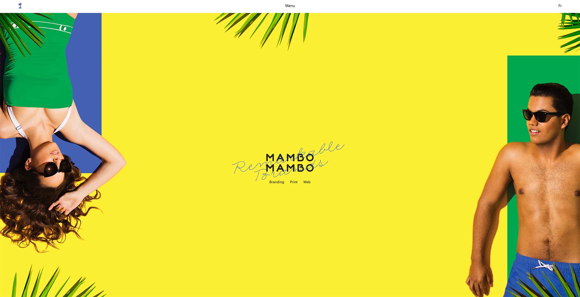
Xavier Truant
Xavier Truant’s portfolio complements his quirky, modern illustrations with an asymmetrical masonry layout. Bold serifs handle the little text that is necessary on a site like this, so everything is kept simple, and just out-of-balance enough to be stylish, without being distracting.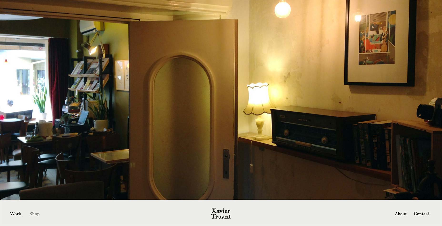
Ryan Garber
Ryan Garber’s photography portfolio keeps things dead-simple with a big image gallery on the home page. I like the way the title of each project is overlaid on the whole page when you hover over an image, but I wish he’d picked a color with better contrast. The black text tends to sort of disappear into some of the photos.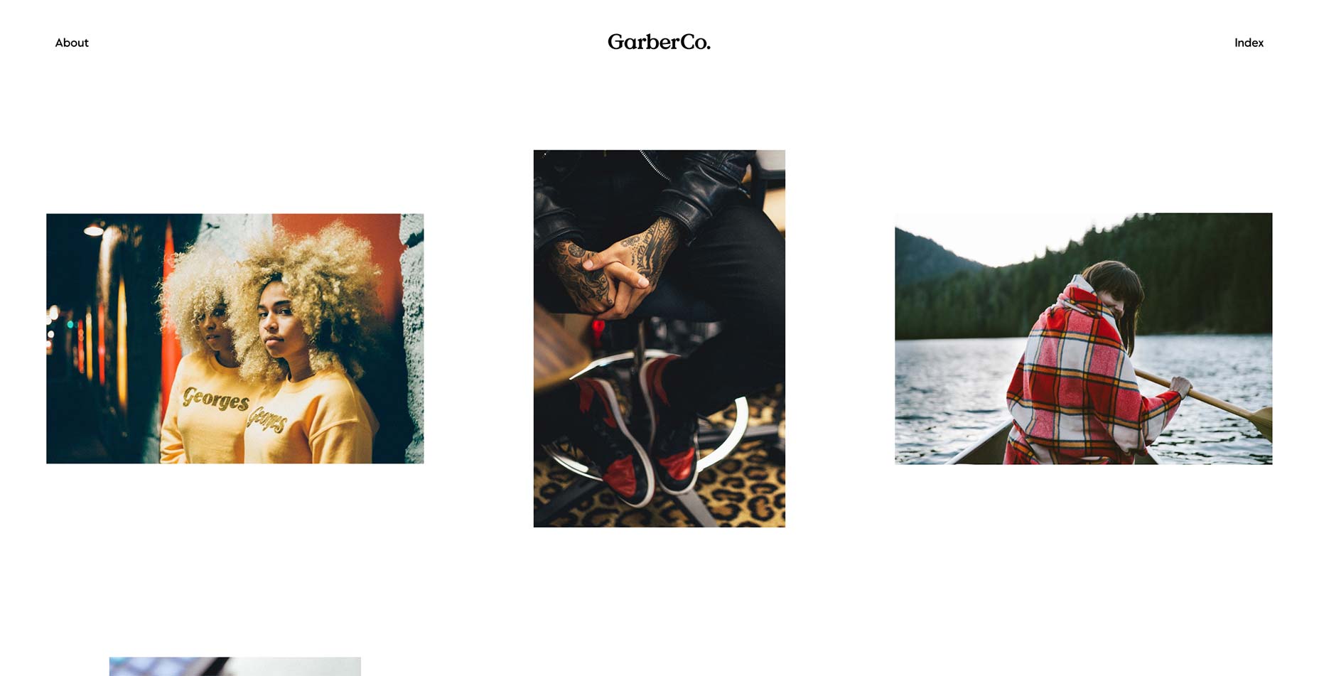
Studio Naam
Studio Naam’s site has gone and embraced thin letters in a big way. They’re used for headings, body text, and input elements. The typographic consistency works beautifully with the largely monochromatic design to create an feeling of both professionalism and sophistication.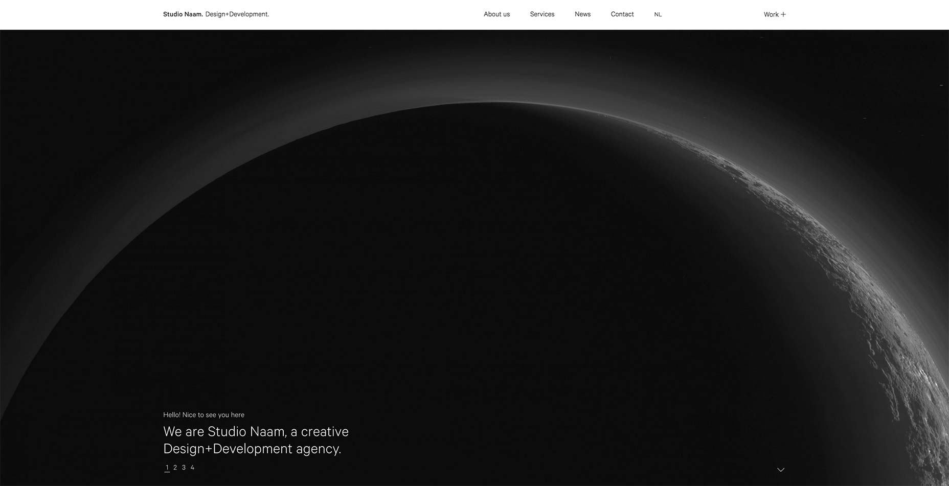
Dogma
I’ll not lie. I like it when sites like Dogma just use enough text to tell the user what’s going on, and then let the images do the rest of the talking. I also love full-screen, dead-simple layouts. I don’t love that I appear to just be saying the same thing over and over. Still, go see their site. It’s good, their work is good, you won’t regret it.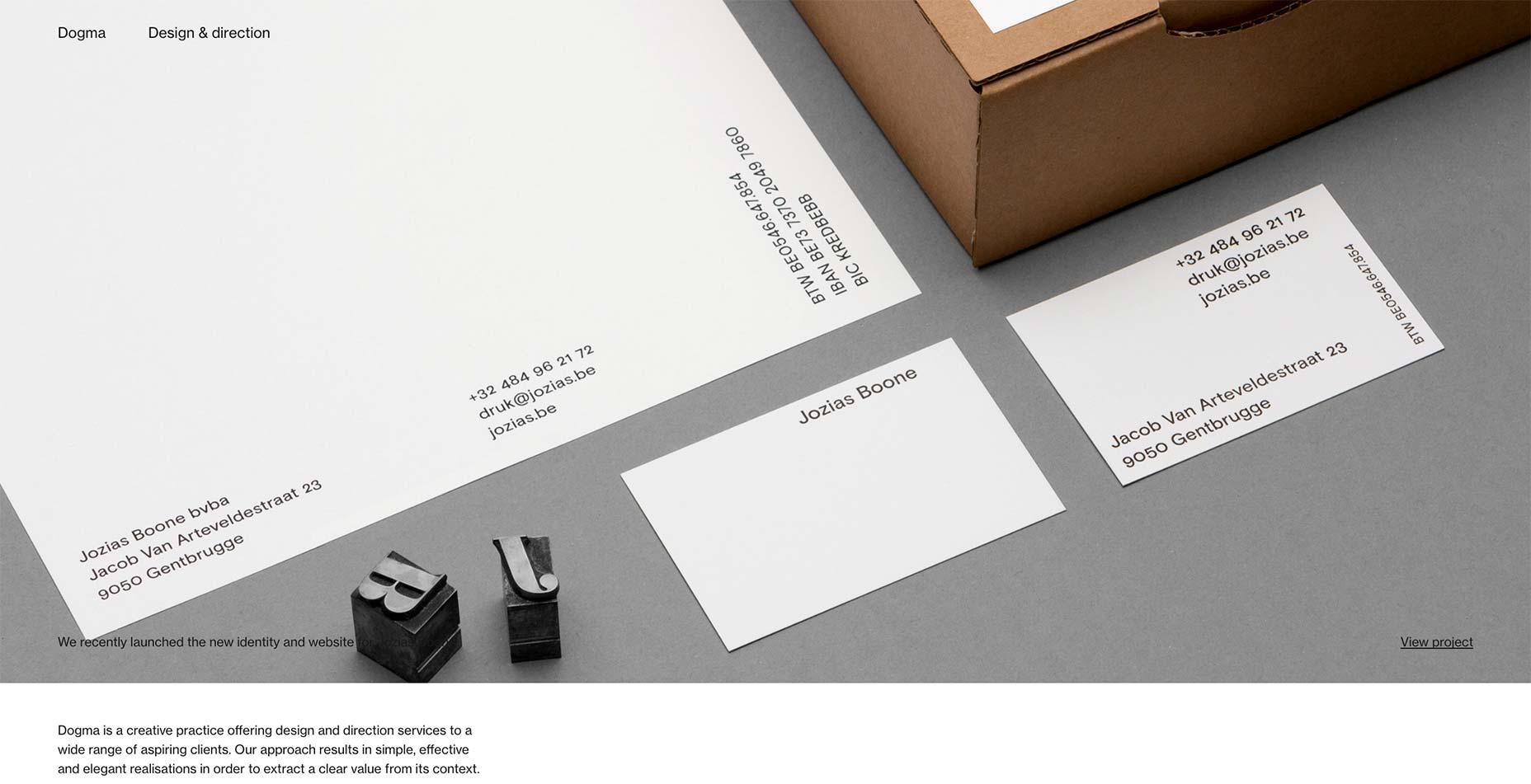
Marcus Eriksson
Marcus Eriksson’s portfolio consists of just two things: the all-important photography, and his contact info. That simplicity makes a great start, but I fell in love with the way the layout of the photo gallery seems to sort of zig-zag back and forth down the page as you scroll.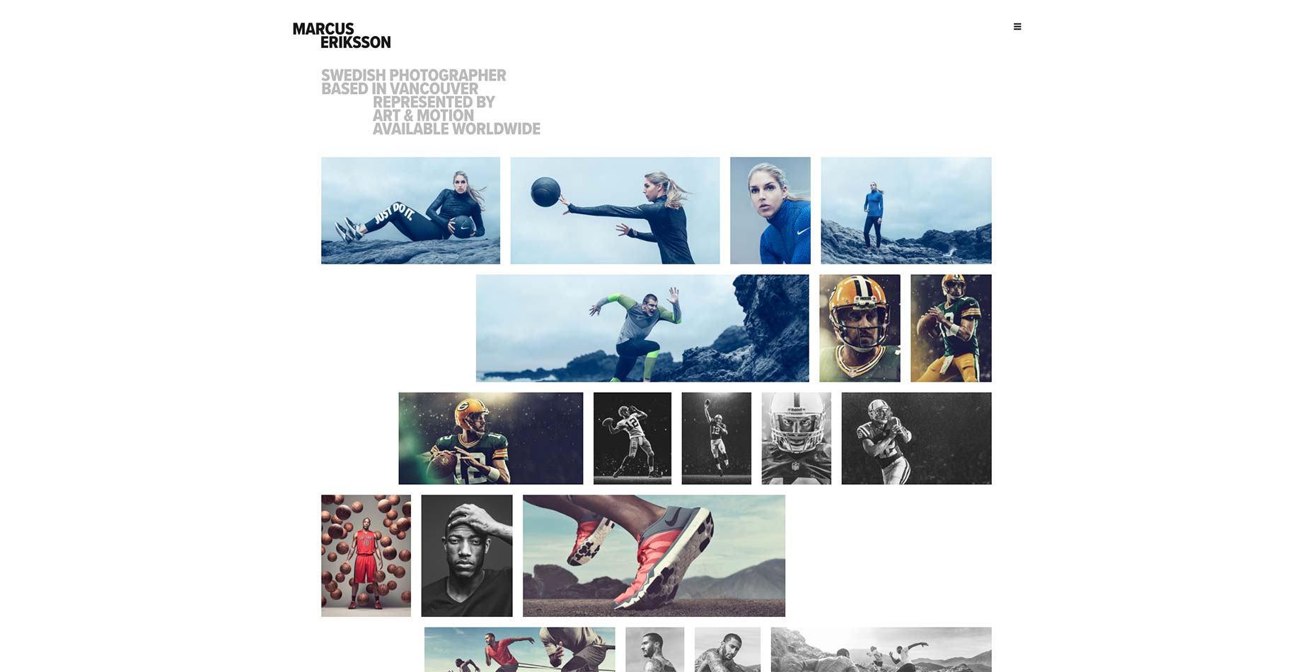
Tobias Thaden
Tobias Thaden goes all out with his portfolio by showing a full case study right under the hero-slideshow thing. If you like what you see, the site leads you deeper into his work, showing off one case study at a time.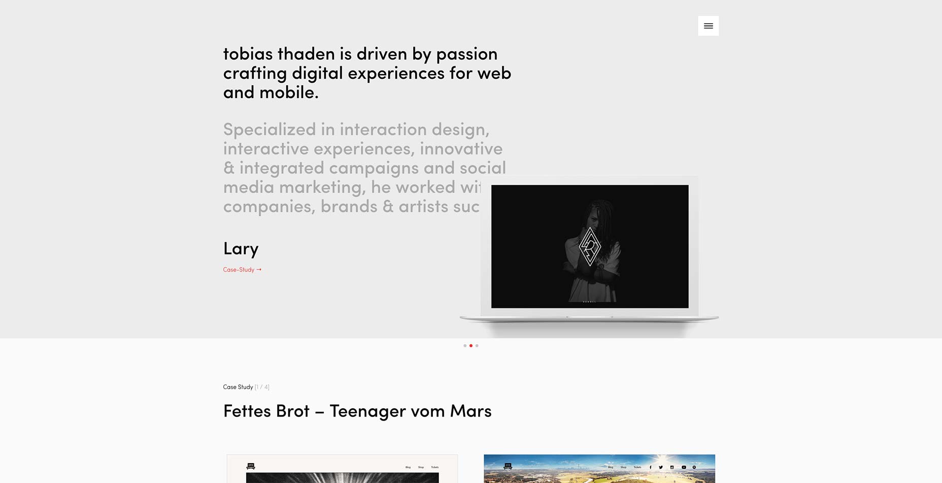
Andy Hook
Andy Hook’s portfolio is another one that’s clean, simple, good. Nothing revolutionary, but still worth a look. If you need inspiration on how to present your work, this is a good place to start.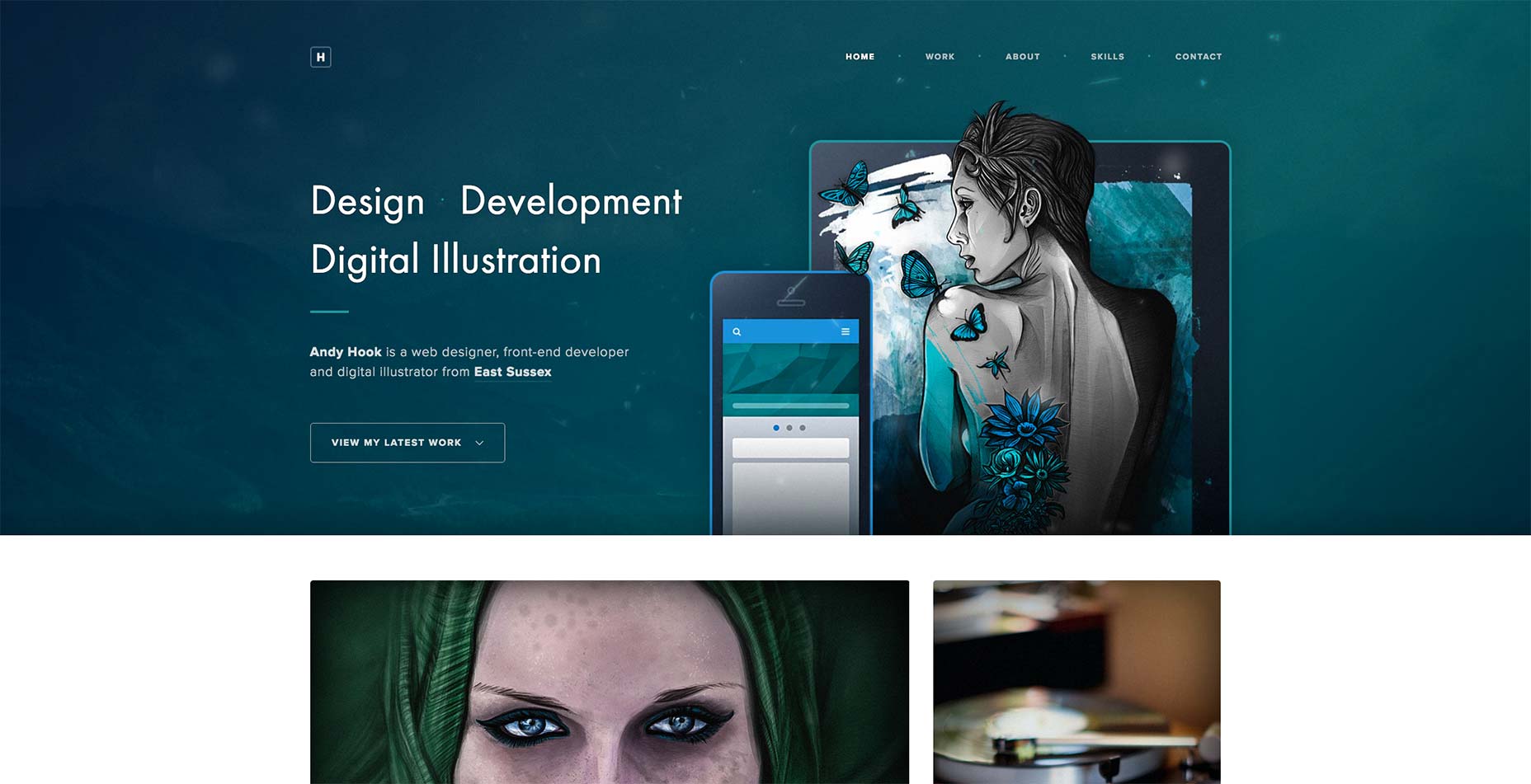
Austin Weight
The thing that really separates one minimalist portfolio site from the next is attention to detail. In Austin Weight’s case, those details are all in the low-key animation he uses. Okay, so the constantly changing logo-thing is distracting me even as I write this. But go scroll over his work. Watch how the details slide in based on where your cursor hits the image. It’s all about those little touches, sometimes.
Ezequiel Bruni
Ezequiel Bruni is a web/UX designer, blogger, and aspiring photographer living in Mexico. When he’s not up to his finely-chiselled ears in wire-frames and front-end code, or ranting about the same, he indulges in beer, pizza, fantasy novels, and stand-up comedy.


Read Next

15 Best New Fonts, July 2024
Welcome to our monthly roundup of the best fonts we’ve found online in the last four weeks. This month, there are fewer…
By Ben Moss

20 Best New Websites, July 2024
Welcome to July’s round up of websites to inspire you. This month’s collection ranges from the most stripped-back…

Top 7 WordPress Plugins for 2024: Enhance Your Site's Performance
WordPress is a hands-down favorite of website designers and developers. Renowned for its flexibility and ease of use,…
By WDD Staff

Exciting New Tools for Designers, July 2024
Welcome to this July’s collection of tools, gathered from around the web over the past month. We hope you’ll find…

3 Essential Design Trends, July 2024
Add some summer sizzle to your design projects with trendy website elements. Learn what's trending and how to use these…

15 Best New Fonts, June 2024
Welcome to our roundup of the best new fonts we’ve found online in the last month. This month, there are notably fewer…
By Ben Moss

20 Best New Websites, June 2024
Arranging content in an easily accessible way is the backbone of any user-friendly website. A good website will present…

Exciting New Tools for Designers, June 2024
In this month’s roundup of the best tools for web designers and developers, we’ll explore a range of new and noteworthy…

3 Essential Design Trends, June 2024
Summer is off to a fun start with some highly dramatic website design trends showing up in projects. Let's dive in!

15 Best New Fonts, May 2024
In this month’s edition, there are lots of historically-inspired typefaces, more of the growing trend for French…
By Ben Moss

How to Reduce The Carbon Footprint of Your Website
On average, a web page produces 4.61 grams of CO2 for every page view; for whole sites, that amounts to hundreds of KG…
By Simon Sterne

20 Best New Websites, May 2024
Welcome to May’s compilation of the best sites on the web. This month we’re focused on color for younger humans,…