

1. Auto-play sound
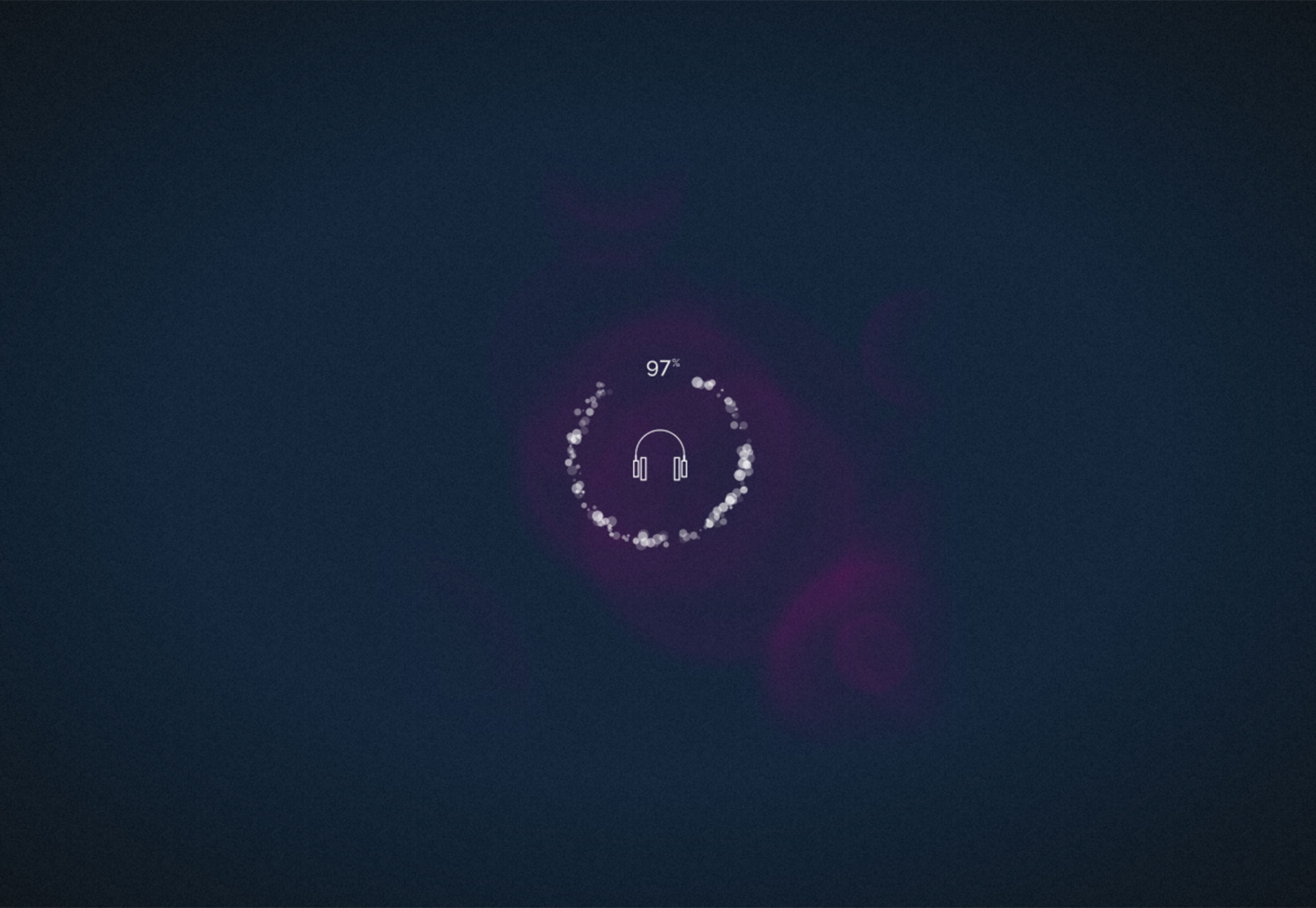
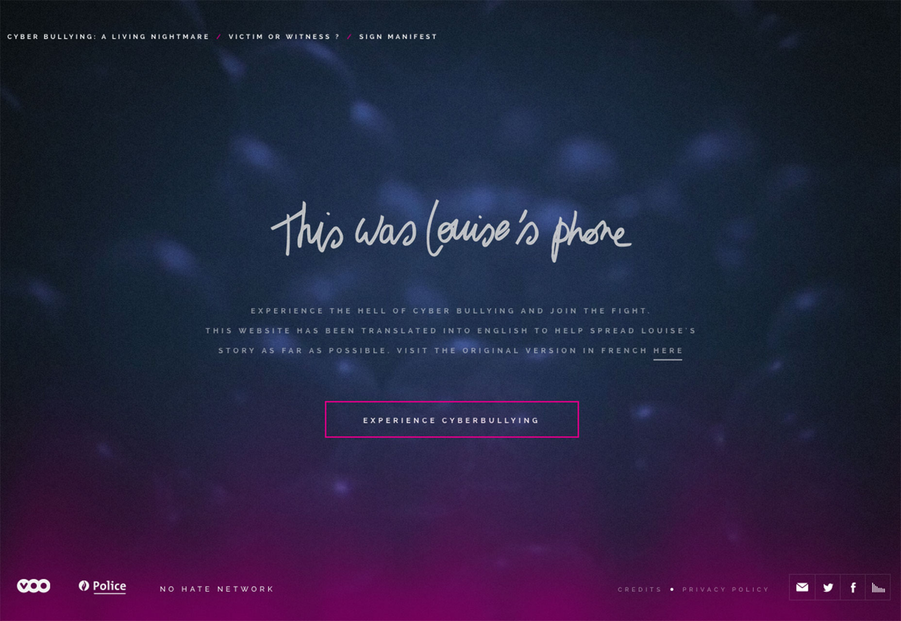
Not that long ago, the rule was not to include sound on your website unless it was optional. And you definitely would not go the auto-play route. Those tables have turned! What used to be a bandwidth hogging, obtrusive design feature is becoming quite commonplace. Sound is being used particularly for a couple of different website types – for media-related content such as music, movies or news and for game or storyline type designs. The trick to using sound is that it needs to include a toggle on/off button for users that still want to interact with a website in silence. Sound is that it shouldn’t come to a shock to users. Many sites, such as This Was Louise’s Phone, that use auto-play sound are using a buffer of sorts to show that sound content is loading. Combine this load action with a toggle switch and users can determine whether sound is for them or not before the site makes the first noise. Another trick when it comes to using sound is to start softly. You don’t want users to jump out of their chairs because your design opens with a heavy metal rift. All sound to crescendo from almost a whisper to full volume in the first few seconds. Finally, it is important that sound (particularly when it plays automatically) is a vital part of the content that contributes to overall user experience. Don’t use sound just because you want to try something new; use it with purpose. Also keep this in mind – even with sound as part of the design, many users will access the content without it. Design wisely.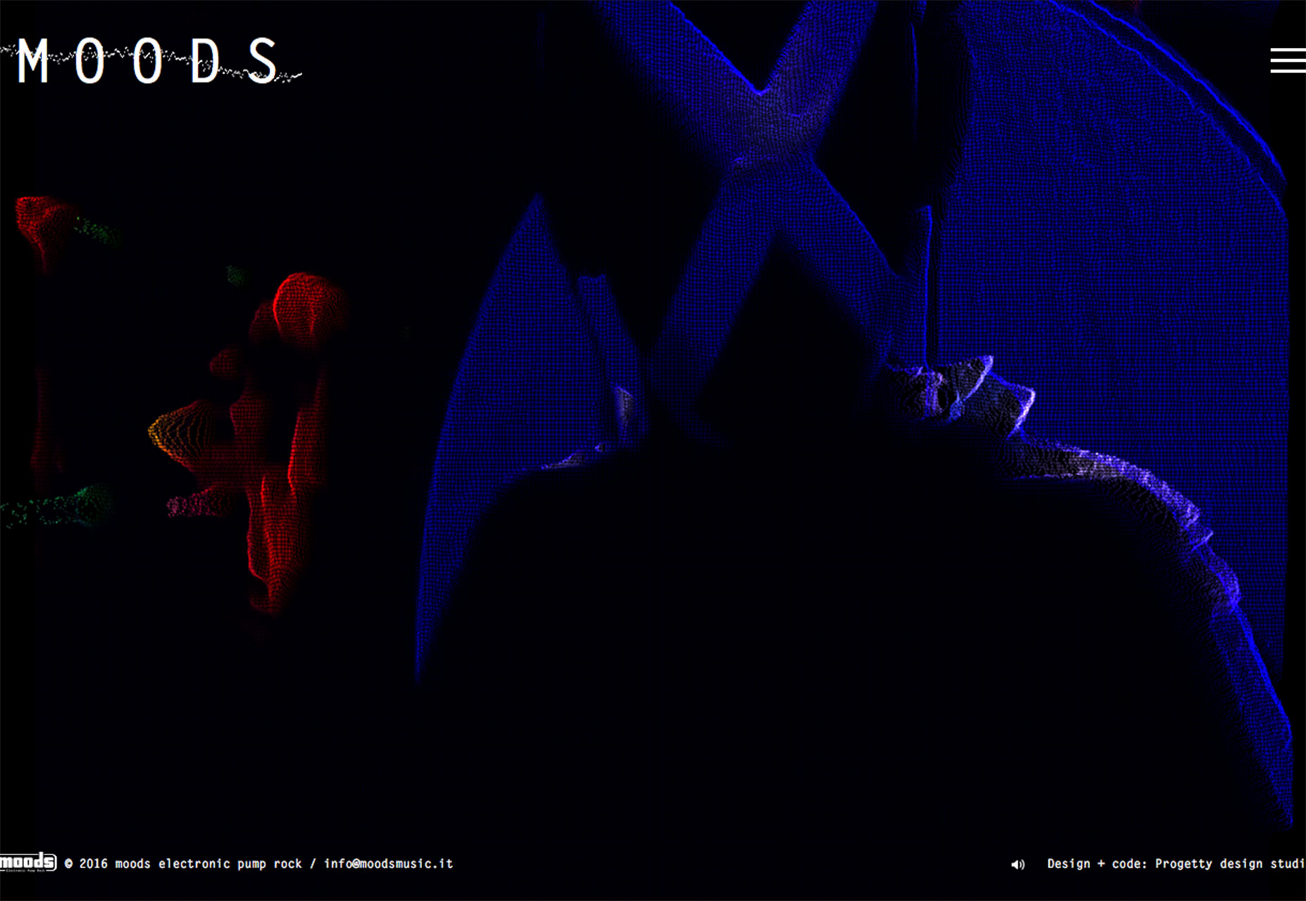
2. Mixing photos and illustration
It can be a tough technique to pull off but the line between photography and illustration has been crossed. Mixing real and hand-drawn elements can add an air of whimsy to a project that’s both fun and visually intriguing. Do it without being cheesy to have a lasting impact on users. Here are a few suggestions:- Use illustrations for icons and buttons, and photography for dominant visual impact
- Create a visual pattern that uses mostly illustration, but add in short video or image areas for emphasis
- Add animated illustrated elements for a touch of something different near photos
- Create a badge or logo that’s illustrated to use with brand photos or on packaging that will appear in brand imagery
- Use illustration to help guide users through other visuals and tell a story
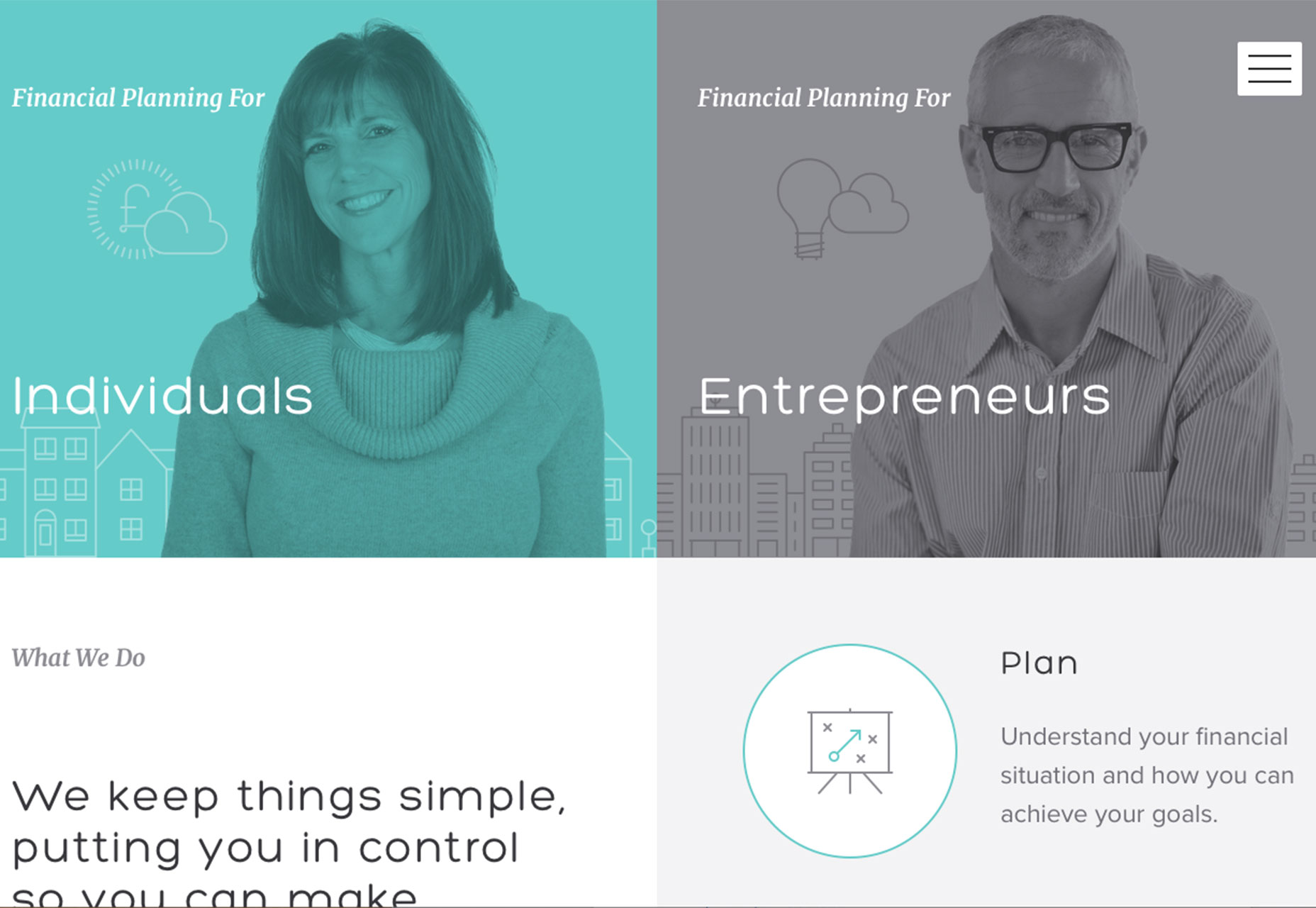
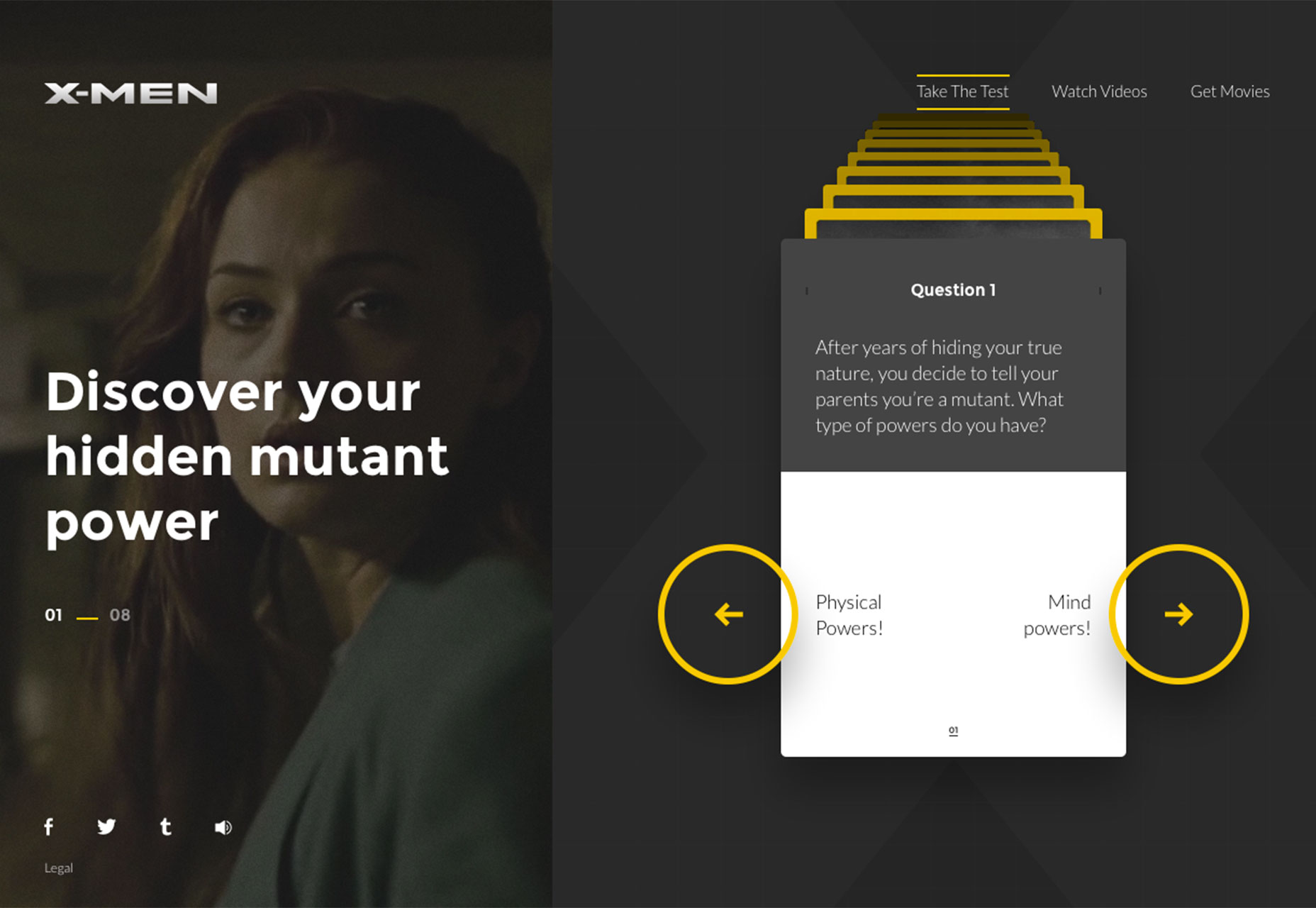
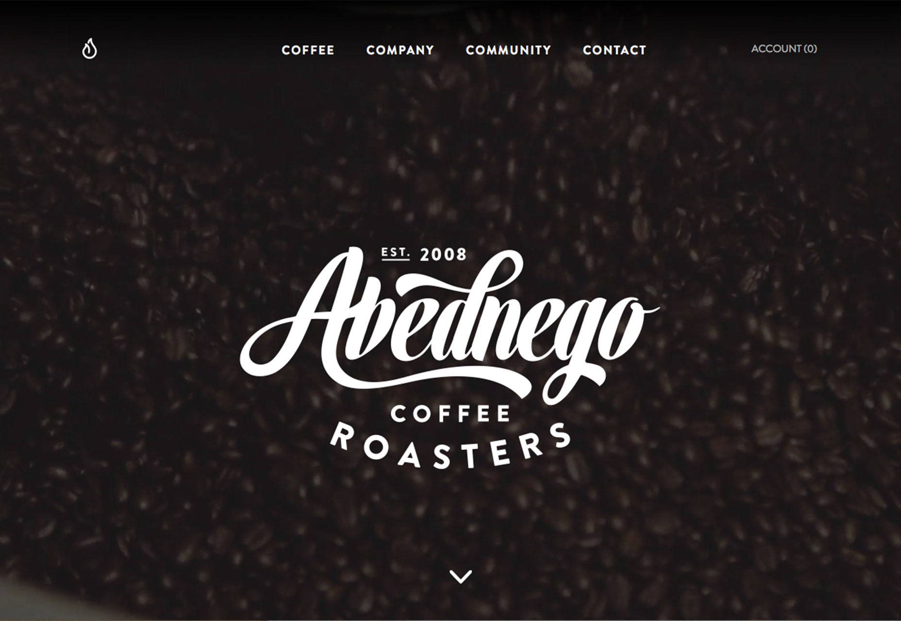
3. Badges on top of hero images
Badges are everywhere you turn right now. From logo design to vintage retro typography styles that could be dubbed hipster favorites, these simple elements have become a staple part of minimal design styles. They are also a common option for designs that might be lacking in photography. That’s shifting though as more designers are using badges with stellar photography in hero images. The trend is exemplified by a single hero image (typically not a slider) with a white or semitransparent badge on top. Badges are often centered horizontally and vertically, although placements can vary. It’s a striking photo to logo (or text) contrast. What makes this work is that the big image draws users in. The badge serves as a focal point for what is often a somewhat weak or loose image. (That’s not to say the images used in this type of style are bad, but they do benefit from the help of a badge.) This trend is an evolution of something we’ve seen for a while with hero image headers. Oversized, bold typography choices were the craze last year. This is a natural shift because of the popularity of badge styles and similarity between how oversized type and badges are used.- Both tend to be white or light type
- Both tend to hammer home a single message to users
- Both work in designs that don’t have a lot of competing visuals
- Both are bold and daring because they only offer users one real point of entry
- Both work exceptionally well with stock photography
- Both styles offer a bold visual solution when you don’t have a lot of photo options
- Both styles lend themselves to adding a touch of animation in other places (such as a hover state) to entice users because there are not a lot of other moving elements, such as video or an image slider
Conclusion
Are you brave enough to add auto-play music to your website design or mix real and illustrated imagery? Both of the trends come with an element of risk—and opportunity for payout. If you aren’t quite ready for these trends, incorporating a badge over a hero image is something that can work for almost any type of design outline. You can also make this adjustment on the fly and use it as needed. What trends are you loving (or hating) right now? I’d love to see some of the websites that you are fascinated with. Drop me a link on Twitter; I’d love to hear from you.Carrie Cousins
Carrie Cousins is a freelance writer with more than 10 years of experience in the communications industry, including writing for print and online publications, and design and editing. You can connect with Carrie on Twitter @carriecousins.


Read Next

15 Best New Fonts, July 2024
Welcome to our monthly roundup of the best fonts we’ve found online in the last four weeks. This month, there are fewer…
By Ben Moss

20 Best New Websites, July 2024
Welcome to July’s round up of websites to inspire you. This month’s collection ranges from the most stripped-back…

Top 7 WordPress Plugins for 2024: Enhance Your Site's Performance
WordPress is a hands-down favorite of website designers and developers. Renowned for its flexibility and ease of use,…
By WDD Staff

Exciting New Tools for Designers, July 2024
Welcome to this July’s collection of tools, gathered from around the web over the past month. We hope you’ll find…

3 Essential Design Trends, July 2024
Add some summer sizzle to your design projects with trendy website elements. Learn what's trending and how to use these…

15 Best New Fonts, June 2024
Welcome to our roundup of the best new fonts we’ve found online in the last month. This month, there are notably fewer…
By Ben Moss

20 Best New Websites, June 2024
Arranging content in an easily accessible way is the backbone of any user-friendly website. A good website will present…

Exciting New Tools for Designers, June 2024
In this month’s roundup of the best tools for web designers and developers, we’ll explore a range of new and noteworthy…

3 Essential Design Trends, June 2024
Summer is off to a fun start with some highly dramatic website design trends showing up in projects. Let's dive in!

15 Best New Fonts, May 2024
In this month’s edition, there are lots of historically-inspired typefaces, more of the growing trend for French…
By Ben Moss

How to Reduce The Carbon Footprint of Your Website
On average, a web page produces 4.61 grams of CO2 for every page view; for whole sites, that amounts to hundreds of KG…
By Simon Sterne

20 Best New Websites, May 2024
Welcome to May’s compilation of the best sites on the web. This month we’re focused on color for younger humans,…