

Unobtrusiveness
There’s a fine line between notifications that serve their purpose and help users with timely alerts and reminders, and notifications that are nothing more than distractions because of how they make their way onto a user’s screen. Designers need to know what this fine line is so they can always stay on the UX-friendly side of it. Notifications should always be as unobtrusive as possible. They shouldn’t interfere with what task the user needs to accomplish at any time, yet they should obviously still achieve their intended purpose of letting users know of something important that’s coming up. On my Mac, for example, OS X is the OS that decides how my calendar app will notify me of important events. I never have my calendar open as with other, more heavily used applications and programs, so the calendar has to find a way to get my attention while still promoting great usability.
When your event gets nearer, my calendar sends me small notifications that slide in at the top right of my screen. Although they’re small, I’ll always see them because the movement catches my eye, and their small size means that they’ll never obstruct what I’m doing. In short, these unobtrusive notifications from my calendar are wonderful because they fulfill their purpose without being a hassle to my UX.
On my Mac, for example, OS X is the OS that decides how my calendar app will notify me of important events. I never have my calendar open as with other, more heavily used applications and programs, so the calendar has to find a way to get my attention while still promoting great usability.
When your event gets nearer, my calendar sends me small notifications that slide in at the top right of my screen. Although they’re small, I’ll always see them because the movement catches my eye, and their small size means that they’ll never obstruct what I’m doing. In short, these unobtrusive notifications from my calendar are wonderful because they fulfill their purpose without being a hassle to my UX.
Location-based relevance
One of the hallmarks of excellent usability is pushing relevant notifications to users, particularly when they’re out and about. Smartphones today are so under siege by a plethora of notifications, but not all of them are designed with the user in mind, unfortunately. Location-based notifications provide a very helpful benefit because of their relevance to where users are in the moment. If an app has properly gathered information from its users, it should already know the user’s likes and dislikes and can therefore push relevant notifications. For instance, when it comes to retail apps, one of the most favorite activities people do on those apps is create shopping and wish lists. This info is a goldmine for the app’s administrators because they can see exactly what’s relevant to a user and what’s not. [pullquote]If an app has properly gathered information from its users, it should already know the user’s likes and dislikes[/pullquote] Location-based relevance means sending your users notifications when they’re able to take action on a specific purchase because they’re geographically near the actual store. In the case of, let’s say the Target app, it’s indescribably helpful to design notifications to ping the user when they’re close to a Target store and using info culled from their in-app shopping lists. If there’s a sale on detergent, and the app knows that detergent just happens to be on the user’s shopping list for the week, a notification should be pushed to user when they’re near an actual Target.Last-chance confirmation messages
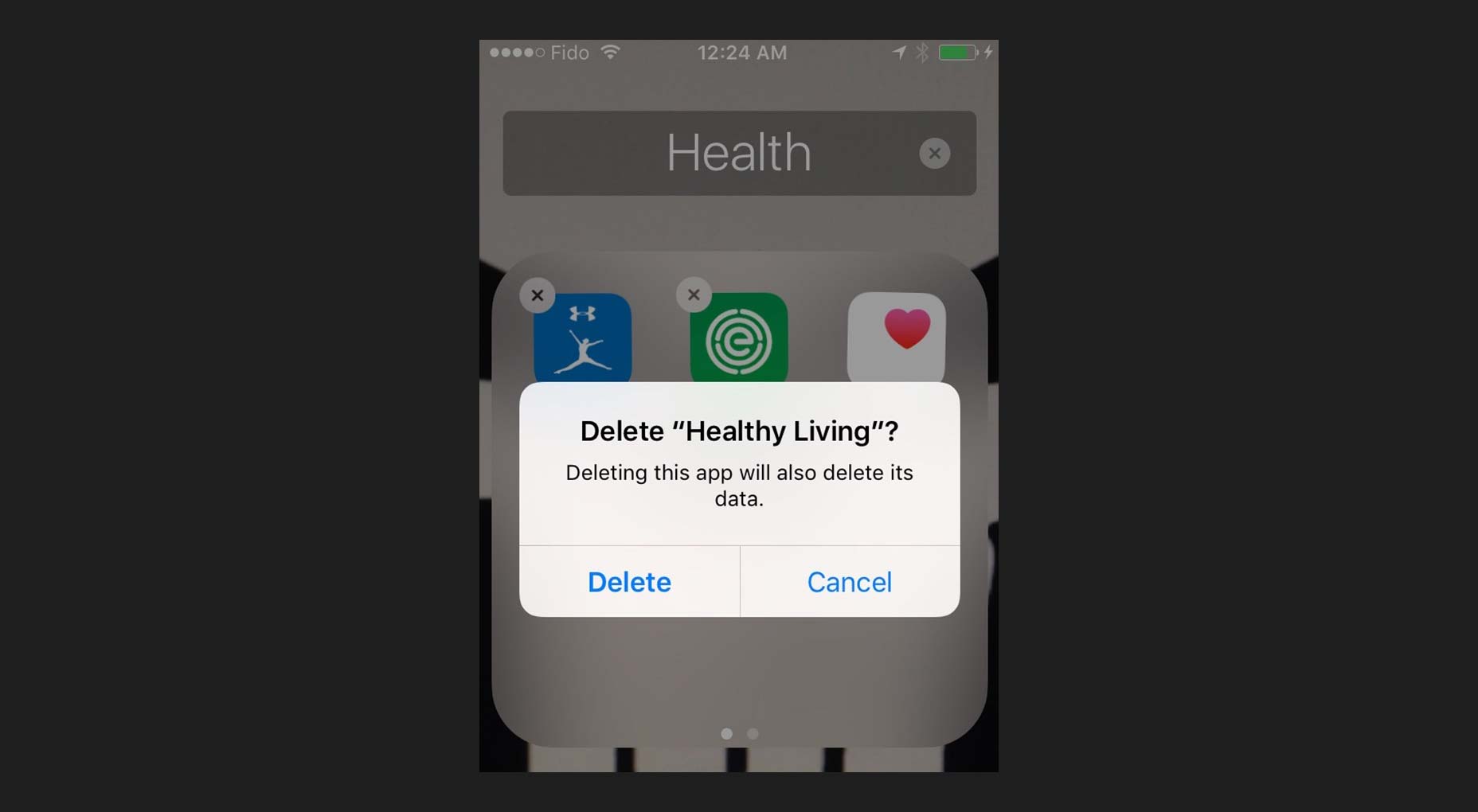
There’s nothing more annoying than accidentally deleting an app, which usually destroys all of the information and data inside of it that you’ve worked hard to accumulate over time. Whether it’s your social-media or cloud-storage apps, not having vital data around anymore all because of an accidental tap on your smartphone is frustrating and hard to take. That’s exactly why notifications that act as confirmation messages should make completely clear what’s being deleted before it’s actually deleted. These popup boxes should have the following characteristics:- be big enough to fill the screen width wise so that users can’t easily overlook them;
- ask a short question of the user that forces them to make a decision;
- use simple and to-the-point language to communicate what action is being considered;
- use a bolded headline to catch the user’s attention;
- feature call to action buttons that are clearly marked and have a distinct color.
Numerical values
When we quantify something, it usually gets easier for us to process and handle the task because it allows us to analyze how much personal investment of time we have to put into it. Numbers also help us to prioritize whether or not we want to take on a certain task at the moment. Measurable things are therefore helpful to usability because they allow us to make better decisions. [pullquote]Notifications that contain numbers allow us to manage our workflows more efficiently[/pullquote] Notifications that contain numbers allow us to manage our workflows more efficiently. When we see a badge, an alert or just an icon that updates us that we have one notification to deal with, we’re likelier to deal with it right at that moment because it implies little work. Looking at one update will take us a conceivably shorter period of time than five updates. At the same time, an alert that communicates that we have several notifications will be something that we’re likelier to put off until we think we can free up more time to adequately handle that load of work.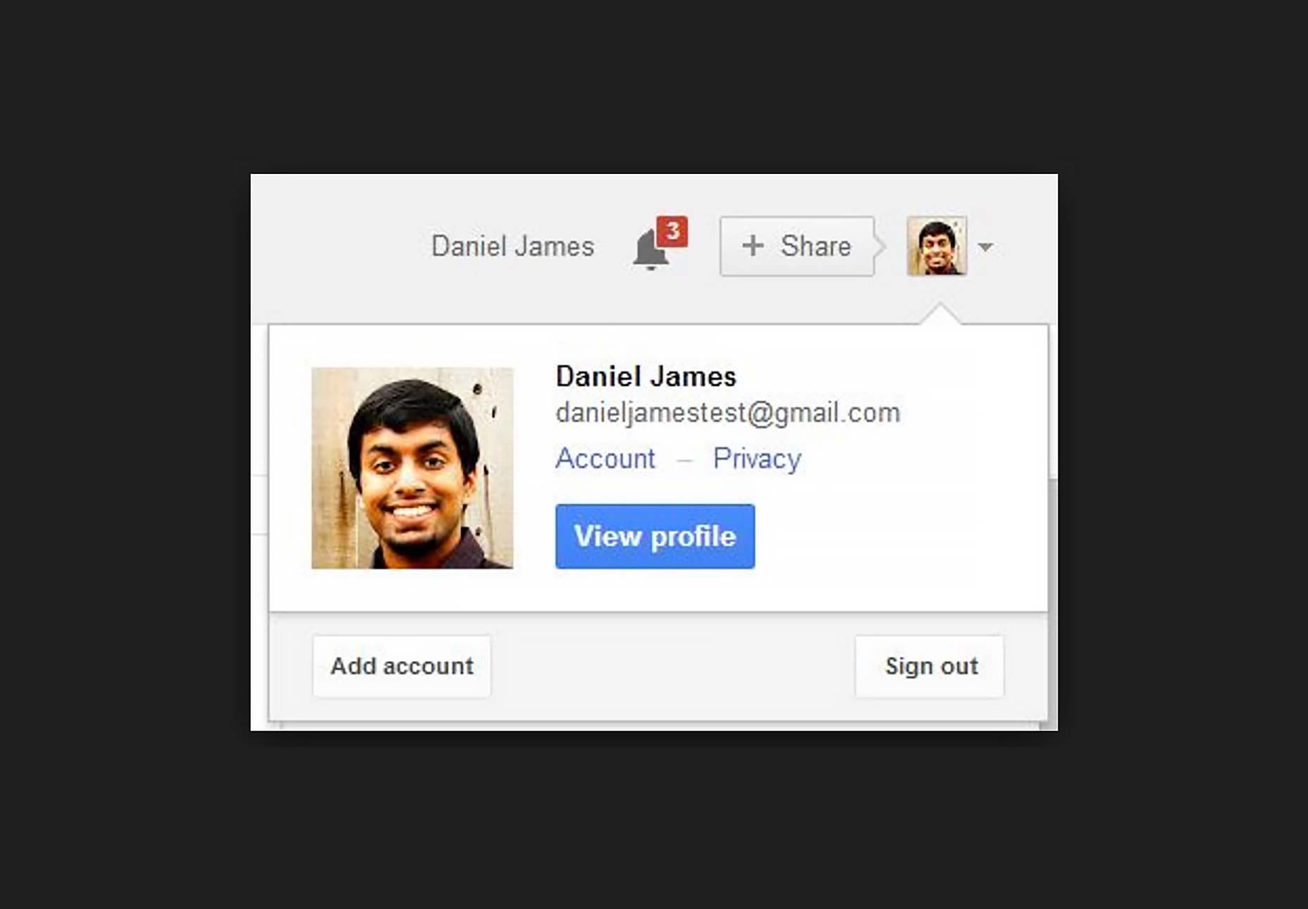 Google’s notifications system routinely uses numbers to update you on how many alerts you have to deal with at a given time, thereby quantifying how much work you’ll likely have to do if you check said alerts. This gives users more control over their time management.
Usability Should be Job One
It’s too easy for designers to get caught up in designing notifications for the sake of designing notifications. It seems like almost every single app out there is replete with alerts and notification features. The biggest job for designers is deciding what notification should ultimately find its way to the end user since not all info is obviously going to be essential to the user. When the notification has a direct impact on the user’s UX, then it has to be pushed to the user, otherwise it probably doesn’t need to be shown.Marc Schenker
Marc’s a copywriter who covers design news for Web Designer Depot. Find out more about him at thegloriouscompanyltd.com.


Read Next

15 Best New Fonts, July 2024
Welcome to our monthly roundup of the best fonts we’ve found online in the last four weeks. This month, there are fewer…
By Ben Moss

20 Best New Websites, July 2024
Welcome to July’s round up of websites to inspire you. This month’s collection ranges from the most stripped-back…

Top 7 WordPress Plugins for 2024: Enhance Your Site's Performance
WordPress is a hands-down favorite of website designers and developers. Renowned for its flexibility and ease of use,…
By WDD Staff

Exciting New Tools for Designers, July 2024
Welcome to this July’s collection of tools, gathered from around the web over the past month. We hope you’ll find…

3 Essential Design Trends, July 2024
Add some summer sizzle to your design projects with trendy website elements. Learn what's trending and how to use these…

15 Best New Fonts, June 2024
Welcome to our roundup of the best new fonts we’ve found online in the last month. This month, there are notably fewer…
By Ben Moss

20 Best New Websites, June 2024
Arranging content in an easily accessible way is the backbone of any user-friendly website. A good website will present…

Exciting New Tools for Designers, June 2024
In this month’s roundup of the best tools for web designers and developers, we’ll explore a range of new and noteworthy…

3 Essential Design Trends, June 2024
Summer is off to a fun start with some highly dramatic website design trends showing up in projects. Let's dive in!

15 Best New Fonts, May 2024
In this month’s edition, there are lots of historically-inspired typefaces, more of the growing trend for French…
By Ben Moss

How to Reduce The Carbon Footprint of Your Website
On average, a web page produces 4.61 grams of CO2 for every page view; for whole sites, that amounts to hundreds of KG…
By Simon Sterne

20 Best New Websites, May 2024
Welcome to May’s compilation of the best sites on the web. This month we’re focused on color for younger humans,…