

Monochrome
Monochrome design does exactly what good design should do: draws attention to the content.
No Fancy CSS
Remember the good old days? When everyone owned a website and had something to prove? The no (or little) CSS approach brings back those days, and, personally makes me extremely nostalgic for simpler times where a website could be just a short bio and collection of links.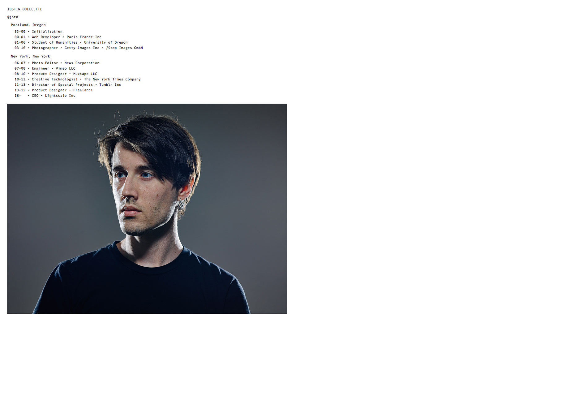
Slanted/overlapping text
Slanted text throws the user off a little, and not in an astonishing way. Instead, it’s something that the user isn’t used to seeing so it makes a powerful impression. Check out the experimental text placement Loïc uses on his website. The total disregard for readability gives visitors the feeling of a high-fashion store that doesn’t have price tags. It’s so uninformative (and in this case, aloof) that it’s classy.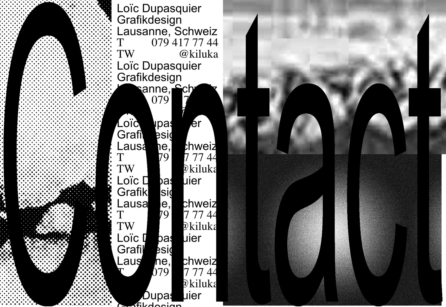
Little regard for scale or padding
Bloomberg’s getting pretty experimental these days, and I love it. Imagine the trials and tribulations the designer had to go through to get that approved with the big boss. The reason this is awesome is that it’s so different. It pays little regard to hard design rules: leaving enough space between elements, keeping things at similar scale, and even making sure that everything is suitably readable on all devices.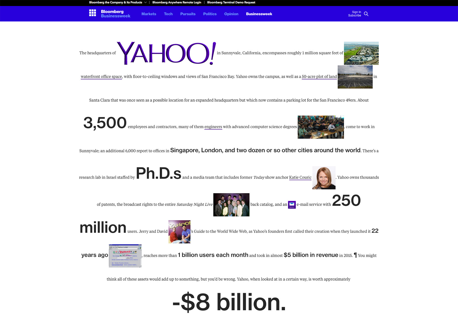
References to legacy tech
Many of us will have fond memories of Windows 98, or early Mac operating systems. Some websites instill a sense of nostalgia—and, perhaps humor—by making references to old software. After all, a lot of brutalist web design does come from the 'old days’. Check out this example from Post HTML (these folders each contain experimental art).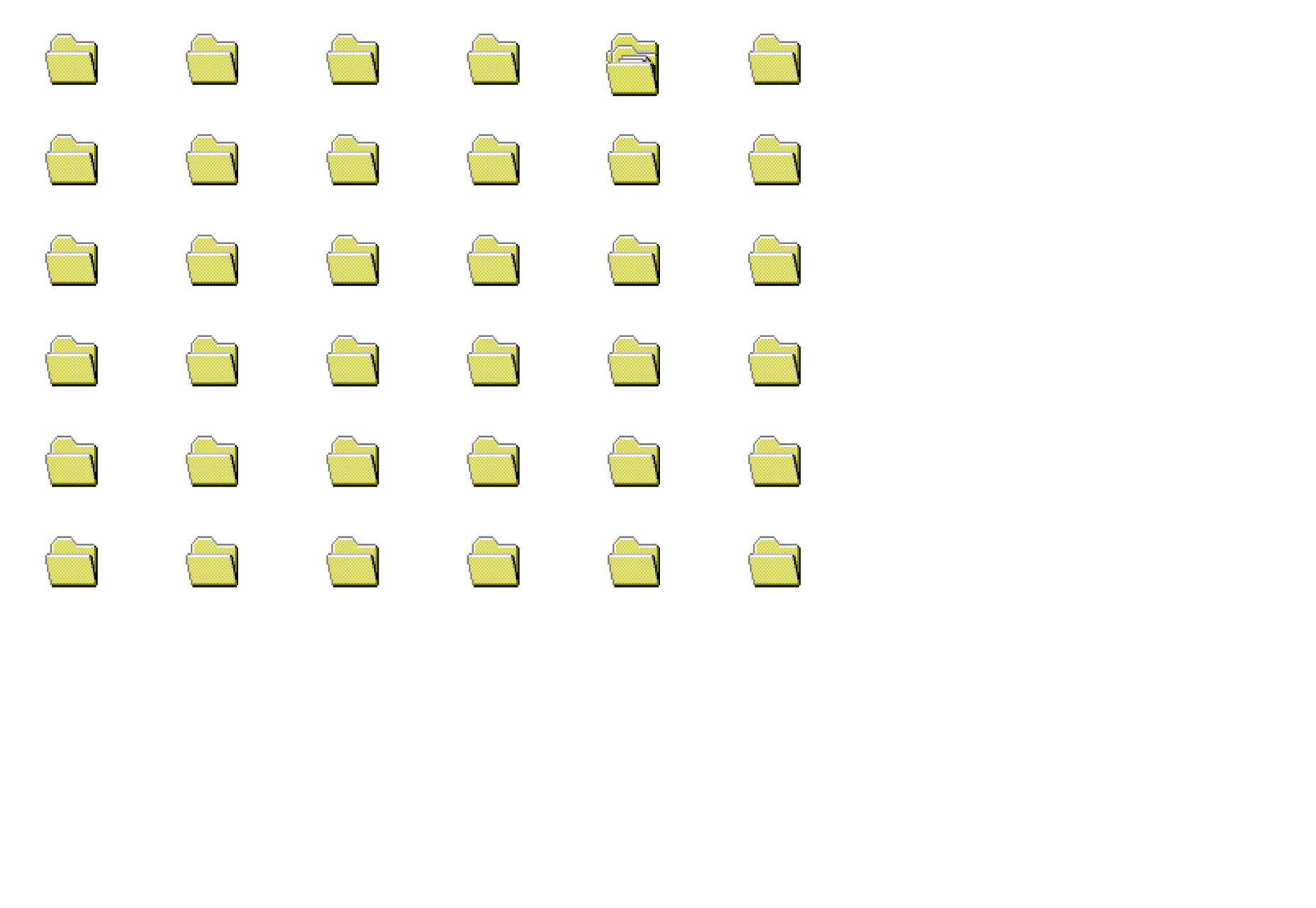
What this means for designers
We thought that flat = simplicity, but obviously it still needed a ton of design work to get it right. With brutalist aesthetics coming to the forefront, designers will need to rely less on traditional CSS frameworks and code sites from scratch. However, it doesn’t seem to be businesses that are employing this trend on their sites. Brutalist design—aside from Bloomberg and some other bigger names—is, right now, confined to design agencies, experimental sites and personal blogs. If you want to make your own brutalist website, here are a few pointers…Strip the CSS out of your current site
While some sites rely heavily on CSS for horizontal positioning, it is possible rip all styling from some sites and still have them display ‘properly'. Here’s an example: If your site relies on flashy animations, JavaScript or fancy CSS, it will probably need remaking if you want to adopt this style. In fact, the reason I ditched WordPress was because I couldn’t find a theme that fit my vision. In the end, I actually ended up learning HTML/CSS by editing an ancient template from the early 2000s. After that, I felt confident to go ahead and start over, scribbling my own messy CSS and making the furthest thing from a polished, ‘modern’ site.Cut back to monochrome
Sometimes, brutalist design means simple design. And that’s always great for the user experience. Cutting back your current color palette to just 2 colors (black and one other—white, technically), can help reduce the user’s overload and give them a clearer direction on where to go. After all, you don’t see sites with a ton of different colors in the text area because it’s hard to focus on.Get creative with text positioning
Who said you have to have everything line up nicely? Loïc Dupasquier’s website above, for example, is a bold statement that says something about the designer. Looking exactly the same as every other potential hire isn’t a good look. Unless you’re the most famous designer in that field, you’re always going to be second best. By shunning traditional ‘rules’ about typography, you’re standing out from the crowd.Re-learn the basics & old ways
For me, it wasn’t a matter of adapting a design or skillset to a new mentality. I learned the basics of web design back when sites actually looked like the ones I’ve shown you, so all I had to do was take a quick refresher and get to work. I’d recommend checking out the source code on old sites and those featured on Brutalist Websites, old HTML tutorials, or this goldmine that features a list of the earliest websites that are still alive.Where this style works well (and where it doesn’t)
In the end, a website is always a balance between self-expression and creating the best experience for your users. On a blog, it’s probably best to concentrate on making the body of the text easy to digest. You’ll notice that while Bloomberg’s piece on Yahoo starts out pretty weird, the main body of text is easy to read. So, when you’re building a blog, it’s better to stick to conventions for the body of the article. For example, WIRED’s design is quite distinctive but when it comes to the articles themselves, they use a pleasant font and keep it readable. For a designer that works mostly with stuffy corporations, an experimental portfolio might put the client off at the most vital moment—first contact. In the end, it comes down to knowing your audience, and whether you can get away with totally ignoring conventions. Go forth, and make something disgustingly brilliant.Benjamin Brandall
Benjamin Brandall is a British writer, hooked on design, UX and startups. He writes at Process Street and on his personal blog. Follow him on Twitter here.


Read Next

15 Best New Fonts, July 2024
Welcome to our monthly roundup of the best fonts we’ve found online in the last four weeks. This month, there are fewer…
By Ben Moss

20 Best New Websites, July 2024
Welcome to July’s round up of websites to inspire you. This month’s collection ranges from the most stripped-back…

Top 7 WordPress Plugins for 2024: Enhance Your Site's Performance
WordPress is a hands-down favorite of website designers and developers. Renowned for its flexibility and ease of use,…
By WDD Staff

Exciting New Tools for Designers, July 2024
Welcome to this July’s collection of tools, gathered from around the web over the past month. We hope you’ll find…

3 Essential Design Trends, July 2024
Add some summer sizzle to your design projects with trendy website elements. Learn what's trending and how to use these…

15 Best New Fonts, June 2024
Welcome to our roundup of the best new fonts we’ve found online in the last month. This month, there are notably fewer…
By Ben Moss

20 Best New Websites, June 2024
Arranging content in an easily accessible way is the backbone of any user-friendly website. A good website will present…

Exciting New Tools for Designers, June 2024
In this month’s roundup of the best tools for web designers and developers, we’ll explore a range of new and noteworthy…

3 Essential Design Trends, June 2024
Summer is off to a fun start with some highly dramatic website design trends showing up in projects. Let's dive in!

15 Best New Fonts, May 2024
In this month’s edition, there are lots of historically-inspired typefaces, more of the growing trend for French…
By Ben Moss

How to Reduce The Carbon Footprint of Your Website
On average, a web page produces 4.61 grams of CO2 for every page view; for whole sites, that amounts to hundreds of KG…
By Simon Sterne

20 Best New Websites, May 2024
Welcome to May’s compilation of the best sites on the web. This month we’re focused on color for younger humans,…