

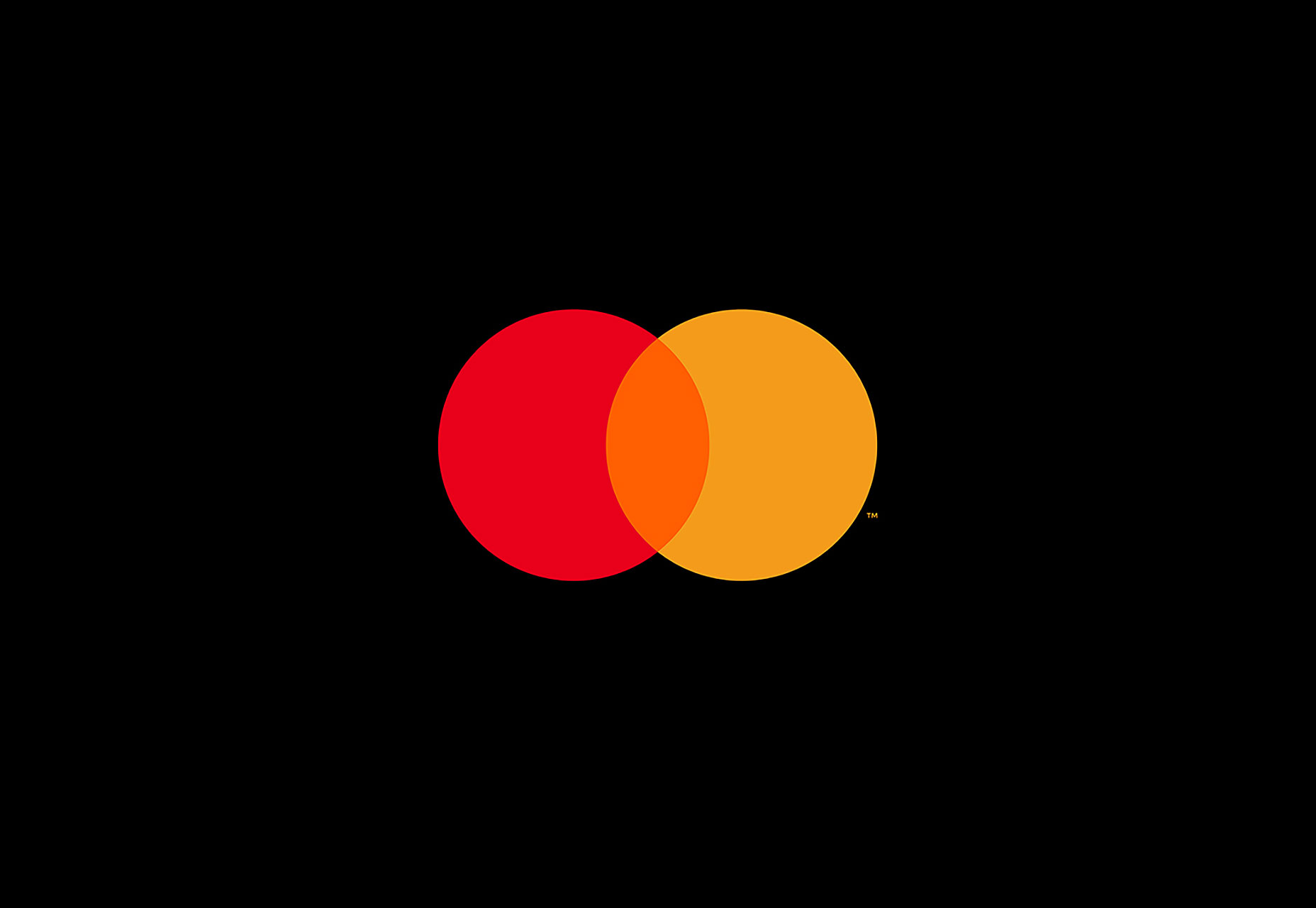
 Instead of the red-and-yellow comb effect in the center of the circles, we know see the true result of red and yellow mixing, which is the color orange. The wordmark “MasterCard” has been entirely kicked out of the circles and now appears underneath them.
The wordmark also features a new typeface, FF Mark. The most notable change is that every letter in the new wordmark is now lowercase while also sporting circular curves that the old wordmark couldn’t accommodate. It’s also gone from white to black.
Instead of the red-and-yellow comb effect in the center of the circles, we know see the true result of red and yellow mixing, which is the color orange. The wordmark “MasterCard” has been entirely kicked out of the circles and now appears underneath them.
The wordmark also features a new typeface, FF Mark. The most notable change is that every letter in the new wordmark is now lowercase while also sporting circular curves that the old wordmark couldn’t accommodate. It’s also gone from white to black.
 The design company that worked on this update, Pentagram, was thankful that it already had much to work with before they began the redesign. The old logo already featured one of the simplest and easiest geometric shapes with which to work, not to mention two of the three primary colors. As a result, Pentagram didn’t really perform a complete overhaul, but, rather, a simple design tweak that updated the logo to today’s branding needs.
The new logo is anything but excessively clever or instantly eye-catching. Instead, it’s a safe and effective transition from a tested design to one that’s complementary to an evolving brand identity.
The design company that worked on this update, Pentagram, was thankful that it already had much to work with before they began the redesign. The old logo already featured one of the simplest and easiest geometric shapes with which to work, not to mention two of the three primary colors. As a result, Pentagram didn’t really perform a complete overhaul, but, rather, a simple design tweak that updated the logo to today’s branding needs.
The new logo is anything but excessively clever or instantly eye-catching. Instead, it’s a safe and effective transition from a tested design to one that’s complementary to an evolving brand identity.
Marc Schenker
Marc’s a copywriter who covers design news for Web Designer Depot. Find out more about him at thegloriouscompanyltd.com.


Read Next

15 Best New Fonts, July 2024
Welcome to our monthly roundup of the best fonts we’ve found online in the last four weeks. This month, there are fewer…
By Ben Moss

20 Best New Websites, July 2024
Welcome to July’s round up of websites to inspire you. This month’s collection ranges from the most stripped-back…

Top 7 WordPress Plugins for 2024: Enhance Your Site's Performance
WordPress is a hands-down favorite of website designers and developers. Renowned for its flexibility and ease of use,…
By WDD Staff

Exciting New Tools for Designers, July 2024
Welcome to this July’s collection of tools, gathered from around the web over the past month. We hope you’ll find…

3 Essential Design Trends, July 2024
Add some summer sizzle to your design projects with trendy website elements. Learn what's trending and how to use these…

15 Best New Fonts, June 2024
Welcome to our roundup of the best new fonts we’ve found online in the last month. This month, there are notably fewer…
By Ben Moss

20 Best New Websites, June 2024
Arranging content in an easily accessible way is the backbone of any user-friendly website. A good website will present…

Exciting New Tools for Designers, June 2024
In this month’s roundup of the best tools for web designers and developers, we’ll explore a range of new and noteworthy…

3 Essential Design Trends, June 2024
Summer is off to a fun start with some highly dramatic website design trends showing up in projects. Let's dive in!

15 Best New Fonts, May 2024
In this month’s edition, there are lots of historically-inspired typefaces, more of the growing trend for French…
By Ben Moss

How to Reduce The Carbon Footprint of Your Website
On average, a web page produces 4.61 grams of CO2 for every page view; for whole sites, that amounts to hundreds of KG…
By Simon Sterne

20 Best New Websites, May 2024
Welcome to May’s compilation of the best sites on the web. This month we’re focused on color for younger humans,…