

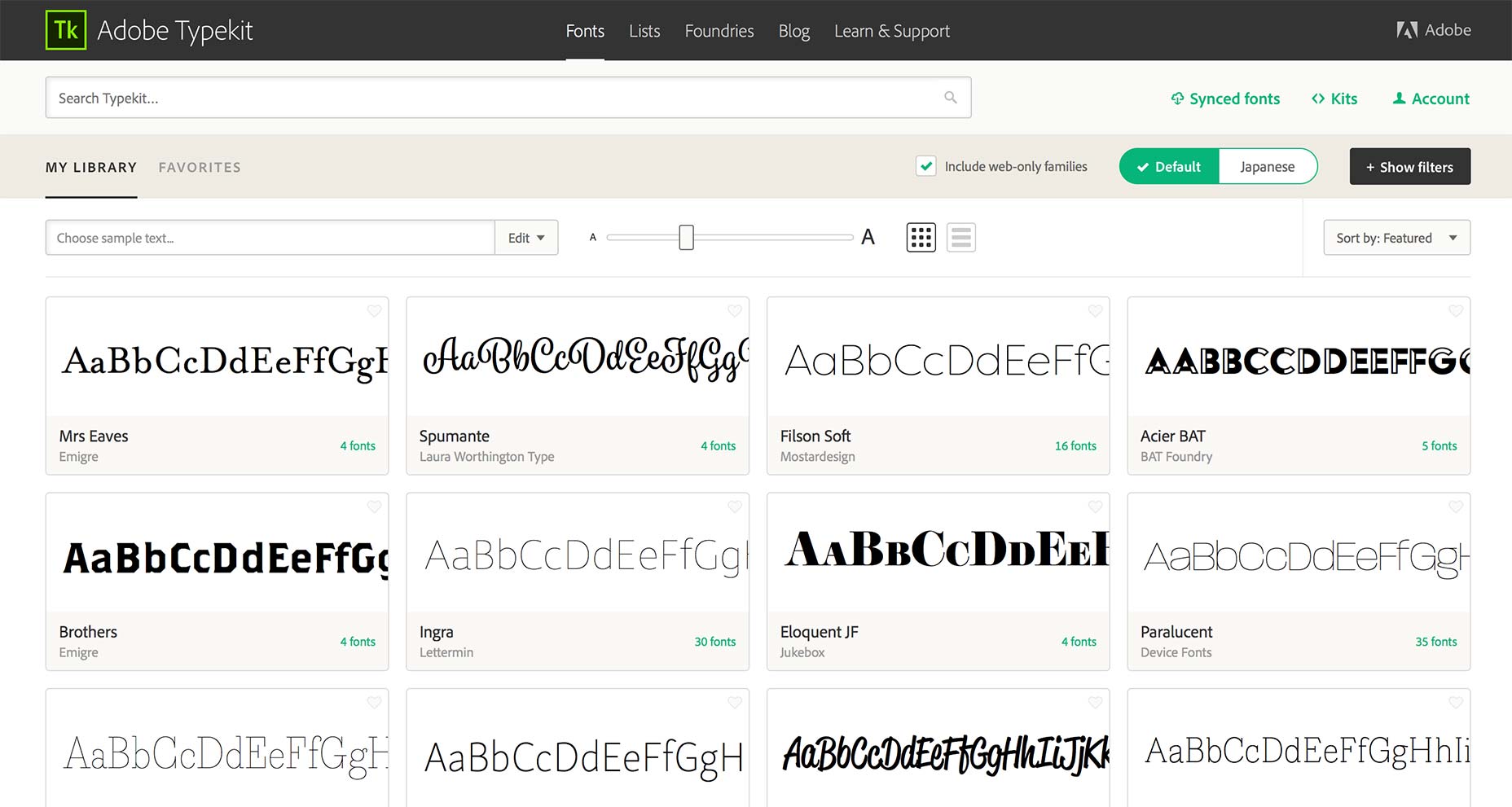
 The new Typekit UI is substantially simpler than its predecessor. Take for example the Web/Desktop option introduced when Adobe began streaming fonts to Creative Cloud; the two toggle buttons have been replaced with an Include web-only families checkbox. (Anyone who produces mockups, style guides, or even graphics for clients will want to toggle that off immediately—so that Typekit only shows you fonts that can be synced as well as displayed on the web.)
Font syncing itself has also been sped up. To sync a font to Creative Cloud apps you no longer need to open a modal window, just click the Sync button next to the preview.
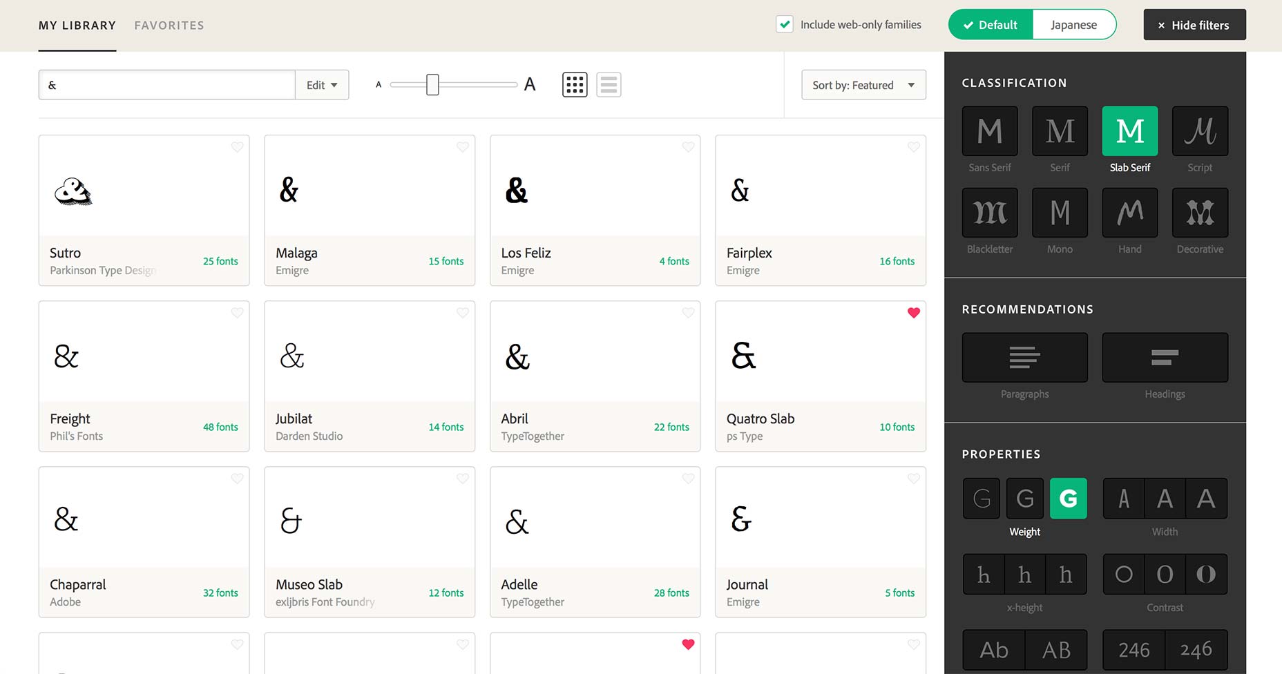
Happily, you can now enter numerals, punctuation, and diacritics as sample text. This is a godsend for designers working in languages other than English but also for anyone (such as myself) who enjoys browsing by ampersand.
The new Typekit UI is substantially simpler than its predecessor. Take for example the Web/Desktop option introduced when Adobe began streaming fonts to Creative Cloud; the two toggle buttons have been replaced with an Include web-only families checkbox. (Anyone who produces mockups, style guides, or even graphics for clients will want to toggle that off immediately—so that Typekit only shows you fonts that can be synced as well as displayed on the web.)
Font syncing itself has also been sped up. To sync a font to Creative Cloud apps you no longer need to open a modal window, just click the Sync button next to the preview.
Happily, you can now enter numerals, punctuation, and diacritics as sample text. This is a godsend for designers working in languages other than English but also for anyone (such as myself) who enjoys browsing by ampersand.
 You’ll also find easier access to premium fonts licensed through Typekit partners. If for example you’ve purchased a license for Frere-Jones’ new Mallory or Process Type’s beautiful Elena, you’ll find it listed under Purchased in the top left menu.
Perhaps the most welcome change has been the switch from infinite scrolling to pagination. In the old design, it was all too easy to click on a font for more details, then hit the browser’s back button and find yourself back at the start of your filtered results. Now, thanks to working with the browser’s default behaviour instead of against it, the back button takes you straight to the last page so you can continue browsing.
You can try out the new interface by logging into Typekit, clicking the Account link and toggling Early Access to On. The Typekit team are asking for feedback on the latest changes, so if there’s a feature you’ve always wanted, or if they’ve scrapped something you use everyday, now’s the time to speak up, via email or on Twitter.
You’ll also find easier access to premium fonts licensed through Typekit partners. If for example you’ve purchased a license for Frere-Jones’ new Mallory or Process Type’s beautiful Elena, you’ll find it listed under Purchased in the top left menu.
Perhaps the most welcome change has been the switch from infinite scrolling to pagination. In the old design, it was all too easy to click on a font for more details, then hit the browser’s back button and find yourself back at the start of your filtered results. Now, thanks to working with the browser’s default behaviour instead of against it, the back button takes you straight to the last page so you can continue browsing.
You can try out the new interface by logging into Typekit, clicking the Account link and toggling Early Access to On. The Typekit team are asking for feedback on the latest changes, so if there’s a feature you’ve always wanted, or if they’ve scrapped something you use everyday, now’s the time to speak up, via email or on Twitter.
 Typekit is an excellent service, arguably one of Adobe’s best, but crowbarring new features like syncing, into a dated interface, lead to an increasingly frustrating user experience. Typekit’s new UI retains the best of the service, and maintains brand familiarity, while addressing most of its flaws.
What the new Typekit does best, is get out of the way. The new design is, if not actually invisible, certainly less opaque. That’s something we can all learn from.
Typekit is an excellent service, arguably one of Adobe’s best, but crowbarring new features like syncing, into a dated interface, lead to an increasingly frustrating user experience. Typekit’s new UI retains the best of the service, and maintains brand familiarity, while addressing most of its flaws.
What the new Typekit does best, is get out of the way. The new design is, if not actually invisible, certainly less opaque. That’s something we can all learn from.
Ben Moss
Ben Moss has designed and coded work for award-winning startups, and global names including IBM, UBS, and the FBI. When he’s not in front of a screen he’s probably out trail-running.


Read Next

15 Best New Fonts, July 2024
Welcome to our monthly roundup of the best fonts we’ve found online in the last four weeks. This month, there are fewer…
By Ben Moss

20 Best New Websites, July 2024
Welcome to July’s round up of websites to inspire you. This month’s collection ranges from the most stripped-back…

Top 7 WordPress Plugins for 2024: Enhance Your Site's Performance
WordPress is a hands-down favorite of website designers and developers. Renowned for its flexibility and ease of use,…
By WDD Staff

Exciting New Tools for Designers, July 2024
Welcome to this July’s collection of tools, gathered from around the web over the past month. We hope you’ll find…

3 Essential Design Trends, July 2024
Add some summer sizzle to your design projects with trendy website elements. Learn what's trending and how to use these…

15 Best New Fonts, June 2024
Welcome to our roundup of the best new fonts we’ve found online in the last month. This month, there are notably fewer…
By Ben Moss

20 Best New Websites, June 2024
Arranging content in an easily accessible way is the backbone of any user-friendly website. A good website will present…

Exciting New Tools for Designers, June 2024
In this month’s roundup of the best tools for web designers and developers, we’ll explore a range of new and noteworthy…

3 Essential Design Trends, June 2024
Summer is off to a fun start with some highly dramatic website design trends showing up in projects. Let's dive in!

15 Best New Fonts, May 2024
In this month’s edition, there are lots of historically-inspired typefaces, more of the growing trend for French…
By Ben Moss

How to Reduce The Carbon Footprint of Your Website
On average, a web page produces 4.61 grams of CO2 for every page view; for whole sites, that amounts to hundreds of KG…
By Simon Sterne

20 Best New Websites, May 2024
Welcome to May’s compilation of the best sites on the web. This month we’re focused on color for younger humans,…