

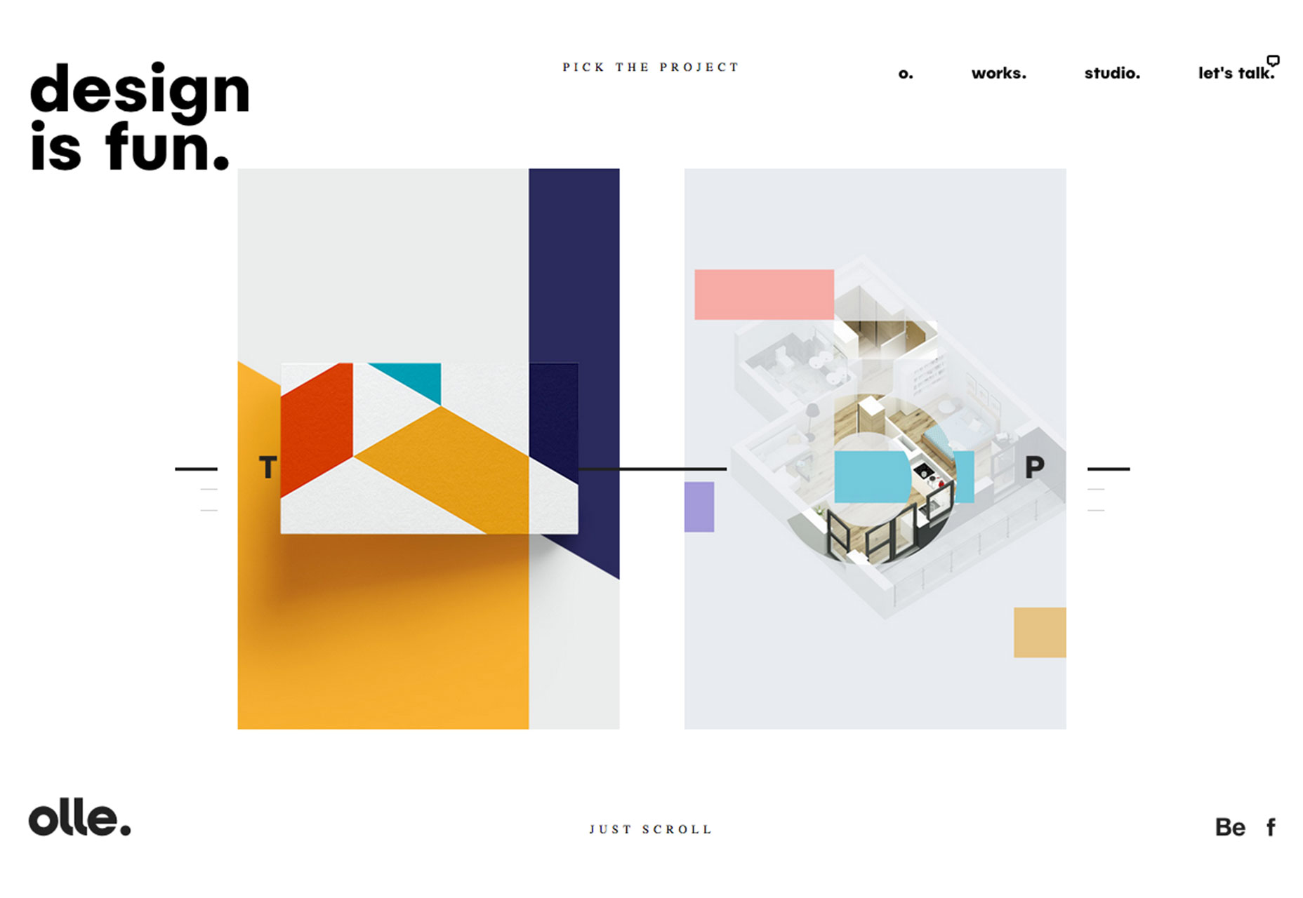
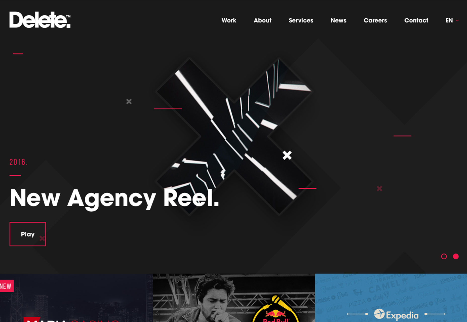
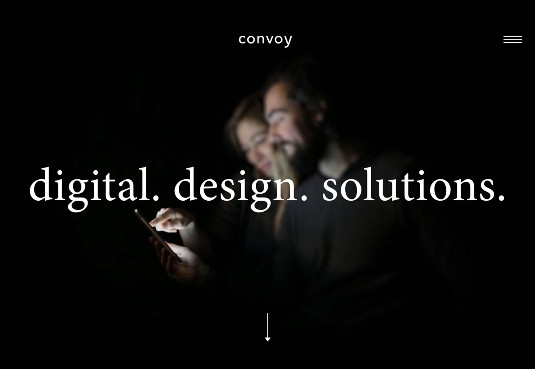
1. Lots of layered elements
Layered elements and three-dimensional effects are the must-have technique in the 2D web space. Thanks to the fun techniques, and even better how-tos, introduced primarily by Material Design, layered elements are popping up in projects of all types. What’s particularly nice is it gives a website a more realistic feel. The user can almost reach out and grab the elements on the screen. (And that’s a good thing!) The trick is that every layer should look real and light, and layers look natural. Here are a couple of ways to start experimenting with layers in your design projects:- “Lift” elements off the background with a simple shadow or animation. Olle does this with multiple elements on different planes, but they all pull together and look natural.
- Allow elements to intersect. Text can crossover into the space occupied by an image.
- Parallax scrolling features are an interesting way to create layered elements (a foreground moving over a background) without being too overwhelming.
- Use geometric shapes, animation and color variation to mimic depth in the design. Users should feel like they can almost fall into the visuals, such as the experience established by Delete Agency.
- Create layers by going outside of the canvas, with elements that go beyond the background or edge of the screen.
- Allow elements to rest on top of a textured background to create separation between the top layer (which users can imagine actually touching) and background layer.
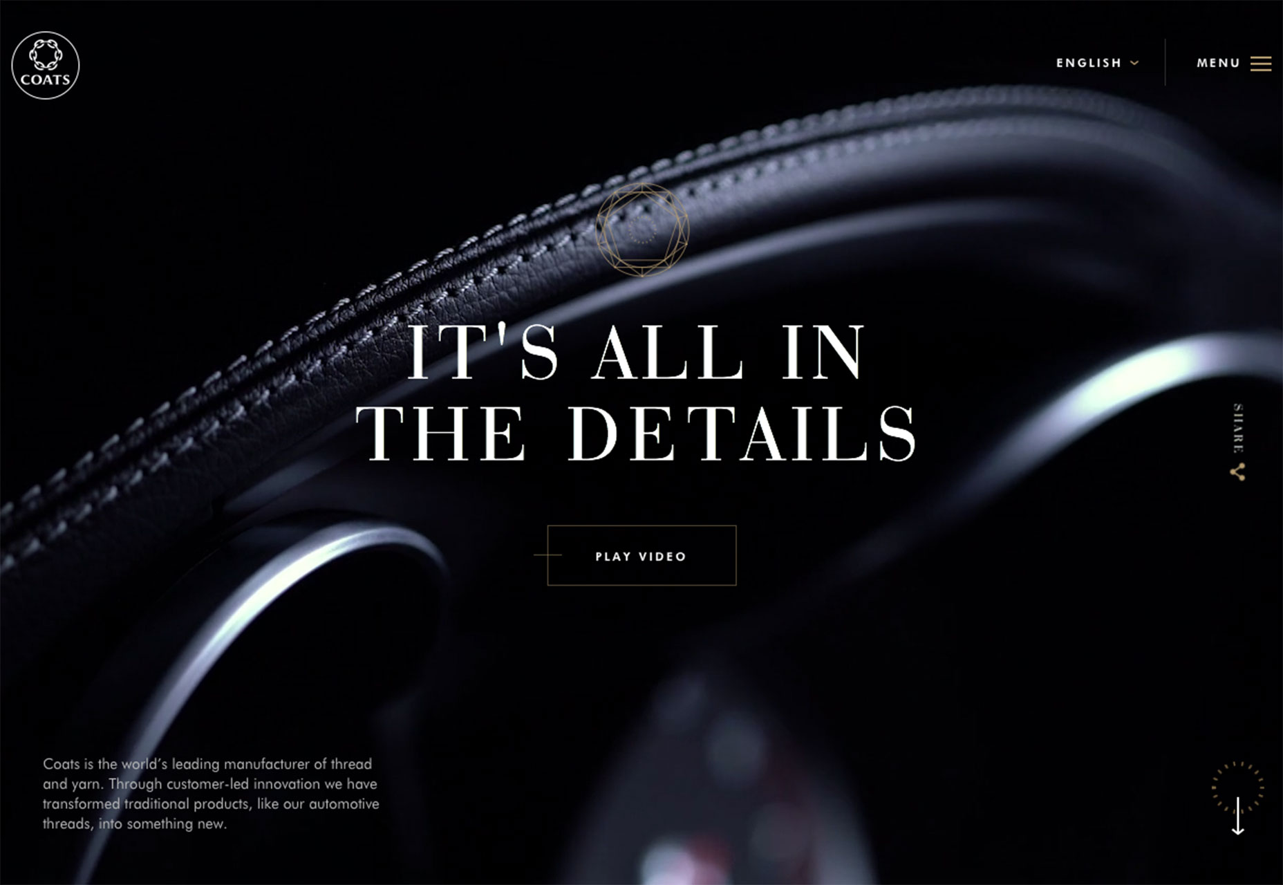
2. Dark color schemes
For a while it seemed like every website was a minimalist ideal, including a stark white background. That trend has shifted as more dark color schemes are emerging as the design favorite. And for good reason. A nice dark color scheme can be attention-grabbing and isn’t as harsh on the eyes of some users as bright white. On the flip side, dark aesthetics can be a little more troublesome if text is small or on smaller screens (so make sure to pay particular care to how elements render on mobile devices). Elements that really stand out on dark color schemes include the use of cool video and animation, even if it is hardly recognizable; bold white typography, pops of bright color to accent calls-to-action or important information and the appropriate overall mood. Remember as well, that dark doesn’t always mean black. Dark color schemes can be rooted in a variety of hues from reds to blues to greens. While black options are the most common, it is important to choose a rich black that is made from various color combinations. A flat black (or “K black” as print designers call it) will leave something to be desired in website design. When working with dark color schemes take special care to make sure there is proper contrast between elements and that colors and images don’t get lost inside the dark nature of the design. White can be a good option as well as other primary colors with a lot of brightness or saturation. Remember to think of size contrast as well. Consider bumping up the size of all text elements by 10 to 20 percent when working with a dark framework to ensure readability.
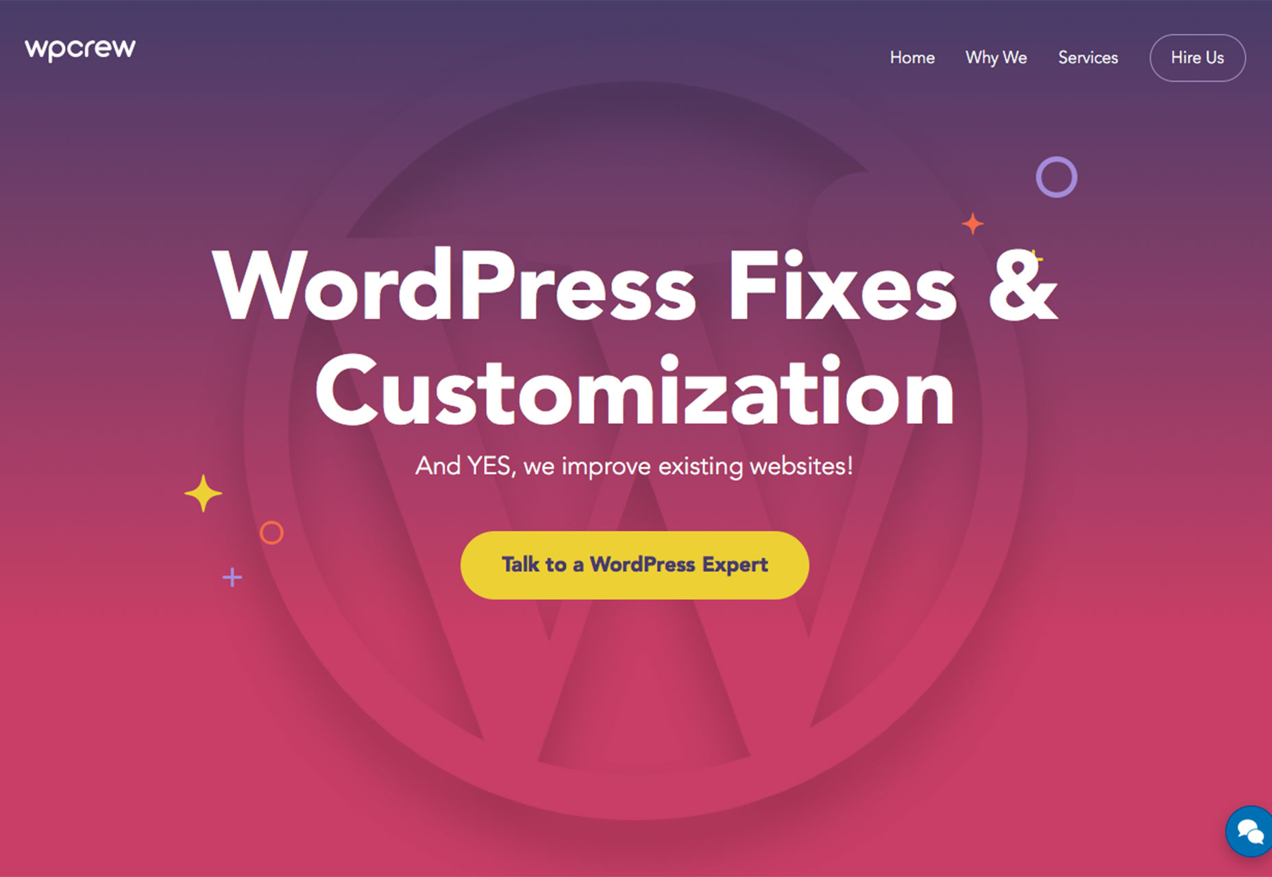
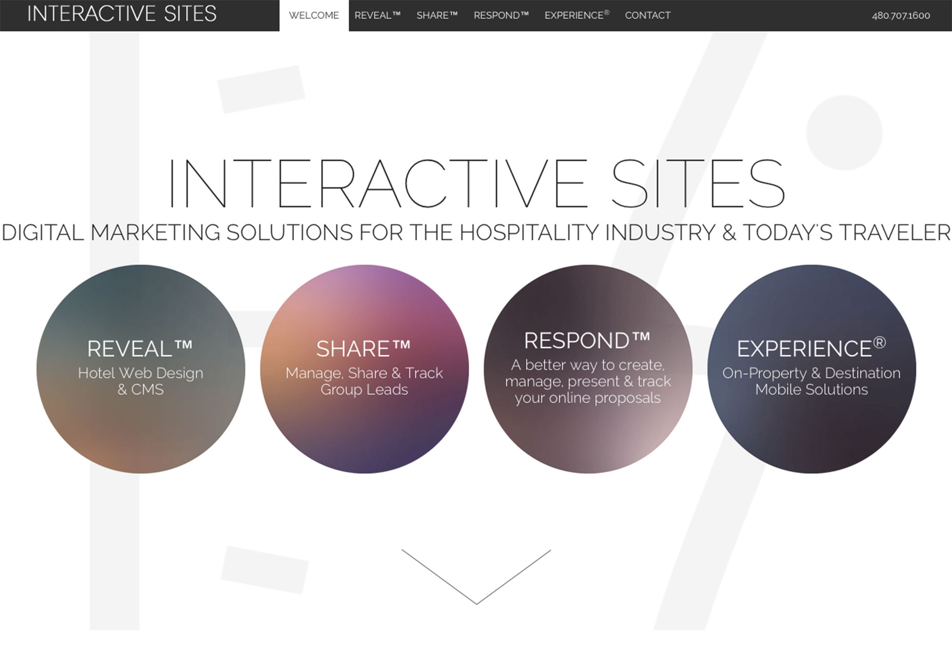
3. Gradients make a comeback
The gradient—one of the techniques shunned by flat design—is making a comeback. (And it’s even being used in mostly flat design patterns.) Gradients work because they do something that many people thought flat design lacked, which is to help create and establish depth. What’s new about gradients this time around is that they are not used to mimic textures or without purpose. Today’s trend focuses on bright-colored gradients that emphasize the content. From full-screen gradient overlays to backgrounds, almost anything goes when it comes to the technique… as long as it is bold. Designers are making the most of the gradient comeback in a few distinct ways:- Gradient-“flat color” pairs mix both design ideas for a bold look, such as the website for WPcrew.
- Two-tone gradients are a fun color overlay to add interest to a photo that might be somewhat lacking or to add depth to a background.
- While many of these gradients seem to be on a more grand scale, they are being used for smaller elements as well, such as buttons or to bring attention to specific content.
- Be wary of small gradients. Use in icons is still not recommended.
- Don’t overwhelm the content. A gradient overlay on a photo can be nice (just think of some of the cool effects that Spotify features regularly), but the photo still needs to be discernable.
- Bold color gradients tend to have a light, cheery feel. Make sure this meshes with your content.
- Pay attention to color combinations and contrast when it comes to readability. Some gradients can get light and white text can present a problem. Make sure to test readability against color, different responsive breakpoint and on multiple size devices. (With gradients, readability issues can sometimes pop up in places you wouldn’t expect.)
Conclusion
There’s nothing more fun than color when it comes to design. Trends in color are nice because they are elements that you can add to almost any style of design without a full-scale overhaul. The same is true of layered elements. This is a technique that can be added to an existing design to give it a more modern feel. What trends are you loving (or hating) right now? I’d love to see some of the websites that you are fascinated with. Drop me a link on Twitter; I’d love to hear from you.Carrie Cousins
Carrie Cousins is a freelance writer with more than 10 years of experience in the communications industry, including writing for print and online publications, and design and editing. You can connect with Carrie on Twitter @carriecousins.


Read Next

15 Best New Fonts, July 2024
Welcome to our monthly roundup of the best fonts we’ve found online in the last four weeks. This month, there are fewer…
By Ben Moss

20 Best New Websites, July 2024
Welcome to July’s round up of websites to inspire you. This month’s collection ranges from the most stripped-back…

Top 7 WordPress Plugins for 2024: Enhance Your Site's Performance
WordPress is a hands-down favorite of website designers and developers. Renowned for its flexibility and ease of use,…
By WDD Staff

Exciting New Tools for Designers, July 2024
Welcome to this July’s collection of tools, gathered from around the web over the past month. We hope you’ll find…

3 Essential Design Trends, July 2024
Add some summer sizzle to your design projects with trendy website elements. Learn what's trending and how to use these…

15 Best New Fonts, June 2024
Welcome to our roundup of the best new fonts we’ve found online in the last month. This month, there are notably fewer…
By Ben Moss

20 Best New Websites, June 2024
Arranging content in an easily accessible way is the backbone of any user-friendly website. A good website will present…

Exciting New Tools for Designers, June 2024
In this month’s roundup of the best tools for web designers and developers, we’ll explore a range of new and noteworthy…

3 Essential Design Trends, June 2024
Summer is off to a fun start with some highly dramatic website design trends showing up in projects. Let's dive in!

15 Best New Fonts, May 2024
In this month’s edition, there are lots of historically-inspired typefaces, more of the growing trend for French…
By Ben Moss

How to Reduce The Carbon Footprint of Your Website
On average, a web page produces 4.61 grams of CO2 for every page view; for whole sites, that amounts to hundreds of KG…
By Simon Sterne

20 Best New Websites, May 2024
Welcome to May’s compilation of the best sites on the web. This month we’re focused on color for younger humans,…