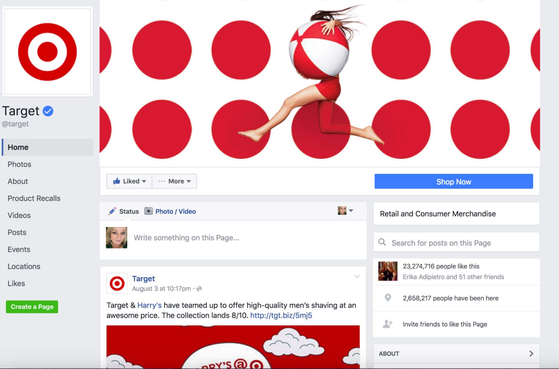
 The user experience drastically changes thanks to this redesign. The profile picture will not block a page’s cover photo anymore since the latter has been moved to the right. The cover photo after the redesign still retains the same dimensions: 828 X 315 pixels.
The striking, blue call to action button is now at the top right of the page, just beneath the cover photo. Businesses also enjoy more customization, as this call to action button can be configured to show exactly the kind of action the businesses want their customers to take. For instance, shopping at their retail site, watching a video, learning more about their product or service, or booking an appointment.
The theme of this redesign is a cleaner and more minimalist look. The removal of the right-side display ads greatly help with this appearance, as Facebook is attempting to make desktop business pages more consistent with the recent mobile updates for its Facebook pages from earlier this year.
As far as usability goes, the biggest improvement comes from the removal of the page tabs. Without the tabs, a business page now feels like a traditional site, with navigation down the left-hand side of the page. As a result, users should feel like they can navigate the entire page more efficiently as they browse from one section—such as About, Likes, Events and Events—to the next.
In the last several weeks, more and more users have already begun remarking on these changes. Most users should now be able to see the improvements to the redesigned business pages—Last week, a Facebook spokesperson asserted that this redesign rollout is almost finished. On August 3rd, the rollout was expanded; by this week, you should be able to see exactly what the new business page looks like.
Marc Schenker
Marc’s a copywriter who covers design news for Web Designer Depot. Find out more about him at thegloriouscompanyltd.com.
Read Next
15 Best New Fonts, July 2024
Welcome to our monthly roundup of the best fonts we’ve found online in the last four weeks. This month, there are fewer…
By Ben Moss
20 Best New Websites, July 2024
Welcome to July’s round up of websites to inspire you. This month’s collection ranges from the most stripped-back…
Top 7 WordPress Plugins for 2024: Enhance Your Site's Performance
WordPress is a hands-down favorite of website designers and developers. Renowned for its flexibility and ease of use,…
By WDD Staff
Exciting New Tools for Designers, July 2024
Welcome to this July’s collection of tools, gathered from around the web over the past month. We hope you’ll find…
3 Essential Design Trends, July 2024
Add some summer sizzle to your design projects with trendy website elements. Learn what's trending and how to use these…
15 Best New Fonts, June 2024
Welcome to our roundup of the best new fonts we’ve found online in the last month. This month, there are notably fewer…
By Ben Moss
20 Best New Websites, June 2024
Arranging content in an easily accessible way is the backbone of any user-friendly website. A good website will present…
Exciting New Tools for Designers, June 2024
In this month’s roundup of the best tools for web designers and developers, we’ll explore a range of new and noteworthy…
3 Essential Design Trends, June 2024
Summer is off to a fun start with some highly dramatic website design trends showing up in projects. Let's dive in!
15 Best New Fonts, May 2024
In this month’s edition, there are lots of historically-inspired typefaces, more of the growing trend for French…
By Ben Moss
How to Reduce The Carbon Footprint of Your Website
On average, a web page produces 4.61 grams of CO2 for every page view; for whole sites, that amounts to hundreds of KG…
By Simon Sterne
20 Best New Websites, May 2024
Welcome to May’s compilation of the best sites on the web. This month we’re focused on color for younger humans,…


