

Fabio Rocha
We start off with the portfolio of one Fabio Rocha. Really, I’m starting us off with an easy one. It’s nothing too complex, just simple, mostly-usable imagery and text in screen-wide sections. It’s pretty, the typography is good. Bonus points for another good use of yellow.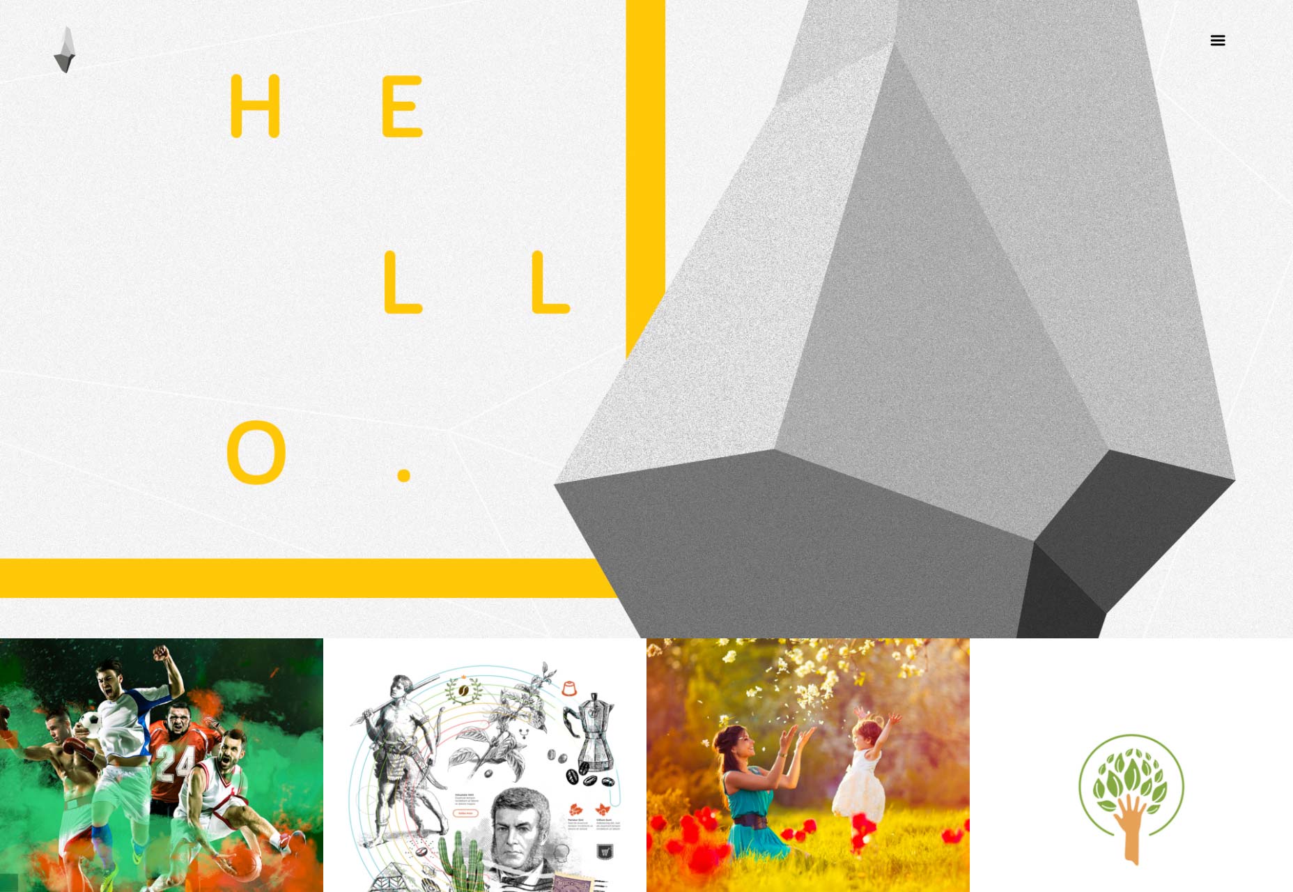
K Logic
And now I throw you into the deep end. K Logic is a marketing company’s portfolio site, and that’s as much as I can tell you. Oh, and their work is presented in case studies. The rest is all Hebrew to me. Literally. It’s worth a look. As a designer, I’ve been accused of making a design look too “box-y”. This shows us what a box-y site really looks like, and how well it can work. It’s also good for those of us who don’t work with RTL languages to see how other designers handle it.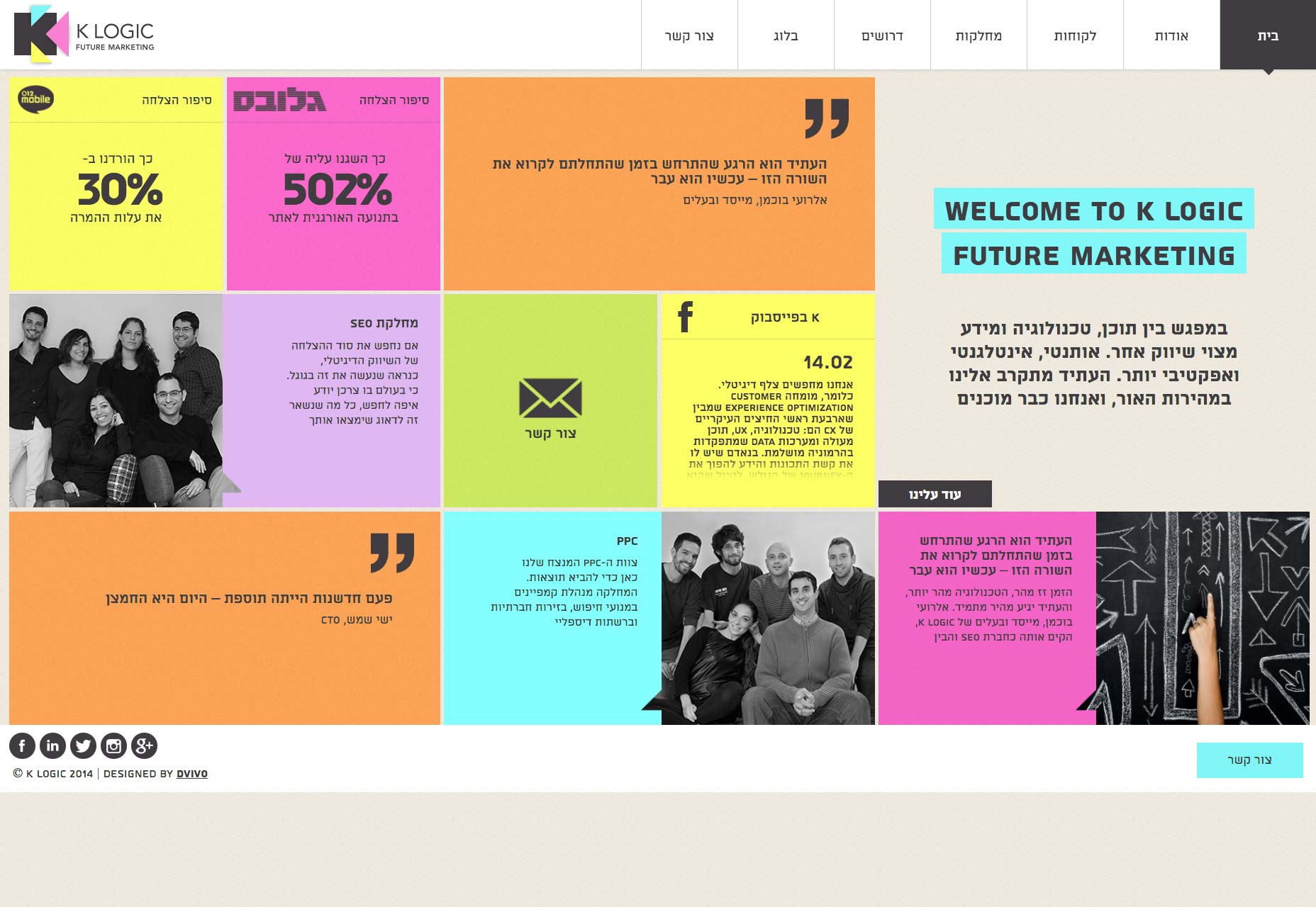
Goran Filipovic
Goran Filipovic’s portfolio is elegant and stylish, with great typography. Nothing too spectacular in the layout department, but then, it doesn’t need it. I’ll never be a fan of preloaders, especially the ones that just plain block your view if JS is turned off, but everyone who actually sees the site will be quite impressed.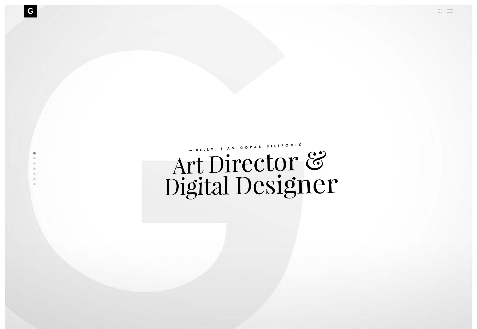
Leeroy
French Canadian agency Leeroy (which sadly has nothing to do with Leeroy Jenkins) brings us a more classic-feeling design with thin fonts, lots of black, and a generally minimal aesthetic. They might depend on animation a little too much, but it’s still a pretty site.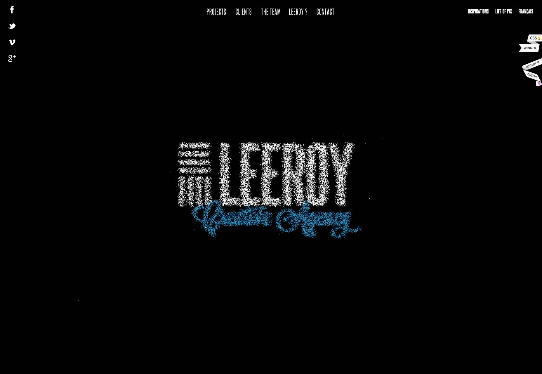
Trama Studio
I’m a sucker for good typography and diagonal lines on a website. Trama Studio gives us both in abundance, along with great usage of color. I’m starting to see the choice to go with a carousel for your portfolio as less of a ‘brave choice’ and more like something that’s bound to break eventually, but the aesthetics of this site hit me right in my soft spot for minimalism.
Mute
Mute brings us what is almost a classic feel these days, with decent type, a full-screen masonry layout for the portfolio, ands lots of illustrations. Nothing too new, but it looks great, and their work is as inspiring as their site.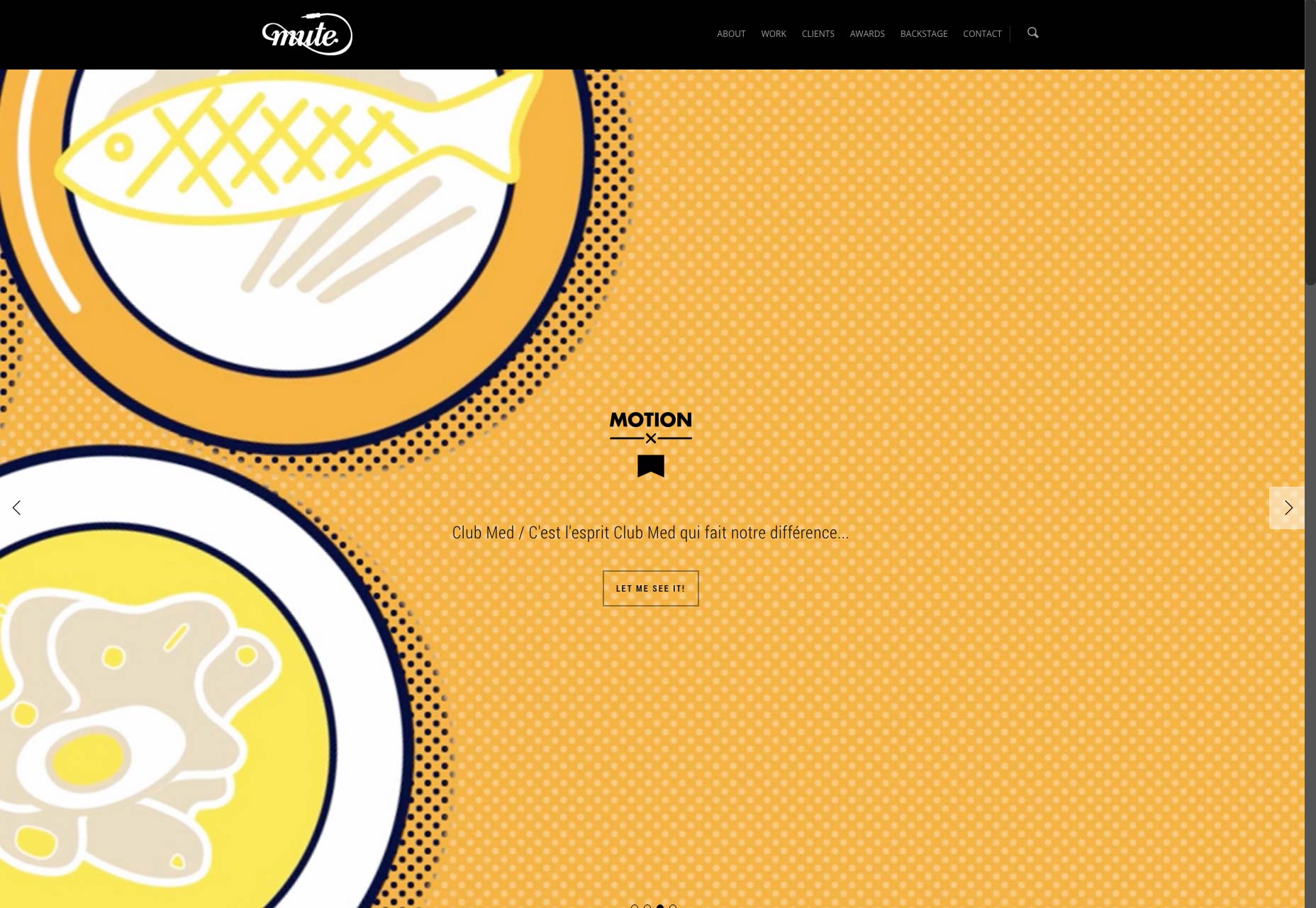
David Guba
David Guba gives us a master class in how to present a small amount of content without using huge text, or leaving the site feeling empty. It helps that his site does it all with style.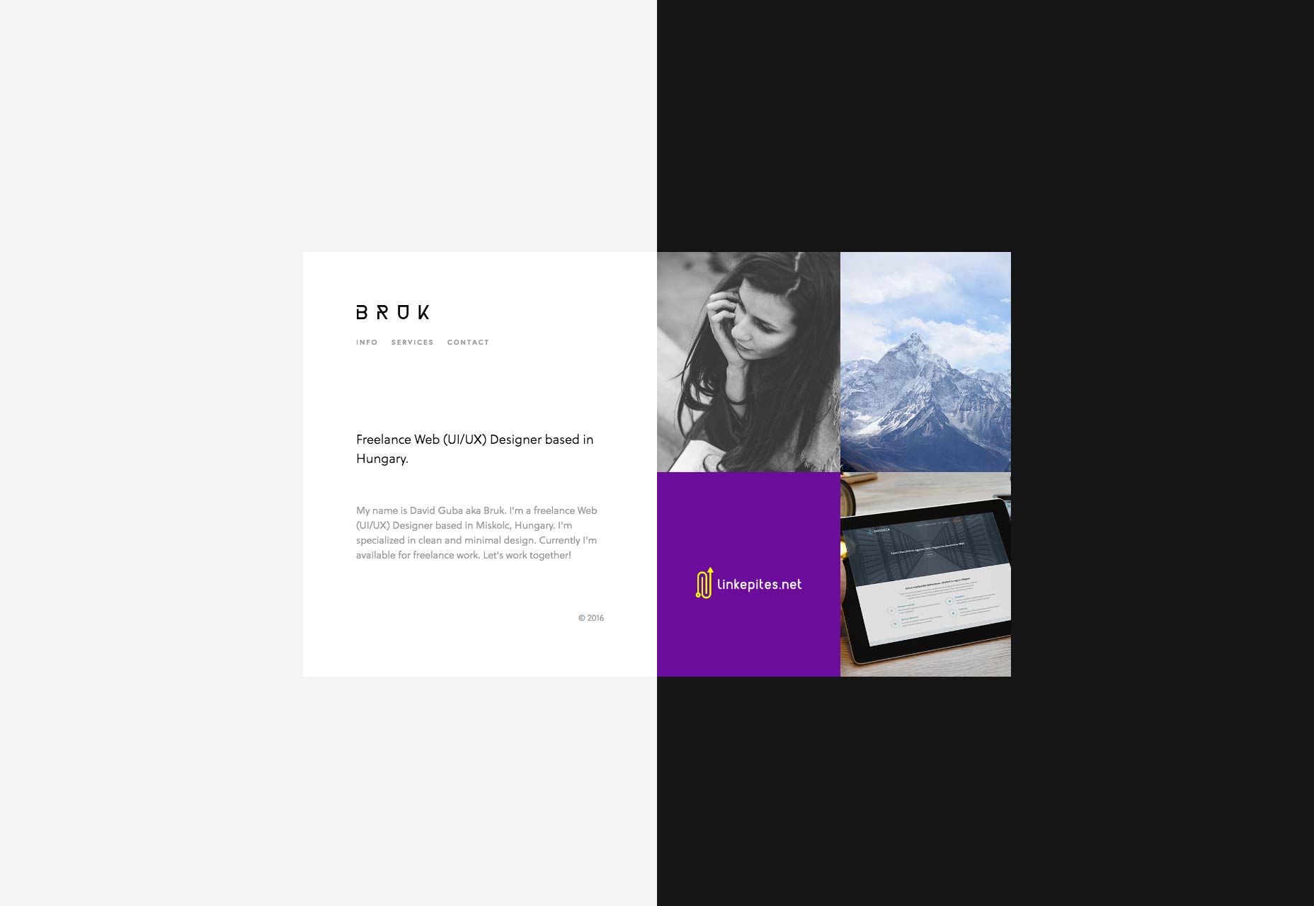
Tarful
Tarful is a web and app studio. Their site is a bit on the conventional side, but still has good UX, typography, and overall style. And they don’t depend on JS for literally everything! Take a lesson from them on those grounds alone, portfolio designers!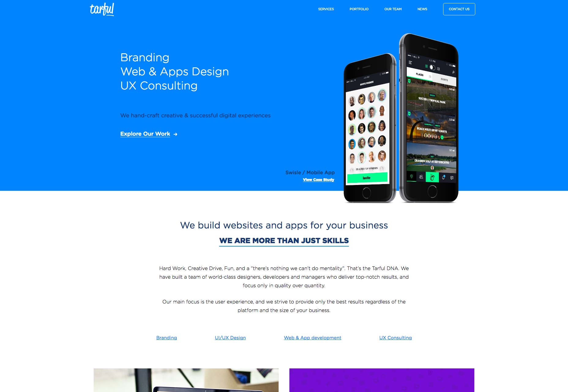
Cosme Faé
Cosme Faé’s portfolio is dead simple, but oh-so-pretty. Plus, this is one of the best examples of the partially-overlaying-text-on-images trend that I’ve ever seen. The contrast, and use of a proper display font truly works wonders. The pleasant aesthetic of that trend is not to be underestimated, but sometimes people forget the ergonomic aspect.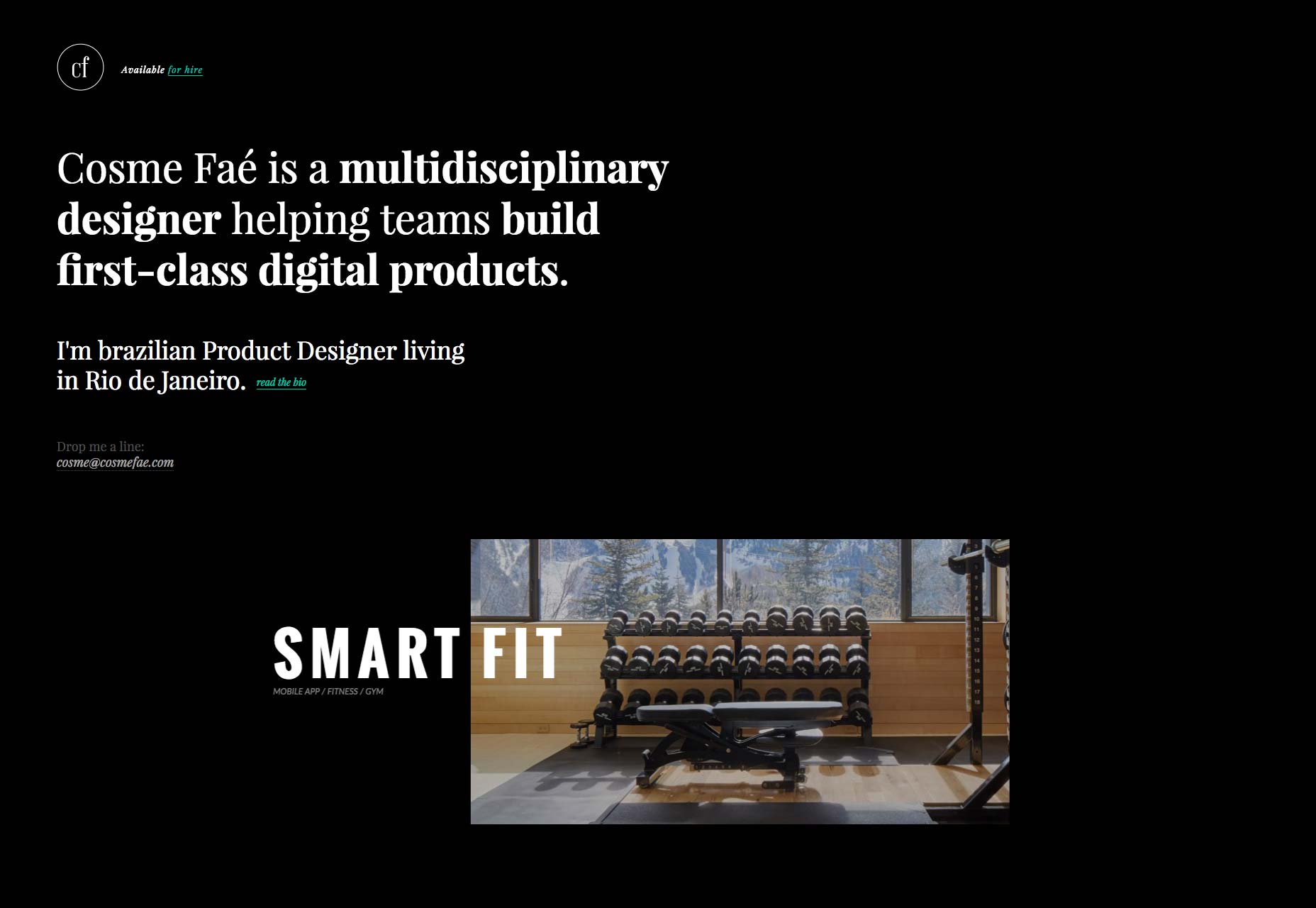
Mosaiko
Mosaiko takes a very… interesting approach to their portfolio. Most of their work was outsourced to them by other companies, so their actual portfolio is restricted by confidentiality terms. You have to request access to see it. That… does make me curious, but not enough to request access for myself. But then, I don’t need to hire them. The rest of their site is pure minimalist goodness. And I mean real minimalist.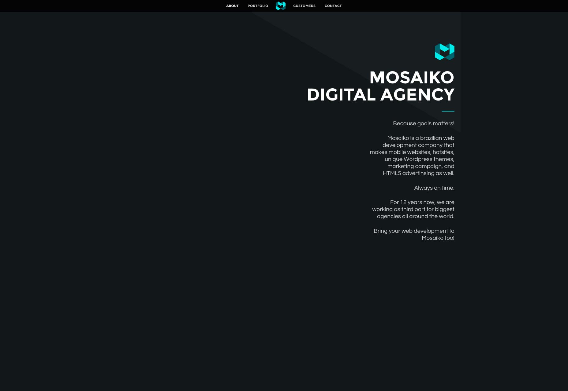
Shawn Park
If you’re going to put animation everywhere on your site, the animation and the site had better both be smooth and beautiful. Shawn Park pulls it off, though. Seeing how some elements worked actually made me curious to see more. I also kinda like the portfolio that can pop-over on any page when you click the link. That way, his work is the most easily-accessed part of his site, not even needing to load a separate page.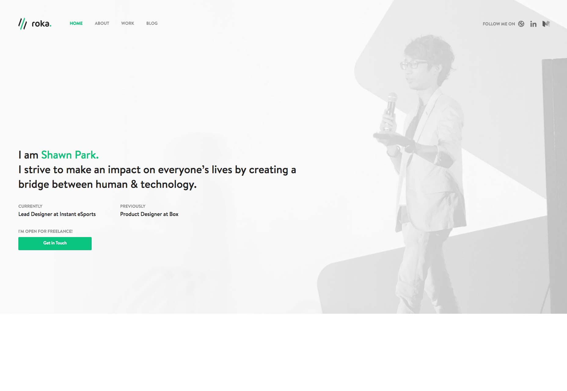
Kultar Singh
Kultar Singh’s portfolio is another of those “conventional but pretty” sites. Everything looks solid and professional, and I like the use of white space. There is the occasional odd use of asymmetry, but as a whole, it’s good, and worth a look.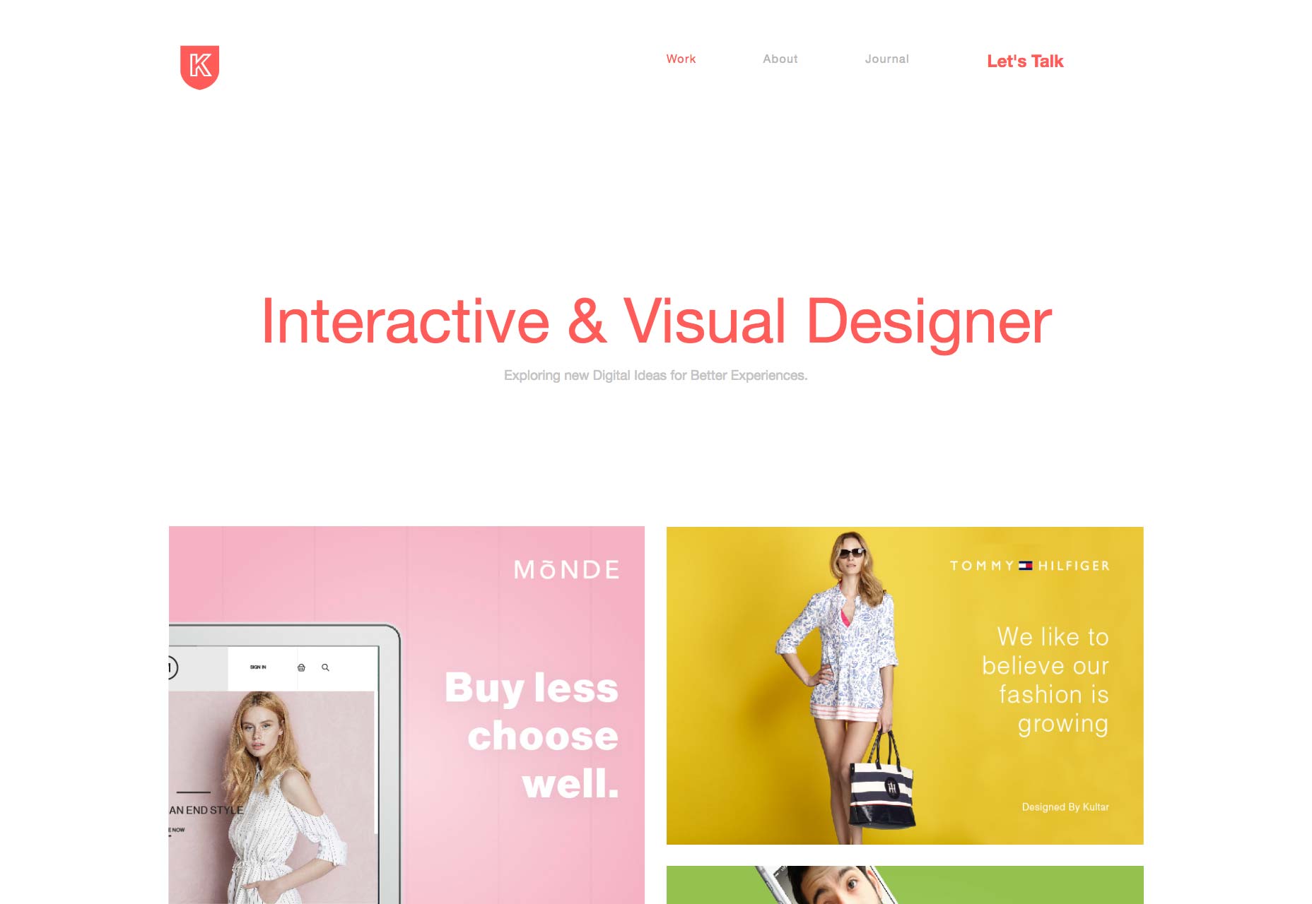
Convoy Interactive
Convoy Interactive makes a bold statement with its use of bright lime green in its navigational elements. While the rest of the site looks subdued, almost plain except for some asymmetrical flourishes, the bright green just begs to be clicked on. You know, once your eyes adjust.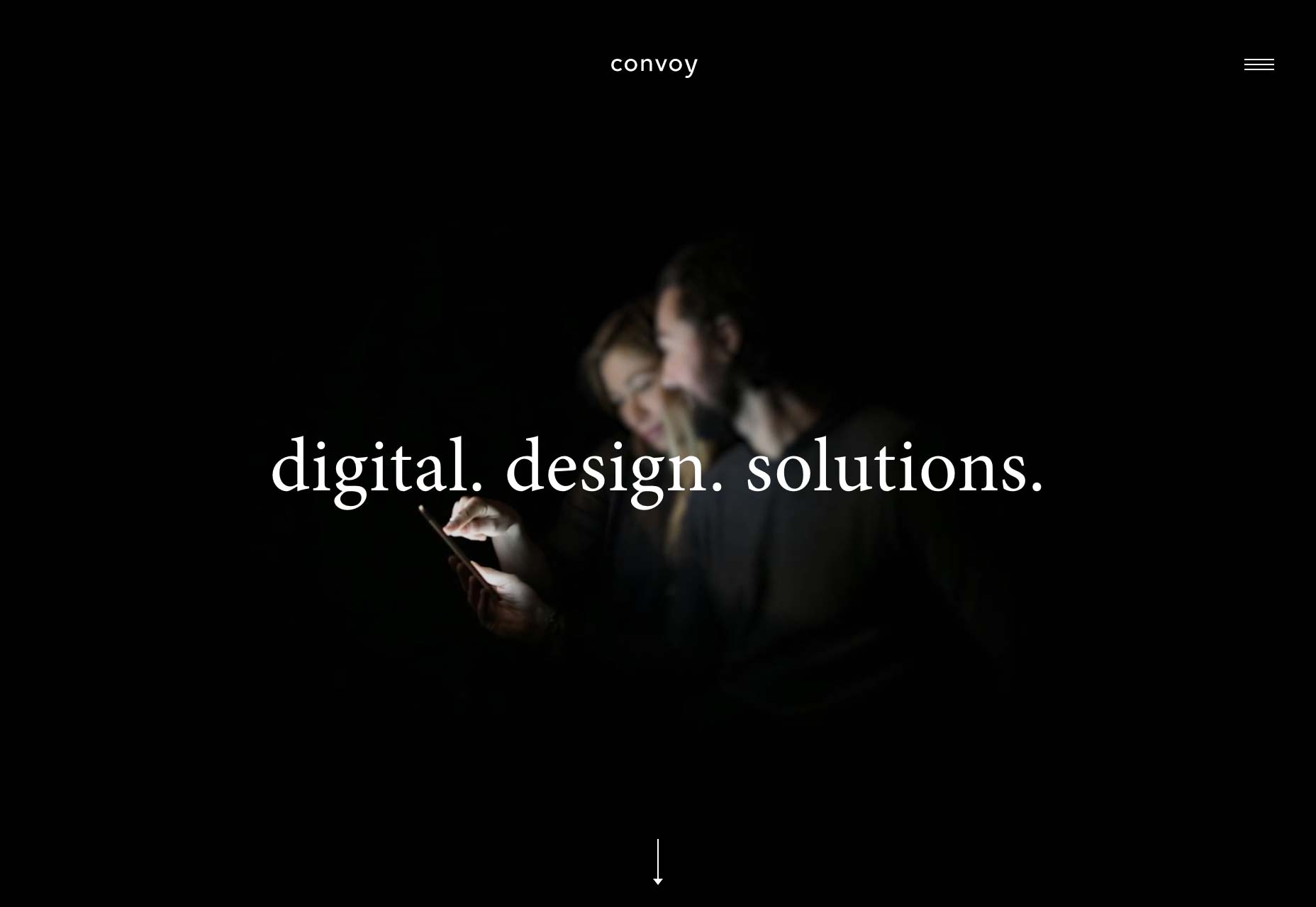
Lynn Schmidt
Lynn Schmidt’s portfolio brings us back into the world of post-modern design that looks really cool, but lacks usability. All the same, the site looks good, is somewhat surprisingly responsive, and is fun to explore. Click on photos to your heart’s content.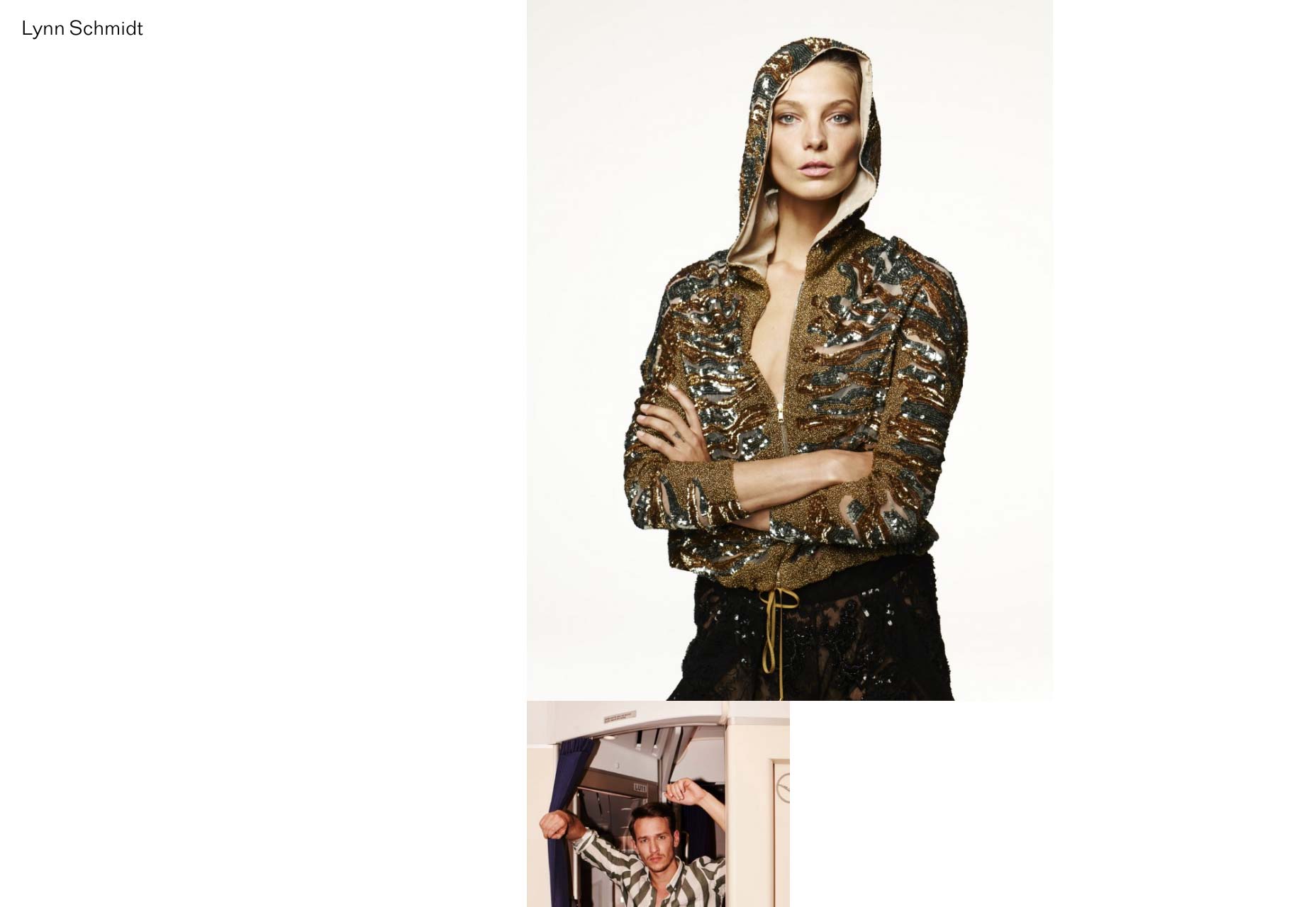
Claudia Doms
Claudia Doms’ portfolio is one of the cleverer ones on this list. The whole thing looks like a spreadsheet. In fact, it basically is a spreadsheet of her clients, and what she’s done for them. The main difference is that this one will open up a little to show off her work. Frankly, of all the sites on this list, I might like this one best. It’s very creative, mostly usable (once you get the idea), and fun to play with. The only big downside is that it’s not responsive. To be fair, I’m not sure how you’d make it responsive, and keep the theme, but there you go.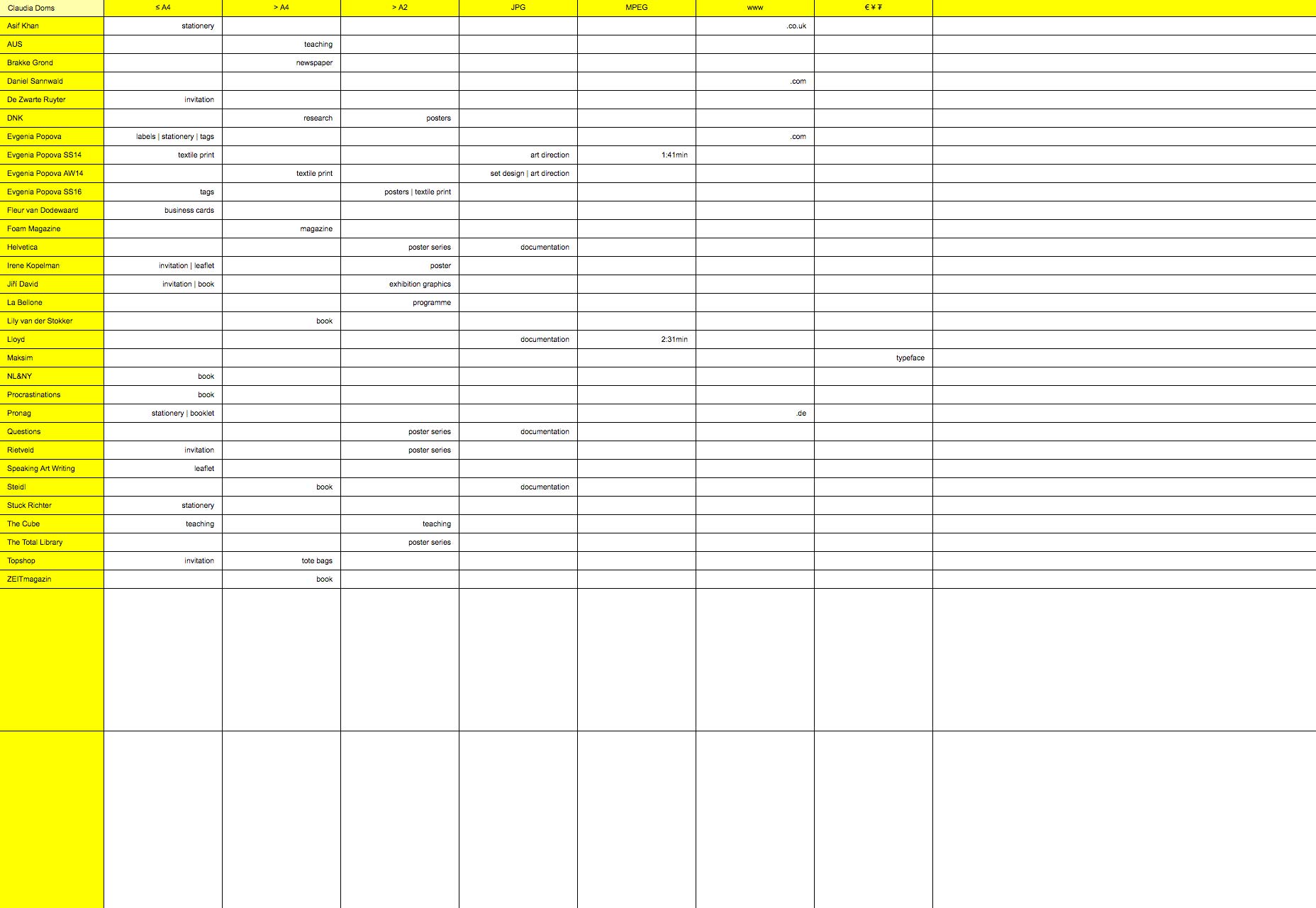
Velvet
The portfolio for Velvet is largely monochromatic, and a little abstract. If I had to describe the style, it would be “grown-up grunge”, or “millennial artsy type”. It’s the kind of aesthetic embraced by those who want to look professional, but also like they’ve kept their edge. It works, though, and is fun to explore. It’s a trip through some very artsy brains, that is still surprisingly usable.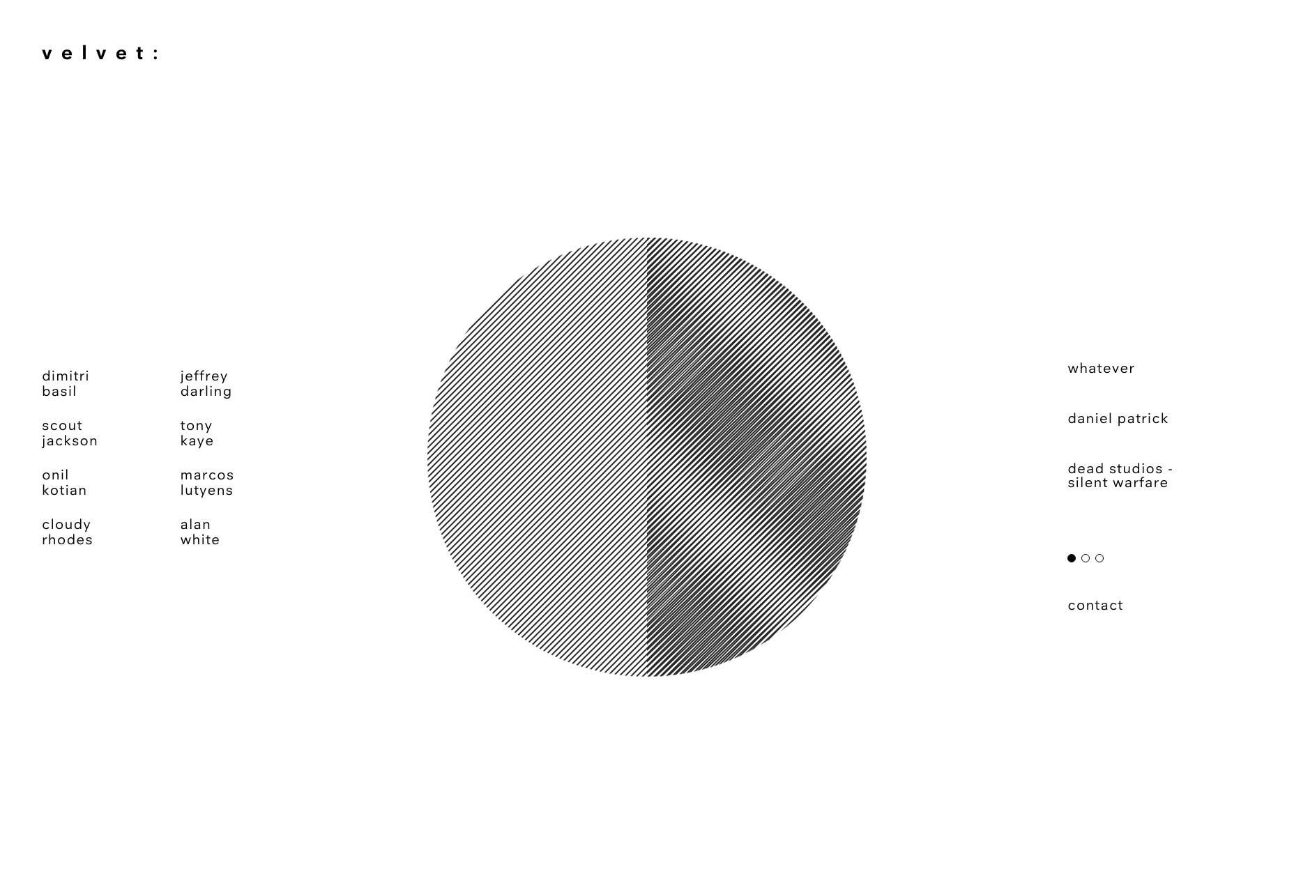
Abby Stolfo
Abby Stolfo’s portfolio is by far the most delicious-looking on the list… by default. It’s a food styling portfolio, after all. There are galleries, of course, but you can see the quality of Abby’s work in the design alone, because bits of food are used as decorative elements. And now I’m hungry.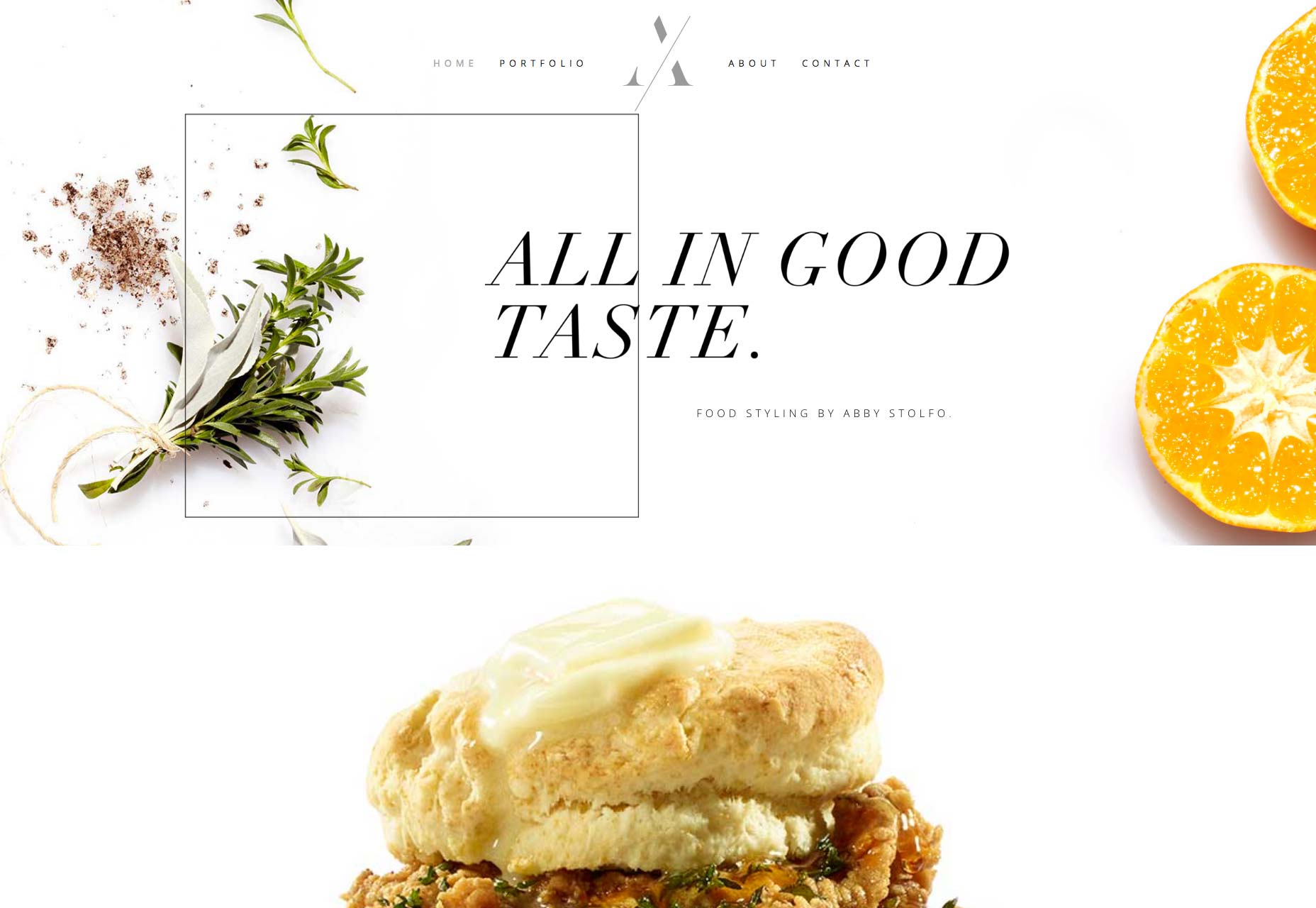
OUI R
OUI R (Get it?) throws you right into their work with a carousel. In keeping with this theme, each portfolio page is designed to be browsed horizontally. It certainly sets them apart, but might throw off a user or two. That said, it looks great, with good typography, a great use of white space, the whole thing looks modern and elegant.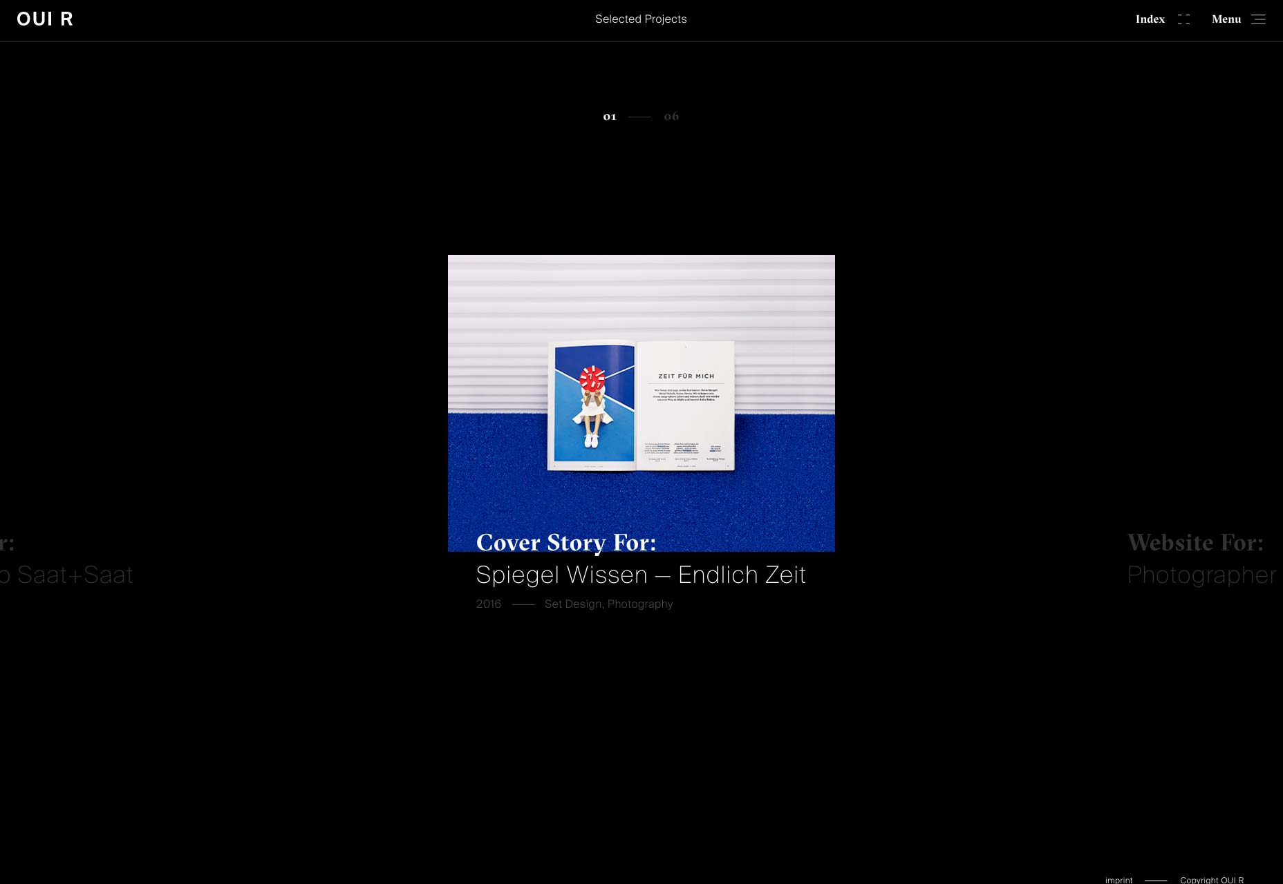
Jeremy Vitte
Jeremy Vitte’s one-page portfolio embraces the collage style, with portfolio pieces scattered seemingly haphazardly over the page. I kind of like the way you can see each project as a whole in a side panel. If you’re going to use JS for layout, might as well go all the way, right? The overall effect is both unassuming and professional, with a touch of that post-modern feel. It’s sort of saying, “Oh hi there. I’m just chilling with the work I’ve done for Vogue. Wanna see?”
Ben Pearce
Ben Pearce is a sculptor. I’d almost be disappointed if his site wasn’t minimal and post-modern. I’d take away points for the transition/preloading screens, but they’re actually kind of entertaining.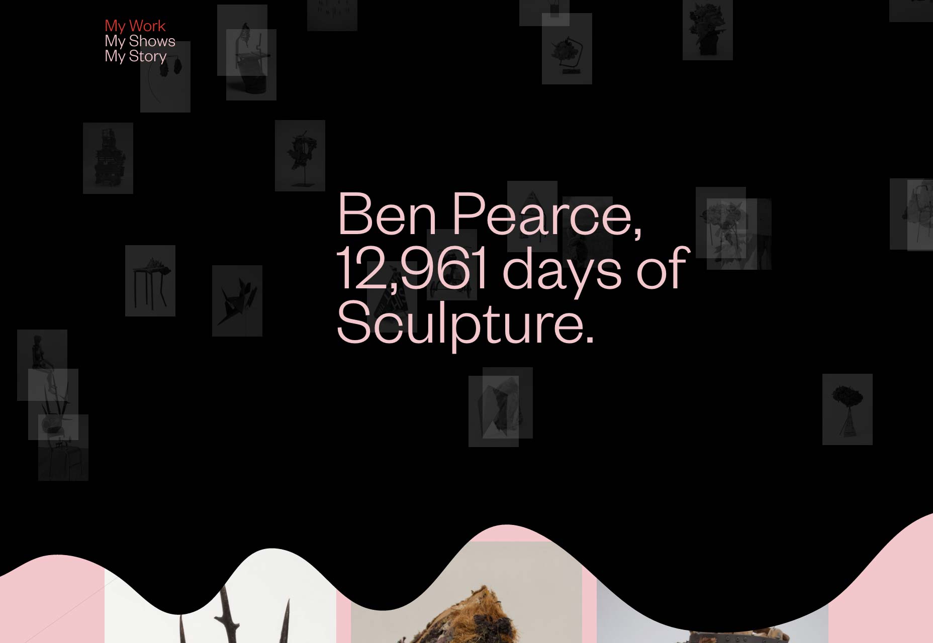
femmefatale
Design studio femmefatale goes even further by mixing elements of modern art into the design itself. Some of these are animated, and some aren’t, but it looks great. On top of looking great, the whole thing is kept simple and usable, which makes me very happy.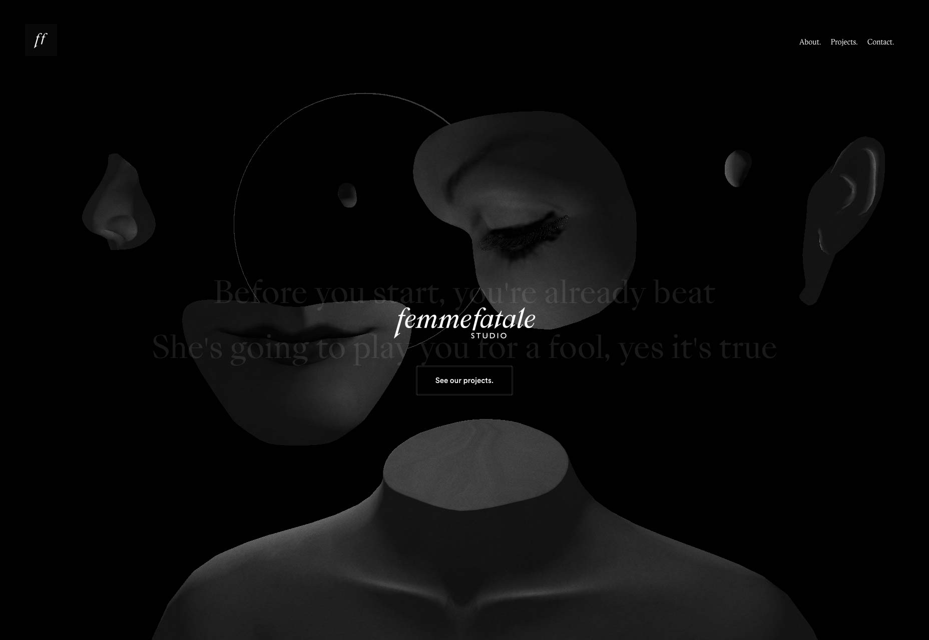
Rofikul Shahin
Rofikul Shahin’s portfolio brings us back to some more traditional, but no less impressive design. Solid type mixed with bold colors draws the eye without any gimmicks. It’s good, usable work. It’s a little weird, these days, to see a design that’s more adaptive than fluid-responsive, but that’s forgivable.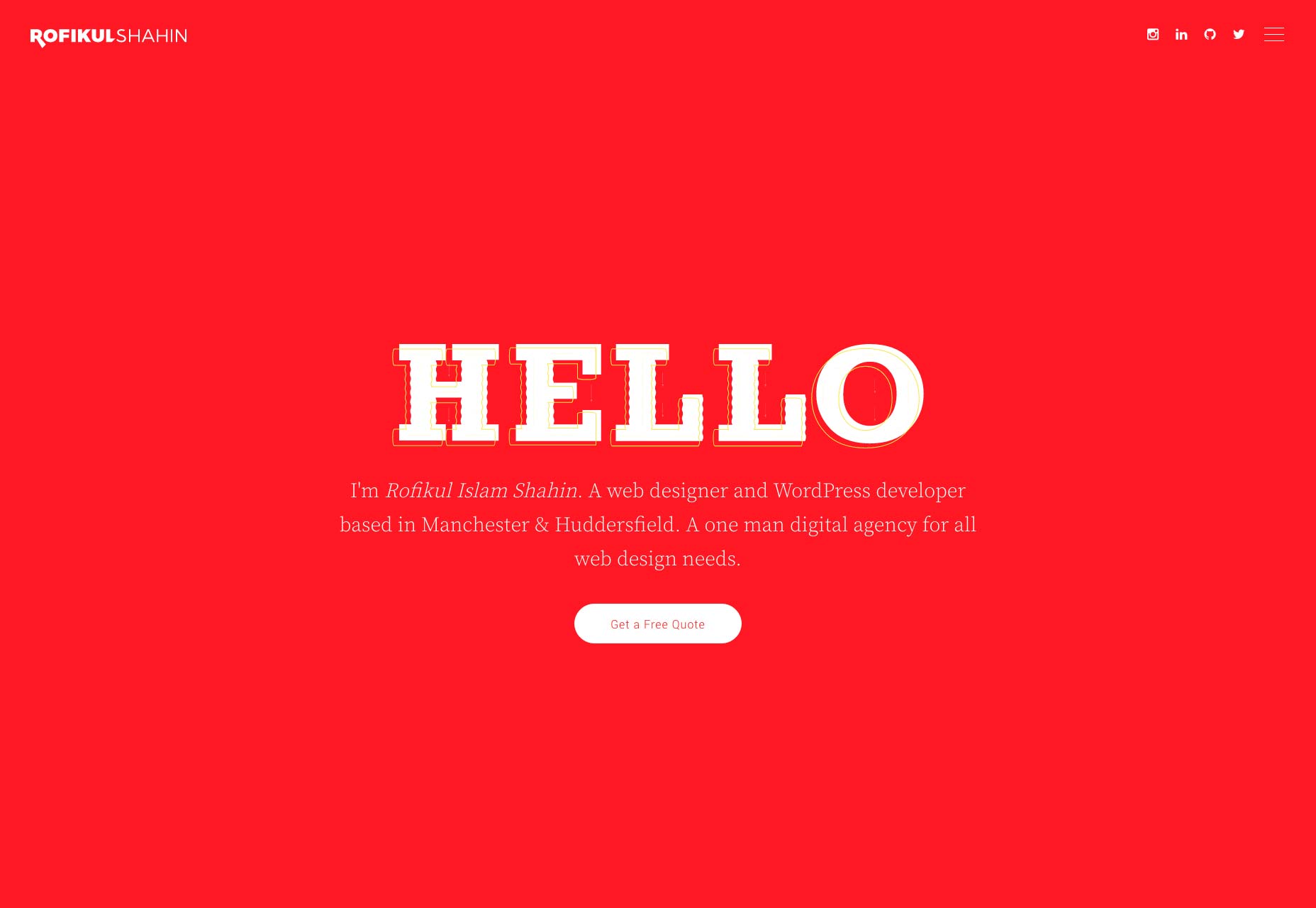
Peter Hol
Peter Hol’s one-page portfolio is part portfolio, part résumé, as it prominently features a timeline of his career so far. It’s a dead-simple site, with a mostly dead-simple design, and it’s easy on the eyes. It’s spiced up with only simple flourishes, like the stylized border on the left, and I like that.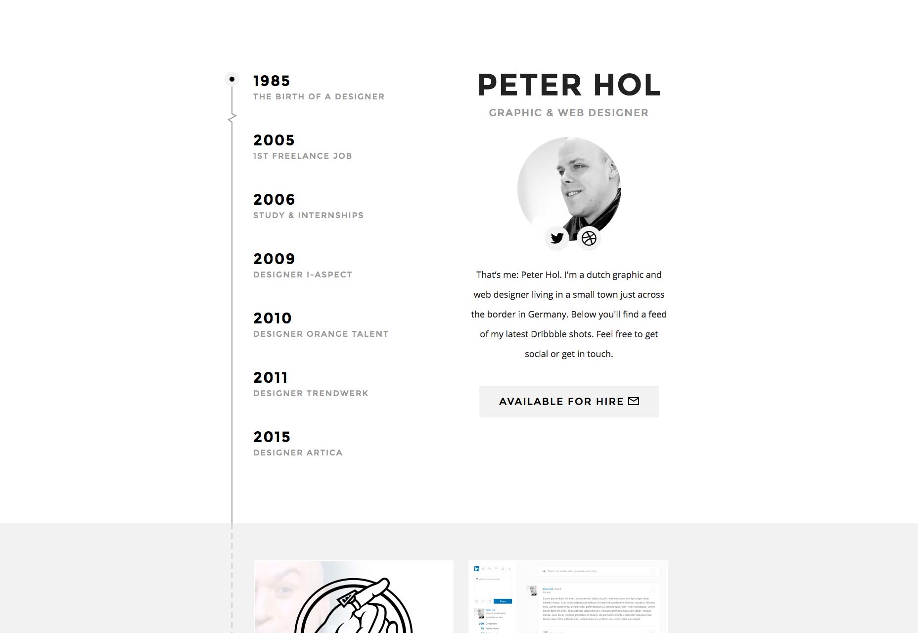
Ezequiel Bruni
Ezequiel Bruni is a web/UX designer, blogger, and aspiring photographer living in Mexico. When he’s not up to his finely-chiselled ears in wire-frames and front-end code, or ranting about the same, he indulges in beer, pizza, fantasy novels, and stand-up comedy.


Read Next

15 Best New Fonts, July 2024
Welcome to our monthly roundup of the best fonts we’ve found online in the last four weeks. This month, there are fewer…
By Ben Moss

20 Best New Websites, July 2024
Welcome to July’s round up of websites to inspire you. This month’s collection ranges from the most stripped-back…

Top 7 WordPress Plugins for 2024: Enhance Your Site's Performance
WordPress is a hands-down favorite of website designers and developers. Renowned for its flexibility and ease of use,…
By WDD Staff

Exciting New Tools for Designers, July 2024
Welcome to this July’s collection of tools, gathered from around the web over the past month. We hope you’ll find…

3 Essential Design Trends, July 2024
Add some summer sizzle to your design projects with trendy website elements. Learn what's trending and how to use these…

15 Best New Fonts, June 2024
Welcome to our roundup of the best new fonts we’ve found online in the last month. This month, there are notably fewer…
By Ben Moss

20 Best New Websites, June 2024
Arranging content in an easily accessible way is the backbone of any user-friendly website. A good website will present…

Exciting New Tools for Designers, June 2024
In this month’s roundup of the best tools for web designers and developers, we’ll explore a range of new and noteworthy…

3 Essential Design Trends, June 2024
Summer is off to a fun start with some highly dramatic website design trends showing up in projects. Let's dive in!

15 Best New Fonts, May 2024
In this month’s edition, there are lots of historically-inspired typefaces, more of the growing trend for French…
By Ben Moss

How to Reduce The Carbon Footprint of Your Website
On average, a web page produces 4.61 grams of CO2 for every page view; for whole sites, that amounts to hundreds of KG…
By Simon Sterne

20 Best New Websites, May 2024
Welcome to May’s compilation of the best sites on the web. This month we’re focused on color for younger humans,…