

Where did brutalism come from?
To fully understand brutalism in web design, we have to realize that its roots go back decades, to architecture and industrial design. It was very popular from the 1950s to approximately the mid-1970s and was popular with both institutional and government buildings, which is perhaps no surprise given that both types of buildings are sometimes associated with harshness, coldness and a certain kind of ugliness that’s far from comforting and easy on the eyes. In fact, brutalism as a word comes from the French for “raw,” which is another apt way of describing sites that are stripped-down and have no frills or aesthetic concern. Some people may call Brutalism a design trend, others consider it anti-design. The concept applied to web design only came to the fore recently, with the popularity of brutalistwebsites.com, a site devoted to showcasing the movement.Brutalist websites going viral
The trend was first picked up by Hacker News, but was quickly taken up by news sites including the Washington Post and CBC. Pascal Deville, creative director at a Zurich ad agency, started brutalistwebsites.com to show that designers and developers can still create engaging sites without having to use the long list of design best practices that many want to follow in today’s web. From this philosophy, we glean another insight into the approach of brutalism: It’s a sort of rebellion against the conventional way many designers approach designing for the web today. Interestingly, Deville makes the point that brutalism doesn’t just apply to the design of a site—it also applies to the backend work. In other words, to him, brutalism is just as much about the way a site is built, so if a site is a rougher, handmade, HTML site, that qualifies as brutalism, too. Brutalism is therefore a design and development approach that touches on all aspects of the site-creation process. Your site’s not really brutalist if it just has a really rough and raw look, but its code uses dozens of libraries. Similarly, your site can’t qualify as brutalist if it was handmade, but it has a very polished and attractive look that promotes all the best practices of corporate design.Well-known sites employing brutalism
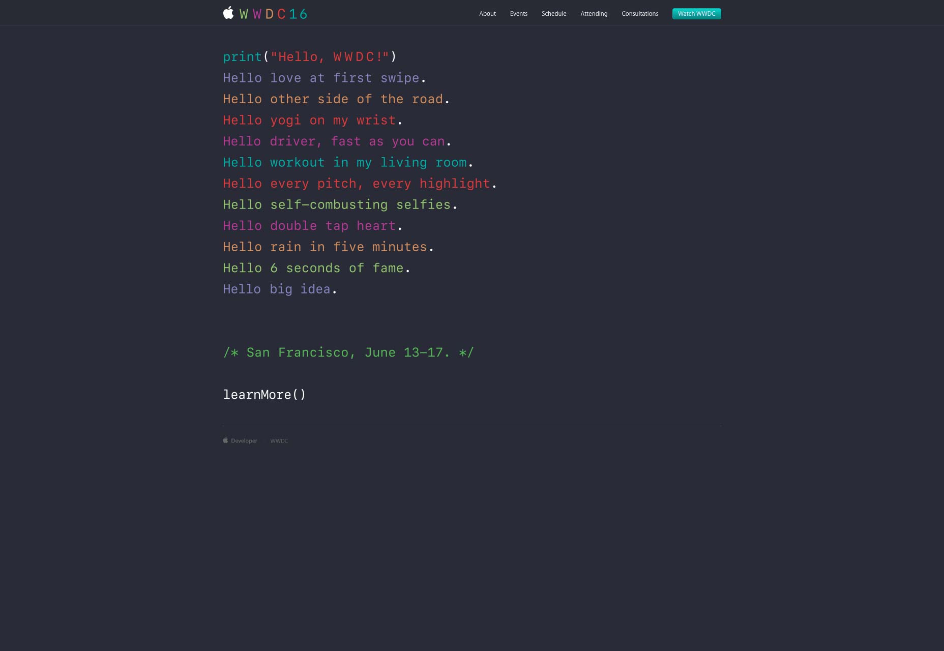
It might seem that Brutalism in web design is a relatively new trend, but actually it’s been a thing all along; it’s just that design journalists have now started taking it seriously. There are actually some well-known sites that have been proud standard bearers of this design choice for quite some time.Apple’s WWDC16
The website for Apple’s 2016 Developers’ Conference had what some would argue is a brutalist design scheme. This represents a further distancing from the old excesses of skeuomorphism. The site features:- a lot of negative (white) space;
- very plain typeface that’s designed to mimic lines of code;
- very few on-page elements overall.
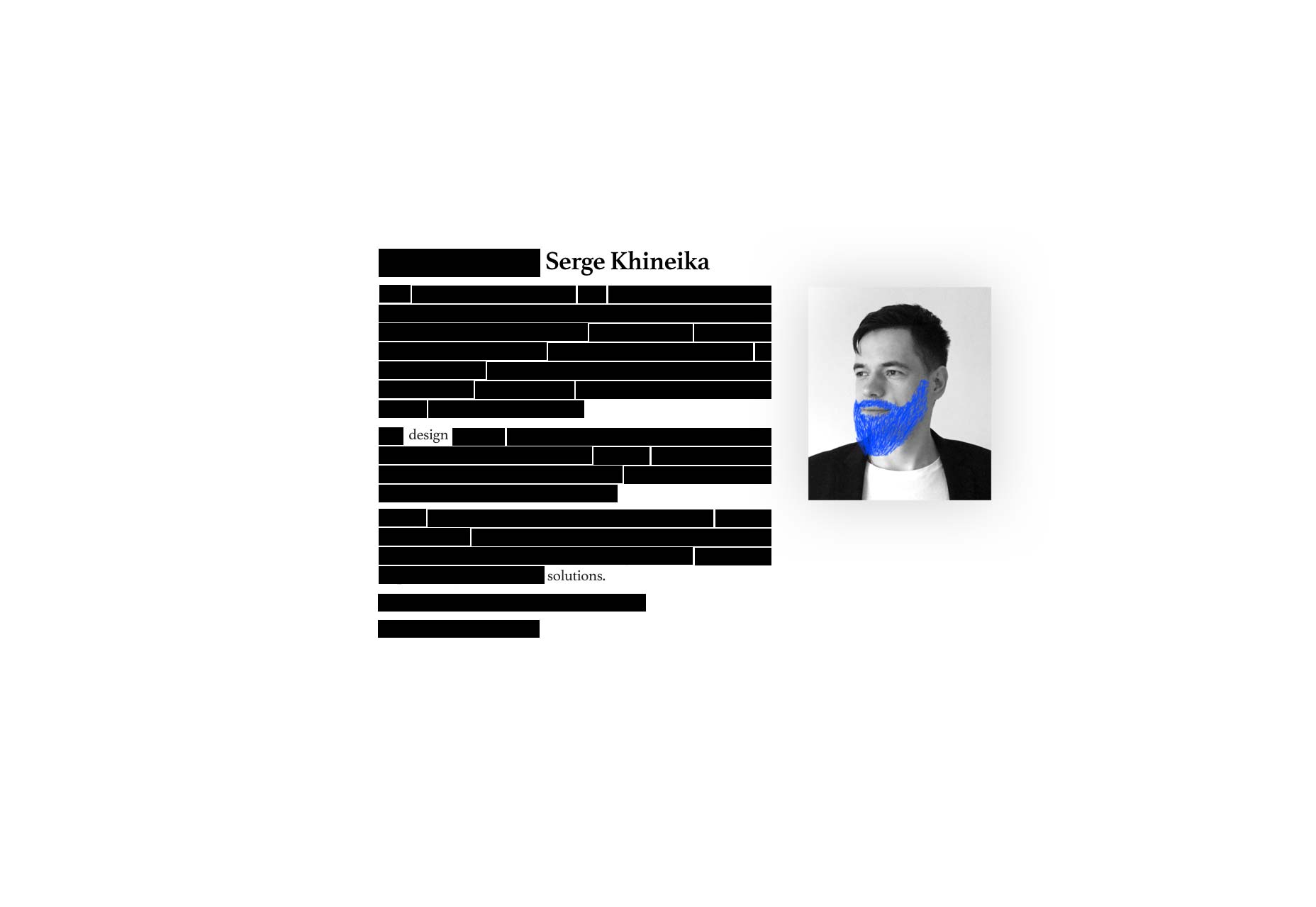
Serge Khineika’s Bio Page
Serge Khineika is a UX and web designer whose professional website has a very raw and crude appearance. Interestingly, it as a very neat scrolling effect that reveals more edits, doodles and page elements as you scroll down. His site has the following brutalist elements:- an enormous amount of white space;
- a very basic font style;
- one black-and-white picture;
- graphics meant to resemble old-school edits with a pen and paper.
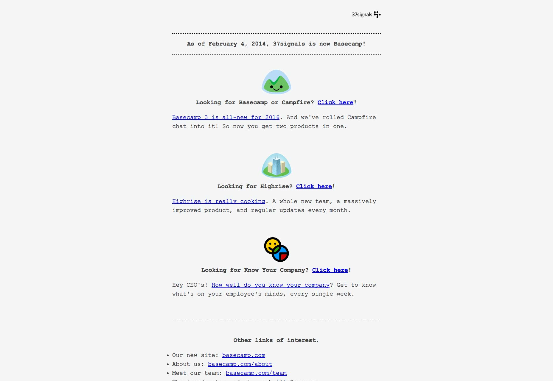
37signals
Basecamp is a web-application company that used to be known as 37signals. The 37signals site is another memorable example of brutalism in web design since it was so stripped-down and bare-bones that it went way beyond minimalism just to the very bare necessities. Here’s what made its old site a study in brutalism. It features:- a lot of white and negative space;
- ultra-simplistic typeface;
- very basic illustrations and graphics;
- very little text.
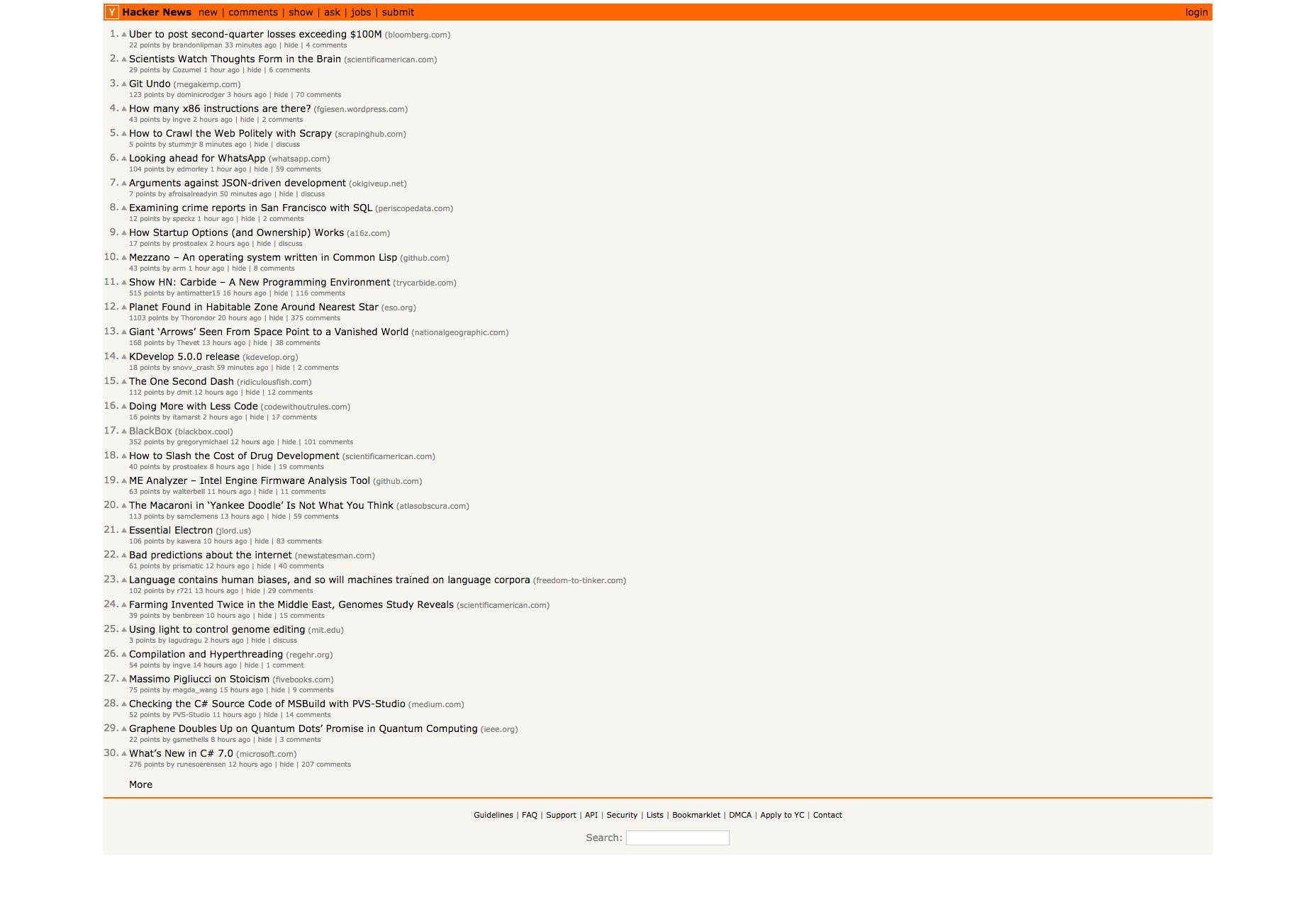
Y Combinator’s Hacker News
It’s highly appropriate that the site that caused the brutalism in web design trend to go viral, is also a brutalist site in and of itself! Hacker News is a no-frills, no-gimmicks site that delivers a raw, line-by-line page of trending topics with barely any color or consideration to aesthetics:- lots of white or negative space (even if part of it functions as a border);
- very small typography that’s so hard to read users have to practically squint;
- very simple navigation menu and footer;
- only three colors on the site.
Brutalism as a design choice
Brutalism in web design has been around for a long time, but it’s really exploded into the public eye in recent months. If we broaden things past web design and go into architecture, then this design approach has been around since the 1950s. What the body of evidence around brutalism makes clear, though, is that it is a design choice, above all else. It’s a knowing rejection of everything that’s attractive, easy on the eyes, and comfortable; and instead supports stark, raw ugliness in a sort of rebellion against design best practices that are meant to make us feel at ease and gives us something aesthetically pleasing. As a result, brutalism is compelling, if for nothing else than to provide an alternative to the safe confines of design conventionalism.Marc Schenker
Marc’s a copywriter who covers design news for Web Designer Depot. Find out more about him at thegloriouscompanyltd.com.


Read Next

15 Best New Fonts, July 2024
Welcome to our monthly roundup of the best fonts we’ve found online in the last four weeks. This month, there are fewer…
By Ben Moss

20 Best New Websites, July 2024
Welcome to July’s round up of websites to inspire you. This month’s collection ranges from the most stripped-back…

Top 7 WordPress Plugins for 2024: Enhance Your Site's Performance
WordPress is a hands-down favorite of website designers and developers. Renowned for its flexibility and ease of use,…
By WDD Staff

Exciting New Tools for Designers, July 2024
Welcome to this July’s collection of tools, gathered from around the web over the past month. We hope you’ll find…

3 Essential Design Trends, July 2024
Add some summer sizzle to your design projects with trendy website elements. Learn what's trending and how to use these…

15 Best New Fonts, June 2024
Welcome to our roundup of the best new fonts we’ve found online in the last month. This month, there are notably fewer…
By Ben Moss

20 Best New Websites, June 2024
Arranging content in an easily accessible way is the backbone of any user-friendly website. A good website will present…

Exciting New Tools for Designers, June 2024
In this month’s roundup of the best tools for web designers and developers, we’ll explore a range of new and noteworthy…

3 Essential Design Trends, June 2024
Summer is off to a fun start with some highly dramatic website design trends showing up in projects. Let's dive in!

15 Best New Fonts, May 2024
In this month’s edition, there are lots of historically-inspired typefaces, more of the growing trend for French…
By Ben Moss

How to Reduce The Carbon Footprint of Your Website
On average, a web page produces 4.61 grams of CO2 for every page view; for whole sites, that amounts to hundreds of KG…
By Simon Sterne

20 Best New Websites, May 2024
Welcome to May’s compilation of the best sites on the web. This month we’re focused on color for younger humans,…