

UI-friendly typography
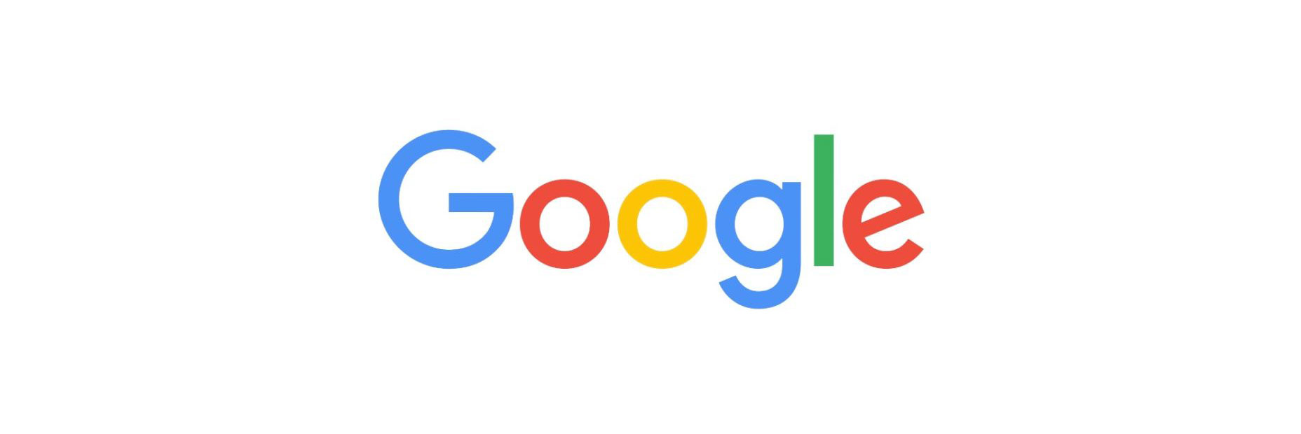
We’re interacting with multiple screens more than ever, and brands are realizing their logos must be scalable so they look great no matter what platform they’re viewed on. A great example of this was Google rebrand last September. Their logo was modernized to a sans-serif font. The product management Vice President of the company explained the change:We think we’ve taken the best of Google (simple, uncluttered, colourful, friendly), and recast it not just for the Google of today, but for the Google of the future.
Ombré
The traditional color gradient is now being replaced with stepped color increments. A gentle path is formed from A to B, and from a distance the logo looks like the colors flow from one color to the next. Ombré logo design allows for texture and pattern to be introduced to the design and helps define edges.Negative Space
This has been popular for many years, though it fell out of favor recently. In 2016 we see this trend re-emerging. Negative space designs traditionally incorporate subliminal messages. Negative space creates balance, in the design and adds a secondary dimension to help communicate the brand’s message to the customer without the use of words.Linked
Logos are great metaphors for what your brand stands for; using linked imagery describes your brand in an instant ad strong and connected. The visual representation a linked logo gives is extremely powerful. Today we are more linked than ever with others through the power of the internet, and brands are rightly using this analogy to strengthen their logos.Corners
The psychology of shapes is powerful, and audiences are influenced by the shapes we see. Squares and rectangles create an inner tranquillity. This is thanks to their natural conformity that we in society crave. These right angles show further that simplicity has returned. Four corners symbolizes unity of an organization, whereas a standalone corner can represent a house, an arrow encouraging movement from the user. Corners can be used in a manner of ways to express unique messages from brands.Line art
Line art was huge in 2015 and can still be seen today. Monoline designs use one solid line throughout the logo and they appear playful in nature as they echo days of childhood drawings. For 2016 the monoline logo has evolved into line dash design. These lines create a sense of motion and add a secondary dimension to the logos of 2015. Of course, in the days of technology designers must be careful when scaling these designs so as not to reduce the visible detail.Bars
Users engage with designs that incorporate rhythm well, as in our daily lives we seek rhythm so as to create meaning in the chaos. Logos that incorporate pattern bars connect with the customer as it gives them a sense of control; they know what is following. Much like the corner trend, the rectangular shapes of bar logos connote the solid structure of the organization.The 2016 logo landscape
Today’s consumers need logos to be designed ASAP—As Simple As Possible. Cut through the clatter of 21st century living with inspiring designs, that communicates your brand’s message clearly. Simplistic design is not about taking away design aspects, but rather clear messages through extremely considered choices.Melissa Lang
Melissa is freelance writer from Glasgow, Scotland. Melissa has a keen eye for all things design and is currently working with business branding experts and Professional Logo Designer, Repeat Logo.


Read Next

15 Best New Fonts, July 2024
Welcome to our monthly roundup of the best fonts we’ve found online in the last four weeks. This month, there are fewer…
By Ben Moss

20 Best New Websites, July 2024
Welcome to July’s round up of websites to inspire you. This month’s collection ranges from the most stripped-back…

Top 7 WordPress Plugins for 2024: Enhance Your Site's Performance
WordPress is a hands-down favorite of website designers and developers. Renowned for its flexibility and ease of use,…
By WDD Staff

Exciting New Tools for Designers, July 2024
Welcome to this July’s collection of tools, gathered from around the web over the past month. We hope you’ll find…

3 Essential Design Trends, July 2024
Add some summer sizzle to your design projects with trendy website elements. Learn what's trending and how to use these…

15 Best New Fonts, June 2024
Welcome to our roundup of the best new fonts we’ve found online in the last month. This month, there are notably fewer…
By Ben Moss

20 Best New Websites, June 2024
Arranging content in an easily accessible way is the backbone of any user-friendly website. A good website will present…

Exciting New Tools for Designers, June 2024
In this month’s roundup of the best tools for web designers and developers, we’ll explore a range of new and noteworthy…

3 Essential Design Trends, June 2024
Summer is off to a fun start with some highly dramatic website design trends showing up in projects. Let's dive in!

15 Best New Fonts, May 2024
In this month’s edition, there are lots of historically-inspired typefaces, more of the growing trend for French…
By Ben Moss

How to Reduce The Carbon Footprint of Your Website
On average, a web page produces 4.61 grams of CO2 for every page view; for whole sites, that amounts to hundreds of KG…
By Simon Sterne

20 Best New Websites, May 2024
Welcome to May’s compilation of the best sites on the web. This month we’re focused on color for younger humans,…