I love designing event websites. They’re ephemeral and almost always simple (no complex user interfaces here). This combination affords us a unique opportunity to test new boundaries of web design, to try a creative navigation pattern, test an unfamiliar layout, play with a interesting animation library or, dare I say, hark back to the days of Flash and ActionScript 3.
Here, I've assembled a list of 10 event websites that are creative, inspirational and just downright beautiful. Check them out below.
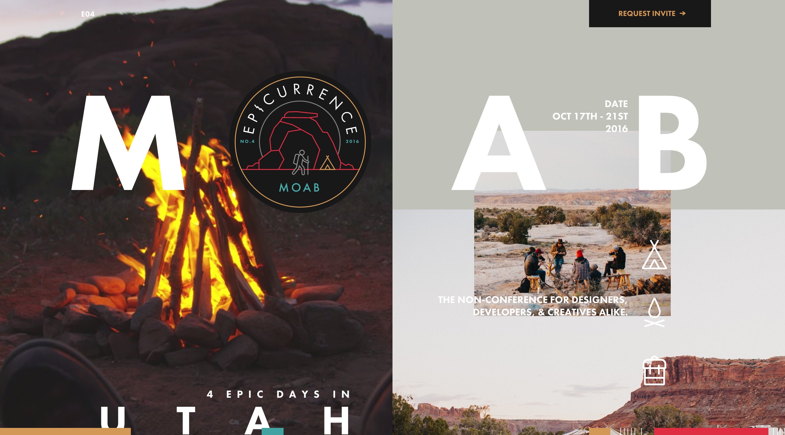
Epicurrence
This website for a 4-day, invite only designer/developer meetup in Moab, Utah (where do I get an invite?) is downright stunning. The graphics are beautiful; the layout is exciting. And special props for making the registration form look good, too–why do we so often create awesome websites but boring forms?
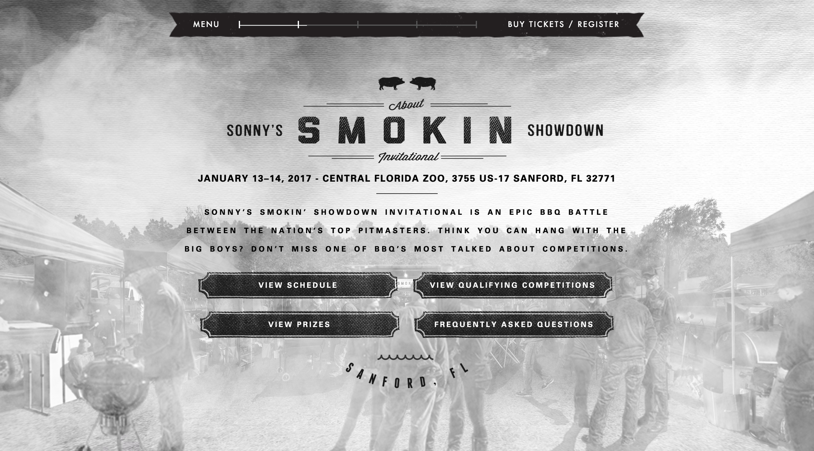
Sonny’s Smokin’ Showdown
This BBQ competition might be low tech event, but their website is pretty high tech. Scroll down to explore the event venue three-dimensionally. There’s overlayed text, but you hardly need it. The complex visuals tell you all about the event without reading a word. Great work Sonny’s Smokin’ Showdown.
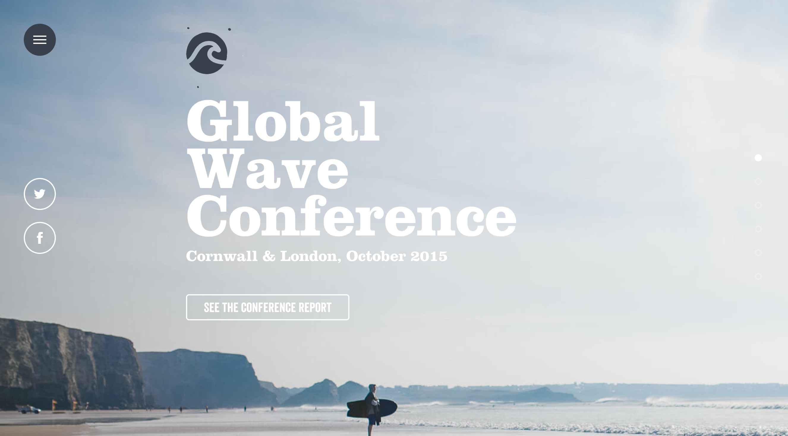
Global Wave Conference
Restraint is often the sign any great creative professional, a philosophy that was embraced warmly by the Global Wave Conference website. Check out the subtly (but cleverly) animated logo (a GIF) and hamburger menu (an SVG), which give the site a high-end feel without distracting from the serene photography and typography.
I also liked the clear, concise event description, a must for any newer event.
Festibiere
Two words: sticky header. This may not be the most cutting-edge site on the list, but the navigation is terrific. And particularly with event websites, a sticky header (with a clear, contrasting call to action button to “register now”) can be a great way to increase your conversion rate and ticket sales. Whatever you do, don’t make this button hard to find.
Note this event occurs twice annually — once in the summer and once in the winter. Navigate to summer (top left) and you’ll see that the designers have done a great job creating different sites for each event. The sites they have very similar interfaces, but are nicely distinguished and appropriately seasonal.

Loop
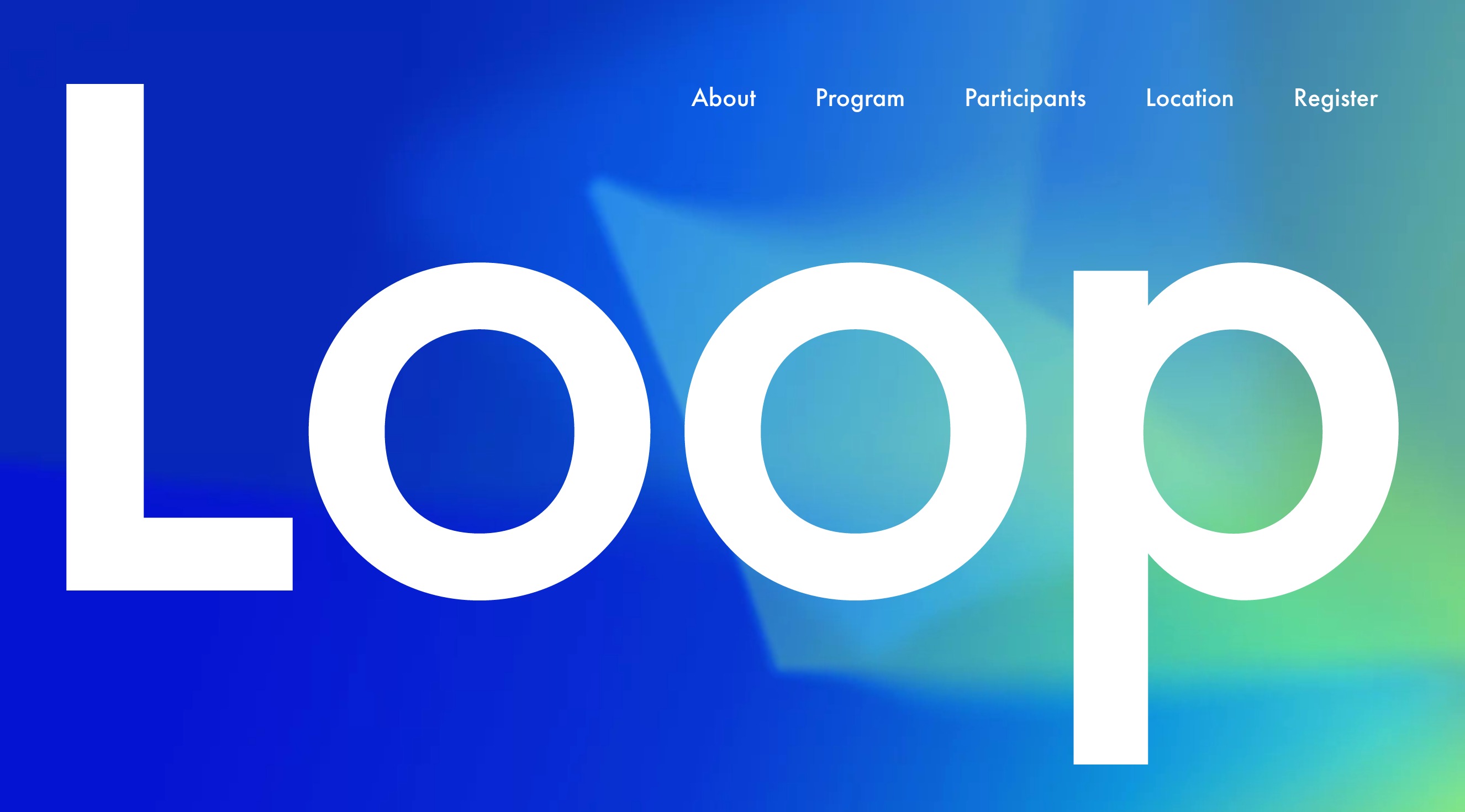
Large type Futura can be tricky to pull off without reminding us of a Volkswagen ad, but the website for Loop pulled it off. Loop is a three-day conference focused on music and technology. The site is inconspicuously simple but downright beautiful.
I loved the body copy gradient too, which is a mask of the homepage background gradients. (For those interested, text gradients can be achieved with CSS using the background webkit clip property.)
Structure
Thanks to some very creative designers (and the JQuery UI draggable library), this Norwegian event website is a digital representation of the event’s more analogue concept: shapes juxtaposed in space. My only suggestion: give me something to do after browsing the website. Ask me to register, capture my email, send me directions, and don’t leave me wanting more.

Valio Con 2016
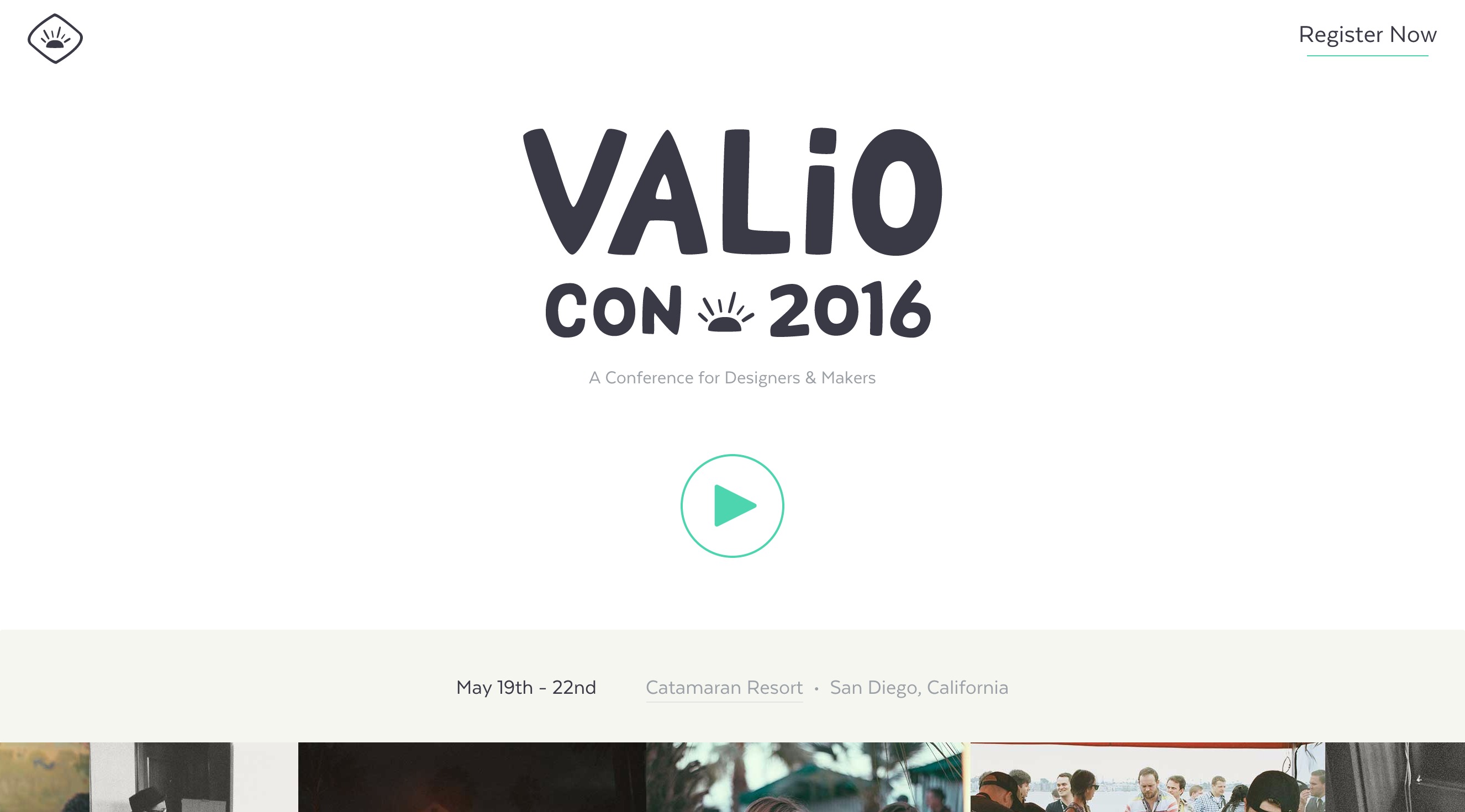
When you’re assembling photos for an event, the speakers will inevitably send you 34 different portrait styles: you’ll get a closeup, one in black and white, and one with the speaker holding their favorite cat. This makes consistency difficult. Fortunately, the designers for ValioCon — an annual conference for designers and makers in San Diego — have answered this challenge with creative photo filters that homogenize the portraits, and make the overall design feel more far consistent (and awesome).
Bloomberg BusinessWeek Design 2016
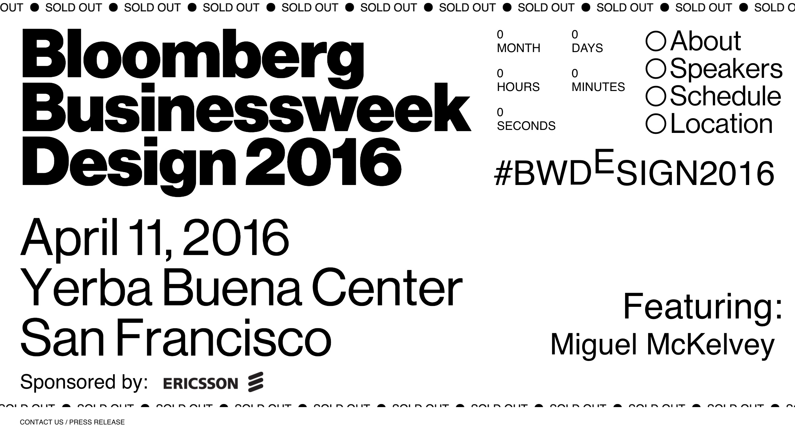
When I first saw this site, I couldn't help but thank god for not being color blind. I mean, how the hell are we supposed to know where to click if every link is the same color? This creative site for the Bloomberg BusinessWeek design conference--which features bold typography and a strong, engaging layout--seems to vehemently ignore every user interface guideline in the book, yet it remains easy to use. Kinda.
Elevate Summit
The Elevate Summit, formerly UserConf, is a conference for customer support and community managers and will be held in October this year. Their event website stands out for being exceptionally clean and beautiful. I liked the “5 reasons to attend” listing (which was pretty convincing) and the embedded registration form. I loved the chat button; I don’t see that often on event websites, but I think it’s a great way to engage attendees.

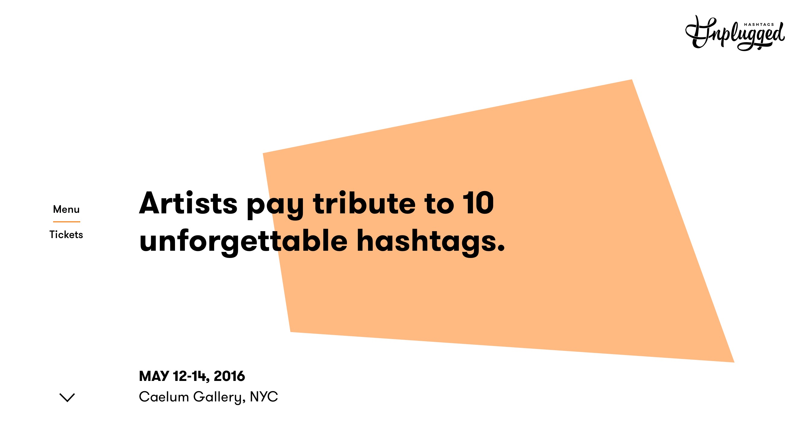
Hashtags Unplugged
This website for a gallery event in New York has a clean design and great typography. But my favorite thing about this site was the navigation. Select “the artists” under a given hashtag and the entire page animates to an artist listing. The transition is subtle and modern, and it doesn’t make you feel like you’ve lost your place in the stack (which is all too important when we introduce new navigation patterns to your users).
