

Duolingo
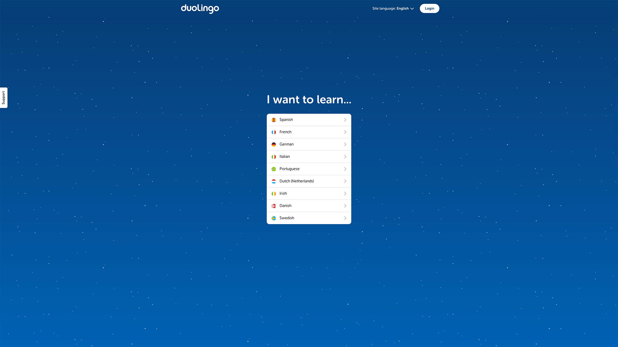
One of the things that fascinates me is the number of products that require a user to hand over their email address in order to use the product—get the email so you can harass a user who hasn’t returned in a while! They must have forgotten how much they loved us!—Is this the best experience we can come up with? If a user doesn’t want to come back no amount of email nagging is going to change their mind. Let’s give them an experience to successful that they return on their own.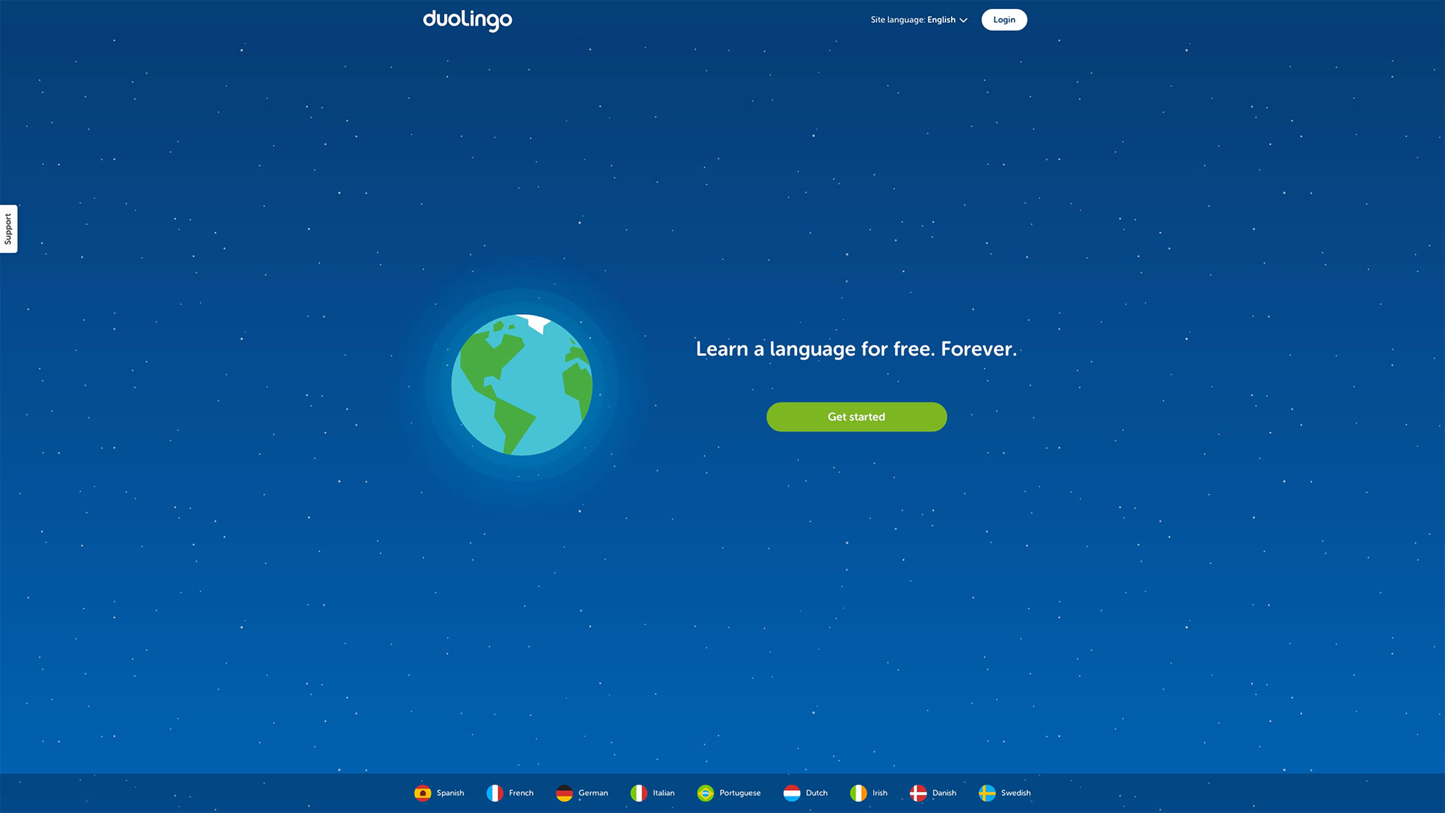 I fell in love with Duolingo’s onboarding, because like many successful onboarding experiences, they allow you to use the app without signing up beforehand. (They recently redesigned, but I like these old designs better.) The experience is all about the user, their wants and needs. After clicking the “Get Started” CTA you’re posed a proposition in first-person language: “I want to learn…”. It’s personal, and it’s relevant.
 Once a user picks a language they are shown how the app works in four simple steps. While the user is learning about the app there is a lot of positive reinforcement: the progress bars may be short, but they fill up quickly; the bottom of the model turns green with “Good job!” written inside; the continue button is green. Everything is nice and lovely and oh so positive. This may be overkill when you start to analyze it but I don’t see many apps praising me this much for using them. Or going through their walkthrough, for that matter.
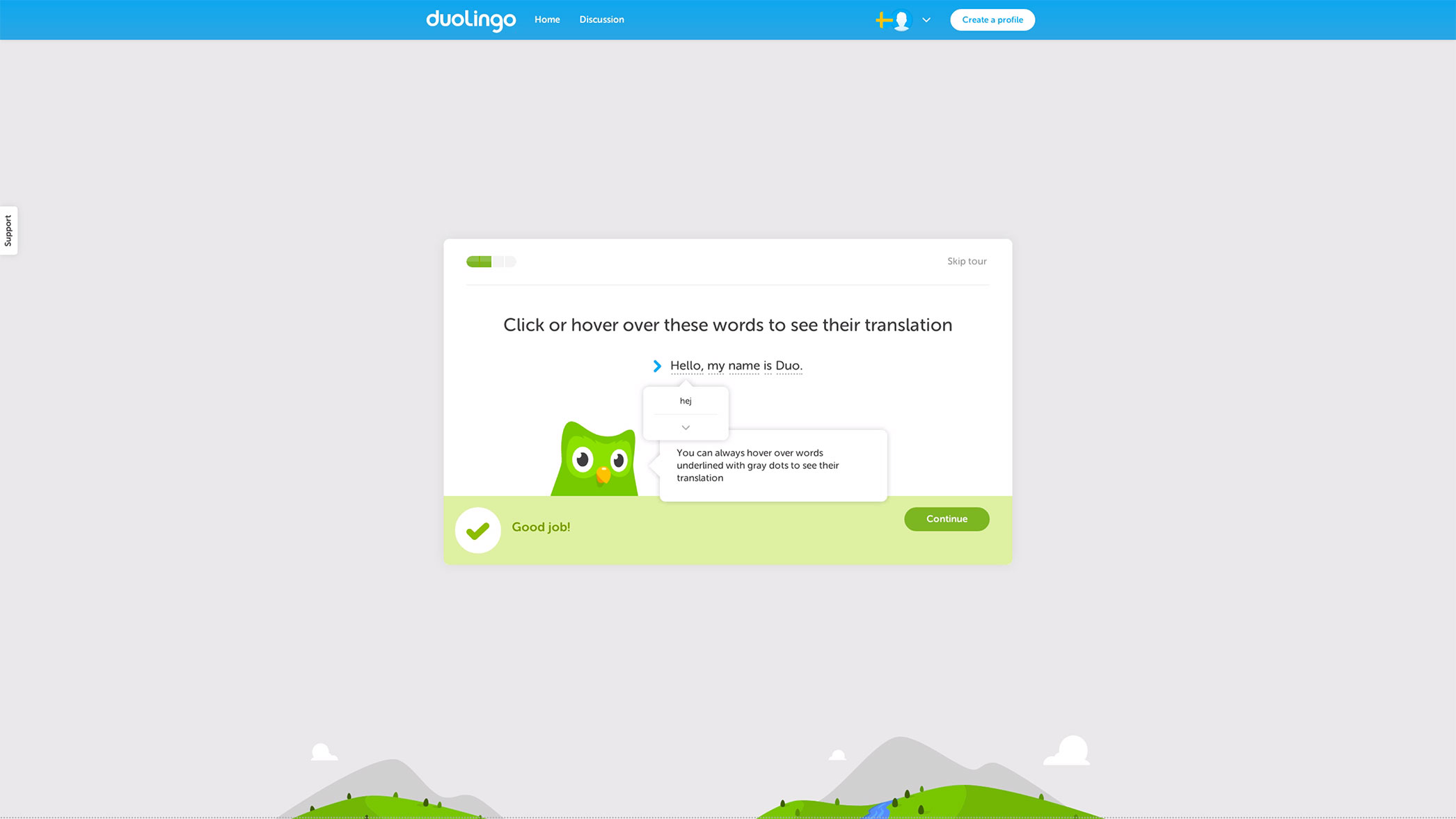
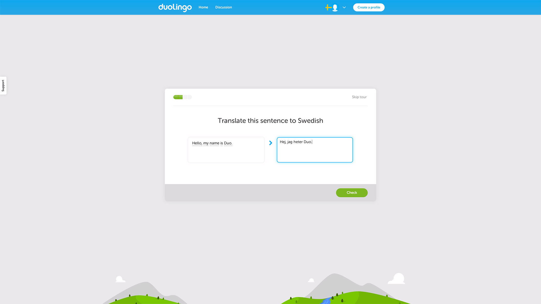 When a user is introduced to the app, they are actually using it. Think about how powerful that is, and how rarely it is used. Instantly a user can be proud of their accomplishment of writing a quick sentence in a foreign language.
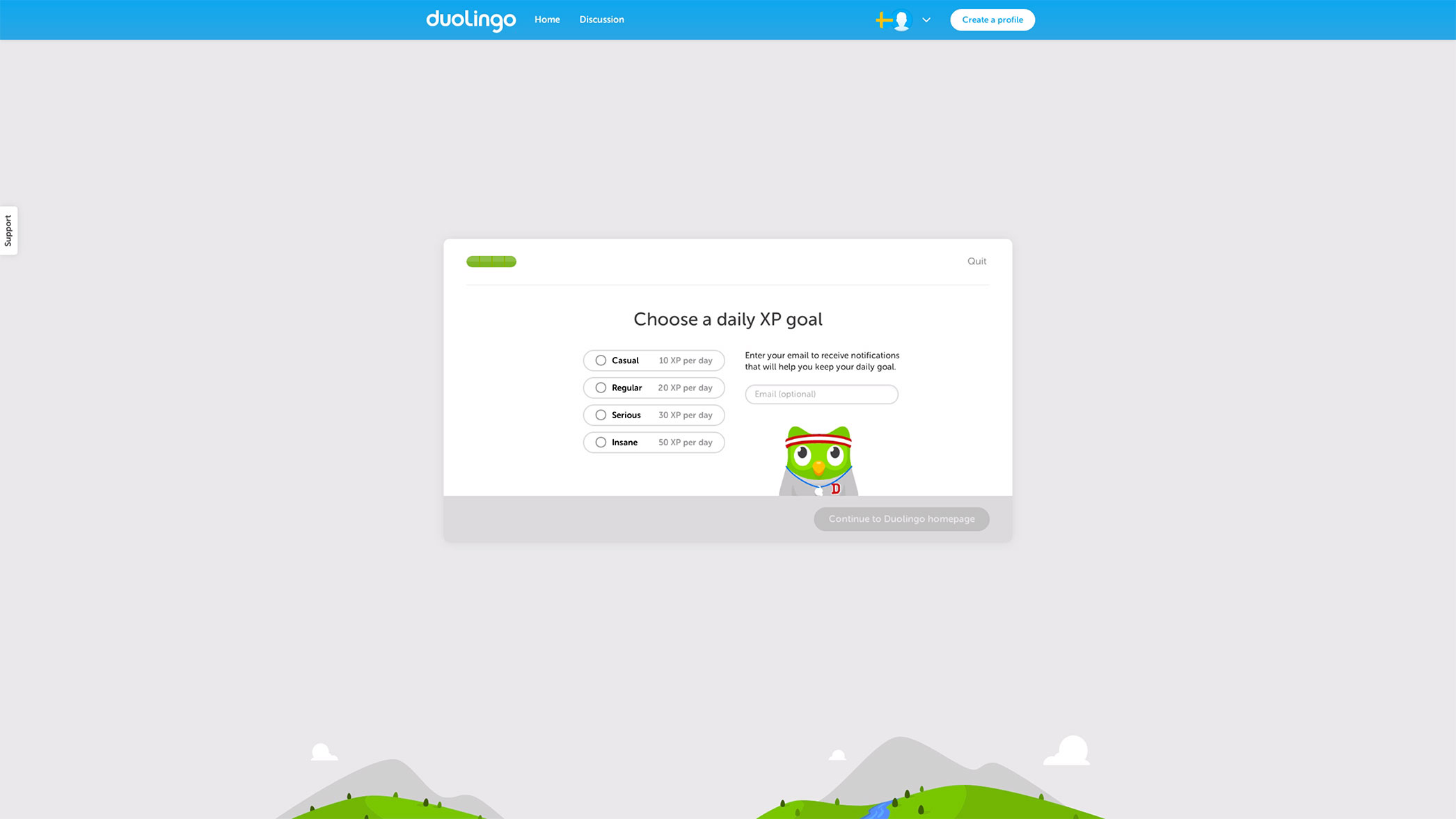
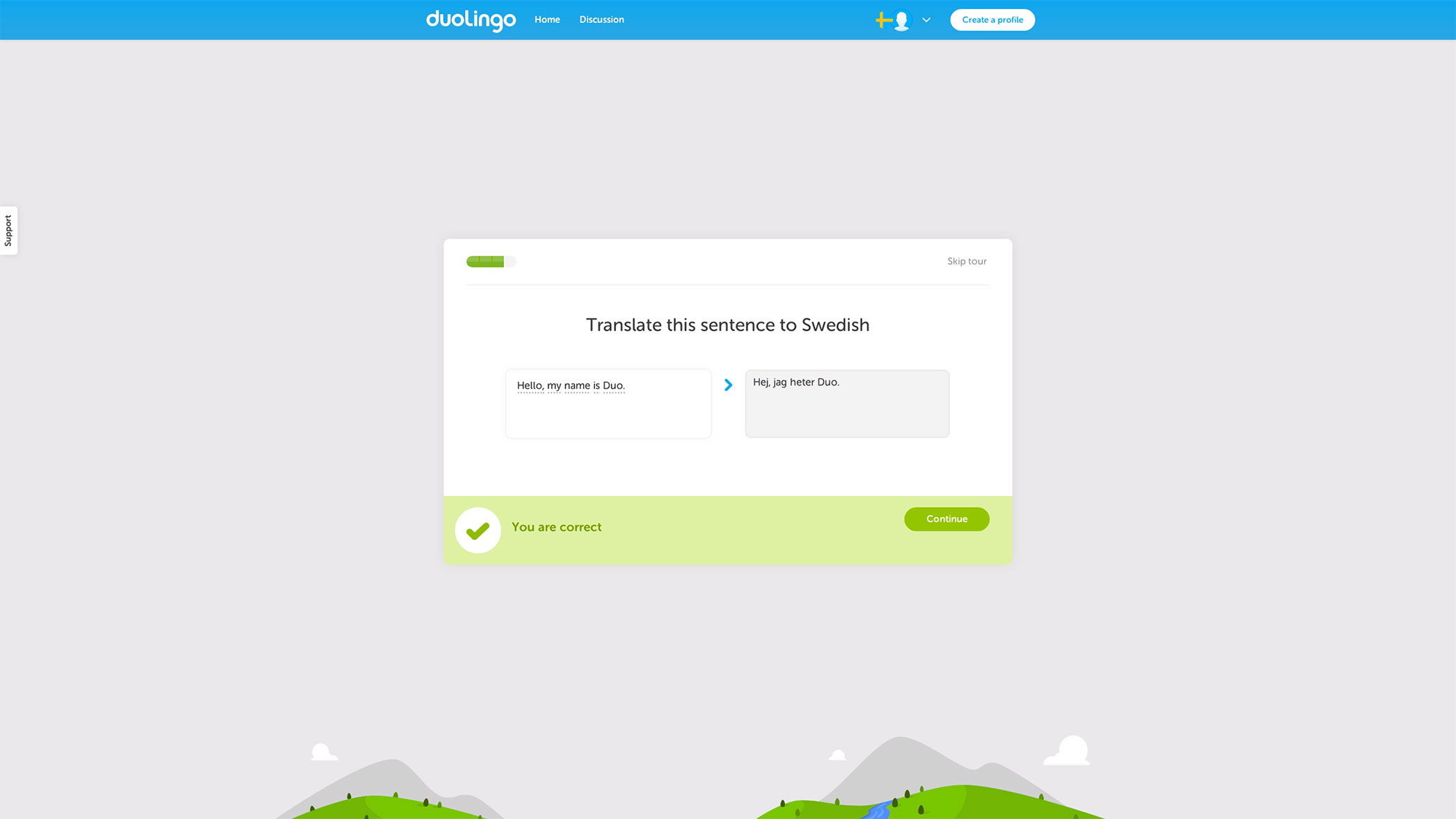 And, once the sentence is submitted there is more positive reinforcement for a job well done: at that point Duolingo knows you either love it or hate it, and if you love it, this is the perfect time to get you started with the app by getting your email. If you don’t care to use Duolingo, no harm done. Having the user pick a commitment is a clever way to get them to commit to learning a new language. Well played Duolingo, well played!
Oscar
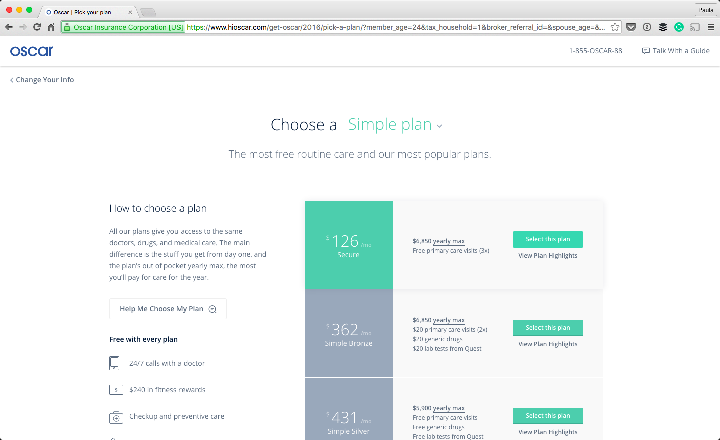
I’d like to walk you through the signup and onboarding process that Oscar Health has. There are a few things about Oscar that I really enjoy. The overall aesthetic of the website is very clean and minimal but it’s still approachable and professional. I think they have a really great onboarding experience with perhaps a little room for improvement.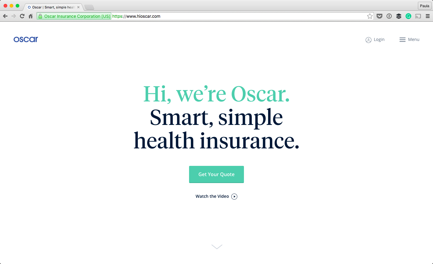 Oscar’s online presentation matters in how serious they are taken by potential customers. Take a look at the form for signing up for a new plan; it doesn’t look like a form. That’s important. You’re answering questions but the inputs are styled so lovingly. It’s natural, as if I was speaking with a person. (Did you notice that Oscar got right to business about me and my needs, instead of asking for my email?)
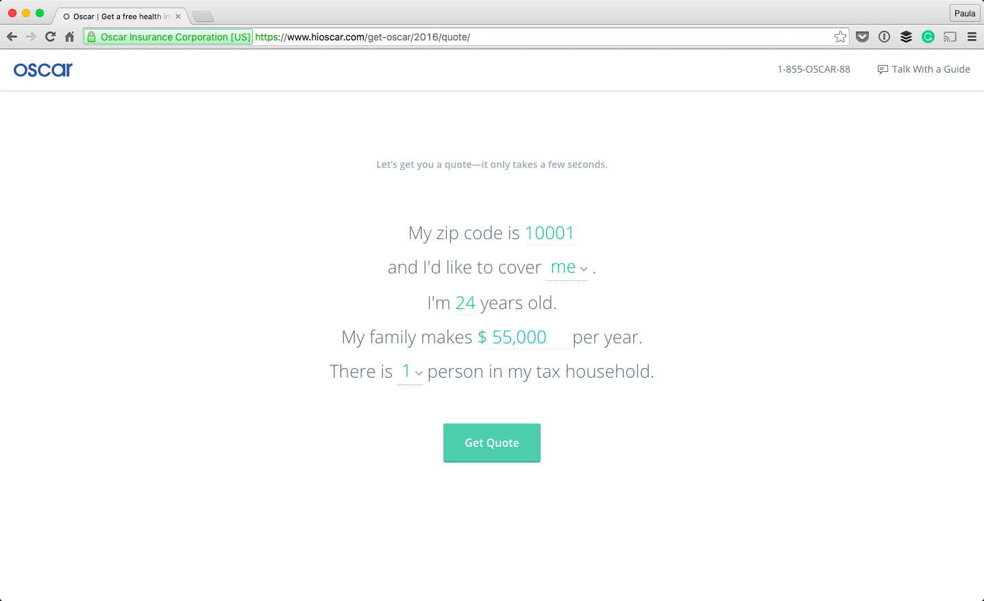
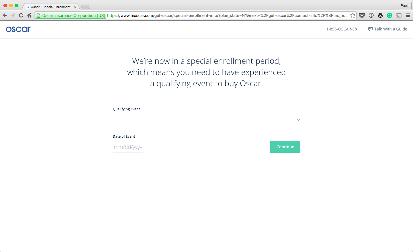
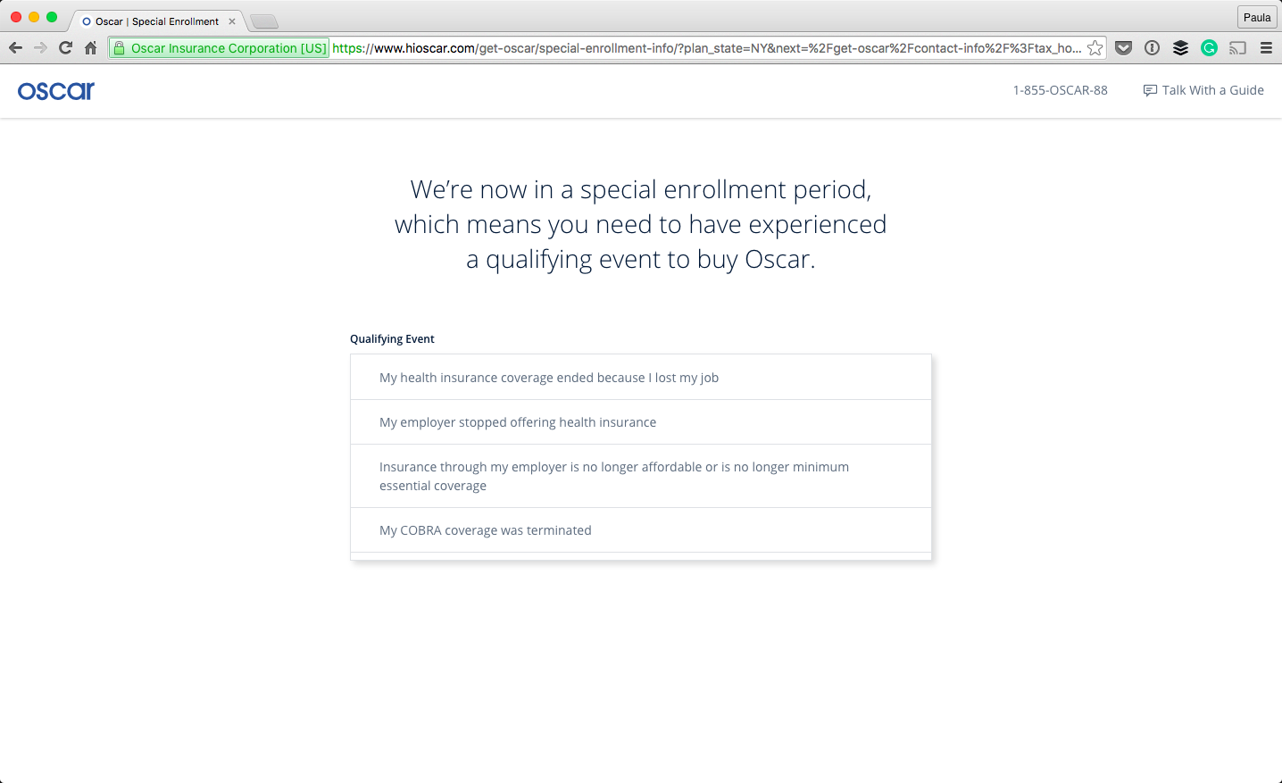
 The original CTA is “Get Your Quote” and I was able to do that very quickly and easily without actually signing up for an insurance plan. But, let’s pretend to proceed with a plan anyways: The next step in the onboarding process, the app explains to the user what is happening. Right now, you can only sign up for new health insurance if something happened to your coverage and you have proof of this—something like losing your job and the coverage they provided or losing your COBRA benefits. I think it’s smart to tell the user up front as to why they can and cannot sign up; it takes a lot of guesswork out of the whole process. Let’s pretend we qualify…
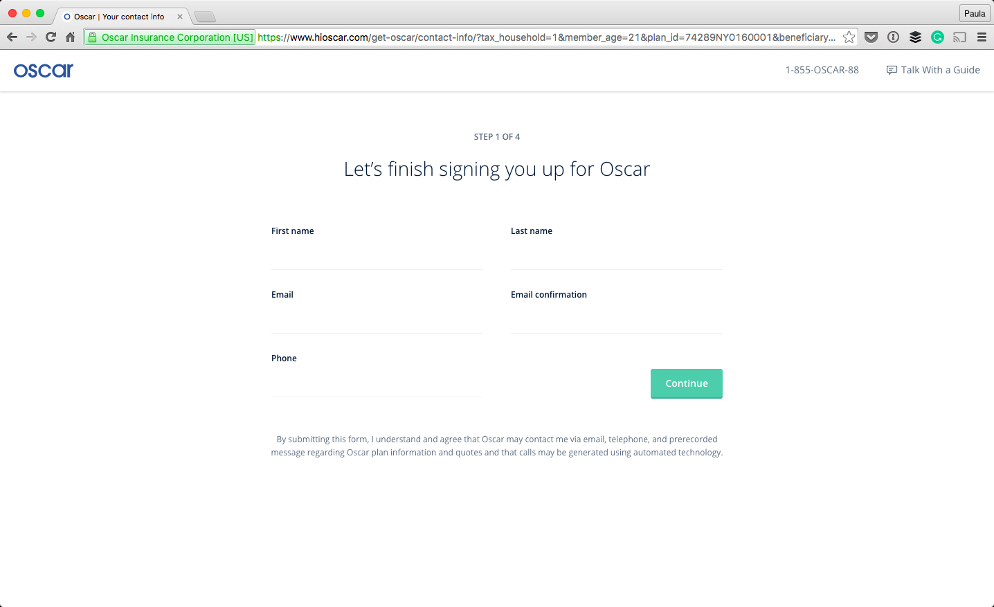
 During the process, the design of the whole thing feels consistent, like I’m still in the same place going after the same thing. The form still doesn’t feel like one as you move along the process. The last thing a user wants to be doing is filling out numerous forms, in any given setting. Styling the interactions not to feel like a form is a great step in making the experience not feel like a bureaucratic formality.
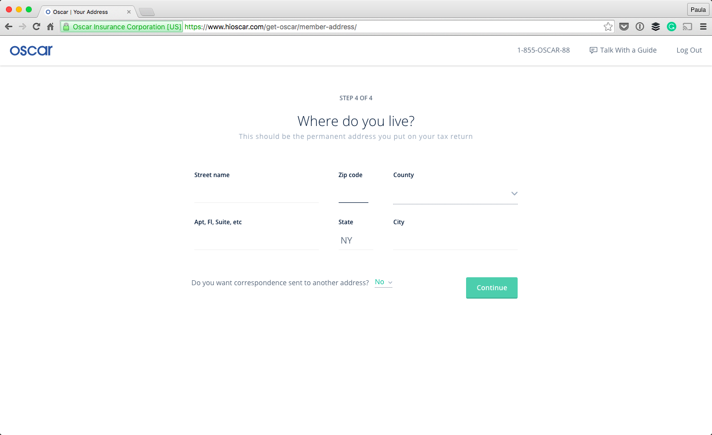
Another thing that’s very important in this sign up process is the fact that the steps are divided up, and you know where in the process you are. This further improves the form filling process.
During the process, the design of the whole thing feels consistent, like I’m still in the same place going after the same thing. The form still doesn’t feel like one as you move along the process. The last thing a user wants to be doing is filling out numerous forms, in any given setting. Styling the interactions not to feel like a form is a great step in making the experience not feel like a bureaucratic formality.
Another thing that’s very important in this sign up process is the fact that the steps are divided up, and you know where in the process you are. This further improves the form filling process.
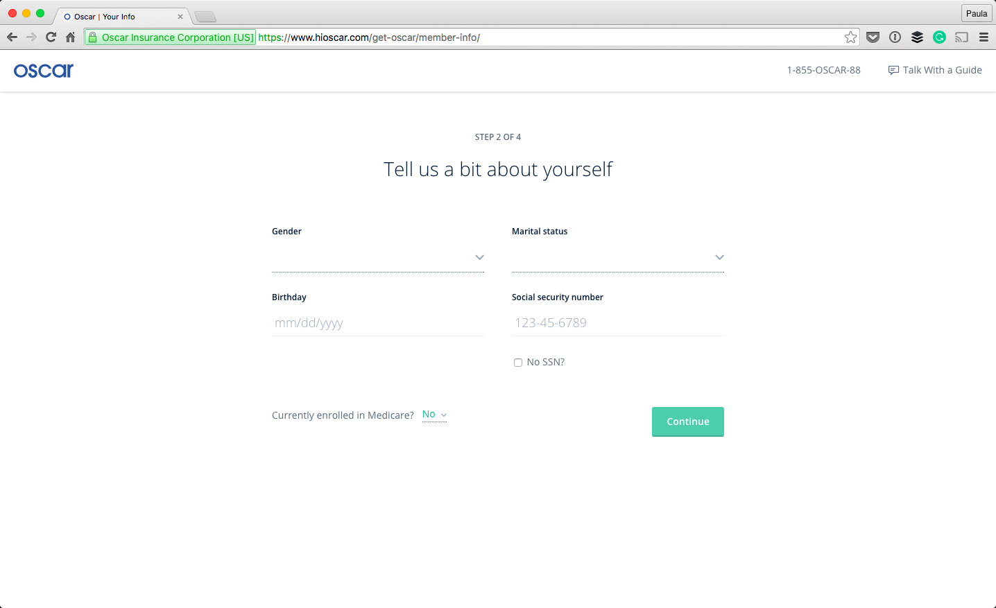 There is one thing I wish the onboarding process did more of and that’s explaining why the information is necessary. They did this in the beginning—they were transparent as to the qualifications for health insurance. But why does my gender, my phone number, or my marital status matter? I know it somehow matters for health insurance because it’s always asked. Is that really necessary? It’s pretty personal information, especially my SSN—it would put the user at ease knowing why they’re being asked for this information.
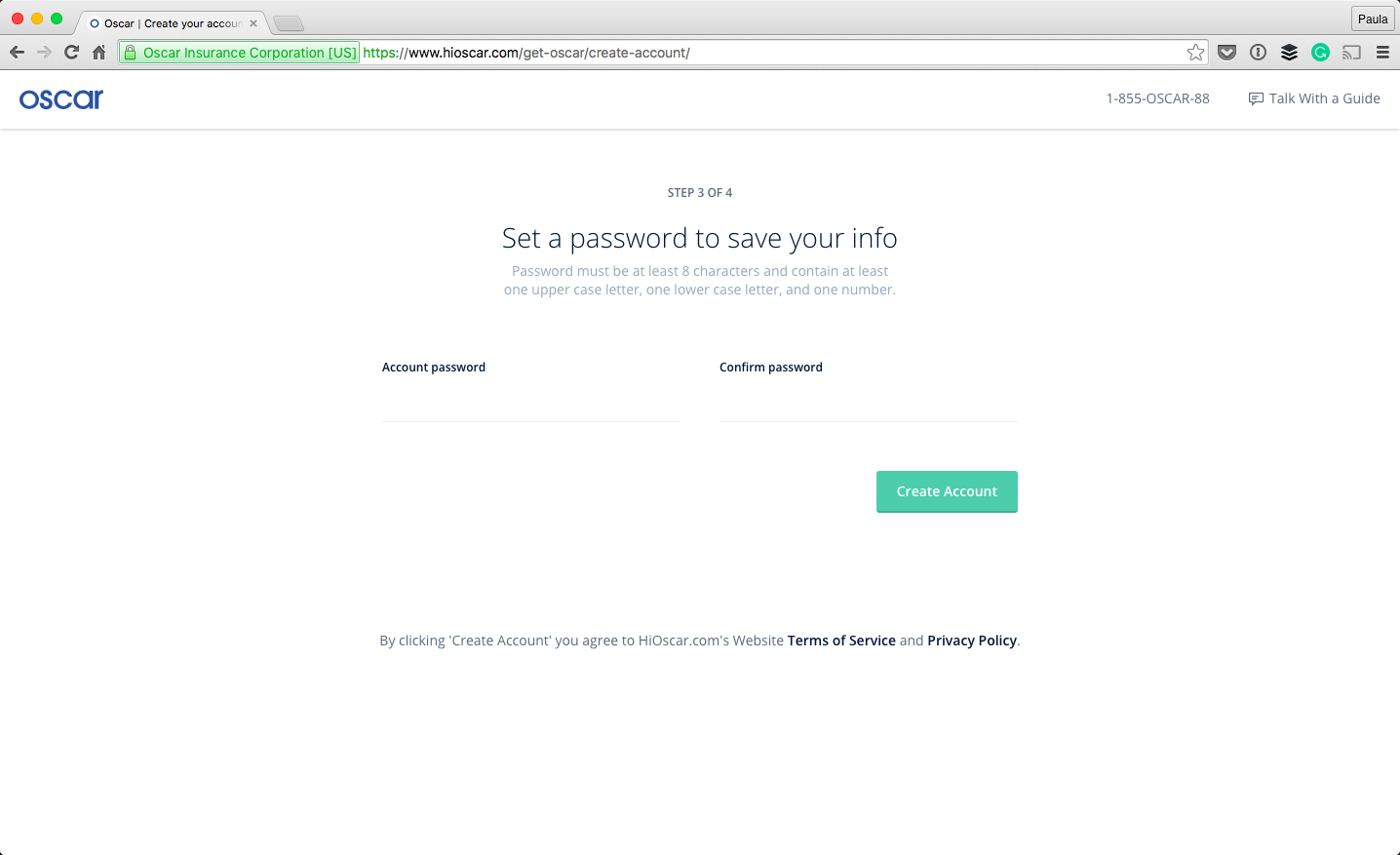
 Eventually, I’m asked to provide a password in order to save my information. They even say what their password formatting preferences are! (How rare is that?!) My other confusion is why the user is asked for a password before the address? It seems like the form is a little out of logical order.
Oscar’s onboarding experience is an improvement compared to many, especially when it comes to onboarding in the healthcare industry. It’s obvious they care about their people, just by spending a few minutes going through their onboarding experience.
Eventually, I’m asked to provide a password in order to save my information. They even say what their password formatting preferences are! (How rare is that?!) My other confusion is why the user is asked for a password before the address? It seems like the form is a little out of logical order.
Oscar’s onboarding experience is an improvement compared to many, especially when it comes to onboarding in the healthcare industry. It’s obvious they care about their people, just by spending a few minutes going through their onboarding experience.
Paula Borowska
Paula is a freelance web designer who documents her travels with photos and words. She works with small companies to help them create products that change the lives for their customers all in the hopes of gaining more customers and retaining their current ones longer.


Read Next

15 Best New Fonts, July 2024
Welcome to our monthly roundup of the best fonts we’ve found online in the last four weeks. This month, there are fewer…
By Ben Moss

20 Best New Websites, July 2024
Welcome to July’s round up of websites to inspire you. This month’s collection ranges from the most stripped-back…

Top 7 WordPress Plugins for 2024: Enhance Your Site's Performance
WordPress is a hands-down favorite of website designers and developers. Renowned for its flexibility and ease of use,…
By WDD Staff

Exciting New Tools for Designers, July 2024
Welcome to this July’s collection of tools, gathered from around the web over the past month. We hope you’ll find…

3 Essential Design Trends, July 2024
Add some summer sizzle to your design projects with trendy website elements. Learn what's trending and how to use these…

15 Best New Fonts, June 2024
Welcome to our roundup of the best new fonts we’ve found online in the last month. This month, there are notably fewer…
By Ben Moss

20 Best New Websites, June 2024
Arranging content in an easily accessible way is the backbone of any user-friendly website. A good website will present…

Exciting New Tools for Designers, June 2024
In this month’s roundup of the best tools for web designers and developers, we’ll explore a range of new and noteworthy…

3 Essential Design Trends, June 2024
Summer is off to a fun start with some highly dramatic website design trends showing up in projects. Let's dive in!

15 Best New Fonts, May 2024
In this month’s edition, there are lots of historically-inspired typefaces, more of the growing trend for French…
By Ben Moss

How to Reduce The Carbon Footprint of Your Website
On average, a web page produces 4.61 grams of CO2 for every page view; for whole sites, that amounts to hundreds of KG…
By Simon Sterne

20 Best New Websites, May 2024
Welcome to May’s compilation of the best sites on the web. This month we’re focused on color for younger humans,…