

 As it stands, a typical workflow for creating an app would look something like this:
- Developing Concept
- Mapping App Screens
- Producing Wireframes
- Refining UX
- Designing UI
- Developing Product
 Google Material Design Guidelines
The advanced and highly-detailed style guides that we now receive from Google and Apple lead me to question just why the user interface design phase requires a designer, or is even relevant at all. If the guidelines are there to be closely adhered to, is there really the need to add any significant creative input? The style and parameters are already defined by the guidelines. And sure, apps need assets such as icons, but why don’t all apps on a single platform just use the same set?
Apps across a platform would be far more consistent if the desire to visually differentiate from the next app was suppressed. As I see it, companies are viewing each app as a unique separate entity. I’d argue that it should simply be the operating system that is the entity. All apps within the system should be absolutely consistent.
There is a real lack of consistency across iOS and particularly Android . Some apps use back arrows, some use hamburger menus, some use icons, and some use text navigation. Some even use the same navigation on Android as on iOS. Apps often try to come up with new and exciting ways to navigate, but it does little more than add to the confusion of the overall OS for the user. Then there’s the case of using a multitude of styles that are wholly inconsistent with one another.
Google Material Design Guidelines
The advanced and highly-detailed style guides that we now receive from Google and Apple lead me to question just why the user interface design phase requires a designer, or is even relevant at all. If the guidelines are there to be closely adhered to, is there really the need to add any significant creative input? The style and parameters are already defined by the guidelines. And sure, apps need assets such as icons, but why don’t all apps on a single platform just use the same set?
Apps across a platform would be far more consistent if the desire to visually differentiate from the next app was suppressed. As I see it, companies are viewing each app as a unique separate entity. I’d argue that it should simply be the operating system that is the entity. All apps within the system should be absolutely consistent.
There is a real lack of consistency across iOS and particularly Android . Some apps use back arrows, some use hamburger menus, some use icons, and some use text navigation. Some even use the same navigation on Android as on iOS. Apps often try to come up with new and exciting ways to navigate, but it does little more than add to the confusion of the overall OS for the user. Then there’s the case of using a multitude of styles that are wholly inconsistent with one another.
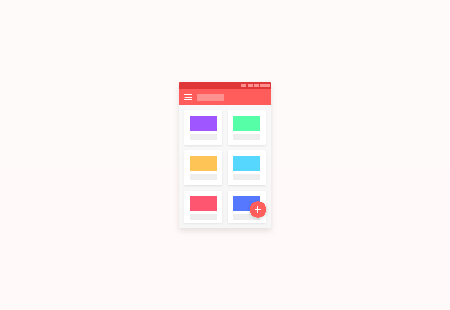
 Canopy for Android
I believe there’s too much creative input, and it’s getting in the way of experiencing a consistent experience across an entire system. If we look through Android Niceties, the scale of the issue with consistency becomes apparent.
The app user interface itself should be fairly mundane if usability is to be at its best. After all, it’s there as a way to view data and content, and navigate screens and elements. The differentiation should come in the branding — colors, icons, imagery — not through constantly switching up guideline styles, fonts, and layouts.
Canopy for Android
I believe there’s too much creative input, and it’s getting in the way of experiencing a consistent experience across an entire system. If we look through Android Niceties, the scale of the issue with consistency becomes apparent.
The app user interface itself should be fairly mundane if usability is to be at its best. After all, it’s there as a way to view data and content, and navigate screens and elements. The differentiation should come in the branding — colors, icons, imagery — not through constantly switching up guideline styles, fonts, and layouts.
We’ll use Android to compare two examples
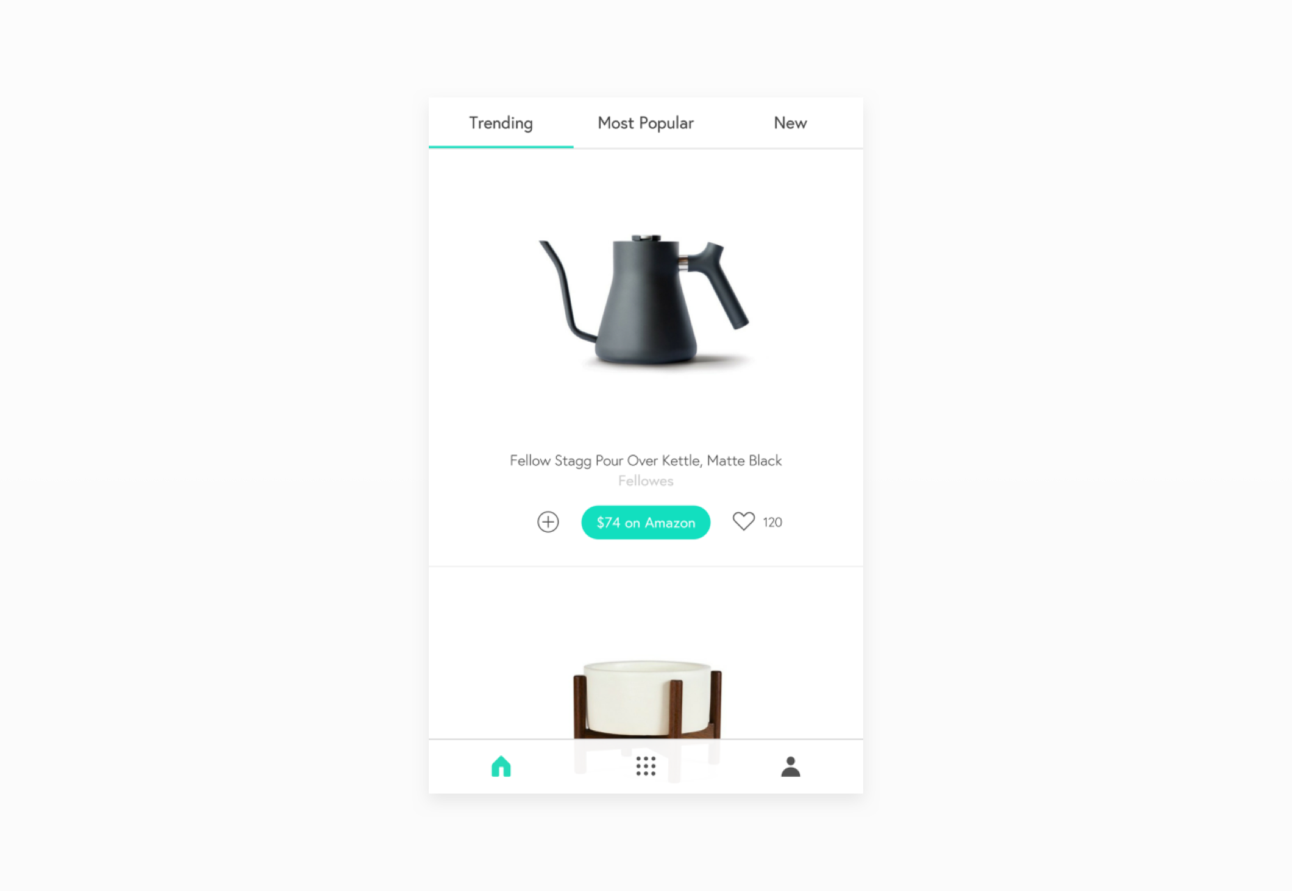
 YouTube for Android
Google’s latest iteration of the YouTube app is a perfect example of using the style guide effectively. The icons are default, there is a single easy-to-use navigation, and the contrast and colors are on point. It avoids unnecessary gimmicks and additions to the user interface, and maintains an experience in line with the system itself.
YouTube for Android
Google’s latest iteration of the YouTube app is a perfect example of using the style guide effectively. The icons are default, there is a single easy-to-use navigation, and the contrast and colors are on point. It avoids unnecessary gimmicks and additions to the user interface, and maintains an experience in line with the system itself.
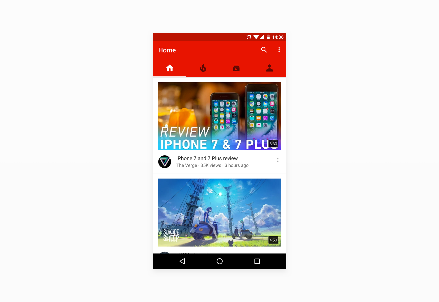
 Snapchat for Android
A poor example would be Snapchat. It does very little in the way of adhering to Material guidelines, and instead appears more interested in standing out visually, and applying their brand throughout the app. It is dissimilar to any other app and is entirely ill-fitting on the Android OS. There is very little to differentiate between this and the iOS counterpart. As much a UX issue as a UI issue, it’s a prime example of disregarding the guidelines and the user in the desire to be unique.
Unspecific to Snapchat, I’m intrigued when I see the size of design teams working on the simplest of apps. When you have 10, 20, 30+ user interface designers all working full-time on a mobile app with two or three main screens, the question has to be asked whether it’s healthy for the end user. This constant drifting away from system guidelines, and changing of styles, has little benefit and could be entirely avoided. It would reduce timescales, efficiency, and cost.
I believe many startups and established companies oversee this and it turns almost into a design popularity contest. The user interface becomes a marketing gimmick, which is far from its purpose.
User interface designers should be creating styles for systems as a whole, and limiting individual app creative input to branding, marketing, advertising, and landing pages. This way, mobile operating systems will become far more cohesive and in the end that will benefit the only person that matters: the user.
Snapchat for Android
A poor example would be Snapchat. It does very little in the way of adhering to Material guidelines, and instead appears more interested in standing out visually, and applying their brand throughout the app. It is dissimilar to any other app and is entirely ill-fitting on the Android OS. There is very little to differentiate between this and the iOS counterpart. As much a UX issue as a UI issue, it’s a prime example of disregarding the guidelines and the user in the desire to be unique.
Unspecific to Snapchat, I’m intrigued when I see the size of design teams working on the simplest of apps. When you have 10, 20, 30+ user interface designers all working full-time on a mobile app with two or three main screens, the question has to be asked whether it’s healthy for the end user. This constant drifting away from system guidelines, and changing of styles, has little benefit and could be entirely avoided. It would reduce timescales, efficiency, and cost.
I believe many startups and established companies oversee this and it turns almost into a design popularity contest. The user interface becomes a marketing gimmick, which is far from its purpose.
User interface designers should be creating styles for systems as a whole, and limiting individual app creative input to branding, marketing, advertising, and landing pages. This way, mobile operating systems will become far more cohesive and in the end that will benefit the only person that matters: the user.


Read Next

15 Best New Fonts, July 2024
Welcome to our monthly roundup of the best fonts we’ve found online in the last four weeks. This month, there are fewer…
By Ben Moss

20 Best New Websites, July 2024
Welcome to July’s round up of websites to inspire you. This month’s collection ranges from the most stripped-back…

Top 7 WordPress Plugins for 2024: Enhance Your Site's Performance
WordPress is a hands-down favorite of website designers and developers. Renowned for its flexibility and ease of use,…
By WDD Staff

Exciting New Tools for Designers, July 2024
Welcome to this July’s collection of tools, gathered from around the web over the past month. We hope you’ll find…

3 Essential Design Trends, July 2024
Add some summer sizzle to your design projects with trendy website elements. Learn what's trending and how to use these…

15 Best New Fonts, June 2024
Welcome to our roundup of the best new fonts we’ve found online in the last month. This month, there are notably fewer…
By Ben Moss

20 Best New Websites, June 2024
Arranging content in an easily accessible way is the backbone of any user-friendly website. A good website will present…

Exciting New Tools for Designers, June 2024
In this month’s roundup of the best tools for web designers and developers, we’ll explore a range of new and noteworthy…

3 Essential Design Trends, June 2024
Summer is off to a fun start with some highly dramatic website design trends showing up in projects. Let's dive in!

15 Best New Fonts, May 2024
In this month’s edition, there are lots of historically-inspired typefaces, more of the growing trend for French…
By Ben Moss

How to Reduce The Carbon Footprint of Your Website
On average, a web page produces 4.61 grams of CO2 for every page view; for whole sites, that amounts to hundreds of KG…
By Simon Sterne

20 Best New Websites, May 2024
Welcome to May’s compilation of the best sites on the web. This month we’re focused on color for younger humans,…