- The principles of good design;
- Mozilla community feedback for the seven concepts unveiled in August;
- Mozilla’s overall branding strategy.
Protocol 2.0
So named because it symbolizes Mozilla’s role at the center of the web, Protocol 2.0 is a logo that essentially places the Internet http:// protocol right into the logo type mark. The beauty of Protocol 2.0 is the flexibility it affords: Mozilla has been experimenting with swapping out certain characters in this proposed work mark, so that emoticons and font characters could suddenly appear in the new logo.The Flame
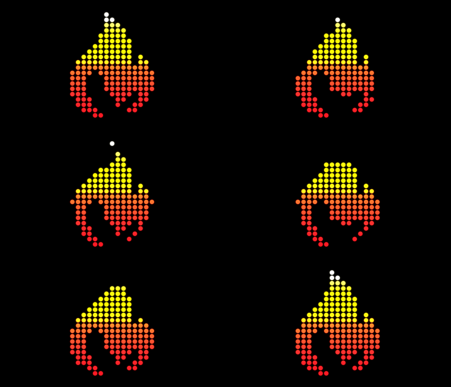
Perhaps no symbol is as universally well-understood as fire. The company is considering a flame logo to represent its drive to remain the beacon for the ideal of the equal, open and accessible web for all. Community’s also important to Mozilla, and a flame would symbolize the warmth of community, too. If you look closer, you’ll also see that this logo contender actually merges the “M” for “Mozilla” with the flame. The final iteration is a pixelated version that lends itself well to animation.
The Burst
The Burst sort of looks like a fireworks display going off, but there is heavy symbolism in this logo contender. It’s been influenced by two schools of thought. First, there’s a new narrative characterized by Mozilla’s advocacy for the health of the web. Second, there’s the visual aspect characterized by the company’s investigation of classic web imagery and data-led ideas. The number five also figures into this logo, as Mozilla’s gathering data around five, vital measurements, and a capital “M” has five nodes. Hence, the five bursts.Dino 2.0
Heavily inspired by a previous logo suggestion called “The Eye,” Dino 2.0 utilizes the reptile eye shape forged out of the “O” in the word “Mozilla”. Dino 2.0 sports a noticeable dinosaur’s head that features white type on a red chevron. Plans call for this logo idea to bite, thanks to moving GIF animations, and showcase a slew of vibrant colors to demonstrate that Mozilla really is for everyone. Stay tuned in the coming weeks as Mozilla moves closer to finalizing its new brand identity.Marc Schenker
Marc’s a copywriter who covers design news for Web Designer Depot. Find out more about him at thegloriouscompanyltd.com.
Read Next
15 Best New Fonts, July 2024
Welcome to our monthly roundup of the best fonts we’ve found online in the last four weeks. This month, there are fewer…
By Ben Moss
20 Best New Websites, July 2024
Welcome to July’s round up of websites to inspire you. This month’s collection ranges from the most stripped-back…
Top 7 WordPress Plugins for 2024: Enhance Your Site's Performance
WordPress is a hands-down favorite of website designers and developers. Renowned for its flexibility and ease of use,…
By WDD Staff
Exciting New Tools for Designers, July 2024
Welcome to this July’s collection of tools, gathered from around the web over the past month. We hope you’ll find…
3 Essential Design Trends, July 2024
Add some summer sizzle to your design projects with trendy website elements. Learn what's trending and how to use these…
15 Best New Fonts, June 2024
Welcome to our roundup of the best new fonts we’ve found online in the last month. This month, there are notably fewer…
By Ben Moss
20 Best New Websites, June 2024
Arranging content in an easily accessible way is the backbone of any user-friendly website. A good website will present…
Exciting New Tools for Designers, June 2024
In this month’s roundup of the best tools for web designers and developers, we’ll explore a range of new and noteworthy…
3 Essential Design Trends, June 2024
Summer is off to a fun start with some highly dramatic website design trends showing up in projects. Let's dive in!
15 Best New Fonts, May 2024
In this month’s edition, there are lots of historically-inspired typefaces, more of the growing trend for French…
By Ben Moss
How to Reduce The Carbon Footprint of Your Website
On average, a web page produces 4.61 grams of CO2 for every page view; for whole sites, that amounts to hundreds of KG…
By Simon Sterne
20 Best New Websites, May 2024
Welcome to May’s compilation of the best sites on the web. This month we’re focused on color for younger humans,…


