
1. Keep your files organized
One of the easiest things you can do to keep your sanity is keep your files organized. Creating and maintaining a consistent folder structure will make finding your files a breeze. Problems arise when you structure one folder differently than another, making it a challenge to locate that Final-Final-logo.ai file. Consistent file naming conventions are essential when organizing your files. This is where versioning comes in. Some designers use dates, others use version numbers, and some use rounds. This will depend on your industry and your personal preferences, but it’s a good practice. Thanks to versioning, you can easily track which file is the most current, especially if you have old versions saved for reference. I generally keep two to three old versions in case the client wants to revert back to that hero strategy from Round One, or preferred your mobile treatment from Round Two. In order to avoid the pack rat mentality, it’s good to archive or delete older files to keep your hard drive from being bogged down.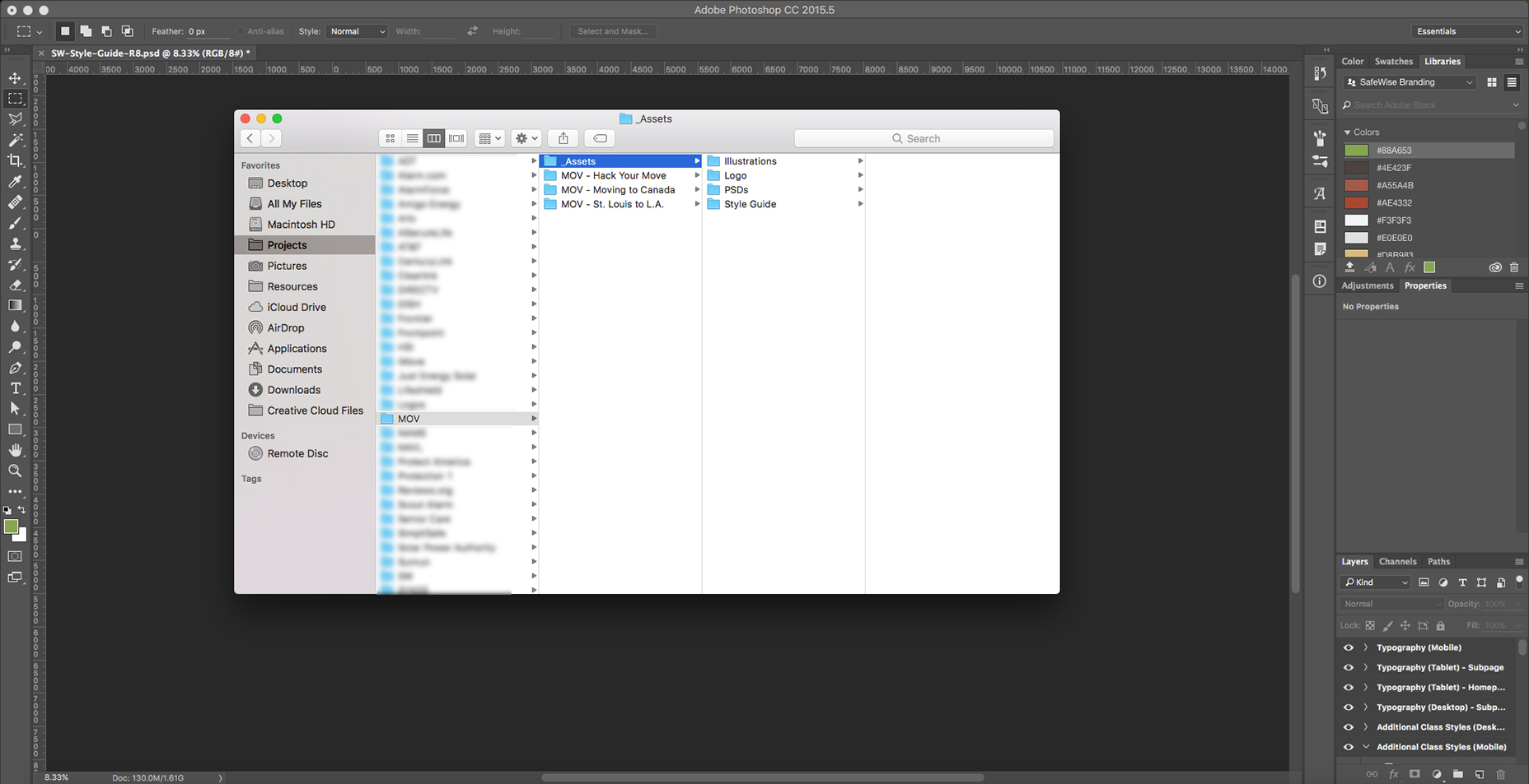 Here’s a sample structure that I use at Clearlink.
The combination of a consistent folder structure and naming conventions with versioning will also help search-ability. For instance, if you start all your file names from one brand with the brand name or abbreviation, you can filter the assets for that brand easier. This will help differentiate “ATT-logo-final.ai” from what could potentially be a sea of “logo-final.ai’s”.
2. Understand your framework
One thing I didn’t learn until several years into my design career is how to properly utilize an existing framework. The two heavy hitters in the framework world are currently Bootstrap and Foundation, but Google’s Materialize will surely give them a run for their money in the near future. The company that I work for uses Foundation for the majority of their branded sites. Foundation comes with a built-in responsive grid, along with styling for buttons, fields, typography, navigation, etc. amongst many other things to make your life easier. By utilizing Foundation’s built-in grid within your PSDs, you’ll make it easier for the developer to implement your designs in a more pixel-perfect way than if you do your own thing. Photoshop has this nifty guide layout tool that not only makes creating grids a breeze but also attaches them to the art-board for ease of file restructuring and movement.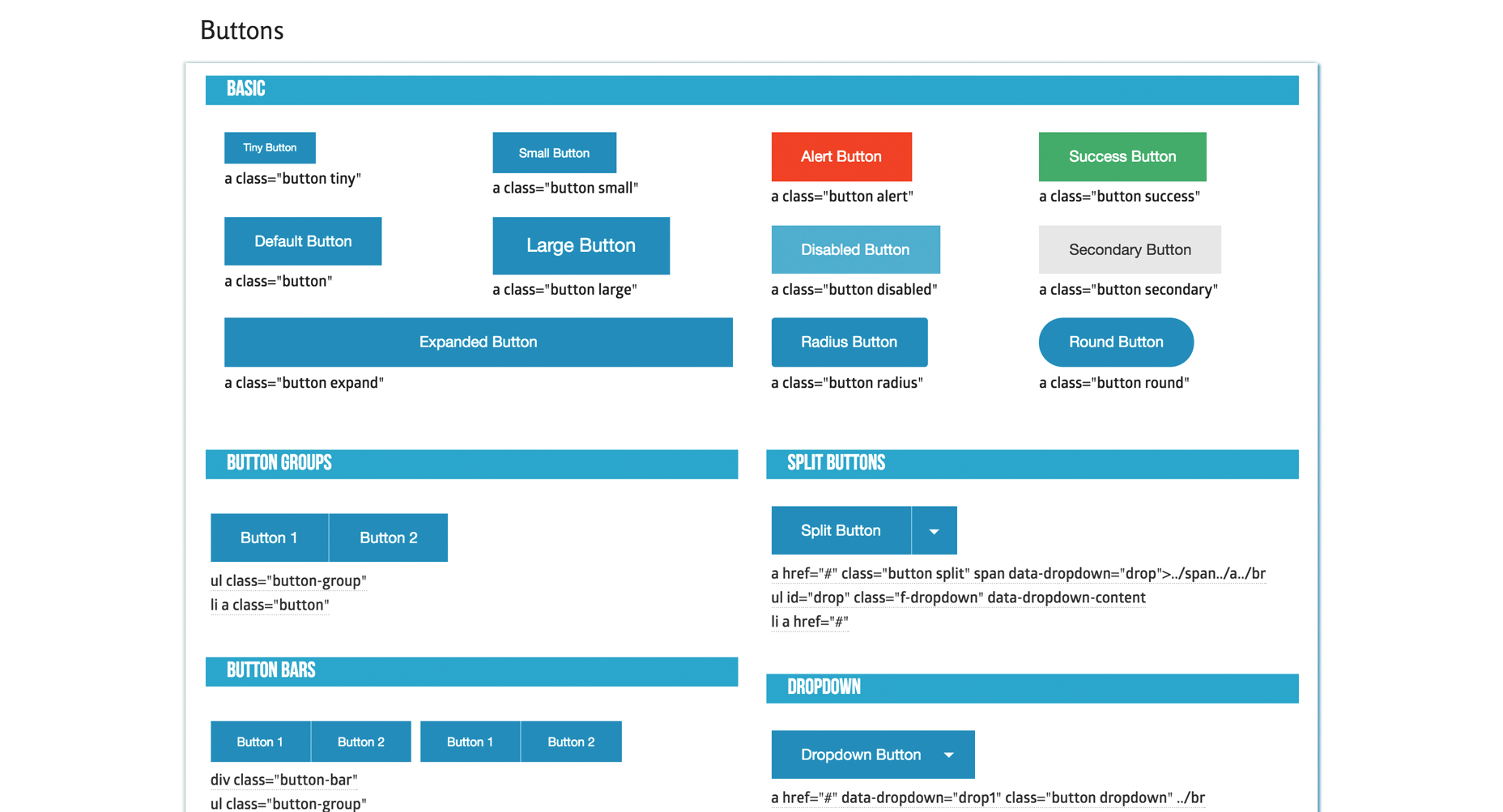 Screenshot from the Foundation Cheat Sheet
Frameworks also provide a good starting point for button styling, forms, etc. and help show the possibilities and limitations of the design strategies you can implement. Not only will this give you a great starting point for your design, but it will help foster friendlier collaboration with your developer.
3. Organize your layers by content section
When you’re dealing with complex web design PSDs with so many folders, layers, smart objects, etc., it’s easy for things to get messy. Once layer 2,455 comes around, you start to realize that you need some sort of organization within your PSD. This is why I recommend organizing your PSD by sections. Mine generally consist of folders that include Nav, Hero, Intro, Packages, Benefits, Footer, etc. I also color code these folders in rainbow fashion, so they’re easy to navigate. This makes updating sections and reworking your PSD a breeze.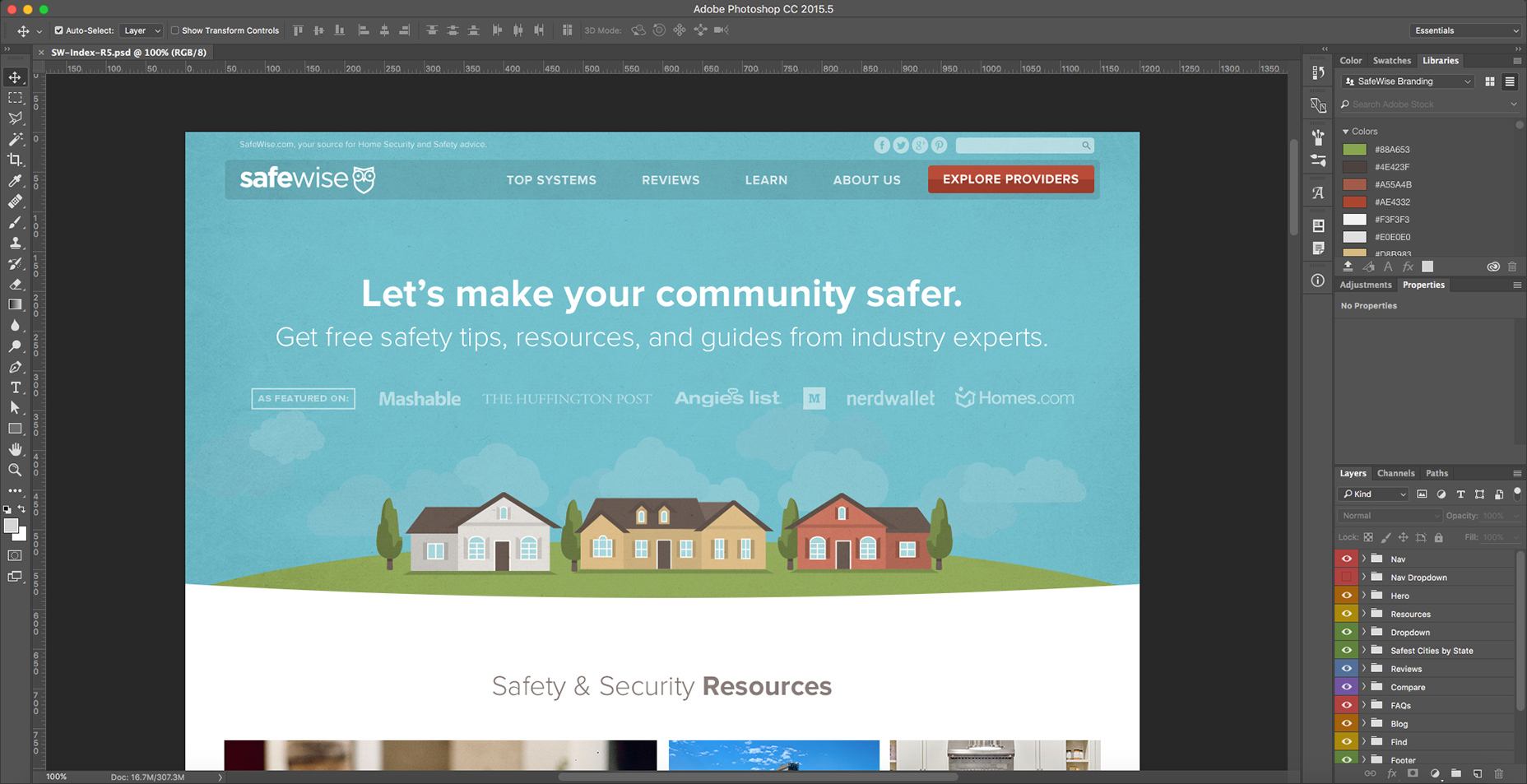 I organize my file into section folders that are rainbow color-coded for easy scan-ability.
For example, if you need to make the hero section larger, you can easily drag all the folders below as one unit (holding command) and then drag them back after the update is made. This strategy also helps developers and other designers easily navigate your file. By using understandable names like “Hero” and “Nav”, a new designer can easily jump into the folder and make whatever changes they need.
Some designers will even get into naming individual layers, which can also be incredibly beneficial but can get a bit time-consuming. Since layers are easy to find via the auto-select tool when it’s set to “layer,” it’s easy to get to individual layers these days, so it’s up to the individual designer how they want to organize their layers. The point is that you git ’er done.
4. Memorize all the keyboard shortcuts you normally use
This one’s a biggie for efficiency. If you find yourself using a specific key command regularly, memorize it. You’ll increase your efficiency exponentially if you have all the main keyboard shortcuts down. Some important ones are saving, font size and leading, layer ordering, save for web, and opacity among many more. Photoshop also gives you the ability to create custom shortcuts. In my book, the most important command to have memorized is saving your file. Due to Adobe’s random crashes, it’s good to err on the side of saving often rather than risk losing any of your progress.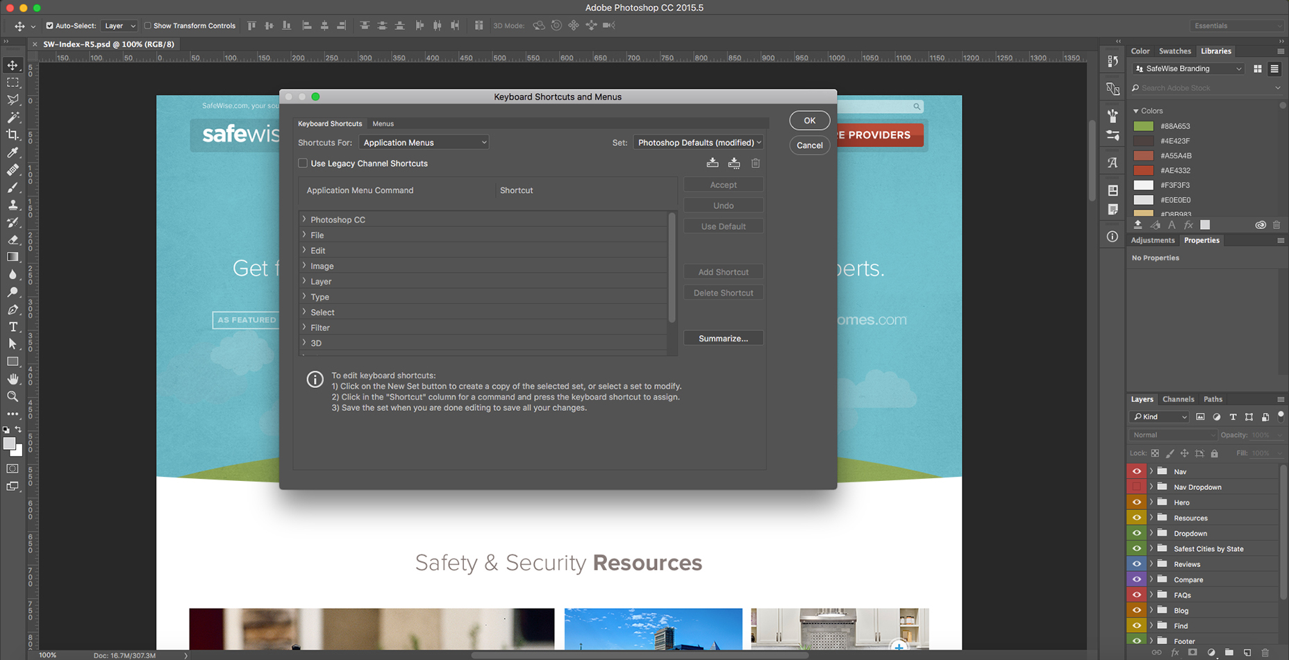 Adobe gives you the option of customizing your keyboard shortcuts under Edit > Keyboard Shortcuts
Shortcuts also tie in to organizing your layers by content section folders (as mentioned above). It’s easier to bring layers to the top and bottom of a folder using keyboard shortcuts than re-ordering layers in an unorganized file. This is where organizing your file as you design comes into play. Memorizing frequently used keyboard shortcuts and keeping your layers organized will vastly improve your efficiency and help other designers work with your files.
5. Utilize CC Libraries
One of the best things that Adobe has added since creating CC is libraries. If you haven’t heard of them, you need to check out this amazing tutorial on how to use them. I feel like every design team should be utilizing this amazing feature. Libraries allow you to create a brand library with assets like colors, font styles, photos, icons, and symbols (like headers & footers). Thanks to libraries, you can easily collaborate with creatives from multiple organizations using a single brand library. Libraries make it easy to change colors and update text styles with the click of a button. They also help store brand icons that can easily be updated in one place with updates reflected quickly across PSDs. This is incredibly beneficial for headers and footers for your site, where you’re likely to make small updates throughout the project. I also use CC Libraries for font styling throughout my design. I’ll set up styles for hero copy, headings, subheadings, body copy, disclaimers, etc. for desktop, tablet, and mobile applications. Regarding the view toggle, I find myself using the list format more-so than the tile view due to its easy scan-ability.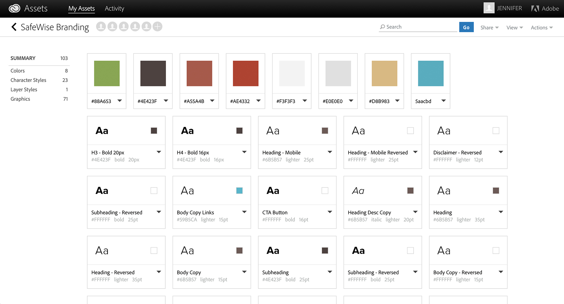 Library elements viewed as a collaborator
Libraries are also great for team collaboration. You can choose to either collaborate with other creatives so they can edit and add to the library, or you can share the library link for easy access. They also have a "Create New Library from Document" feature, but I prefer to create the library myself, so it stays organized and only has the most relevant assets.
Unfortunately, there are a few downsides to libraries, one of these being the lack of separate character and paragraph styles for text. I work around this by applying my character style in a separate box and then pasting different styles into a box together to make text boxes easier to manage within the file. Another downside is that you currently can’t update a character style globally. Currently, there’s no organization abilities within the library to create subfolders within the categories (color, character styles, etc.), but hopefully Adobe is working on this as well.
The current way CC Libraries work is that the most recently updated/added asset will appear up top. CC Library colors can’t be applied to individual text within text boxes and are only easily applied to shapes and entire text boxes. I’m sure Adobe is hard at work to fix these issues, so I’m not too worried, especially since the pros definitely outweigh the cons.
6. Keep images and vectors in smart object format
Even though it will make your file larger, keeping your images and vectors in smart object format will make it easier for future designers to edit your PSDs. Picture this: the client comes back with edits that include re-cropping a hero photo and making small tweaks to a vector icon. This is more smoothly done if the PSD includes the full-resolution photo rather than a smaller, rasterized version. Vectors are also easy to tweak when they’re smart objects from Illustrator rather than rasterized graphics. Another benefit of having photos in smart object format comes when you save them as PSDs and then place them into your file as a smart object. Using a placed photo PSD makes it easy to add adjustment layers and edits within a separate, contained photo file rather than cluttering up your source file. Utilizing smart objects as library graphics gives you even more of a winning combination. Not only can you easily edit the vector objects, but library graphics will update across all applications.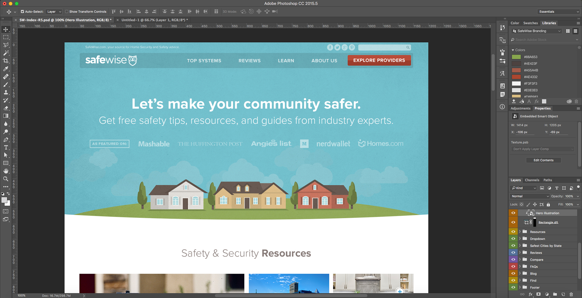 The “Hero Illustration” graphic can be edited in a separate PSD to keep the clutter of the main file to a minimum.
7. Create a style guide and stick to it
A lot of brands will have a general style guide for you to follow when it comes to fonts, colors, photos, icons, illustrations, etc. This is helpful as a resource but won’t always keep you consistent on your website-specific styling. I’ve vastly improved my efficiency by creating web style guides for each specific site that I work on. Sometimes brands will have multiple sites with different styles, so I make sure I have one for each site, so I can stay consistent while I design. This also creates an easy drag-and-drop resource when I need buttons, icons, illustrations, photos, etc. Not only will this make you more efficient as a designer, but it will help you stay consistent in your styling throughout the site. What spacing do I use between sections? Check out the style guide! What was the primary button color and padding again? Grab it from the style guide! This will also help other designers easily jump on the site designs with ease and efficiency. If you merge the use of CC Libraries with the style guide, you’re even more ahead of the game.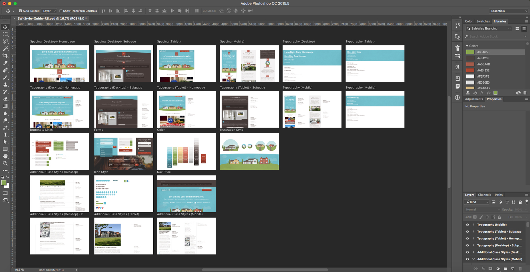 I create a PSD style guide for all the different brands that I work on so I can easily grab elements like buttons and icons.
A lot of designers are tempted to add new styles each time they face a new problem within the design. For consistency, it’s best to avoid this and always stick to the standards you’ve established within your style guide. If you add new layers and styles, make sure they are applied across the entire site.
The more new styles that are created, the more complex future designs will be, and the harder it will be for new designers to jump on projects and keep designs consistent. In many instances, consistency is more important than constant innovation when it comes to user experience. Even though it may take you more time to create the web style guide at the beginning of a project, it will increase your efficiency for all future pages.
One best practice that I learned from Brad Frost is to do an interface inventory either during the design process or on an existing site that you’ll be working on. An interface inventory consists of collecting all the different text styles, button styles, etc. via screenshots and compiling them to find inconsistencies. You can then present your findings to the client to propose updates and improvements.
Since websites touch multiple designers over the case of their existence, things can get pretty hairy in the consistency department. Once you find a unified design style for the elements on the page, make sure to update your style guide so that everyone is up to date.
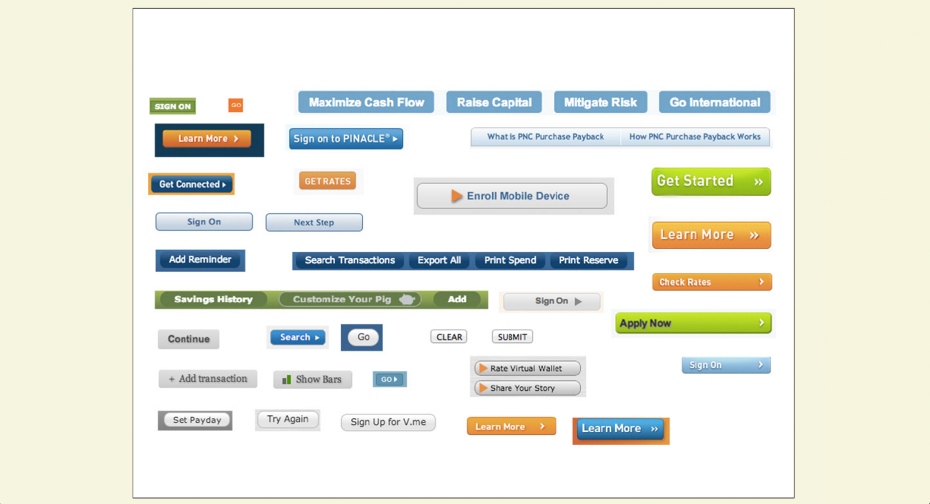 Interface inventory screenshot from http://bradfrost.com/blog/post/interface-inventory/
8. Foster inter-departmental collaboration
A lot of people that pursue careers in marketing production (designers, developers, copywriters, etc.) tend to be introverted, so it’s hard to step out of your comfort zone when it comes to collaboration. It’s also hard to leave your expertise bubble, especially when it’s easier to relate to people in your field. Even though it can be awkward or uncomfortable sometimes, leaving your bubble and regularly collaborating with people from other departments can vastly improve the quality of your designs along with your efficiency. A prime example of this is when designers and developers collaborate on a redesign. You should meet with the developer beforehand to go over what framework they’re using, educate yourself on the grid system, and assess the possibilities. When the design work is complete, make sure to share your Photoshop Library, so the developer will have easy access to the color palette, font styles, etc. It’s also helpful to share the style guide in advance, along with any components you’ve designed to give them a good head start. Collaboration with other designers on your team utilizing Libraries will also help you stay consistent and be more efficient. Giving the Art Director or most Senior Designer responsibility over Library and style guide updates will eliminate confusion and keep branding consistent. Just make sure there’s a line of communication when updates are made, so that everyone is on the same page.Stay sane
Web design can be overwhelming and challenging sometimes. It doesn’t always have to be that way. By following these simple tips on Photoshop efficiency, you can alleviate a good chunk of your stress. Not only will this improve your well-being, but managers and directors on both the business and creative side will really appreciate your hard work and commend you for it. After all, everyone is good with more consistent, efficient, beautifully-crafted design.Jenni Moore
About the author: Jenni Moore is an Art Director at Clearlink who loves tackling design challenges with fun, innovative solutions. Outside of design, she is an avid Rock Band player and passionate shelter-dog advocate. See Jenni’s latest work at jennimoore.com or follow her on Facebook and Twitter.
Read Next
15 Best New Fonts, July 2024
Welcome to our monthly roundup of the best fonts we’ve found online in the last four weeks. This month, there are fewer…
By Ben Moss
20 Best New Websites, July 2024
Welcome to July’s round up of websites to inspire you. This month’s collection ranges from the most stripped-back…
Top 7 WordPress Plugins for 2024: Enhance Your Site's Performance
WordPress is a hands-down favorite of website designers and developers. Renowned for its flexibility and ease of use,…
By WDD Staff
Exciting New Tools for Designers, July 2024
Welcome to this July’s collection of tools, gathered from around the web over the past month. We hope you’ll find…
3 Essential Design Trends, July 2024
Add some summer sizzle to your design projects with trendy website elements. Learn what's trending and how to use these…
15 Best New Fonts, June 2024
Welcome to our roundup of the best new fonts we’ve found online in the last month. This month, there are notably fewer…
By Ben Moss
20 Best New Websites, June 2024
Arranging content in an easily accessible way is the backbone of any user-friendly website. A good website will present…
Exciting New Tools for Designers, June 2024
In this month’s roundup of the best tools for web designers and developers, we’ll explore a range of new and noteworthy…
3 Essential Design Trends, June 2024
Summer is off to a fun start with some highly dramatic website design trends showing up in projects. Let's dive in!
15 Best New Fonts, May 2024
In this month’s edition, there are lots of historically-inspired typefaces, more of the growing trend for French…
By Ben Moss
How to Reduce The Carbon Footprint of Your Website
On average, a web page produces 4.61 grams of CO2 for every page view; for whole sites, that amounts to hundreds of KG…
By Simon Sterne
20 Best New Websites, May 2024
Welcome to May’s compilation of the best sites on the web. This month we’re focused on color for younger humans,…


