

1. Navigation with vertical lettering
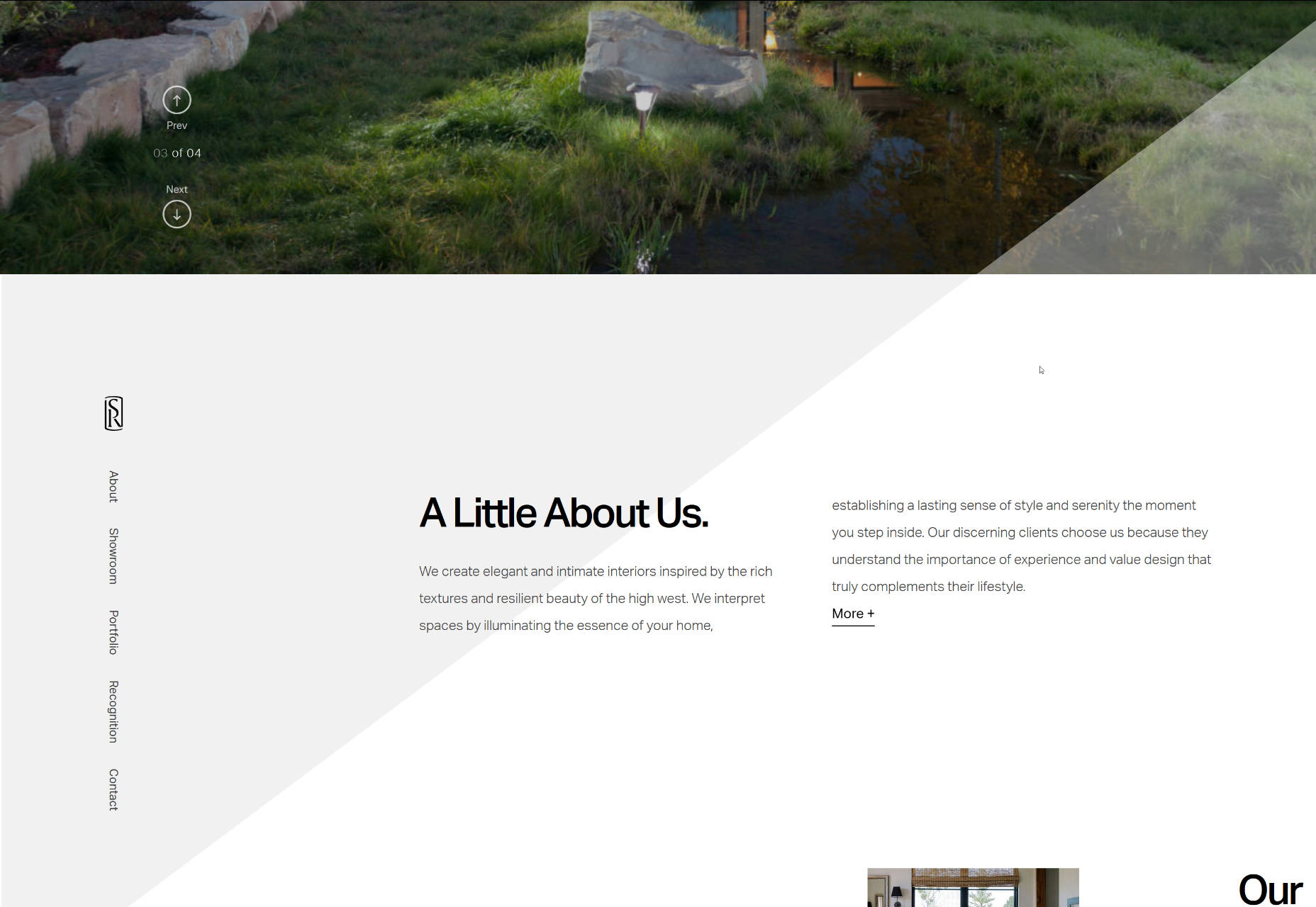
Vertical lettering is a brand-new trend these days. It looks increasingly fresh, and naturally stands out from the usual horizontally-oriented content. What's more, it takes less space: just a narrow line. Nonetheless, it is visually weighty since it is stretched almost to the height of the screen. Compact, informative and zingy—an ideal solution for contemporary designs. VR Sessions brings home to us how to implement this type of navigation successfully. The team has turned its navigation 90 degrees, and placed it in a dedicated panel along with the logo. Nice and ingenious.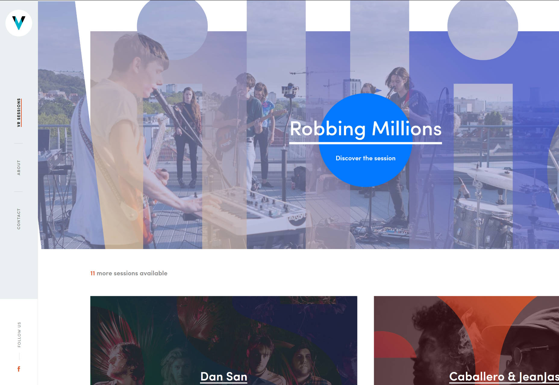 In the beginning, the Snake River Interiors website features a banal nav bar in the header; however, when you begin to scroll down, it smoothly transforms into the menu with vertical typography that sticks to the left side and follows the visitors. It certainly does the trick here.
2. Menu scattered around the perimeter of the screen
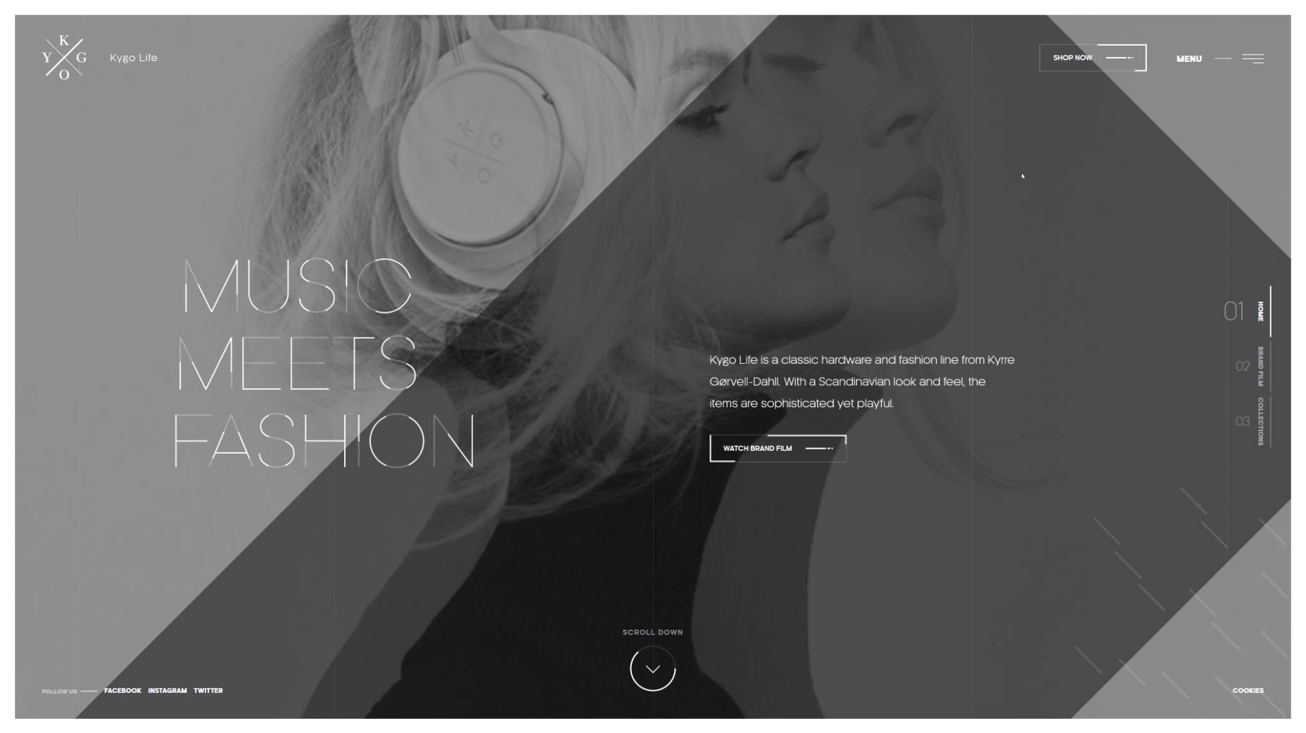
It is not a widely-used solution, and usually, it requires a proper environment, like a centered layout with perceptible gutters around the structure; nevertheless, it is a good way to give some zest to your navigation. Predictably, you may think that this concept is ideal only for small websites that have no more than four inner directories since there are just four corners. Well, that is not exactly correct. Take a look at the front page of Proud and Punch.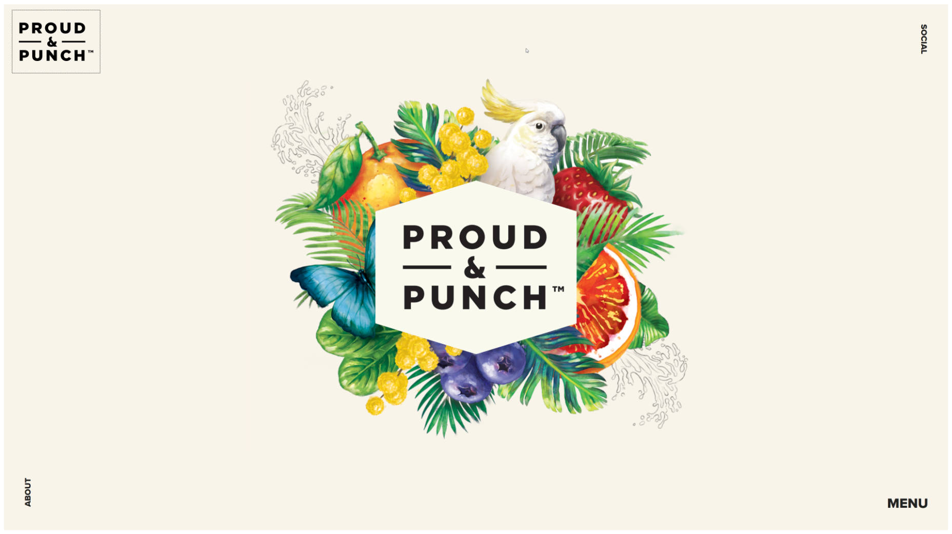 Each corner is reserved for its piece of information: logotype, socials, menu icon and quick access to the ‘about’ section. The team has skillfully identified their priorities, and kept everything neat and simple; whereas the team behind the Kygo Life did not limit itself at all, using the free space as effectively as possible. The homepage features lots of stuff that is located on the border of the page: CTAs, navigation indicators, social media, logotype, and some other things, resulting in a nifty design.
3. Ultra-narrow slide-out menu
Sidebars make a return. It is not dramatic, but still pretty perceptible. They are slicker, thinner, more compact and more elegant than before. In point of fact, it is just one ultra-narrow column that houses several elements: logotype, menu icon and depending on artist’s preferences it can be social icons, link to portfolio or standard icon-based pagination of the hero slider. Usually, it is located on the left side and seamlessly integrated. As for behavior, in the majority of cases, it just slides out revealing all the hidden elements like in mobile apps. The personal portfolio of Maison Ullens features one of these. The homepage is split into two unequal parts. The first one is a sidebar with the logotype and link to the menu and the second one is the primary content area. The solution naturally directs the attention towards the ‘welcome’ area and at the same time unobtrusively establishes a focal point.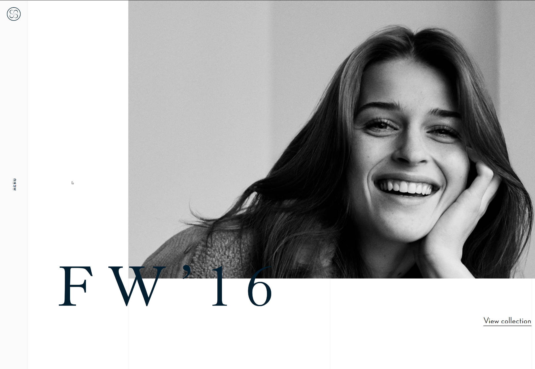
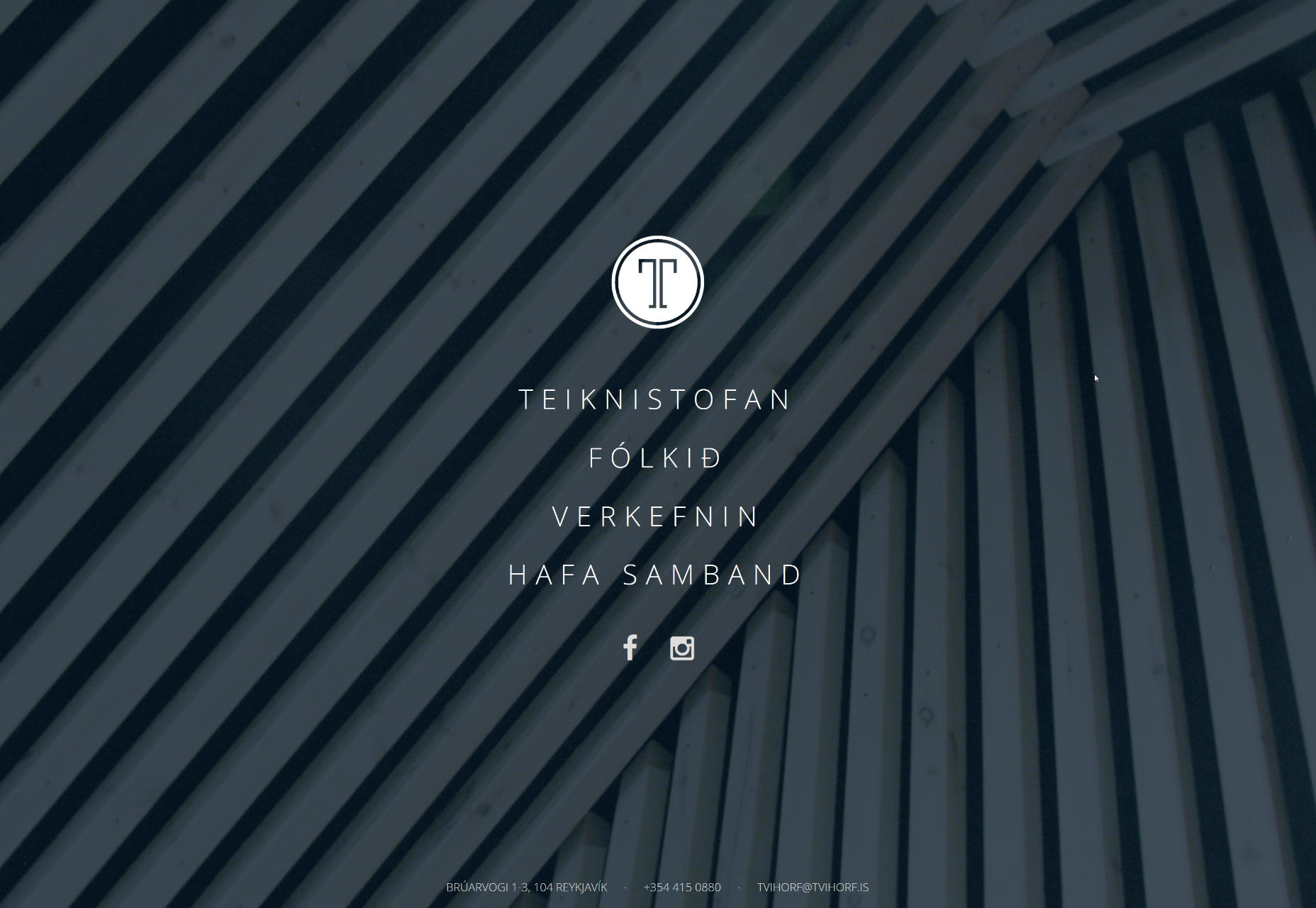
4. Soaring vertical menu
You might say, “That’s ancient history.” Much like a horizontal menu, vertical navigation seems to be banal and trivial. However, in the era of the hamburger menu button, it too looks like a craze. It can be used both against the solid color and transparent backgrounds. It can be placed anywhere; but as a rule, it’s paired with the logo. For example, Linmark; the team utilizes a traditional vertical navigation that is carefully arranged on the right side of the screen. It starts with the type-based logotype and ends with the set of social media links presented as icons. The right side of each slide is intentionally whitened so that the component gets the necessary contrast to hit the optimal readability. The solution feels unusual.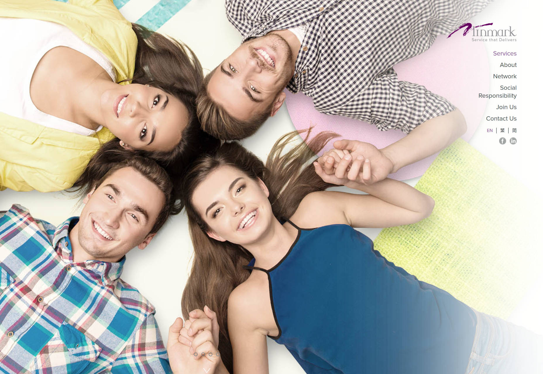 Tvihorf welcomes online visitors with the activated menu that is presented as a conventional vertical navigation where options are carefully arranged line by line. It occupies the leading position, but not dominant. As you may expect, located in the heart of the page, it predictably catches the eye from the first seconds. It looks neat, crisp and subtle, going perfectly well with the logotype and prevailing businesslike atmosphere.
Conclusion
As the saying goes, small details make a big difference; and such a common element of the website design as the menu is capable of enriching the general aesthetic, adding some nice twists to the structure, and enhancing the user experience when it stands out from the crowd. These four types of navigation might not impress your visitors with their incredible dynamic behavior, nor intricate realization. They will just feel unique, refreshing and original.Nataly Birch


Read Next

15 Best New Fonts, July 2024
Welcome to our monthly roundup of the best fonts we’ve found online in the last four weeks. This month, there are fewer…
By Ben Moss

20 Best New Websites, July 2024
Welcome to July’s round up of websites to inspire you. This month’s collection ranges from the most stripped-back…

Top 7 WordPress Plugins for 2024: Enhance Your Site's Performance
WordPress is a hands-down favorite of website designers and developers. Renowned for its flexibility and ease of use,…
By WDD Staff

Exciting New Tools for Designers, July 2024
Welcome to this July’s collection of tools, gathered from around the web over the past month. We hope you’ll find…

3 Essential Design Trends, July 2024
Add some summer sizzle to your design projects with trendy website elements. Learn what's trending and how to use these…

15 Best New Fonts, June 2024
Welcome to our roundup of the best new fonts we’ve found online in the last month. This month, there are notably fewer…
By Ben Moss

20 Best New Websites, June 2024
Arranging content in an easily accessible way is the backbone of any user-friendly website. A good website will present…

Exciting New Tools for Designers, June 2024
In this month’s roundup of the best tools for web designers and developers, we’ll explore a range of new and noteworthy…

3 Essential Design Trends, June 2024
Summer is off to a fun start with some highly dramatic website design trends showing up in projects. Let's dive in!

15 Best New Fonts, May 2024
In this month’s edition, there are lots of historically-inspired typefaces, more of the growing trend for French…
By Ben Moss

How to Reduce The Carbon Footprint of Your Website
On average, a web page produces 4.61 grams of CO2 for every page view; for whole sites, that amounts to hundreds of KG…
By Simon Sterne

20 Best New Websites, May 2024
Welcome to May’s compilation of the best sites on the web. This month we’re focused on color for younger humans,…