

So why do we need a design language?
There are two ways of looking at it, from an internal and an external perspective.Internal
It creates a holistic perspective to ensure we’re all adhering to the same methodologies and patterns as a team. Every team member should be inline with the concept that we’re promoting and should be able to reference the design principles against any project they are currently working on. The main goal of a design language is to create focus and clarity for designers. A design language is like any language. If there is any confusion it will cause a breakdown in communication.External
Having a cohesive Design Language creates harmony within a platform. For onlookers, standardised colours, interactions and patterns creates a sense of familiarity and security. A well planned and well executed design language is the key to a gratifying experience. For instance, if you walk into a Starbucks in Iceland, you will recognize a lot of similar touches to your local Starbucks down the road. Familiarity brings a sense of comfort and security to the user.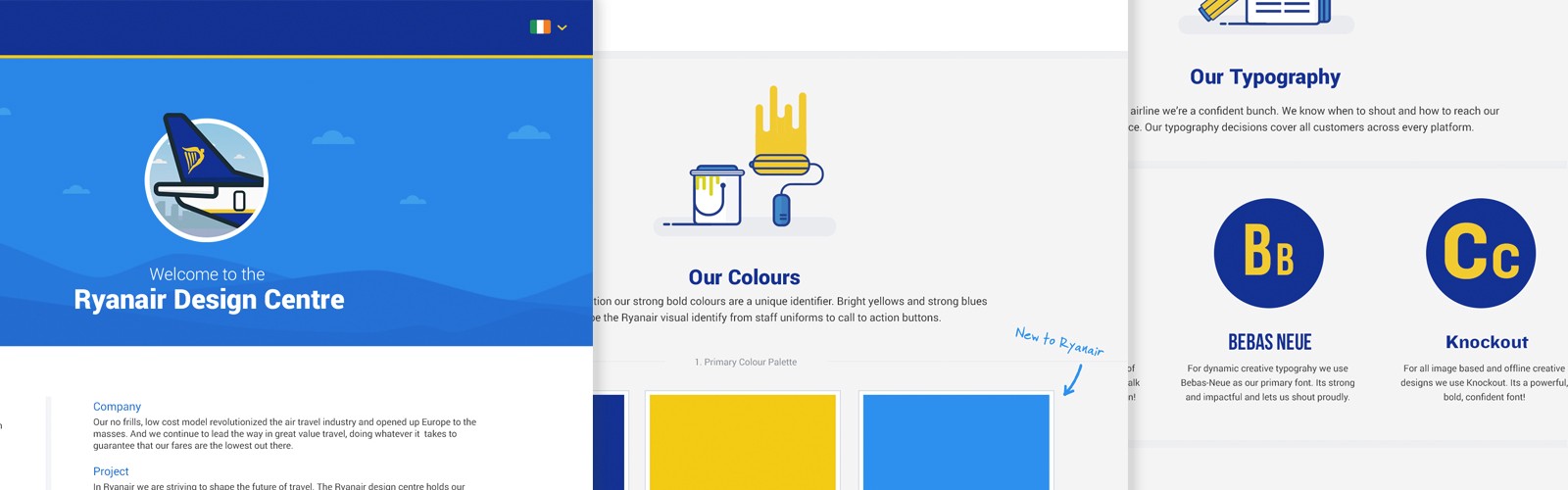 Introducing design constraints on individual elements within a platform creates consistency at a higher level.
A successful design language will:
Introducing design constraints on individual elements within a platform creates consistency at a higher level.
A successful design language will:
- Focus: allow the designer to focus clearly on the project at hand rather then to be diverted by other distractions.
- Clarity: allow the designer to think clearly about our design beliefs as well as the design constraints in place across the platform.
- Confidence: allow the designer to have complete confidence in what they are designing and that it is in line with others in the team.
- Consistency: create consistency across the product which in turn will create a secure, familiar experience across the platform.
- Efficiency: create understanding across the teams, meaning less time consumed concentrating on the less important details.
Building the foundations
Design principles
Having solid design principles in place, that the whole team has contributed to, ensures that we’re all adhering to the same methodologies and patterns as a team. Every team member should be in line with the concept that we’re promoting and should be able to reference the design principles against any project they are currently working on.Tone of voice
Its important to create a consistent voice for our product. Each designer (or whoever is involved) should be aware of the approach needed when writing content. Having consistent content is a very large part of creating a consistent user experience and all designers should try to align all content accordingly.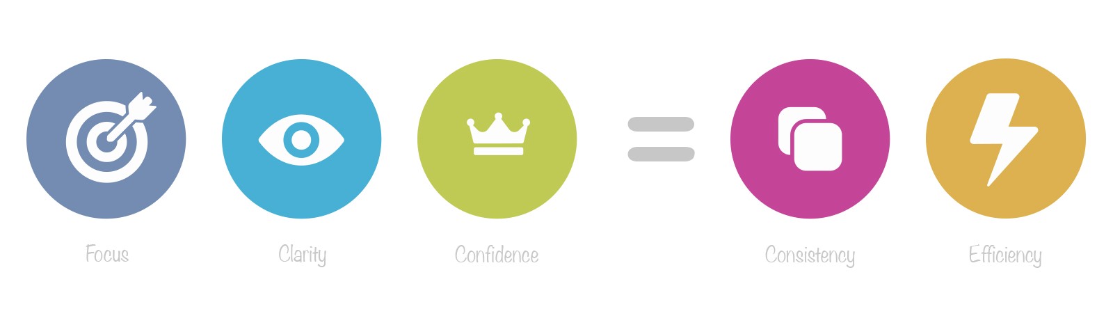 How do we work together as a team? It’s important that everyone pulls in the same direction and everyone agrees that the chosen values are important to creating a happy working environment.
There are obviously a whole lot more elements you can establish to create a core foundation for your design identity. The above is just the tip of the iceberg. Every company is different so feel free to expand on it as much as you feel is right to explain the methodologies of your approach.
How do we work together as a team? It’s important that everyone pulls in the same direction and everyone agrees that the chosen values are important to creating a happy working environment.
There are obviously a whole lot more elements you can establish to create a core foundation for your design identity. The above is just the tip of the iceberg. Every company is different so feel free to expand on it as much as you feel is right to explain the methodologies of your approach.
Visual identity
Creating the visual identity isn’t something that will be created overnight. It takes time. Sometimes it’s as clear as day as to what is needed, other times it takes time for the building blocks to fall into place. Once in place, it’s important that the fundamentals are captured and documented at a high level. The likes of use of colour, typography and style of iconography is key to creating consistency across a platform.- Colours: What is the colour palette used on the platform? Explain how, where and why we use certain colours.
- Typography: What typeface is used on the platform? Summarises rules around weighting, sizing, vertical alignment etc?
- Iconography: What is the generic style for icons? It will explain the rational as to why we have specific styles for different icon families.
- Grid/Layouts: What grid system is used across the platform? Explain the use of the grid and the high level idealism of our layouts.
- Interactions: What do people expect to see when they interact with our site? Give an overview of our standard interactions.
- Animations: How do we approach animations? Explain the reason for animations on the platform and our constraints around using them.
- Design Resources: A central point for assets to be easily downloaded for external partners. Colour swatches, logo’s, icon sets etc.
The next steps
You probably are fully aware of how important a design language is within your platform but saying to yourself ’where do I start?. This article is pretty high level. Creating a design language goes far, far deeper then what I have identified above. The creation of the style guide and in turn the development of a component library is the evolution of a design system. So here is a process that I’ve put together that should help you focus on exactly what is needed to get the ball rolling:Do a UI inventory audit
Before you start anything, its best to identify how inconsistent the current build is. This works in two ways. It helps identify the reason as to why you’re doing it, to identify how inconsistent everything is but it should help you get the backing of the business as to why exactly you’re creating the design system; to create consistency across the platform. Brad Frost has put together a great article around how you go about doing a UI audit.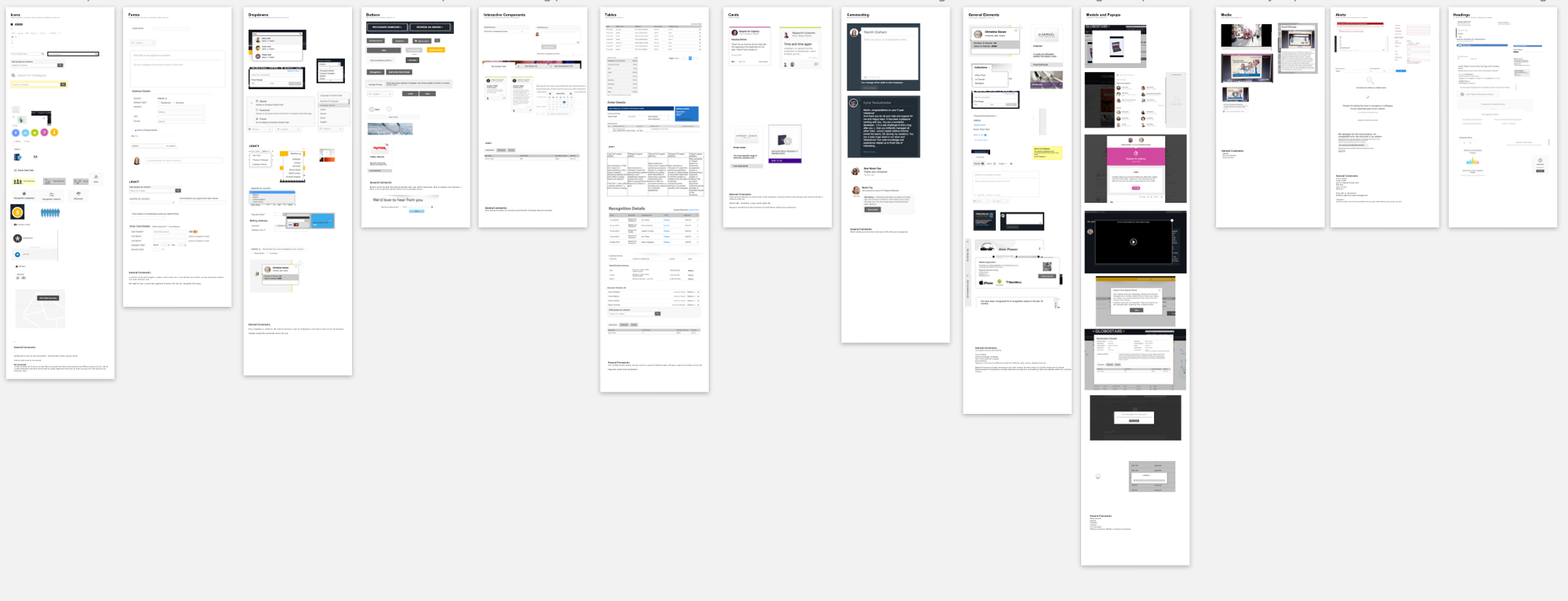 An example of a UI Audit
Prioritize your UI elements
I’m sure every design team has different priorities with regards to what they feel is crucial to creating consistency but there are generally some elements that are critical to creating the basics. The likes of colors, typography and iconography is a great place to start. Work closely with the design and development team to create a list of priorities based on your UI audit, this should guide your road map for the foreseeable future. I’ve found using a Trello board, as a way to keep a priority list up to date, is a great way of working. It allows you to a) create your list and set items in a line of priority i.e. what are you going to tackle first and b) allows you to track exactly how far along you are with each component.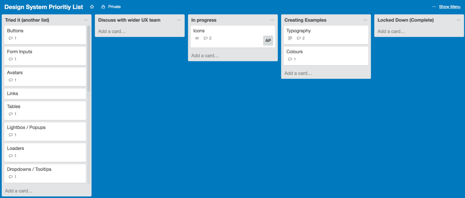 An example of a Trello board documenting the transition of a component in the cycle
Start discussions with the design team
So now that you’ve identified exactly what you’re going to be tackling first in the priority list, it’s time to sit down with the design team to get all ideas and opinions out around the first components needed. There are various approaches as to who owns the design system project, but for this example I’m going to take the instance that there is one sole designer who is in charge of the project. This means it’s up to you to discuss every aspect of the component with the designers who will, in time, be using the design language. This is extremely important to ensure that the designers all feel as if they have had an input into what is being created.Document all instances
Its time to start making some decisions. Document what you are creating, ensuring that you’re catering for all instances needed. It’s vital that what you are creating is not subjective. You have to have rationale as to why you are making these decisions as it will allow you to explain your decisions to the design team down the line.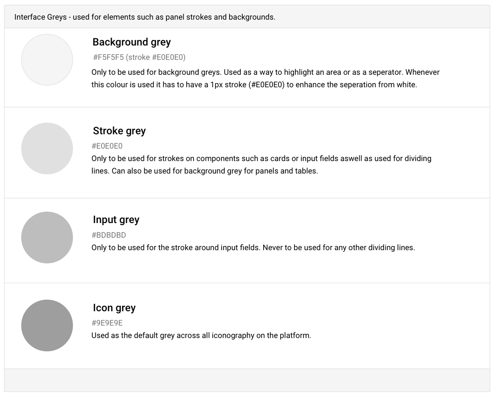 An example of color usage.
See if it works
The next step is to try out your decisions. It’s very easy to make decisions on paper but when you are putting them into practice it might turn out that some decisions just don’t work. Try out some examples of the new style using current designs.Lock it down
Once you are happy with the outcome, and you have buy-in from all parties, it’s time to lock it down and educate the rest of the team as to how and why these elements are to be used. It’s important to remember that although you are locking down the styling, if you feel certain elements aren’t working, you can change them if needs be.Move on to the next element
Once you have educated the team and are comfortable in the knowledge that the designers are respecting your decisions, it’s time to move on to the next set of elements. It’s up to you as to how many elements you take at a time, but you should never bite off too much. It will just distract you from really focusing on the smaller details. My starting preference would be : colors, typography, icons, input fields, tables, lists. Once everyone is educated as to what the new style is, it’s important that all designers and developers are implementing the styles properly. Weekly check-ins are vital to monitor the style choices to ensure that everyone is working off the same design decisions. Using products such as Craft by Invision really help bring consistency when moving forward.How to gauge success
The design language is not a success until the company starts using it and finding value in it.Examples of design languages
- https://www.ibm.com/design/language/framework
- https://www.lightningdesignsystem.com/
- https://design.atlassian.com/
- https://material.google.com/
- https://ux.mailchimp.com/patterns
- https://standards.usa.gov/
- https://rizzo.lonelyplanet.com/styleguide/design-elements/
- http://harmony.intuit.com/
- http://solid.buzzfeed.com/typography.html
- http://dev.office.com/fabric#/
The biggest existential threat to any system is neglectAlex Schleifer, VP of Design at Airbnb [-- This article was originally published on Medium. --]
Alan Power
I'm an Irish product designer who specialises on visual design, illustration and brand identity. With over 14 years in the industry, I've learned alot and try to use my experience to bring some clarity to any product I'm working on.


Read Next

15 Best New Fonts, July 2024
Welcome to our monthly roundup of the best fonts we’ve found online in the last four weeks. This month, there are fewer…
By Ben Moss

20 Best New Websites, July 2024
Welcome to July’s round up of websites to inspire you. This month’s collection ranges from the most stripped-back…

Top 7 WordPress Plugins for 2024: Enhance Your Site's Performance
WordPress is a hands-down favorite of website designers and developers. Renowned for its flexibility and ease of use,…
By WDD Staff

Exciting New Tools for Designers, July 2024
Welcome to this July’s collection of tools, gathered from around the web over the past month. We hope you’ll find…

3 Essential Design Trends, July 2024
Add some summer sizzle to your design projects with trendy website elements. Learn what's trending and how to use these…

15 Best New Fonts, June 2024
Welcome to our roundup of the best new fonts we’ve found online in the last month. This month, there are notably fewer…
By Ben Moss

20 Best New Websites, June 2024
Arranging content in an easily accessible way is the backbone of any user-friendly website. A good website will present…

Exciting New Tools for Designers, June 2024
In this month’s roundup of the best tools for web designers and developers, we’ll explore a range of new and noteworthy…

3 Essential Design Trends, June 2024
Summer is off to a fun start with some highly dramatic website design trends showing up in projects. Let's dive in!

15 Best New Fonts, May 2024
In this month’s edition, there are lots of historically-inspired typefaces, more of the growing trend for French…
By Ben Moss

How to Reduce The Carbon Footprint of Your Website
On average, a web page produces 4.61 grams of CO2 for every page view; for whole sites, that amounts to hundreds of KG…
By Simon Sterne

20 Best New Websites, May 2024
Welcome to May’s compilation of the best sites on the web. This month we’re focused on color for younger humans,…