Three main types of breadcrumb navigation
There are three main types of breadcrumbs you’ll usually encounter on any given site, with two being more popular than the last one.Location breadcrumbs
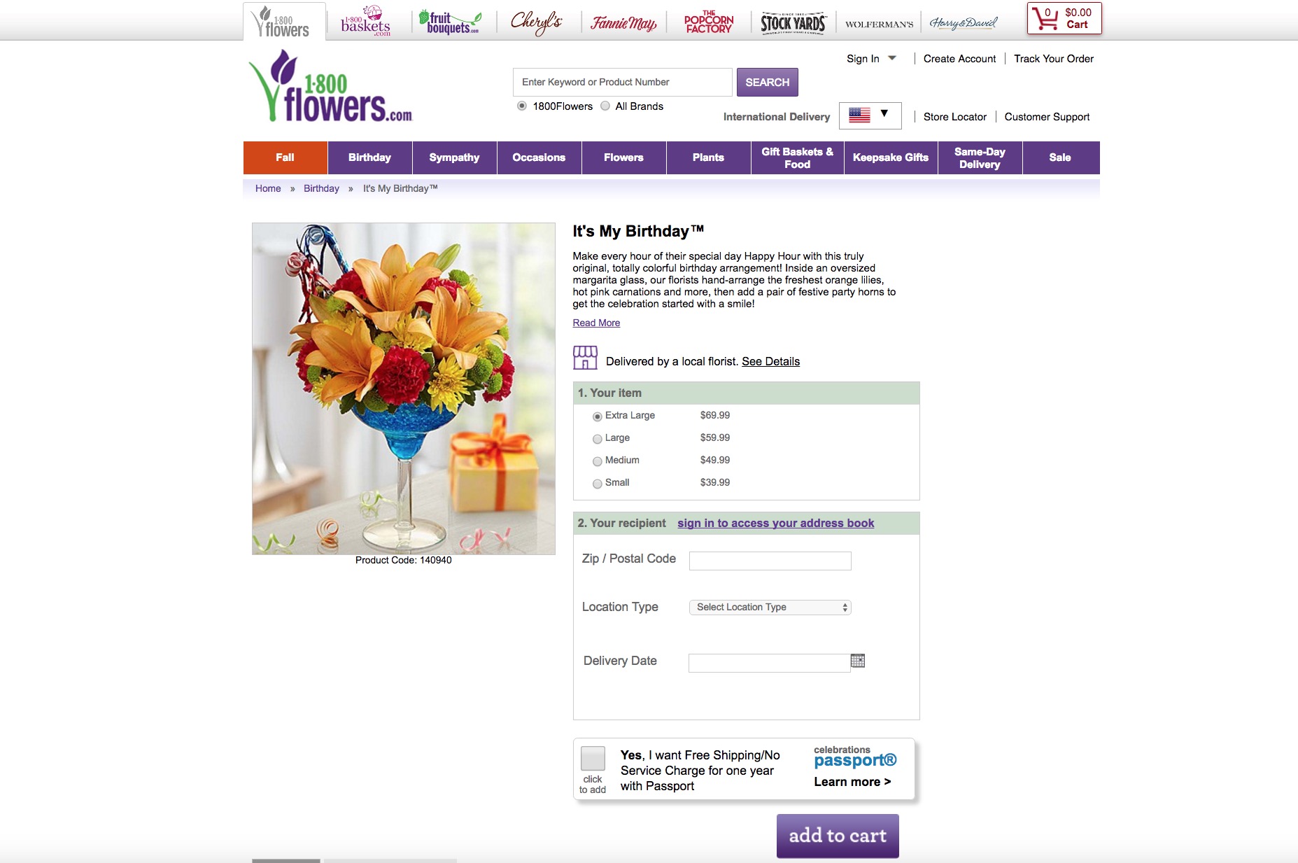
One of the two most popular kinds you’ll encounter, location breadcrumbs tell your users where they are in regard to the site’s hierarchy. Its straightforward organization that orients users in a clear-cut manner within the site makes this type very widely used. Popular among sites that have numerous levels of content and layers of navigation, location breadcrumbs empower users to efficiently get back to previous, higher levels of content with a simple click. Also, location breadcrumbs are static (they never change), making them a reliable way of helping to reorient users. 1-800 Flowers provides the classic example of functional location breadcrumbs. Each time a shopper visits the It’s My Birthday floral arrangement page, he’ll see that he first had to click on the Birthday category after starting from the homepage. Of course, he can click on each higher level breadcrumb to get there instantly.
Attribute breadcrumbs
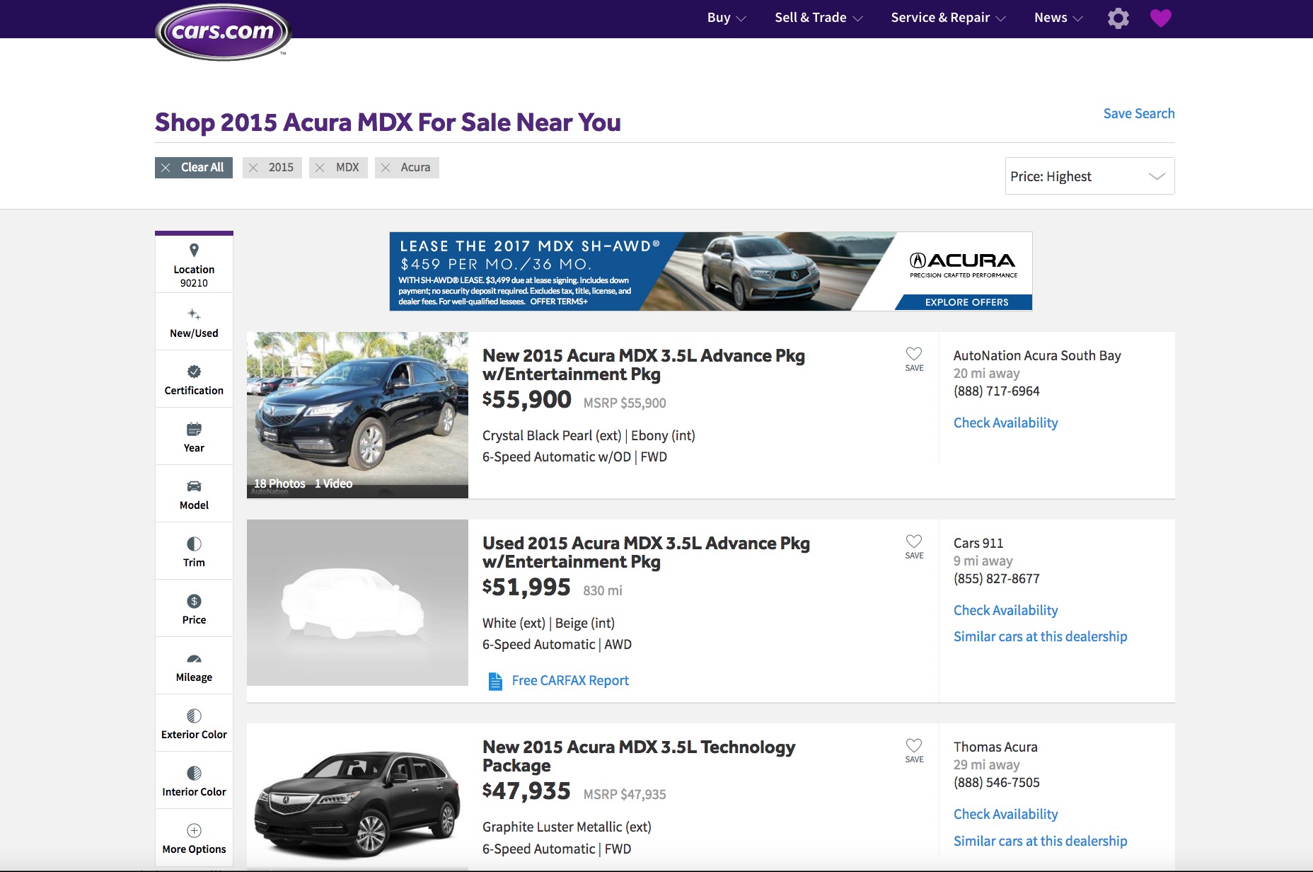
Attribute breadcrumbs are the second major type you’ll encounter. Unlike location breadcrumbs, these work sort of like filter choices in that they’re not static and continually change based on the preferences of the user. They won’t tell you your location on the site, but instead display meta data about the page’s content. Attribute breadcrumbs are therefore popular with e-commerce sites where you’re able to customize what you want to buy, such as on car sites. As a result, you can’t necessarily use this type of breadcrumb approach to find your way back to pages you already visited. To see what I’m talking about, check out Cars.com’s breadcrumbs. When you search for cars by make and model, notice the breadcrumbs near the top-left of the screen, just underneath the site logo. The year, make and model all represent previous searches on the site, but they don’t provide a reliable trail to revisit old pages that you already viewed. Note the difference between this type of breadcrumb and the location breadcrumbs, which allow you to revisit exactly the pages you recently visited.
Path breadcrumbs
Path breadcrumbs are the least popular of the three because, quite frankly, all they do is replicate what a browser’s back button already does! That’s not helping to improve UX at all; it’s rather quite redundant. Also known as a history trail, path breadcrumbs really aren’t that helpful since they don’t give additional context or information to visitors who land on a page that’s already deep within the site’s hierarchy. An example would be a visitor landing on a product page because he found a search result that he clicked on. Because of these UX problems that this type of breadcrumb causes, it’s getting increasingly rare to find it on sites today.Which type is most appropriate for what site?
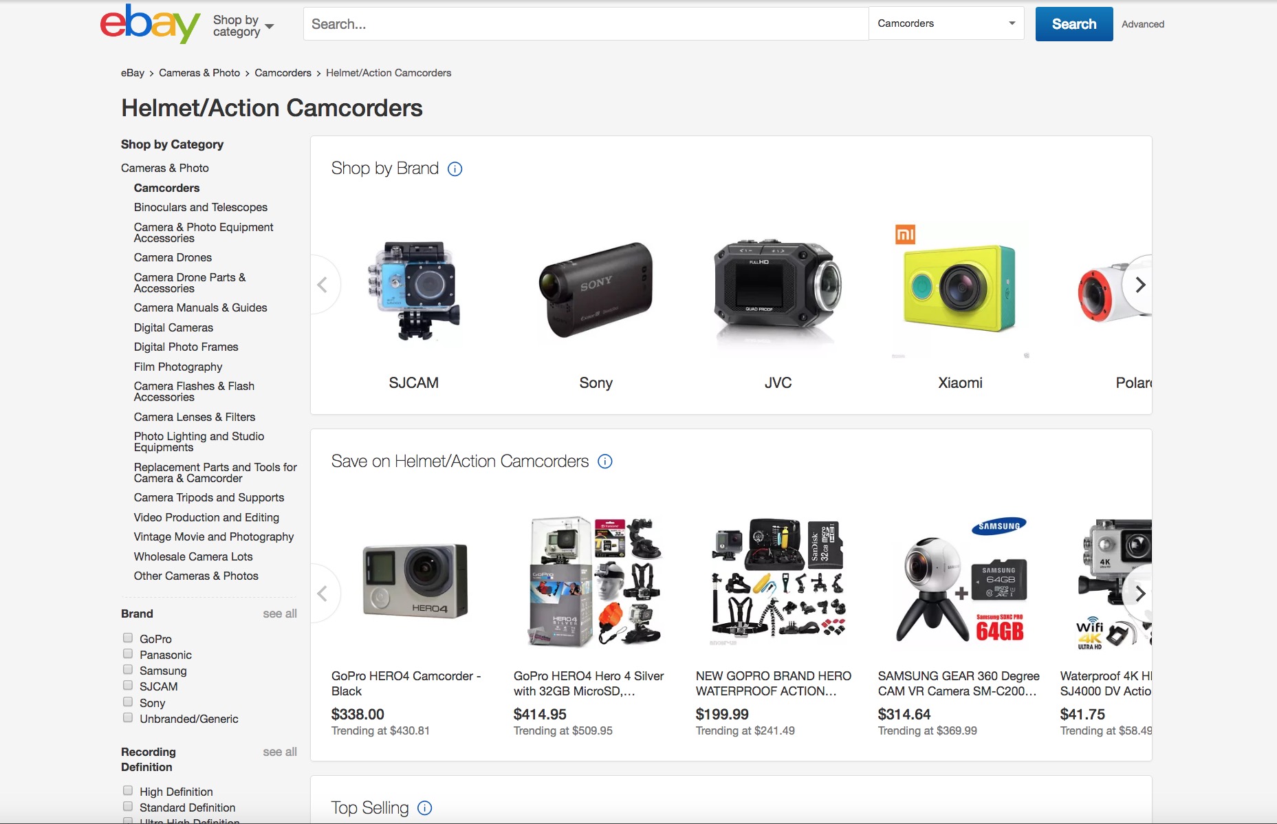
The breakdown of the three main types of breadcrumbs begs the obvious question, which is most suitable for what purpose? Let’s start off with the one you likely shouldn’t bother with anymore: path breadcrumbs. At the very least, this doesn’t help the UX; the worst-case scenario is that users might actually get confused by path breadcrumbs since they don’t show the proper hierarchy of different levels within the site. Now that we have that out of the way, let’s focus on just the location and attribute breadcrumbs. Location breadcrumbs are more appropriate for bigger sites that have very deep and levels of content. An excellent example of this is eBay, which is a huge store because of all the items that are up for sale or auction. Accordingly, location breadcrumbs are perfect for this depth of content, as visitors can clearly use the extra orientation. Now let’s turn our attention to attribute breadcrumbs.
As seen in the above example with Cars.com, eCommerce sites that offer shoppers many customizable options will greatly benefit from having this type of navigational aid. Sites with various customization options can be overwhelming to shoppers. That’s why giving them these filters makes more sense than location breadcrumbs since shoppers will want to keep track of the various changes they’ve made to their search results and orders.
Best practices for breadcrumbs
In general, when you follow these tips when designing breadcrumb navigation for your client’s sites, you can’t go wrong:- Ensure that there are no duplicate elements in your trail of breadcrumbs (read: pages that fall into multiple categories or levels of content) since that can actually confuse users.
- Use the greater-than sign (>) to break up the links in your breadcrumbs, as this is what users are already expecting from years of site familiarity and conventions.
- Use keywords that you want to actually rank for in SEO when deciding on the names of your different categories within your breadcrumbs, as this helps SEO.
Breadcrumbs: great idea, but not always used properly
As with many concepts in design and UX, a great idea that can be very helpful to users becomes a difficulty if it’s not implemented correctly. That’s what this brief guide is for: to equip you with the knowledge to empower you to design breadcrumbs to optimize UX instead of making no impact or even hurting it. While not an absolute necessity on every kind of site, breadcrumbs can provide users with an extra layer of navigational help when they’re either faced with many layers of content or a lot of options that they’d like to filter. Either way, the usability derived from breadcrumbs ultimately comes down to how designers implement them on their clients’ sites. By making sure that you understand the purpose behind each type of breadcrumb navigation, you assist yourself in making the right choice for the type of site you’re designing. And when you choose intelligently, you’ll have satisfied users, happy clients, and good referrals, so take some extra care the next time you’re dealing with breadcrumbs.Marc Schenker
Marc’s a copywriter who covers design news for Web Designer Depot. Find out more about him at thegloriouscompanyltd.com.
Read Next
15 Best New Fonts, July 2024
Welcome to our monthly roundup of the best fonts we’ve found online in the last four weeks. This month, there are fewer…
By Ben Moss
20 Best New Websites, July 2024
Welcome to July’s round up of websites to inspire you. This month’s collection ranges from the most stripped-back…
Top 7 WordPress Plugins for 2024: Enhance Your Site's Performance
WordPress is a hands-down favorite of website designers and developers. Renowned for its flexibility and ease of use,…
By WDD Staff
Exciting New Tools for Designers, July 2024
Welcome to this July’s collection of tools, gathered from around the web over the past month. We hope you’ll find…
3 Essential Design Trends, July 2024
Add some summer sizzle to your design projects with trendy website elements. Learn what's trending and how to use these…
15 Best New Fonts, June 2024
Welcome to our roundup of the best new fonts we’ve found online in the last month. This month, there are notably fewer…
By Ben Moss
20 Best New Websites, June 2024
Arranging content in an easily accessible way is the backbone of any user-friendly website. A good website will present…
Exciting New Tools for Designers, June 2024
In this month’s roundup of the best tools for web designers and developers, we’ll explore a range of new and noteworthy…
3 Essential Design Trends, June 2024
Summer is off to a fun start with some highly dramatic website design trends showing up in projects. Let's dive in!
15 Best New Fonts, May 2024
In this month’s edition, there are lots of historically-inspired typefaces, more of the growing trend for French…
By Ben Moss
How to Reduce The Carbon Footprint of Your Website
On average, a web page produces 4.61 grams of CO2 for every page view; for whole sites, that amounts to hundreds of KG…
By Simon Sterne
20 Best New Websites, May 2024
Welcome to May’s compilation of the best sites on the web. This month we’re focused on color for younger humans,…


