

Alex Suarez
Alex Suarez’s portfolio uses semi-flat design tastefully. While the site may be a bit low on contrast, the layout works, the drop shadows actually work, and the overall style gives a very clear picture of what kind of work to expect.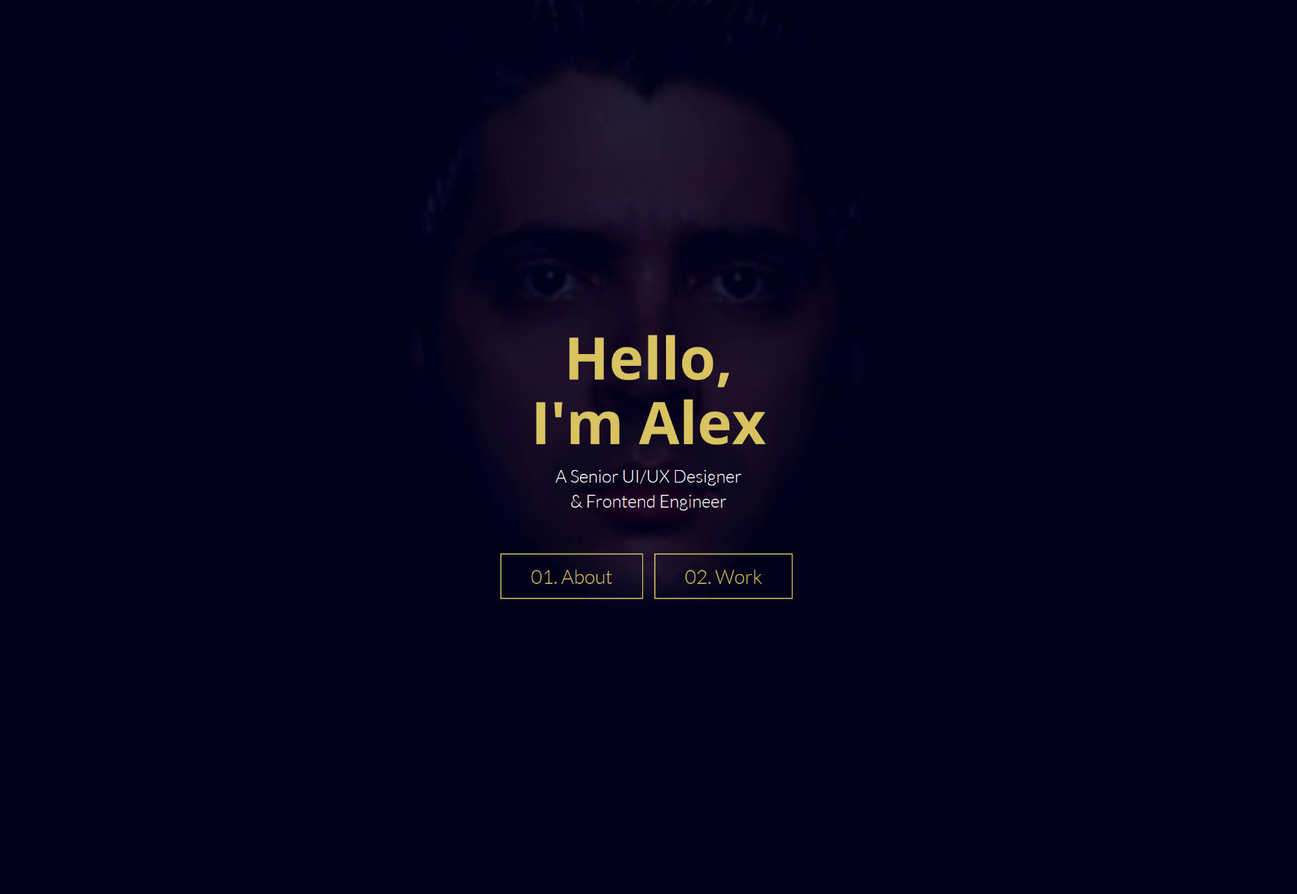
Robin Saulet
Robin Saulet uses brush fonts and colorful photography to give us a bit of a retro feel, while keeping the colors muted enough that they don’t blind anyone. It works well when paired with the now-classic full-screen-sections layout.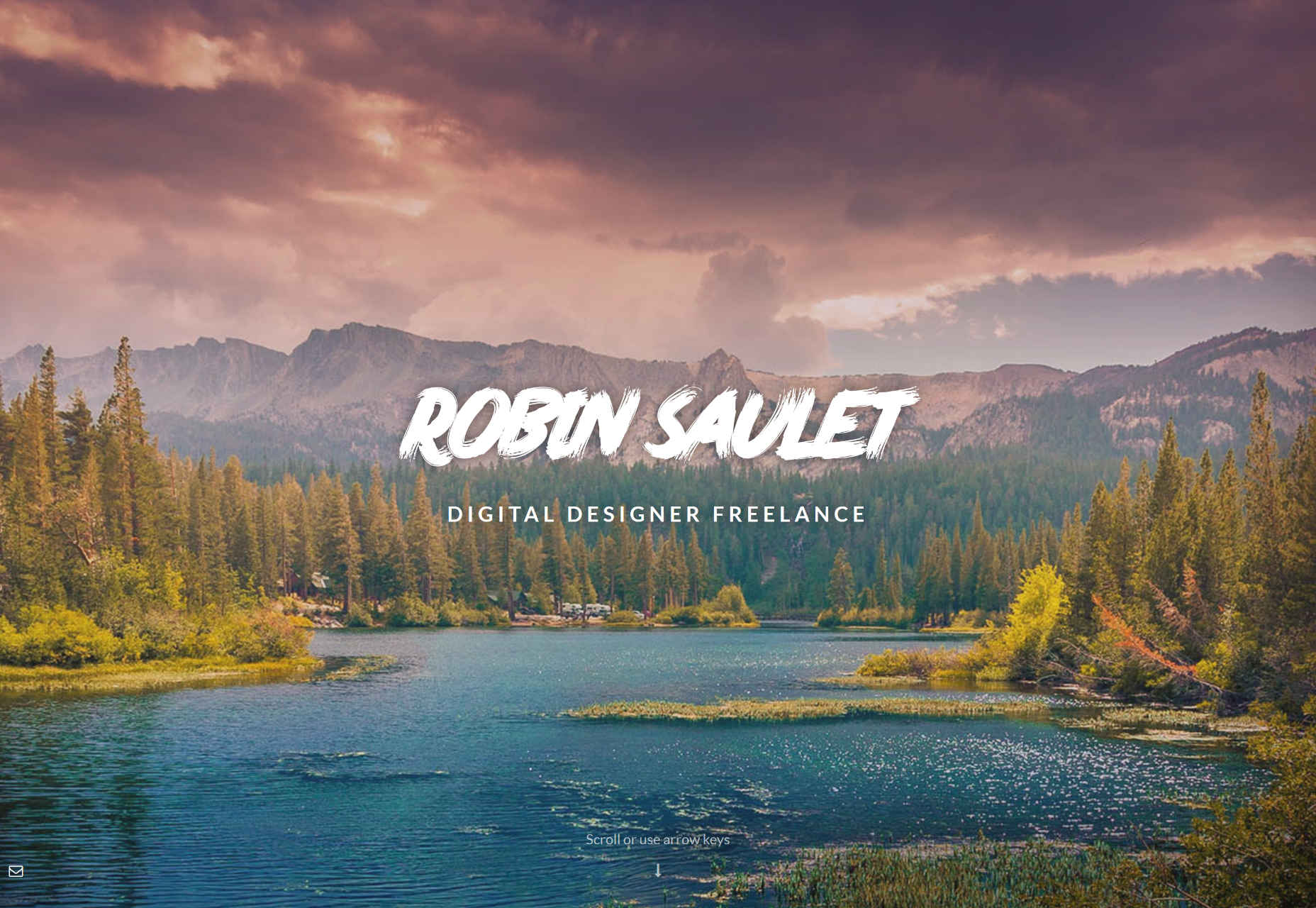
Carina Czisch
Carina Czisch’s portfolio is about as minimalist as they come without being brutalist, and looks fantastic for it. Now, the (large) header being the same on every page might confuse some people with small screens, but otherwise, this site is just plain calming to lok at.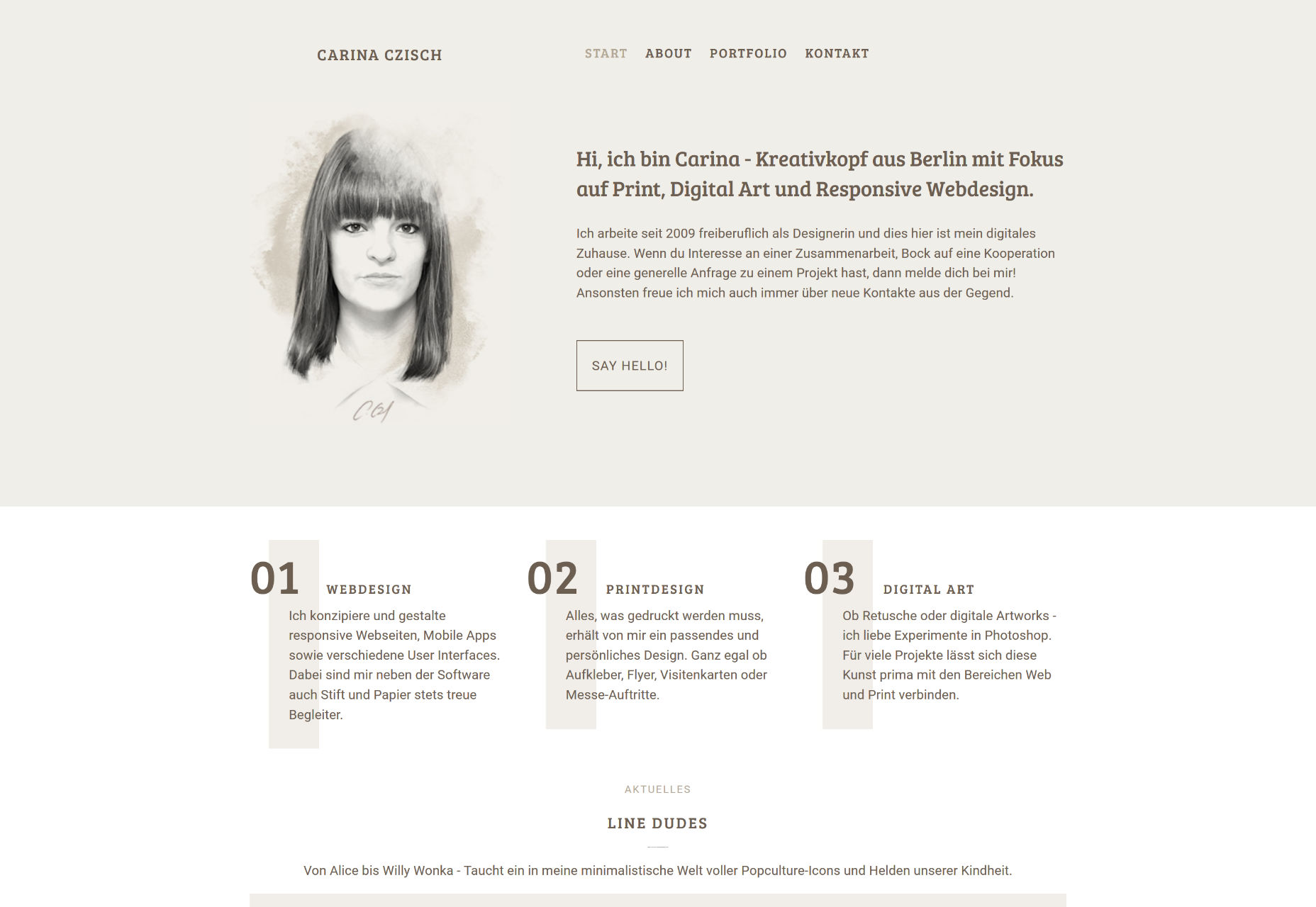
Owen O’Donnell
And here we have our first monthly it’s-nothing-too-original-but-still-well-done site! Good craftsmanship deserves appreciation, even if it’s similar to things you’ve seen before. I’d just recommend more paragraph breaks in the blog entries.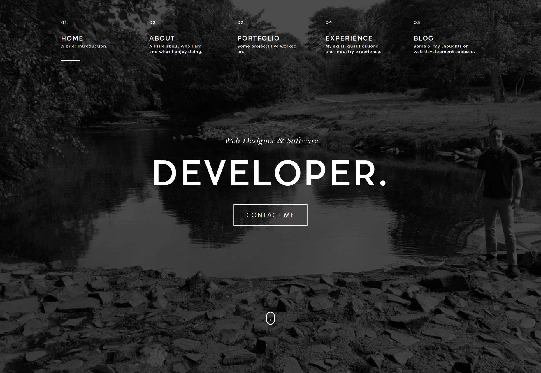
DUX
DUX doesn’t shy away from vibrant design. With the blues, greens, high contrast, geometric designs, and minimalist illustrations, this site is a glut of color and style. It’s enough to make you forget that it is, technically, a flat design. I love my minimalism, but it’s fun to see designers go all out, too. Know when to follow your constraints, and when to break them.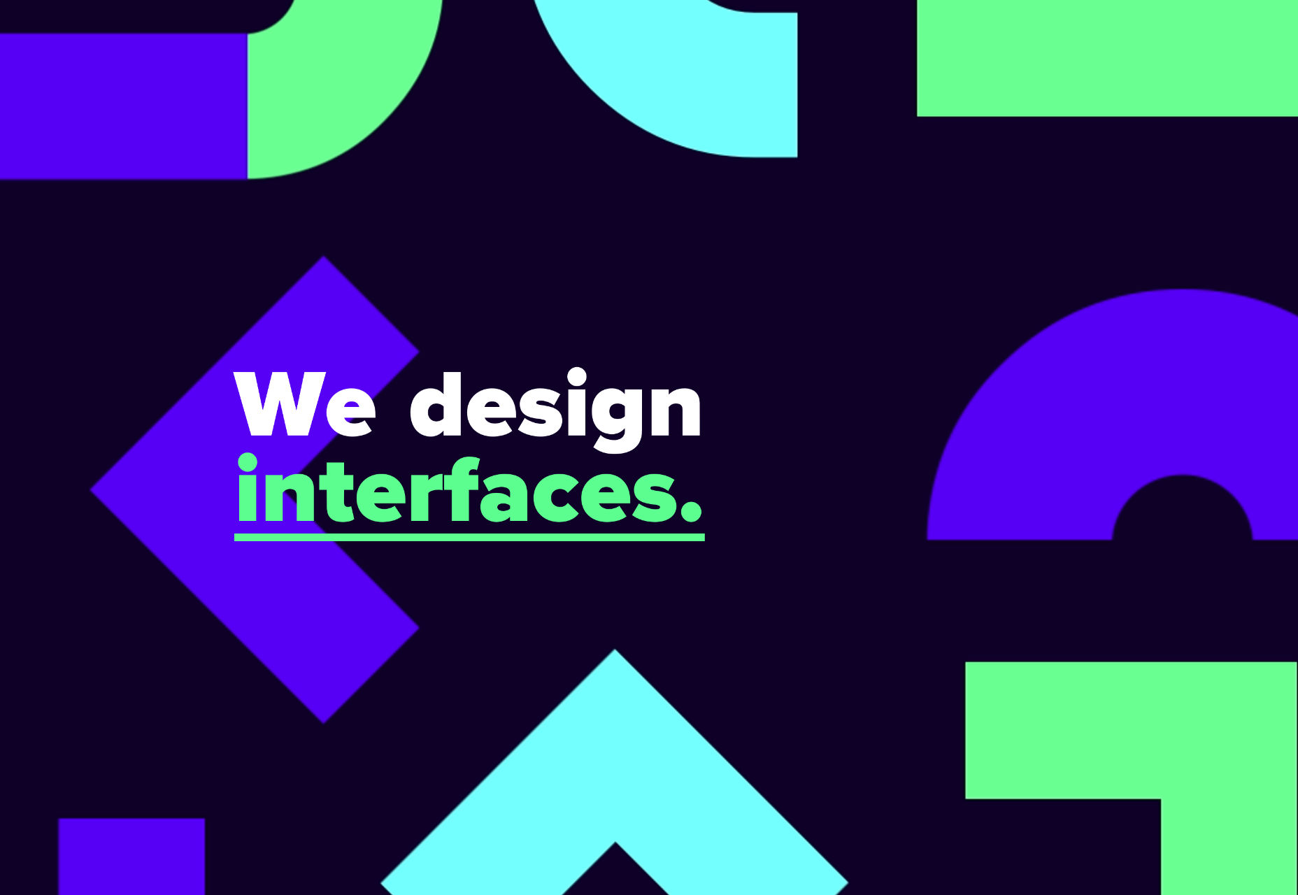
Jens Nielsen
And we go back to the mostly-monochrome minimalism with Jens Nielsen’s portfolio. It’s small, it’s sweet, it’s smooth. Go check it out.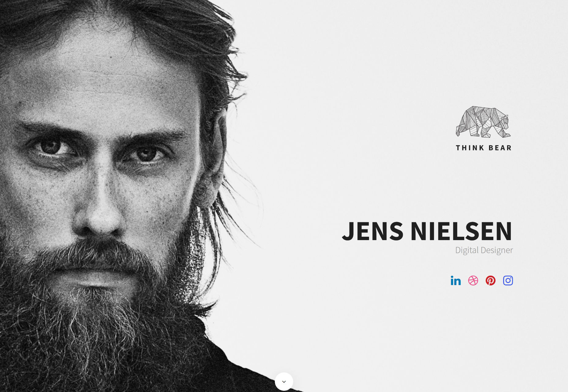
Florian Monfrini
Florian Monfrini’s portfolio follows the trend of many art-focused sites these days, with a focus on minimalism and asymmetry. As in other cases, it works quite well, here.
Re:collection
Re:collection is brought to you by minimalism, asymmetry, and presumably a whole lot of float: left;. I love it.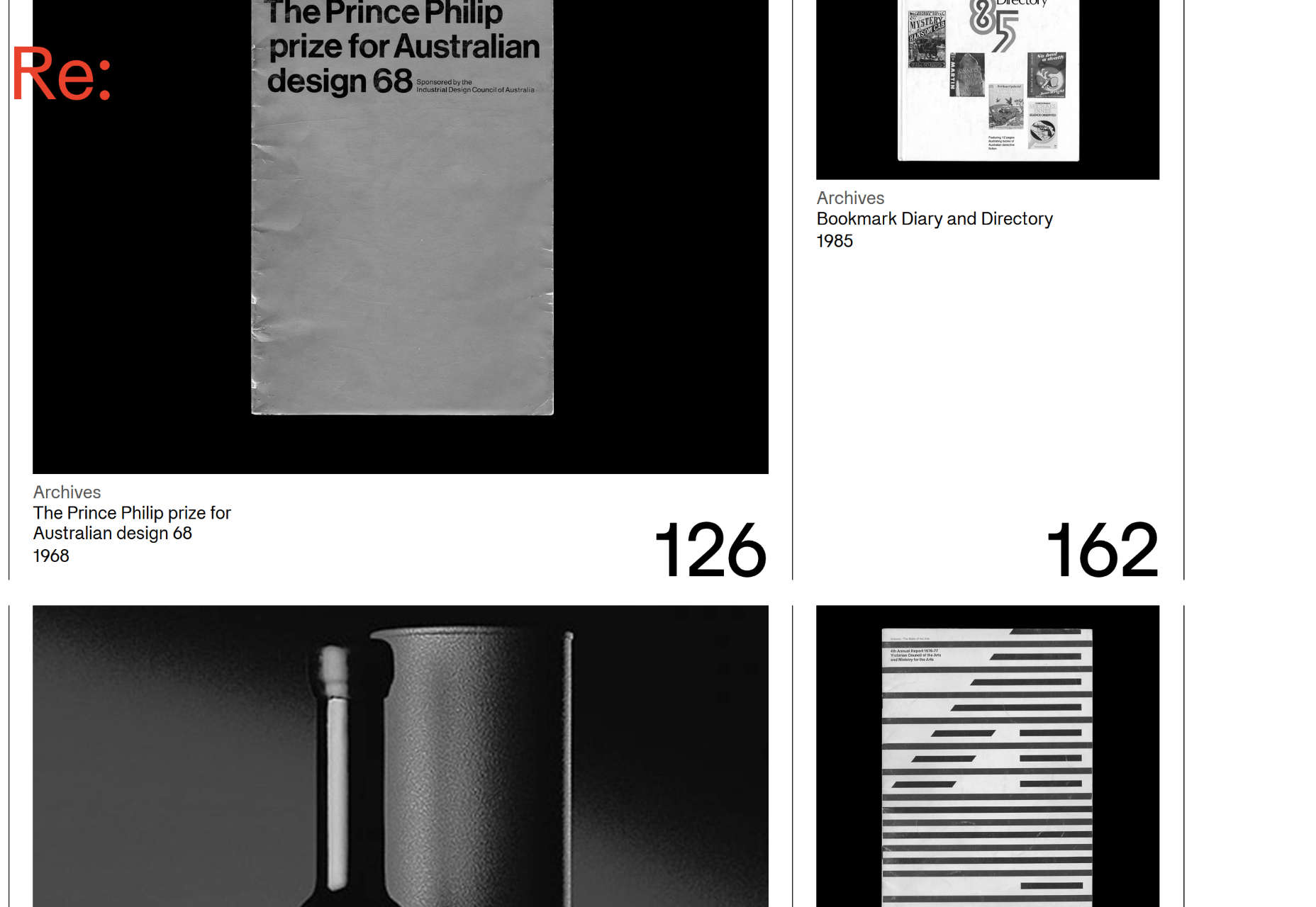
Liam Ricketts
Liam Ricketts’ portfolio takes things old-school with what may be one of the early 3D/Flash/Video effects I can think of. I don’t know what has possessed so many to make their photographs look like flags or other bits of cloth flapping in the wind, but here we are. Combined with a dead-simple modern layout, the effect make this site stand out in a big way, and that’s never a bad thing.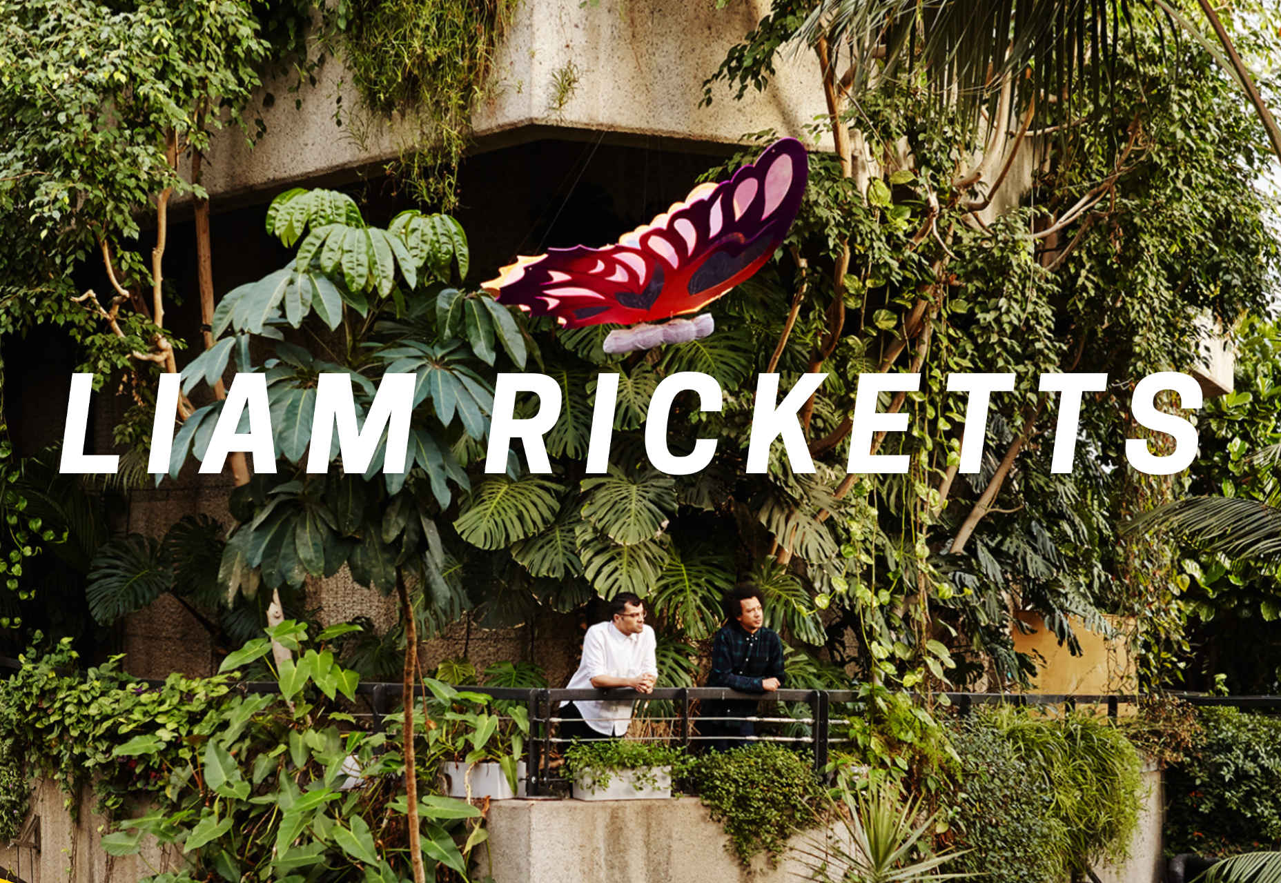
AW&CO
AW&CO brings more minimalism, more asymmetry. There’s a more elegant/fashionable feel to it, though, which seems appropriate, given their clientele.
E-TYPES
E-Types bnrings us yet more minimalism, and more asymmetry, but this time, it’s spiced up with motion in tthe form of background videos implemented with HTML5.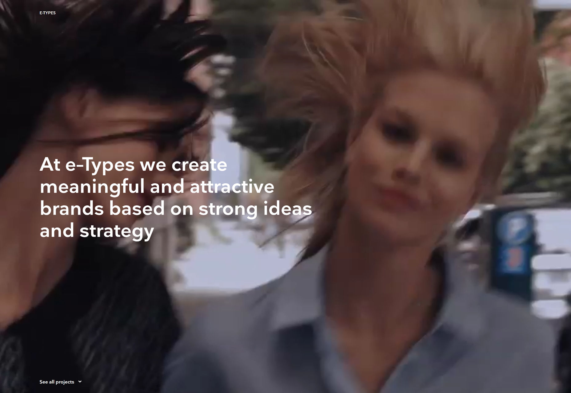
Oblik
Oblik is one of those portfolio sites that likes to put their navigation all around the page. In this case, though, it makes sense. The navigation text on the upper left brings up a modal screen about the studio itself, and the ones on the bottom navigate through the projects. See? Make a lot more sense than putting “About us”, “Work”, and “Contact” in three different corners.
Lionel Durimel
Lionel Durimel’s portfolio also makes use of some fairly original navigation. Use your mouse wheel to horizontally scroll through three rows of project names, and hover over one for a preview. The rest of the page layouts largely stick to convention, which is good for the usability.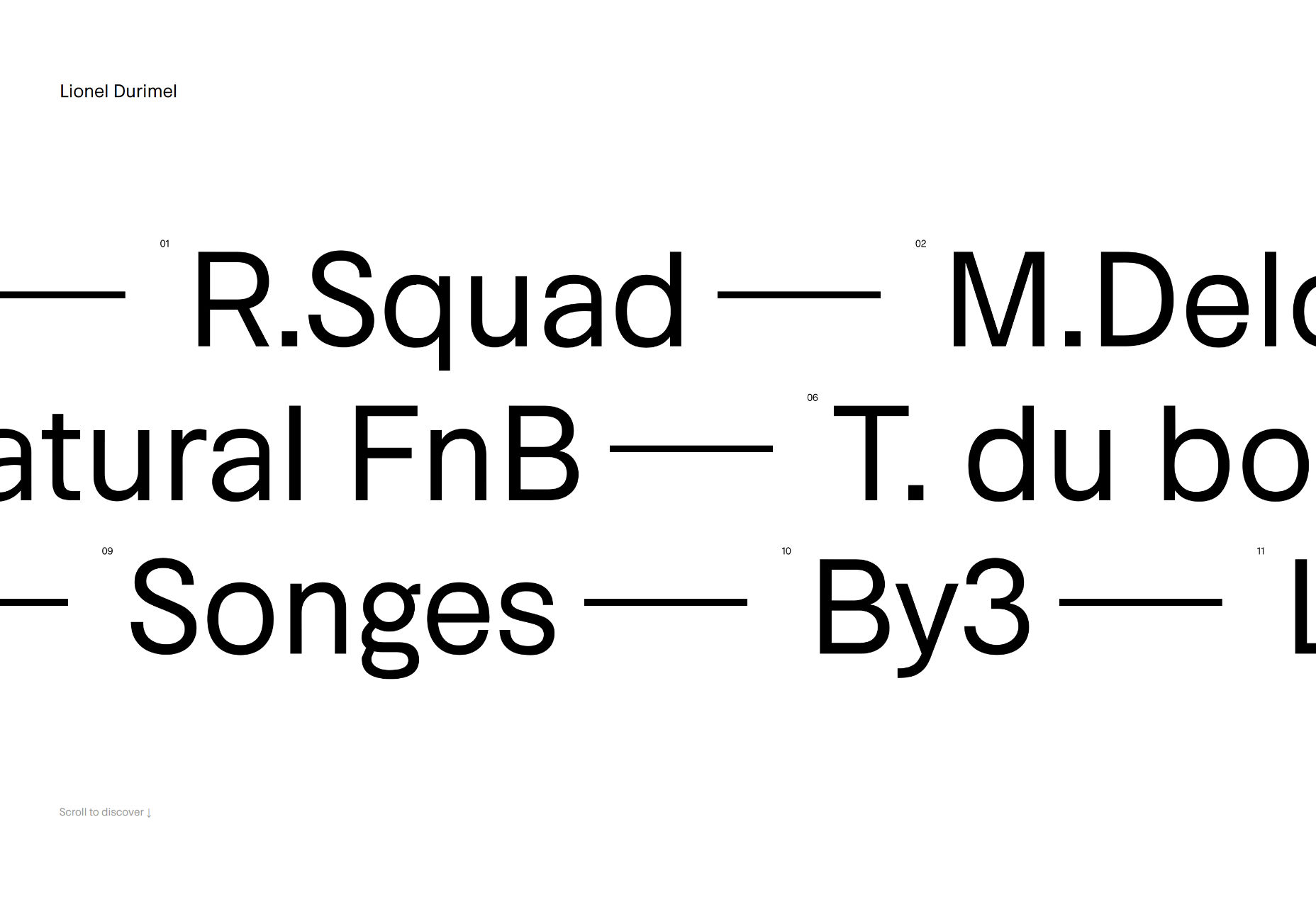
Mozell
Mozell shows off their work in an interface that is more app/Powerpoint than site. For their content, though, it works.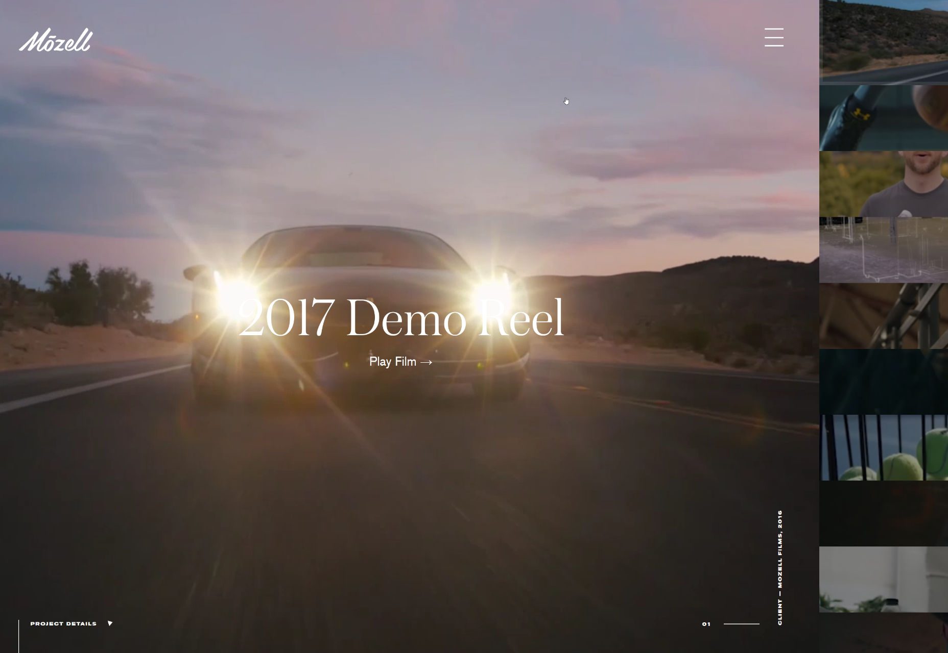
Brave
Brave is a design studio that focuses on working with nonprofits and charities.They don’t do anything out of the ordinary in the layout department, but trheir chosen imagery (and background videos) are spot-on, and well-though-out.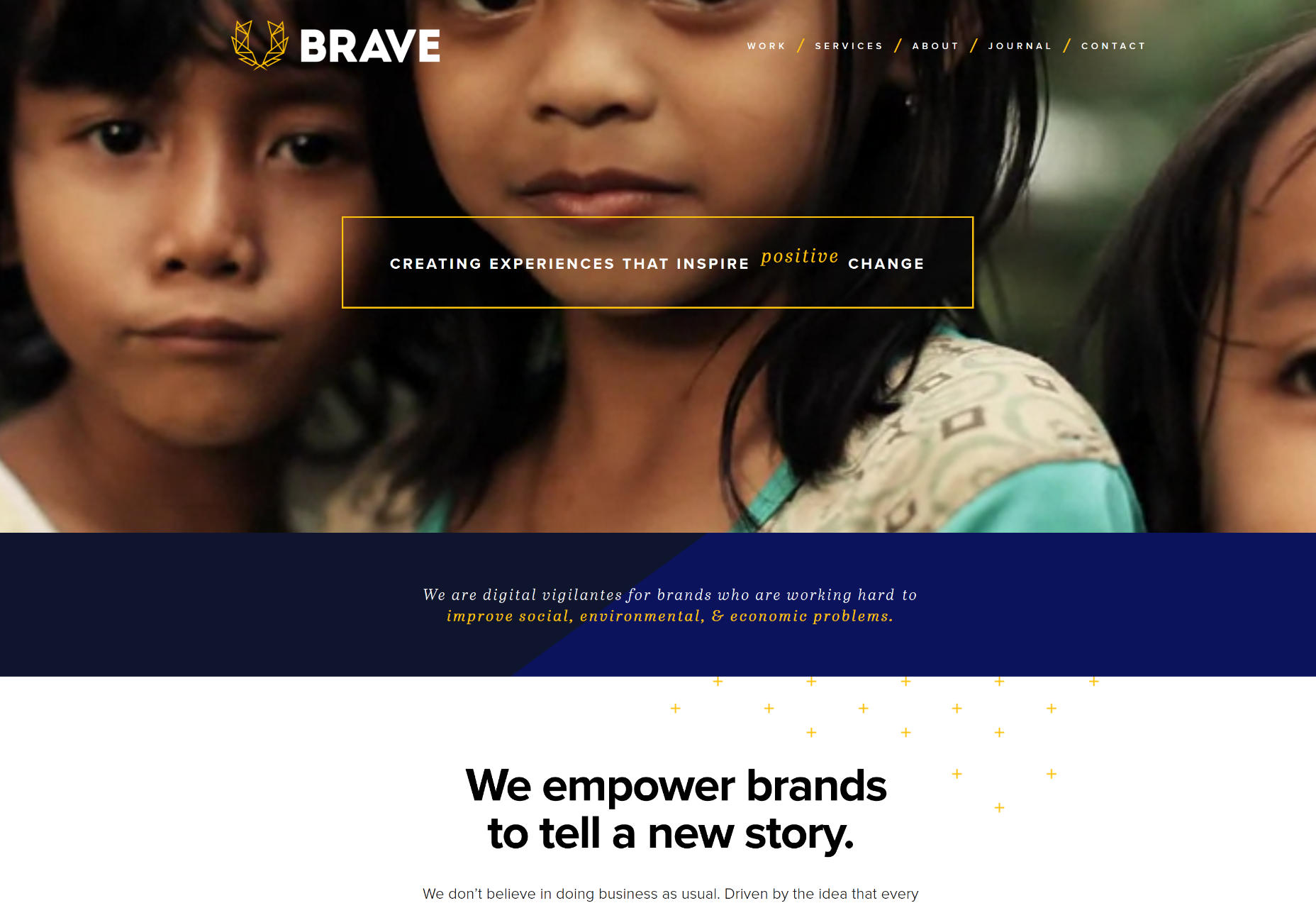
13 Bytes
13 Bytes uses the hand-drawn look to impressive effect in showing off their own work. It’s not overdone, though. There’s just the right amount of sketchy illustrations and “hand-wrtten” text to offset the more normal sans-serif typography.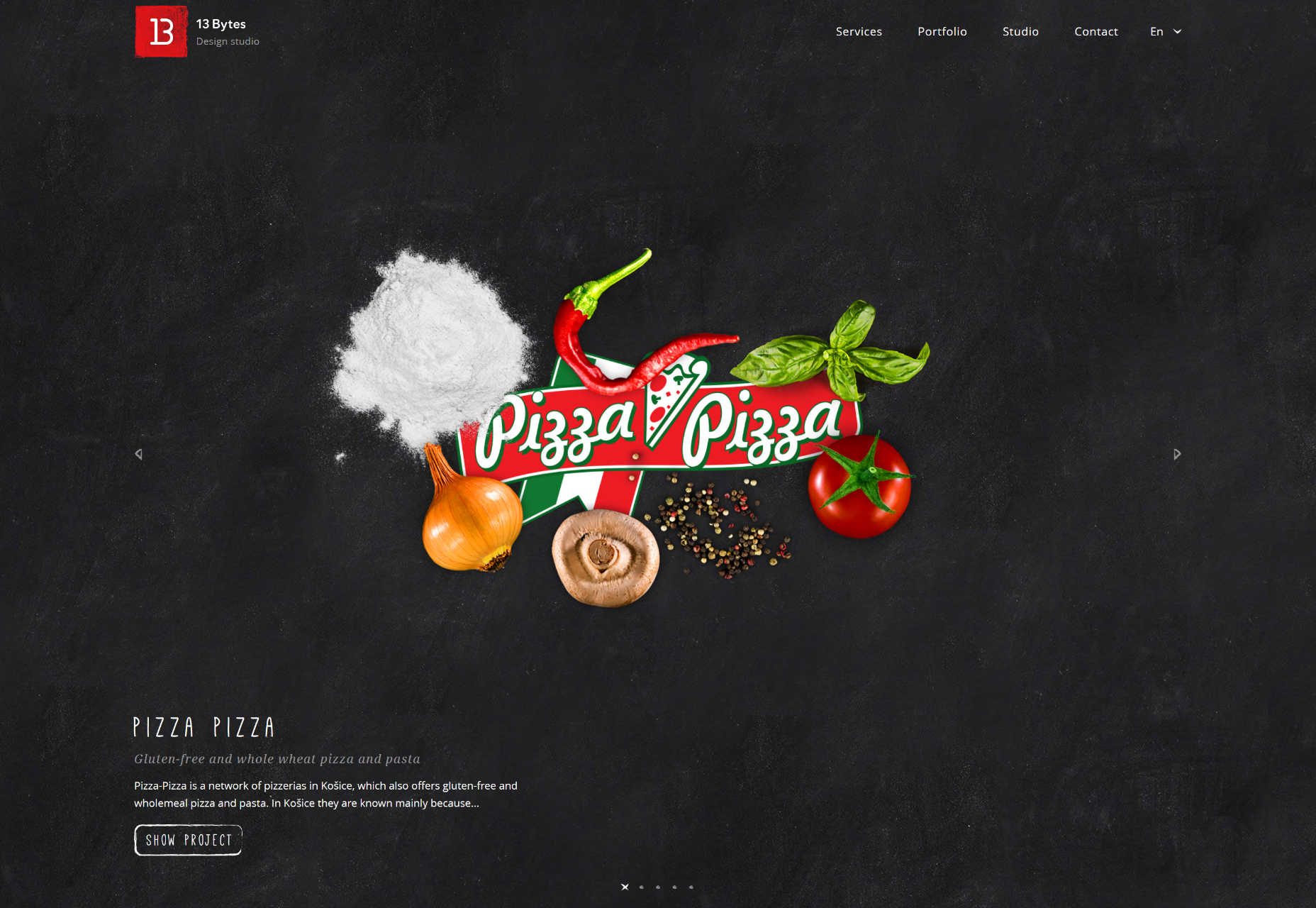
.DOT
.DOT is a master class in integrating vibrant branding into every part of a website without overwhelming and outshining the content.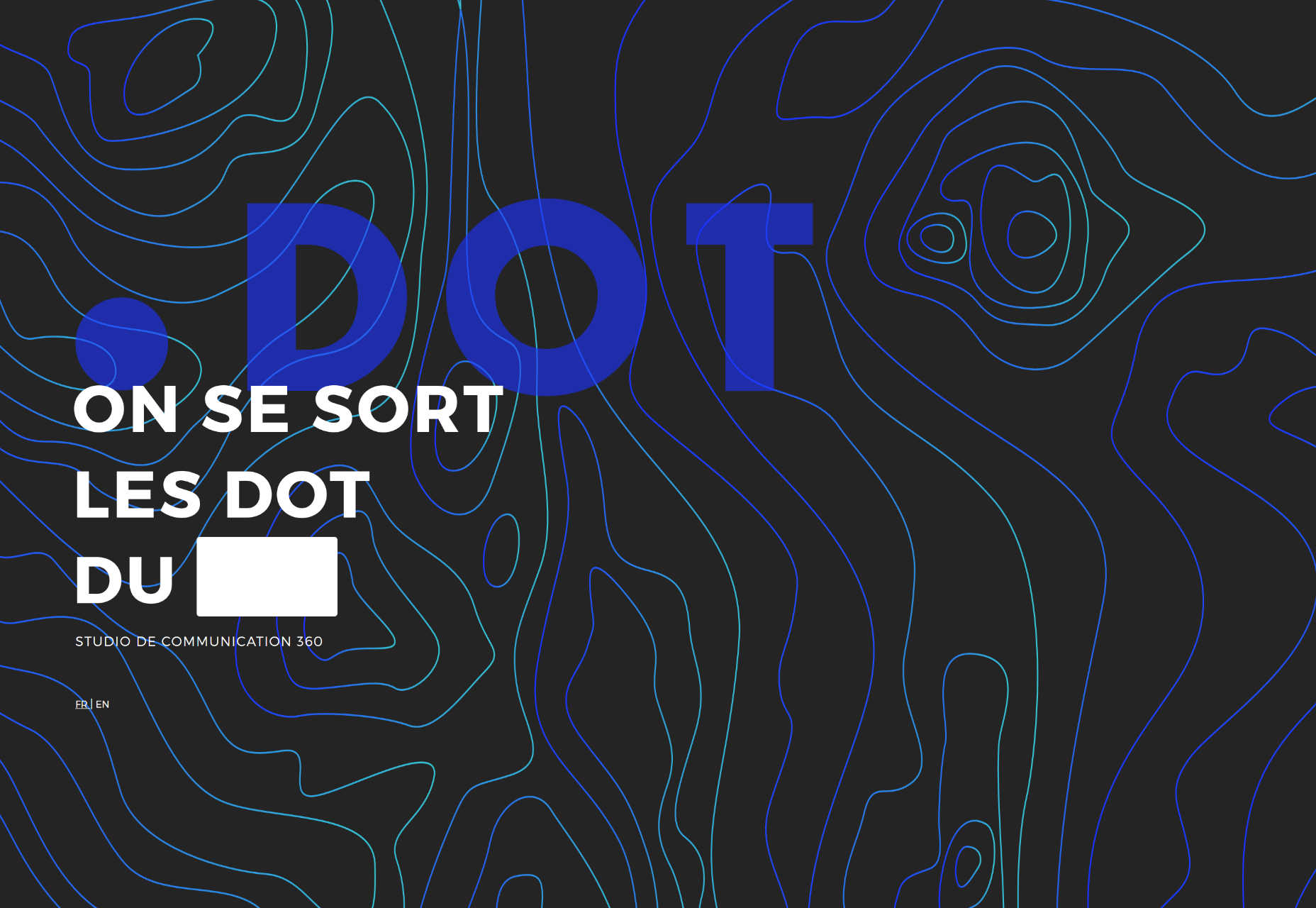
The Hideout
The Hideout’s site is highly minimalist, but not post-modern. It’s just… regular modern, and all the more refreshing for it. The inclusion of subtle illustrated wood patterns is a very nice touch.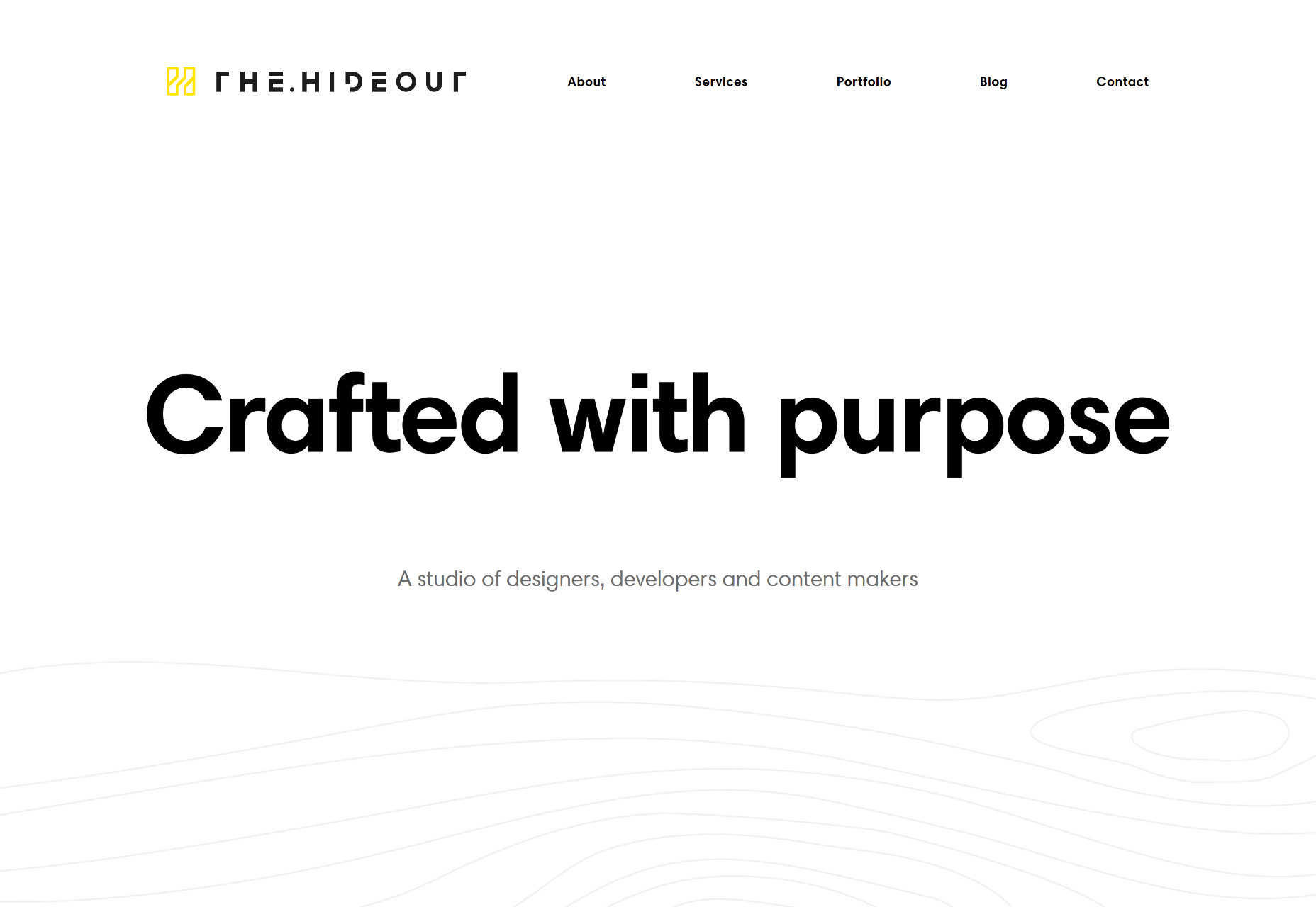
Brittany Chiang
Brittany Chiang’s portfolio is an excellent example of how high-resolution full-screen layouts should be done. The timeline section is pretty great too.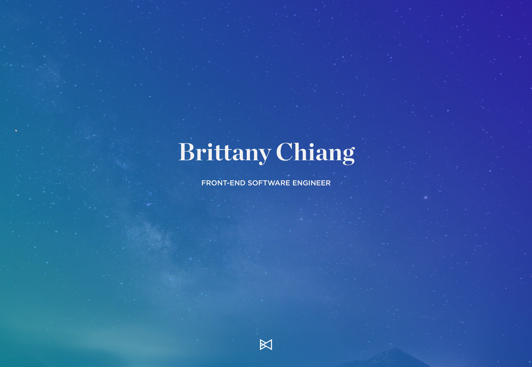
Jascha Goltermann
Jascha Goltermann’s portfolio combines that monochrome-with-neon-accents look with some subtle animation to spice things up even further. Once you get away from the flashy effects, the design itself is delightfully minimalist. I appreciate a design that only pulls out all the stops when it actually needs to.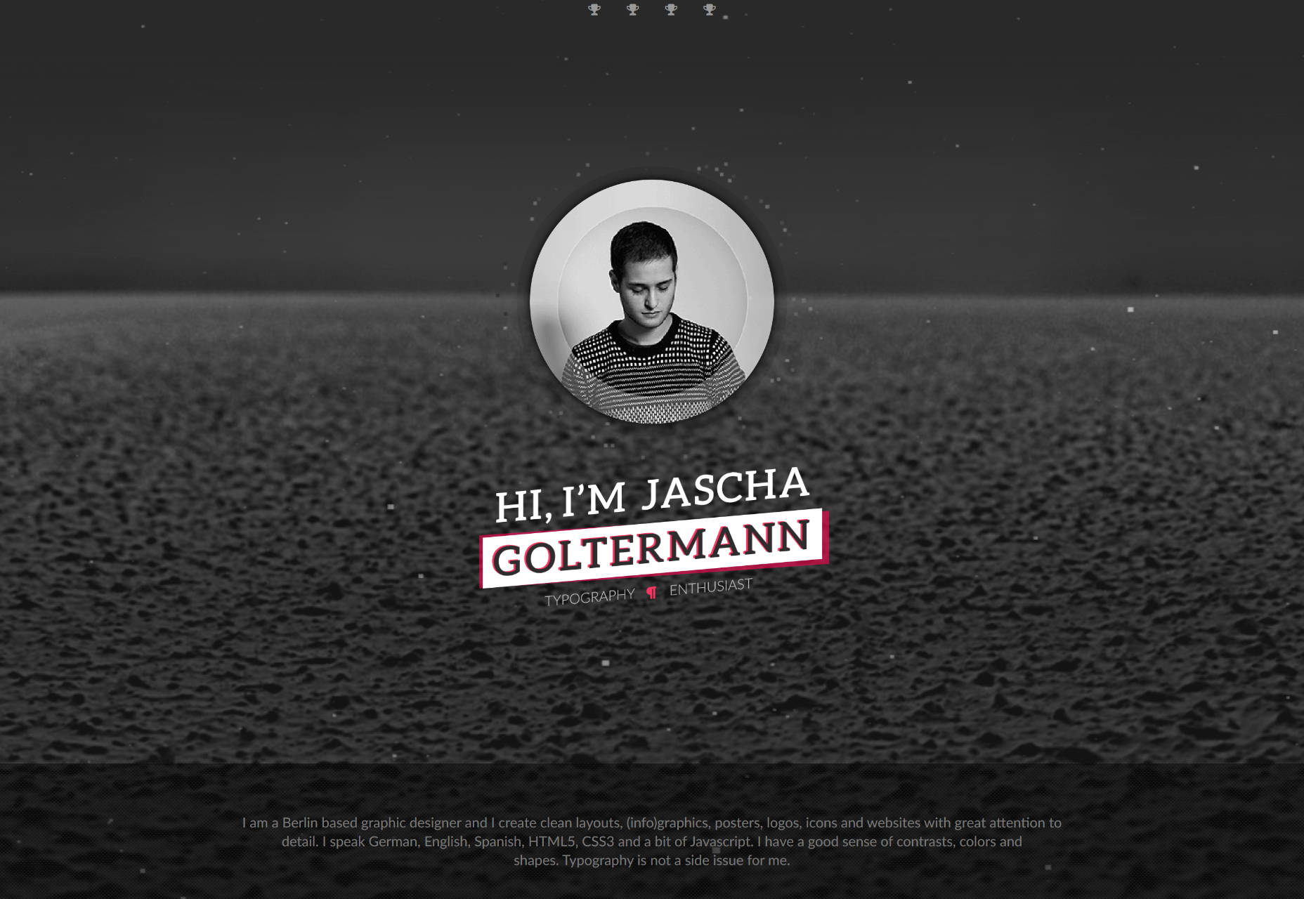
Ezequiel Bruni
Ezequiel Bruni is a web/UX designer, blogger, and aspiring photographer living in Mexico. When he’s not up to his finely-chiselled ears in wire-frames and front-end code, or ranting about the same, he indulges in beer, pizza, fantasy novels, and stand-up comedy.


Read Next

3 Essential Design Trends, May 2024
Integrated navigation elements, interactive typography, and digital overprints are three website design trends making…

How to Write World-Beating Web Content
Writing for the web is different from all other formats. We typically do not read to any real depth on the web; we…
By Louise North

20 Best New Websites, April 2024
Welcome to our sites of the month for April. With some websites, the details make all the difference, while in others,…

Exciting New Tools for Designers, April 2024
Welcome to our April tools collection. There are no practical jokes here, just practical gadgets, services, and apps to…

How Web Designers Can Stay Relevant in the Age of AI
The digital landscape is evolving rapidly. With the advent of AI, every sector is witnessing a revolution, including…
By Louise North

14 Top UX Tools for Designers in 2024
User Experience (UX) is one of the most important fields of design, so it should come as no surprise that there are a…
By Simon Sterne

What Negative Effects Does a Bad Website Design Have On My Business?
Consumer expectations for a responsive, immersive, and visually appealing website experience have never been higher. In…

10+ Best Resources & Tools for Web Designers (2024 update)
Is searching for the best web design tools to suit your needs akin to having a recurring bad dream? Does each…
By WDD Staff

3 Essential Design Trends, April 2024
Ready to jump into some amazing new design ideas for Spring? Our roundup has everything from UX to color trends…

How to Plan Your First Successful Website
Planning a new website can be exciting and — if you’re anything like me — a little daunting. Whether you’re an…
By Simon Sterne

15 Best New Fonts, March 2024
Welcome to March’s edition of our roundup of the best new fonts for designers. This month’s compilation includes…
By Ben Moss

LimeWire Developer APIs Herald a New Era of AI Integration
Generative AI is a fascinating technology. Far from the design killer some people feared, it is an empowering and…
By WDD Staff