

What is a Typographic Scale?
A visual typographic scale encapsulates the sizes, space and proportions of type elements relative to on another in a project. This includes everything from the main body text style to headlines, subheaders, captions and any other text element.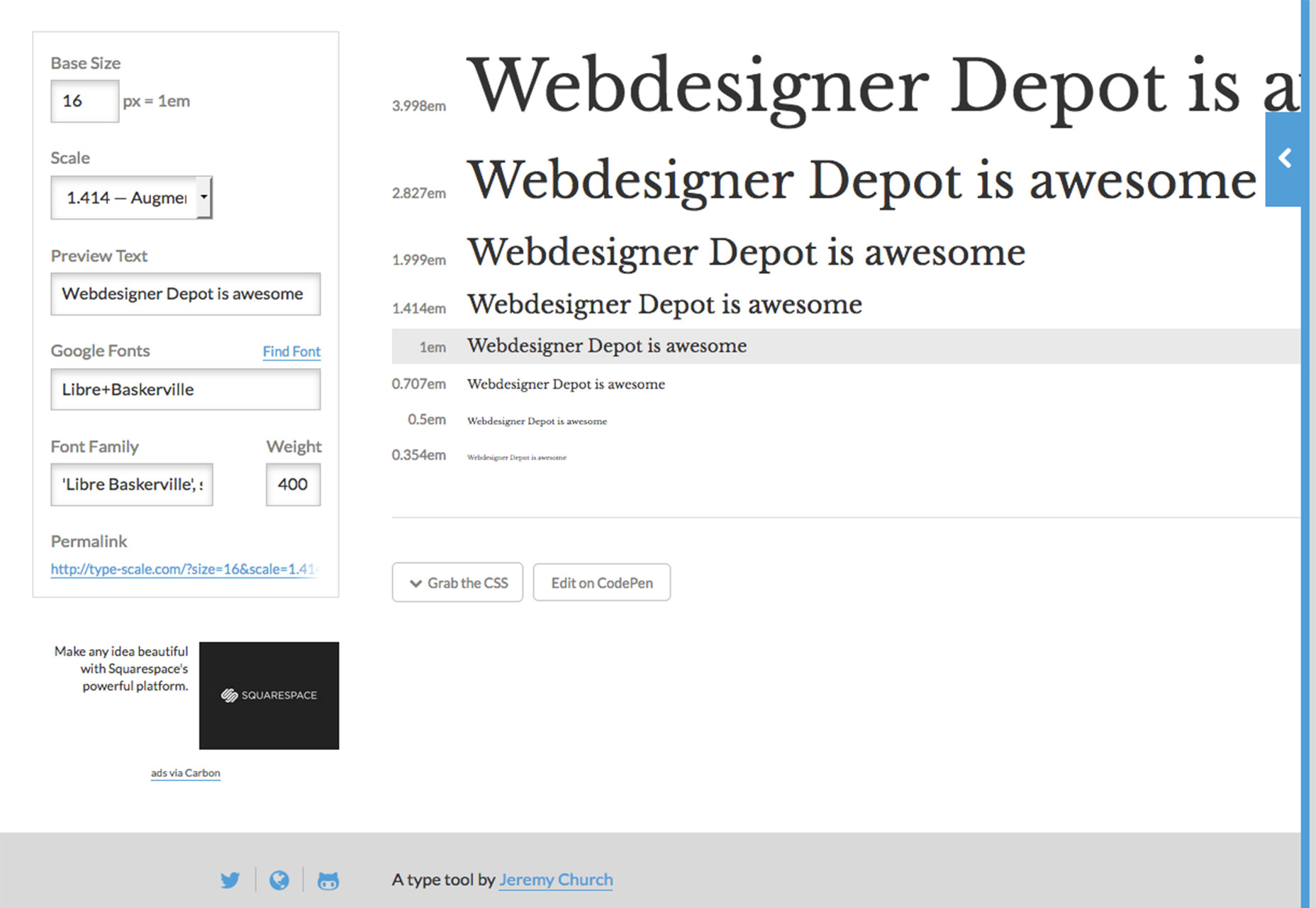 The scale helps determine size and placement of the text elements in relationship to one another. For web design, in particular, the visual type scale often corresponds to tags in your CSS (such as h1, h2, h3, p, and so on).
A type scale helps you create harmony and rhythm in the design. It also keeps you out of stylistic trouble because text elements correspond with CSS elements so that every part of the design uses the same elements and consistency.
The scale should be based on the size of body text. (Always set a typeface and size for that first). Then build the scale around this main typography. Not sure where to start? Google has a solid recommendation:
The scale helps determine size and placement of the text elements in relationship to one another. For web design, in particular, the visual type scale often corresponds to tags in your CSS (such as h1, h2, h3, p, and so on).
A type scale helps you create harmony and rhythm in the design. It also keeps you out of stylistic trouble because text elements correspond with CSS elements so that every part of the design uses the same elements and consistency.
The scale should be based on the size of body text. (Always set a typeface and size for that first). Then build the scale around this main typography. Not sure where to start? Google has a solid recommendation:
- Use a base font size of 16 CSS pixels. Adjust size based on properties of the font being used.
- Use sizes relative to the base size to define the typographic scale.
- Text needs vertical space between characters; the general recommendation is to use the browser default line-height of 1.2 em.
- Restrict the number of fonts used and the typographic scale.
Create harmony and rhythm
A type scale does more than just help users move through the copy, it creates harmony and rhythm for the flow of text. This is important on any device. So where do you start? UX Matters has some of the best research available on minimum text sizes by device. Note that these are minimum sizes and as body text sizes continue to increase (as does line spacing), you should strongly consider larger point sizes. Steven Hoober recommends starting at least 40 percent larger than the recommended minimums. Further, enhanced content styles can go up to 80 percent above the minimum, but you should be cautious with exceptionally large type as well.
| Device Type | Minimum Size | 40% Recommendation (adjusted for easy use) | 80% Maximum (adjusted for easy use) |
| Small Phone | 4 | 5.6 (6) | 7.2 (7.5) |
| Large Phone | 6 | 8.4 (8.5) | 10.8 (11) |
| Phablet | 7 | 9.8 (10) | 12.6 (13) |
| Tablet | 8 | 11.2 (11.5) | 14.4 (14.5) |
| Laptop/Desktop | 10 | 14 (14) | 18 (18) |
Character and spacing guidelines
There are some other guidelines that designers look to as well when it comes to type on the screen. When it comes to spacing, one of the rules of thumb has been to look at characters per line to ensure readability.- Desktop and large devices: 60 to 75 characters per line
- Phones and small devices: 35 to 40 characters per line
 The same idea applies to spacing as well. You need more space between lines of text when the screen size is limited to make it easier for users to read and scan content. Consider adding 25 percent more line spacing on smaller devices than for desktop typography.
The additional size and spacing helps ease that tight or crunched feeling that users can feel when trying to read on smaller devices. Because the canvas is small, reader flow and legibility is vital to keep users scrolling.
The same idea applies to spacing as well. You need more space between lines of text when the screen size is limited to make it easier for users to read and scan content. Consider adding 25 percent more line spacing on smaller devices than for desktop typography.
The additional size and spacing helps ease that tight or crunched feeling that users can feel when trying to read on smaller devices. Because the canvas is small, reader flow and legibility is vital to keep users scrolling.
Tips to get started
There are plenty of ways to create a typographic scale and ensure that the text does not make your design look fat. How you go about it likely depends on your comfort level with code and development in addition to the design. The best option is to use a responsive design with media queries. This is the designer-developer option that will provide the greatest level of control over text specifications. (For more go back to those Google recommendations, above.)
Another route is to design different versions. While this is a pretty out-of-date concept, there are still some places using mobile URLs and desktop URLs for their websites. It’s not recommended in most cases, but for some websites where the design is dramatically different or users experience different things, it can be an option.
The easy option is to start with a theme for your website. Just make sure to opt for a fully responsive option. When you use a high quality responsive theme, most of the guesswork is taken out of it for you. All you really have to think about is the body text size. Just make sure to check everything to make sure the mobile type sizes meet your standards.
The best option is to use a responsive design with media queries. This is the designer-developer option that will provide the greatest level of control over text specifications. (For more go back to those Google recommendations, above.)
Another route is to design different versions. While this is a pretty out-of-date concept, there are still some places using mobile URLs and desktop URLs for their websites. It’s not recommended in most cases, but for some websites where the design is dramatically different or users experience different things, it can be an option.
The easy option is to start with a theme for your website. Just make sure to opt for a fully responsive option. When you use a high quality responsive theme, most of the guesswork is taken out of it for you. All you really have to think about is the body text size. Just make sure to check everything to make sure the mobile type sizes meet your standards.
3 tools to create a type scale
 There are a number of tools available to help you see the exact impact of a visual typography scale. Here are a few of the best and most user-friendly options.
- Type Scale: Enter text and play with options such as size, scale and font right on the screen; grad the CSS or edit the code right from the tool;
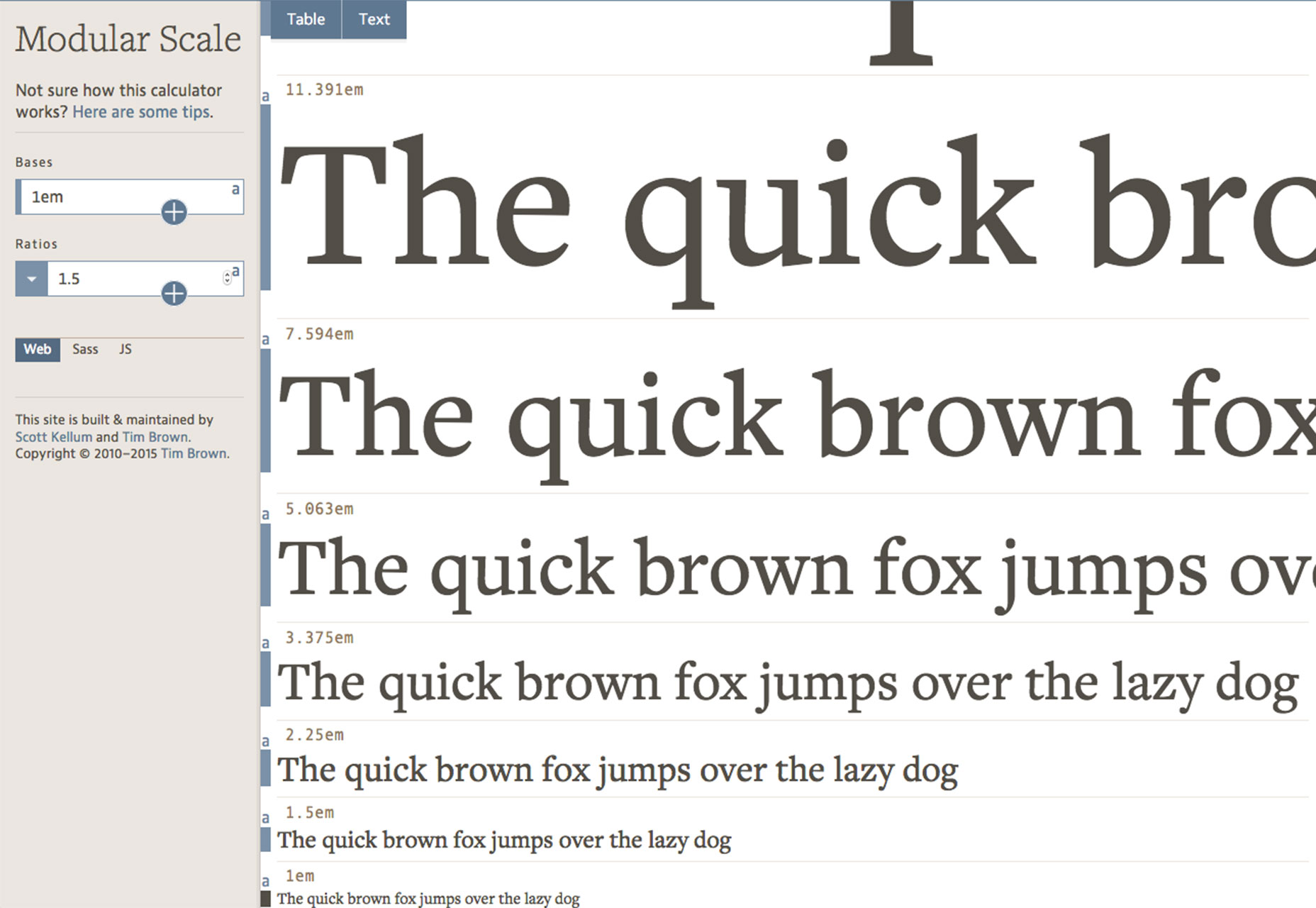
- Modular Scale: The scale works like a rule to help determine sizes for type; then download the results as a Sass or JS plugin or see them on the screen;
- Golden Ratio Typography Calculator: The tool optimizes size, line height, width and characters per line using the golden ratio
Conclusion
The right typographic scale will keep your design looking trim and svelte. It is the added harmony that users might not understand but contributes to overall readability and usability. It’s likely that the scale is off if the design “just doesn’t look right.” Improperly sized type can be tough to pinpoint but is often a place to look when something about a design is out of balance. Play with a few different options for scale before settling on something, and remember the trend right now is for type that’s a bit larger than in the past.Carrie Cousins
Carrie Cousins is a freelance writer with more than 10 years of experience in the communications industry, including writing for print and online publications, and design and editing. You can connect with Carrie on Twitter @carriecousins.


Read Next

15 Best New Fonts, July 2024
Welcome to our monthly roundup of the best fonts we’ve found online in the last four weeks. This month, there are fewer…
By Ben Moss

20 Best New Websites, July 2024
Welcome to July’s round up of websites to inspire you. This month’s collection ranges from the most stripped-back…

Top 7 WordPress Plugins for 2024: Enhance Your Site's Performance
WordPress is a hands-down favorite of website designers and developers. Renowned for its flexibility and ease of use,…
By WDD Staff

Exciting New Tools for Designers, July 2024
Welcome to this July’s collection of tools, gathered from around the web over the past month. We hope you’ll find…

3 Essential Design Trends, July 2024
Add some summer sizzle to your design projects with trendy website elements. Learn what's trending and how to use these…

15 Best New Fonts, June 2024
Welcome to our roundup of the best new fonts we’ve found online in the last month. This month, there are notably fewer…
By Ben Moss

20 Best New Websites, June 2024
Arranging content in an easily accessible way is the backbone of any user-friendly website. A good website will present…

Exciting New Tools for Designers, June 2024
In this month’s roundup of the best tools for web designers and developers, we’ll explore a range of new and noteworthy…

3 Essential Design Trends, June 2024
Summer is off to a fun start with some highly dramatic website design trends showing up in projects. Let's dive in!

15 Best New Fonts, May 2024
In this month’s edition, there are lots of historically-inspired typefaces, more of the growing trend for French…
By Ben Moss

How to Reduce The Carbon Footprint of Your Website
On average, a web page produces 4.61 grams of CO2 for every page view; for whole sites, that amounts to hundreds of KG…
By Simon Sterne

20 Best New Websites, May 2024
Welcome to May’s compilation of the best sites on the web. This month we’re focused on color for younger humans,…