

David Robert
I wasn’t kidding about the French. Our first entry is from David Robert, a French designer with a penchant for monochrome designs paired with minimalism. Okay, we’ve seen a lot of that lately, but it’s done well here, and the layout is atypical. Plus, I kinda love the little “film-blur” effect applied to some text on hover. It’s kind of classic and grunge at the same time. Oh go look, it works.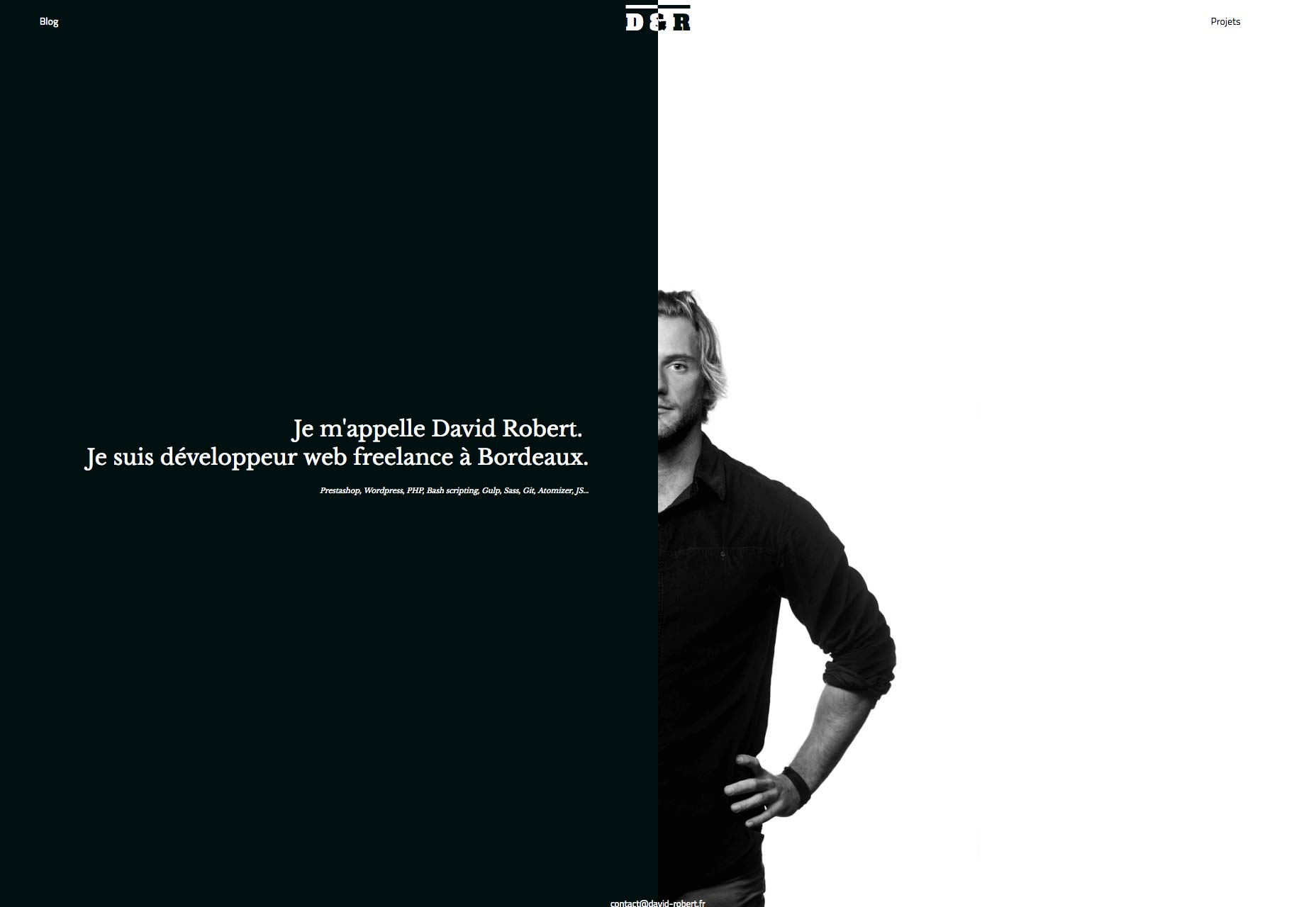
Playful
Playful has yet another site that’s more presentation than site. They live up to their name, though, with lots of vibrant color and subtle animation. The one thing I’d criticize is the way text is placed over images. It makes the text less-than-readable. You can steal good ideas from the rest of the site, though.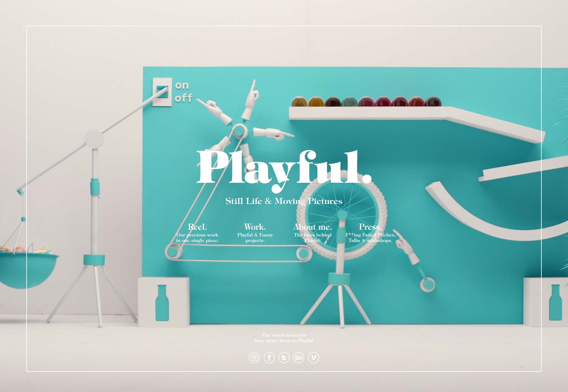
Christopher Hall
Christopher Hall is an interior and furniture designer. His site brings us some more of that “split-down-the-middle” design. In this case, it’s a form of categorization. His furniture is on the left, and his interiors are on the right. Other pages stick with the two-column layout, if not the dimensions, tying the whole design together. From there on out, it’s all minimalist, serif-heavy goodness.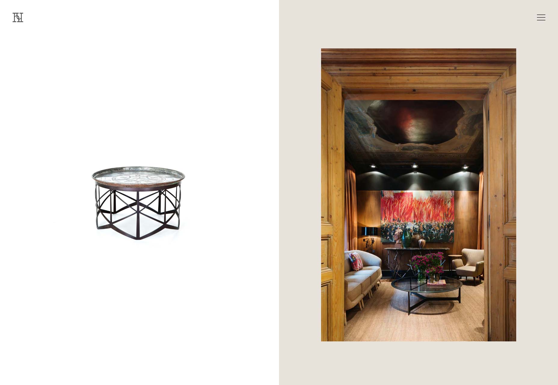
ueno
ueno combines beautifully-executed minimalism with a timeline layout for the portfolio. This is one you’ll be looking at just for the typography.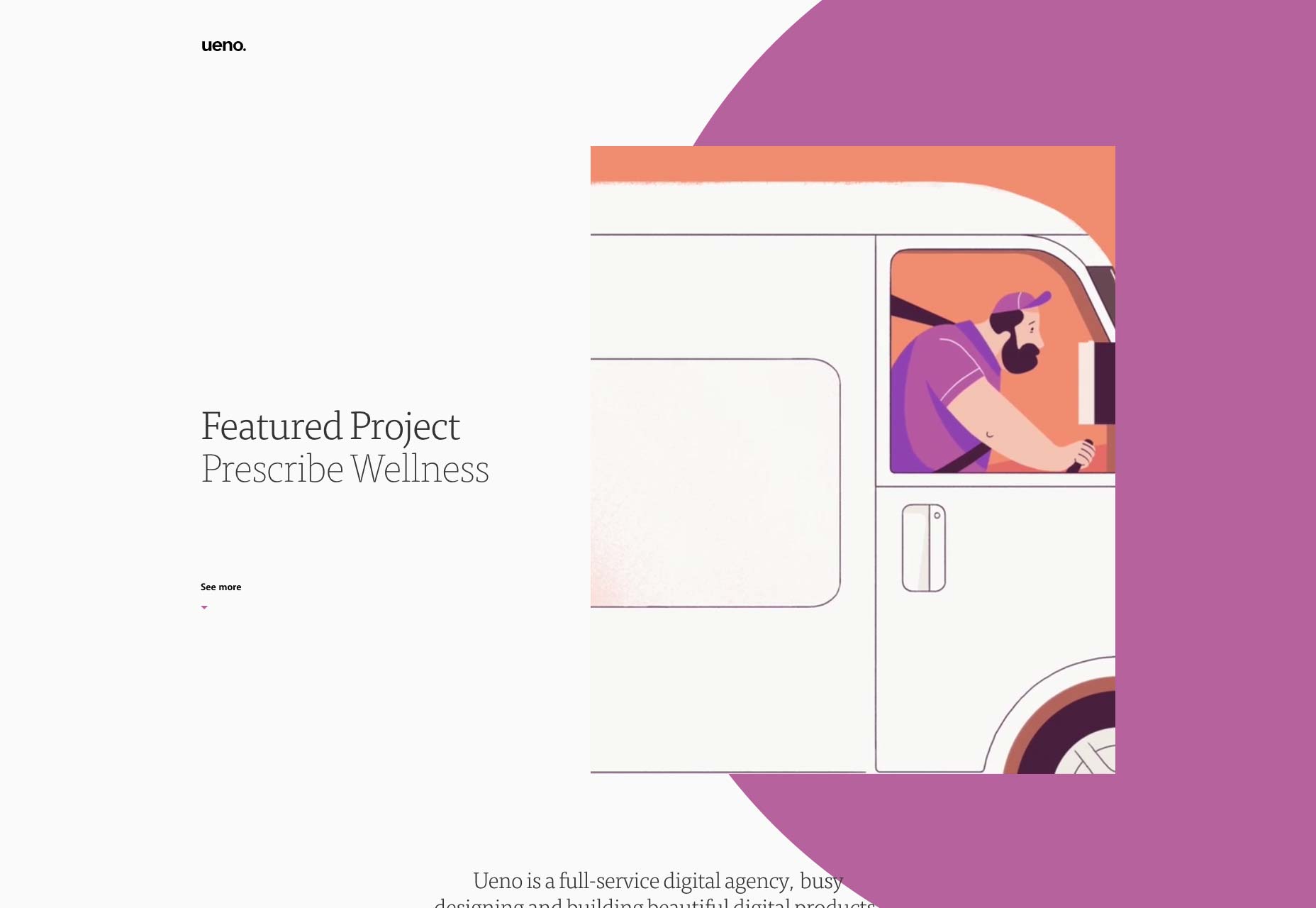
Made Together
Made Together starts off with a lot of solid blue, and some geometric shapes. This is almost a design style in its own right, these days. From there, the site moves on to a familiar layout. The typography is eye-catching and feels perfect for the style of the site overall.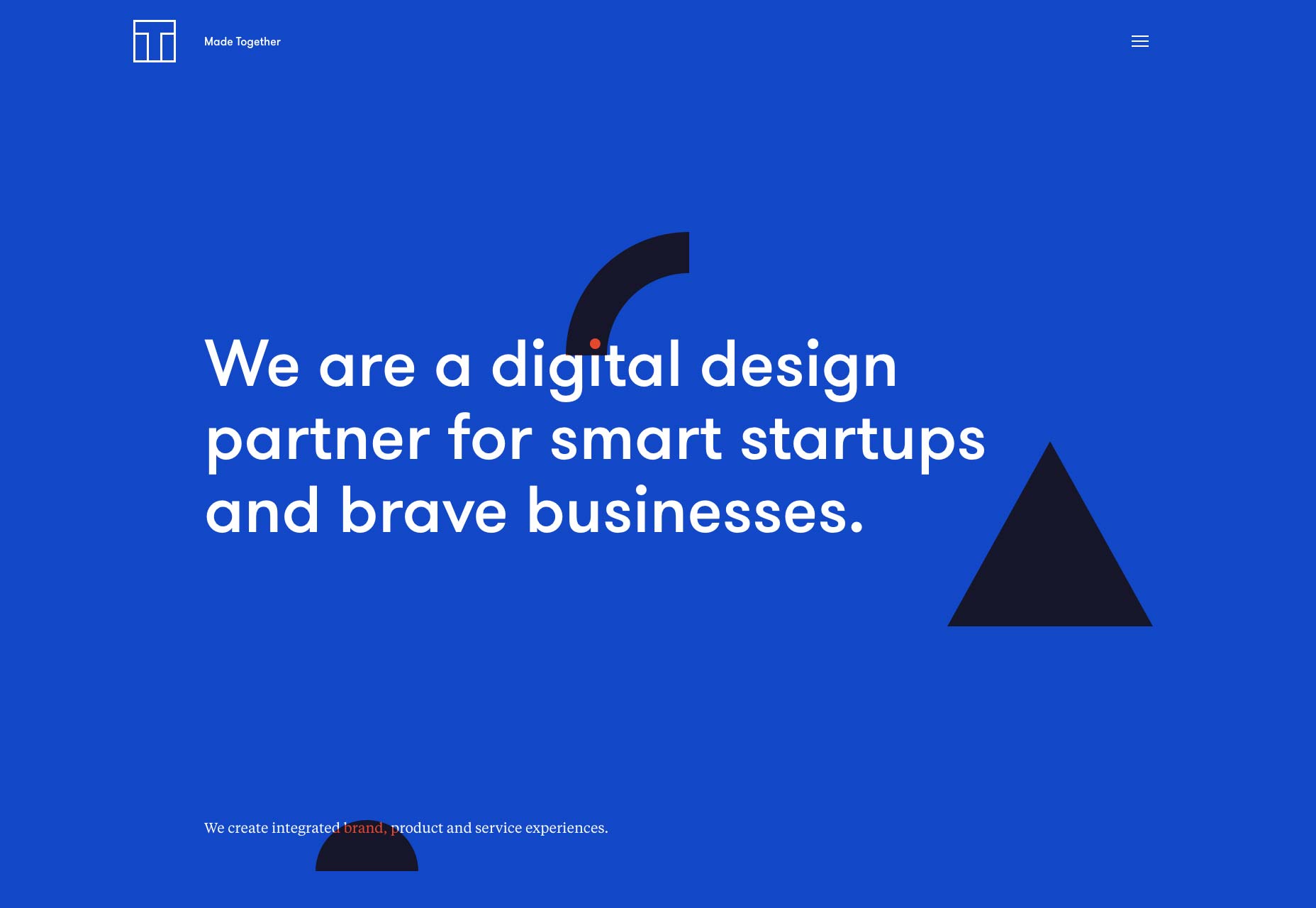
blackballoon
blackballoon gives us a proper dark website design. This is one of those sites that doesn’t make you worry about mundane things like “text” or “reading” very much. It’s all about the imagery, the animation, and the sheer sense of style. It works, too.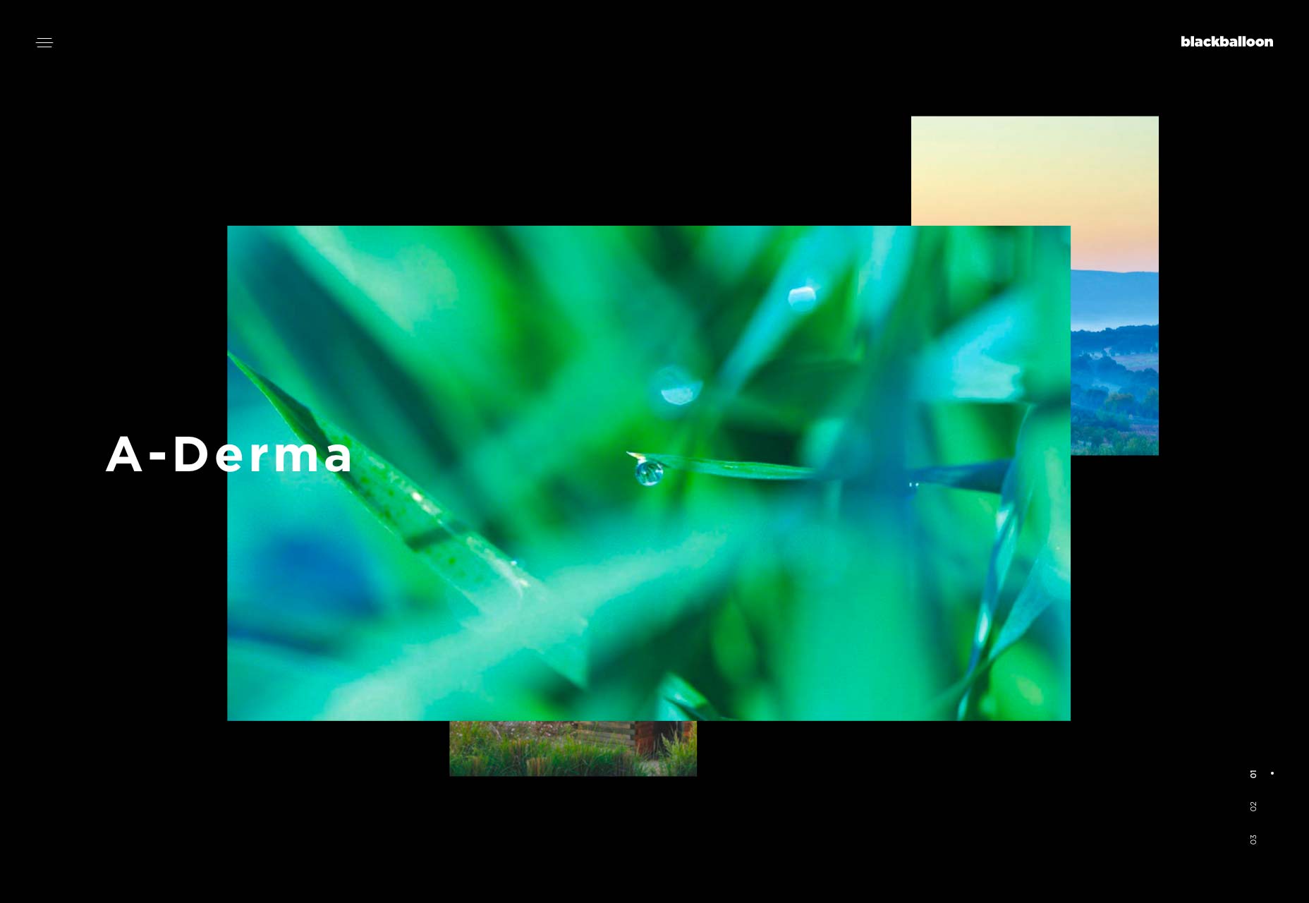
Standard
Standard is a video production studio that, as you may expect, depends on background video to start off their showcase. From there, you can browse through their videos, or through their rather massive list of directors. Take a look at this section especially,it’s quite stylish. It’s got that now-typical presentation feel to it, but given the content, it works rather well.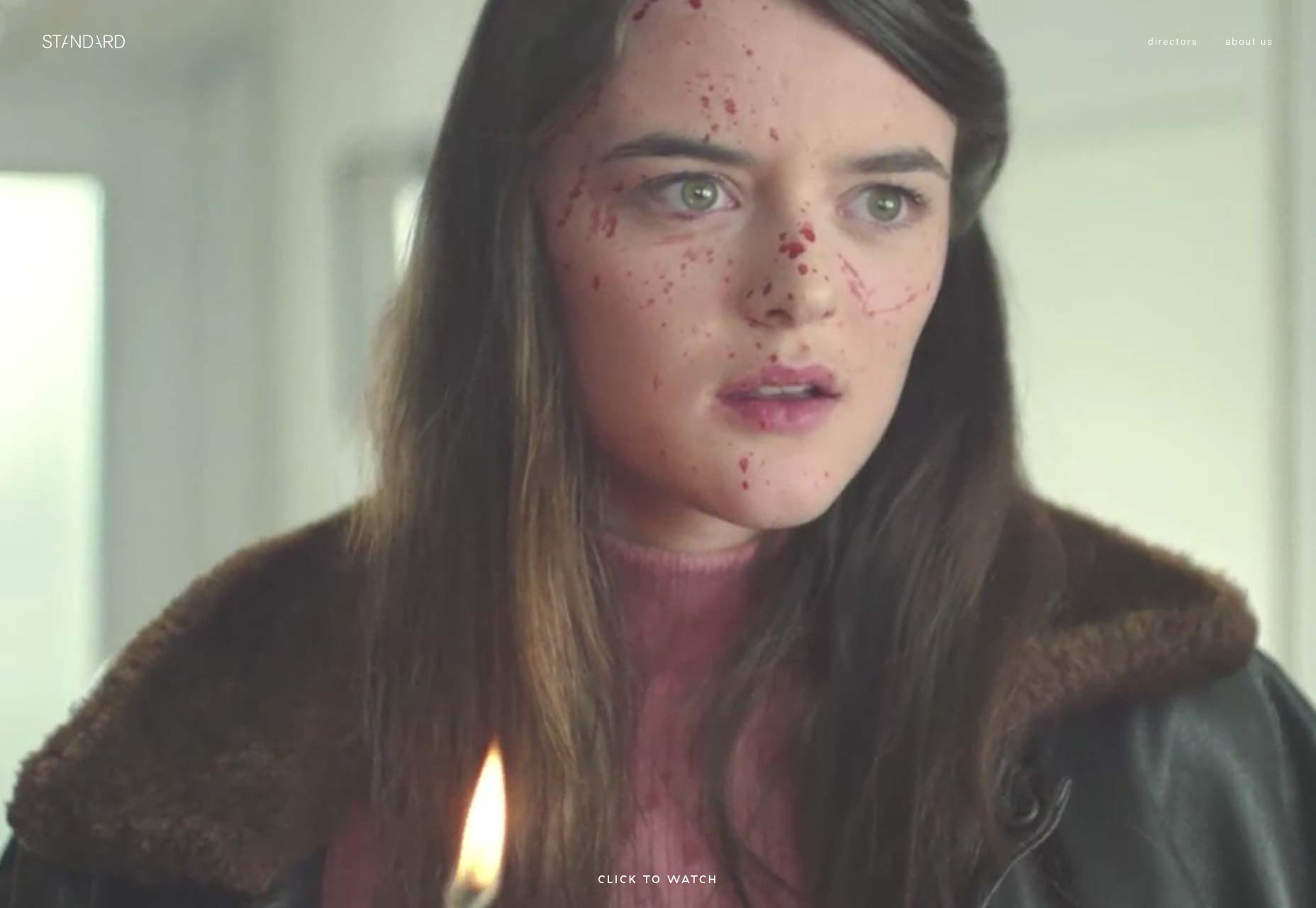
Zengularity
Zengularity doesn’t do anything particularly out of the box, but everything is done quite well. Look at it for color ideas, typography, and general style.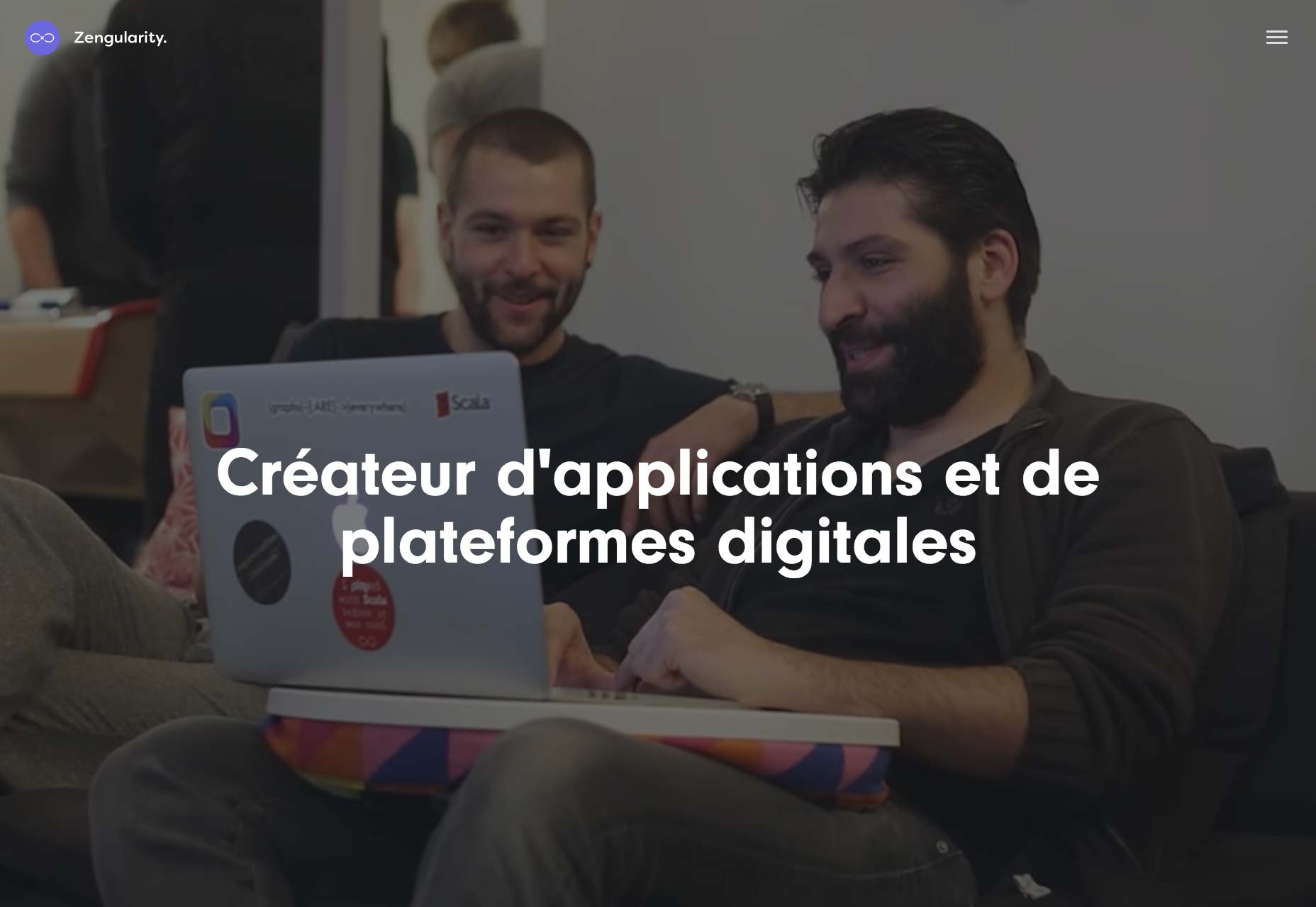
Lundgren+Lindqvist
Lundgren+Lindqvist is one of those sties where you might feel like you’ve seen this before, but it’s still definitely “theirs”. It walks the line between minimalist and brutalist, with the occasional pixel-graphics touch. I think I’m going to start calling this “low-fi minimalism”. I kind of like it.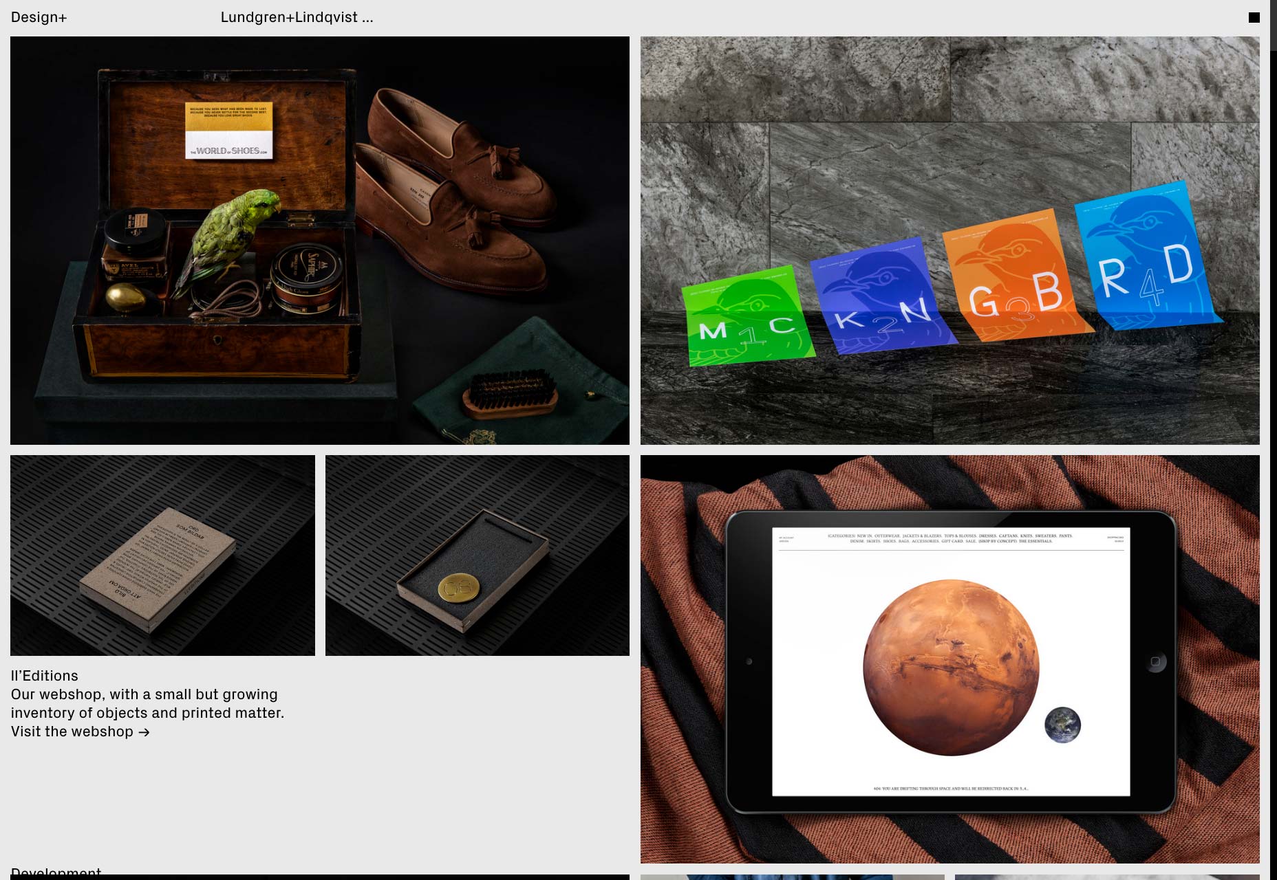
Adam Widmanksi
Adam Widmanksi’s portfolio takes us far away from brutalism to deliver some of that post-modern minimalism that was all the rage earlier this year. Combining this with distinctive typography, striking images, and asymmetry, it’s a visual feast.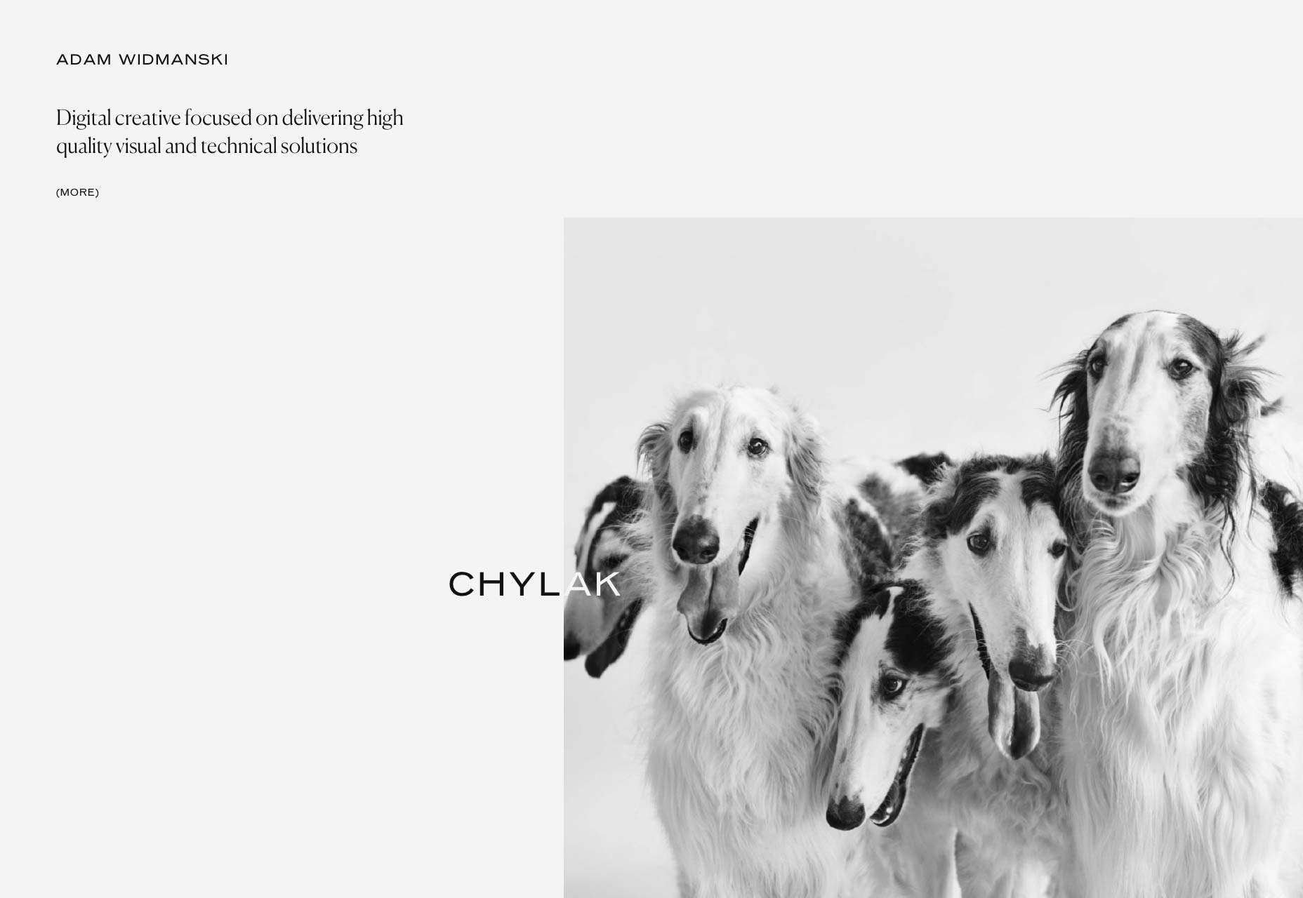
B14
B14 put a lot of thought, time, and effort into this modern design. But whatever impression they intended to make has been overshadowed by what may be the single greatest compliment my fianceé has ever given to a website: “Well, my grandma could read those letters.” After that, I can’t bring myself to put in any other description. Usability is what it’s all about, people.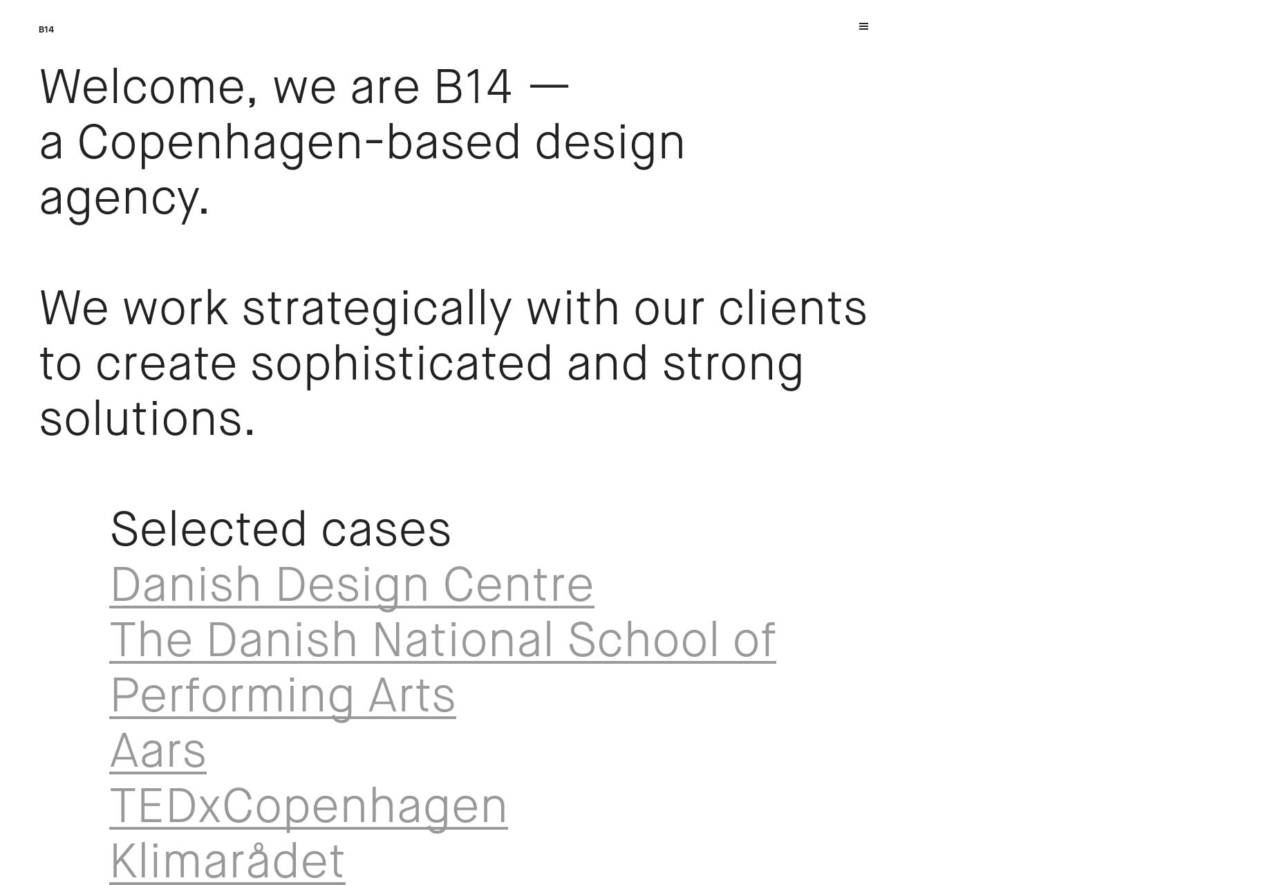
Nicolas Paries
Some websites go for a collage-like feel in their design. Nicolas Paries’ portfolio site almost feels like it’s an actual scrapbook. While that does make for reduced text legibility sometimes, it’s a refreshingly chaotic site experience. And yet, it’s still pretty usable.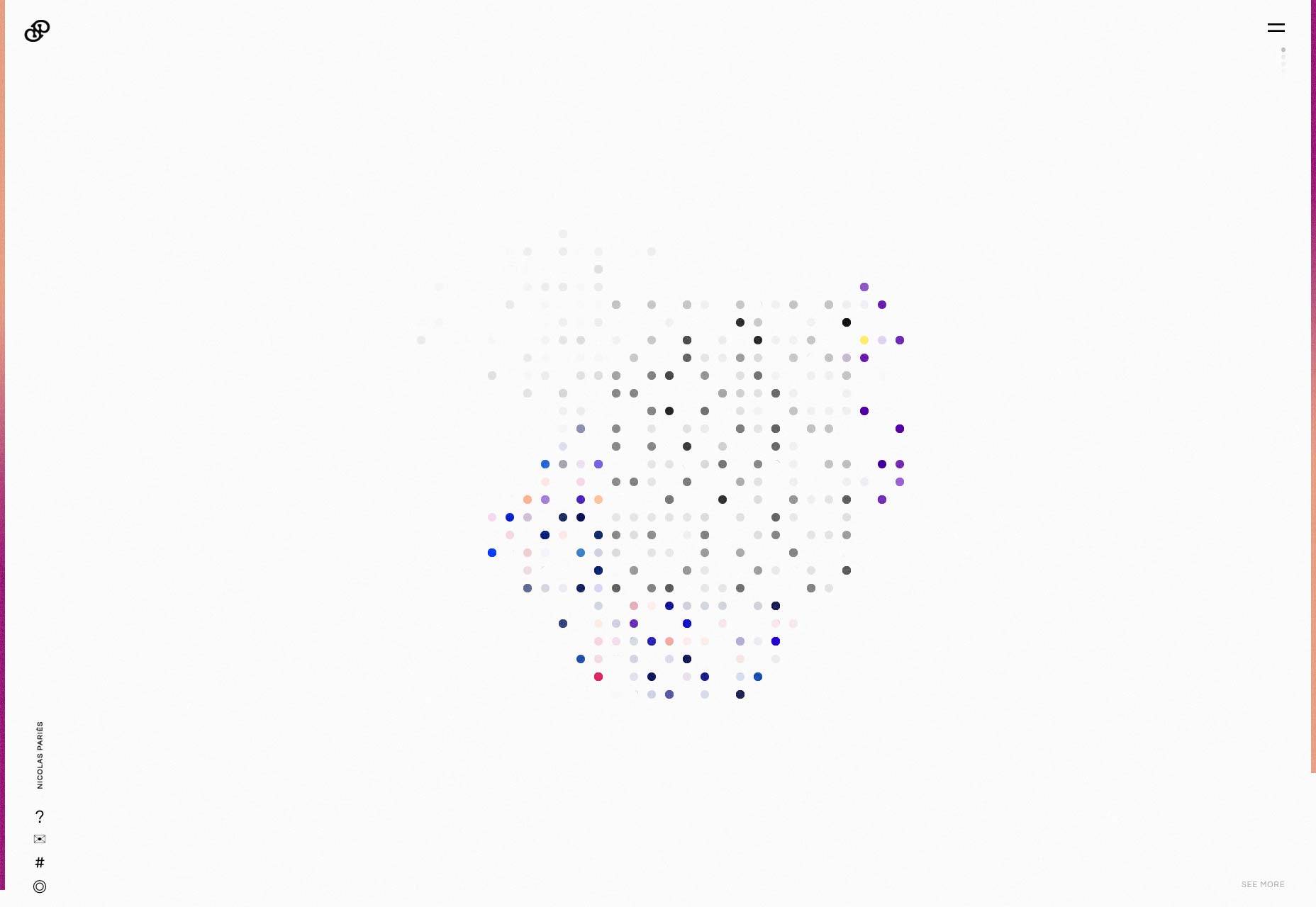
Colin Simpson
Colin Simpson uses the now-classic single-column, full-width style of portfolio. What he does to stand out is make great use of skewed perspectives to show off his design work. Inside his case studies, he lays out the individual design elements in each project: the color palette, the typography, any custom elements, and even wireframes. It gives you a lot of context for each project, and a few clues about how he works.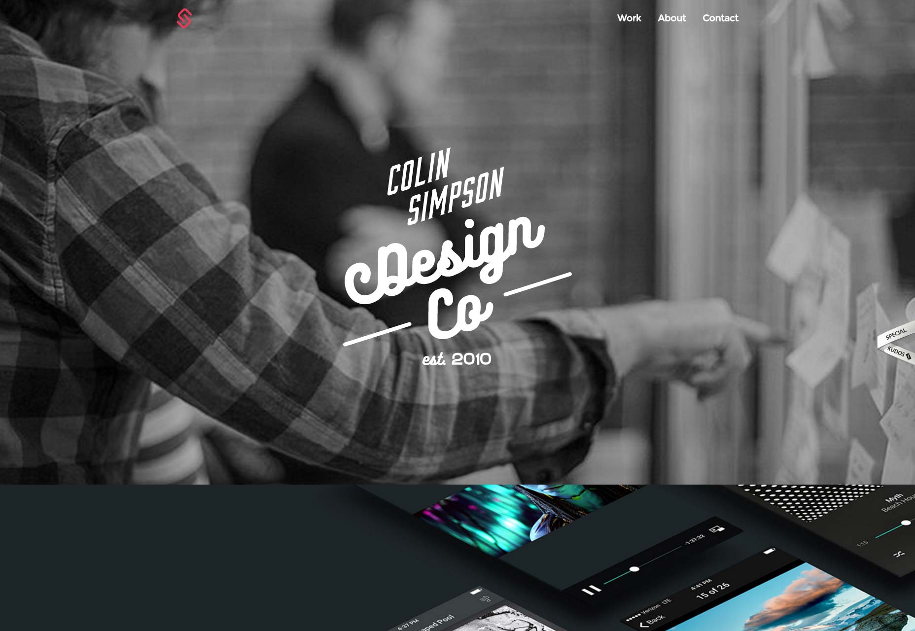
Daru Sim
Daru Sim uses a card-style UI to show off his portfolio in a masonry layout. When you consider just how well-suited a card-style UI is to a portfolio, I do kind of wonder why people don’t use it more.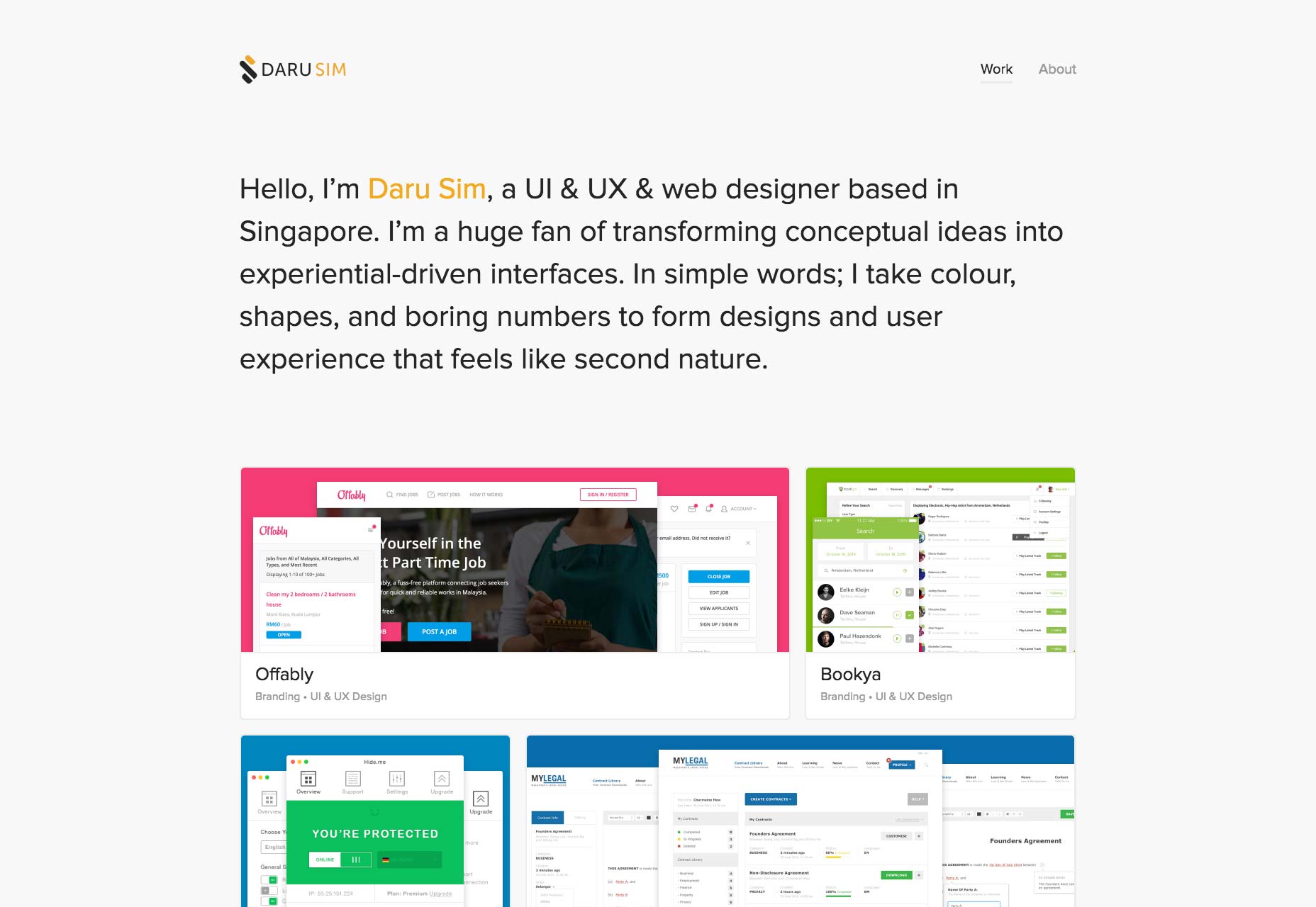
João Amaro da Costa
João Amaro da Costa brings us a minimalist layout that manages to be responsive while still proving that “pixel-perfect” quality that everyone used to advertise about five years ago. It may be flexible, but it is also meticulously executed, and it looks all the better for it.
Design Militia
Design Militia’s site is largely enterprise-looking, which makes sense, given their clients. A simple layout with dependable typography lands this site a spot in the article this month.
Metin Bilgin
Metin Bilgin’s site is a veritable smorgasbord of different styles with no apparent overarching theme. At least when you’re looking at the portfolio, the site’s style seems to change depending on which of his projects you’re looking at. The rest of the site is minimalist, with the text-overlapping-other-elements style that we’ve all come to know.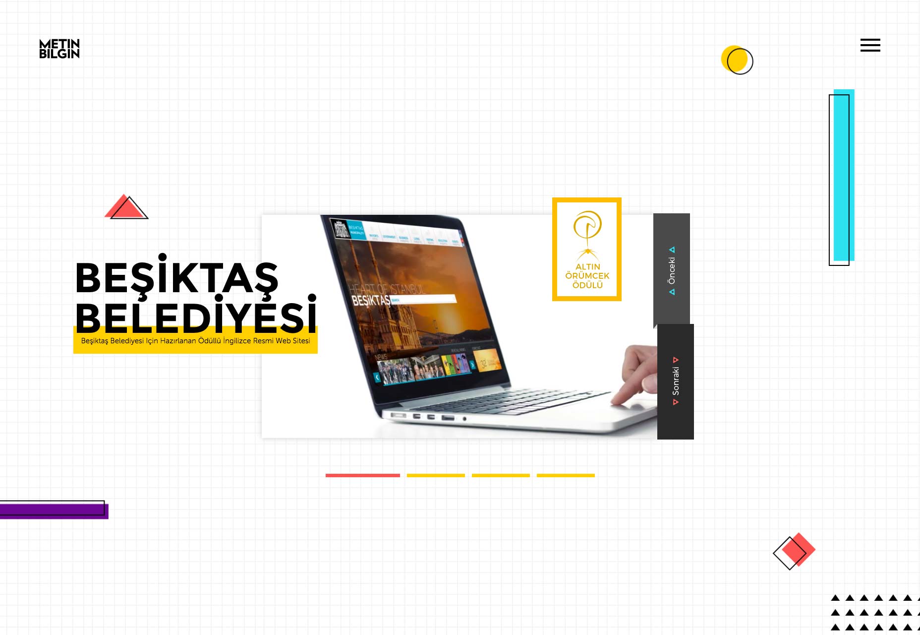
Ezequiel Bruni
Ezequiel Bruni is a web/UX designer, blogger, and aspiring photographer living in Mexico. When he’s not up to his finely-chiselled ears in wire-frames and front-end code, or ranting about the same, he indulges in beer, pizza, fantasy novels, and stand-up comedy.


Read Next

15 Best New Fonts, July 2024
Welcome to our monthly roundup of the best fonts we’ve found online in the last four weeks. This month, there are fewer…
By Ben Moss

20 Best New Websites, July 2024
Welcome to July’s round up of websites to inspire you. This month’s collection ranges from the most stripped-back…

Top 7 WordPress Plugins for 2024: Enhance Your Site's Performance
WordPress is a hands-down favorite of website designers and developers. Renowned for its flexibility and ease of use,…
By WDD Staff

Exciting New Tools for Designers, July 2024
Welcome to this July’s collection of tools, gathered from around the web over the past month. We hope you’ll find…

3 Essential Design Trends, July 2024
Add some summer sizzle to your design projects with trendy website elements. Learn what's trending and how to use these…

15 Best New Fonts, June 2024
Welcome to our roundup of the best new fonts we’ve found online in the last month. This month, there are notably fewer…
By Ben Moss

20 Best New Websites, June 2024
Arranging content in an easily accessible way is the backbone of any user-friendly website. A good website will present…

Exciting New Tools for Designers, June 2024
In this month’s roundup of the best tools for web designers and developers, we’ll explore a range of new and noteworthy…

3 Essential Design Trends, June 2024
Summer is off to a fun start with some highly dramatic website design trends showing up in projects. Let's dive in!

15 Best New Fonts, May 2024
In this month’s edition, there are lots of historically-inspired typefaces, more of the growing trend for French…
By Ben Moss

How to Reduce The Carbon Footprint of Your Website
On average, a web page produces 4.61 grams of CO2 for every page view; for whole sites, that amounts to hundreds of KG…
By Simon Sterne

20 Best New Websites, May 2024
Welcome to May’s compilation of the best sites on the web. This month we’re focused on color for younger humans,…