1. Improving page load speed
The page load speed of your website is an extremely important element of user experience. While designers often get caught up in trying to show off their visual design skills, the truth of the matter is that website visitors generally care more about page load speed than gaudy adornments. According to a recent study by Kissmetrics, nearly half (47%) of all consumers expect a web page to load in 2 seconds or less; if your page takes longer than that to load, it is reducing the quality of the user experience. If your page takes more than three seconds to load, you will have, on average, 40% of visitors abandon your website; that will increase by 7% for each additional second it takes your website to load. A slow website translates into lost opportunities and lost sales. Additionally, while slow load times cut down on the number of conversions your website generates, slow load times also work to reduce the number of opportunities your website will give rise to by having a negative impact on its search engine ranking. The effect is small, but you certainly want to do everything you can to improve your website’s search engine ranking. To help keep your pages loading in under 3 seconds, try utilizing the following tips: first, opt for a simpler design style avoiding unnecessary items and flashy decorations (in A/B tests, simpler designs generally outperform ornate designs anyway); second, optimize your images in a graphics program, you don’t want to use html to resize them; third, avoid using too many plugins, they slow down the experience for site visitors; fourth, if your site is popular, consider utilizing a content delivery network to improve server response time.2. Leveraging white space
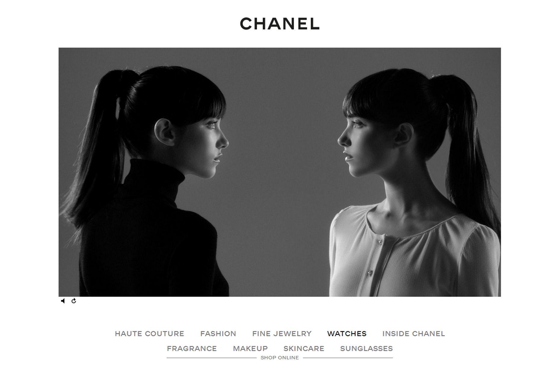
White space is often overlooked but it is a very important part of effective user interface design. I am sure you have been in the same situation as most designers where clients view white space as empty space and rush to fill it, thinking white space is a waste. In fact, the opposite is the case; white space is one of the most important parts of a website. If used properly, white space can dramatically improve the user experience of a website. White space helps make a user interface easy on the eye, which helps retain visitors and keeps them reading. It does this by making content more legible. The white space around website text and images helps people improve comprehension and creates a better user experience. White space also helps improve the appearance of your website, giving it a nice, clean professional look. White space helps reduce confusion on the part of visitors as websites lacking in white space often look disorganized. You want to create a nice balanced look for your website using white space to separate different blocks of content. White space is also effective to highlight something important such as your call to action. The proper use of white space in your design helps guide your visitors’ attention to key parts of your website and without it, visitors may overlook important items. A wonderful example of this is the Chanel website. It is a beautiful, clean site that uses white space well to draw your attention to key areas of the site.
3. Cutting down the amount of text
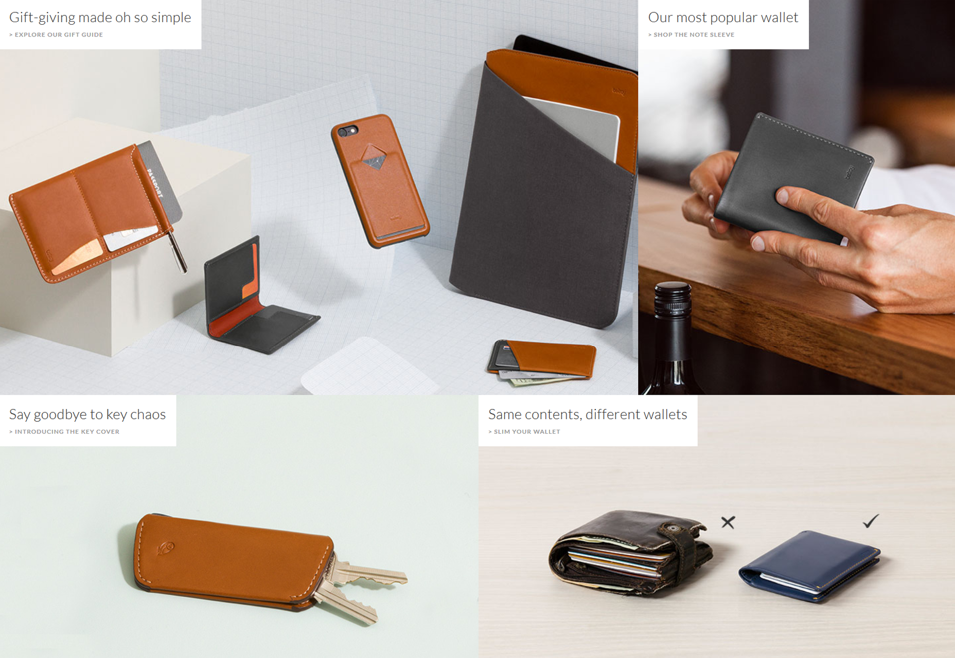
Website visitors will generally just skim your web pages looking for important keywords, significant headings, and scannable lists. Visitors are typically in a hurry to find the information they’re looking for and will skip over content that appears to be inconvenient or irrelevant. Because of this, you should understand that visitors will most likely not read your content if it is not formatted to this pattern of behavior. Avoid creating long blocks of text that appear uninviting to users wanting to quickly scan your website. When it comes to the modern web, less is definitely more. You also want to avoid over-indulging in promotional writing, as customers will quickly see through fluff and stop reading. Having the correct tone is important. According to the Nielsen Norman Group, objective copywriting in a concise, scannable style results in 124% better usability. When and where it is possible, utilize visuals as people tend to be better engaged by visual content. Utilize icons, attention grabbing images, video clips and infographics to help get your message across rather than relying on large blocks of text. Bellroy illustrates this concept well on their website as they keep text down to a minimum amount and showcase their products with big, easy to view images.
4. Reducing visual clutter
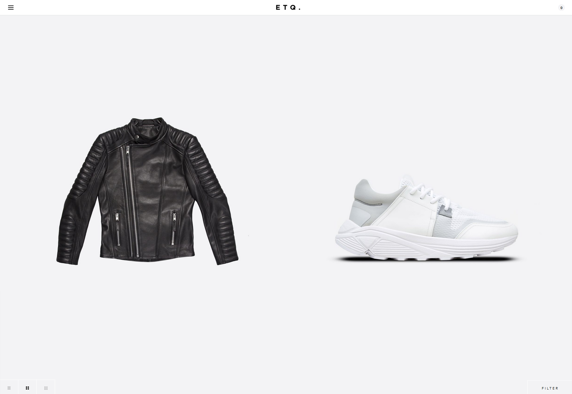
Treat your website visitors’ attention as a precious resource. As visitors arrive at your website, remember that they will be quickly scanning for pertinent information and not paying full attention to everything on the page. If you clutter up your user interface, it will overload website visitors with too much information, make your website seem complicated and reduce the quality of the user experience. Start by removing items that are not essential. By getting rid of anything that isn’t necessary to the user completing their intended actions, you will reduce the clutter and improve visitors’ ability to focus on and comprehend essential information. ETQ’s website shows how by eliminating clutter you are able to focus on the products themselves.
5. Providing a clear call to action
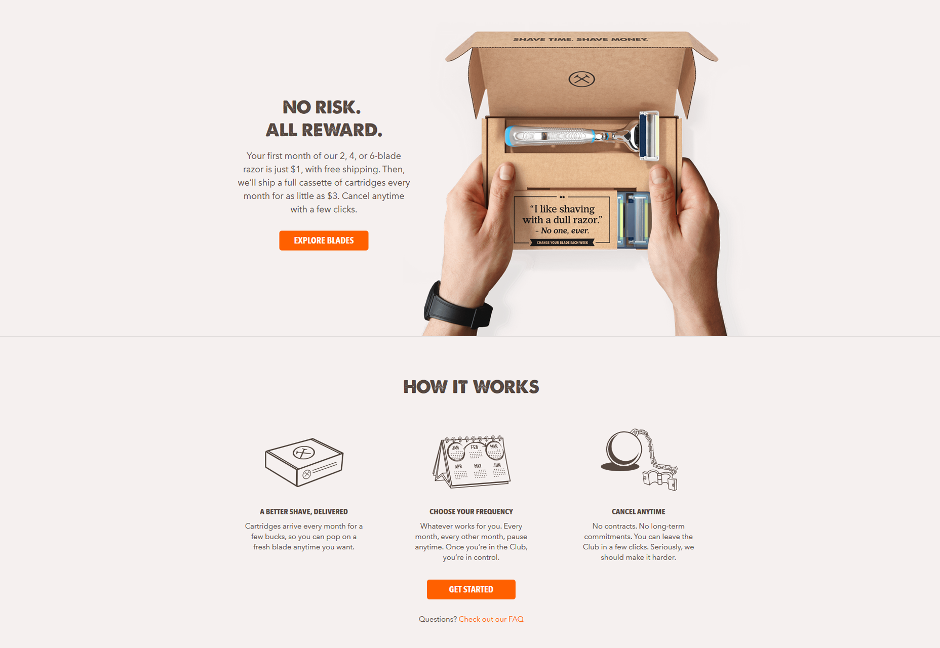
You should have a clear goal for visitors who arrive at your website. You want this to be obvious to visitors and easy for them to complete. Perhaps you want visitors to make a purchase, request a quote, or just to call you, let them know what to do to keep them moving forward after landing on your website. Your call to action is how you tell visitors what action they should take while on your website. We regularly see websites with no clear call to action and it is no surprise when we find out they are not performing the way their owners’ hope. Your call to action should stand out and make it easy for the visitors to take the desired action. Before deciding on your website’s call to action it is best to understand your visitors’ reasons for coming to your website. Having a call to action that runs counter to visitors’ intentions will reduce its effectiveness. If visitors just want to make a purchase but you push them to ask for a quote it can cut down on the effectiveness of your call to action. Dollar Shave Club’s buttons just beg to be pushed. Their website illustrates how clear calls to action can draw your attention and promote forward movement.
Samella Garcia
Samella Garcia works as an Integration Manager for UX Phoenix. She has 8 years’ experience developing mobile applications and web sites that focus on UX. Samella has a passion for user experience projects, coding, digital technology and hiking.
Read Next
15 Best New Fonts, July 2024
Welcome to our monthly roundup of the best fonts we’ve found online in the last four weeks. This month, there are fewer…
By Ben Moss
20 Best New Websites, July 2024
Welcome to July’s round up of websites to inspire you. This month’s collection ranges from the most stripped-back…
Top 7 WordPress Plugins for 2024: Enhance Your Site's Performance
WordPress is a hands-down favorite of website designers and developers. Renowned for its flexibility and ease of use,…
By WDD Staff
Exciting New Tools for Designers, July 2024
Welcome to this July’s collection of tools, gathered from around the web over the past month. We hope you’ll find…
3 Essential Design Trends, July 2024
Add some summer sizzle to your design projects with trendy website elements. Learn what's trending and how to use these…
15 Best New Fonts, June 2024
Welcome to our roundup of the best new fonts we’ve found online in the last month. This month, there are notably fewer…
By Ben Moss
20 Best New Websites, June 2024
Arranging content in an easily accessible way is the backbone of any user-friendly website. A good website will present…
Exciting New Tools for Designers, June 2024
In this month’s roundup of the best tools for web designers and developers, we’ll explore a range of new and noteworthy…
3 Essential Design Trends, June 2024
Summer is off to a fun start with some highly dramatic website design trends showing up in projects. Let's dive in!
15 Best New Fonts, May 2024
In this month’s edition, there are lots of historically-inspired typefaces, more of the growing trend for French…
By Ben Moss
How to Reduce The Carbon Footprint of Your Website
On average, a web page produces 4.61 grams of CO2 for every page view; for whole sites, that amounts to hundreds of KG…
By Simon Sterne
20 Best New Websites, May 2024
Welcome to May’s compilation of the best sites on the web. This month we’re focused on color for younger humans,…


