

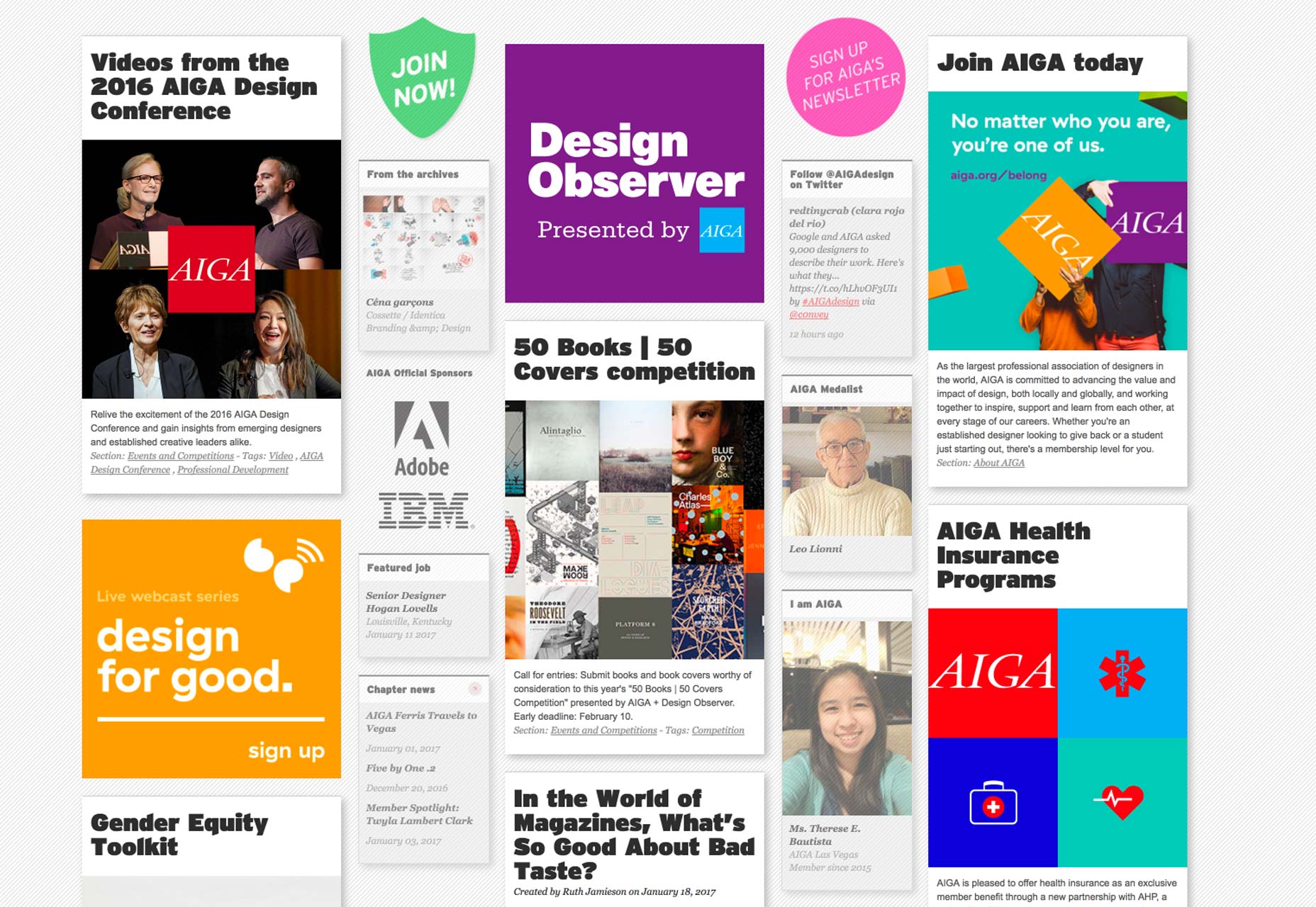
AIGA
cssdsgn
Awwwards
Shopify Themes
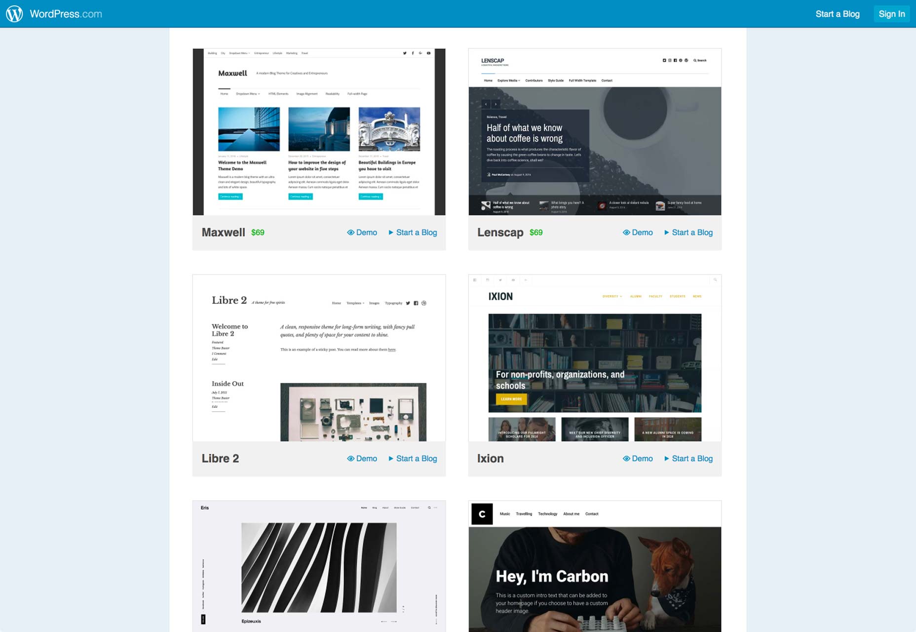
Wordpress.com Themes
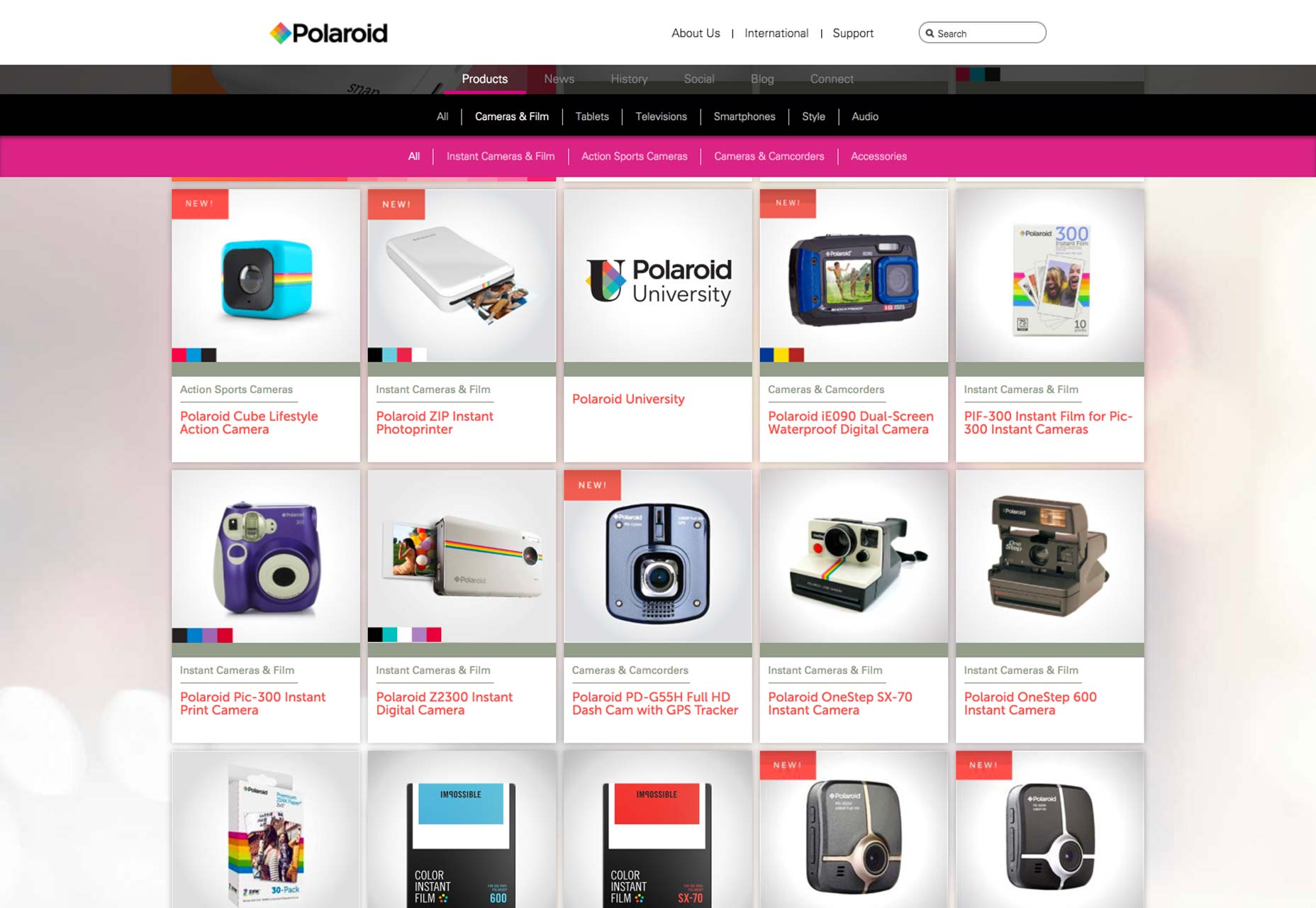
Polaroid
Casual start
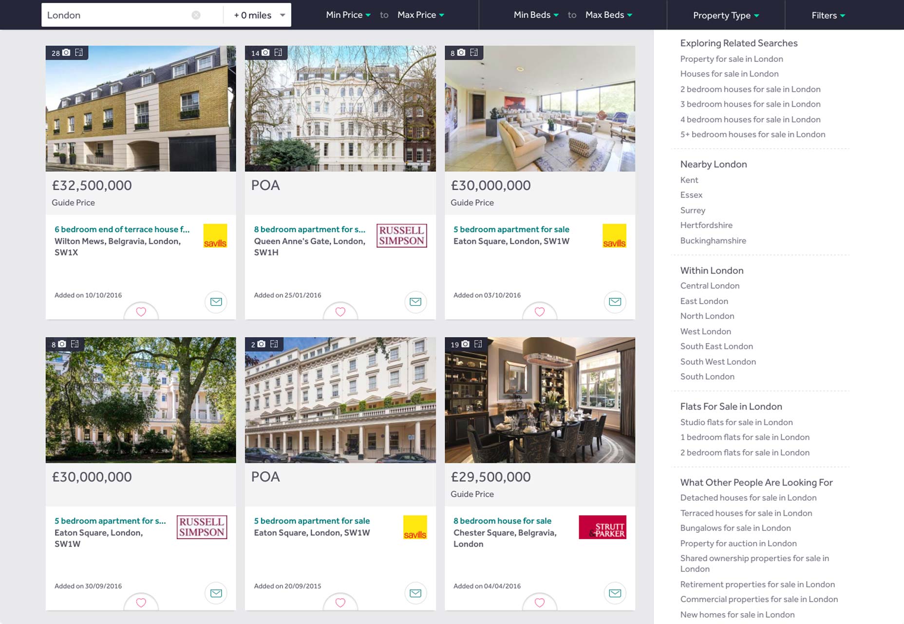
Rightmove
UXPin
We Occupy
UI8
Our Daily Edit
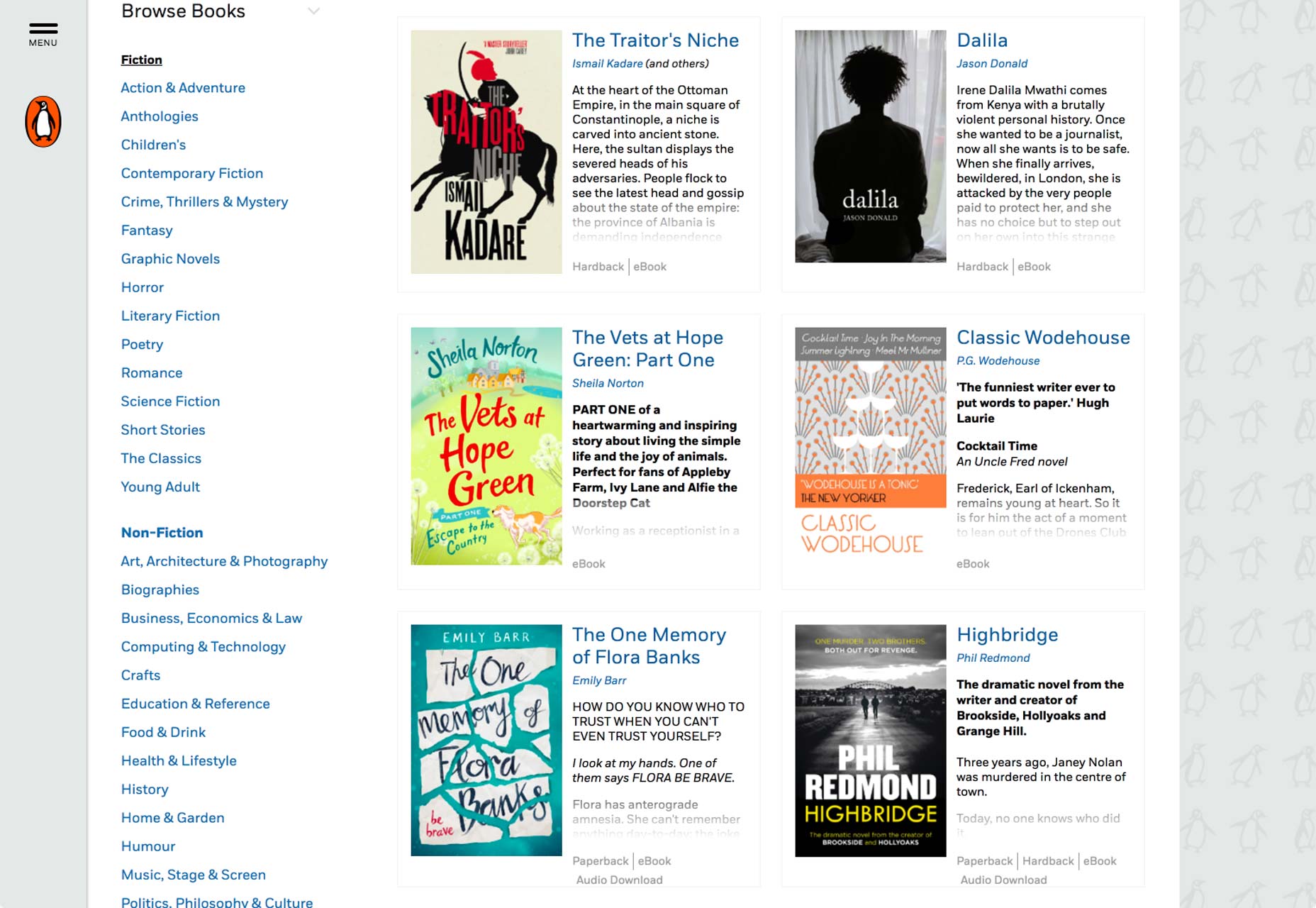
Penguin
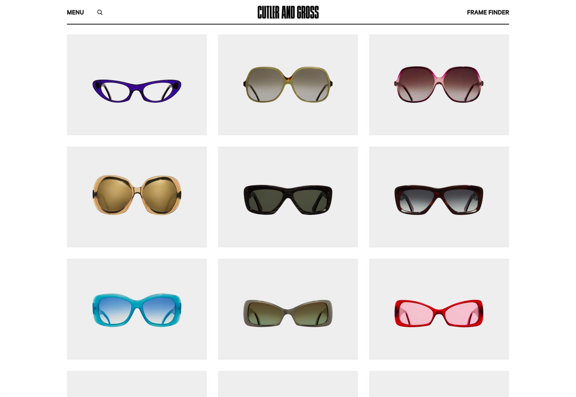
Cutler and Gross
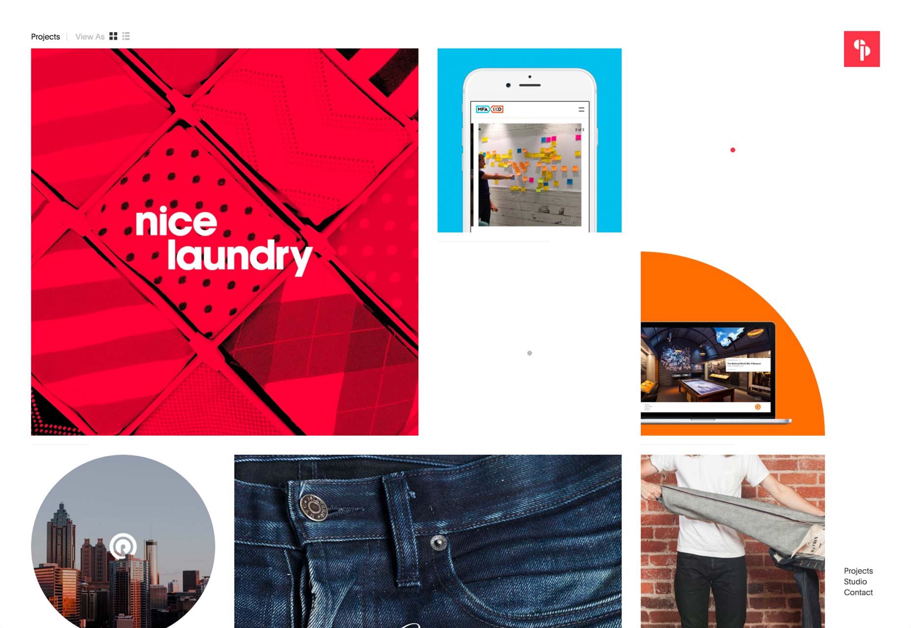
Extended Play
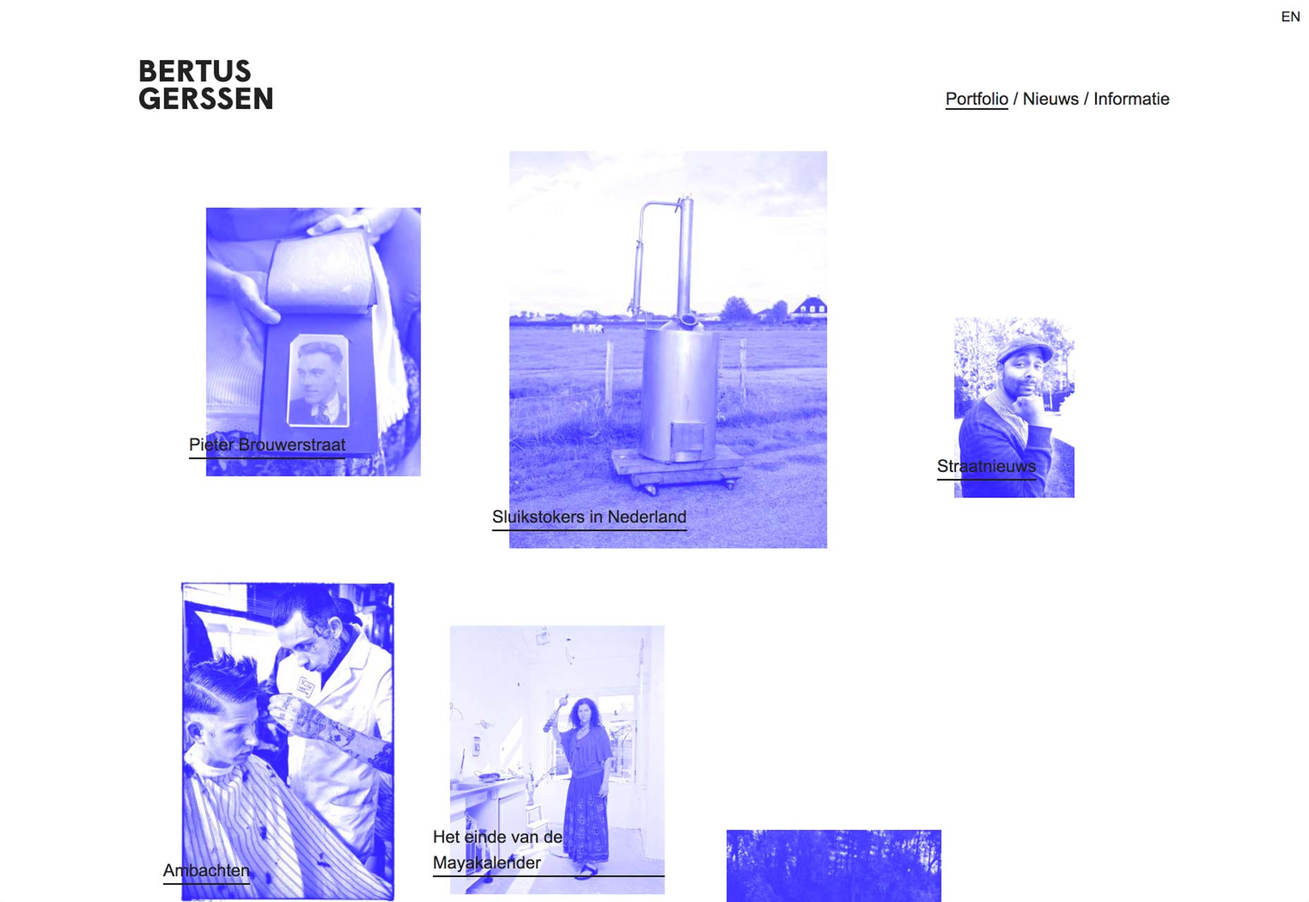
Bertus Gerssen
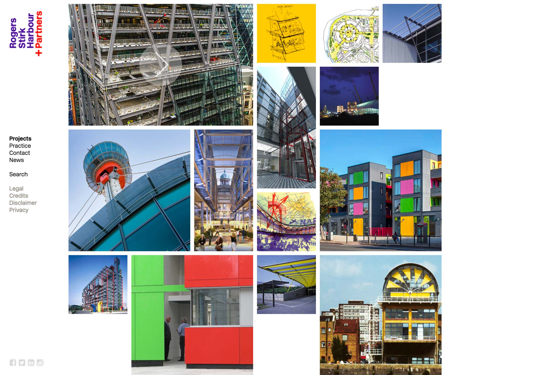
Rogers Stirk Harbour and Partners
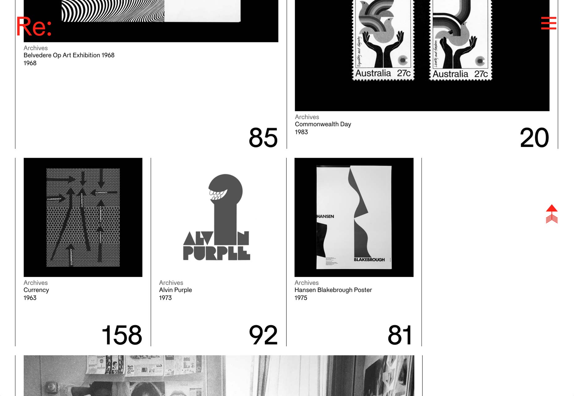
Re:collection
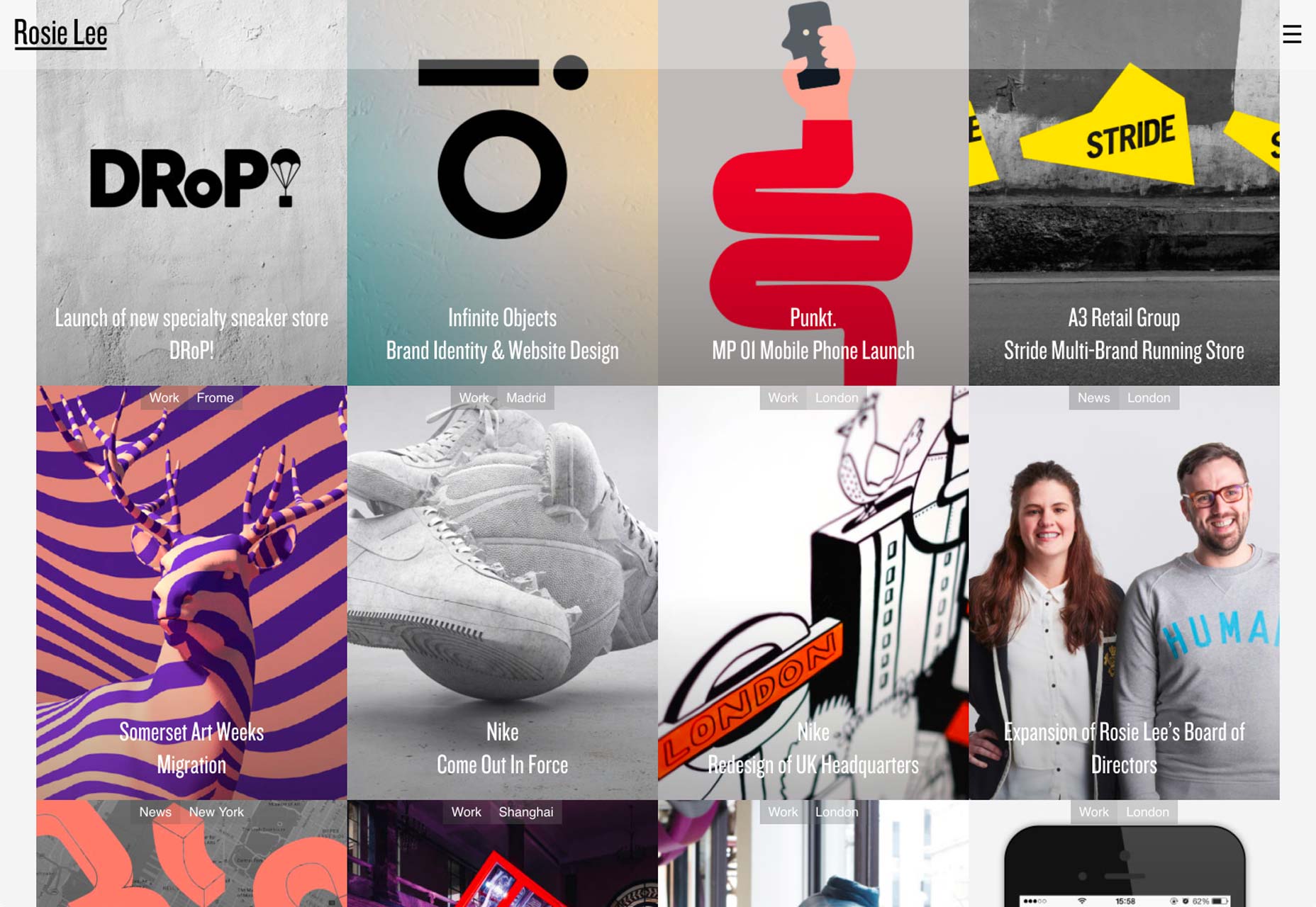
Rosie Lee
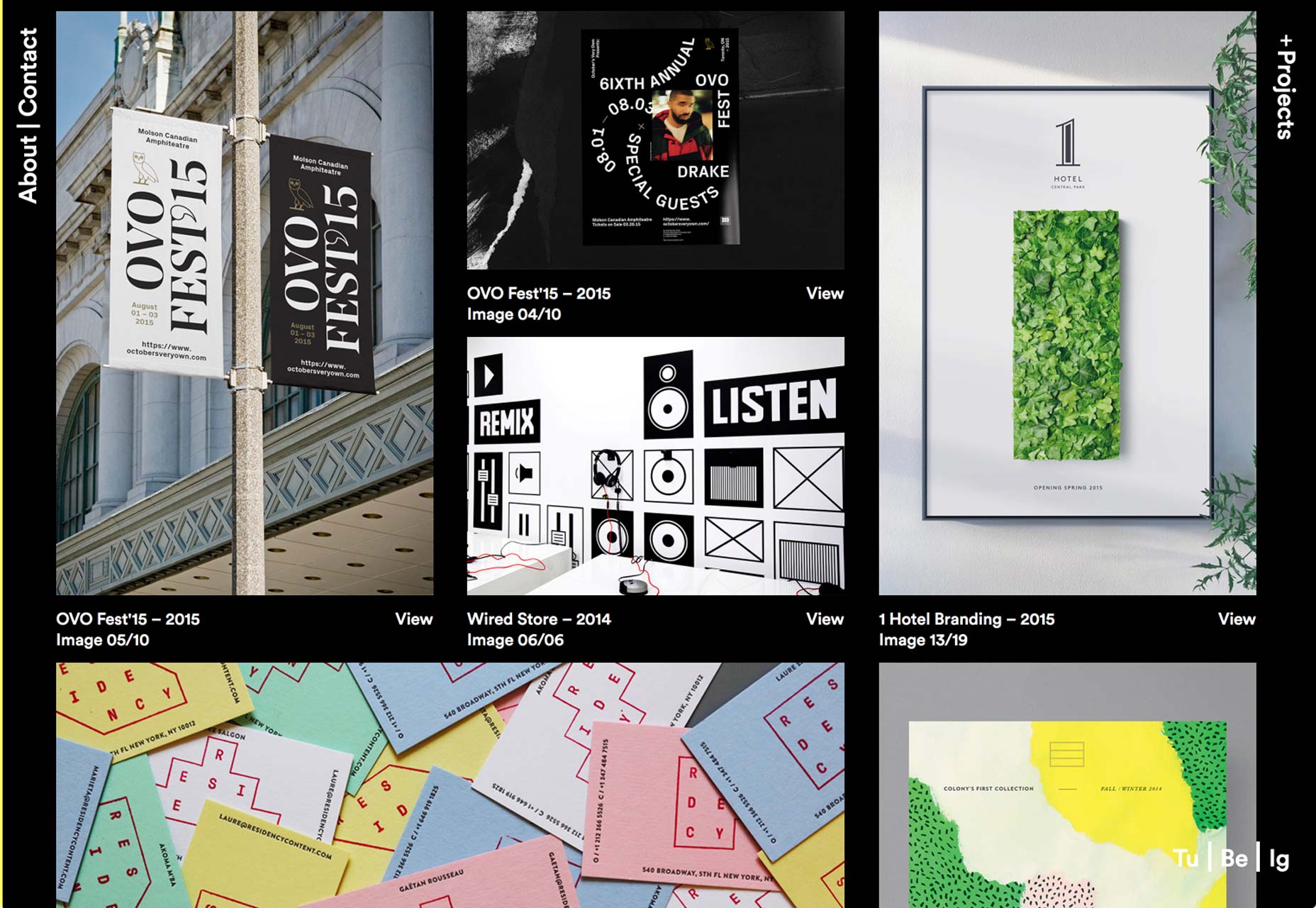
Jules Tardy
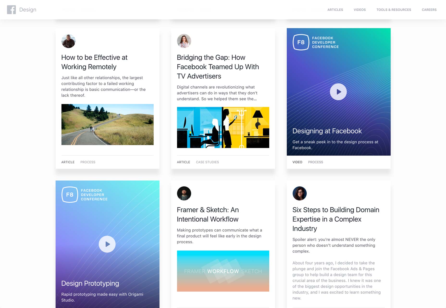
Facebook Design
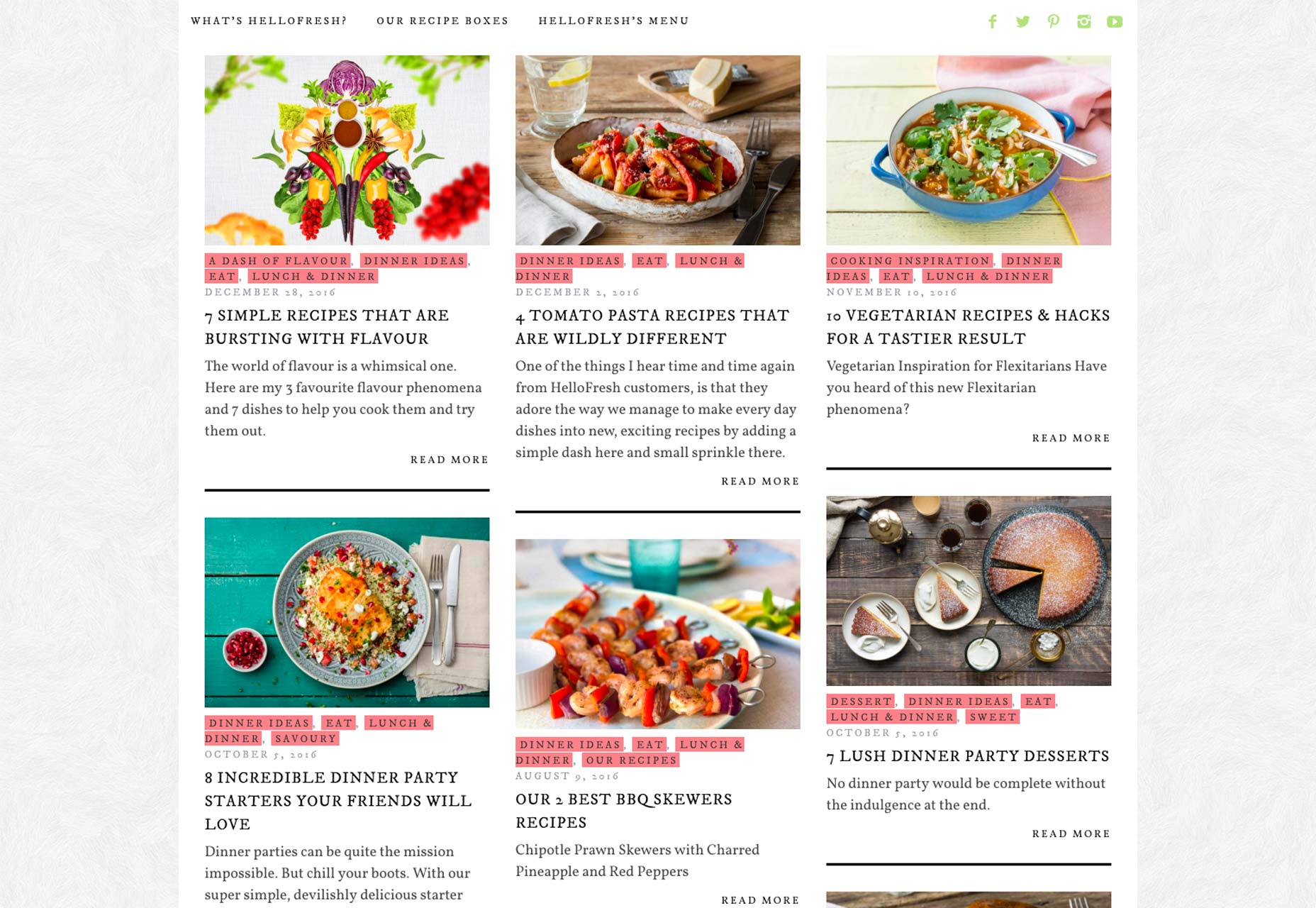
HelloFresh Blog
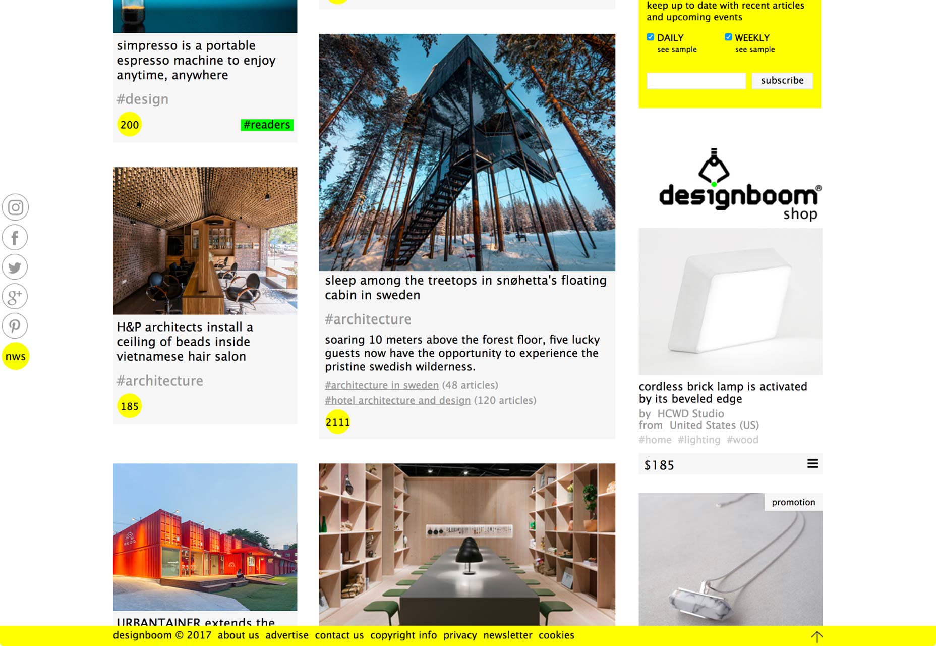
designboom
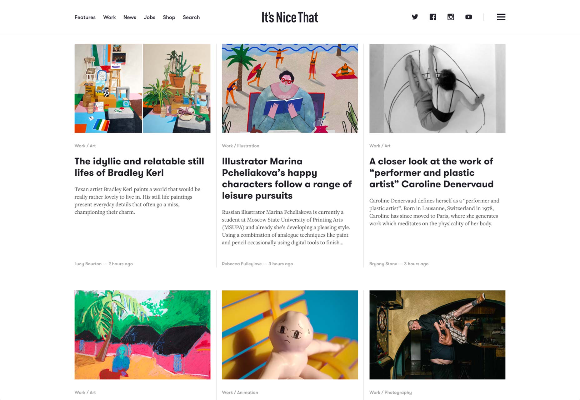
It’s Nice That
Excelsiorama
Handsome Frank
Behance
Dribbble
The Vinyl Factory

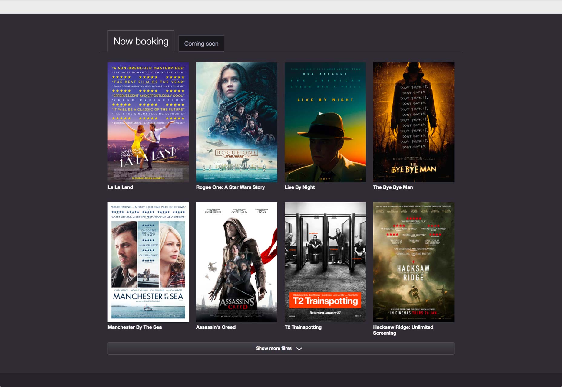
Cineworld
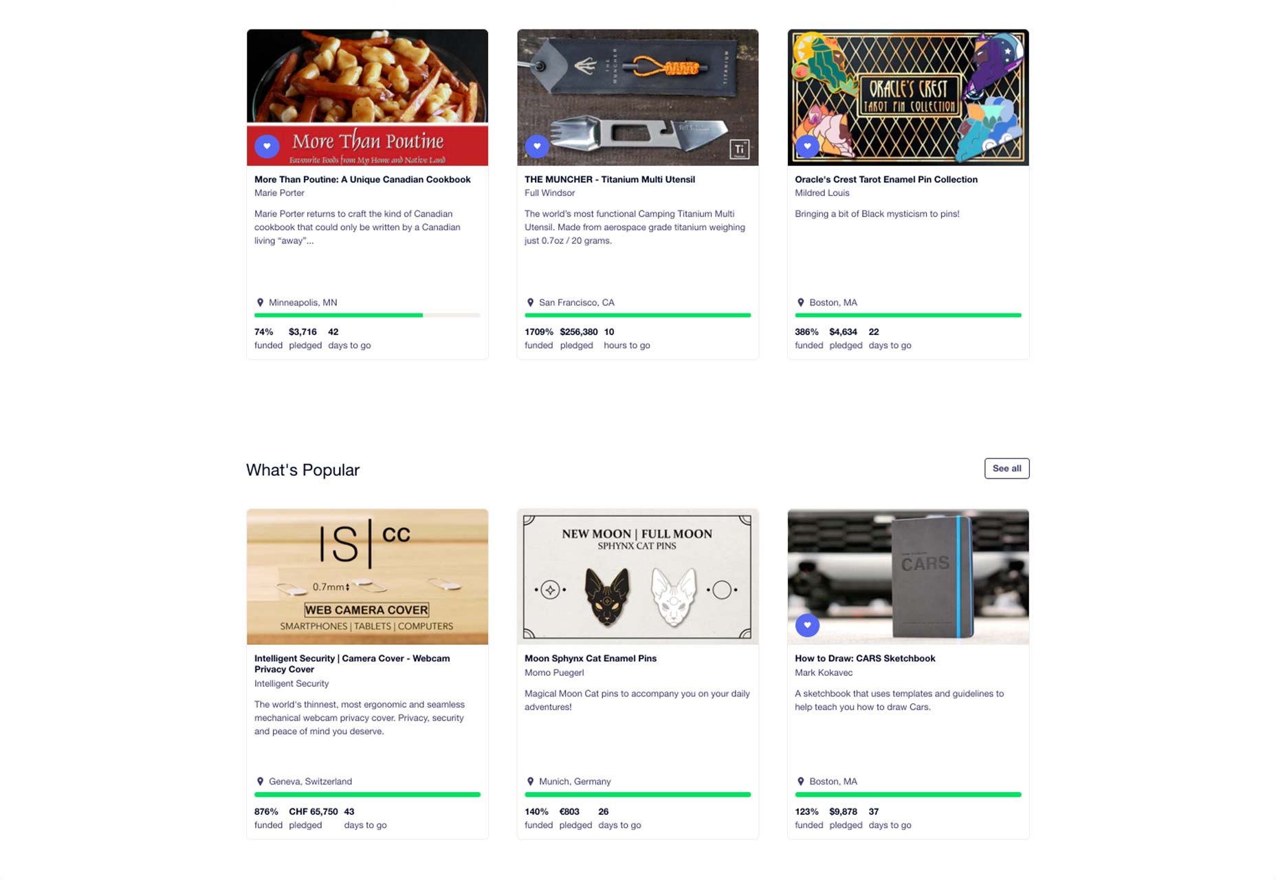
Kickstarter
The British Museum
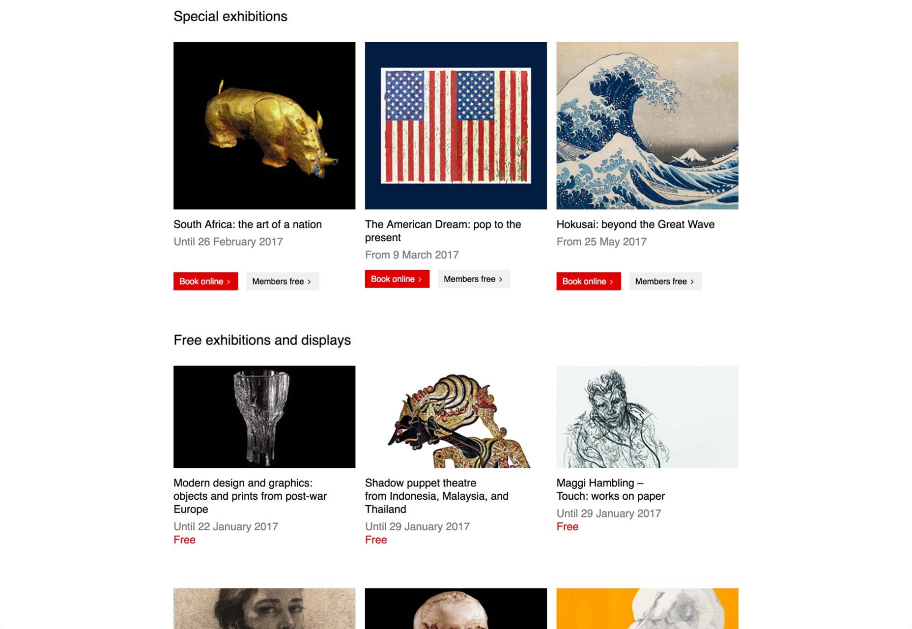
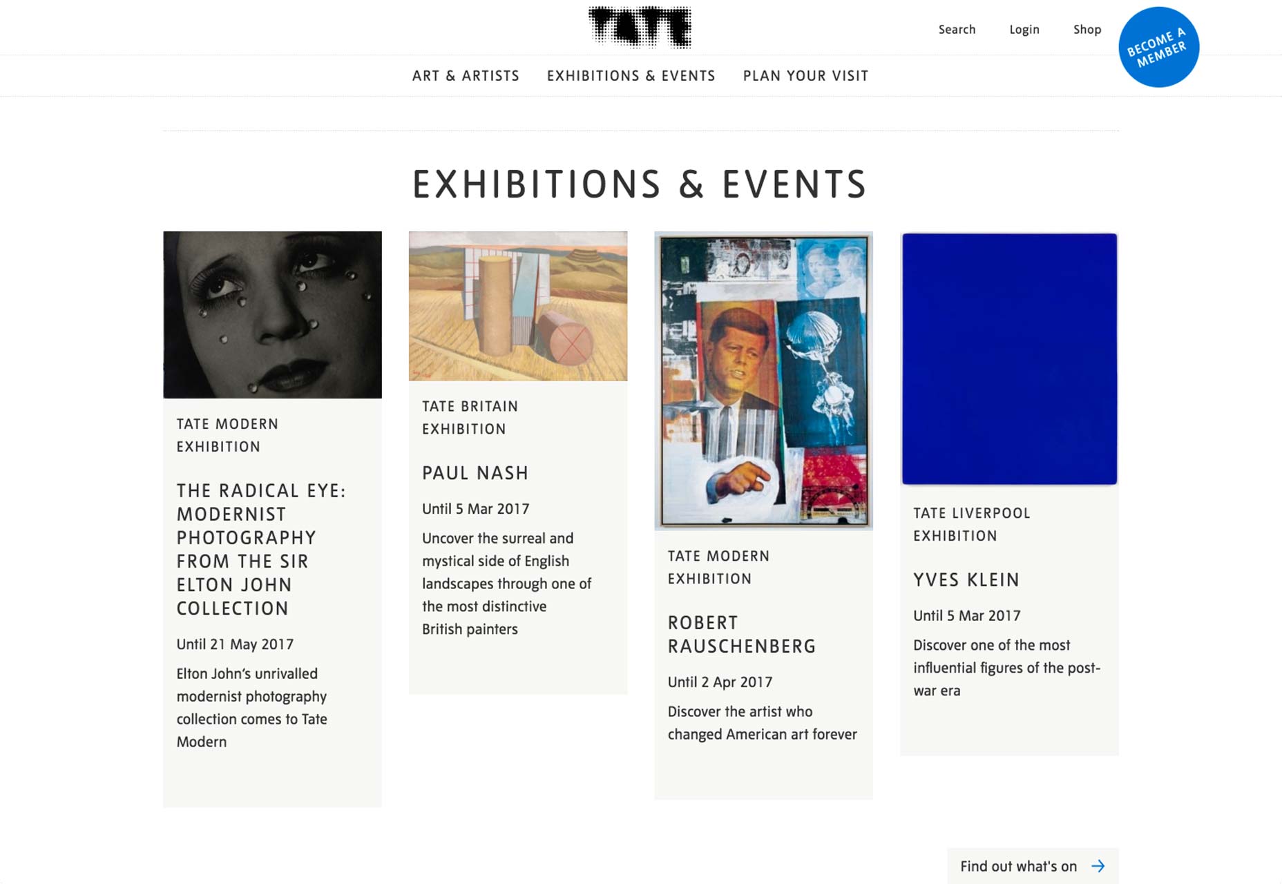
The Tate
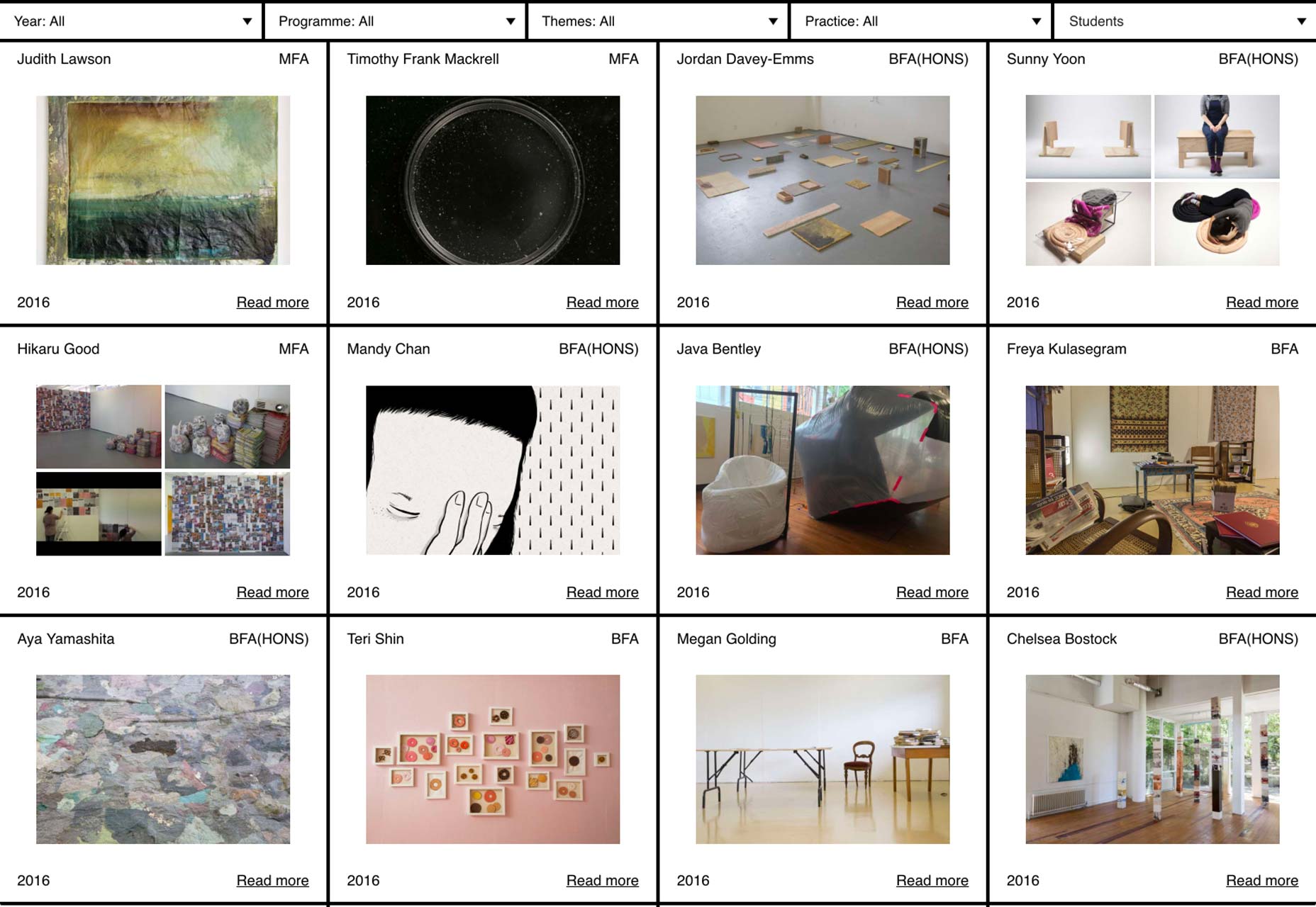
Elam Artists
POP Montreal
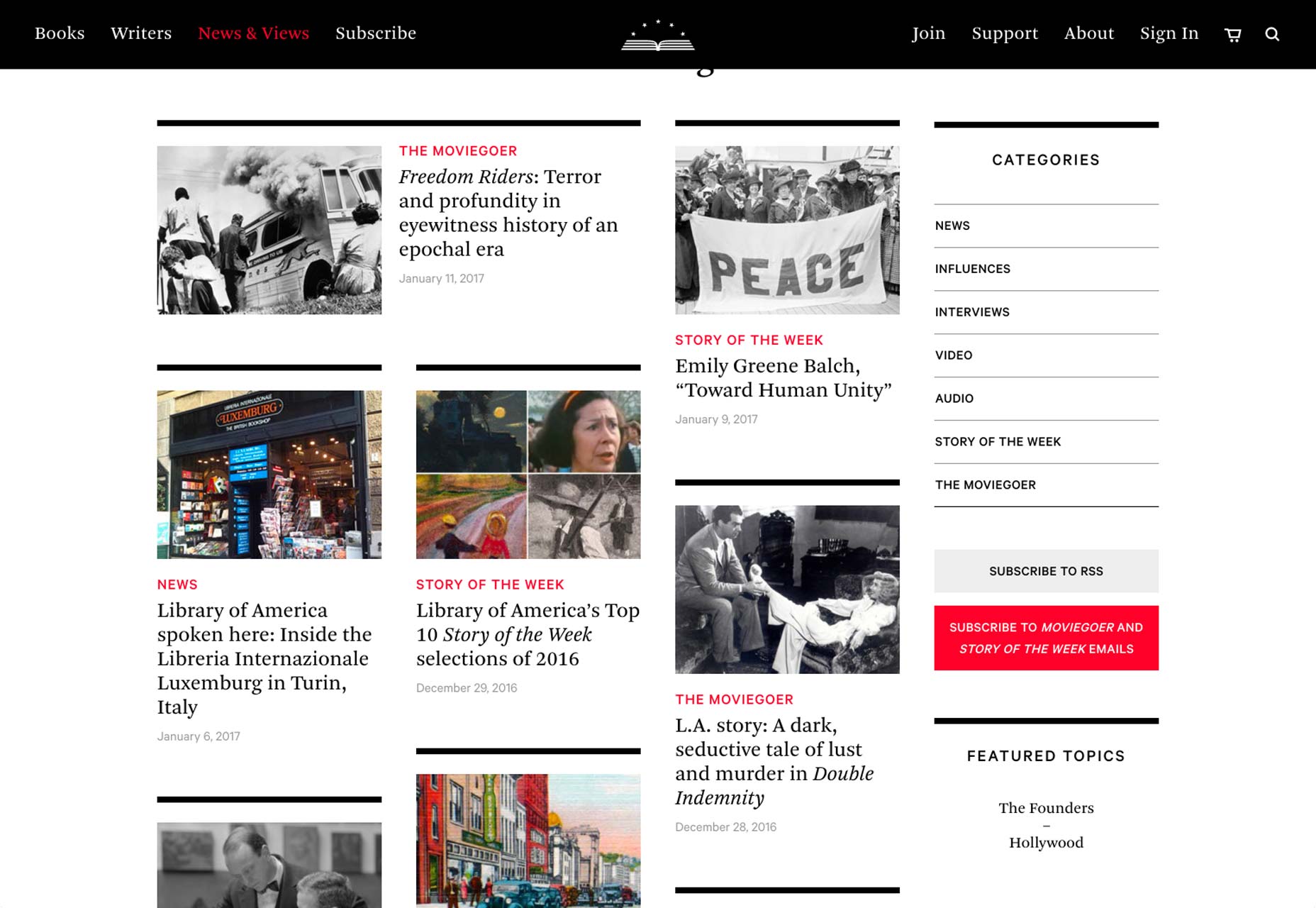
Library of America
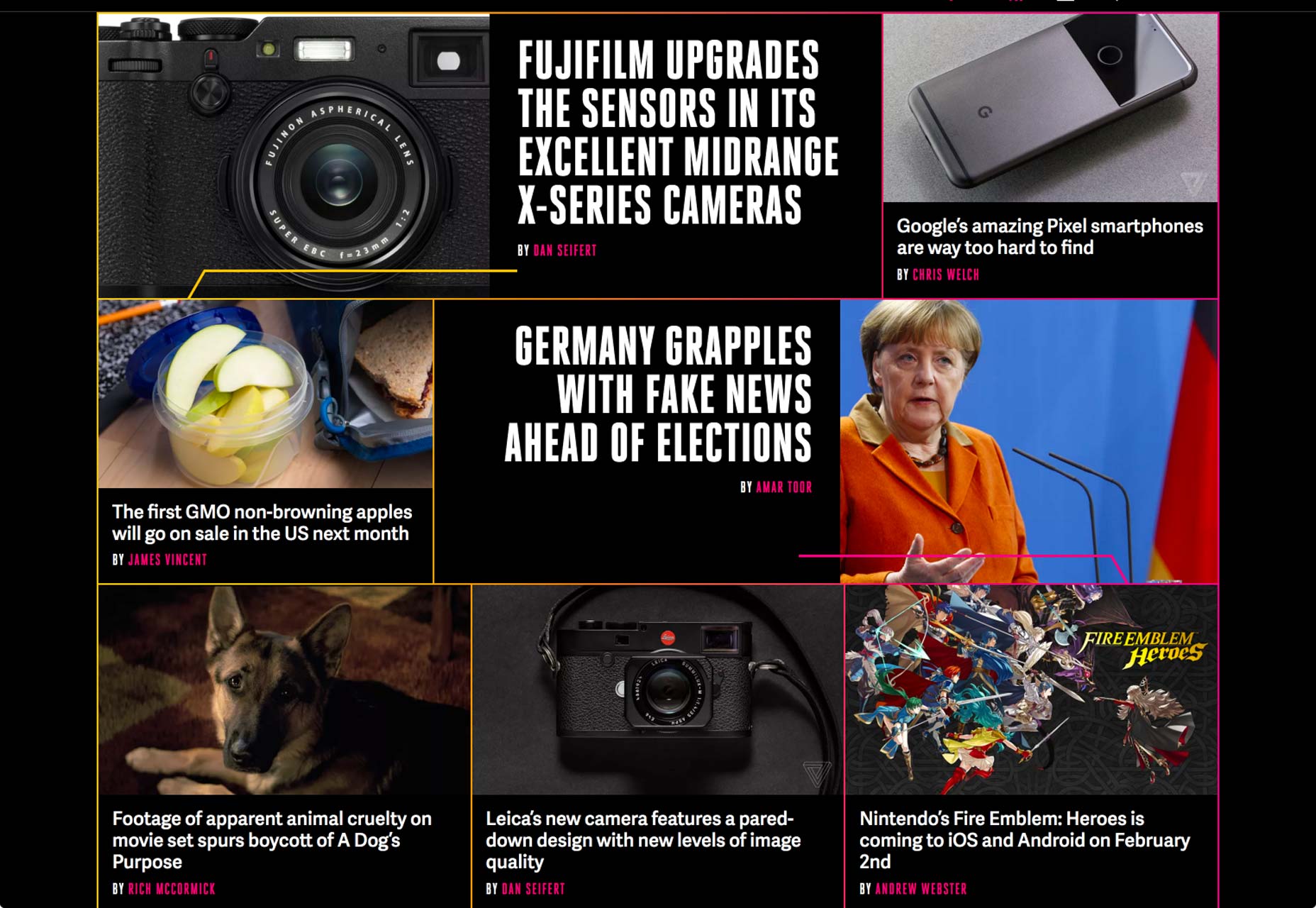
The Verge
The Guardian
The BBC
Vogue
Vice
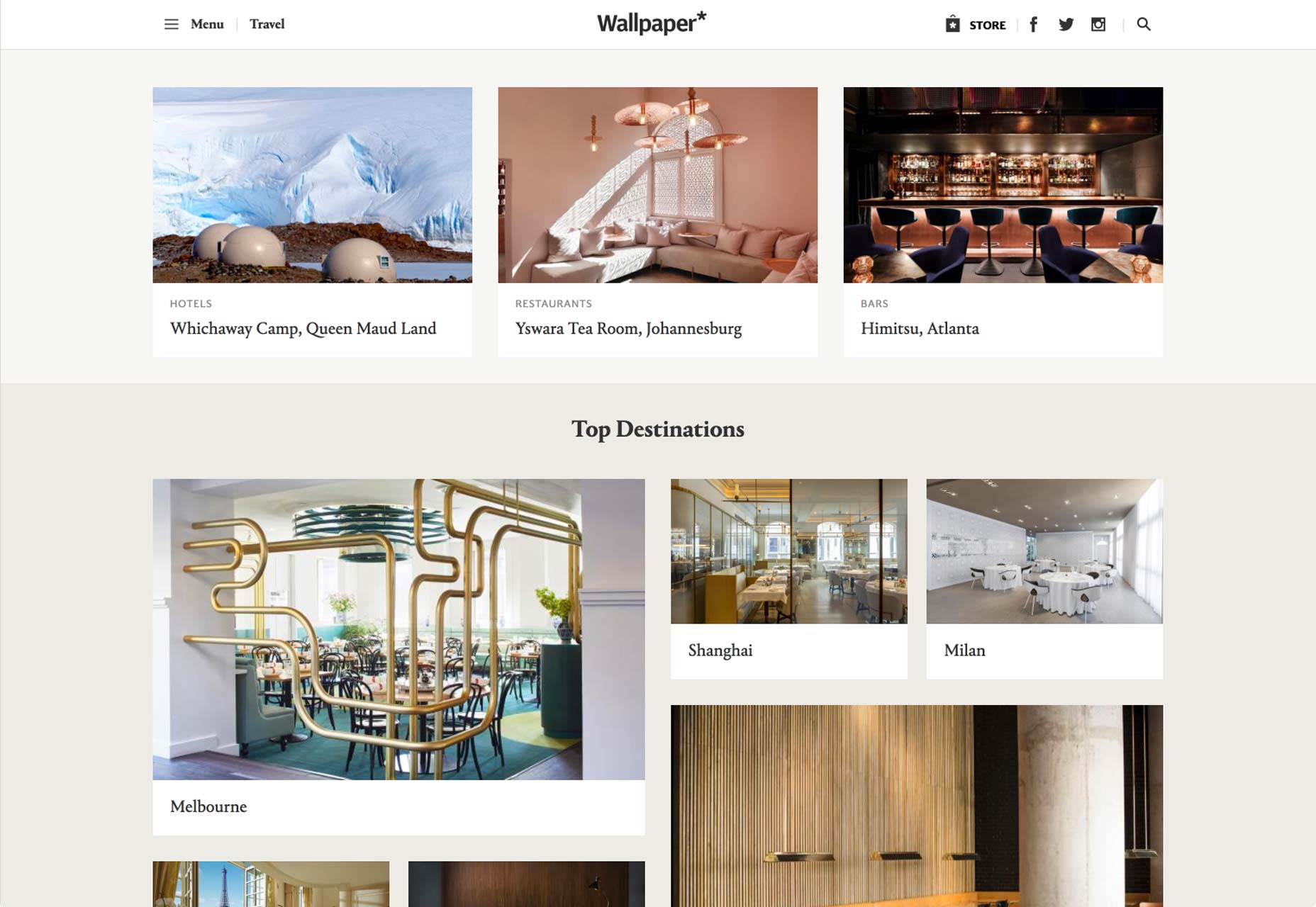
Wallpaper
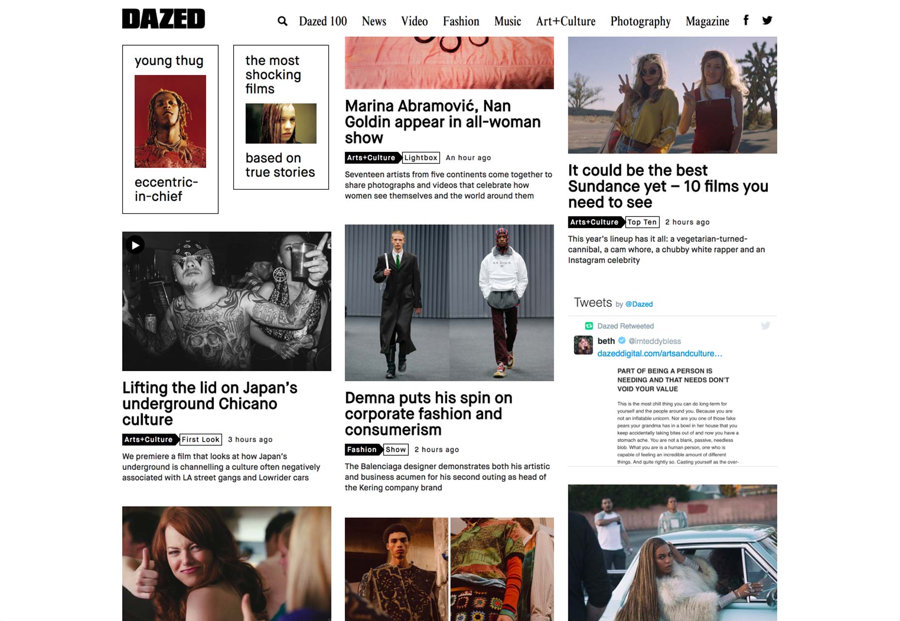
Dazed
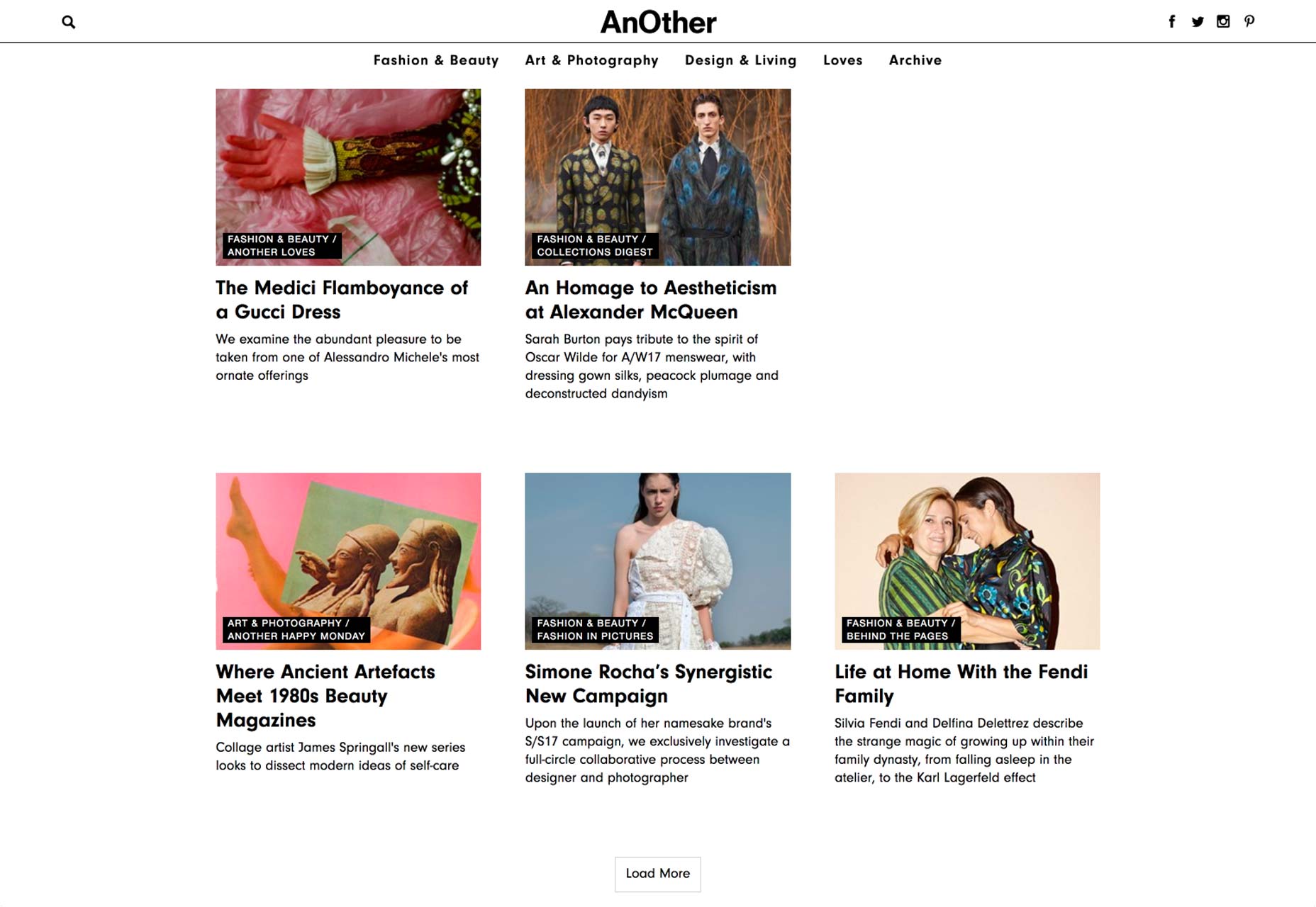
AnOther
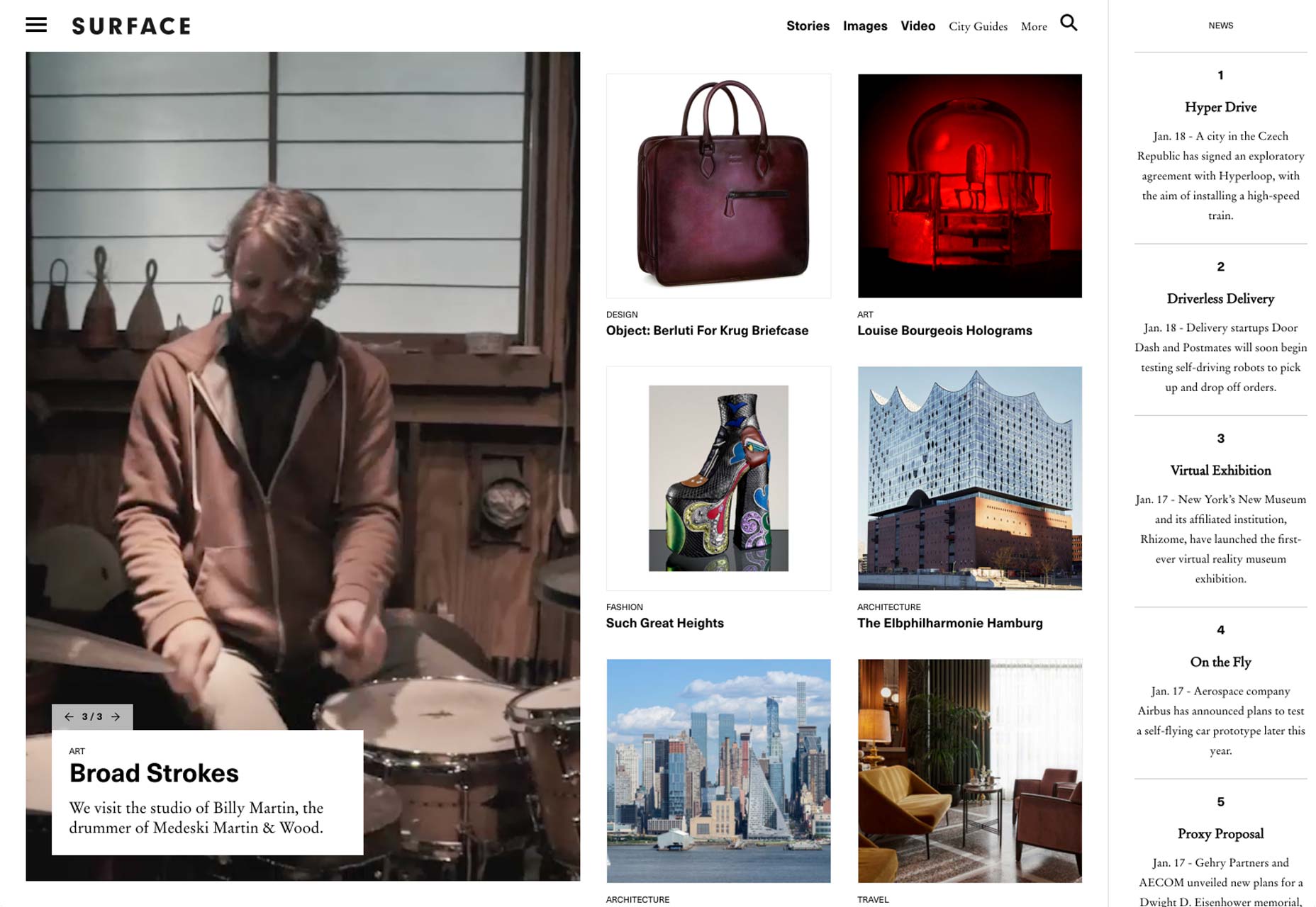
Surface
Design Week
Wired
Kinfolk
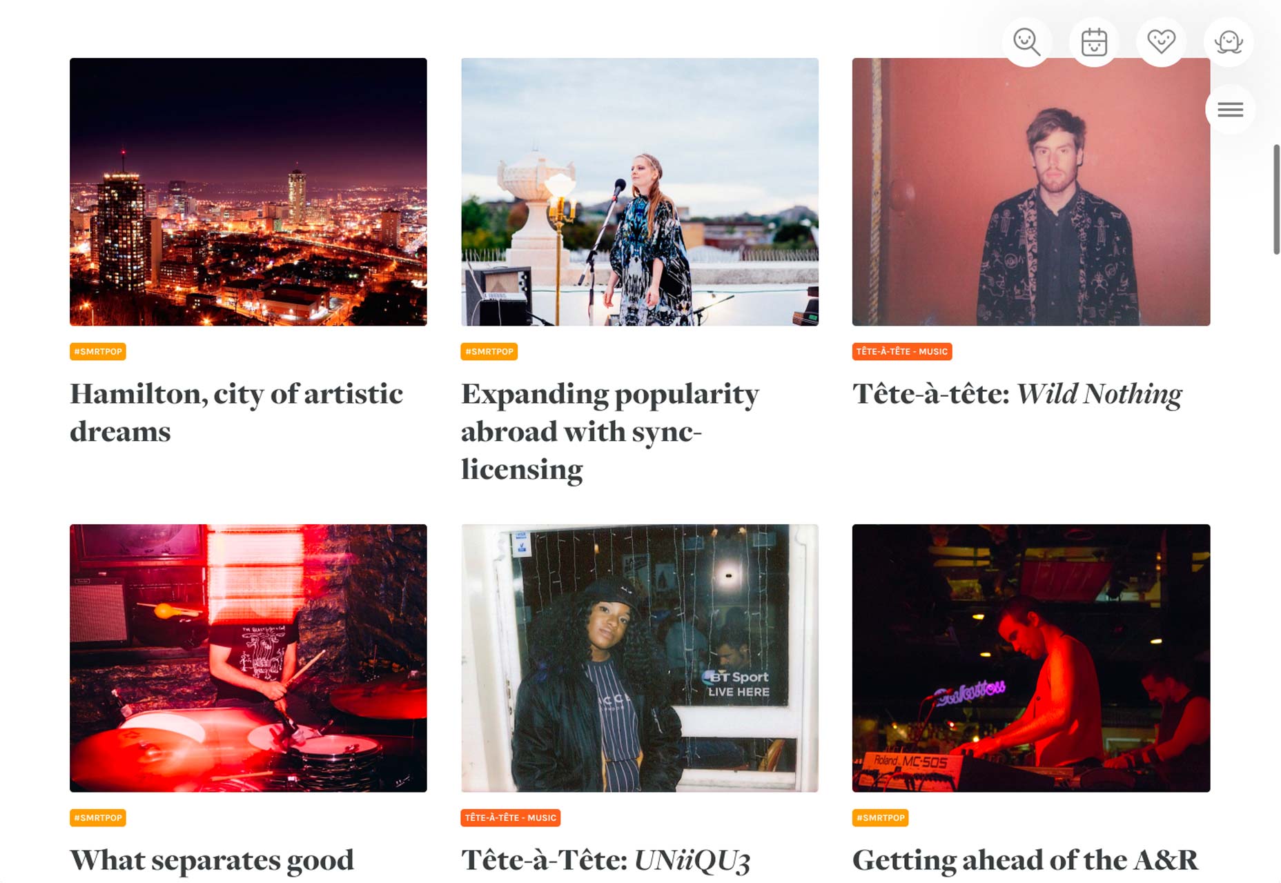
Pitchfork
Grafik
Paddi MacDonnell
Paddi MacDonnell is a designer and entrepreneur from Northern Ireland, follow her on Twitter.


Read Next

15 Best New Fonts, July 2024
Welcome to our monthly roundup of the best fonts we’ve found online in the last four weeks. This month, there are fewer…
By Ben Moss

20 Best New Websites, July 2024
Welcome to July’s round up of websites to inspire you. This month’s collection ranges from the most stripped-back…

Top 7 WordPress Plugins for 2024: Enhance Your Site's Performance
WordPress is a hands-down favorite of website designers and developers. Renowned for its flexibility and ease of use,…
By WDD Staff

Exciting New Tools for Designers, July 2024
Welcome to this July’s collection of tools, gathered from around the web over the past month. We hope you’ll find…

3 Essential Design Trends, July 2024
Add some summer sizzle to your design projects with trendy website elements. Learn what's trending and how to use these…

15 Best New Fonts, June 2024
Welcome to our roundup of the best new fonts we’ve found online in the last month. This month, there are notably fewer…
By Ben Moss

20 Best New Websites, June 2024
Arranging content in an easily accessible way is the backbone of any user-friendly website. A good website will present…

Exciting New Tools for Designers, June 2024
In this month’s roundup of the best tools for web designers and developers, we’ll explore a range of new and noteworthy…

3 Essential Design Trends, June 2024
Summer is off to a fun start with some highly dramatic website design trends showing up in projects. Let's dive in!

15 Best New Fonts, May 2024
In this month’s edition, there are lots of historically-inspired typefaces, more of the growing trend for French…
By Ben Moss

How to Reduce The Carbon Footprint of Your Website
On average, a web page produces 4.61 grams of CO2 for every page view; for whole sites, that amounts to hundreds of KG…
By Simon Sterne

20 Best New Websites, May 2024
Welcome to May’s compilation of the best sites on the web. This month we’re focused on color for younger humans,…