

1) Exaggerated use of space
The right amount of space can make or break a design. Whether it is white, a background color or surrounds text or images, “empty” space in a design can speak volumes. Exaggerated use of space is one of those design trends that can be a lot of fun, and when used well it can be rather effective in helping users know just how to look at or use a website or app. Open space is an extension of minimal styles that have been popular for some time, but with one major exception: Rather than a symmetrical outline with space all around, these designs balance images or text with space in a more asymmetrical format. Think about it from the user perspective. They will likely be drawn immediately to the open part of the design, whether they think about it consciously or not. From there, the eye will hop to the more populated part of the design. The two step process grabs users’ attention and almost shows them where to look. Pretty smart, right? This simple balancing act is visually interesting and great for making a strong impact. Look at the examples below and think about the space in relationship to what you see next: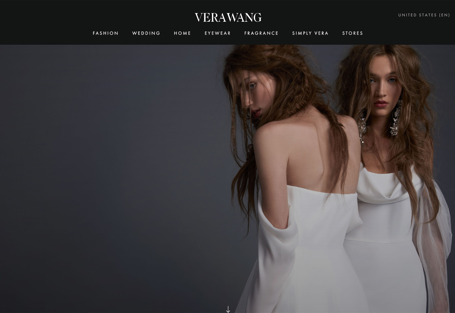 Vera Wang: Space on the left moves the user to the clothing on the women. Perfect for a fashion designer.
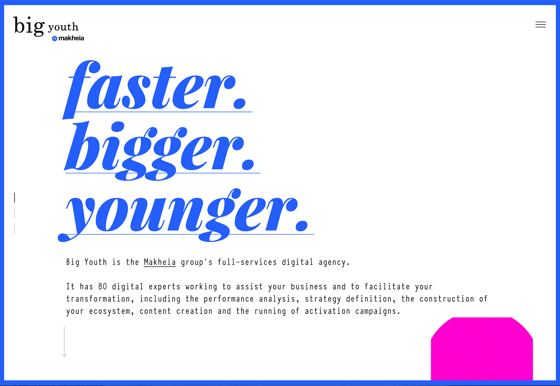 Big Youth: Space around the text draws users to the headline. The headline should always be one of the first things someone looks at on the page.
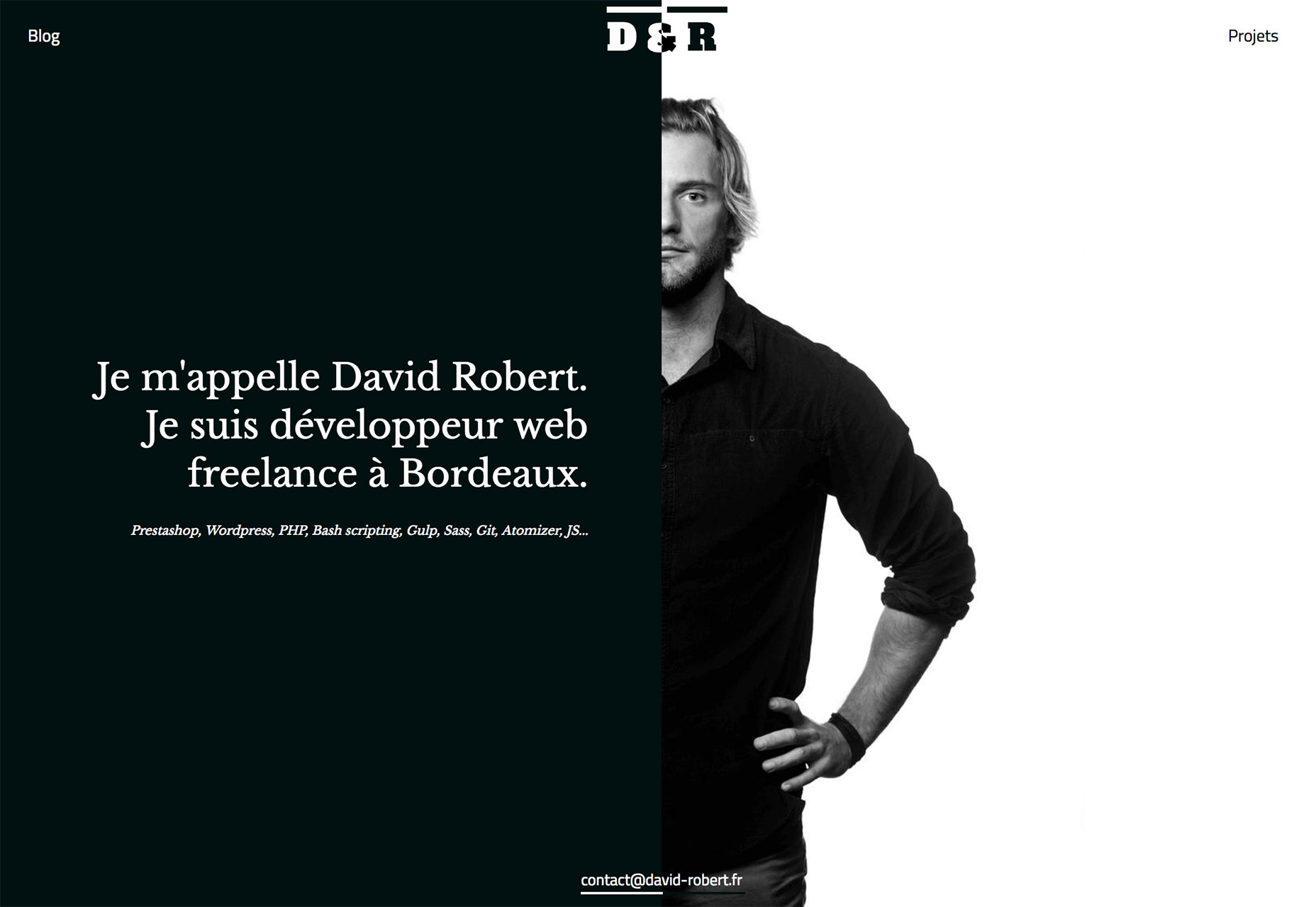 David Robert: Space pulls the eye first to the person and then to his bio. Contrasting light and dark elements also help enforce this movement. Interesting because you read from right to left and it feels quite creative. Something you’d probably look for in a designer.
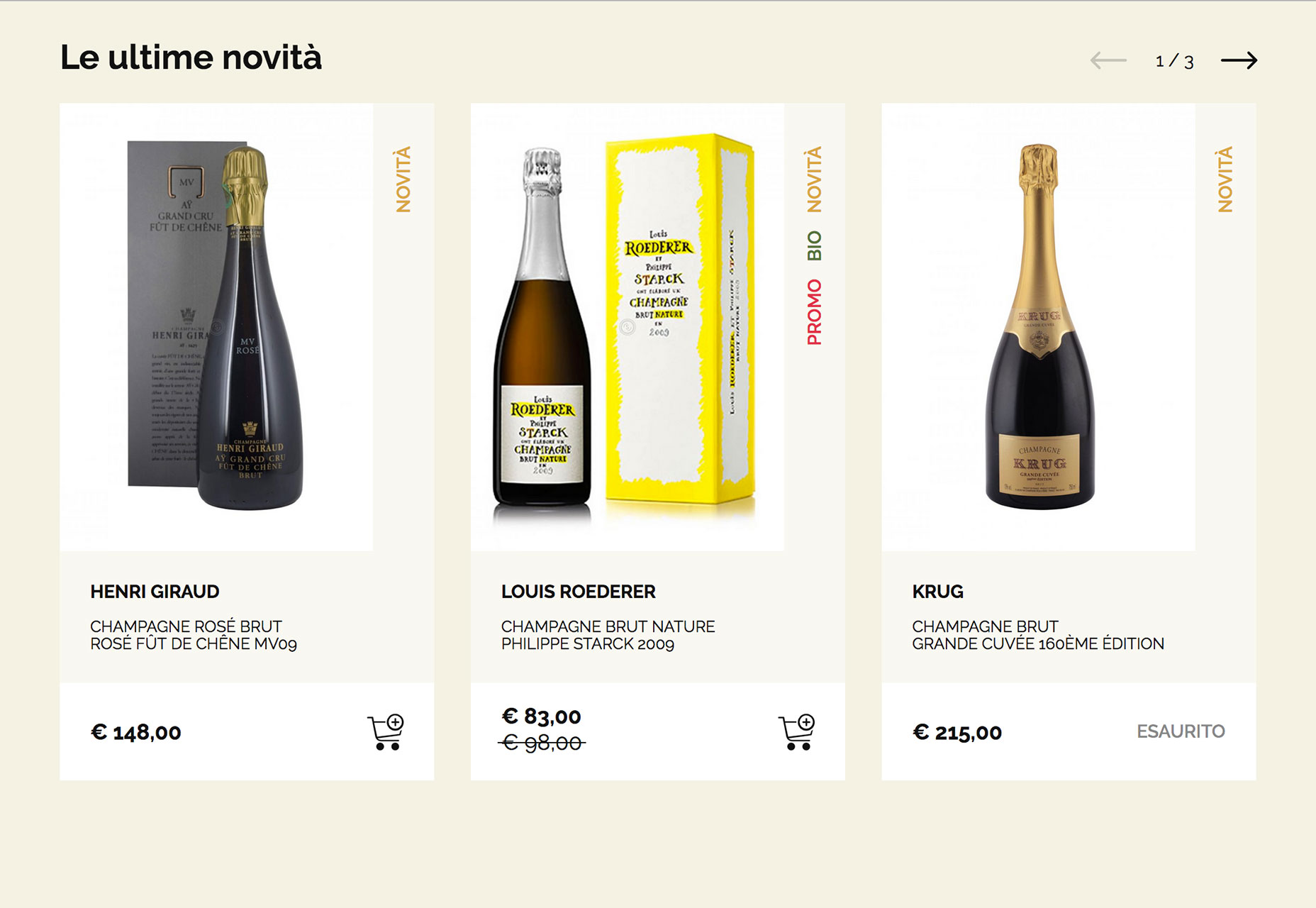
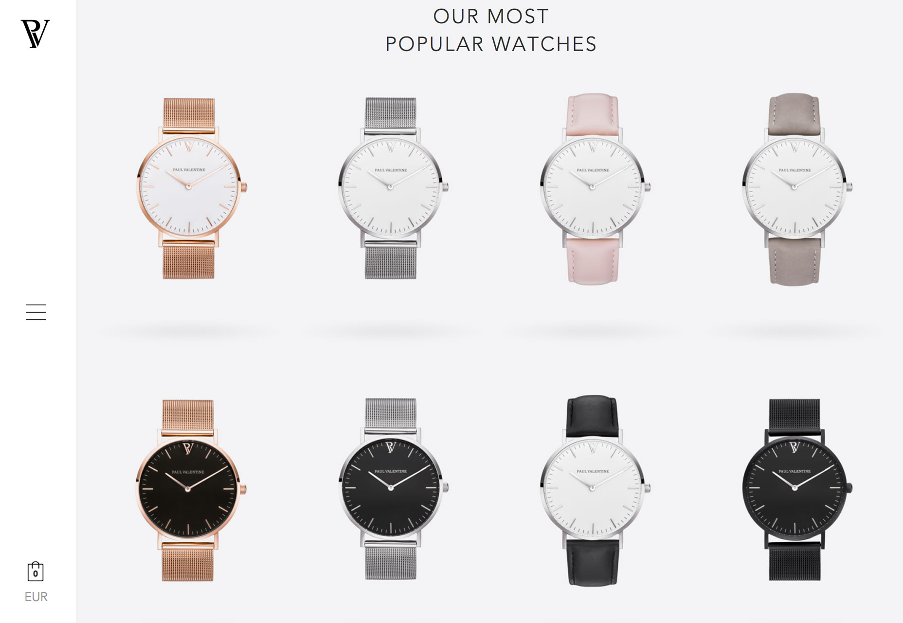
2) Shopping experiences
When it comes to shopping online, experience tend to fall into two categories: The almost seamless experience offered by major retailers such as Amazon or the clunky too-many clicks to checkout experience that is common among small shops. There’s got to be something in the middle, right? More retailers are opting for highly visual, more experiential design styles for their online stores. While the trend seems to work best for shops with only a few items to choose from, it’s a neat take on user experience. The examples below tend to come from shops that are a little higher end and don’t hit you with huge navigation menus and hundreds of options right from the start. The focus is on the beauty or uniqueness of the item and the story behind it. Then on scroll or hover do you find that you can actually buy the item right there. The design has a more visual feel, using Instagram-influenced photos, and card-style interfaces that encourage clicks. Items in these retail designs don’t seem to come with many options per item; items are more specifically made to order as is. While this concept wouldn’t work well for shops with large inventories or complicated levels of options or customizations, it is a nice alternative for retailers that want to exhibit a high-end feel with a high-end design. Each of these examples uses brilliant hover effects to show pricing but make the user want the item before they even think about impact to the pocketbook. The other commonality? You can’t find a single price until the scroll. The first screen is designed to increase desire through a product story.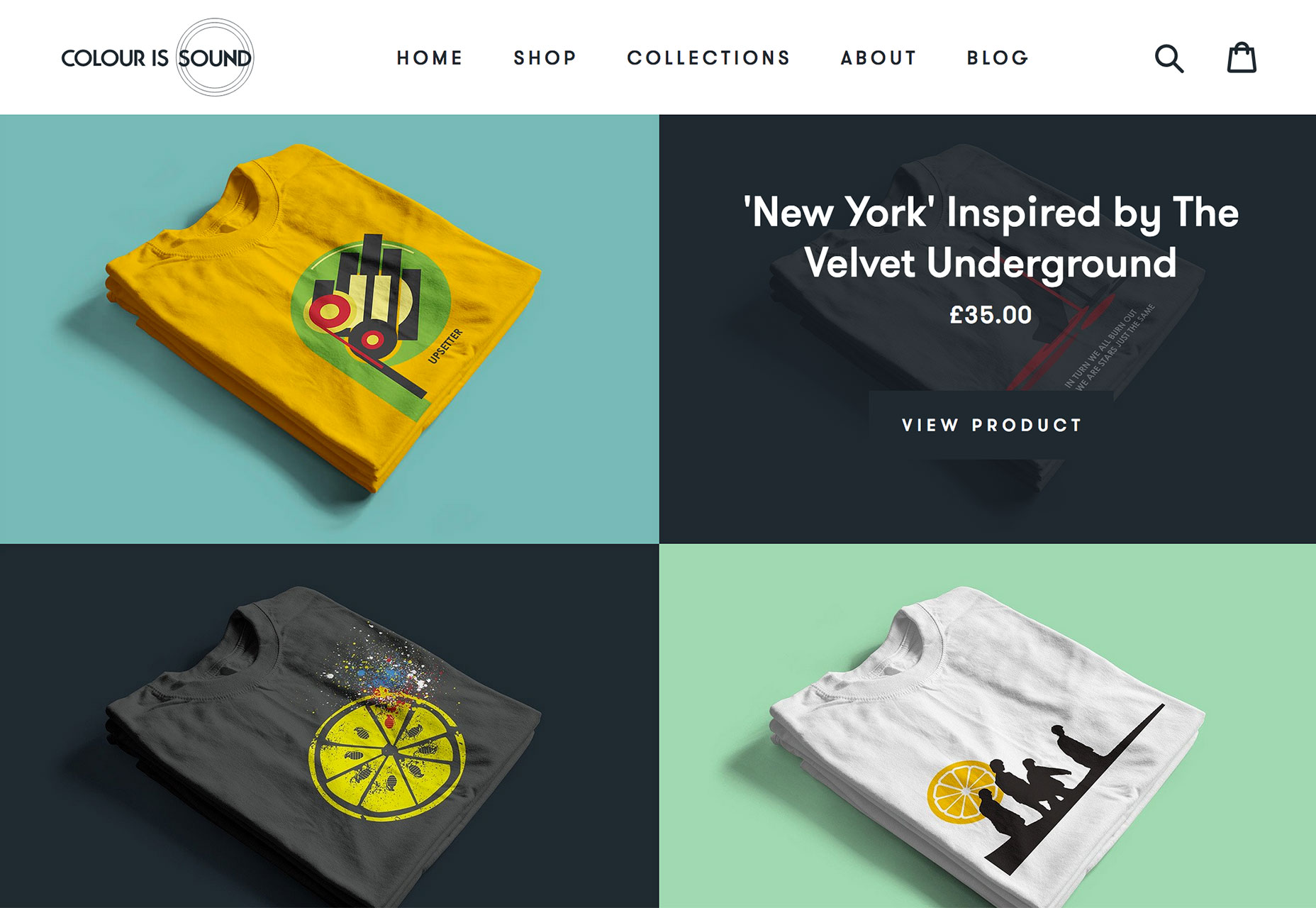
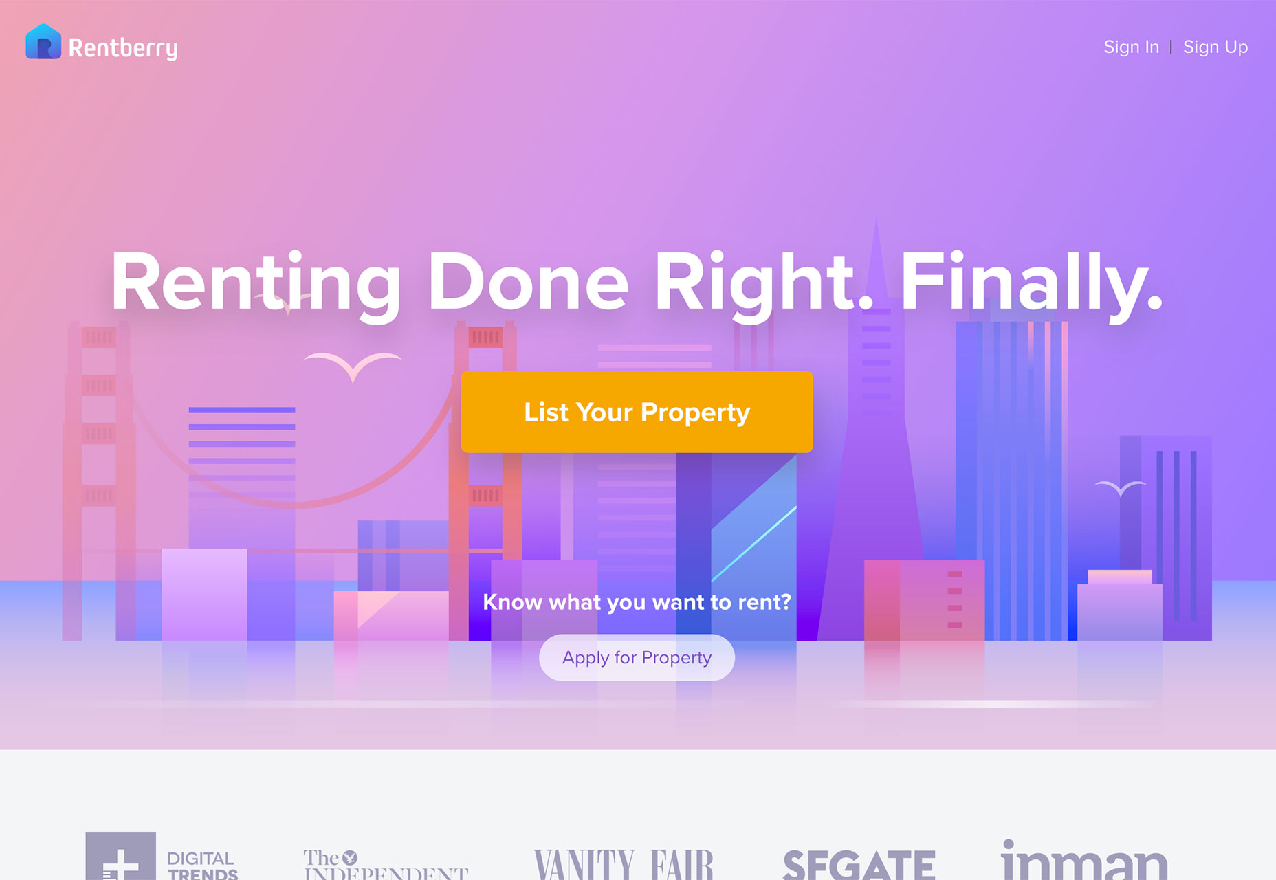
3) Pastel color palettes
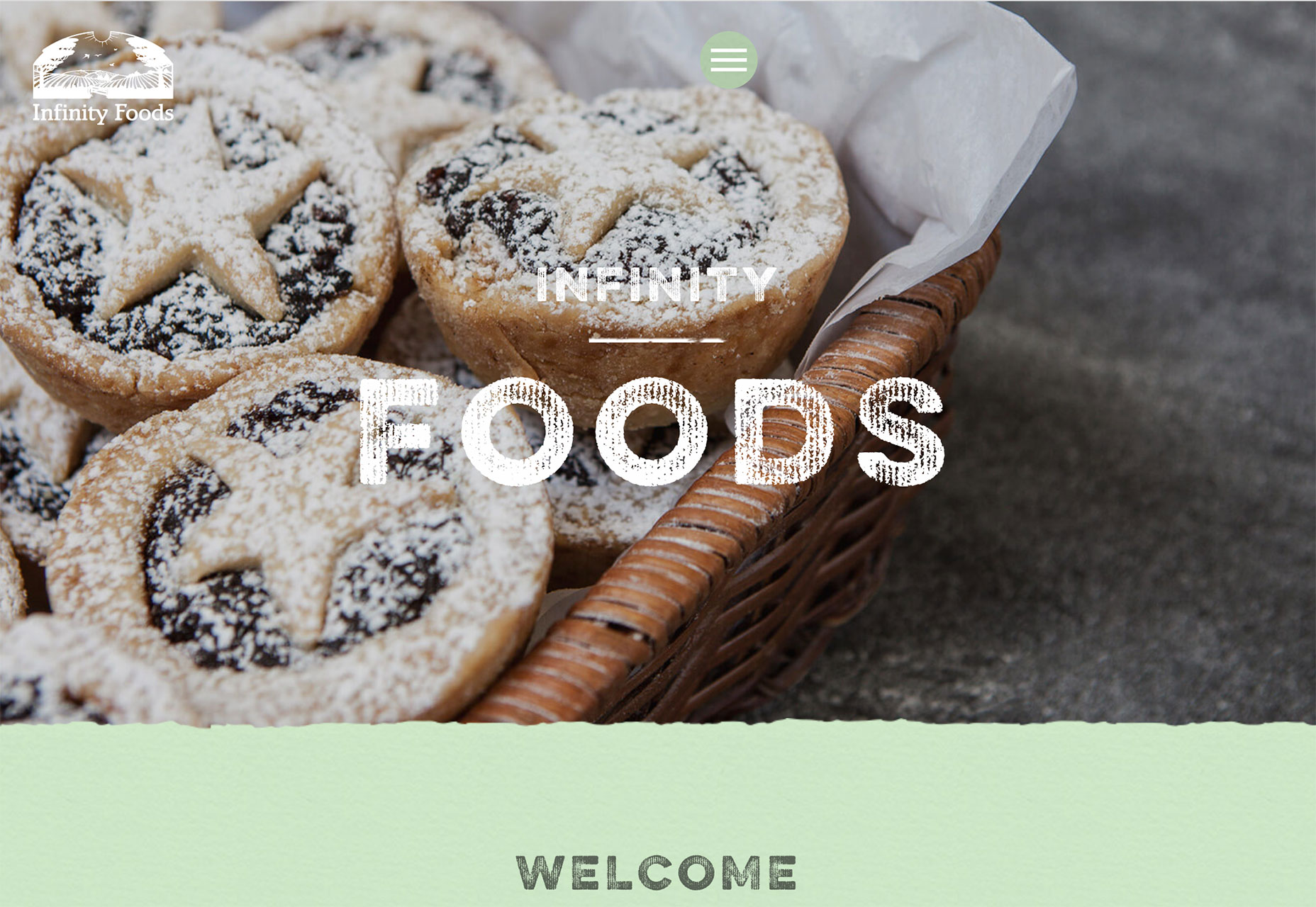
Softer colors are coming back in a big way. While brighter, bolder palettes have been the go-to for some time, that seems to be shifting. The usage, however, is not. Pastel hues are being used with flat and material design projects in a way that gives new life to these design styles. While you might think pastel colors are best saved for backgrounds, that’s not always the case either. While a pastel background can be easy to work with – many styles of text are highly readably on light backgrounds in darker colors – they can be used in other ways as well. Pastel based images for hero headers and dominant imagery is popular. Many designers seem to be pulling color palettes from these images. Or is it the other way around? Either way, image and photo matching with pastels palettes can be a striking combination that set a softer tone, such as the website below for The Bridal Planner. The Infinity Foods uses a similar technique, pairing pastel neutrals with images that have a similar color theme. Other designers are using less saturated color palettes as a new take on trends that some could argue to be overused. Rentberry uses a fun palette with a distinctly material style. What really makes the design pop is that it works and looks just as you would expect, but the color almost causes you to do a double-take. This little element of surprise is a fun bonus for users. And an easy way for designers to make a mark on a design aesthetic that is all too common.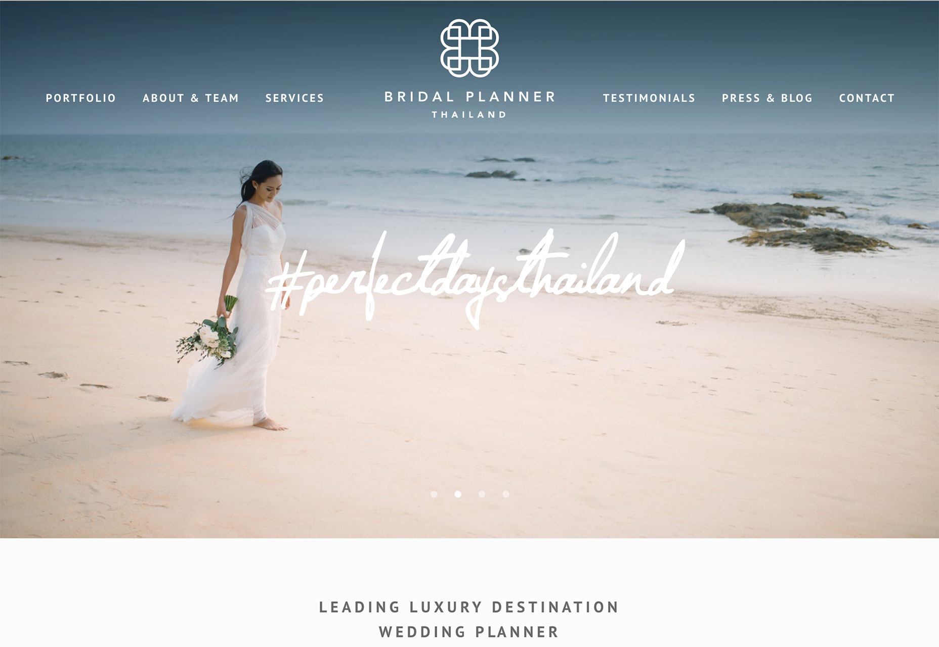
Conclusion
While trends can be pinpointed in snapshots of time, they don’t always hang around. Which of these trends do you think is the most applicable to your projects? How do you see them evolving? The shift in shopping experiences is intriguing and has the potential for staying power for low inventory, high end shops. What trends are you loving, or hating, right now? I’d love to see some of the websites that you are fascinated with. Drop me a link on Twitter; I’d love to hear from you.Carrie Cousins
Carrie Cousins is a freelance writer with more than 10 years of experience in the communications industry, including writing for print and online publications, and design and editing. You can connect with Carrie on Twitter @carriecousins.


Read Next

15 Best New Fonts, July 2024
Welcome to our monthly roundup of the best fonts we’ve found online in the last four weeks. This month, there are fewer…
By Ben Moss

20 Best New Websites, July 2024
Welcome to July’s round up of websites to inspire you. This month’s collection ranges from the most stripped-back…

Top 7 WordPress Plugins for 2024: Enhance Your Site's Performance
WordPress is a hands-down favorite of website designers and developers. Renowned for its flexibility and ease of use,…
By WDD Staff

Exciting New Tools for Designers, July 2024
Welcome to this July’s collection of tools, gathered from around the web over the past month. We hope you’ll find…

3 Essential Design Trends, July 2024
Add some summer sizzle to your design projects with trendy website elements. Learn what's trending and how to use these…

15 Best New Fonts, June 2024
Welcome to our roundup of the best new fonts we’ve found online in the last month. This month, there are notably fewer…
By Ben Moss

20 Best New Websites, June 2024
Arranging content in an easily accessible way is the backbone of any user-friendly website. A good website will present…

Exciting New Tools for Designers, June 2024
In this month’s roundup of the best tools for web designers and developers, we’ll explore a range of new and noteworthy…

3 Essential Design Trends, June 2024
Summer is off to a fun start with some highly dramatic website design trends showing up in projects. Let's dive in!

15 Best New Fonts, May 2024
In this month’s edition, there are lots of historically-inspired typefaces, more of the growing trend for French…
By Ben Moss

How to Reduce The Carbon Footprint of Your Website
On average, a web page produces 4.61 grams of CO2 for every page view; for whole sites, that amounts to hundreds of KG…
By Simon Sterne

20 Best New Websites, May 2024
Welcome to May’s compilation of the best sites on the web. This month we’re focused on color for younger humans,…