
Act Normal
Act Normal’s website is standard fare on the surface. The layout is simple, the typography is great, and they make bold use of color to stand out. But the site really shines in the small details. The animations and illustrations used in between more common elements are nice little surprises. The site has character. Mind you, the character gets a bit aggressive when you leave the tab, and the page’s title changes from “Act Normal” to “Get back in here!” Even the emoji-style favicon changes to reflect their disappointment, and I get enough of that from distant relatives, thank you very much. I don’t need it from a website.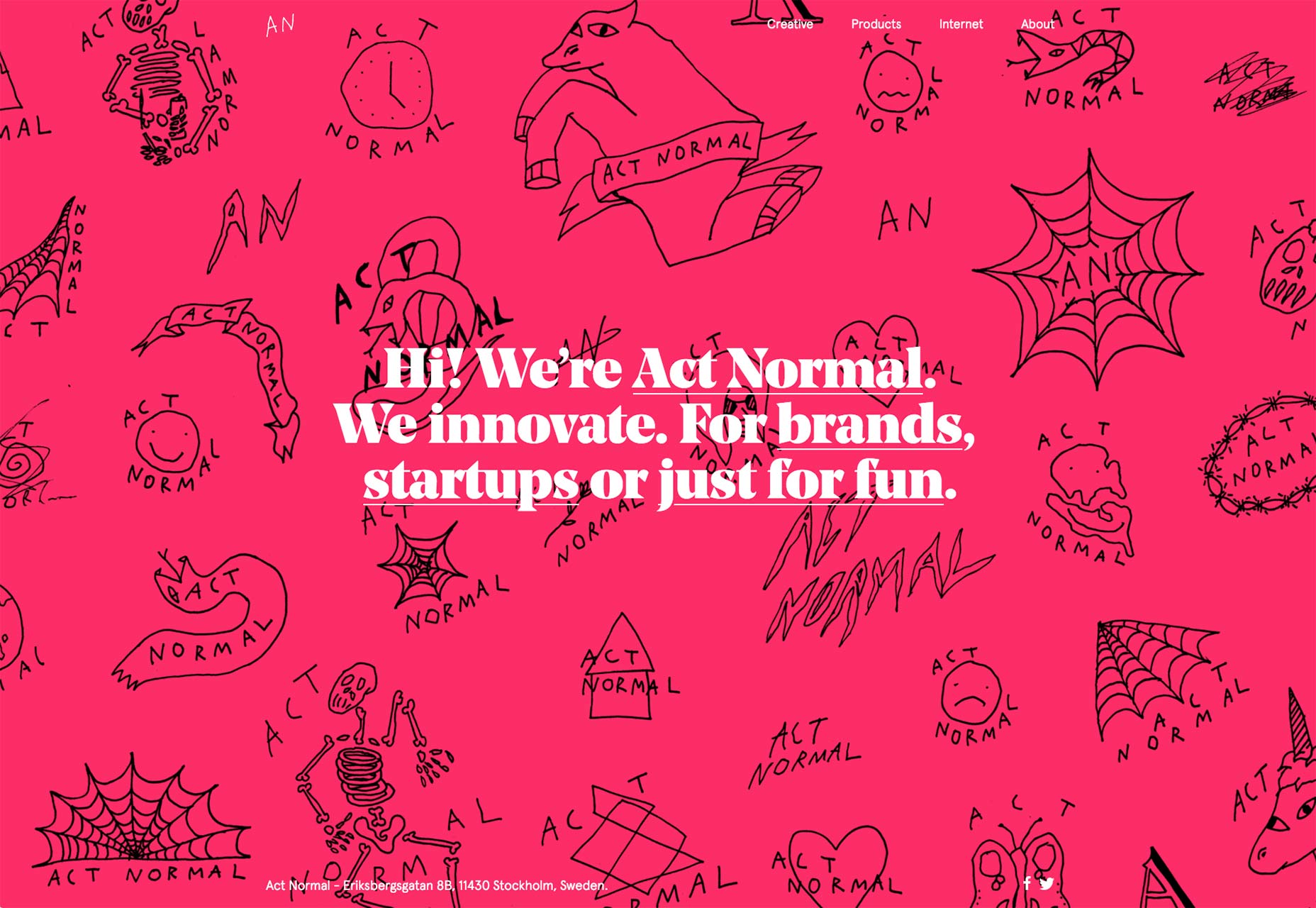
Blah
With a name like “Blah”, you might expect this website to take a rather meta approach to their site and content. The distinctly modern, minimalist site doesn’t disappoint at all. It feels meta, but it handles like a clean, well thought-out portfolio. They don’t let their cleverness get in the way of usable design, for the most part, and for that, we can all be grateful.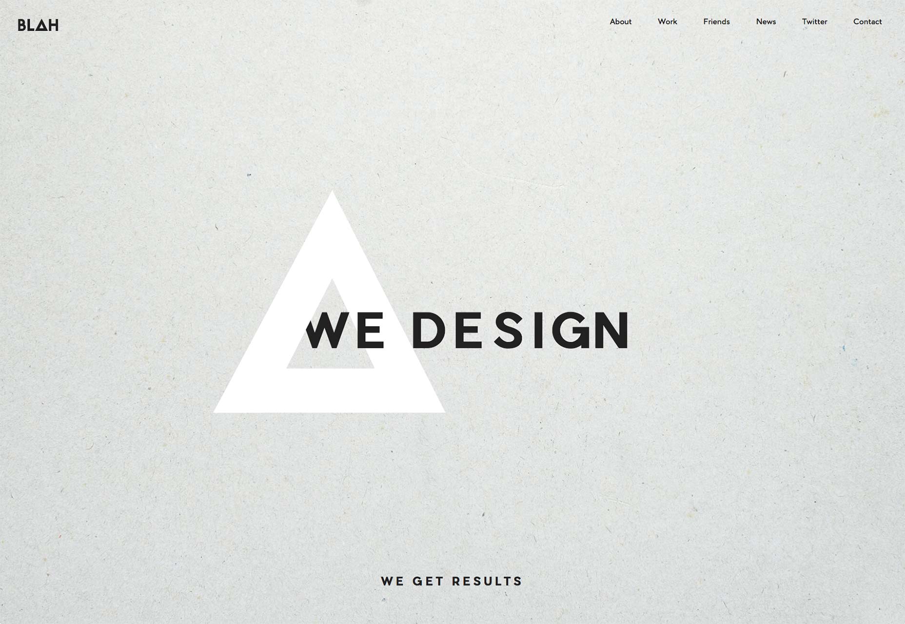
Josh Sender
Josh Sender’s portfolio taps directly into my love of all things which are dead simple. This single-column, one-page layout presents his work as a collection of miniature case studies, and that’s all there is to it. That’s all it needs. Every day, designers fight the temptation to overdo their designs because, “it just feels like something’s missing.” Half of these situations (at least) could be resolved by reorganization, rather than addition.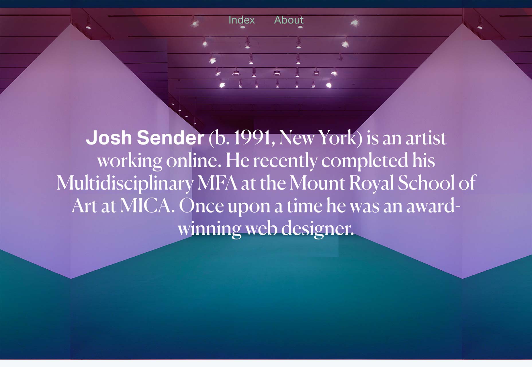
Stefanie Brückler
Stefanie Brückler’s site uses an effect that I’ve seen in a few places. Basically, there’s a simple fixed frame around the rest of the layout, and I kind of love it. It’s a very situationally useful design element, but it certainly mixes things up. It adds an extra touch of old-school elegance to something that might otherwise be a little too minimalist.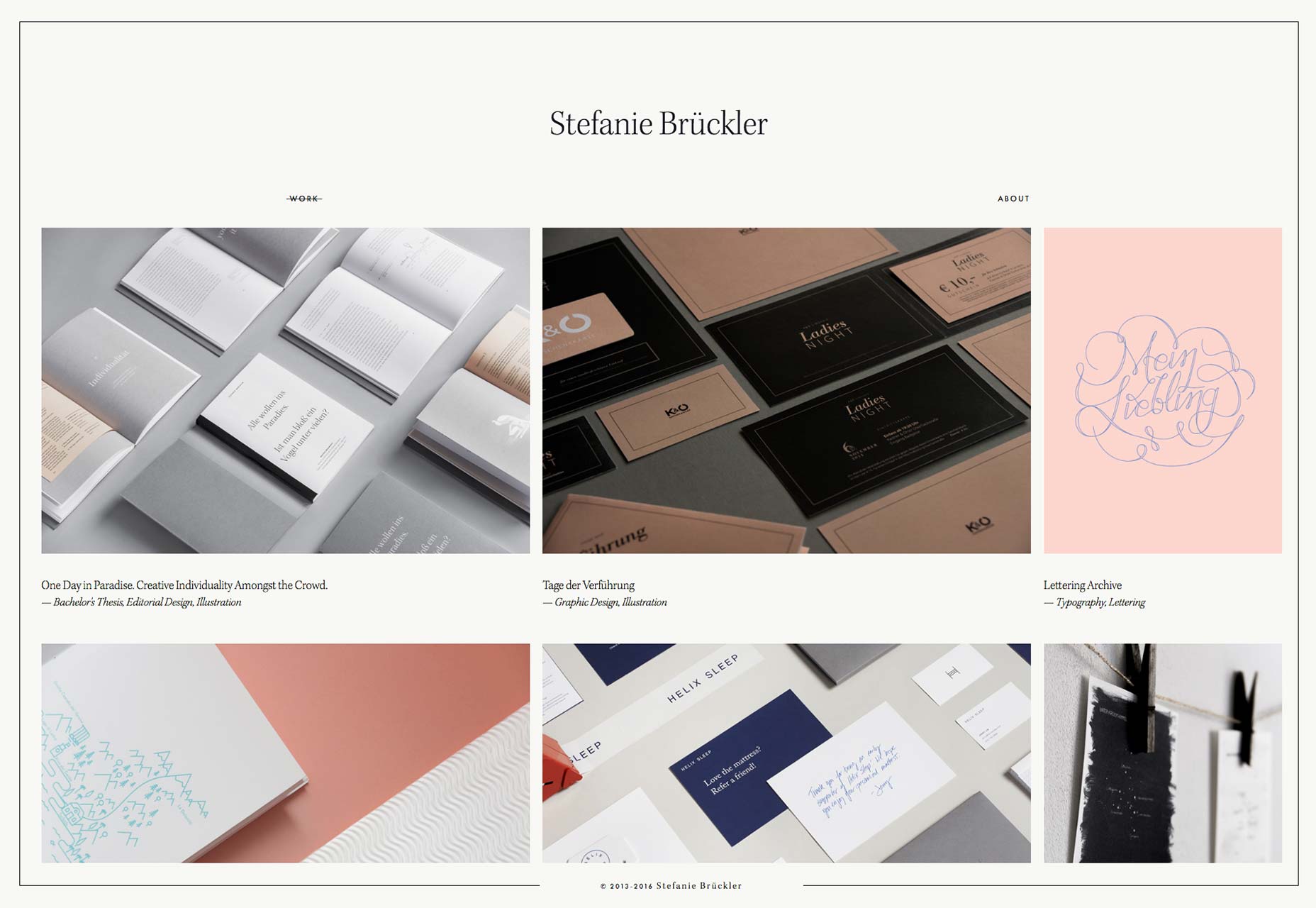
Phosphene
Phosphene’s portfolio is all about visual effects in video, so I’ll forgive them for the preloader. Like most other sites of its kind, it is heavy on the use of video footage and animation in its interface. When there is any text to speak of, the classic minimalism-with-asymmetry magazine-ad layout does a lot to convey the studio’s personality and culture.
Peter Tait
Peter Tait’s site is bold, and very, very blue (on the home page, at least). As in, it’s all blue except for the text and a few design elements. It’s always refreshing to see a designer take that kind of simple, yet all-encompassing risk when designing a site. Okay, the color changes depending on the page you’re browsing. This simple act of art direction completely changes the tone and feel of the page to match the project you’re looking at. I could stand to see more of this in the future.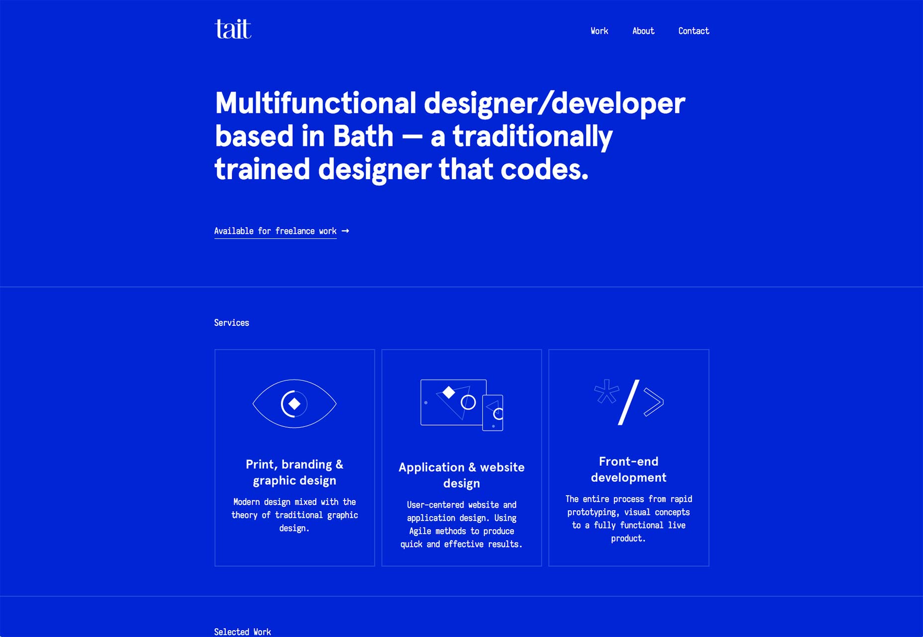
The Future Forward
The Future Forward has a bit of a classic feel while using a distinctly modern minimalist style. If you want a master class on how to organize relatively little content on a big screen, you can start here.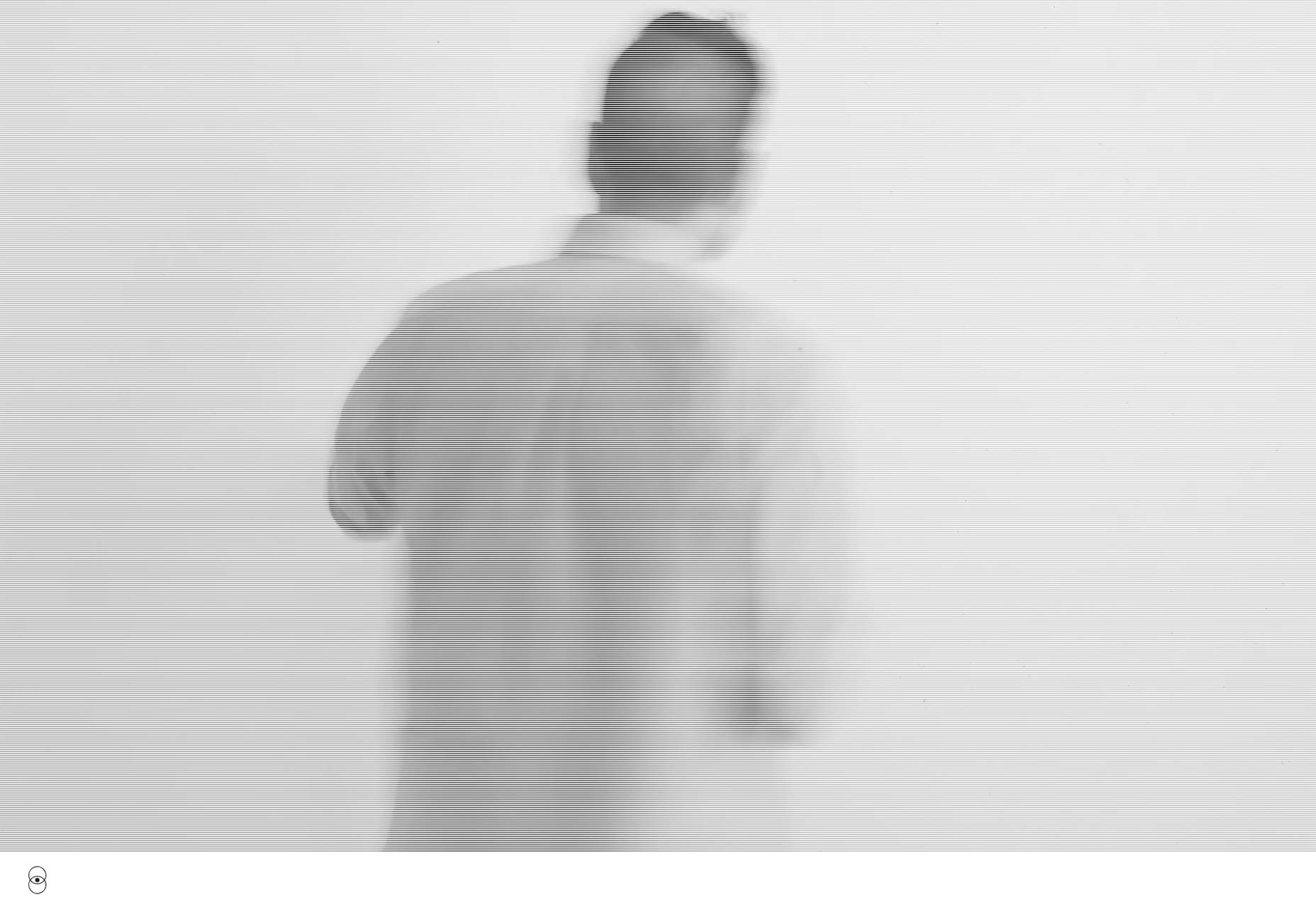
Darryn Thomas Ansted
This portfolio takes us from the modern to the almost post-modern. Here, white space reigns supreme, in a way that makes you think the way they framed the content is almost as important as the content itself. Settle down, I said “almost”. In any case, the style perfectly fits the content, as this is a portfolio full of modern art.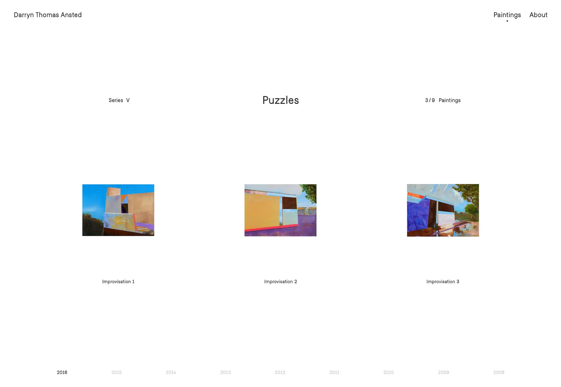
Pogon
Pogon has more or less perfected the sidebar navigation layout. The sidebar shifts and adapts to whatever you’re doing on the site: it hides when you’re just scrolling through content, shows you the site’s navigation when you need it, and guides you through individual sections of the site when you need that. Plus, you get a lot more of that “bold and blue” style that I mentioned earlier.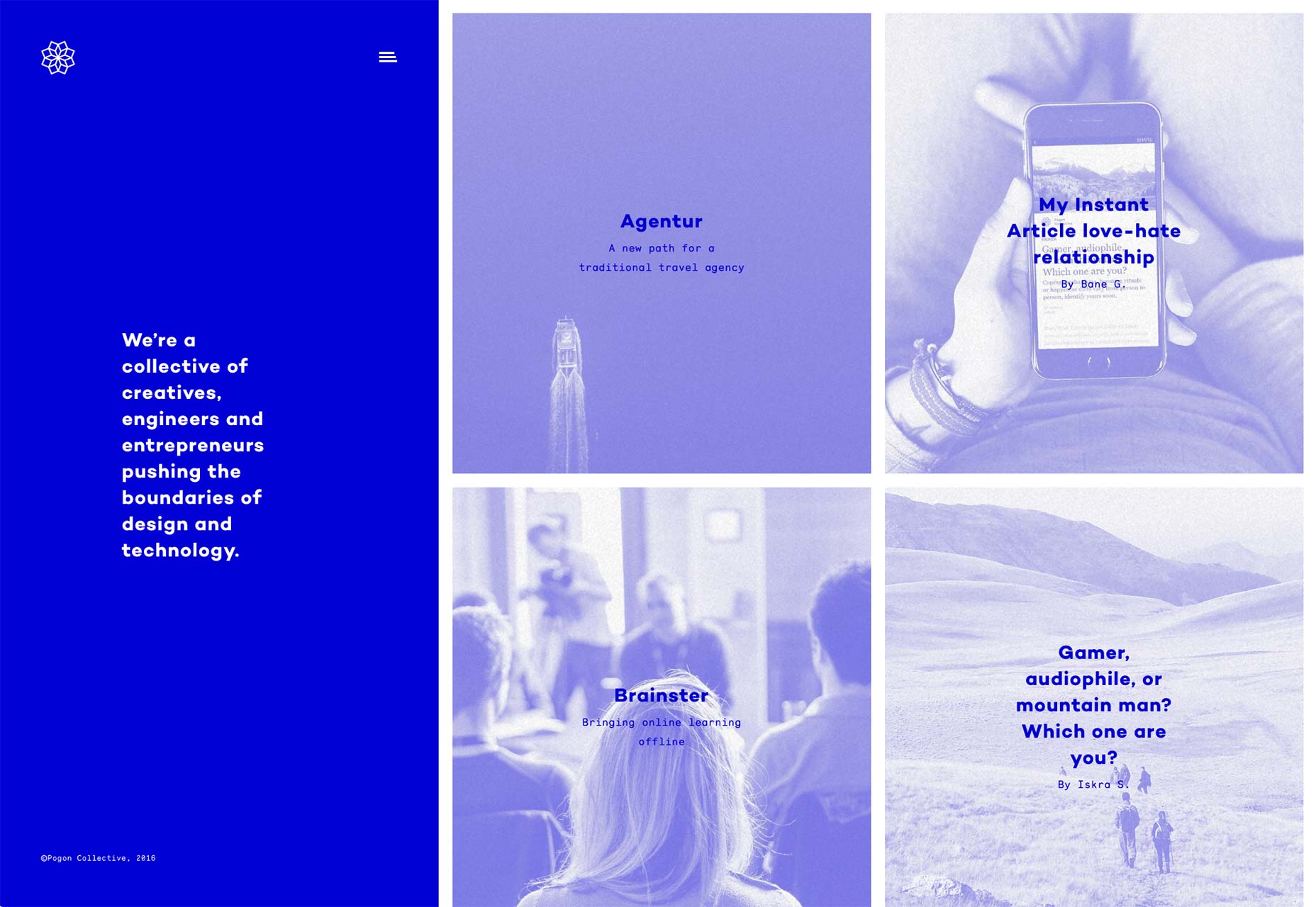
Cecile Henryon
This is yet another stunning example of art-focused minimalism. This is also yet another site that is more like a presentation than a website in any classic sense. Go. Look. Learn. But know what to expect.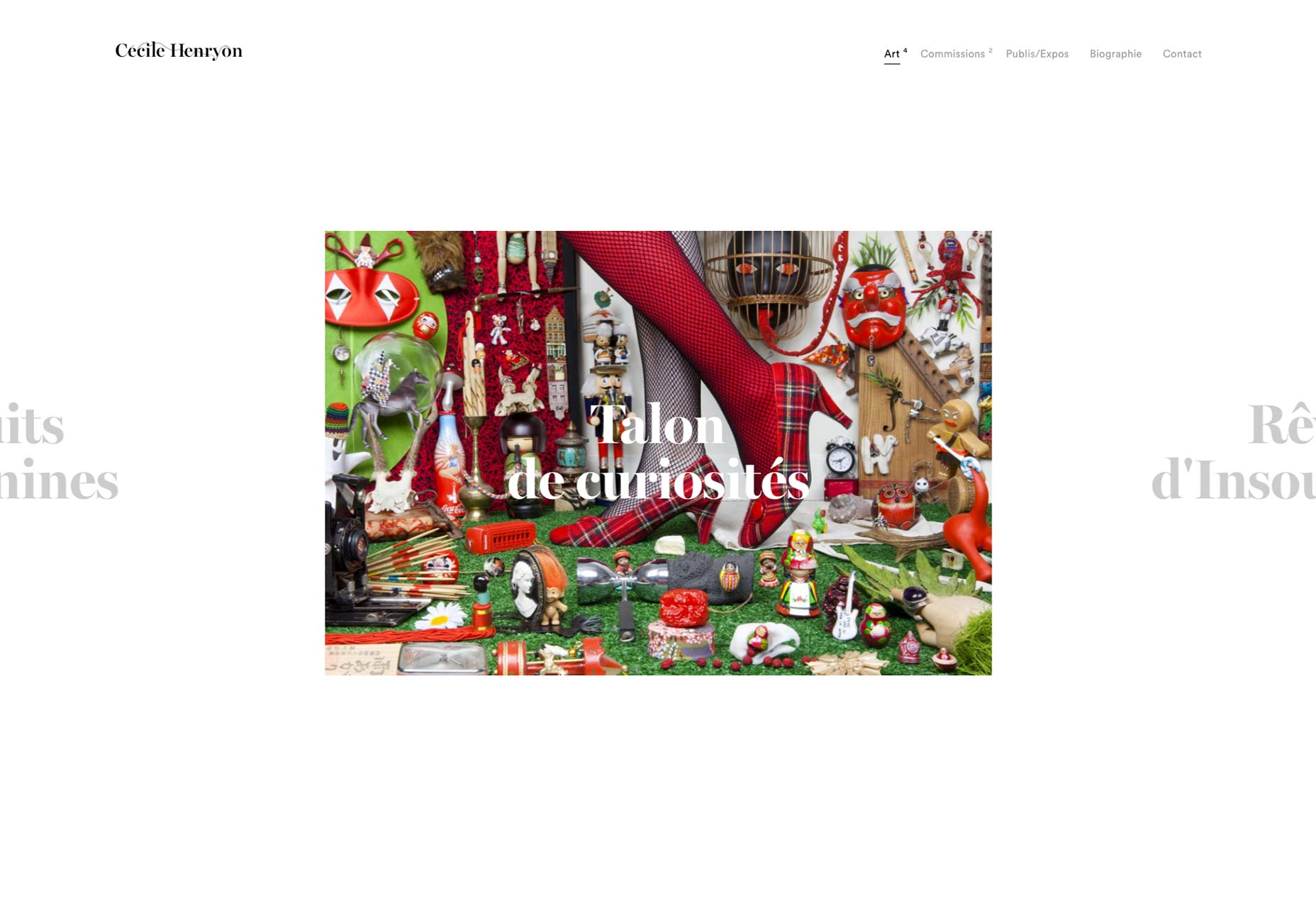
Veintido Grados (Twenty-two degrees)
Veintidos Grados combines minimalism and overlapping elements with (mostly) subtle background animation and parallax effects to make a visually striking portfolio. In a happy twist, the parallax feels natural, and not at all forced. In a site this colorful and intentionally flashy, it feels right at home.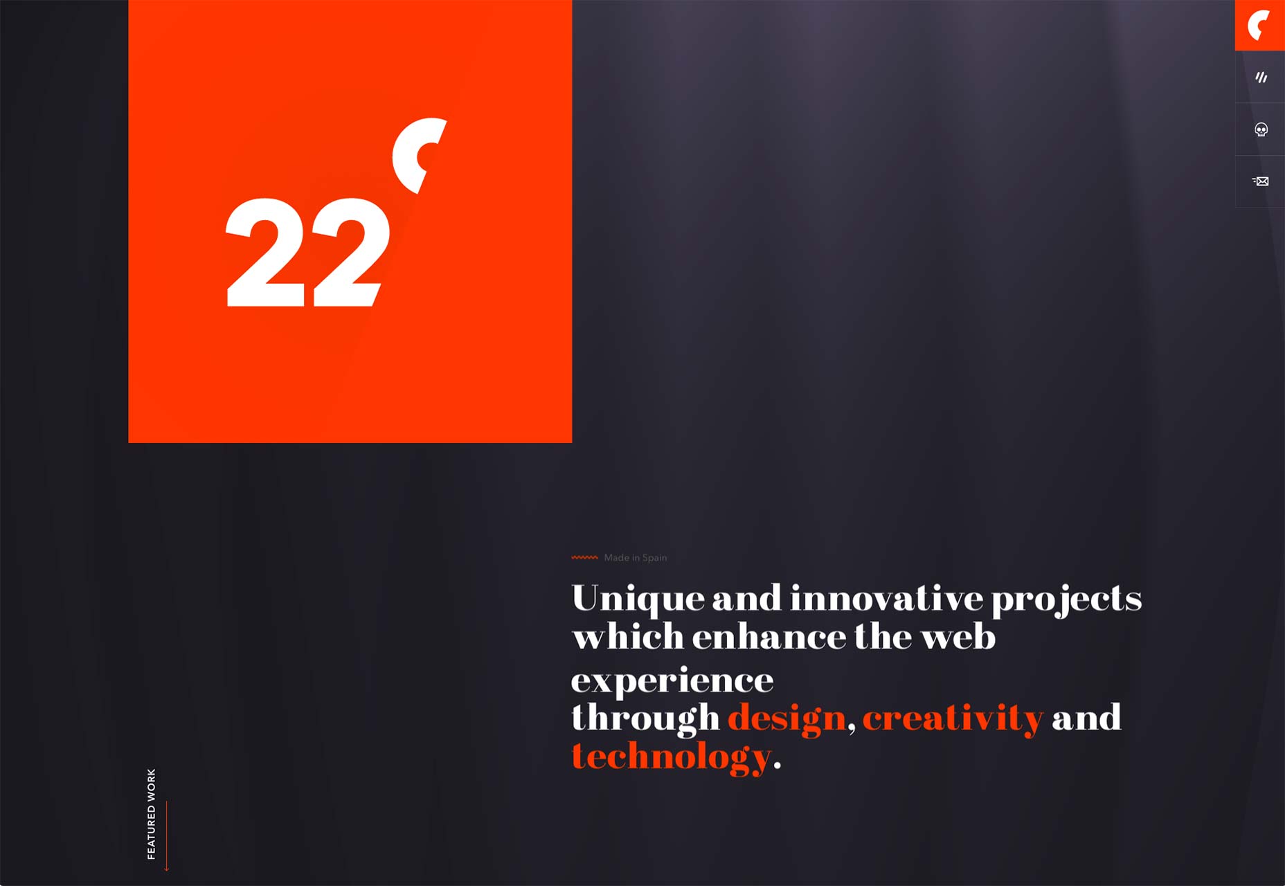
Head Office
Head Office abandons the concept of the portfolio site entirely, by presenting the user with an “operating system”. That’s right, the home page looks like a very rudimentary desktop, and you browse through the content by opening up folders and files. And the whole thing is yellow! It’s yellow by default, anyways. You can change that. But still, bold choice. According to Head Office, it’s more than just a creative design. This “web operating system” is designed to explore the interactions between humans and machines, presumably to help them design better websites. Whatever the case, it’s certainly worth looking at.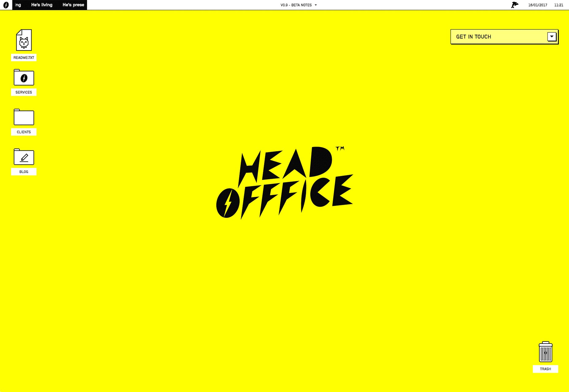
Terring Photography
Björn Terring’s photography site does something very, very smart with its organization. The site starts out as a collage of his photographs, which veteran Internet users should have no issue with. For those who might prefer a more organized browsing experience, a list view is available right at the top. It might be less-than-usable to put all of the contact info at the bottom.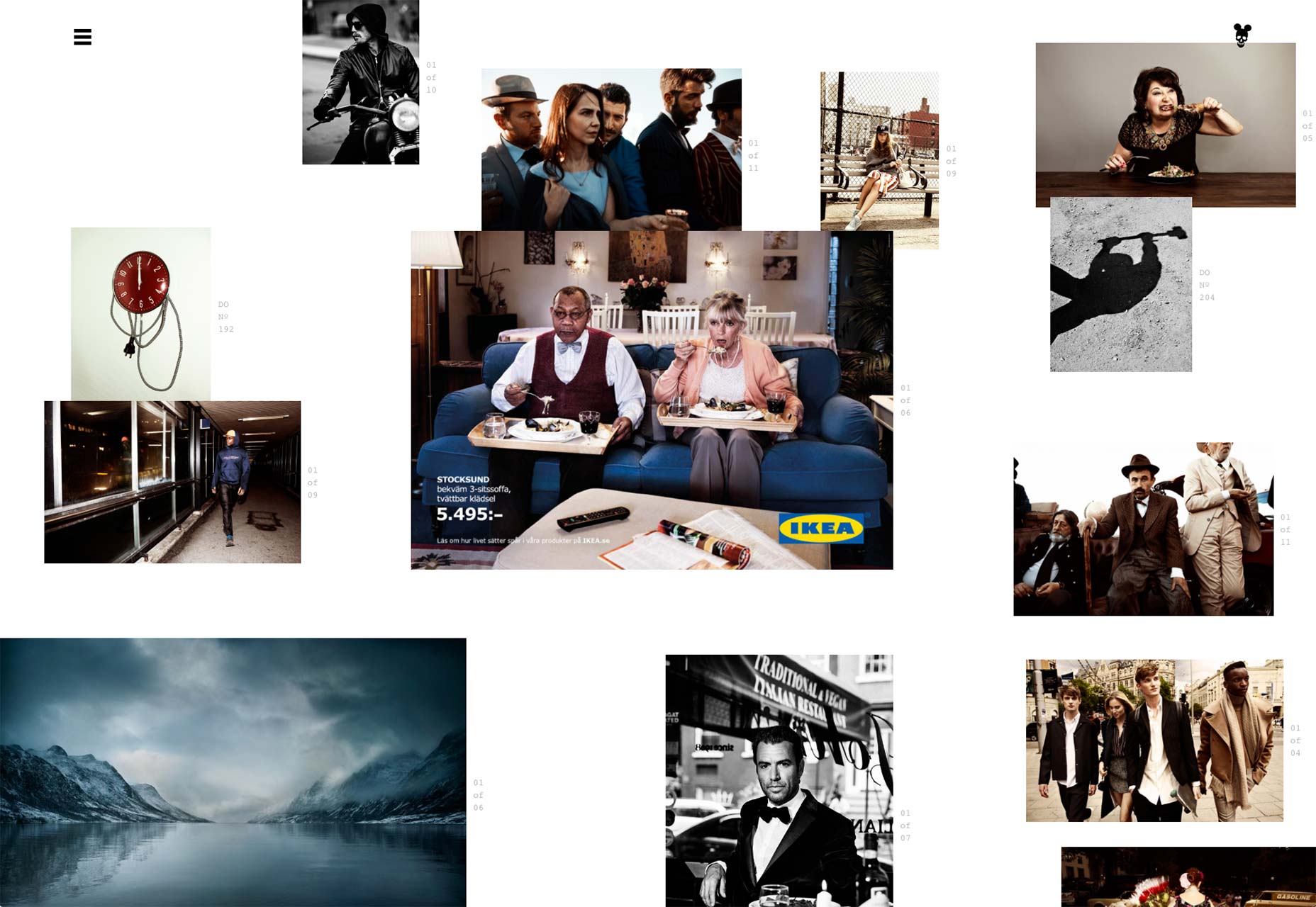
Merci Michel
Merci Michel brings us another great example of the site-turned-presentation. The imagery of their projects is striking enough to work on its own, so why not?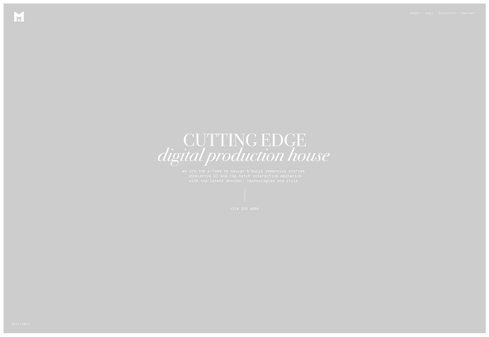
Trionn
Trionn’s agency website is fascinanting in that it walks the line between the corporate and the artistic. It kind of reminds me of bank brochures I used to look at when I was a kid, and yet that feels like I’m doing this design a disservice, because there’s a lot of personality here. I’m feeling confused, and I like it.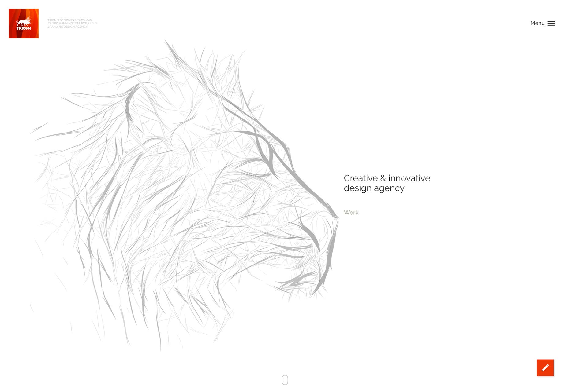
Eric Porter
Eric Porter’s one-page site combines “minimalist-ish”—that’s a word now, you’re welcome—design with good typography to make a design that would feel rather ordinary except for the use of diagonal lines and, once again, parallax. This time, the parallax effects are actually rather subtle. They’re designed to please the eye without distracting the focus, and that’s just perfect, in my opinion. It seems to me that we, as a community, mnight be finally starting to get parallax right, as much as that is even possible.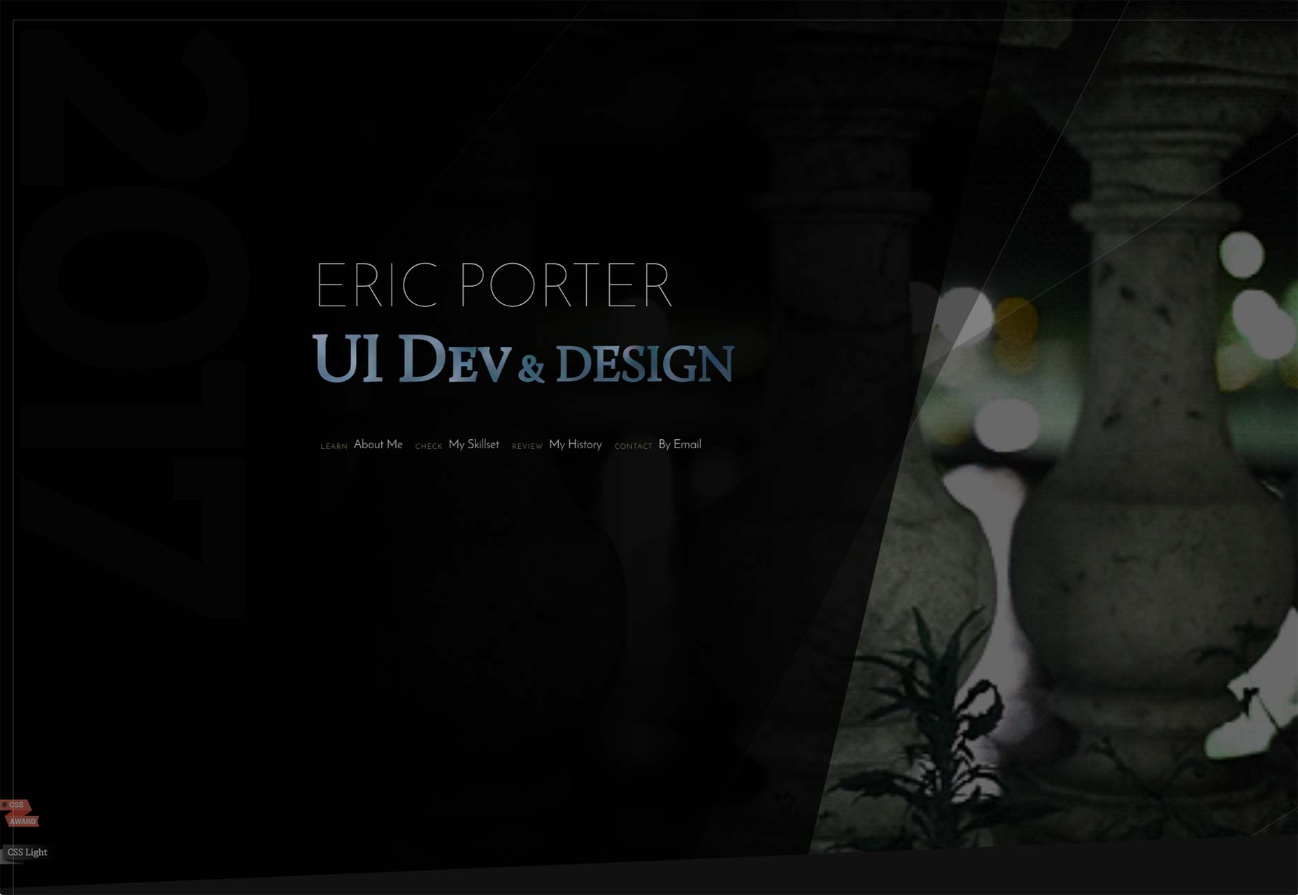
Infinite Imaginations
Infinite imaginations combines a bit of a “techy” style with minimalism, understated animation, and the periodic table. I’m not even kidding about that. While the design does have its (miniscule) flaws, its reserved sense of style is both appealing and kind of relaxing.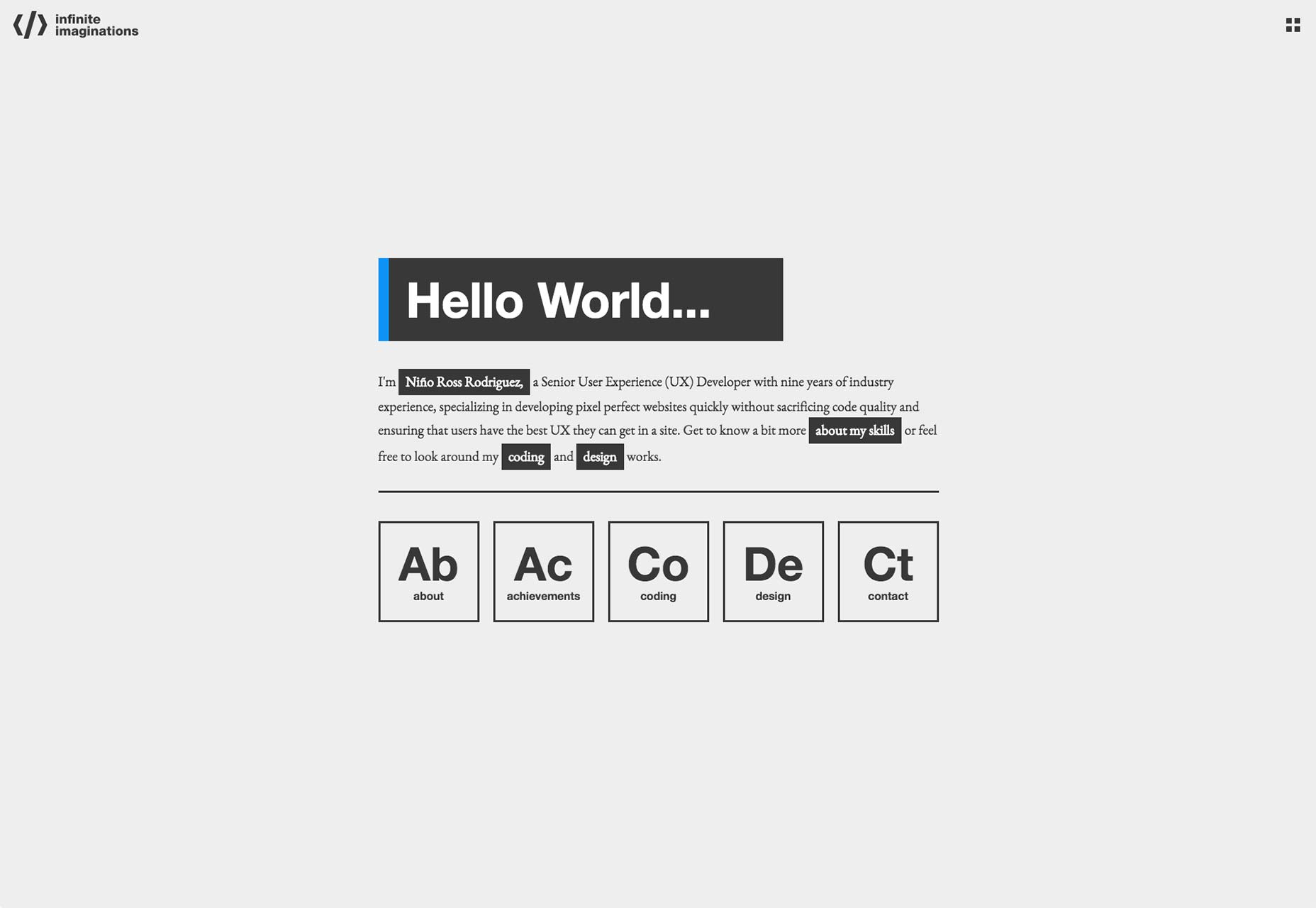
Heather Shaw
Heather Shaw’s site is all about her graphics work, and her site sticks with that theme. It’s all about the strong use of color, and overlaying colors onto photos. Yeah, that’s one of the major themes, and it works, thanks to an abundance of contrast, large typography, and clear imagery.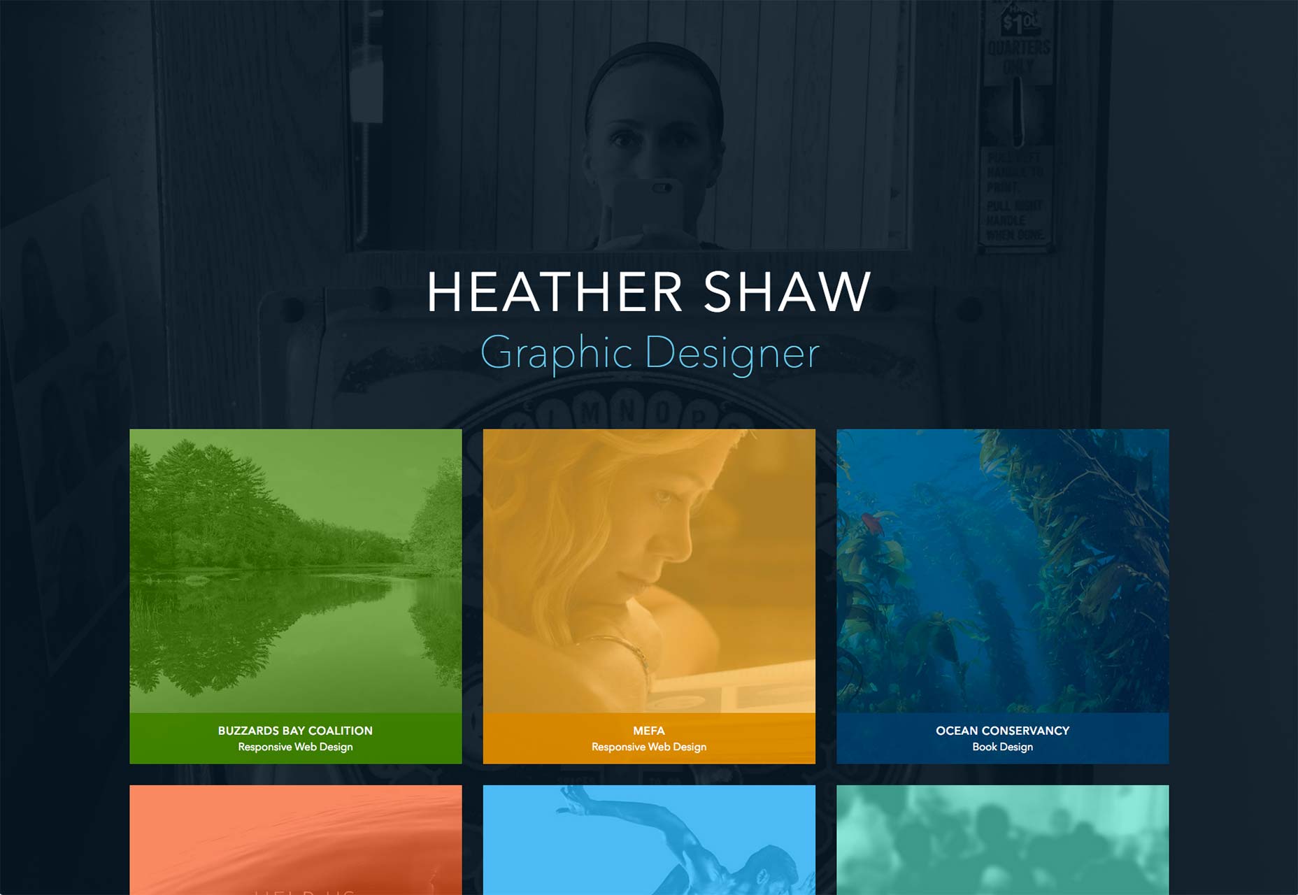
Marija Zaric
We’ve seen sites that have almost no color to speak of, and sites that are saturated (pun intended) with it. Marija Zaric is one of the few who have found a happy middle ground between the two. While the site could, perhaps, make better use of white space, it’s a great example of a site that manages to use a fair amount of color without blasting your eyeballs.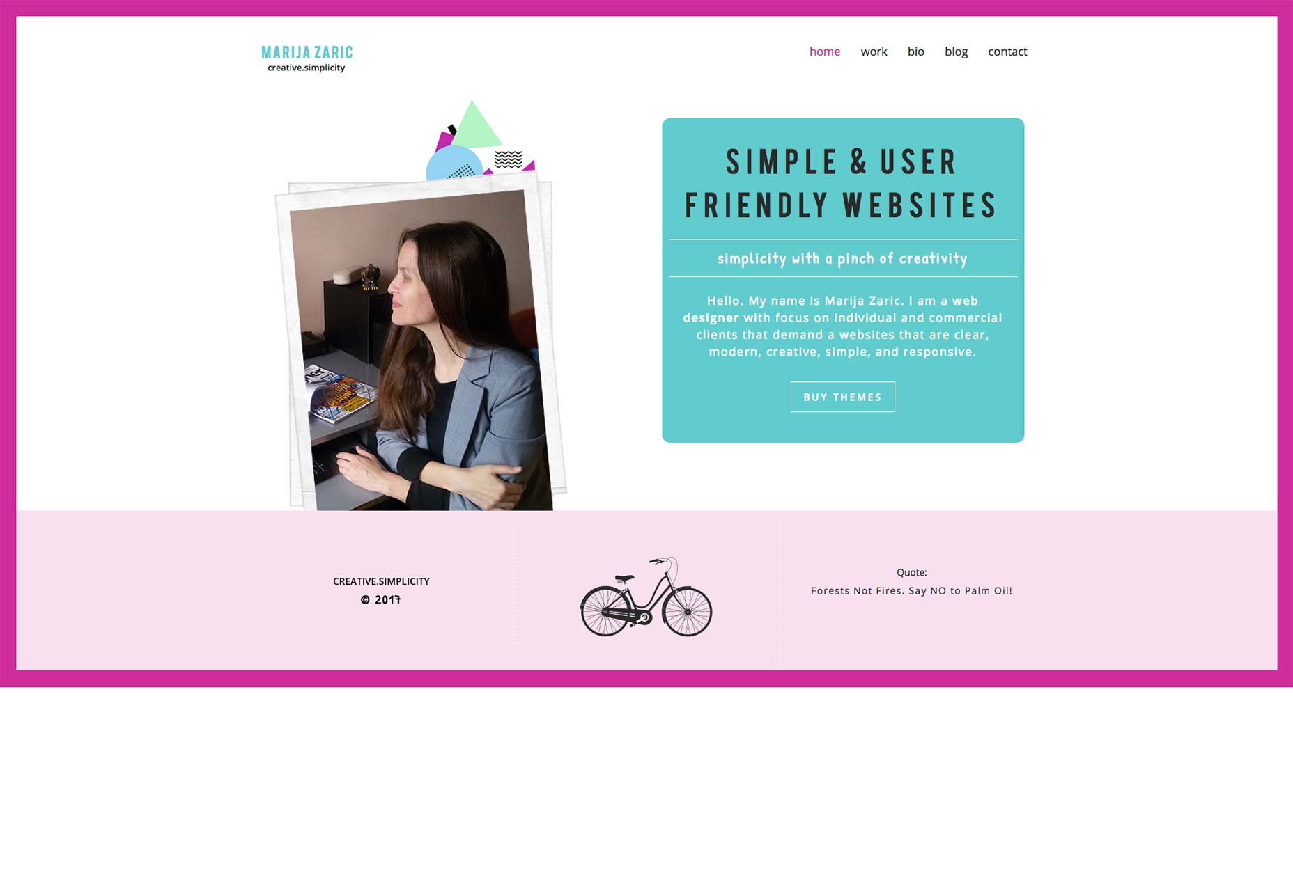
Andretti Brown
Andretti Brown’s portfolio site is more resumé than portfolio. There is a small gallery of images to look through, and his latest Instagram posts (all showcasing his design work) in the side bar, but the majority of the site is dedicated to his work history, and other data that’s relevant to job hunting. The image gallery and the contact form are front-and-center, though, giving people a quick and easy way to reach him. It’s simple, it’s stylish, and it does what it sets out to do, which is give all relevant information at a glance. It doesn’t do too well when you browse in a full window at very high resolutions, but is noteworthy for its approach to finding work.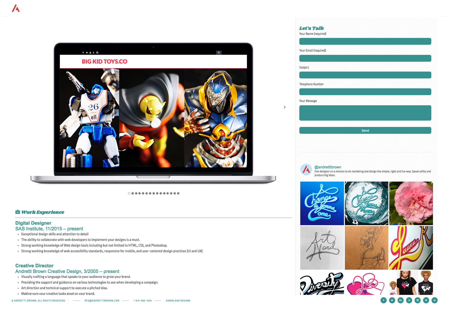
Ezequiel Bruni
Ezequiel Bruni is a web/UX designer, blogger, and aspiring photographer living in Mexico. When he’s not up to his finely-chiselled ears in wire-frames and front-end code, or ranting about the same, he indulges in beer, pizza, fantasy novels, and stand-up comedy.
Read Next
15 Best New Fonts, July 2024
Welcome to our monthly roundup of the best fonts we’ve found online in the last four weeks. This month, there are fewer…
By Ben Moss
20 Best New Websites, July 2024
Welcome to July’s round up of websites to inspire you. This month’s collection ranges from the most stripped-back…
Top 7 WordPress Plugins for 2024: Enhance Your Site's Performance
WordPress is a hands-down favorite of website designers and developers. Renowned for its flexibility and ease of use,…
By WDD Staff
Exciting New Tools for Designers, July 2024
Welcome to this July’s collection of tools, gathered from around the web over the past month. We hope you’ll find…
3 Essential Design Trends, July 2024
Add some summer sizzle to your design projects with trendy website elements. Learn what's trending and how to use these…
15 Best New Fonts, June 2024
Welcome to our roundup of the best new fonts we’ve found online in the last month. This month, there are notably fewer…
By Ben Moss
20 Best New Websites, June 2024
Arranging content in an easily accessible way is the backbone of any user-friendly website. A good website will present…
Exciting New Tools for Designers, June 2024
In this month’s roundup of the best tools for web designers and developers, we’ll explore a range of new and noteworthy…
3 Essential Design Trends, June 2024
Summer is off to a fun start with some highly dramatic website design trends showing up in projects. Let's dive in!
15 Best New Fonts, May 2024
In this month’s edition, there are lots of historically-inspired typefaces, more of the growing trend for French…
By Ben Moss
How to Reduce The Carbon Footprint of Your Website
On average, a web page produces 4.61 grams of CO2 for every page view; for whole sites, that amounts to hundreds of KG…
By Simon Sterne
20 Best New Websites, May 2024
Welcome to May’s compilation of the best sites on the web. This month we’re focused on color for younger humans,…


