

1. Make it clear
When a website visitor doesn’t know what to expect when clicking a link, or how to easily find what they are looking for, confusion results. Reduce confusion by designing your website’s navigation to be easy for visitors to understand. Abercrombie & Fitch’s website provides an example of this concept. Their navigation is easy to understand from the first moment a visitor arrives at their website.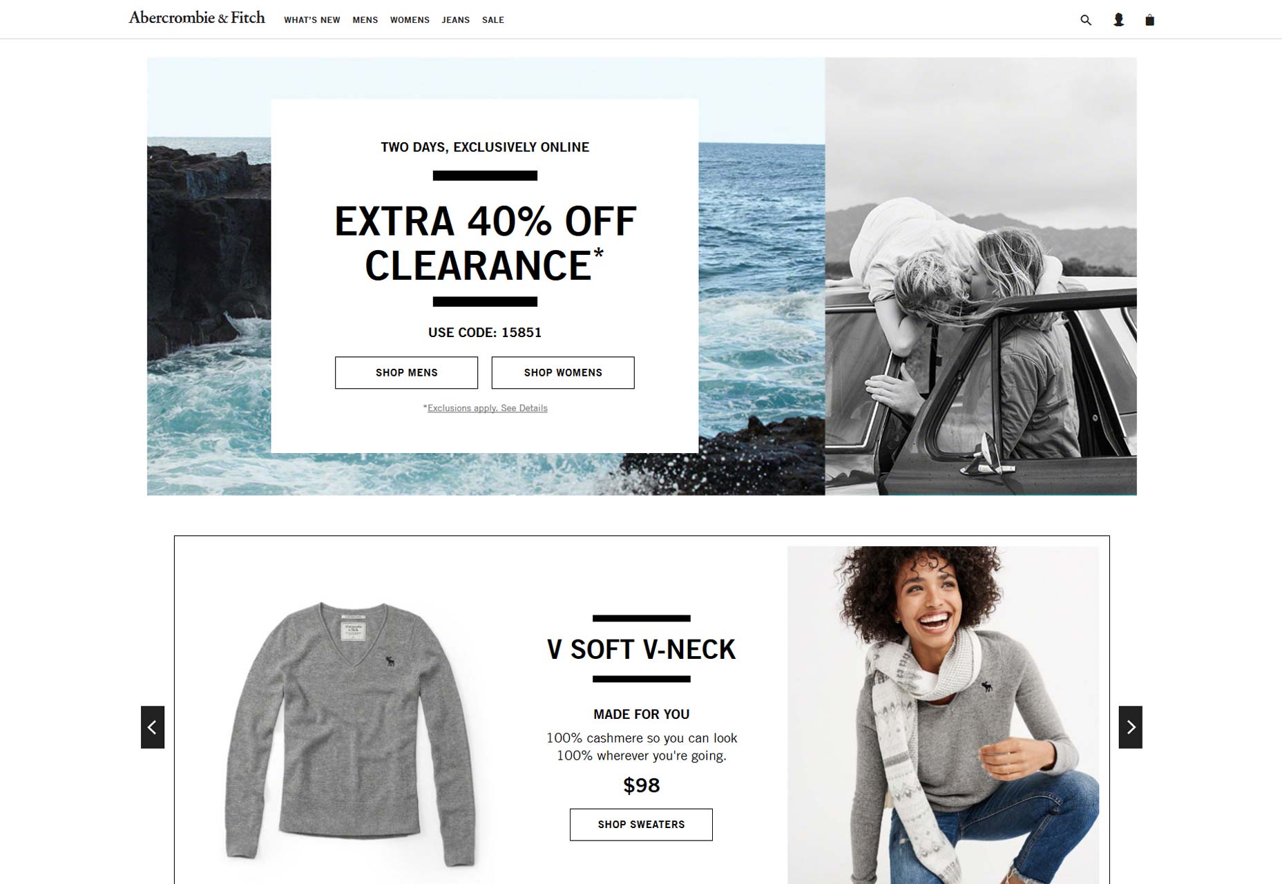 The use of clear labels, that are obvious at a glance, lets visitors know what your company does. From the start, they will know they are at the right place and how to get to where they want to be. Thoughtfully consider the terminology you use for the navigation of your website, making it easy for visitors to find what they are looking for.
Avoid creating navigation around the format of content, for instance, rather than having a videos page, create a ‘how to’ section with content separated by topic. Make it easy for users to find what they are looking for by describing content in the terms they will use. Visitors to your website probably will not be looking for a videos section, but they may be looking for tips on how to set up your product or how to use certain features.
Make it clear for visitors which items are navigation items. Subtlety will not help your website visitors get to where they want to be. For instance, even though it may look great to you, making links a slightly darker shade of gray than website text does not help create a great user experience. Don’t make visitors work to use your site.
The use of clear labels, that are obvious at a glance, lets visitors know what your company does. From the start, they will know they are at the right place and how to get to where they want to be. Thoughtfully consider the terminology you use for the navigation of your website, making it easy for visitors to find what they are looking for.
Avoid creating navigation around the format of content, for instance, rather than having a videos page, create a ‘how to’ section with content separated by topic. Make it easy for users to find what they are looking for by describing content in the terms they will use. Visitors to your website probably will not be looking for a videos section, but they may be looking for tips on how to set up your product or how to use certain features.
Make it clear for visitors which items are navigation items. Subtlety will not help your website visitors get to where they want to be. For instance, even though it may look great to you, making links a slightly darker shade of gray than website text does not help create a great user experience. Don’t make visitors work to use your site.
2. Stay consistent
I am sure you have been to websites where it looks like part of their navigation was tacked on as an afterthought or it just doesn’t belong. This lack of consistency works to reduce trust on the part of site visitors, additionally, it reduces the quality of the user experience. If something just looks tacked on to you, it will most likely look the same or worse to your customers. The nice, clean navigation of Bouguessa’s website is consistent and helps improve visitors’ experiences while on their site.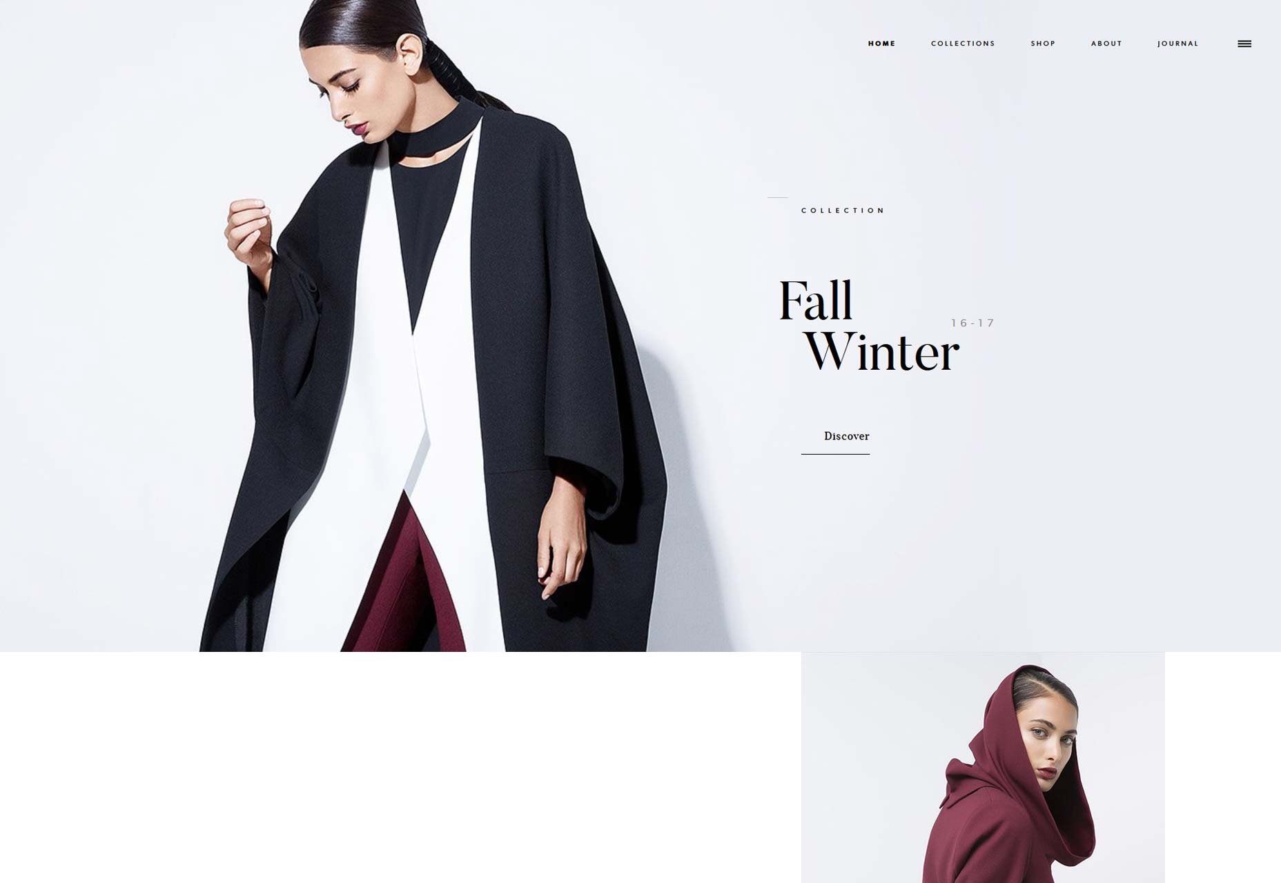 Another issue that tends to reduce the quality of navigation, is having items on menus that aren’t links, especially when they appear to be. When visitors click on menu items that don't link it increases the level of confusion and consequently, the level of frustration. Use visual design to show which items are links and which are not, for instance, if you have headers as part of a mega menu, use a different font style, color or whitespace to indicate they are headers and not links.
Secondary navigation should also be designed consistently across your website. Apply the same focus and consideration to secondary navigation that you do to primary navigation. Regardless of where visitors are headed on your site, you want to provide a great experience.
If you have pages that are of primary importance that you want to be easier to access, create a feature block on your homepage or section landing page for it. Website visitors pay attention to these blocks, meanwhile, trying to highlight items on navigation menus can often disrupt the menu.
Another issue that tends to reduce the quality of navigation, is having items on menus that aren’t links, especially when they appear to be. When visitors click on menu items that don't link it increases the level of confusion and consequently, the level of frustration. Use visual design to show which items are links and which are not, for instance, if you have headers as part of a mega menu, use a different font style, color or whitespace to indicate they are headers and not links.
Secondary navigation should also be designed consistently across your website. Apply the same focus and consideration to secondary navigation that you do to primary navigation. Regardless of where visitors are headed on your site, you want to provide a great experience.
If you have pages that are of primary importance that you want to be easier to access, create a feature block on your homepage or section landing page for it. Website visitors pay attention to these blocks, meanwhile, trying to highlight items on navigation menus can often disrupt the menu.
3. Keep it concise
Avoid creating menus with too many items. It is best if you can limit the number of items included as part of your menu to seven. Having fewer items to choose from is better for your website’s visitors. It creates less mental strain on the part of your visitors as they are making decisions and increases the chances that they will move forward. Research has shown that the human brain uses chunking as a method to improve recall. By breaking data up into relevant groups or chunks, it allows us to understand and remember it better. This is an especially effective technique for larger websites that need more than seven menu items. By breaking menu items up into groups you will be helping your website visitors. Remember that each time you remove an item from your menu or an element from your page; you are making everything else a little more visually prominent. When you remove something, you make other items more likely to be seen and clicked on. Carefully evaluate what you really need as part of your website and be willing to remove the items you don’t need to streamline and improve the experience. The Olson Kundig website provides a great example of a website with a streamlined navigation experience.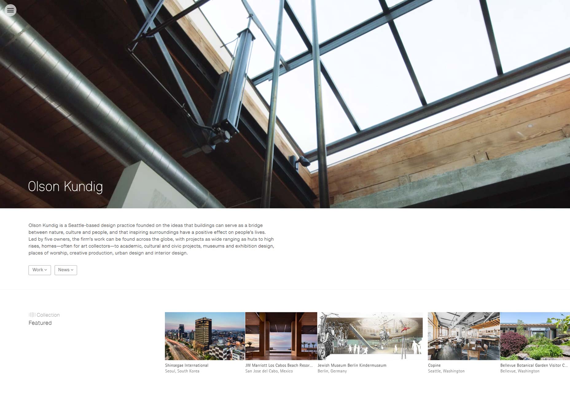 Additionally, you will want to consider the order you use within your navigation. Just like in other areas of life, items at the beginning or end will stand out to users. User attention and retention are at their highest at the beginning or end of a list. This is the result of our basic psychology. As humans, we are wired to remember items at the beginning (primacy) or at the end (recency).
Leverage this phenomenon and put important items at the beginning or end of your menu. By putting items that are important to your customers in these areas you make it easier for visitors to use your website. If you are not sure which items are most important to your customers, take a look at your analytics and see which pages of your website get the most traffic.
Additionally, you will want to consider the order you use within your navigation. Just like in other areas of life, items at the beginning or end will stand out to users. User attention and retention are at their highest at the beginning or end of a list. This is the result of our basic psychology. As humans, we are wired to remember items at the beginning (primacy) or at the end (recency).
Leverage this phenomenon and put important items at the beginning or end of your menu. By putting items that are important to your customers in these areas you make it easier for visitors to use your website. If you are not sure which items are most important to your customers, take a look at your analytics and see which pages of your website get the most traffic.
4. Use a flat architecture
Great navigation begins with a well thought out information architecture (IA).As you consider the organization of your website you will want to keep the architecture as flat as possible. Allow your website visitors to reach any page within one or two clicks. When you have fewer levels it is quicker, easier and less confusing for your customers to get to where they want to be. Limit the number of levels to help make navigating simple for your visitors. To help organize your site, separate pages into groups and instead of nesting groups within groups within groups, look to create the flattest organization possible. Consolidate content where appropriate, perhaps even considering grouping the pages differently than you currently are doing to enable this, but make sure that your groupings are consistent with the how your customers view your products. Odd groupings that don’t make sense to users will not help you, even if they help flatten your website hierarchy. Use visual design to help users understand the hierarchy when they are looking at your menu. Using font styles, sizes, colors, and whitespace can help visitors understand navigation levels. Clearly differentiate secondary navigation in a way that separates it from primary navigation in a harmonious way.Samella Garcia
Samella Garcia works as an Integration Manager for UX Phoenix. She has 8 years’ experience developing mobile applications and web sites that focus on UX. Samella has a passion for user experience projects, coding, digital technology and hiking.


Read Next

15 Best New Fonts, July 2024
Welcome to our monthly roundup of the best fonts we’ve found online in the last four weeks. This month, there are fewer…
By Ben Moss

20 Best New Websites, July 2024
Welcome to July’s round up of websites to inspire you. This month’s collection ranges from the most stripped-back…

Top 7 WordPress Plugins for 2024: Enhance Your Site's Performance
WordPress is a hands-down favorite of website designers and developers. Renowned for its flexibility and ease of use,…
By WDD Staff

Exciting New Tools for Designers, July 2024
Welcome to this July’s collection of tools, gathered from around the web over the past month. We hope you’ll find…

3 Essential Design Trends, July 2024
Add some summer sizzle to your design projects with trendy website elements. Learn what's trending and how to use these…

15 Best New Fonts, June 2024
Welcome to our roundup of the best new fonts we’ve found online in the last month. This month, there are notably fewer…
By Ben Moss

20 Best New Websites, June 2024
Arranging content in an easily accessible way is the backbone of any user-friendly website. A good website will present…

Exciting New Tools for Designers, June 2024
In this month’s roundup of the best tools for web designers and developers, we’ll explore a range of new and noteworthy…

3 Essential Design Trends, June 2024
Summer is off to a fun start with some highly dramatic website design trends showing up in projects. Let's dive in!

15 Best New Fonts, May 2024
In this month’s edition, there are lots of historically-inspired typefaces, more of the growing trend for French…
By Ben Moss

How to Reduce The Carbon Footprint of Your Website
On average, a web page produces 4.61 grams of CO2 for every page view; for whole sites, that amounts to hundreds of KG…
By Simon Sterne

20 Best New Websites, May 2024
Welcome to May’s compilation of the best sites on the web. This month we’re focused on color for younger humans,…