

I am always looking for inspiration, for great design that challenges convention. This post is all about unique layout solutions; that means I will be talking about eight different websites which present something typical, in a unique way. We’ll go over unique layout solutions from showing off products, to incorporating personal and human elements in a website.
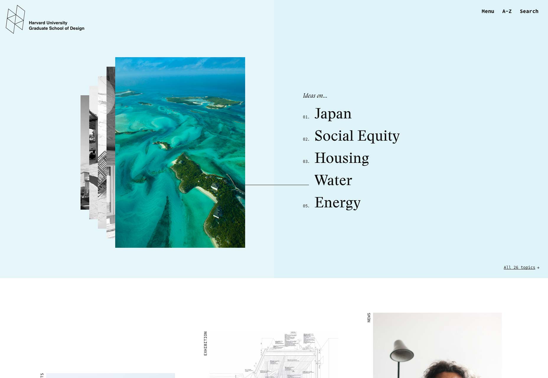
1. Harvard reinvents the infamous carousel
Harvard’s School of Design website has a unique way of approaching navigation. When you first land on the homepage, there is a visual display of the navigation. Of course, every single link isn’t represented here, just a few key ones. Many websites have embraced linking to the more important pages in the header of the home page; that’s what brought us carousels for instance. But, I have yet to see another website present it in this way. The navigation may be small but it’s front and center. More importantly, it looks like it belongs there. It’s executed exceptionally.
The images on the left overlap each other but you can still see how many are there. There is a clear relationship between the image and the titles on the left-hand side. The images rotate in relation to the items on the left. However, at any given time, you know what information is available for you. It’s like Harvard’s School of Design created an improved version of what the carousel should have been in the first place. Not only is usability taken seriously in this design solution, the layout is unique as well. Both of those factors combined make for a fantastic visual design.
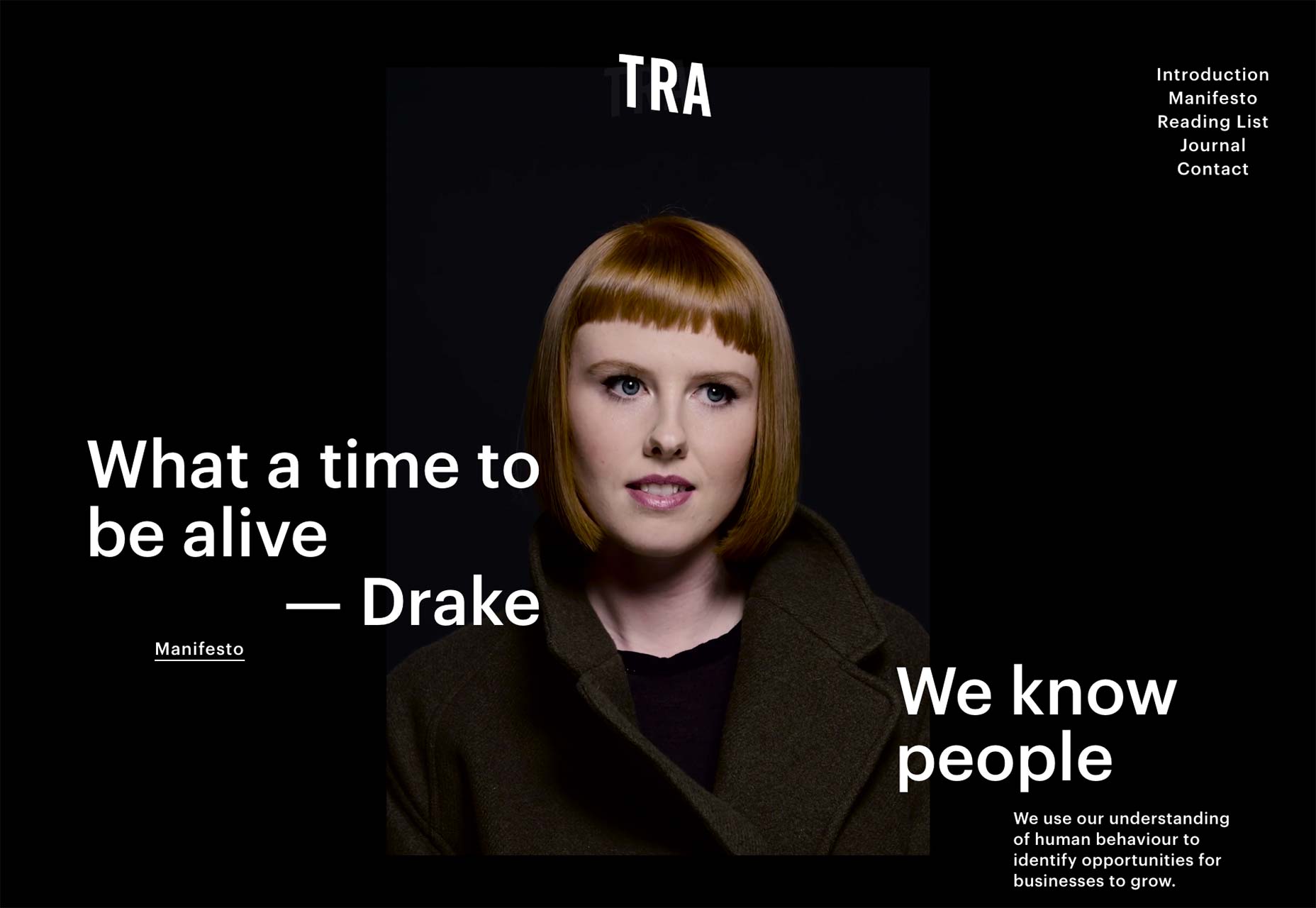
2. Tra goes off grid
It’s quite obvious that Tra’s website uses a non-traditional layout. The website is, overall, minimal. They also use a reverse color scheme where the background is black and text is white. The color scheme most certainly gives it a wow factor. However, this is about the layout of Tra’s website. Let’s start with the homepage: there are a few pieces of text on the homepage, most of it overlaps the background image at least a little, except for the paragraph copy from under the “We know people” section. The copy is aligned specifically to be off the image. It’s different, it’s unique, it’s noticeable.
On the about page, there is a little bit more order and use of a grid. But, the grid is still irregular. It seems as if each section of the about page has its own grid. The thing that captivated me the most about this page is the cut off image from the top left of the webpage. It just doesn't fit into anything. Naturally, that makes me curious. It turns out the image is a gallery—you have to click it to make the images open. That’s a pretty clever way to leverage a layout; people who care to investigate are rewarded with a bunch of images. The people who don’t care to, don’t lose out on as much. It’s a fun easter egg.
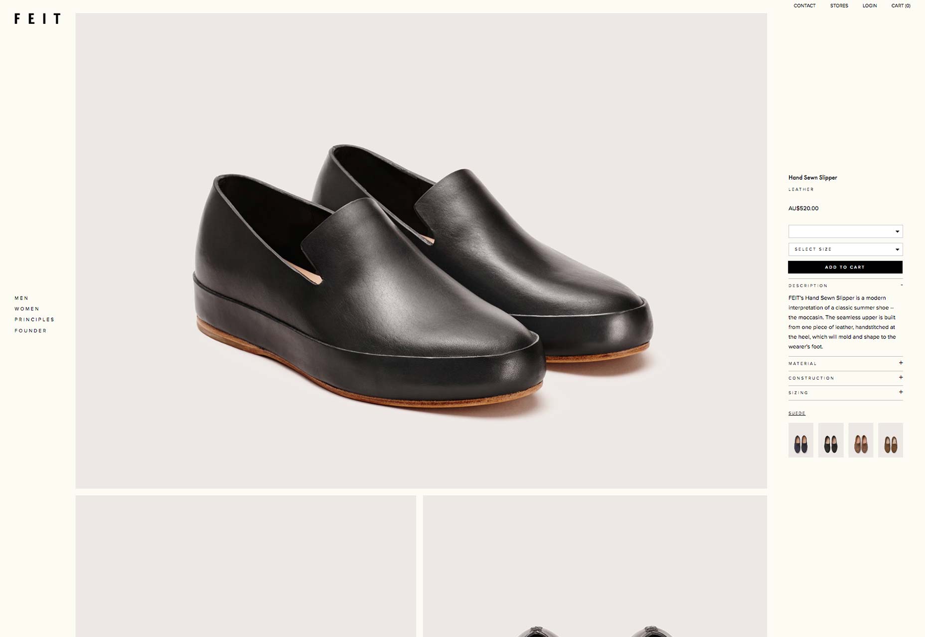
3. Scrollable shoe photos within a fixed page
This example of a unique layout solution revolves around an online shoe retailer. Feit’s product page is just brilliant. First of all, the design utilizes the full width and height of the screen. That means that every area of the screen has been designated with a specific purpose. Second, of all, the website is simple, minimal and clean. That means that even though the design does use the full screen, it’s not messy. That’s a very good thing as plenty of design relies on whitespace to make for a clean and light looking website.
The thing that impressed me the most about this specific product page is the way the layout is divided. The page is specifically divided into three different sections. First, there is the navigation on the left-hand side. It’s pretty standard and nothing too special. Then there is the right-hand side with the product details. Both, the left-hand side navigation and the details section are fixed to the screen. But, the last section, the middle photo section, is filled with scrollable photos. I think it’s a brilliant solution because it’s not the most common solution.
Often time, if there is a big list of product photographs, the information about it stays behind. Here, as I scroll down I still see the description and name of the product, I still see the different colors it comes in and can access more information such as details about the material as I please without having to scroll up and down. Overall, this is a seamless experience for a potential customer.
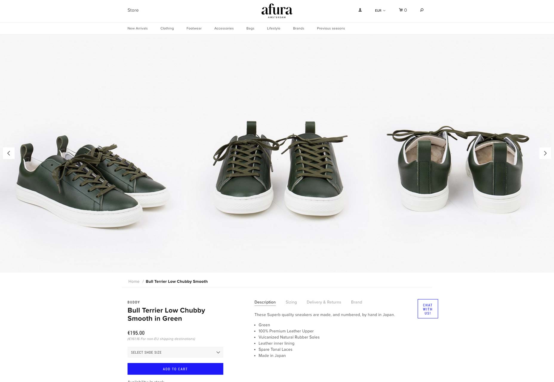
4. Showing off multiple sides of a product at a single glance
Here we have another product page and another way to display a product. Okay, fine, we also have another shoe example too! Afura’s website also has a unique display method. This time the shoes are shown in multiple different shots atop the page. It’s actually part of a carousel UI element. However, the usability here isn’t a big issue. For starters, there are three images displayed by default on a desktop or laptop screen sizes. The default images all have the same background which makes a nice and seamless display. If a user doesn’t realize that the images are part of a carousel they will at least see three different images of the product on their computers. For smaller screen sizes like tablets, the default is to display two images at a time; that’s still pretty good. All in all, the display of the shoe products here is a unique design solution.
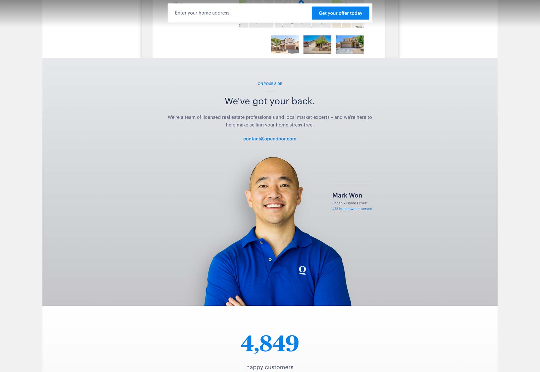
5. Opendoor shows off their humans
I, for one, believe the web is an impersonal place where we don’t usually see the human being; the real people behind apps, products, companies and so on. I’ve always strived to include a human element within my designs. I can see that Opendoor wants to do the exact same thing. On their home page, about halfway down, is a section called “We've got your back.” It’s supposed to explain that there are real human beings behind the Opendoor company who are there to help their customers every step of the way. Now, Opendoor could have just left it there but instead, they placed a big photo of one of their employees.
This section has very little text. Instead, the photo and face are the bigger part of the section. I’d even say that the photo overpowers the section in 100% positive way. If the photo had been a thumbnail or an avatar, the effect wouldn’t even exist. If the photo had been a medium sized square (say at least 300px by 300px) right next to the copy, the effect wouldn’t be the same. The choice to use such a large image of Mark’s friendly face was a good call; not only does this design decision provide a human and personalized design element, it’s a creative as well. Without this photo, there would be no personal impact on the user. Without this specific layout, this section would have a whole different emotional effect.
6. UX Flow shows a little animation can go a long way
This next example of a unique layout solution has to do with animation. If you take a look at the home page of UX Flow and scroll down a little bit you may notice that one of the section’s backgrounds animates in. It’s honestly nothing fancy but it is unique. Backgrounds don’t ease in as you scroll on a web page. If anything, over the last few years we’ve seen different elements from within a section fly in or out as you scroll. But, I haven’t seemed that many background animations besides parallax. The reason this is important is that a background defines a section. And, although, this isn’t some crazy animation it is still impressive.
Not everything needs to be bold, loud and obnoxious to be impressive. Sometimes the subtle things like a small and quick ease-in animation is just enough to produce a unique experience for a user. This is most definitely one of those times. Another thing that’s important to notice is that the sections between which the animation happens don’t have unique layouts themselves. That’s okay; the transition is noticeable as you go from one section to the next it’s still part of the layout even if it’s not the end layout made by the animation.
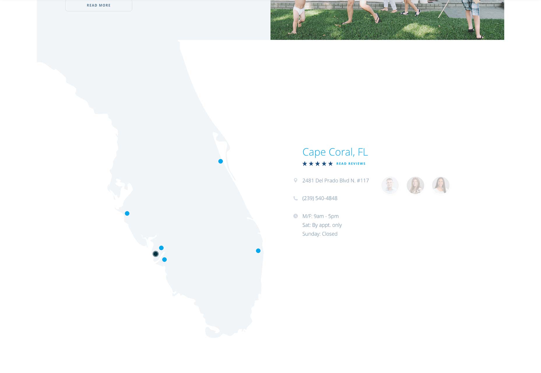
7. Ted Todd integrated map
The visual design and overall user experience of Ted Todd’s website is well designed. For the sake of this article, I’d like to talk about the way Ted Todd uses the location and map section on their website. Towards the bottom of their homepage, there is a section designated for the different office locations the company has throughout Florida. There are multiple reasons why this section is amazing. First, the section does use the layout in a unique way to provide a stellar design solution. The most noticeable thing about this section is the light shape of Florida to the right. The visual of Florida with its many dots is a fantastic way to show off the company's reach. They don’t just say they are in Florida, the design shows you exactly where. It’s an easy visual to digest and it is executed in a fantastic way too.
The next important thing about this section are the dots. They are actually interactive. When you hover over them you get the name of the town or city the Ted Todd Insurance office is located in. But, if you click it the whole section shifts left to make room for details about the specific office. You get the office’s phone number, address, open hours in addition to a list of employees. I like this design solution because it allows a user to quickly navigate to a location near to them. It’s visually a lot more interesting and unique representation than if the information was stacked on top of each other on a page title “Our Florida Offices,” don’t you think?
Paula Borowska


Read Next

15 Best New Fonts, July 2024

20 Best New Websites, July 2024

Top 7 WordPress Plugins for 2024: Enhance Your Site's Performance

Exciting New Tools for Designers, July 2024

3 Essential Design Trends, July 2024

15 Best New Fonts, June 2024

20 Best New Websites, June 2024

Exciting New Tools for Designers, June 2024

3 Essential Design Trends, June 2024

15 Best New Fonts, May 2024

How to Reduce The Carbon Footprint of Your Website
