

How exactly do people read on the web?
If you think that people read most or even half of the written content on the web, you’re giving them too much credit. Study after study that’s looked at web-reading habits concludes that people simply don’t take the time to properly read every single word, paragraph or page on the web. Instead, they’re fond of skimming or scanning your content. A classic study on this subject is the Nielsen Norman Groups F-shaped pattern study from more than a decade ago, which established that users don’t read word-for-word and just scan copy. A much more recent study from 2013 looking at this phenomenon concluded the same thing, namely that users don’t read word-for-word, don’t finish reading the entire article, and stop reading about halfway through. Looking at these landmark studies, what can we conclude, then? A lot of your content doesn’t get read—whether that’s ad or business copy or information in a news article—and most people will, at best, just skim or scan your written text. So what are designers to do, faced with this seeming dilemma? They have to faithfully start chunking their content. Here’s how:Using smaller and shorter paragraphs
When you’re arranging content on your client’s webpages, be sure to go with smaller and shorter paragraphs. Both of the studies above specifically found that your visitors won’t be reading word-for-word and instead love to skim and scan. Content that’s formatted into thicker and longer paragraphs isn’t conducive to easy eye scanning and skimming. When paragraphs are longer, readers will be discouraged from staying on the page and have the tendency to bounce. This ties into how they naturally read on the web, which is by scanning and skimming. When readers scan and skim, they’re trying to pull out bits of information from content that can help them decide if they want to continue reading on. Longer paragraphs don’t let them do this, but shorter paragraphs—which readers can more quickly scan through—allow them to get a better sense of what the content on the whole page will be like. For an example of a site with shorter paragraphs, we look to National Geographic. Its articles rarely contain paragraphs with more than three sentences. It’s skimming perfection.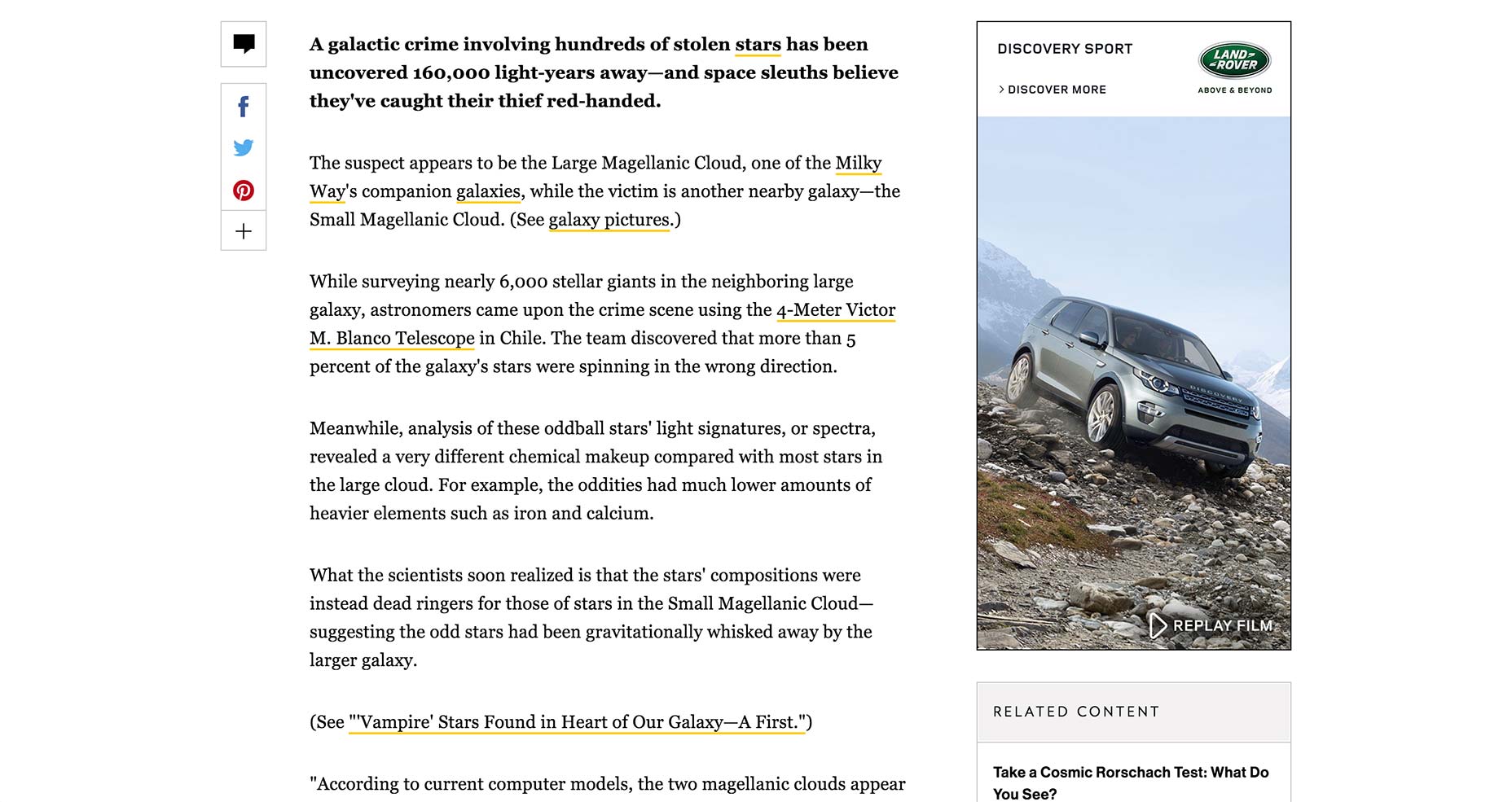
Using bullet points
The beauty of bullet points is that they draw the eye to pithy pieces of info that are easy to read and retain. Because they’re presented in short and consecutive fashion, they’re ideal in supporting how your visitors read content. Copyblogger advises the use of bullet points on the web, saying they “keep people reading your blog posts, pages, articles, and copy like nothing else.” It’s all about the brevity. Since people already don’t read thoroughly on the web, you need to present them with content whose big takeaways they can understand in a matter of moments. Bullet points fulfill this to a tee. It also should be stressed that bullet points shouldn’t be long, as in you shouldn’t include long sentences or pieces of info for each bullet point, as that defeats its purpose of brevity. The shorter the bullet point, the better for reading. One of the best places to observe bullet points used successfully is usually on ecommerce sites like Flipkart. On this page for the Samsung Galaxy J5-6, note the use of bullet points to quickly communicate the phone’s features.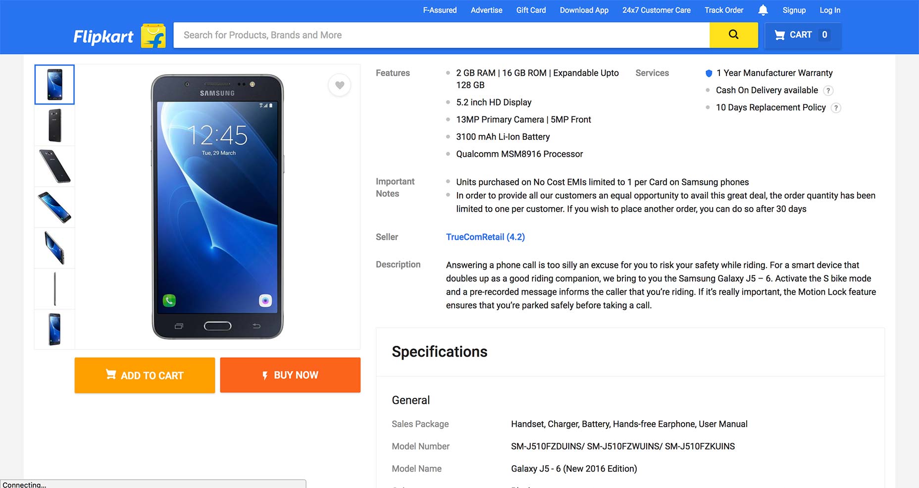
Using headlines and subheadings
These are excellent for breaking up content into more easily readable and digestible sections. In addition, headlines and subheadings also work as short “previews” of the next section of content, thereby enabling readers to immediately understand what the upcoming section will talk about and decide on whether or not to keep reading. Studies have shown as well that many web readers are headline-readers, for the most part. This complements the above studies exposing that people are, for the most part, just skimmers and scanners on the web. The Washington Post reports that approximately 60% of Americans just read the headlines on the web, whether they’re reading on desktop or mobile. This ties in perfectly to the short-attention span behavior of your visitors, leads, readers and customers. When many just read the headlines, it’s your job as a designer to ensure that your content’s headline clearly spells out what readers can expect—otherwise, they may decide not to delve into your content deeper to read more. An example of a site that lives and dies by the headline is Listverse, the listicle compiler of all things strange, shocking and sensational. In its article on strangeness at Disneyland, note how the site uses a crystal-clear headline that explicitly previews what the content will be about. When one scrolls down, note how each subheading also makes it very clear what each section will cover, therefore making reading and retaining this info a breeze.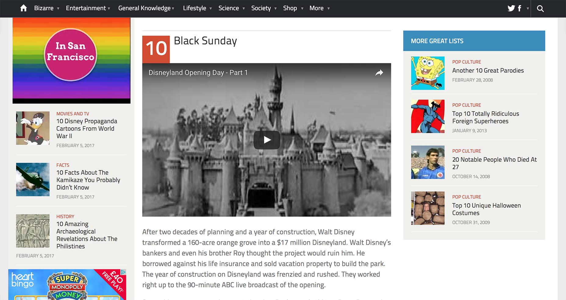
Help UX by always chunking your content
The key to showing your visitors better content is presenting them said content in the way that they already naturally absorb it. That means chunking. Since your content is going to face an uphill battle on the web to be read anyway, not chunking your content virtually assures that very few people will read it. This means fewer leads, conversions and customers, as someone not reading your sales copy to the end can mean a lost sale, or another visitor refusing to read your blog post thoroughly can mean lost signups and lead captures. In short, not chunking your content on the web leads to bad outcomes. Chunking encourages people to read content on the web how they’re already naturally inclined to read it, which is by skimming and scanning. Don’t fight it! Don’t bunch your content together in longer paragraphs, expecting the quality of your content to persuade people to read word-for-word. The truth of the matter is that people just don’t spend that much time reading content on the web. And your job as a designer is to take this short attention span and get them to read and retain as much of it as possible. You’ll do that only by chunking.Marc Schenker
Marc’s a copywriter who covers design news for Web Designer Depot. Find out more about him at thegloriouscompanyltd.com.


Read Next

15 Best New Fonts, July 2024
Welcome to our monthly roundup of the best fonts we’ve found online in the last four weeks. This month, there are fewer…
By Ben Moss

20 Best New Websites, July 2024
Welcome to July’s round up of websites to inspire you. This month’s collection ranges from the most stripped-back…

Top 7 WordPress Plugins for 2024: Enhance Your Site's Performance
WordPress is a hands-down favorite of website designers and developers. Renowned for its flexibility and ease of use,…
By WDD Staff

Exciting New Tools for Designers, July 2024
Welcome to this July’s collection of tools, gathered from around the web over the past month. We hope you’ll find…

3 Essential Design Trends, July 2024
Add some summer sizzle to your design projects with trendy website elements. Learn what's trending and how to use these…

15 Best New Fonts, June 2024
Welcome to our roundup of the best new fonts we’ve found online in the last month. This month, there are notably fewer…
By Ben Moss

20 Best New Websites, June 2024
Arranging content in an easily accessible way is the backbone of any user-friendly website. A good website will present…

Exciting New Tools for Designers, June 2024
In this month’s roundup of the best tools for web designers and developers, we’ll explore a range of new and noteworthy…

3 Essential Design Trends, June 2024
Summer is off to a fun start with some highly dramatic website design trends showing up in projects. Let's dive in!

15 Best New Fonts, May 2024
In this month’s edition, there are lots of historically-inspired typefaces, more of the growing trend for French…
By Ben Moss

How to Reduce The Carbon Footprint of Your Website
On average, a web page produces 4.61 grams of CO2 for every page view; for whole sites, that amounts to hundreds of KG…
By Simon Sterne

20 Best New Websites, May 2024
Welcome to May’s compilation of the best sites on the web. This month we’re focused on color for younger humans,…