

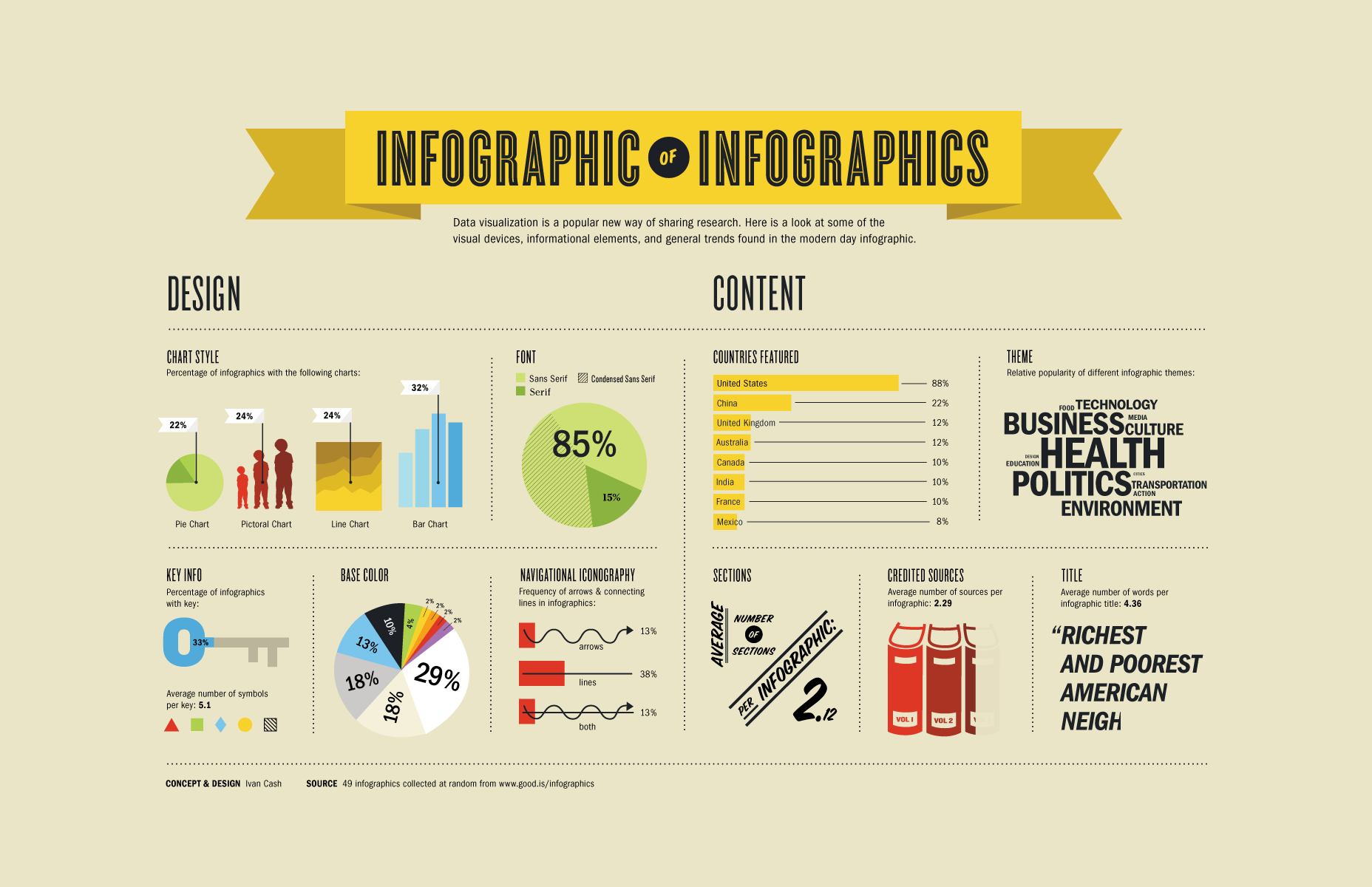
Perfect infographics start with a thesis
The number one thing to understand about designing successful infographics is that it cannot just be “a bunch of stats or other figures arranged visually on a page.” Infographics, like any other marketing collateral, are used best when they're telling a story. In this particular case, that story just happens to be told primarily with figures and data as opposed to good, old-fashioned text. Because of this, before you even get into the visual element of your Infographics you'll need to settle on a thesis statement: What exactly are you trying to say? What impression do you want the reader to take away when they finally get to the end? The answer to this question will dictate every choice you make moving forward, so it’s an important one to settle on as quickly as possible.Structuring your infographic
Once you've settled on the story you're trying to tell, the next thing to do is to nail down your structure. Think of it a bit like telling a joke: First you introduce the setup, meaning the context that people need to understand what is to come; then, you expand on that setup and offer the hook (the thing that keeps people interested); finally, you hit them with the punch line (the surprise at the end of the joke that generates the laugh). If you don't have these core elements, or if they're not in the appropriate order, your joke (or in this case, your infographic) won't be nearly as successful as you need. In terms of infographics, the ideal structure is as follows:- Introduce your topic, either by way of a short block of text or by a bold opening fact or figure.
- Introduce a complication. This is a problem that you're offering a solution to, or an idea that you're going to be expanding on.
- Expand on that complication. Your reader should learn why this topic is important and should slowly be able to get an idea of what you're trying to say about it.
- Finally, the conclusion. This is the period on the end of your sentence that sums up what someone has learned, what they can do with this information and where they can find more if they so choose.
Don't forget about design
Just because you can make an infographic without a graphic design degree, doesn't mean you can throw out all the tried-but-true rules of visual communication. The data you arrange should naturally flow from top to bottom. These elements should be presented in a way that guides the reader from one point to the next, often without them even realizing you're in control in the first place. Each data point should build and expand on the one that came before it, eventually leading the reader directly to the beautiful climax (or punch line) that they were after in the first place.Payman Taei
Payman is the founder of Visme, a tool for creating infographics and other engaging content. He loves to write about topics that help fuel people's design and communication skills.


Read Next

15 Best New Fonts, July 2024
Welcome to our monthly roundup of the best fonts we’ve found online in the last four weeks. This month, there are fewer…
By Ben Moss

20 Best New Websites, July 2024
Welcome to July’s round up of websites to inspire you. This month’s collection ranges from the most stripped-back…

Top 7 WordPress Plugins for 2024: Enhance Your Site's Performance
WordPress is a hands-down favorite of website designers and developers. Renowned for its flexibility and ease of use,…
By WDD Staff

Exciting New Tools for Designers, July 2024
Welcome to this July’s collection of tools, gathered from around the web over the past month. We hope you’ll find…

3 Essential Design Trends, July 2024
Add some summer sizzle to your design projects with trendy website elements. Learn what's trending and how to use these…

15 Best New Fonts, June 2024
Welcome to our roundup of the best new fonts we’ve found online in the last month. This month, there are notably fewer…
By Ben Moss

20 Best New Websites, June 2024
Arranging content in an easily accessible way is the backbone of any user-friendly website. A good website will present…

Exciting New Tools for Designers, June 2024
In this month’s roundup of the best tools for web designers and developers, we’ll explore a range of new and noteworthy…

3 Essential Design Trends, June 2024
Summer is off to a fun start with some highly dramatic website design trends showing up in projects. Let's dive in!

15 Best New Fonts, May 2024
In this month’s edition, there are lots of historically-inspired typefaces, more of the growing trend for French…
By Ben Moss

How to Reduce The Carbon Footprint of Your Website
On average, a web page produces 4.61 grams of CO2 for every page view; for whole sites, that amounts to hundreds of KG…
By Simon Sterne

20 Best New Websites, May 2024
Welcome to May’s compilation of the best sites on the web. This month we’re focused on color for younger humans,…