

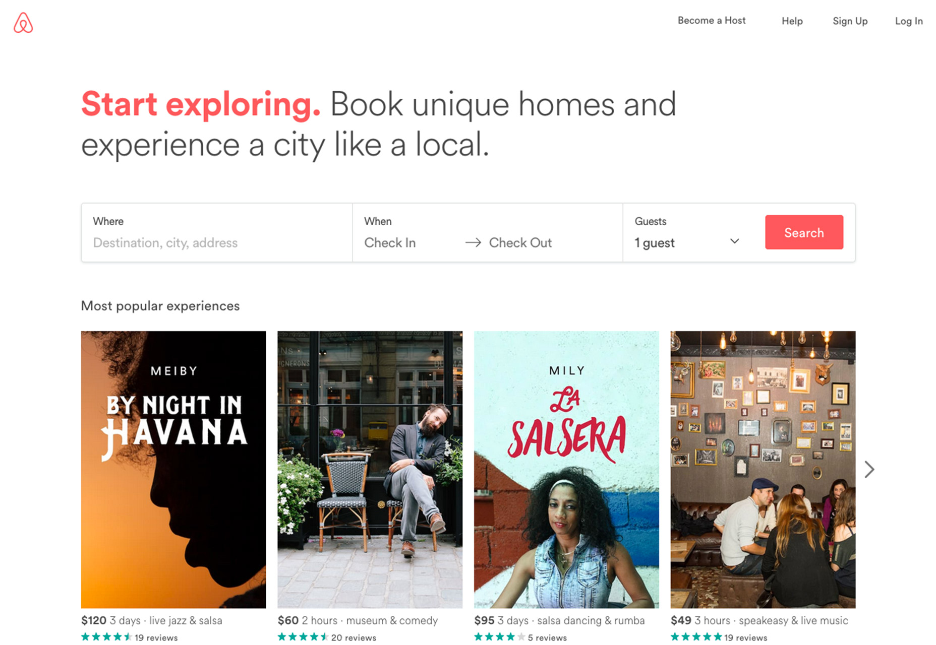
1. Make It Easy to Scan and Read
You know that users scan websites to glean information and determine what actions they will take or whether the content and design interests them or not. The same is true of forms. User should be able to tell what information is needed at a glance and provide a clear explanation of what the form is for and how to submit it. A highly-scannable form includes the following:- Contrast: Text needs to be short and easy to read. Avoid lots of color and stick to traditional dark on light text-background combinations.
- Grouping and space: Group information that’s similar on longer forms. When collecting payment information for example, group customer information, payment information and shipping information. Three shorter blocks are easier to digest than one long one. Use smart spacing to that labels are connected to the field they explain, rather than uniform spacing between text and field elements.
- Clear finish/call to action: Make the button big and easy to see. The microcopy inside the button should tell users what will happen, such as “submit,” “pay now” or “proceed to next step.” Remember to close the feedback loop and let users know when a form is properly submitted.
2. Consider Floating Labels
There’s been a lot of debate about whether or not to use hint text inside form fields. The main problem is that too often this text doesn’t go away with a click and users have to actively delete it to start typing. That’s awkward.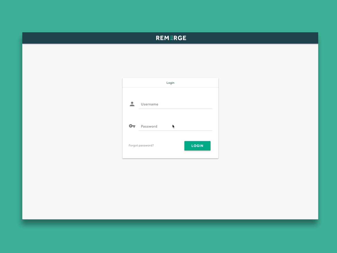 Further, the Nielsen Norman Group found that blank fields can draw the eye and help users input information more clearly.
If you feel the need to use hints, consider an interactive solution—floating labels. Include your label information inside form fields so that it looks like placeholder text, but allow the text to animate and shift to the top left position once a user hovers over or clicks into the field. The label or hint never goes away and it does not get in the way of the user trying to fill out the form. (Plus the little animation is a fun surprise for users.)
Further, the Nielsen Norman Group found that blank fields can draw the eye and help users input information more clearly.
If you feel the need to use hints, consider an interactive solution—floating labels. Include your label information inside form fields so that it looks like placeholder text, but allow the text to animate and shift to the top left position once a user hovers over or clicks into the field. The label or hint never goes away and it does not get in the way of the user trying to fill out the form. (Plus the little animation is a fun surprise for users.)
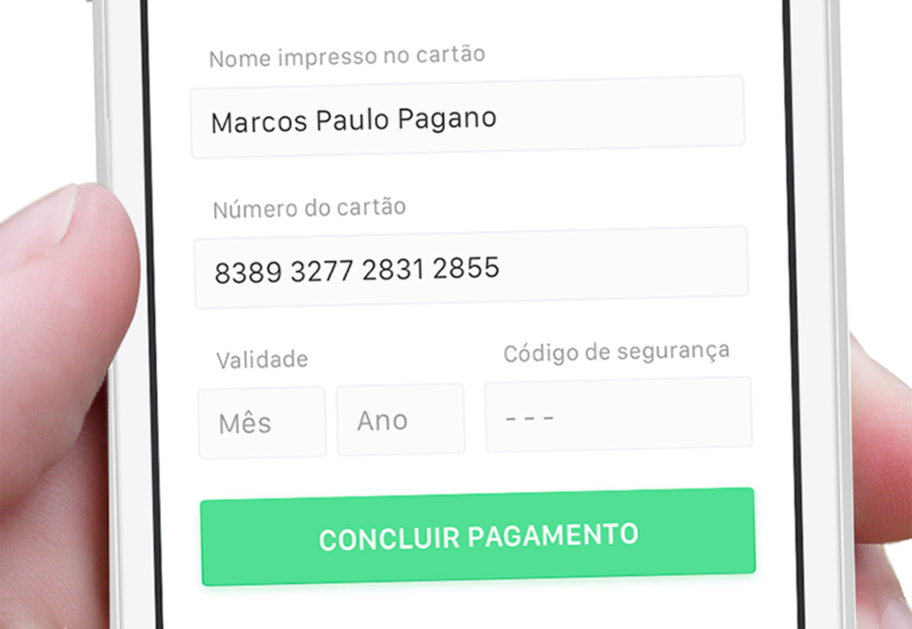
3. Use Field Masks
Field masks can provide some of the same clues and form hints but without getting in the way of the usability. A field mask only appears once a user activates a field and provides an additional scanning clue as to what information is needed. The mask can assist the user further by automatically formatting information in an effort to avoid errors that will kick the form out on submission. A good example of a field mask in action is with phone numbers. Consider the multiple format options:- (000) 000-0000
- 000-000-0000
- 0000000000
4. Make Forms Keyboard-Friendly
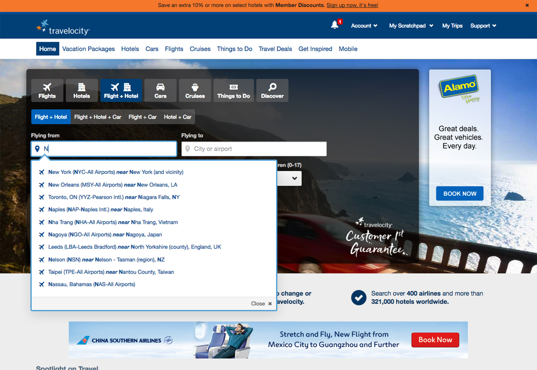
You have no way of knowing what type of device a user will encounter your form on, but it should be equally easy to fill out anyway. Consider all the different types of keyboards that could send information to the form and adjust fields to detect and use the appropriate option. On desktops, users should be able to enter a form and fill out each field without having to click a mouse. Advance automatically from one field to the next upon completion or use tabs or enter to move around. W3.org has a solid set of keyboard recommendations for you to follow. On mobile devices, match the keyboard type to the data required. If the input is for letters, bring up the alpha keyboard; for numbers, bring up the numeric option. From Google: “App users appreciate apps that provide an appropriate keyboard for text entry. Ensure that this is implemented consistently throughout the app rather than only for certain tasks but not others.”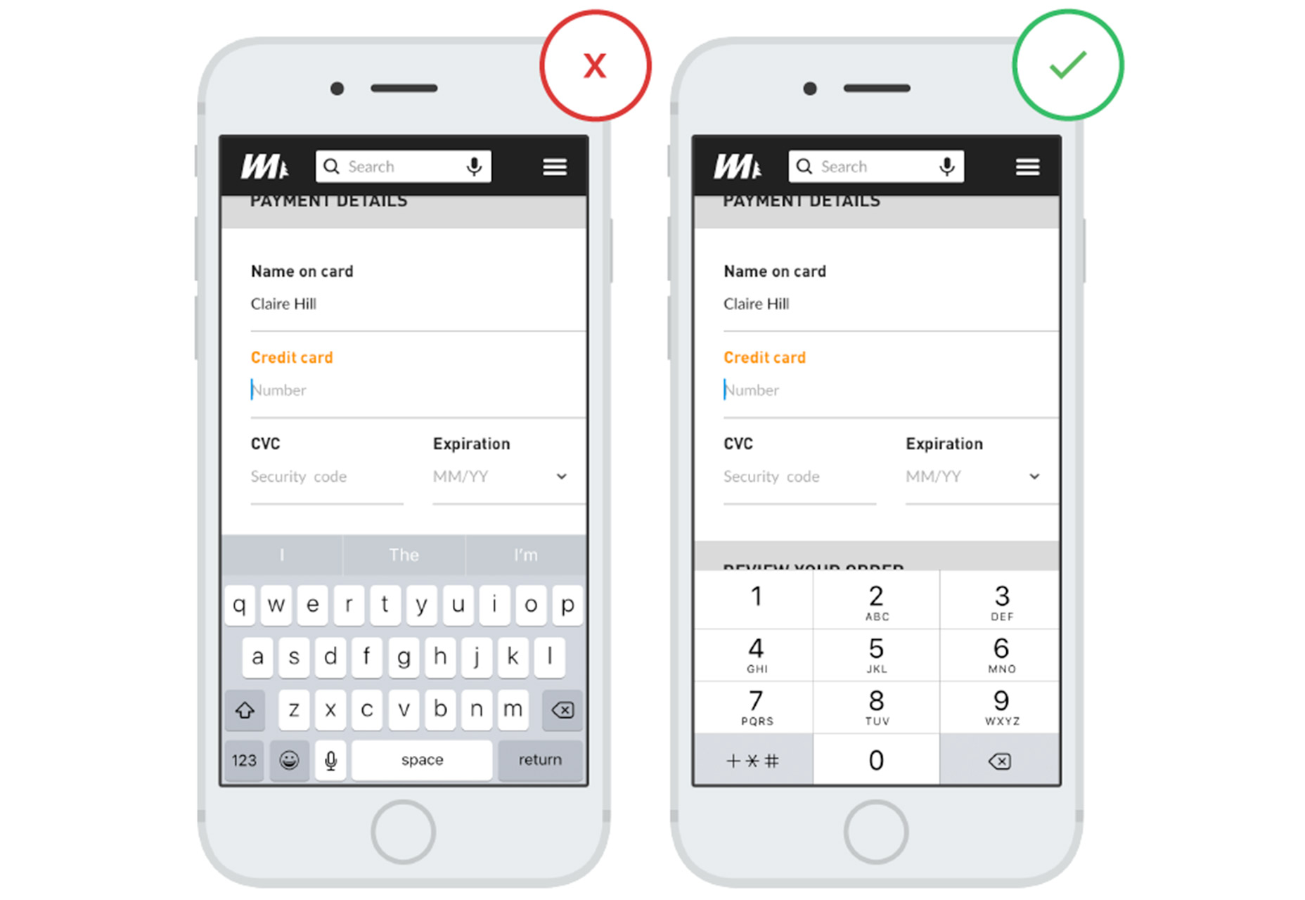
5. Opt for Vertical Format
Vertical forms are easier for users than multiple column formats. To best practice rule is to ensure that all the fields can fit on the screen without scrolling in a top to bottom format. The one exception is for super-short forms where a user only needs to enter an email address or name and email address. Two side-by-side columns followed by a call to action button can work well in this situation as long as the email box is long enough for users to see all the letters of their address. Remember to order elements logically in a vertical form as well. If you are collecting first name, last name, email address, and hair color sequence them in that way.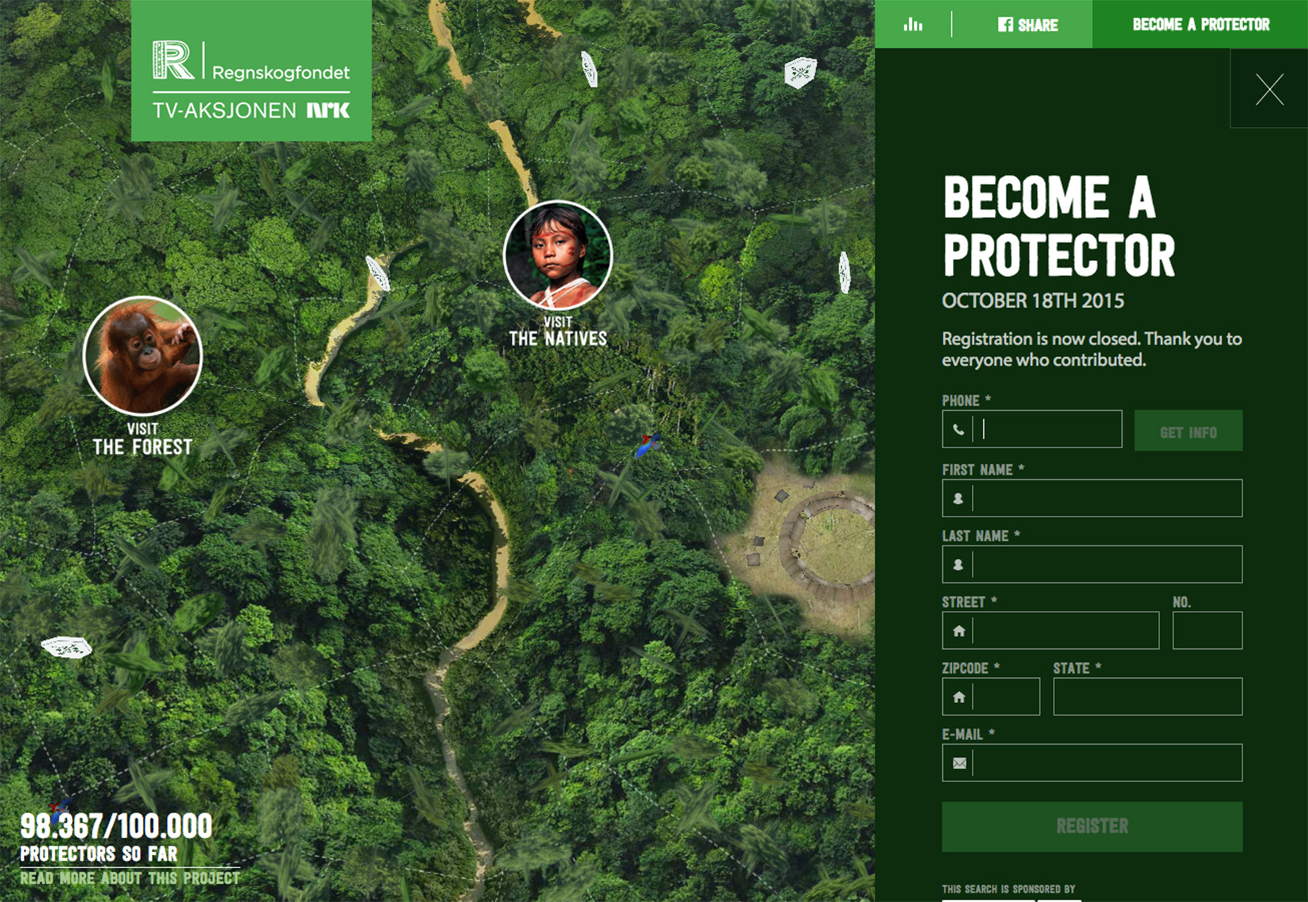
6. Limit Typing
Use as many pre-fill solutions as possible with forms. Nothing is more delightful then going to add an address and after the first few taps, the Google API kicks in and suggests address options. This does three things:- It makes it easier for users, particularly on mobile.
- It helps limit the number of fields necessary.
- It can help eliminate some user error, such as mistyping.
7. Keep It Short and Sweet
You are going to be tempted to ask users for a lot of information in forms. Resist the urge! Only ask for vital information in forms. There’s a stronger likelihood that users will fill out forms that require less commitment. If you need more information later, you can then email them from your list as ask for additional details. (As someone who has already opted in, the user is more likely to engage with you for more at this time.) Avoid optional fields. Don’t ask for redundant information. Don’t use multiple fields where you could use one (phone numbers for example).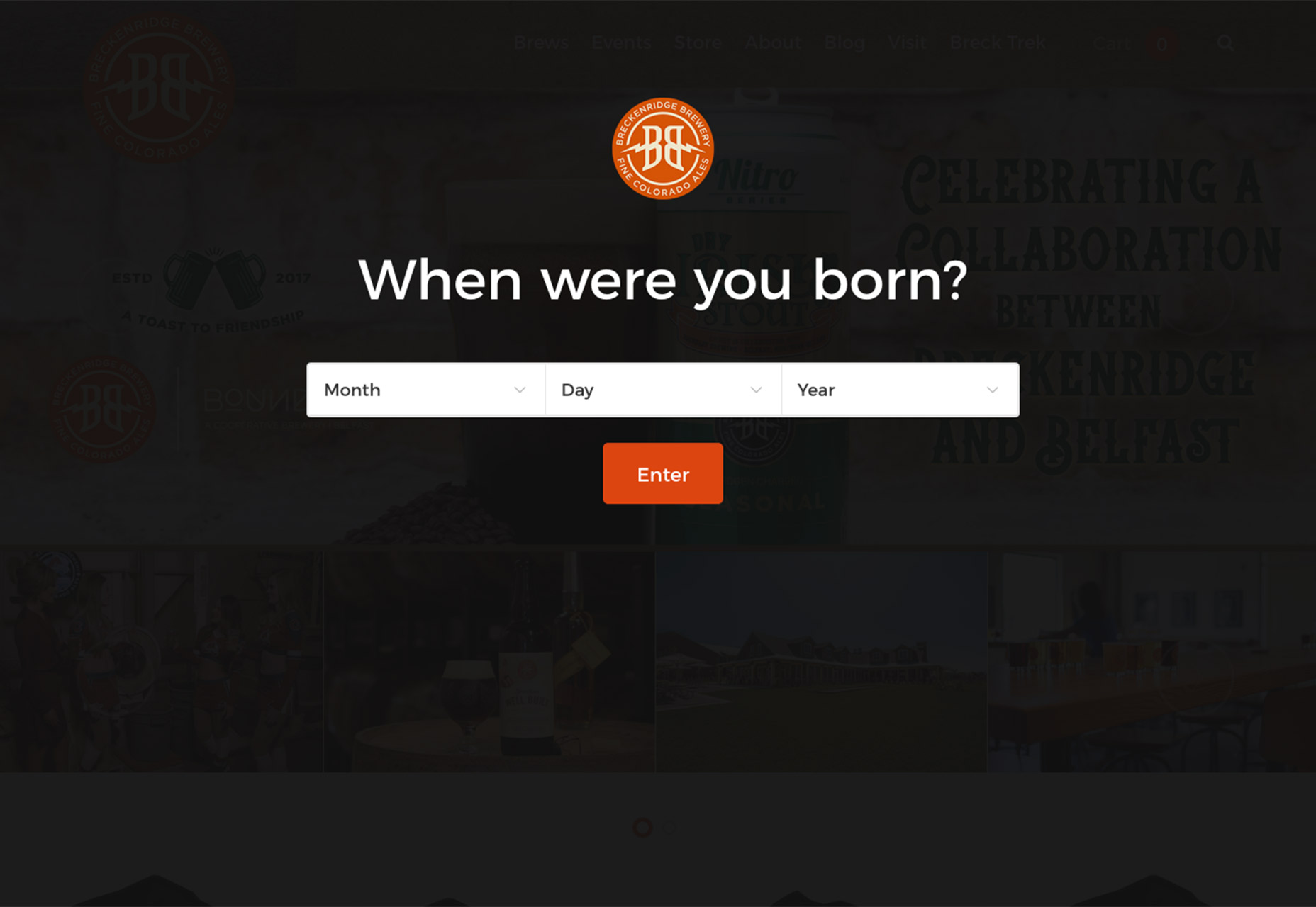
Conclusion
Give users something in return for filling out a form. Make it fun or interesting. Thank the user. Creating a form that’s easy to read and easy to use will increase your chances of collecting data and turning a website visitor into a repeat user.Carrie Cousins
Carrie Cousins is a freelance writer with more than 10 years of experience in the communications industry, including writing for print and online publications, and design and editing. You can connect with Carrie on Twitter @carriecousins.


Read Next

15 Best New Fonts, July 2024
Welcome to our monthly roundup of the best fonts we’ve found online in the last four weeks. This month, there are fewer…
By Ben Moss

20 Best New Websites, July 2024
Welcome to July’s round up of websites to inspire you. This month’s collection ranges from the most stripped-back…

Top 7 WordPress Plugins for 2024: Enhance Your Site's Performance
WordPress is a hands-down favorite of website designers and developers. Renowned for its flexibility and ease of use,…
By WDD Staff

Exciting New Tools for Designers, July 2024
Welcome to this July’s collection of tools, gathered from around the web over the past month. We hope you’ll find…

3 Essential Design Trends, July 2024
Add some summer sizzle to your design projects with trendy website elements. Learn what's trending and how to use these…

15 Best New Fonts, June 2024
Welcome to our roundup of the best new fonts we’ve found online in the last month. This month, there are notably fewer…
By Ben Moss

20 Best New Websites, June 2024
Arranging content in an easily accessible way is the backbone of any user-friendly website. A good website will present…

Exciting New Tools for Designers, June 2024
In this month’s roundup of the best tools for web designers and developers, we’ll explore a range of new and noteworthy…

3 Essential Design Trends, June 2024
Summer is off to a fun start with some highly dramatic website design trends showing up in projects. Let's dive in!

15 Best New Fonts, May 2024
In this month’s edition, there are lots of historically-inspired typefaces, more of the growing trend for French…
By Ben Moss

How to Reduce The Carbon Footprint of Your Website
On average, a web page produces 4.61 grams of CO2 for every page view; for whole sites, that amounts to hundreds of KG…
By Simon Sterne

20 Best New Websites, May 2024
Welcome to May’s compilation of the best sites on the web. This month we’re focused on color for younger humans,…