

Use cases for tooltips
Tooltips exist to boost your site’s or app’s UX. That’s pretty much it. These micro interactions have to make life easier for your users in some way, shape or form. Although their purpose is straightforward, correctly and consistently implementing them in your platform may be a different story since it can get tricky to make the right call.Unfamiliar Icons or Buttons
When your users encounter icons or buttons that are unfamiliar to them or are otherwise not labeled, then it’s a good idea to design some tooltips into the interface. Even if an icon or button is familiar-looking, but still needs a short explanation to onboard users quickly—say, in the case of a cogwheel on a dashboard—then including a tooltip makes all the sense in the world.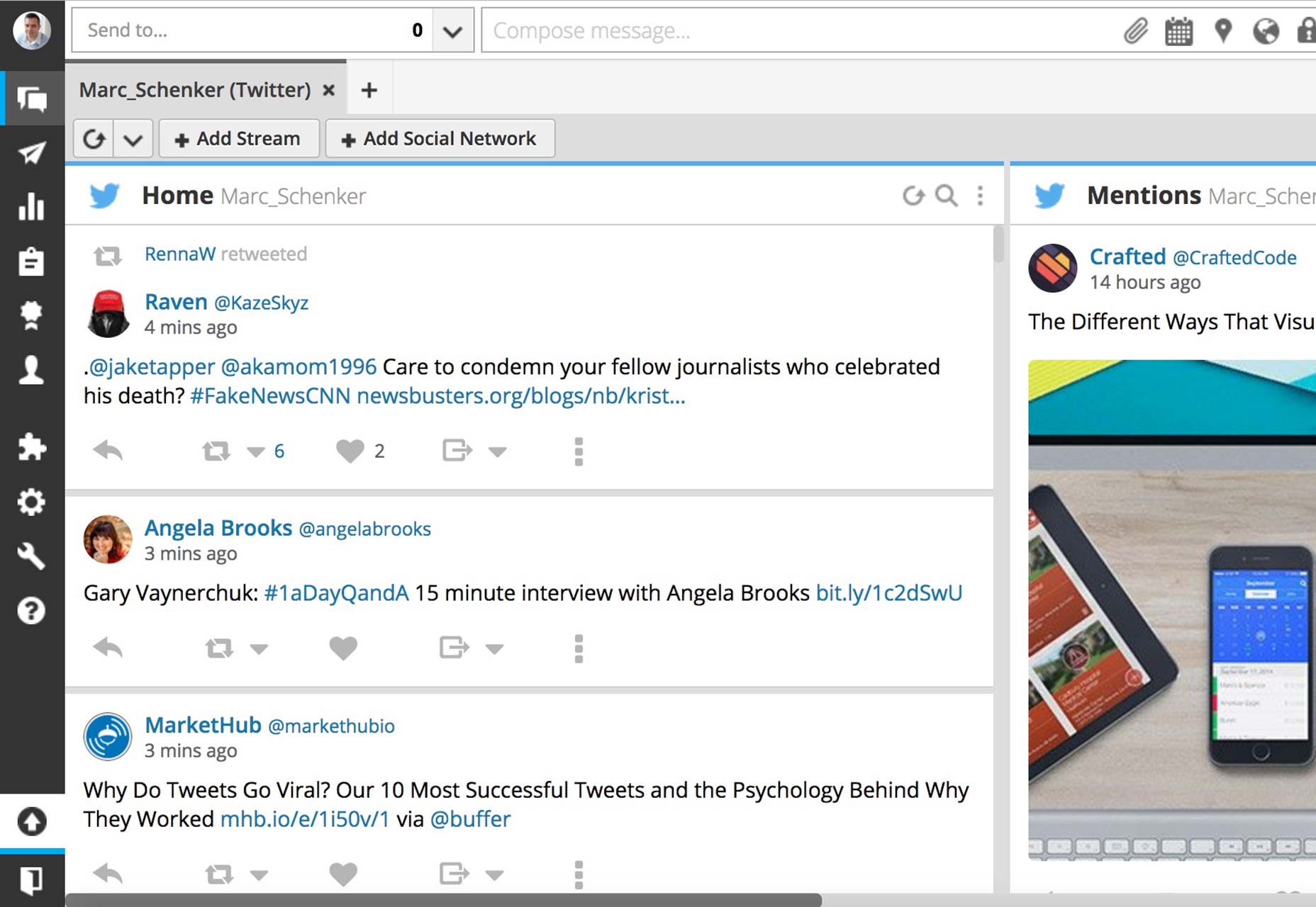
Additional (non essential) information
Here’s the key: not essential. A tooltip can provide extra information to users, so that the screen isn’t overly full of unnecessary text. A great example of this is when you have tabs open in your browser: when you hover with your cursor over the tab, a tooltip will quickly appear, telling you the exact webpage title of where you are. Now, this extra info isn’t essential, but it’s nice to have when you want to make a note of exactly what page you’re visiting. If the info is essential, a tooltip’s no good. The info should be included permanently right in your interface for user convenience and quick reference.Tooltips aren’t ideal for everything
By the same token, tooltips can quickly become harmful to great UX on a device when they’re used incorrectly. Overdoing their use is a sure way to make your users sick and tired of what is otherwise a very helpful means of guiding your users through an interface you just designed.Unintuitive design
Unintuitive design is when your design forces your users to keep relying on a tooltip to make it through your interface. In such a scenario, the best tooltip won’t help because, blatantly, something’s wrong in your design that keeps forcing your users to keep checking the tooltip too much. A tooltip should really only be used for onboarding users to a specific process, but, after that initial tutorial, users should be able to do things themselves.Interaction with the tooltip’s content
Sometimes, it becomes necessary for users to actually interact with the content inside of the tooltip itself. For example, a tooltip’s content might include a call to action button, and the content may prompt users to click on the button. It could be anything from a signup button to login link.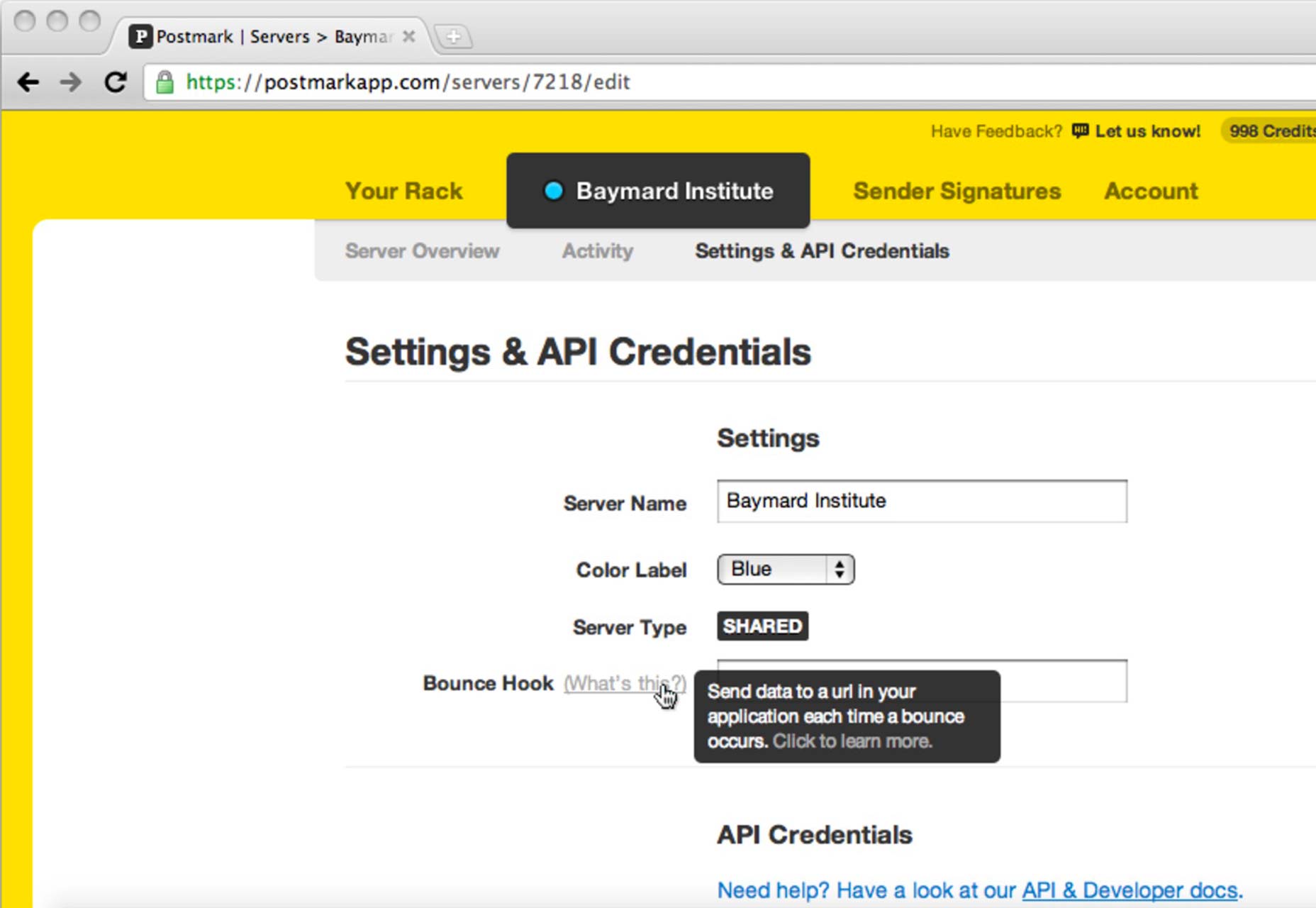 However, it’s considered sub-par design to include such interactive elements inside your tooltips if they disappear when your users move their cursors to the tooltip…to follow the call to action. Just think of how frustrating that is to users—especially when your tooltip tells them how they can perform the action to begin with!
In such cases, just allow the calls to action to speak for themselves, designing them significantly enough so that they can get noticed all on their own.
However, it’s considered sub-par design to include such interactive elements inside your tooltips if they disappear when your users move their cursors to the tooltip…to follow the call to action. Just think of how frustrating that is to users—especially when your tooltip tells them how they can perform the action to begin with!
In such cases, just allow the calls to action to speak for themselves, designing them significantly enough so that they can get noticed all on their own.
Rules for awesome tooltip design
How you design your tooltips to provide micro interactions that guide users, and provide feedback, makes a great difference to their enjoyment of your interface. By spending a bit of extra time on how you design tooltips, you can provide a helpful experience to your users instead of one they get frustrated with.Minimalism
As with so much else in web design, minimalism makes for a superior interface. There’s less chance of something not being as clear as it should to the user…and thereby ruining what should otherwise be a helpful micro interaction. Minimalism means basic colors, copy and language.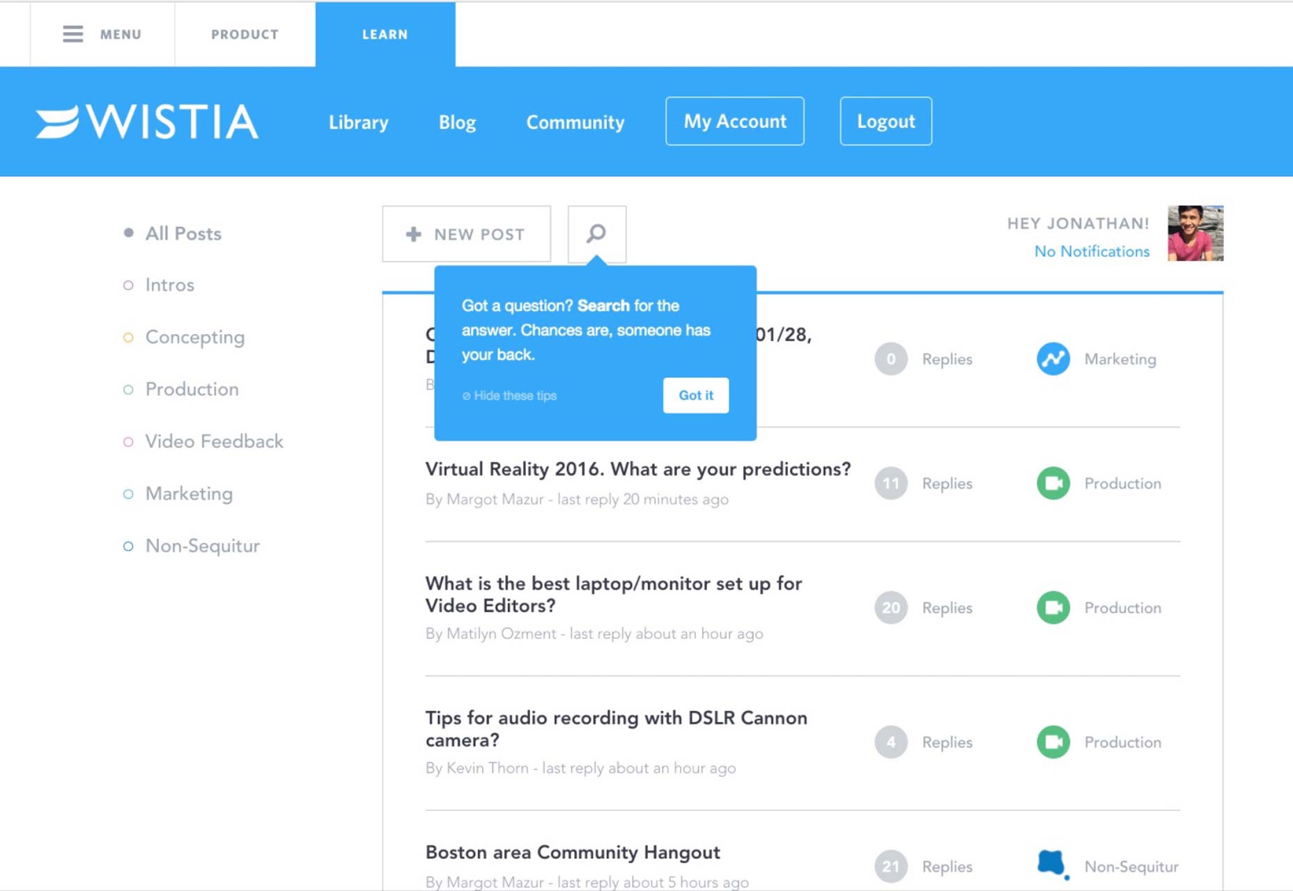 Source: Appcues
Sustainability
Your tooltip should be as helpful, unobtrusive and convenient to users the 100th time, as it was the very first time. Resist the temptation to go with questionable or clever design cues and go with tried, tested and true instead.Noticeability
Tooltips should be easy to find and see without users having to resort to any detective work on the screen. One way to achieve this is by using very obvious visual or directional cues, such as arrows going from the tooltip to the element (button, icon, etc.).Relevant and sensible information
When a tooltip appears, the info therein has to be easily understood by your users. This means short sentences with very clear language. Since the on-screen area for a tooltip is limited anyway, it’s necessary to be very concise. Nonetheless, you should also refrain from providing info that’s redundant since the info in a tooltip should only be a supplement to info that’s not immediately apparent in your interface. This can’t be stressed enough: By thinking through how you design your tooltips, you can make them live up to their purpose and avoid the worst kind of tooltip, which is the one that hampers the task you want users to accomplish smoothly.Tooltips: the epitome of microinteractions
In many ways, tooltips are the ultimate microinteractions. They help your users achieve a task or manipulate a process in an interface that you’ve designed. Depending on how you design them, you can save your users a lot of trouble or make life harder for them. Unfortunately, it can be quite easy for designers to get a tooltip wrong—to the detriment of their users. To ensure stellar tooltip design each and every time, it helps to fully understand the true nature and reason of using tooltips in the first place, along with what works in tooltip design and what doesn’t. Only then can you provide your users with the relevant information they need to efficiently understand your interface in a convenient and simple way.Marc Schenker
Marc’s a copywriter who covers design news for Web Designer Depot. Find out more about him at thegloriouscompanyltd.com.


Read Next

15 Best New Fonts, July 2024
Welcome to our monthly roundup of the best fonts we’ve found online in the last four weeks. This month, there are fewer…
By Ben Moss

20 Best New Websites, July 2024
Welcome to July’s round up of websites to inspire you. This month’s collection ranges from the most stripped-back…

Top 7 WordPress Plugins for 2024: Enhance Your Site's Performance
WordPress is a hands-down favorite of website designers and developers. Renowned for its flexibility and ease of use,…
By WDD Staff

Exciting New Tools for Designers, July 2024
Welcome to this July’s collection of tools, gathered from around the web over the past month. We hope you’ll find…

3 Essential Design Trends, July 2024
Add some summer sizzle to your design projects with trendy website elements. Learn what's trending and how to use these…

15 Best New Fonts, June 2024
Welcome to our roundup of the best new fonts we’ve found online in the last month. This month, there are notably fewer…
By Ben Moss

20 Best New Websites, June 2024
Arranging content in an easily accessible way is the backbone of any user-friendly website. A good website will present…

Exciting New Tools for Designers, June 2024
In this month’s roundup of the best tools for web designers and developers, we’ll explore a range of new and noteworthy…

3 Essential Design Trends, June 2024
Summer is off to a fun start with some highly dramatic website design trends showing up in projects. Let's dive in!

15 Best New Fonts, May 2024
In this month’s edition, there are lots of historically-inspired typefaces, more of the growing trend for French…
By Ben Moss

How to Reduce The Carbon Footprint of Your Website
On average, a web page produces 4.61 grams of CO2 for every page view; for whole sites, that amounts to hundreds of KG…
By Simon Sterne

20 Best New Websites, May 2024
Welcome to May’s compilation of the best sites on the web. This month we’re focused on color for younger humans,…