

Samantha Zhang
It’s rare to see a designer trust their content (which in this case is their work) as much as Samantha Zhang does. Many of the minimalist sites I find still depend on some gimmick or trend to set themselves apart. That approach is so common, it makes sites like this one stand out by their sheer simplicity. It’s just good type, a simple layout, and it’s done. As a UX guy, I would not be sad if most of the web looked like this. I know, I know. It’ll never happen, and that’s probably for the best.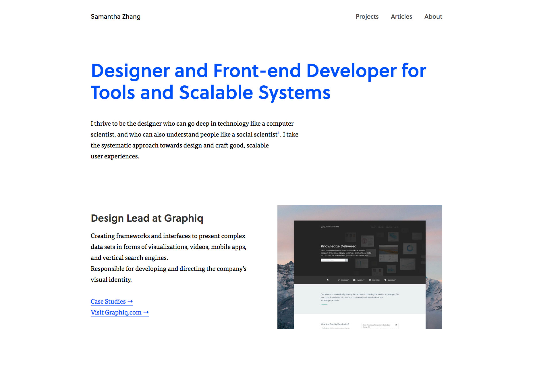
Rakesh
Like any true rock star, Rakesh only gives us his first name. He also gives us a beautiful dark interface to stare at. Like the Samantha’s site, its defining feature is great type, but it could hardly be called minimalist. It’s more like a collage of text and images that nonetheless manages to look professional, rather than purely artistic. It’s a pleasure to read through.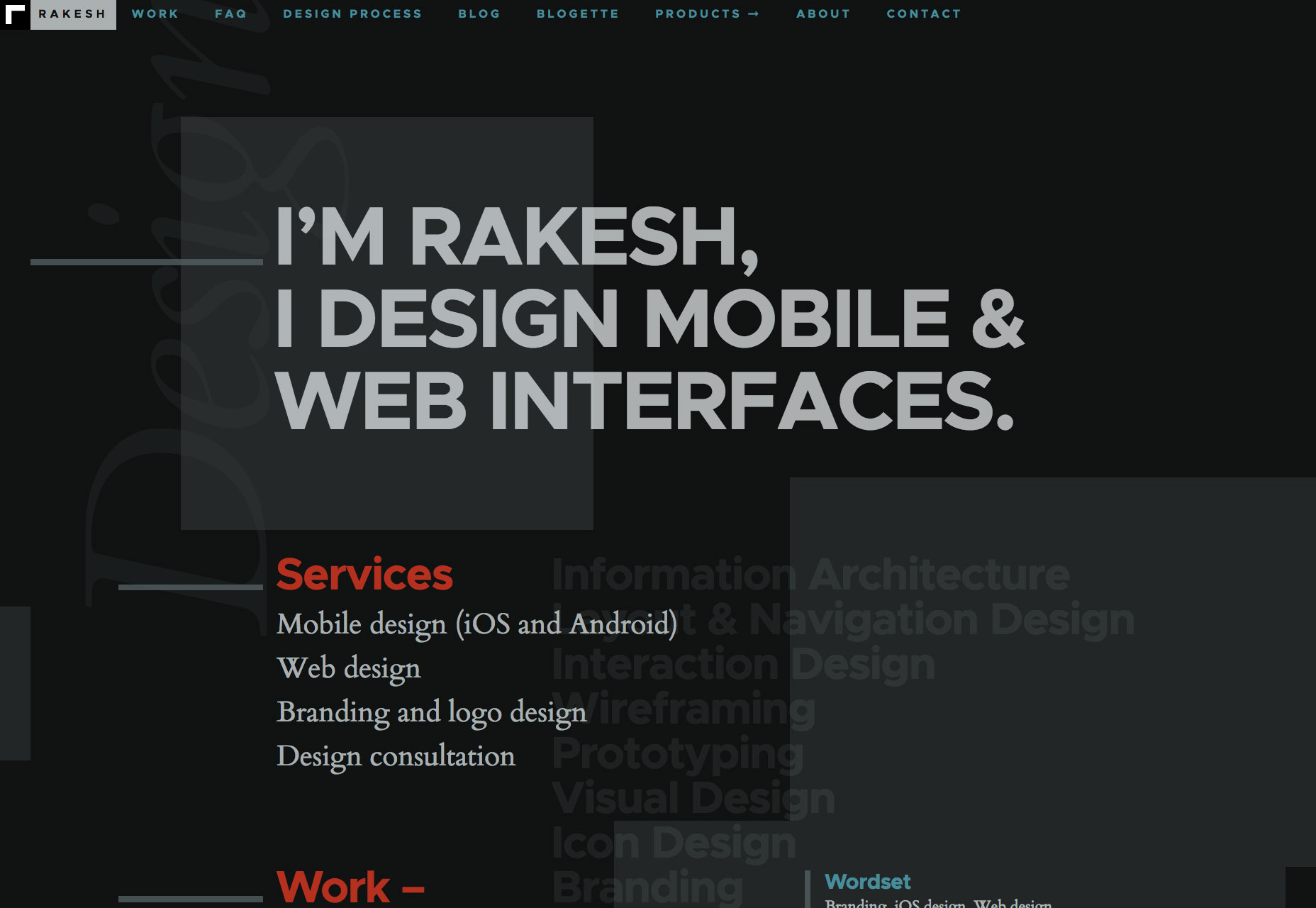
Clearleft
Here’s a big one! In the minds of many Clearleft will always be “those web standards guys”. That’s still a big part of their identity, but it’s only one part of their identity these days. To reflect that, they’ve updated their site bigtime. It looks a bit more semi-corporate now, with a clear focus on selling to larger clients (which makes sense, considering…). The actual portfolio section of the site is consequently made up of full-blown case studies. The whole site… well do I really need to tell you it looks good? It’s Clearleft. Just go look.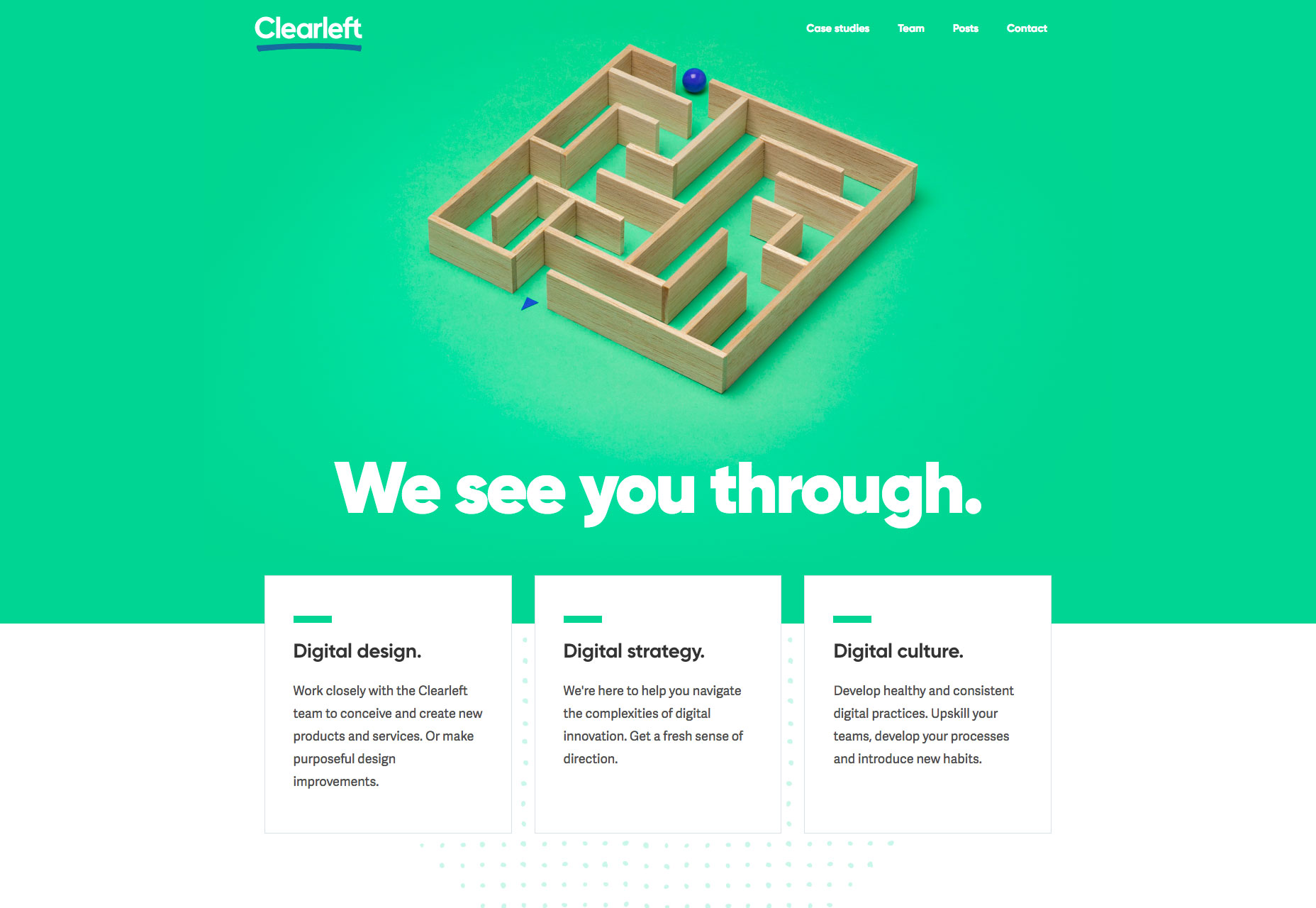
Tobias van Schneider
Tobias van Schneider kept things dead simple when he designed his site. It’s big, fat text, and lots of photos. Okay, that does nothing to describe the skill behind his use of big fat text and photos, which is considerable. There’s lots of contrast, it’s all easy to read, and the whole site is well organized. It has to be. It needs to show off his his aried skillsets and projects, after all. Tobias is no one-trick-pony, and I think this site does a great job of conveying this.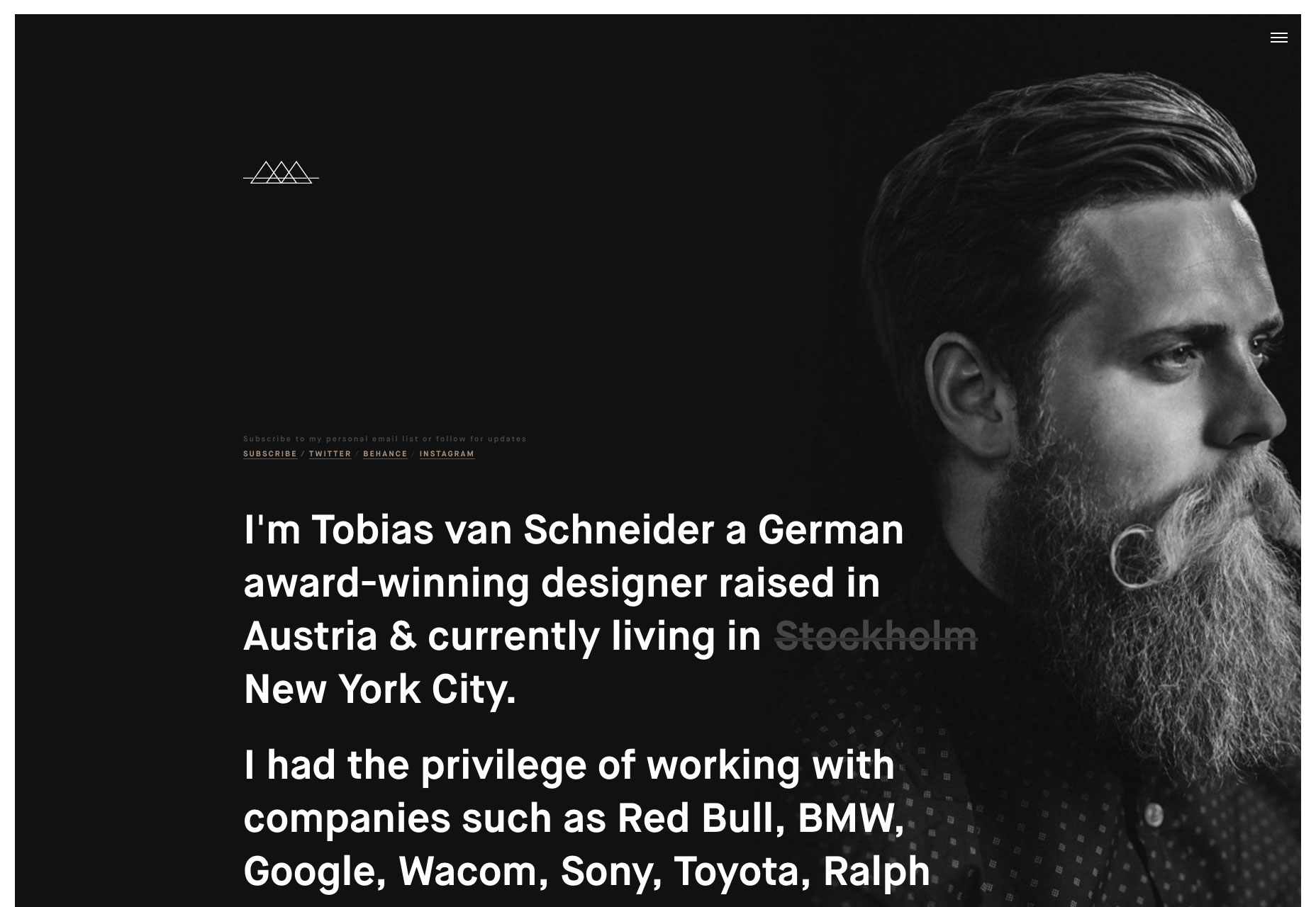
P22
P22 is one of those sites that looks dead simple until you start actually navigating through it. The classic type-and-borders look hides some well-executed animation, and other JS-based touches that enhance the experience.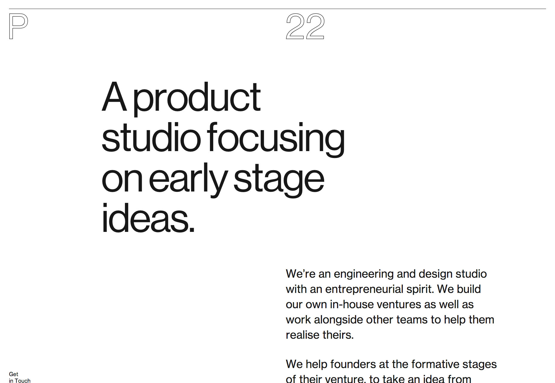
Alexis Facca
Alexis Facca’s site showcases its sense of style in its organization, type, and animation. Most notably, it uses page transitions designed to look like distortion. I happen to think it’s cool. If there was ever an example or brutalism that actually looked good, this might be it. Or maybe it’s just minimalism with a “digital” flavor.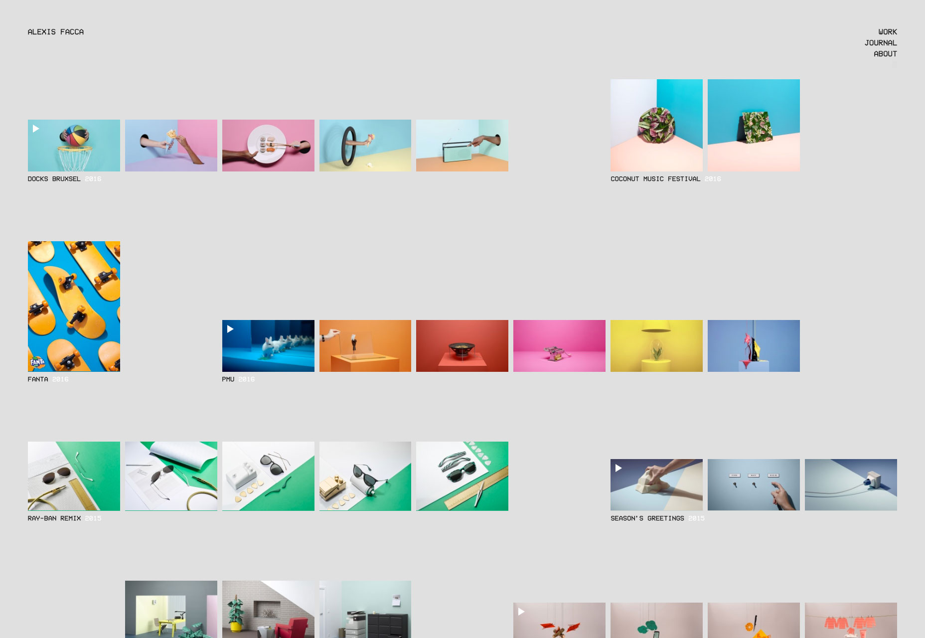
Volkhaus
Volkhaus is another site that is very minimalist, but distinguishes itself (at least on its home page) with animation.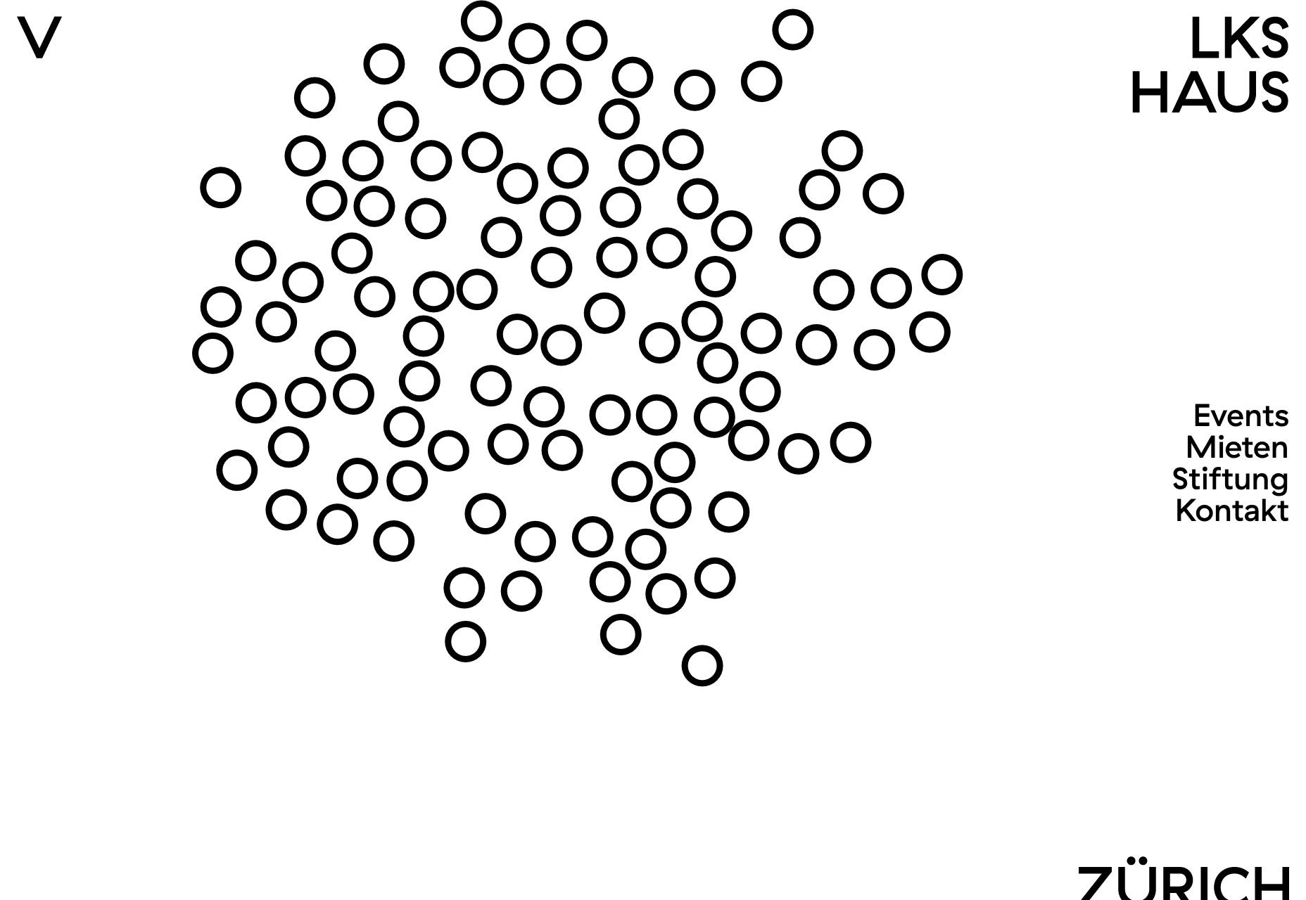
Paack
Paack give us some more of that asymmetrical minimalism with a nice twist: it scrolls horizontally. Horizontal scrolling is hardly a good idea for most sites, but for sites with relatively little content, it works. Pro tip: Paack remaps the scroll wheel to work properly with horizontal scrolling. Be like Paack. Don’t just rely on a gimmick. Pay attention to the details.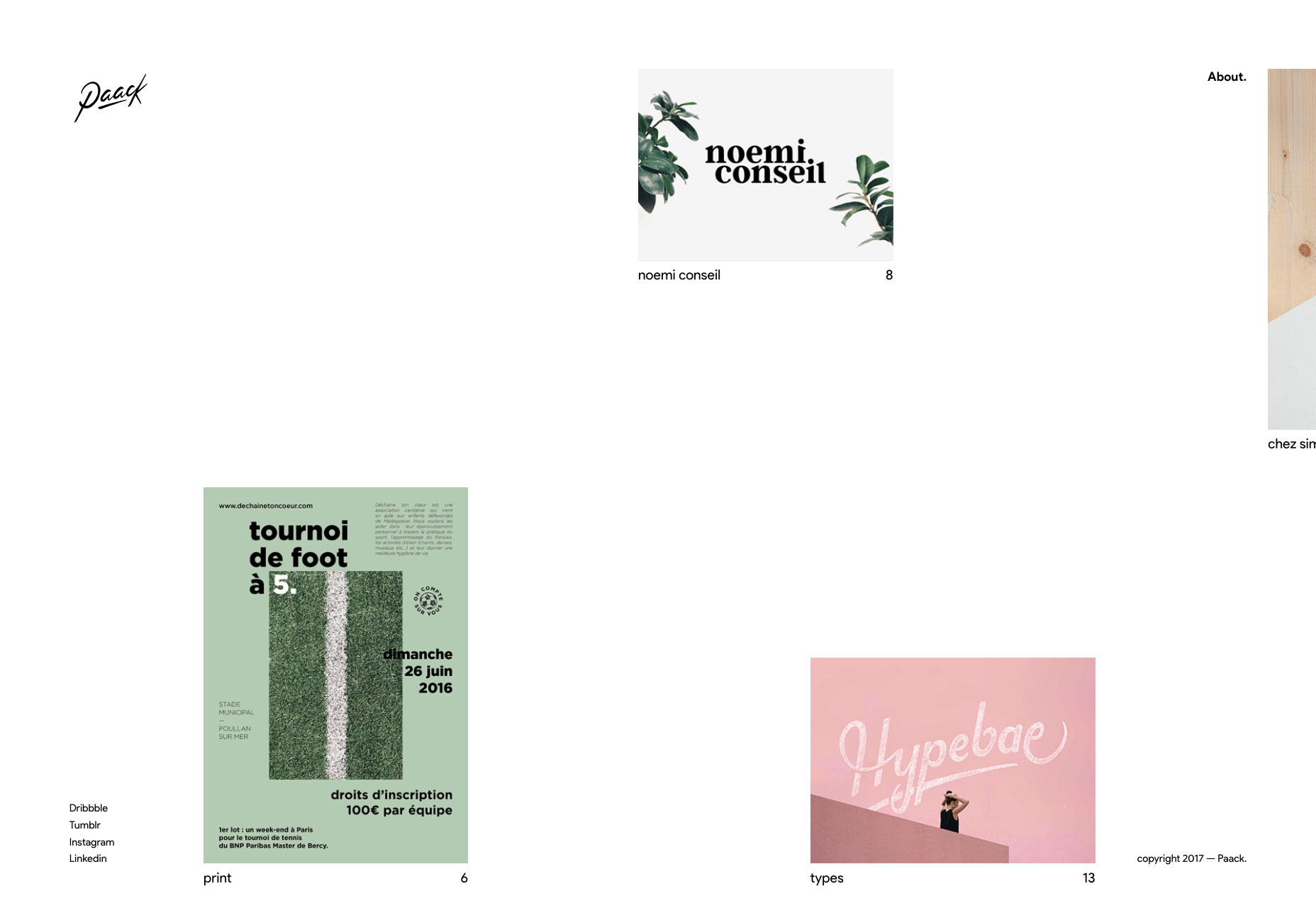
Grant Burke
Grant Burke’s portfolio is text heavy, and mixes a dead-simple premise with a striking shade of gold-ish yellow. That’s right, yellow is back, baby, and cheating its way onto this list. His site also works perfectly with JS turned off. My only complaint is the needlessly small text. I can see why it was done in this case, but it’s still not great. Otherwise, this site ticks pretty much all of my personal boxes.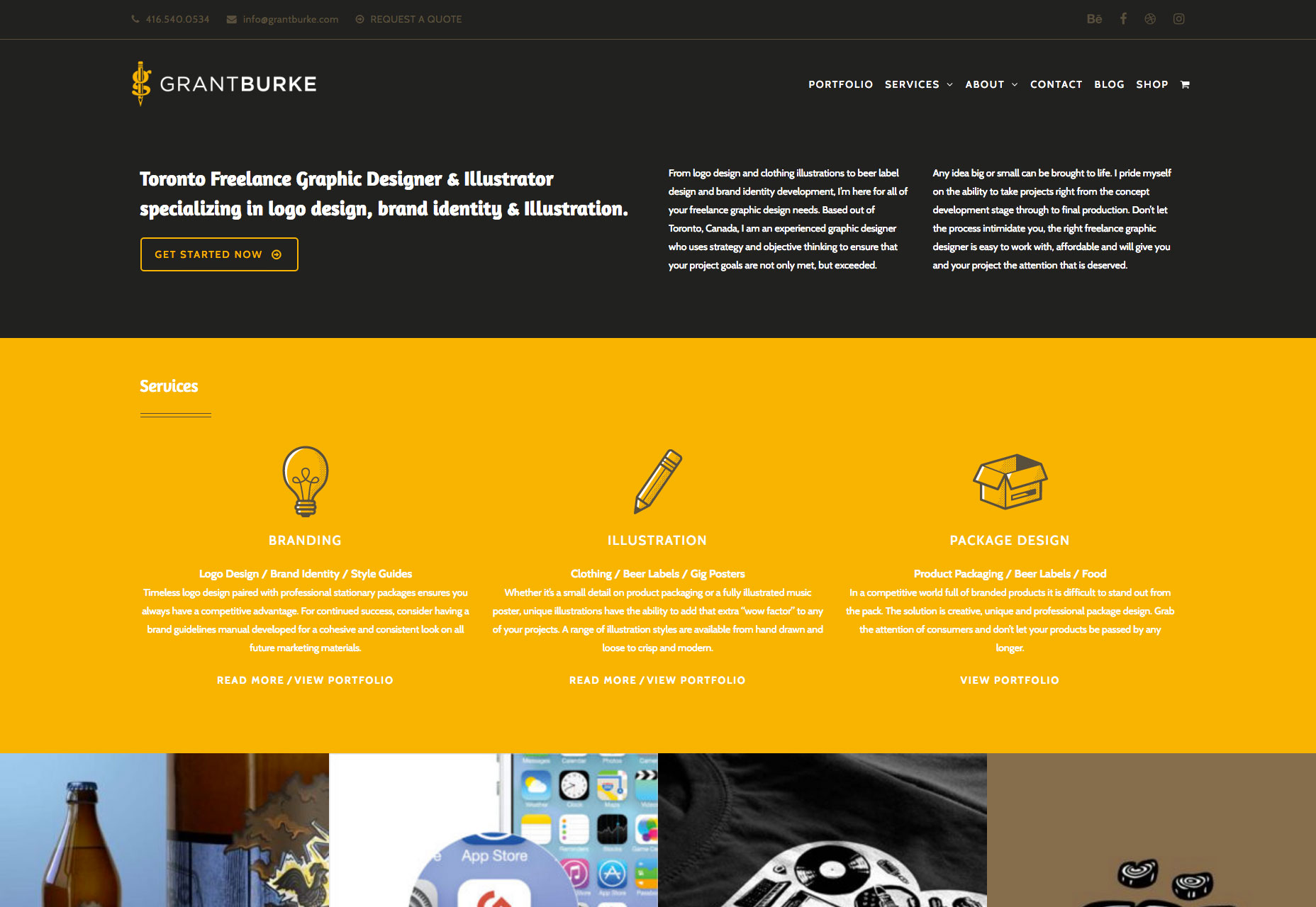
Maison Carnot
This site is a living, breathing current trend! Asymmetry! Text overlapping on stuff! Serif headings and sans content! No, but really, it looks great, and you should steal ideas from it. It just also happens to be the epitome of current design trends, and I can’t help but be a bit sarcastic.
sguardiostinati
sguardiostinati. I don’t know if that’s a person’s name or what, but it seems to be the name of a small film studio in Italy. Their site looks a bit like a spreadsheet or database at first glance, with the rows expanding to show you what each project is about. Okay, that sounds boring, but it’s a surprisingly elegant approach, and it’s elegantly styled as well.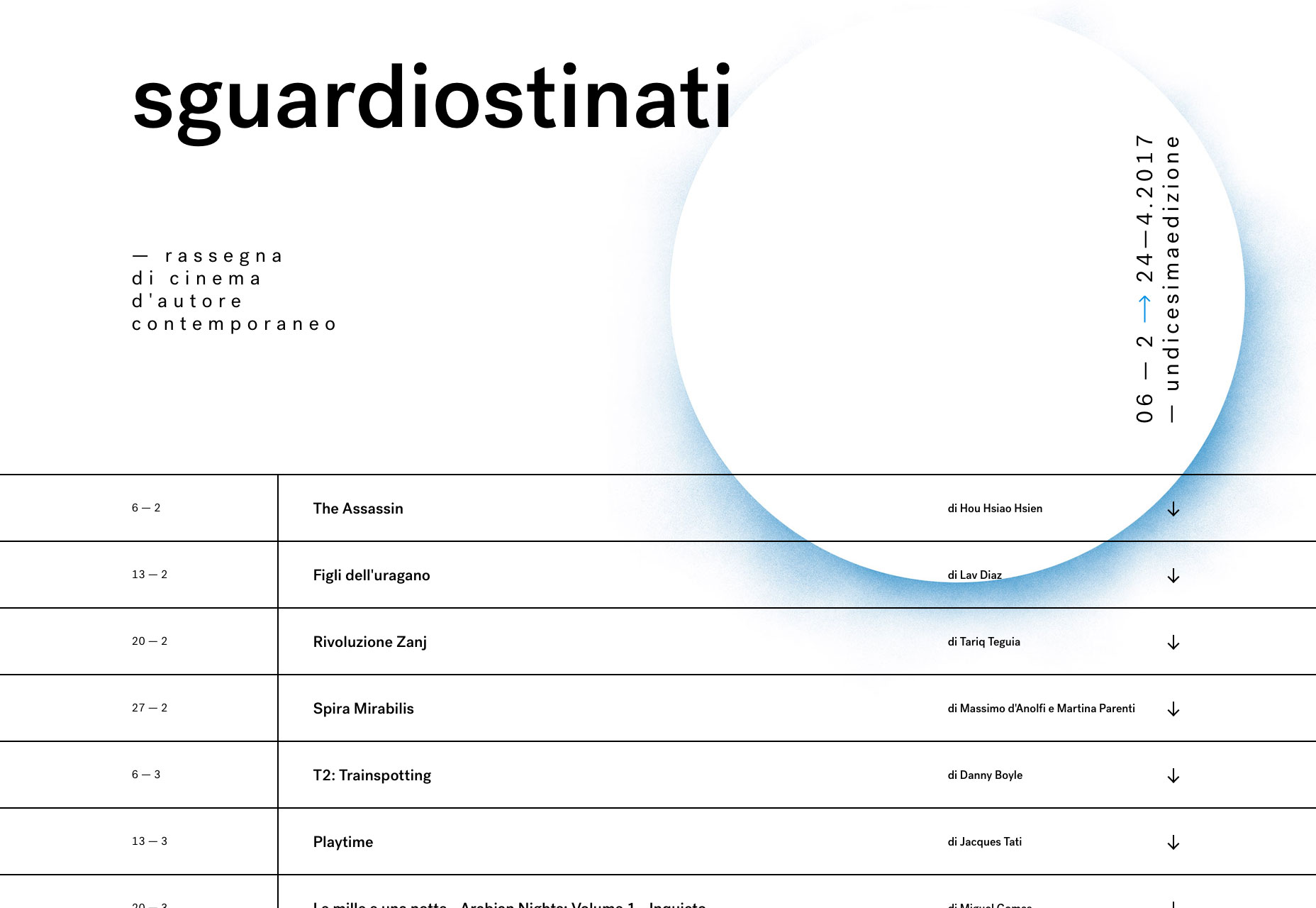
Moreau Kusunoki
Moreau Kusunoki’s portfolio defies current trends by, well, using a grid. That’s the great circle of life, really. For this architectural portfolio, the grid is thematically appropriate, and well executed. If you want a bit more detail, however, you can switch to “list view” which looks a bit like (can you guess where I’m going?) a spreadsheet. It turns out that one of the most efficient ways of displaying information at a glance is becoming more popular on the web. Who knew? The hilarious thing is that I don’t think anyone will ever use tables for it.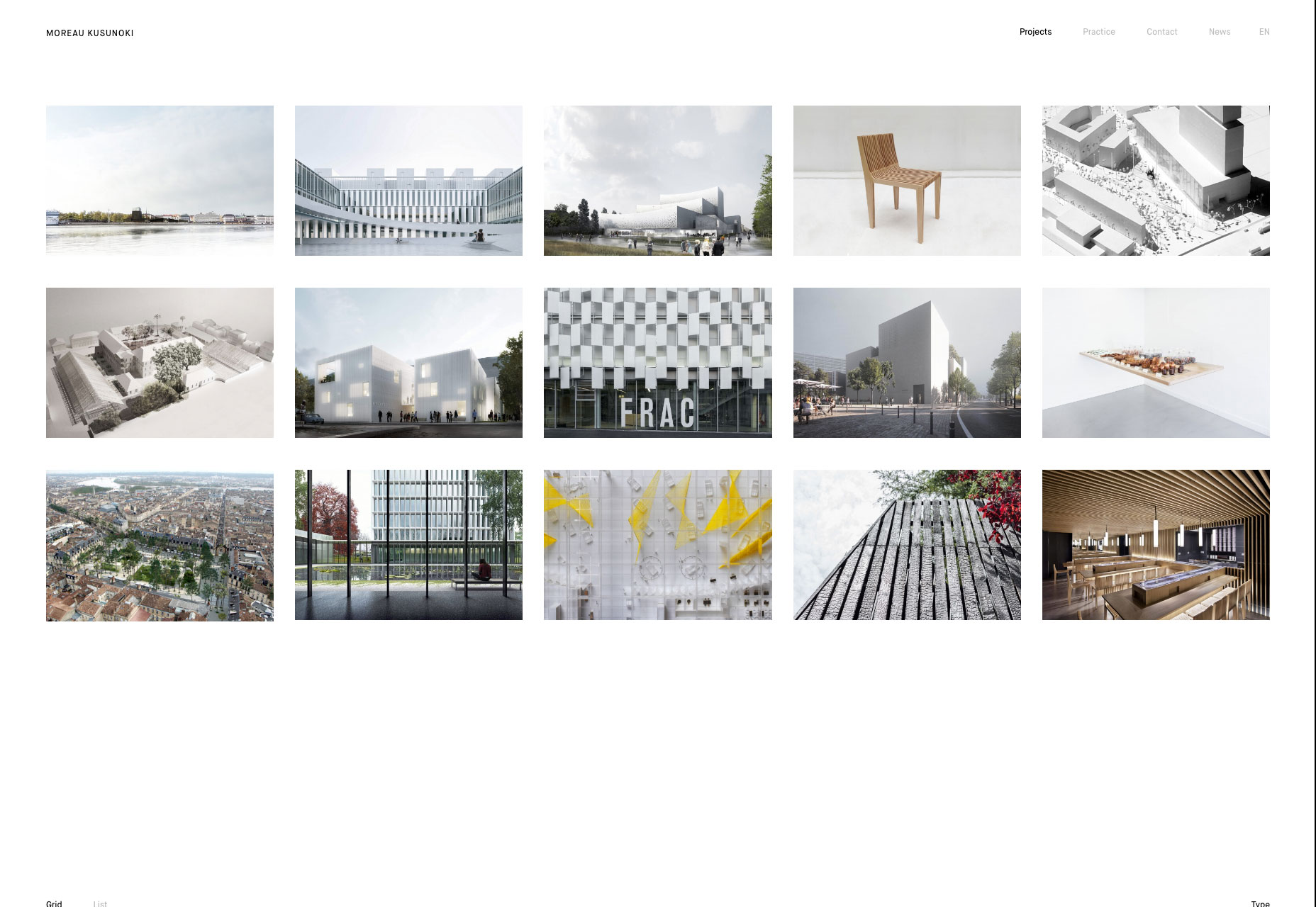
Anagram
I don’t normally advocate preloaders or heavy JS, but Anagram is getting a free pass. I mean, the site looks great. That’s part of it, but it’s not why they get a free pass. Go to the page. Click and drag it, or swipe through it on your phone. See that effect? That’s why they get a free pass. Whomever does this next won’t, but they do. It’s just that much fun.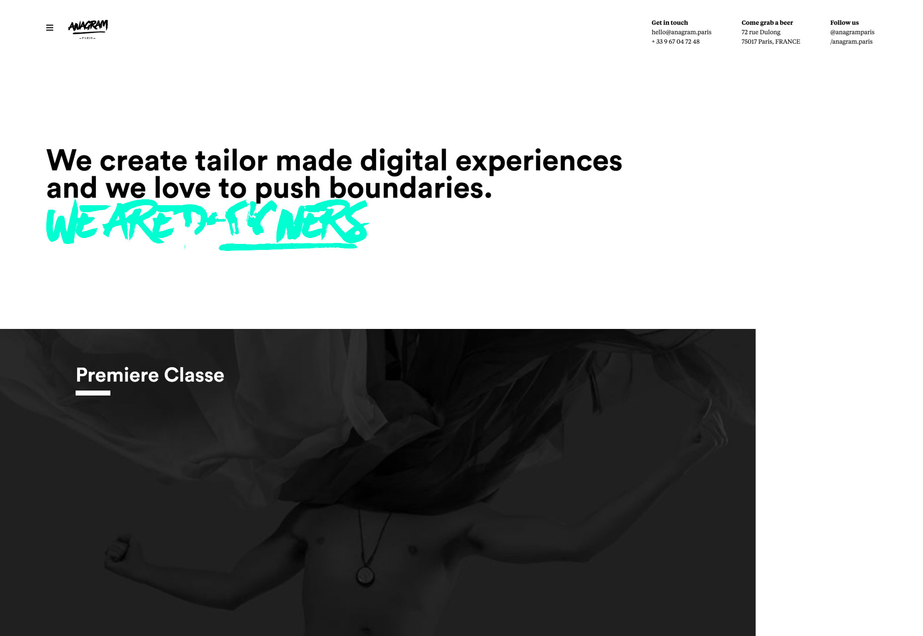
Juliette Neveu
Juliette Neveu’s portfolio brings us yet more of the now-popular minimalist-but-asymetrical style. It’s modern. It defies conventional grid layouts. It’s pretty. Most importantly, it fits rather well with the style of her client work.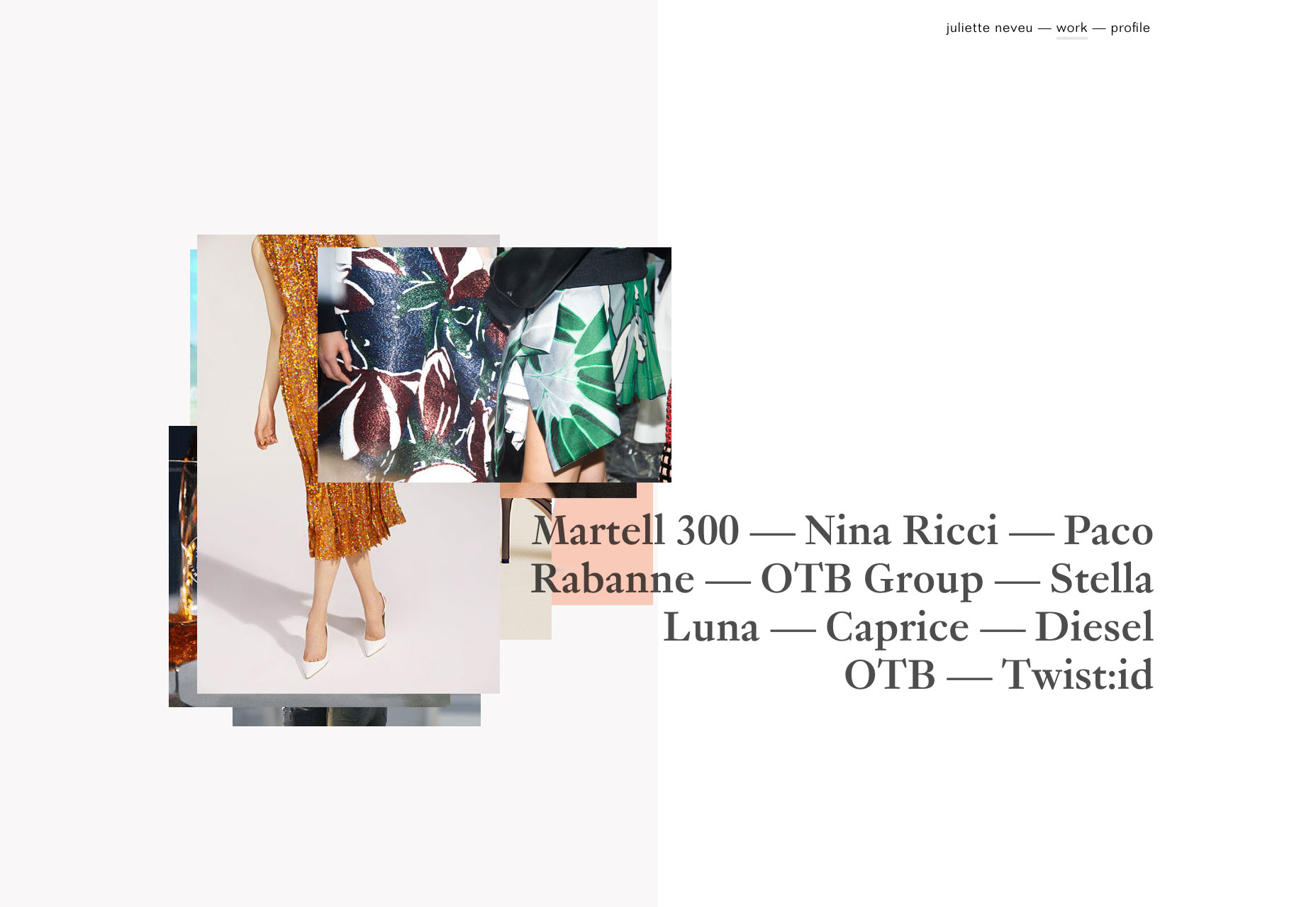
Veintidos Grados
Veintidos Grados presents a clean, dark design with plenty of animation. There’s a lot to this one, so it’s hard to describe properly, but it’s worth going in and checking out all of the little details.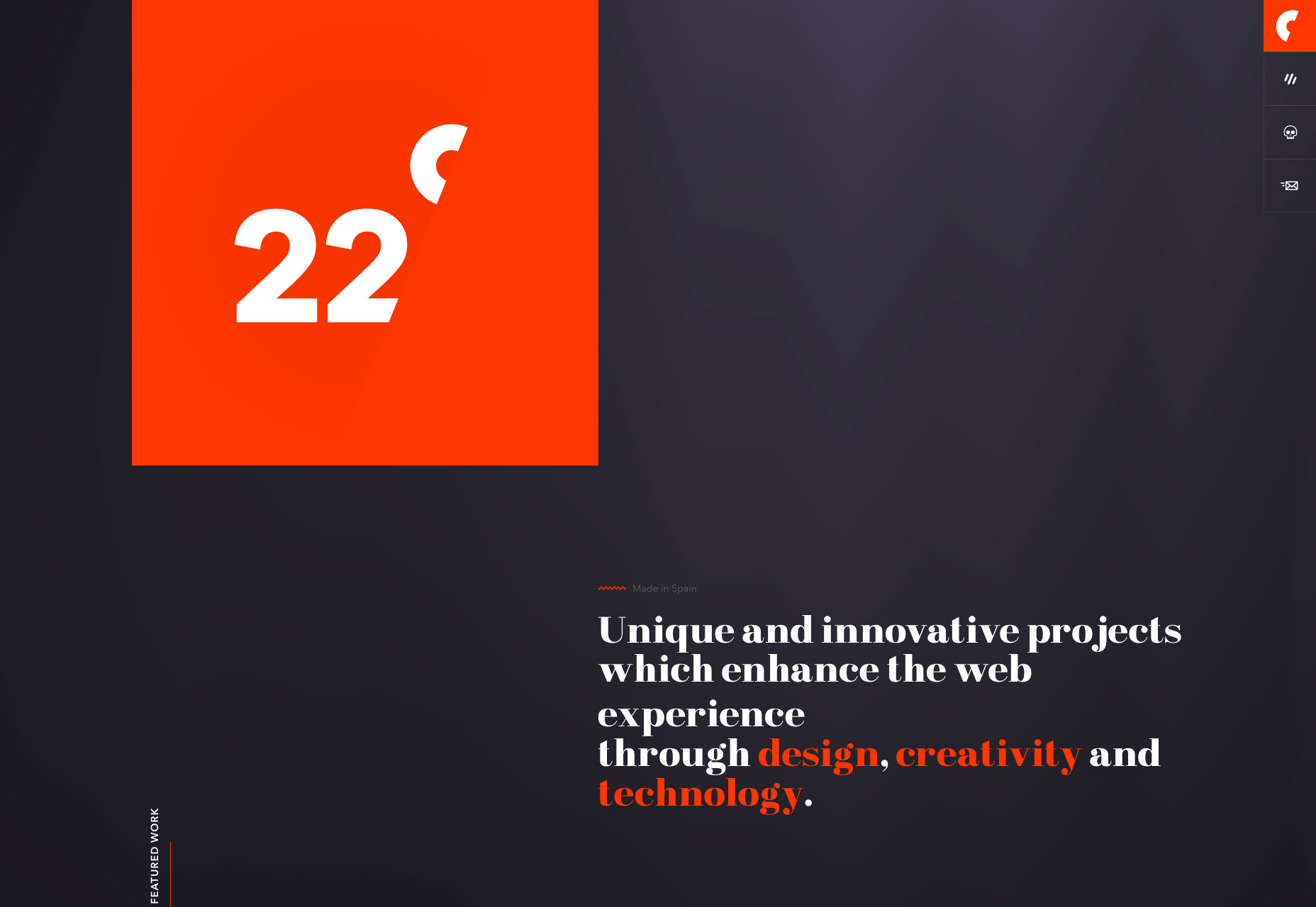
Heydays
Heydays takes a bold risk by making their portfolio a slideshow. That’s it, by the way. Just a full-screen slideshow, with some navigation scattered along the edges. It makes a bold impression, to be sure.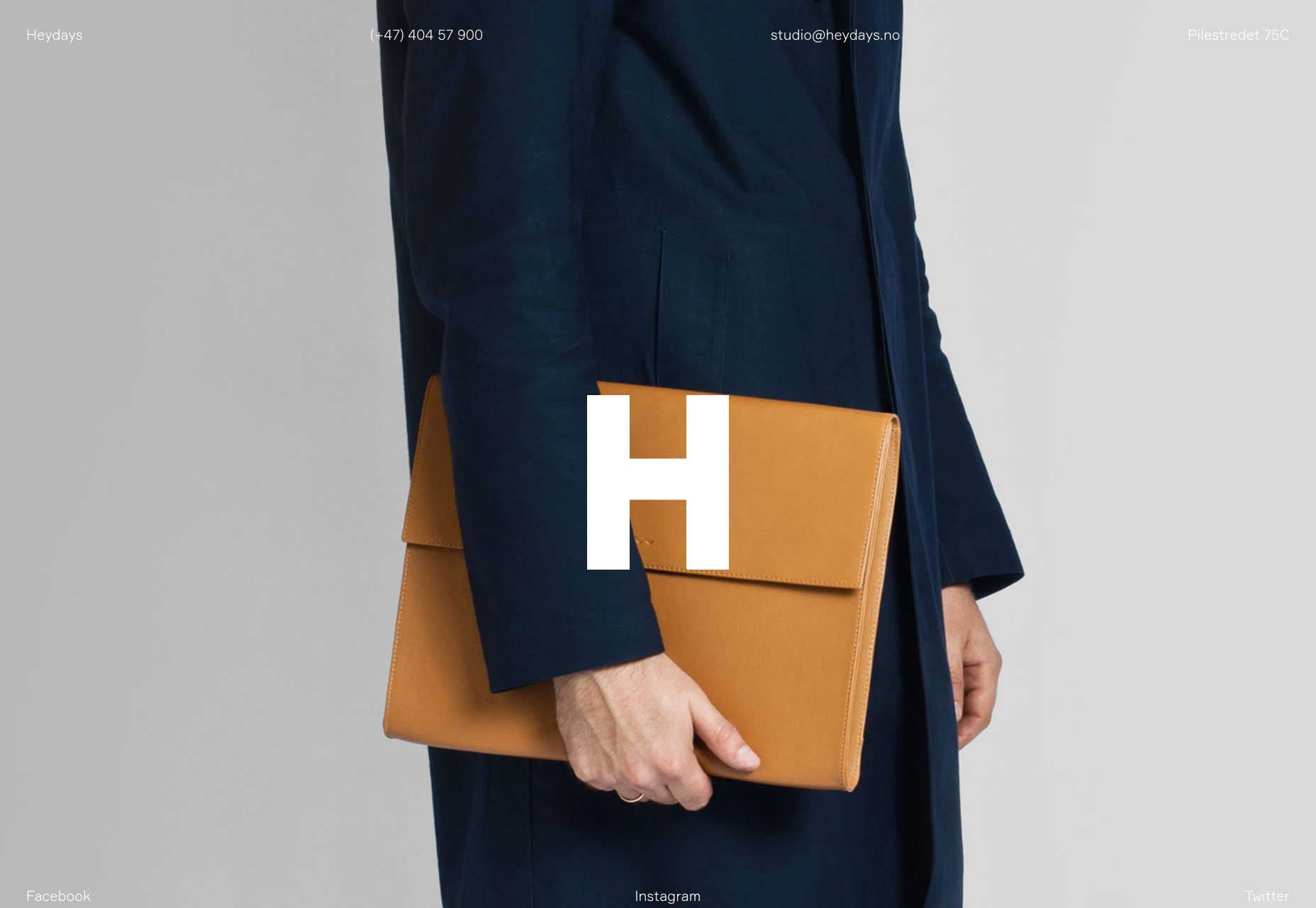
Alessandro Carpellini
Alessandro’s portfolio has a similar slideshow setup, but it’s restricted to the header of the site. There’s text below for anyone who wants to know more. It’s still bold, but doesn’t lack for relevant information.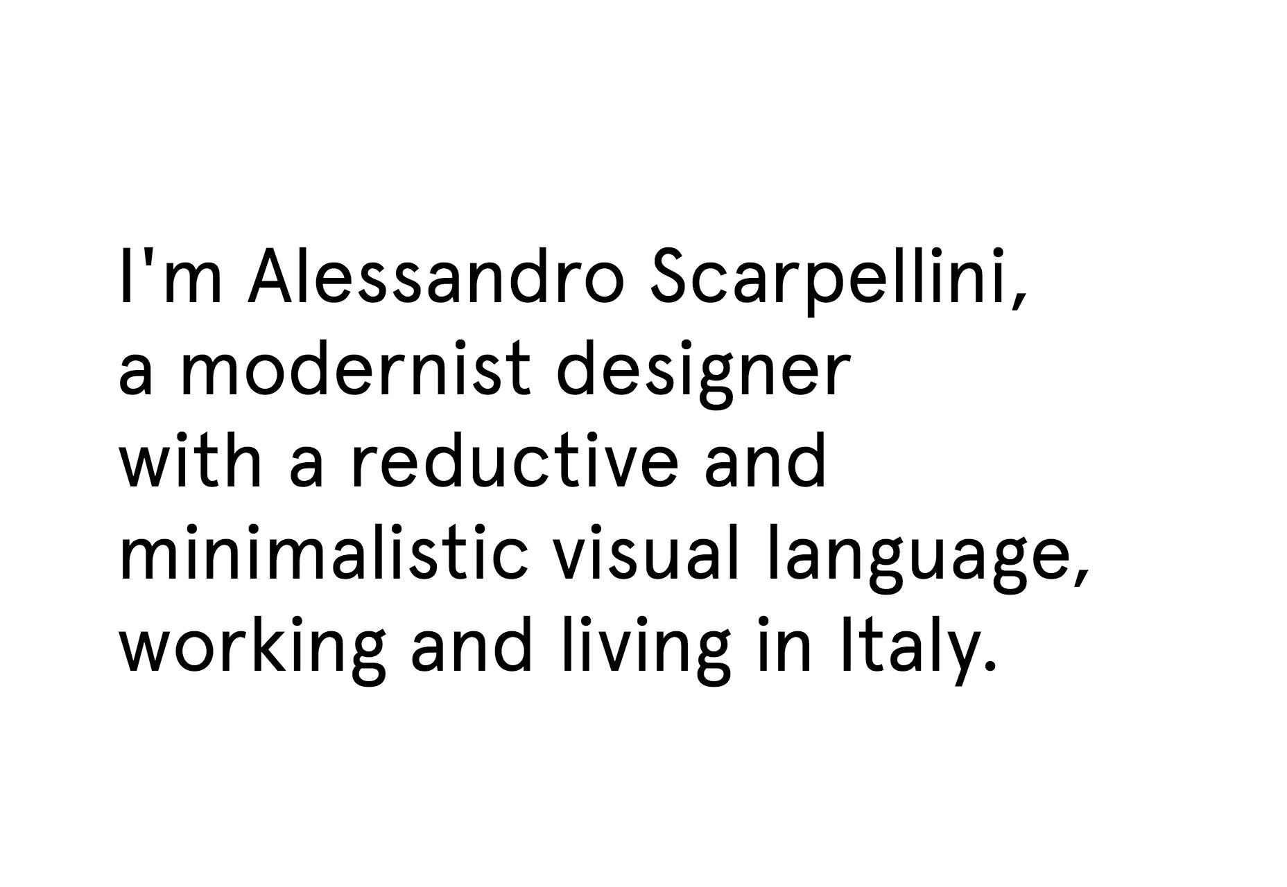
Hum Creative
Okay, I’ve talked about how bored I’m getting with the trends featured on this site, but Hum Creative is still great. It’s peak trend, with its minimalist, asymmetry, and navigation scattered to the four corners of the screen, but it’s just so beautifully executed, that I had to include it here. What really pushed this site over the top for me were the little details. There is a wave in the middle of the “H” when you scroll. There are custom-branded mouse cursors that don’t seem over the top or irritating. There is a minimum of stylish animation. And then there are the screen savers. Yes, screen savers. They show up if you haven’t interacted with the site for a while. This would be really irritating on a text-heavy site, but here it’s kind of amusing.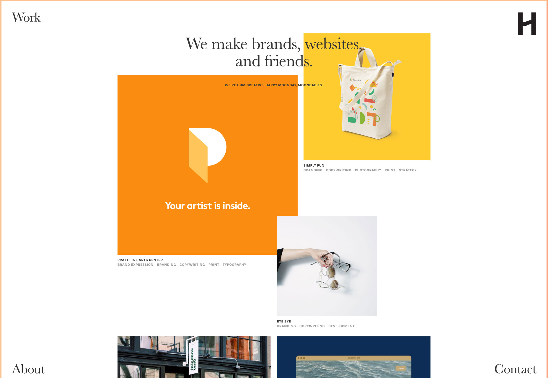
Ezequiel Bruni
Ezequiel Bruni is a web/UX designer, blogger, and aspiring photographer living in Mexico. When he’s not up to his finely-chiselled ears in wire-frames and front-end code, or ranting about the same, he indulges in beer, pizza, fantasy novels, and stand-up comedy.


Read Next

15 Best New Fonts, July 2024
Welcome to our monthly roundup of the best fonts we’ve found online in the last four weeks. This month, there are fewer…
By Ben Moss

20 Best New Websites, July 2024
Welcome to July’s round up of websites to inspire you. This month’s collection ranges from the most stripped-back…

Top 7 WordPress Plugins for 2024: Enhance Your Site's Performance
WordPress is a hands-down favorite of website designers and developers. Renowned for its flexibility and ease of use,…
By WDD Staff

Exciting New Tools for Designers, July 2024
Welcome to this July’s collection of tools, gathered from around the web over the past month. We hope you’ll find…

3 Essential Design Trends, July 2024
Add some summer sizzle to your design projects with trendy website elements. Learn what's trending and how to use these…

15 Best New Fonts, June 2024
Welcome to our roundup of the best new fonts we’ve found online in the last month. This month, there are notably fewer…
By Ben Moss

20 Best New Websites, June 2024
Arranging content in an easily accessible way is the backbone of any user-friendly website. A good website will present…

Exciting New Tools for Designers, June 2024
In this month’s roundup of the best tools for web designers and developers, we’ll explore a range of new and noteworthy…

3 Essential Design Trends, June 2024
Summer is off to a fun start with some highly dramatic website design trends showing up in projects. Let's dive in!

15 Best New Fonts, May 2024
In this month’s edition, there are lots of historically-inspired typefaces, more of the growing trend for French…
By Ben Moss

How to Reduce The Carbon Footprint of Your Website
On average, a web page produces 4.61 grams of CO2 for every page view; for whole sites, that amounts to hundreds of KG…
By Simon Sterne

20 Best New Websites, May 2024
Welcome to May’s compilation of the best sites on the web. This month we’re focused on color for younger humans,…