

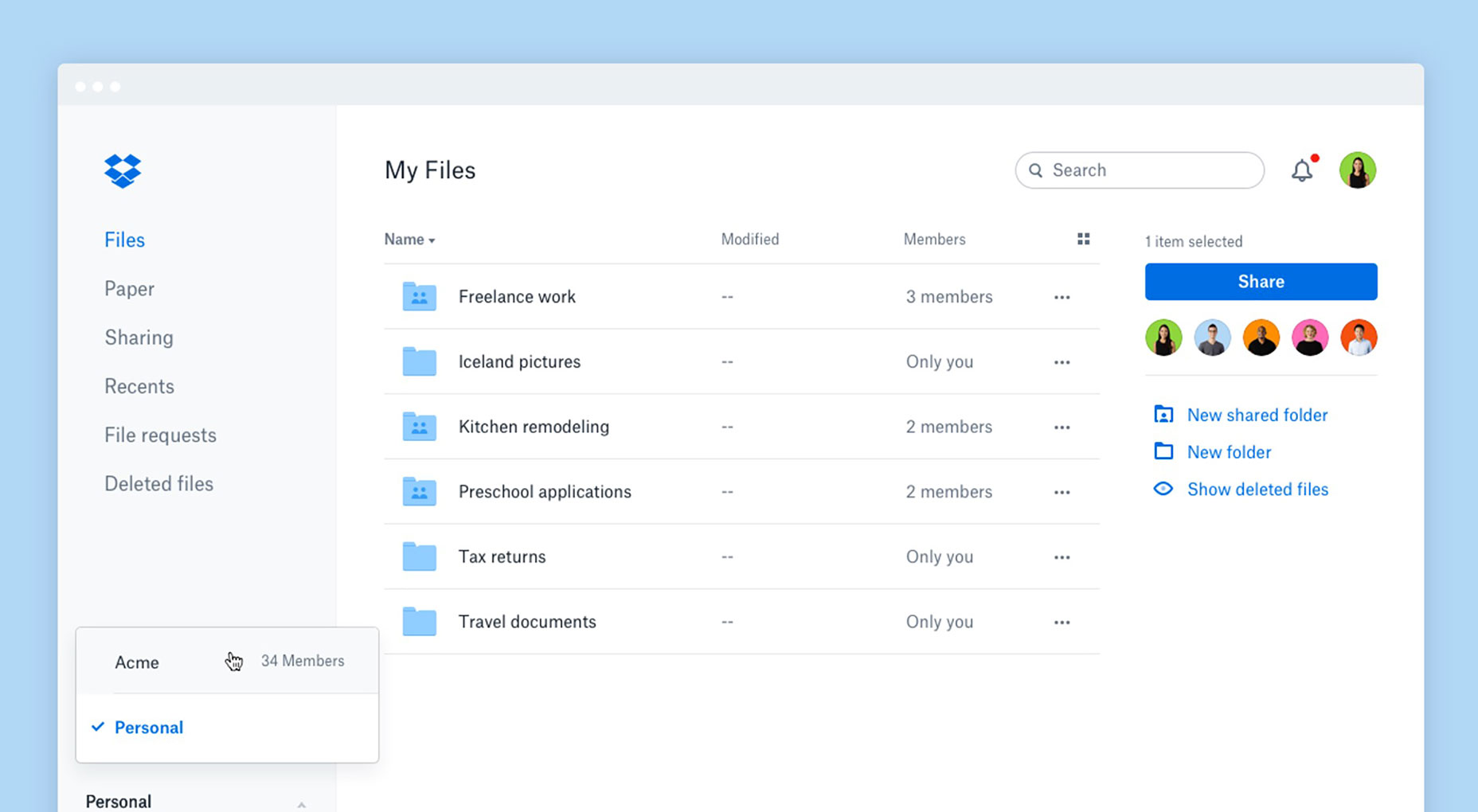
 To achieve these UX goals, the company decided to simplify its navigation. This allows users to avoid the long conversations through email and instead share Paper documents and files, leave feedback, and quickly see any status updates—all from the Dropbox interface.
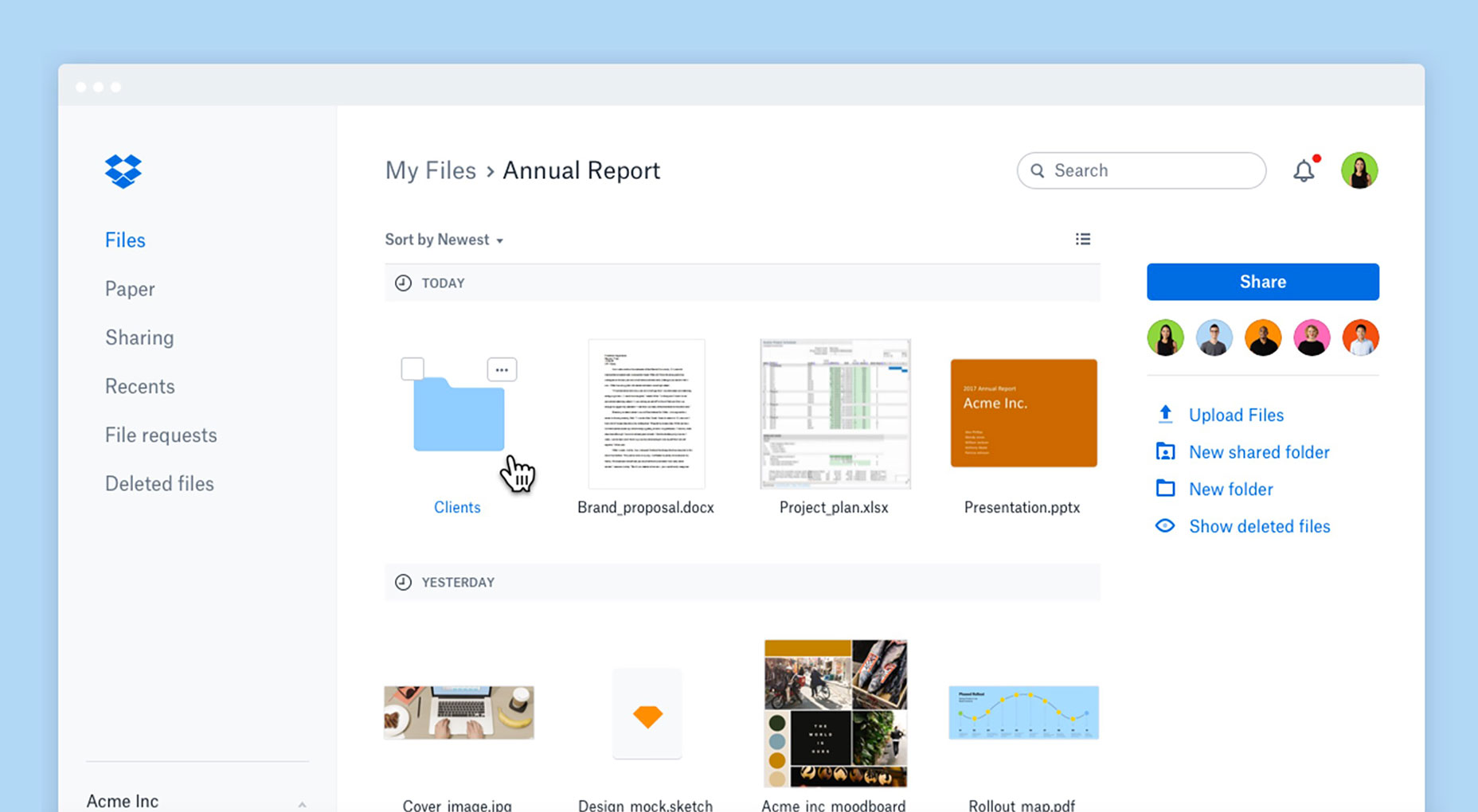
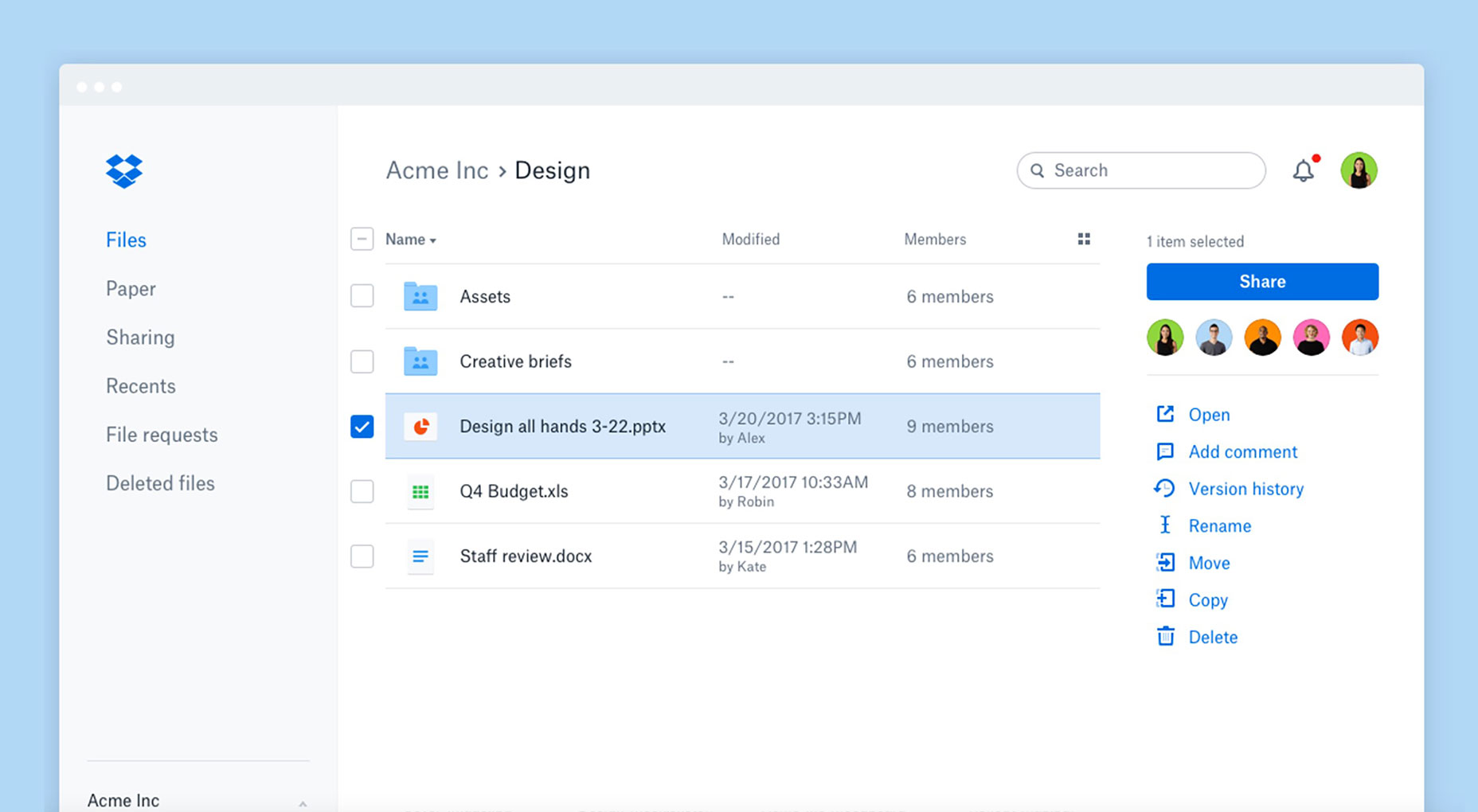
The toolbar has also gotten a facelift. Now, only the pertinent, next steps for a user’s workflows are displayed, based on his selections.
As a result, users should be able to get more work done and work faster, as the navigation now produces less friction.
The way information is presented to users is also improved. There’s more information on tap at a glance; users are now allowed to use a thumbnail view to visually browse their files, as well as check who is collaborating with them on shared files and folders.
To achieve these UX goals, the company decided to simplify its navigation. This allows users to avoid the long conversations through email and instead share Paper documents and files, leave feedback, and quickly see any status updates—all from the Dropbox interface.
The toolbar has also gotten a facelift. Now, only the pertinent, next steps for a user’s workflows are displayed, based on his selections.
As a result, users should be able to get more work done and work faster, as the navigation now produces less friction.
The way information is presented to users is also improved. There’s more information on tap at a glance; users are now allowed to use a thumbnail view to visually browse their files, as well as check who is collaborating with them on shared files and folders.
 If you’ve ever searched on Dropbox before, you’ll remember that it wasn’t always the most intuitive feature. Thanks to this redesign, Dropbox search surfaces results across both Dropbox Paper documents and users’ files.
Sometimes, it gets hard to differentiate between work and personal tasks when you’re using cloud services like Dropbox. Part of that has to do with the interface not making distinct enough separations.
Dropbox’s overhaul offers clearer account separation, letting users distinguish between their work and personal accounts with greater ease. One of the biggest differences is that users will only see their specific search and notifications for the account that they’ve signed into.
If you’ve ever searched on Dropbox before, you’ll remember that it wasn’t always the most intuitive feature. Thanks to this redesign, Dropbox search surfaces results across both Dropbox Paper documents and users’ files.
Sometimes, it gets hard to differentiate between work and personal tasks when you’re using cloud services like Dropbox. Part of that has to do with the interface not making distinct enough separations.
Dropbox’s overhaul offers clearer account separation, letting users distinguish between their work and personal accounts with greater ease. One of the biggest differences is that users will only see their specific search and notifications for the account that they’ve signed into.
 Overall, these design changes should turn Dropbox into a better organized cloud-sharing service that streamlines tasks and therefore improves the UX.
The company’s not done, though. In the near future, you can expect to see a new administration console that will improve how Dropbox Business’ administrators manage their teams.
For more detailed info on how users can get the most from the redesign, see this overview.
Overall, these design changes should turn Dropbox into a better organized cloud-sharing service that streamlines tasks and therefore improves the UX.
The company’s not done, though. In the near future, you can expect to see a new administration console that will improve how Dropbox Business’ administrators manage their teams.
For more detailed info on how users can get the most from the redesign, see this overview.
Marc Schenker
Marc’s a copywriter who covers design news for Web Designer Depot. Find out more about him at thegloriouscompanyltd.com.


Read Next

15 Best New Fonts, July 2024
Welcome to our monthly roundup of the best fonts we’ve found online in the last four weeks. This month, there are fewer…
By Ben Moss

20 Best New Websites, July 2024
Welcome to July’s round up of websites to inspire you. This month’s collection ranges from the most stripped-back…

Top 7 WordPress Plugins for 2024: Enhance Your Site's Performance
WordPress is a hands-down favorite of website designers and developers. Renowned for its flexibility and ease of use,…
By WDD Staff

Exciting New Tools for Designers, July 2024
Welcome to this July’s collection of tools, gathered from around the web over the past month. We hope you’ll find…

3 Essential Design Trends, July 2024
Add some summer sizzle to your design projects with trendy website elements. Learn what's trending and how to use these…

15 Best New Fonts, June 2024
Welcome to our roundup of the best new fonts we’ve found online in the last month. This month, there are notably fewer…
By Ben Moss

20 Best New Websites, June 2024
Arranging content in an easily accessible way is the backbone of any user-friendly website. A good website will present…

Exciting New Tools for Designers, June 2024
In this month’s roundup of the best tools for web designers and developers, we’ll explore a range of new and noteworthy…

3 Essential Design Trends, June 2024
Summer is off to a fun start with some highly dramatic website design trends showing up in projects. Let's dive in!

15 Best New Fonts, May 2024
In this month’s edition, there are lots of historically-inspired typefaces, more of the growing trend for French…
By Ben Moss

How to Reduce The Carbon Footprint of Your Website
On average, a web page produces 4.61 grams of CO2 for every page view; for whole sites, that amounts to hundreds of KG…
By Simon Sterne

20 Best New Websites, May 2024
Welcome to May’s compilation of the best sites on the web. This month we’re focused on color for younger humans,…