

The “Don’ts”
Bandwagon-hopping
Following trends isn’t an inherently bad thing. Right now, trends are basically what push web design forward. It’s how we went from “Web 2.0” gradients to skeuomorphism, and then on to flat design, and beyond. People following trends, and the inevitable backlash to people following trends are what keep the discipline alive, interesting, and ever-changing. More recently, trends are how we ended up with some highly creative post-modern style sites: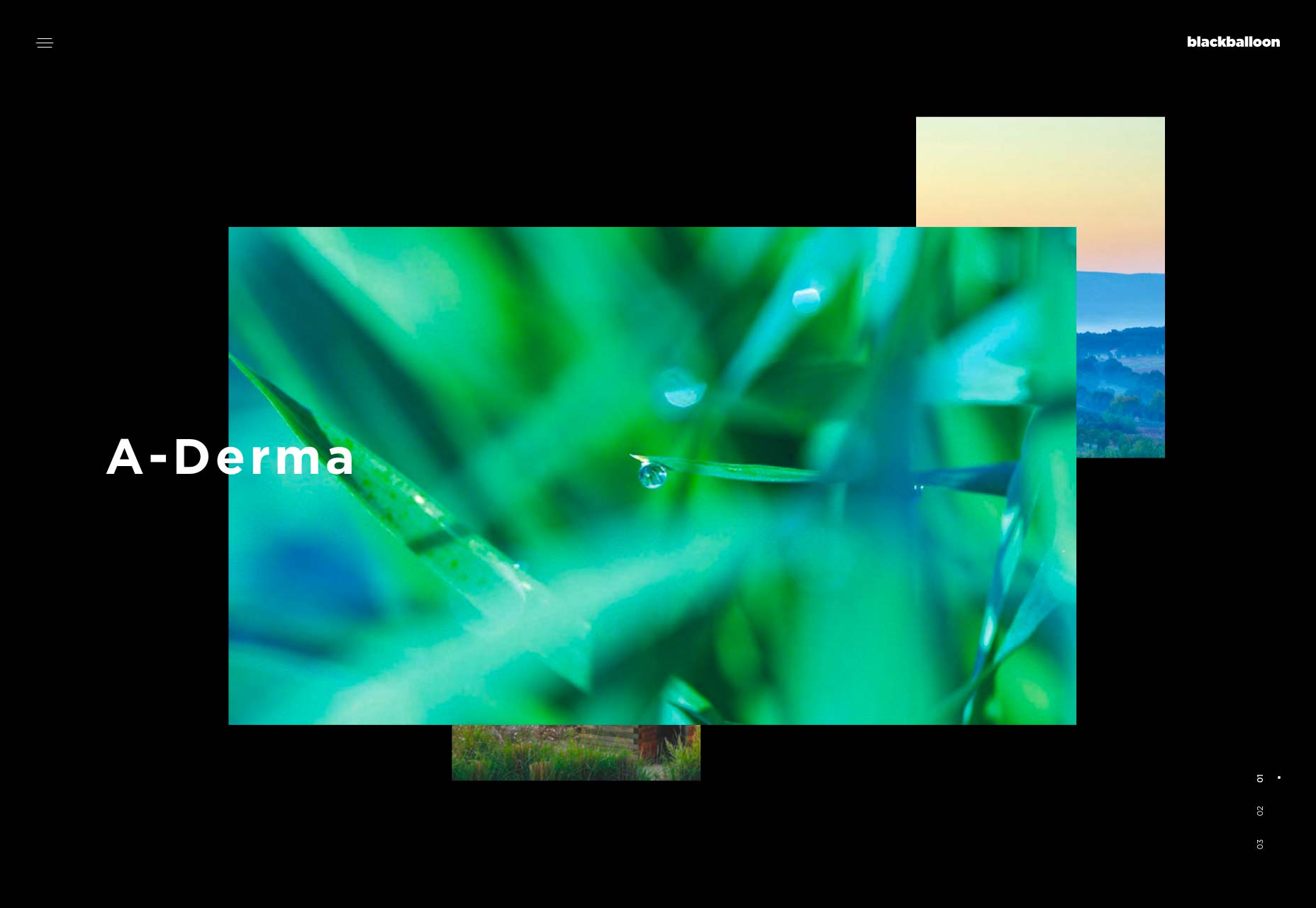
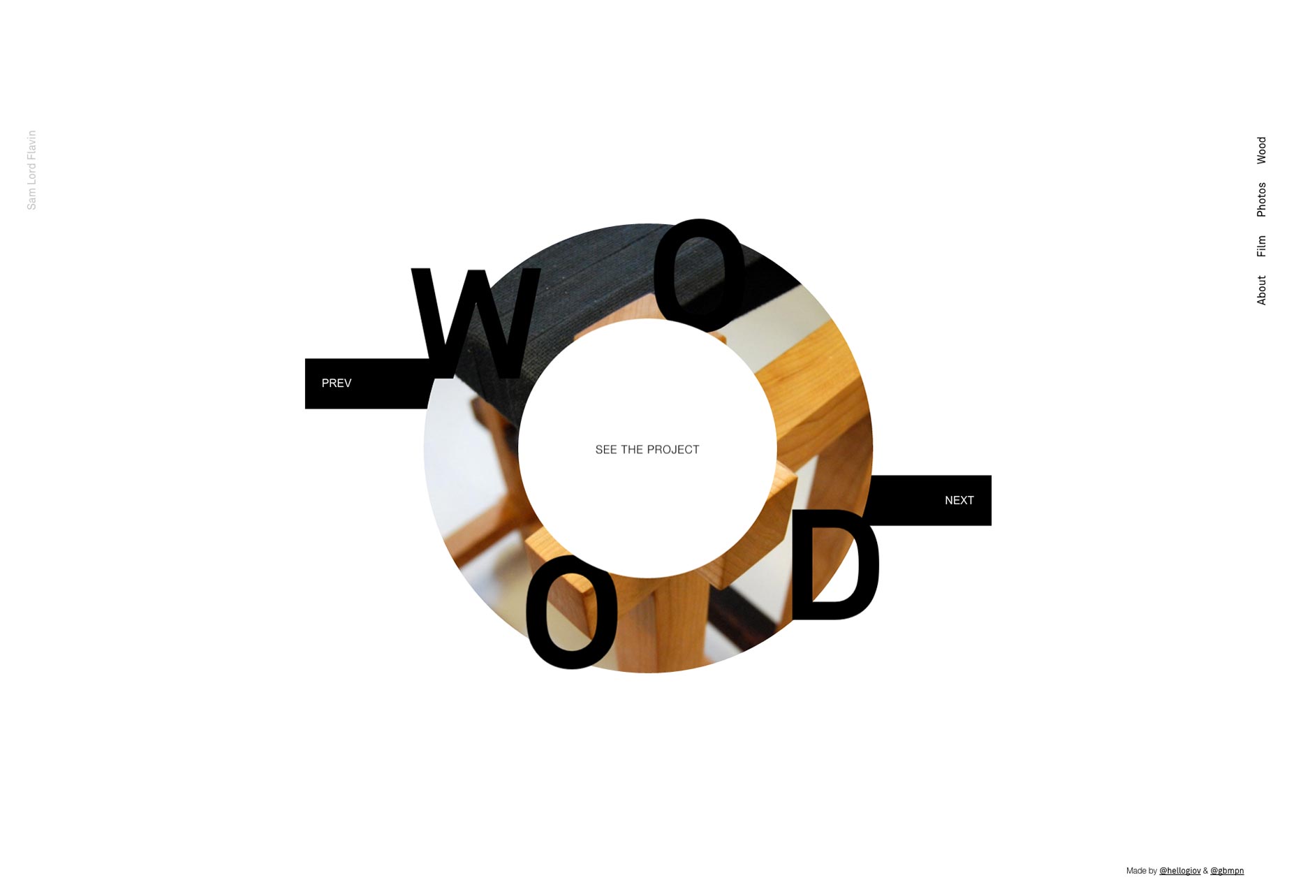 Trends are how we ended up with daring typography-based sites:
 Trends are the reason we talked about brutalism and pseudo-brutalism for like a month before we forgot about it:
 The downside is that many people embrace trends without thinking too hard. They don’t think about the purpose behind the aesthetic, or the usability concerns of the people who started these trends. These aesthetic styles didn’t come from nowhere. They came from the minds of people that needed to solve a specific problem, to scratch a particular itch.
There’s nothing wrong with having a design in a currently-trending style, just make sure that you’re embracing the trend for the right reasons.
The downside is that many people embrace trends without thinking too hard. They don’t think about the purpose behind the aesthetic, or the usability concerns of the people who started these trends. These aesthetic styles didn’t come from nowhere. They came from the minds of people that needed to solve a specific problem, to scratch a particular itch.
There’s nothing wrong with having a design in a currently-trending style, just make sure that you’re embracing the trend for the right reasons.
Misplaced experimentation
If you do any creative work, you’ll always get the urge to try something new and different. You might feel as though you’re selling out if you make two similar site designs in a row. Experimentation is good, both for design and development. You should be doing new things. However, maybe your portfolio isn’t actually the best place to do them. I contend that if you’re going to get crazy with the animation, the navigation placement, or what-have-you, it might be better to do it with a side project. Too many of the portfolios I’ve seen throw basic usability principles to the wind in favor of wild creativity. Your portfolio is supposed to be selling your work or services. If the site breaks because the JS doesn’t load properly, or if it’s just hard to navigate, the results are just as bad as they would be on a large eCommerce site, or a major blog. You will lose money. People with bad internet need websites too.The “Do’s”
Okay, that’s enough negativity in your life. How should you approach your portfolio’s look, then? Well, I don’t have all the answers, but I do have two pretty good answers:Approach 1: Design the site your customers want
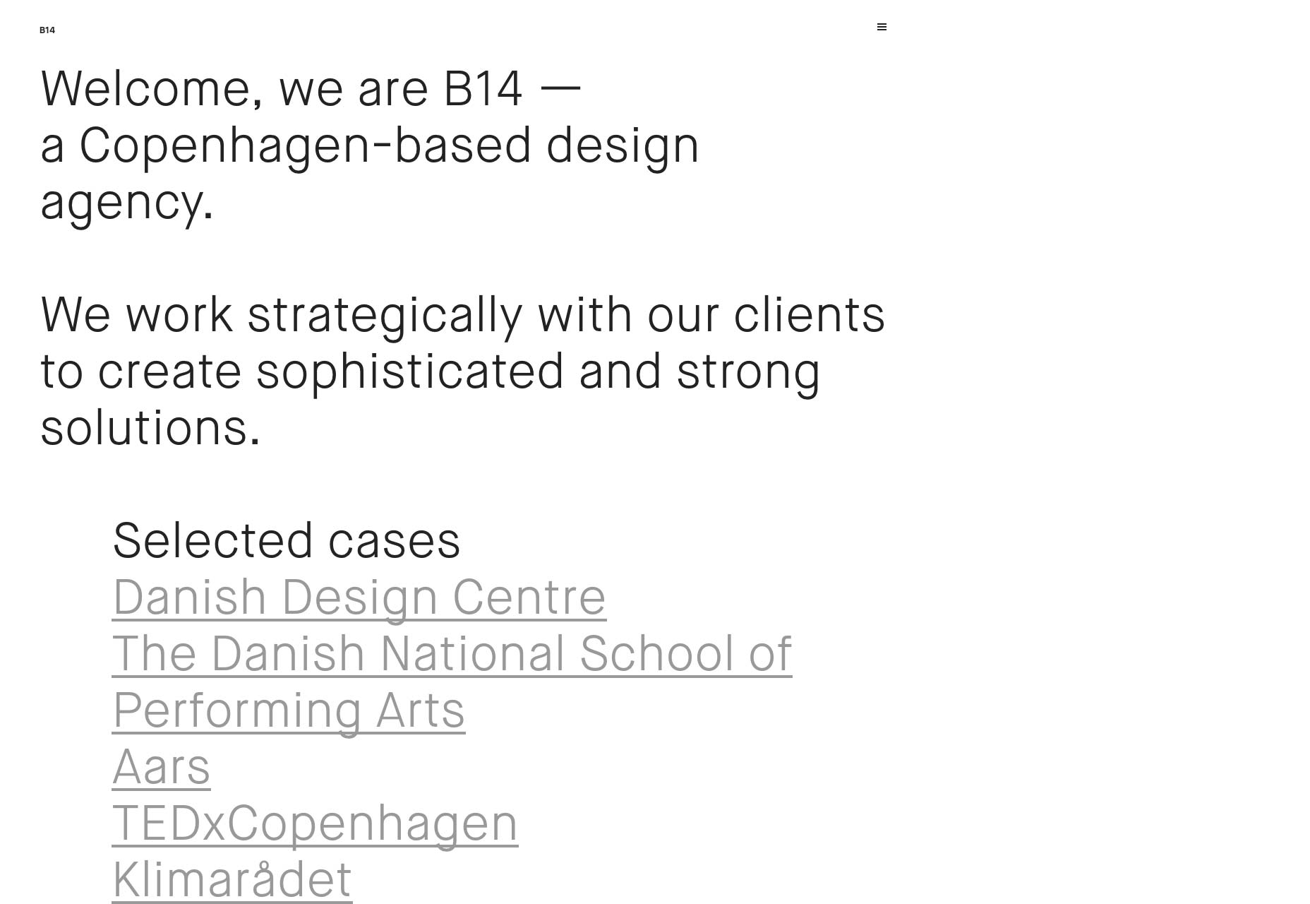
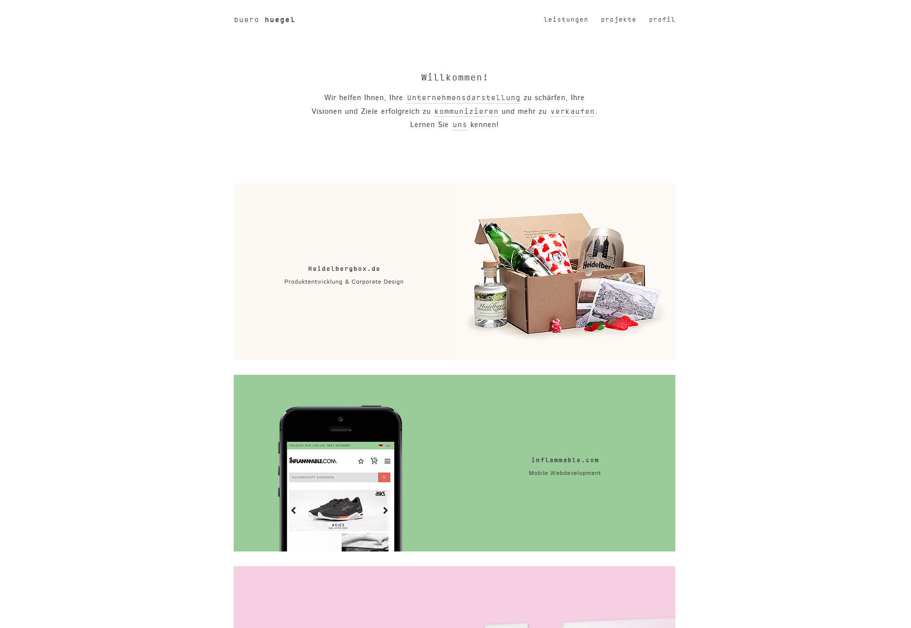
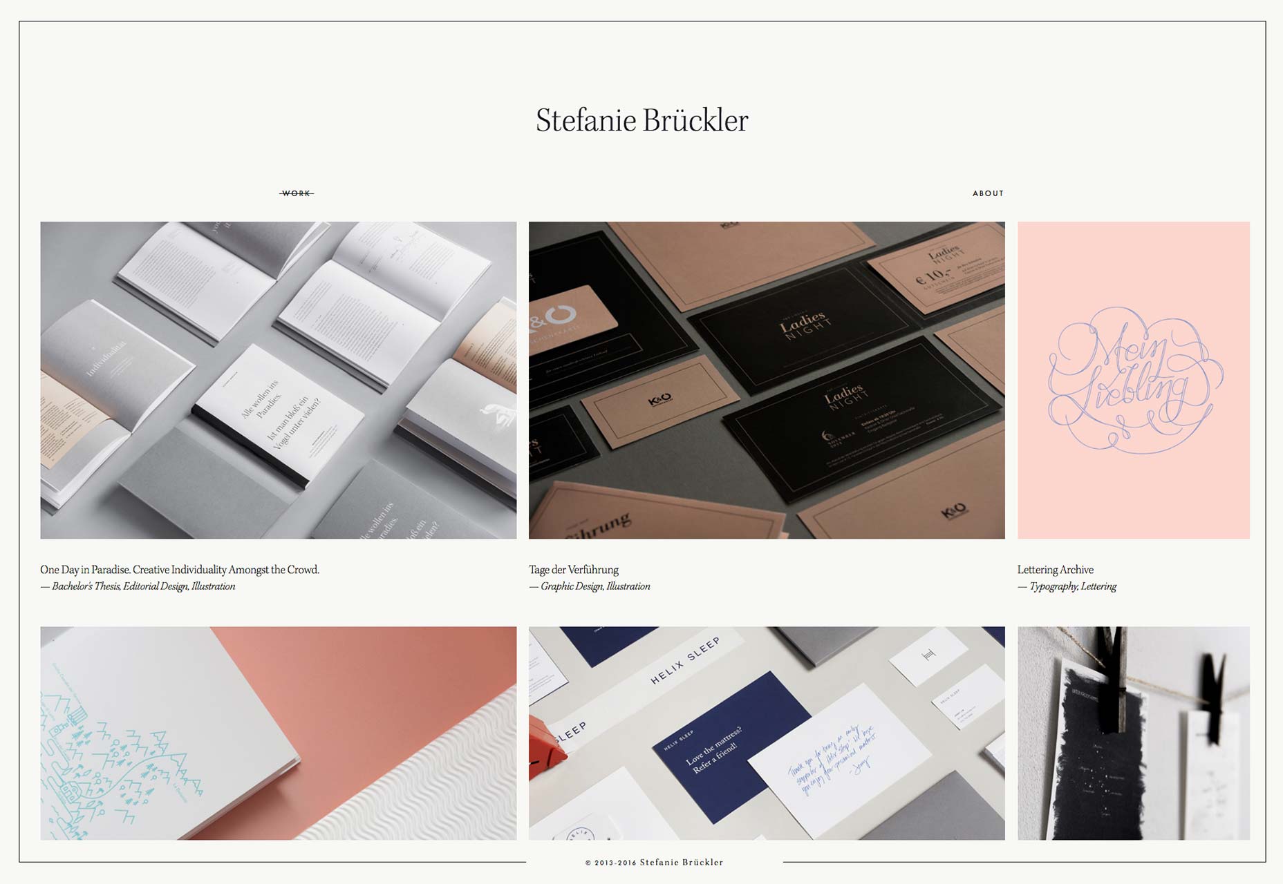
Design the site that your client aspires to have. Make them envious, and then give them what they want. I mean, you have a chosen niche, right? A target audience? Make your portfolio site feel a lot like the sites you build for clients. You know your market. Use that. Shape does this quite well. The whole look and feel of the site is vaguely similar to that of an eCommerce template. Well, they design eCommerce sites, so that’s absolutely perfect.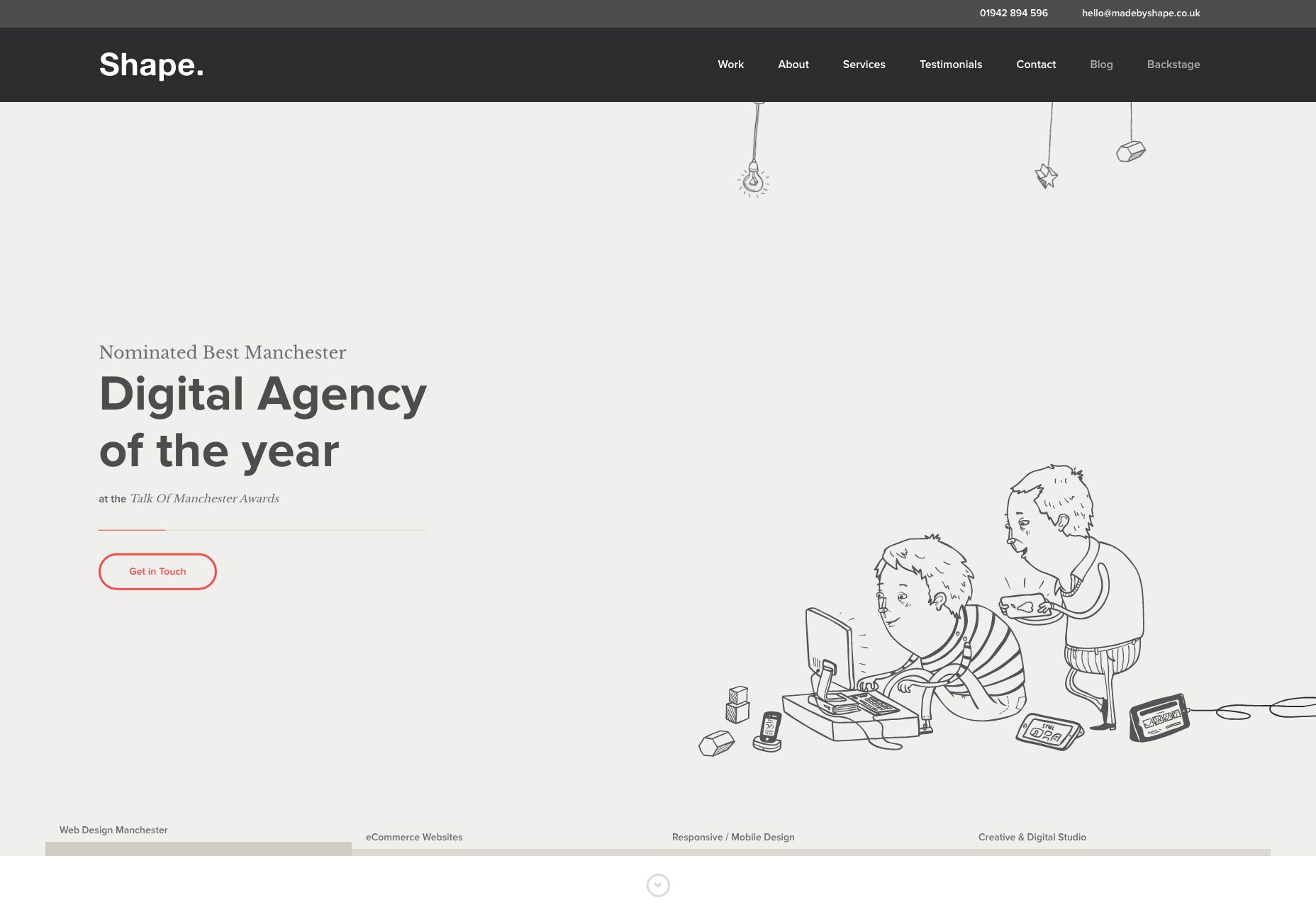 Now how about a portfolio that isn’t about web design? Stefanie Bruekler’s portfolio bears a striking thematic resemblance to the print work showcased on her site.
Approach 2: Put your work front and center
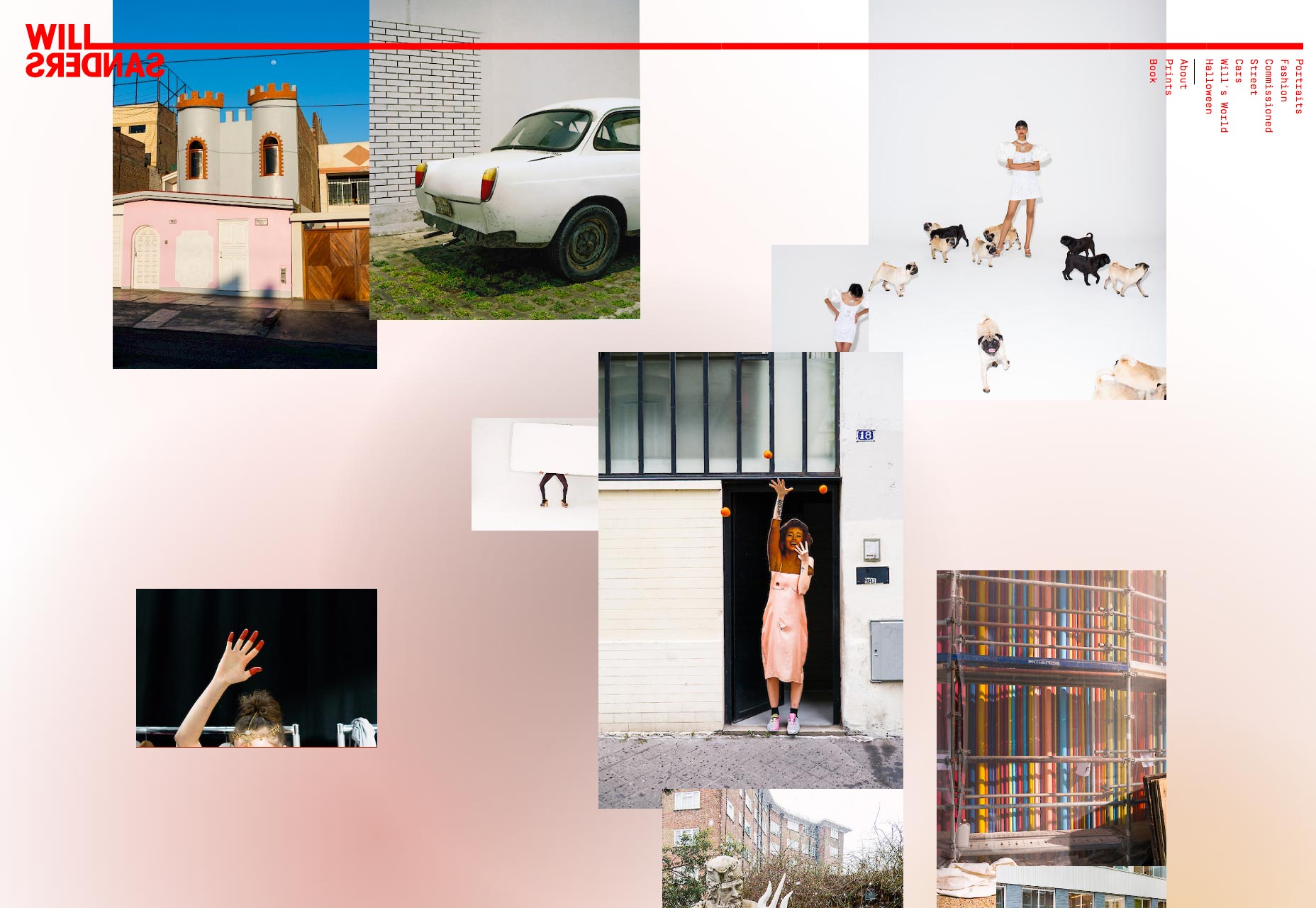
Don’t give them the time to judge your portfolio site’s aesthetic by putting your work right in front of them. This approach is typically used with minimalist sites, but it can work pretty much anywhere. Put a preview or two on the home page, or put the full portfolio there. If they’re already looking at your work, then the look of your site (and anything you might have to say about yourself, really) is incidental. Christopher Hall does this by showcasing his two major disciplines (furniture design and interior design) side by side, with no frills. Just look, and you get the idea.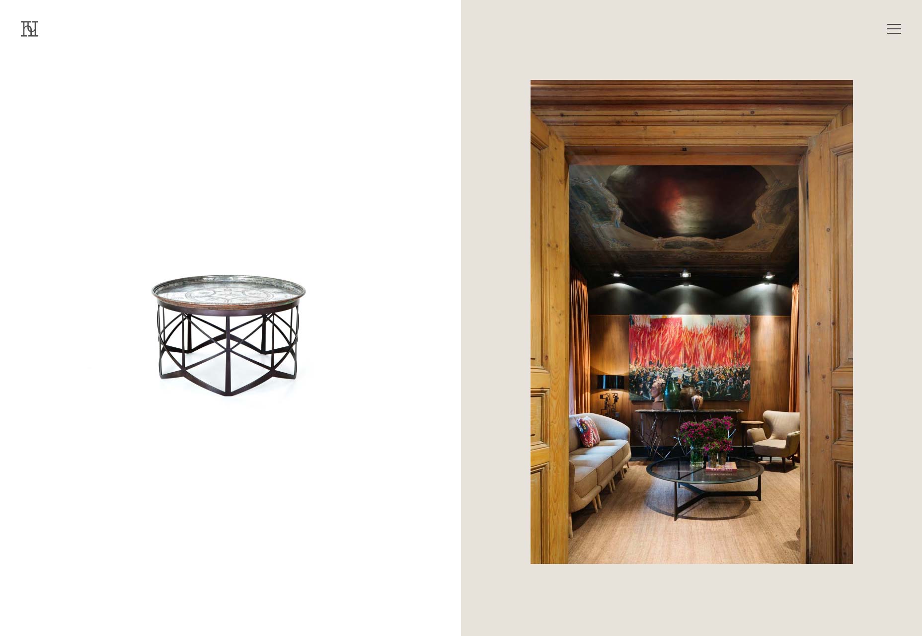 Will Sanders does pretty much the same thing, only his photography is organized as a collage. The photos draw in the eye so quickly, it’s easy to forgive the inconveniently-orientated navigation.
 You may have noticed that Stefanie Bruekler’s portfolio from the last section could also easily be in this section. You can easily combine both approaches.
Conclusion
Sharp observers will note that these methods alone will not solve all of the issues I raised earlier. No matter how you choose your site’s aesthetic, accessibility and usability are on you. However, using these simpler approaches to the question can remove some of the temptation to go overboard. You’ll notice that these two approaches allow for a lot of variation and creativity. Still, you don’t need to limit yourself to them. If you end up with a trend-filled site, that’s great. If you invent a whole new kind of UI, I’m in (so long as it’s usable). If you’ve made these decisions with care, then I’ve done my job, here. Besides, I am curious to see what’s coming after this big asymmetry trend.Ezequiel Bruni
Ezequiel Bruni is a web/UX designer, blogger, and aspiring photographer living in Mexico. When he’s not up to his finely-chiselled ears in wire-frames and front-end code, or ranting about the same, he indulges in beer, pizza, fantasy novels, and stand-up comedy.


Read Next

15 Best New Fonts, July 2024
Welcome to our monthly roundup of the best fonts we’ve found online in the last four weeks. This month, there are fewer…
By Ben Moss

20 Best New Websites, July 2024
Welcome to July’s round up of websites to inspire you. This month’s collection ranges from the most stripped-back…

Top 7 WordPress Plugins for 2024: Enhance Your Site's Performance
WordPress is a hands-down favorite of website designers and developers. Renowned for its flexibility and ease of use,…
By WDD Staff

Exciting New Tools for Designers, July 2024
Welcome to this July’s collection of tools, gathered from around the web over the past month. We hope you’ll find…

3 Essential Design Trends, July 2024
Add some summer sizzle to your design projects with trendy website elements. Learn what's trending and how to use these…

15 Best New Fonts, June 2024
Welcome to our roundup of the best new fonts we’ve found online in the last month. This month, there are notably fewer…
By Ben Moss

20 Best New Websites, June 2024
Arranging content in an easily accessible way is the backbone of any user-friendly website. A good website will present…

Exciting New Tools for Designers, June 2024
In this month’s roundup of the best tools for web designers and developers, we’ll explore a range of new and noteworthy…

3 Essential Design Trends, June 2024
Summer is off to a fun start with some highly dramatic website design trends showing up in projects. Let's dive in!

15 Best New Fonts, May 2024
In this month’s edition, there are lots of historically-inspired typefaces, more of the growing trend for French…
By Ben Moss

How to Reduce The Carbon Footprint of Your Website
On average, a web page produces 4.61 grams of CO2 for every page view; for whole sites, that amounts to hundreds of KG…
By Simon Sterne

20 Best New Websites, May 2024
Welcome to May’s compilation of the best sites on the web. This month we’re focused on color for younger humans,…