

Hugo Brook
Hugo Brook’s portfolio doesn’t bother with imagery, and for good reason. Hugo is primarily a developer. The emphasis is placed on describing the tools he uses, and linking to live site’s that he’s worked on. The monospaced typographical approach fits the theme, and the vertical navigation is an interesting touch.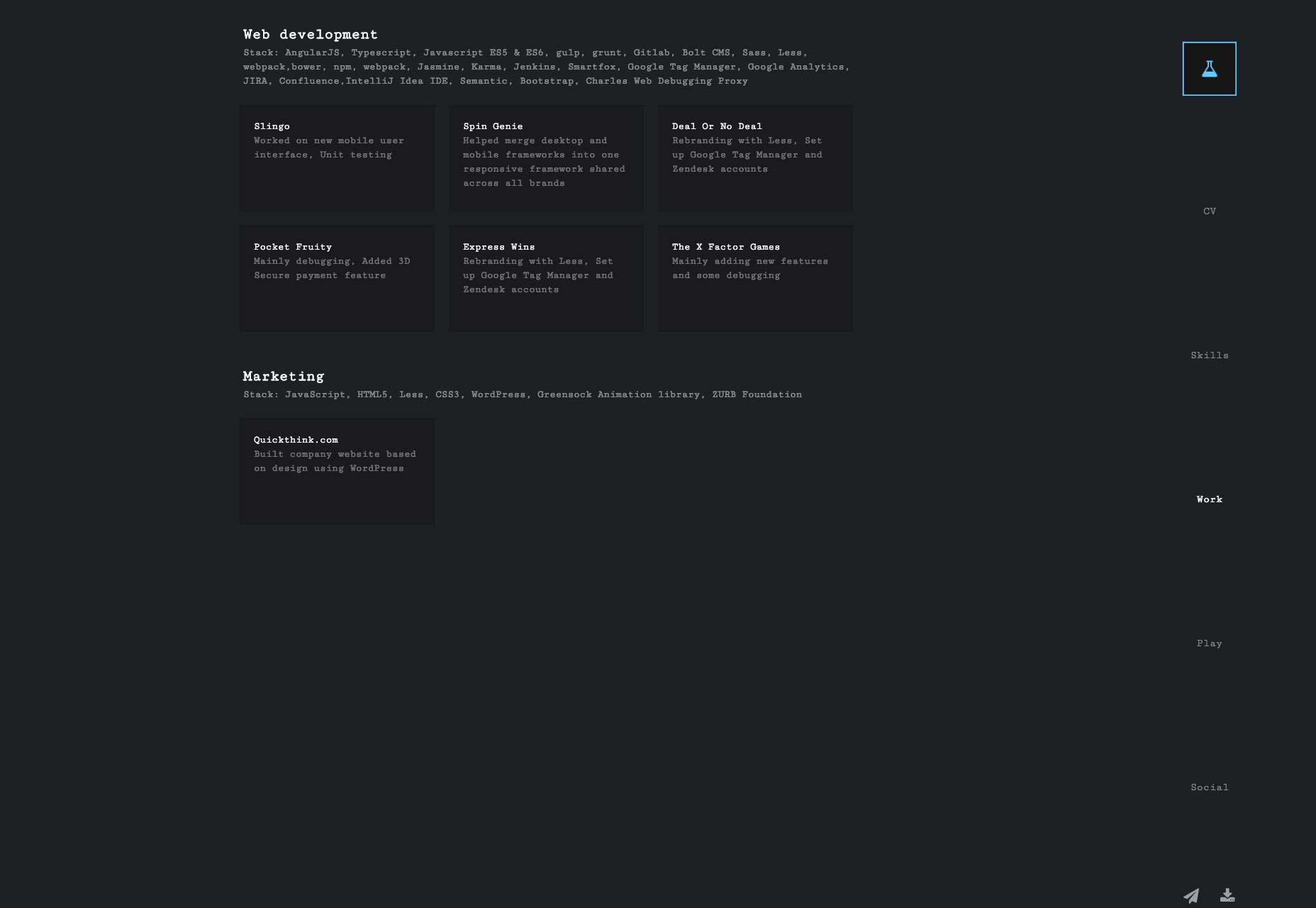
CreatLive Studios
CreatLive Studios puts their work front and center in a fairly typical masonry layout. Bonus points for the use of yellow. Things get really good, however, when browsing through their individual projects, and on the Services page. These are the parts of the site where their particular style really comes into play.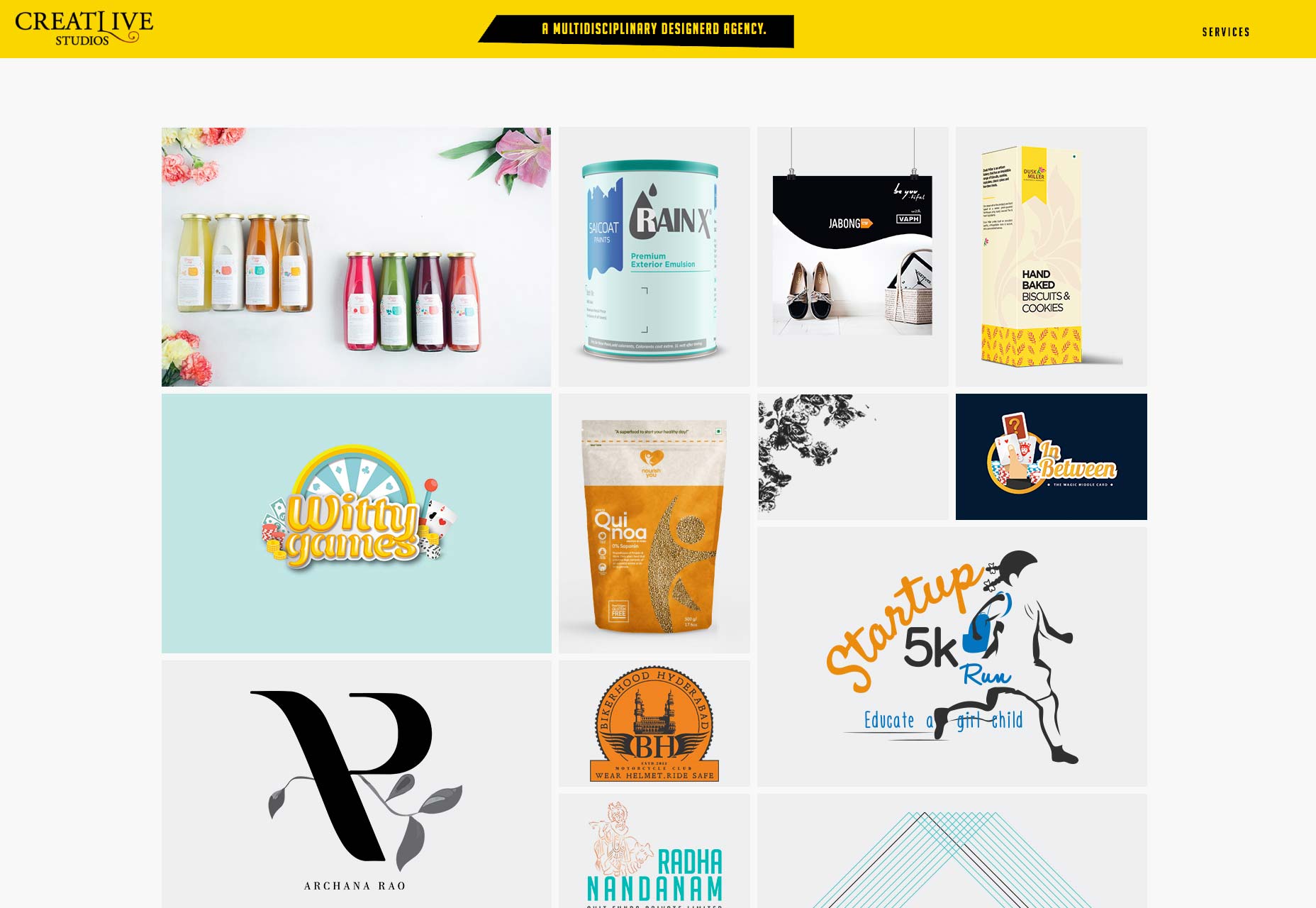
Hula Hoop
Hula Hoop’s portfolio uses a combination of familiar hipster typography and asymmetry, resulting in an aesthetic I’m going to start calling “post-business”. It’s a style that aspires to be professional, yet stylish, with aspirations to artistry. It’s not a bad look, but I’m starting to feel that it’s not nearly as original as people hope. Still, Hula Hoop uses it well, and combines it with a bold red color scheme. I mean it…all the text is red. You’d think that wouldn’t work, but they pull it off.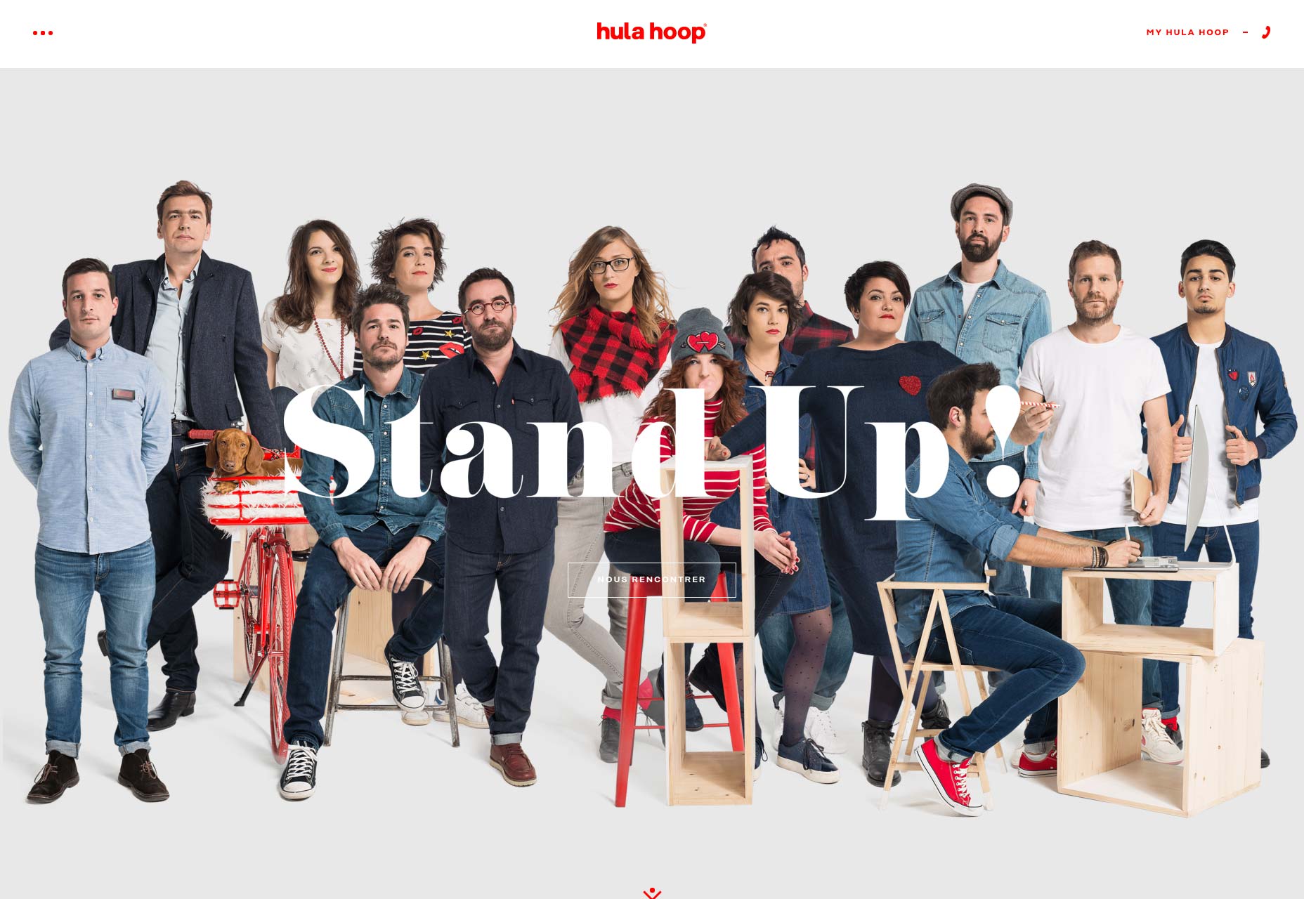
Patrick David
It’s not every day that you get to see a site’s grid (or part of it) incorporated into the finished product. Patrick David seems to have done just that in his one-page portfolio. Heck, while I’m making up names for design styles, I’m going to call this one “programmer-chic”. I keep making up names like this, I’m going to have to start a dictionary site.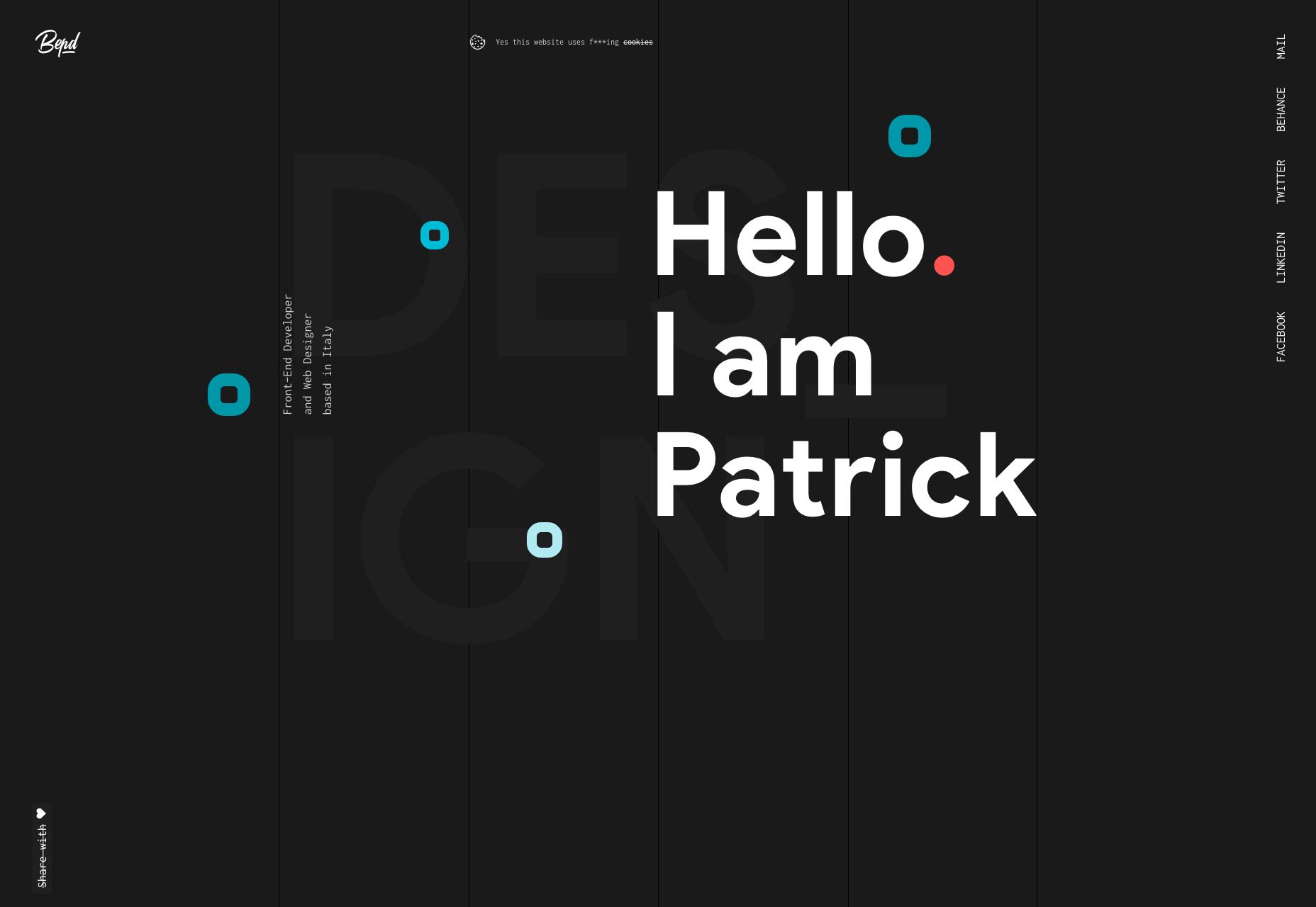
Rakesh
Rakesh has taken the rock star approach to marketing in that I haven’t been able to find his last name yet. His site looks fantastic, though. There’s a huge emphasis on typography in this mostly-monochrome sites, and it never starts to feel stale as you browse through it.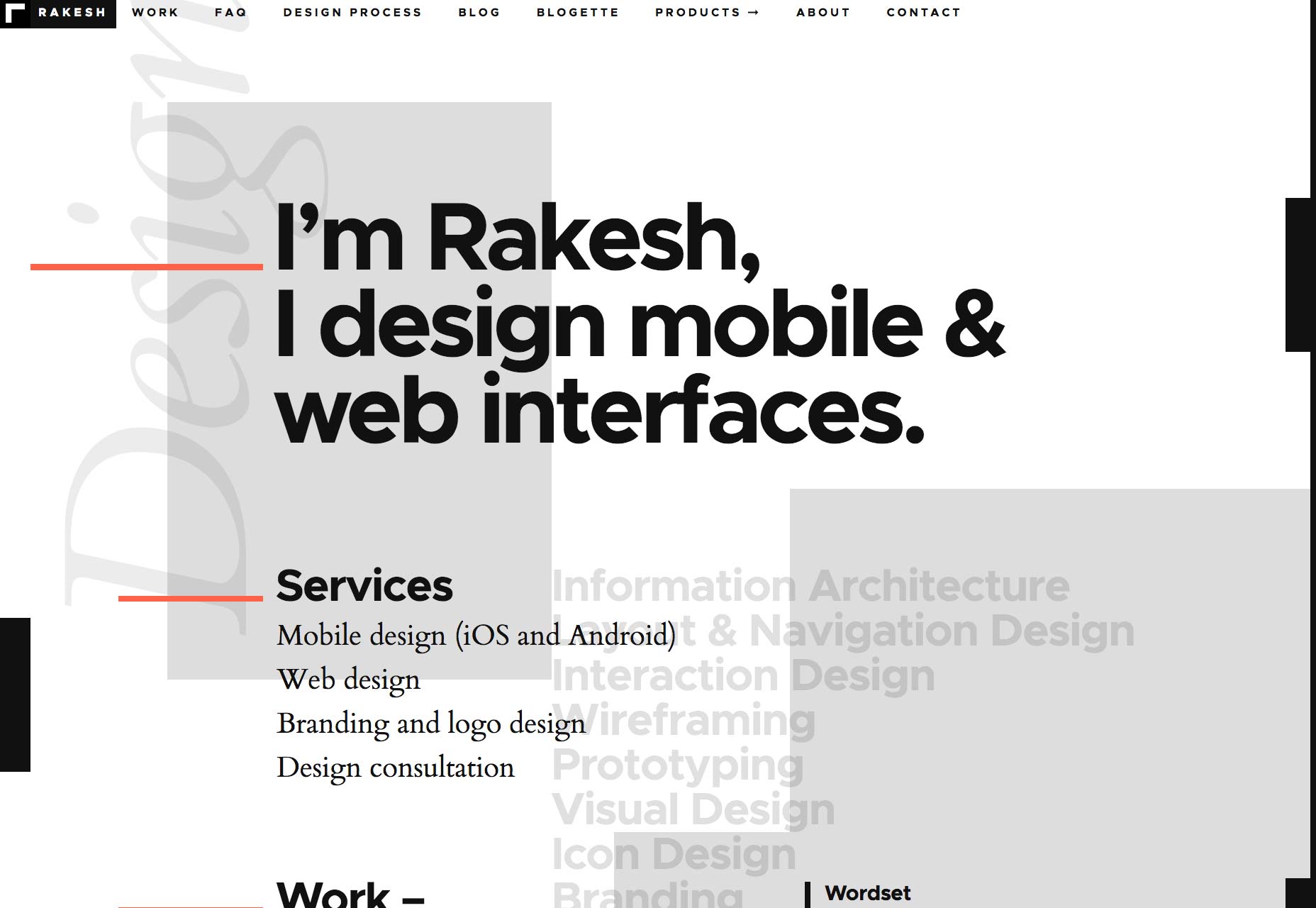
Mashvp
Mashvp is classically minimalist, with lots of white space and large type. There’s not much that stands out on its own except that strangely hypnotic “swinging” letter M on the home page. Put the whole thing together, though, and you get an eye-pleasing site that gets the job done.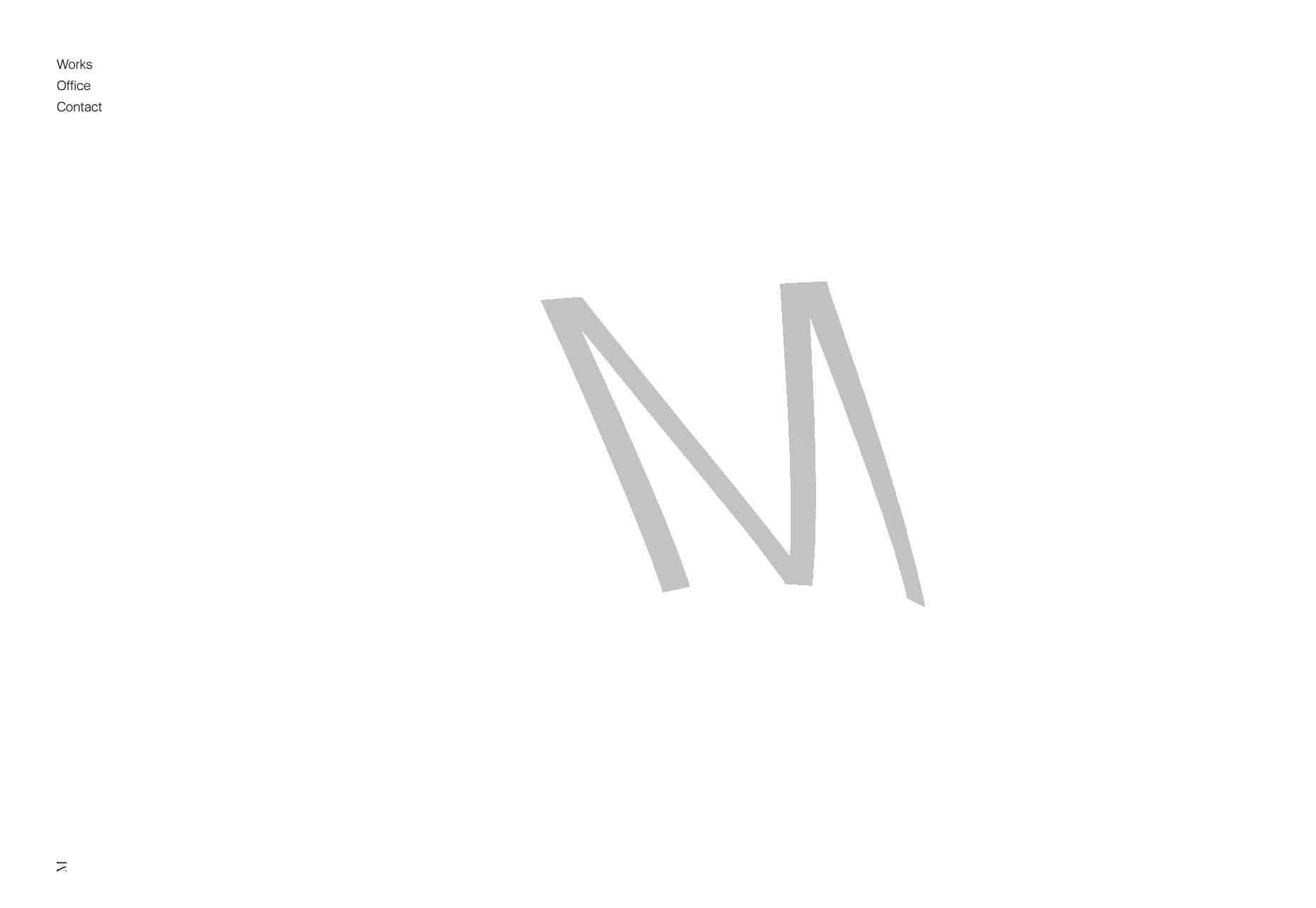
Brooke Promnitz
It’s hard to make a site look professional and playful at the same time, without it looking tacky. Brooke Promnitz has done it. Everything from the color choices to the typography gives off a fun-loving vibe, but still makes you seriously consider hiring her.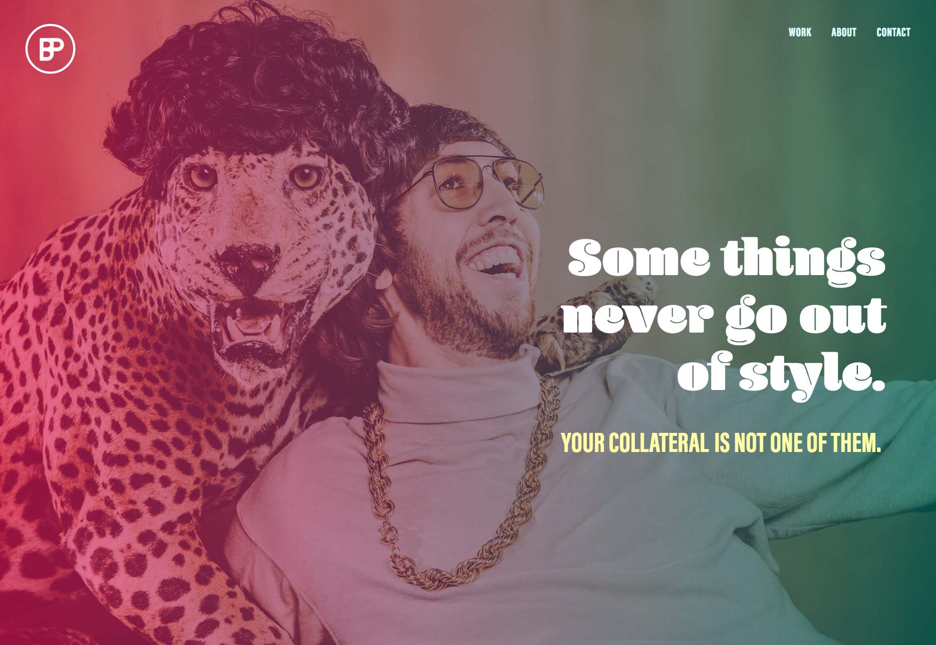
Shantell Martin
Shantell Martin is an artist, and that definitely show in her site. It’s wild, it’s playful, and then it gets all minimalist and asymmetrical as your browse deeper into the site. Now, I’m not sure why they mixed some of the navigation into the animated illustrations on the home page. It’s easy to miss in there, even being as big as it is. Still, this is all about finding new design ideas, and this site has plenty to share. (Hint, click on the logo. It’s worth it.)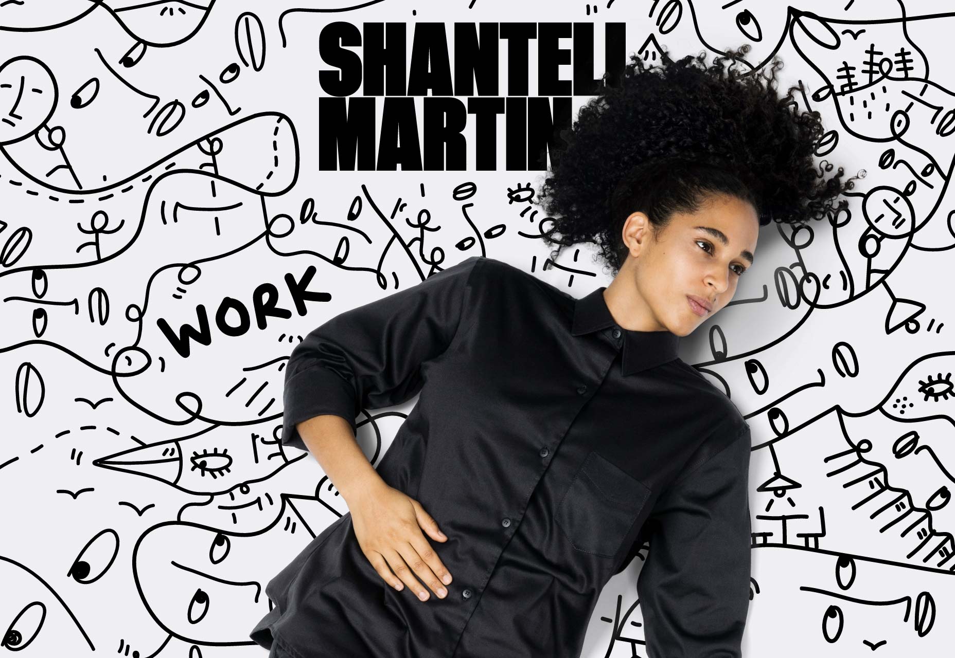
Prashant Sani
Prashant Sani has combined that aforementioned programmer-chic aesthetic with a fair bit of animation, and a lot of geometry-themed imagery. It’s bold, it’s stark, it’s very nerdy. The navigation feels a bit over the top for a one-page portfolio, but it’s a great-looking site overall.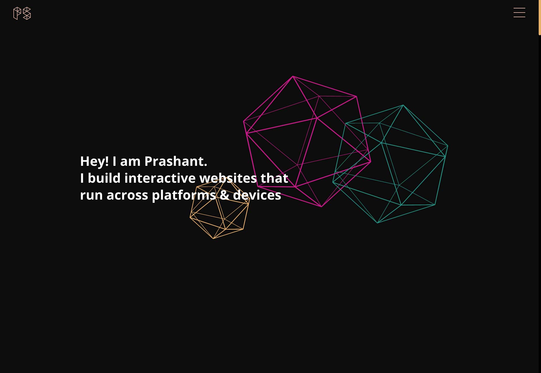
Drexler
I am on a roll today, because I get to make up another term. Drexler’s home page has inspired me, and I’m calling it the parallax collage. Go, scroll down that page. You’ll see it pretty quickly. Meanwhile, the rest of the site doesn’t let up, because the portfolio section has an honest to God marquee. I mean, okay, it uses the aside element, but I thought marquees were basically dead. A relic of the Geocities era, and Yahoo’s old home pages. Shows how much I know.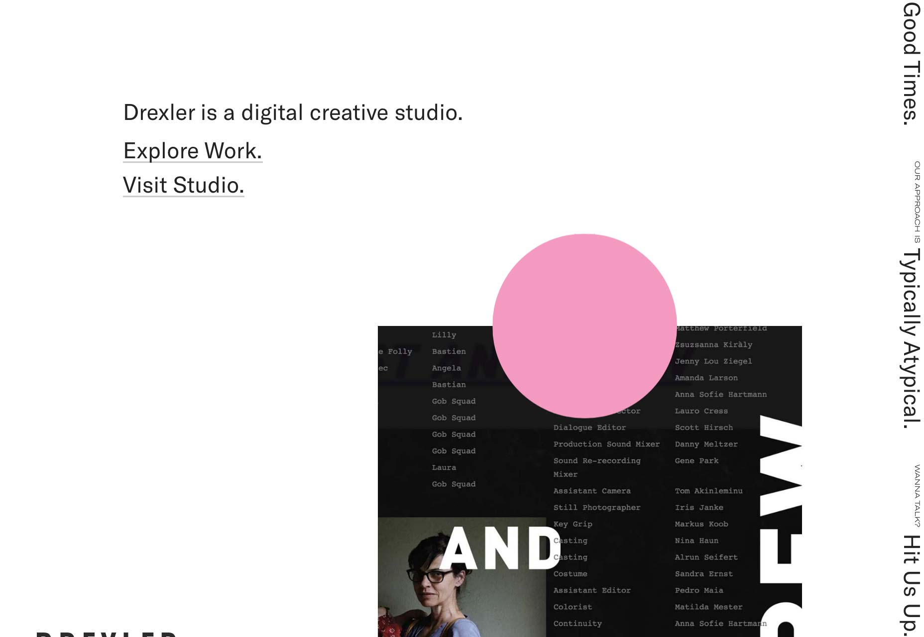
Sam Williams
It’s minimalist, it’s dark, it’s actually kind of low-key for a video portfolio. After all of the over-the-top video portfolios I’ve seen, I’m okay with this.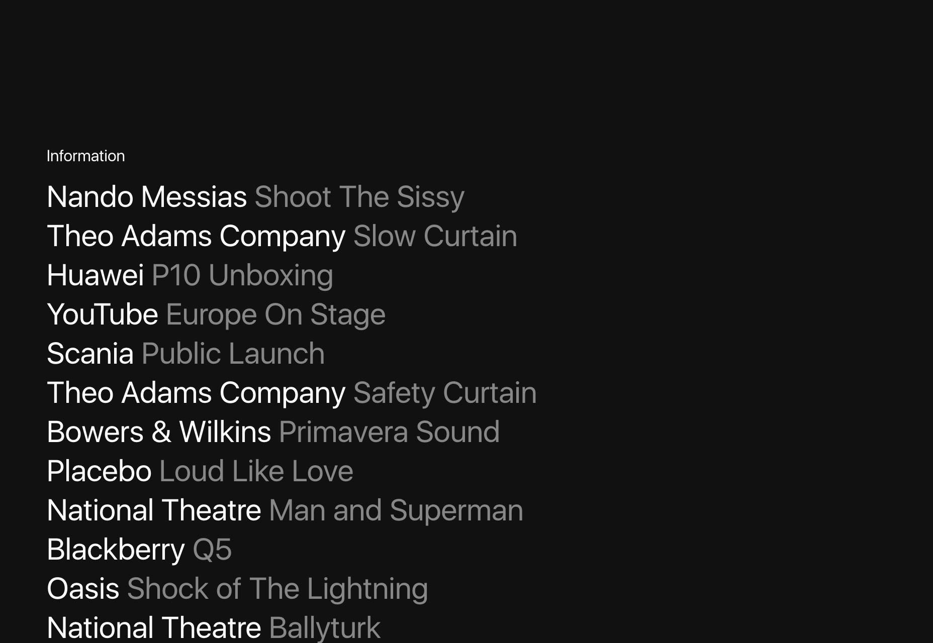
Art Processors
This portfolio might feel like a museum website, and it’s supposed to. Art Processors make multi media experiences for museums, to help show off the exhibits, and inform the visitors. Therefore, the site uses a lot of muted tones, subdued typography, and a lot of white space. It all fits together perfectly, given their clientele.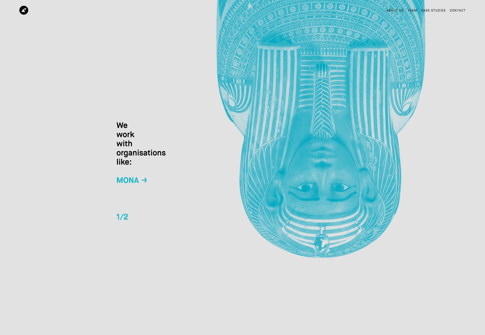
Basic
Basic does everything from branding, to websites, to video production. To accommodate all of that, they keep their aesthetics fairly simple, and animate the heck out of everything. Between the solid type, and the heavy use of video, they’re showing off. And I can’t say it didn’t work on me.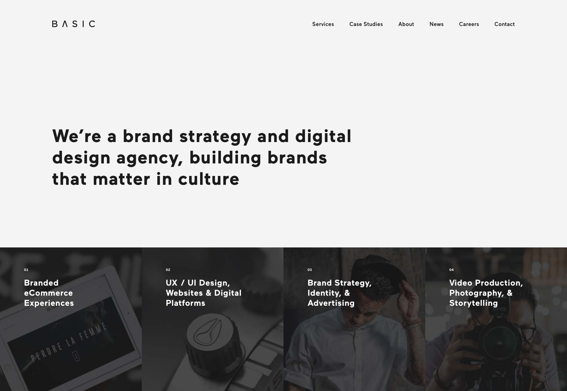
Vyctoire
Vyctoire is pleasantly minimalist, and highly animated. It almost feels like it’s been a while since I’ve reviewed a site that was more like a presentation, but here we are. That’s mostly on the home page, though. So while this site won’t be winning any accessibility prizes, I still enjoyed browsing through it. The animation is done in a tasteful, almost understated way. The whole thing just looks great.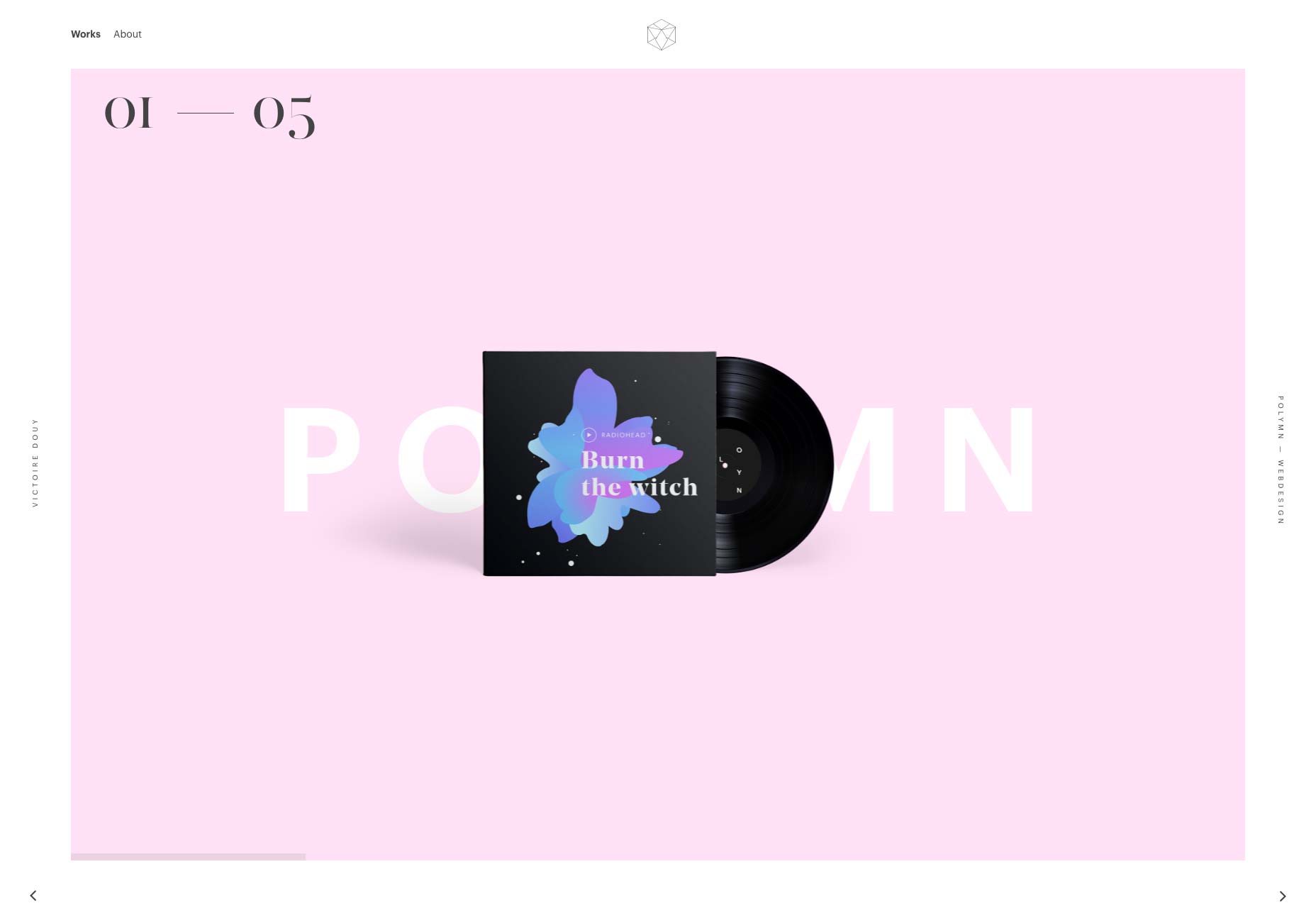
subsign
subsign isn’t anything special in terms of layout or type, but there’s a vibrance to the whole site that I can’t help but enjoy. As much as I love my minimalist, mono-or-duo-chromatic designs, I also gotta love a site that just goes all out with the color and life. It it a little distracting sometimes? Sure, but when you need to do actual reading, they do tone it down quite a bit.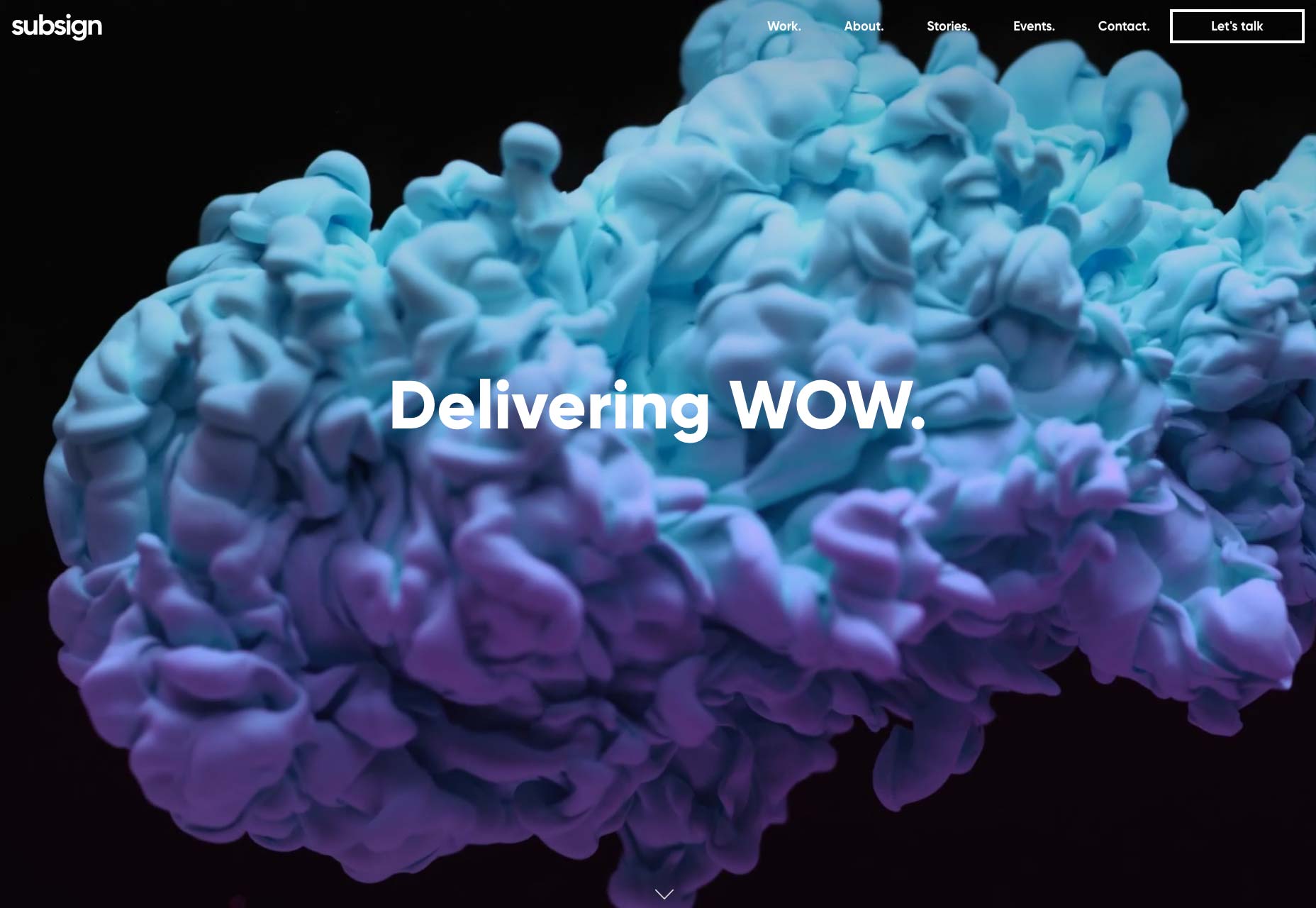
Parallax
Parallax’s site is extremely minimal and uses no JS whatso… I’m kidding, obviously. It’s called “Parallax”, so it’s got more animations than you can shake a stick at. Even without the animation, though, this would be a visually impressive site. It takes that post-business feel to a whole new level. They use every layout trick in the book to keep you staring, and it worked on me.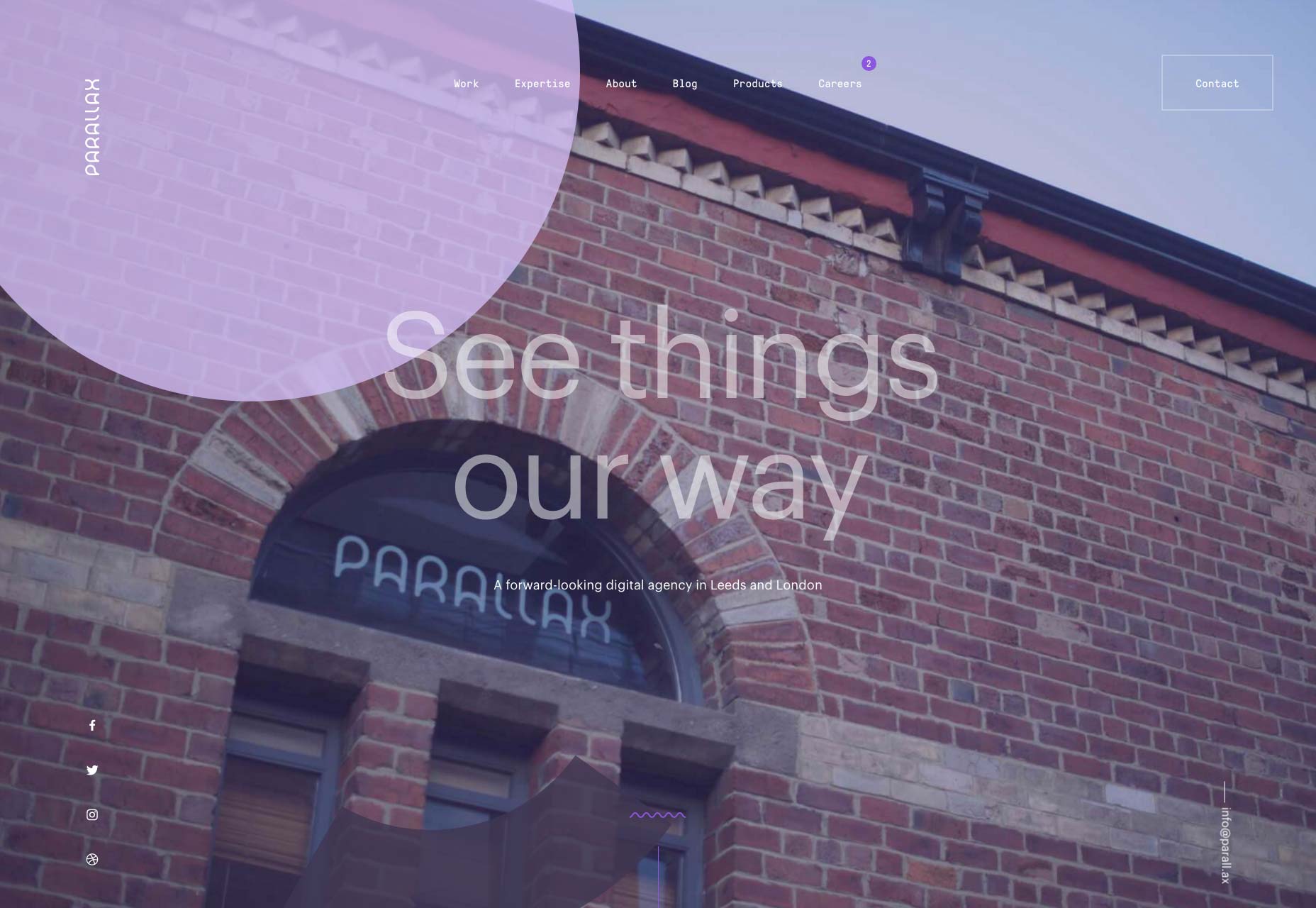
Brand Almanac
Okay, I know I said that using yellow well is an easy way to impress me. Brand Almanac might be taking it a little far with that home page. That said, Brand Almanac is now one of the most easily memorable sites on this list, not least because it was the last thing I saw before I lost my sight. Okay, slight exaggeration. Still, I’d call it a bold choice… perhaps even a daring risk.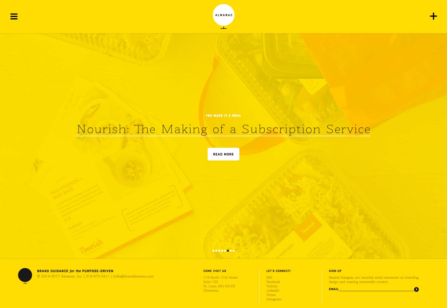
Sebastian Graz
Sebastian Graz brings us a portfolio that embraces asymmetry like many others, but without the nearly compulsory post-modern or artsy feel that many others employ. It gives me the sense that he’s not showing off. He’s just showing you his work, and having a little fun on the way.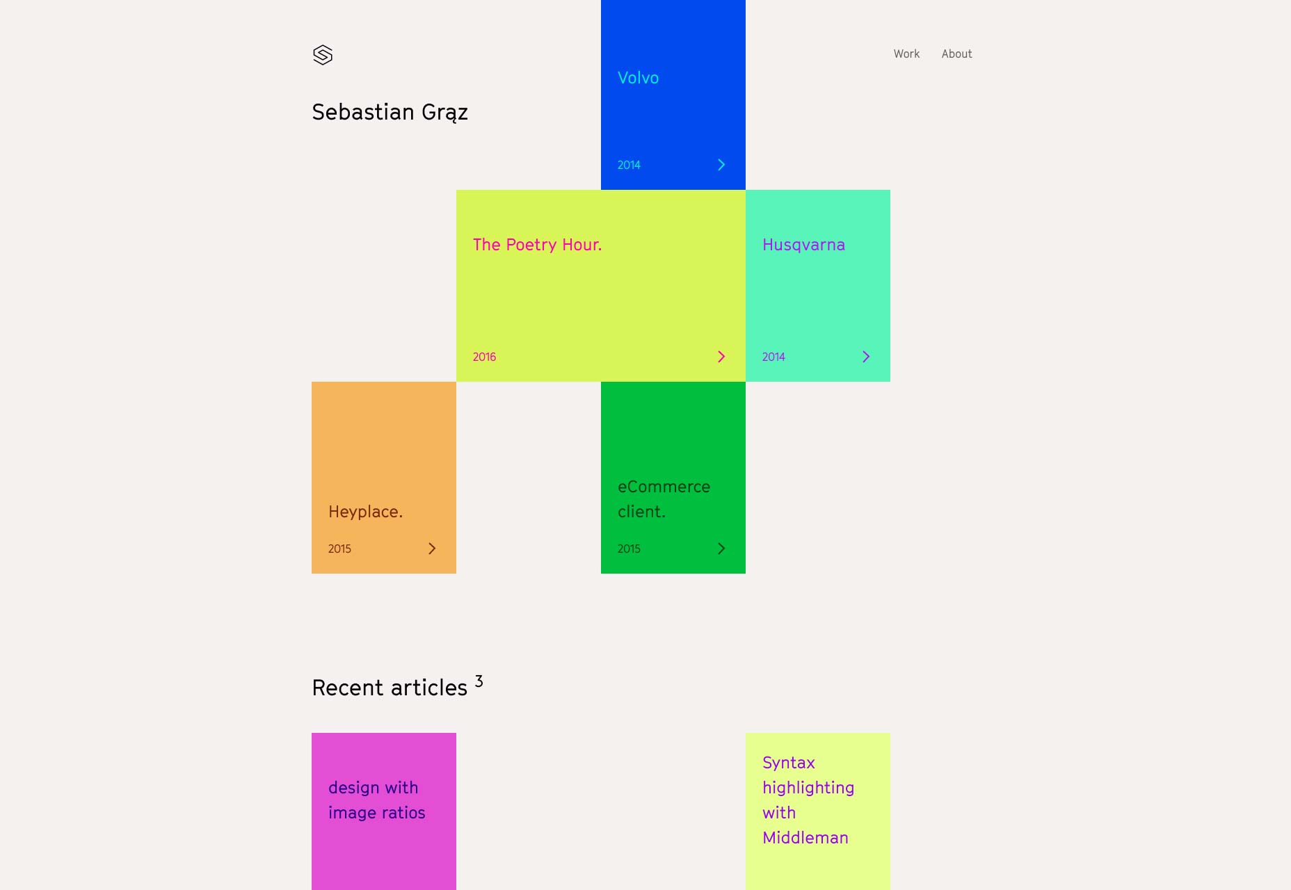
Ezequiel Bruni
Ezequiel Bruni is a web/UX designer, blogger, and aspiring photographer living in Mexico. When he’s not up to his finely-chiselled ears in wire-frames and front-end code, or ranting about the same, he indulges in beer, pizza, fantasy novels, and stand-up comedy.


Read Next

15 Best New Fonts, July 2024
Welcome to our monthly roundup of the best fonts we’ve found online in the last four weeks. This month, there are fewer…
By Ben Moss

20 Best New Websites, July 2024
Welcome to July’s round up of websites to inspire you. This month’s collection ranges from the most stripped-back…

Top 7 WordPress Plugins for 2024: Enhance Your Site's Performance
WordPress is a hands-down favorite of website designers and developers. Renowned for its flexibility and ease of use,…
By WDD Staff

Exciting New Tools for Designers, July 2024
Welcome to this July’s collection of tools, gathered from around the web over the past month. We hope you’ll find…

3 Essential Design Trends, July 2024
Add some summer sizzle to your design projects with trendy website elements. Learn what's trending and how to use these…

15 Best New Fonts, June 2024
Welcome to our roundup of the best new fonts we’ve found online in the last month. This month, there are notably fewer…
By Ben Moss

20 Best New Websites, June 2024
Arranging content in an easily accessible way is the backbone of any user-friendly website. A good website will present…

Exciting New Tools for Designers, June 2024
In this month’s roundup of the best tools for web designers and developers, we’ll explore a range of new and noteworthy…

3 Essential Design Trends, June 2024
Summer is off to a fun start with some highly dramatic website design trends showing up in projects. Let's dive in!

15 Best New Fonts, May 2024
In this month’s edition, there are lots of historically-inspired typefaces, more of the growing trend for French…
By Ben Moss

How to Reduce The Carbon Footprint of Your Website
On average, a web page produces 4.61 grams of CO2 for every page view; for whole sites, that amounts to hundreds of KG…
By Simon Sterne

20 Best New Websites, May 2024
Welcome to May’s compilation of the best sites on the web. This month we’re focused on color for younger humans,…