

1. Ensure Content is Accessible When User Has No Internet Connection
According to recent research by Google, 34% of users prefer an app over a mobile website when they have a poor internet connection. When they open an app, they expect to see lots of content there, regardless of whether they are connected to the internet or not. It’s vital to make key content accessible even when there is little or no data connection. If the content isn’t there, users will get frustrated and switch to a different app which does a better job of caching the information they want to see. Below is an example of how Apple Maps (left) and Google Maps (right) use their cache. Google Maps remembers the last location and holds an impressive amount of map detail in the cache, while Apple Maps shows you absolutely nothing. Not much good to be said about Apple Map’s offline experience.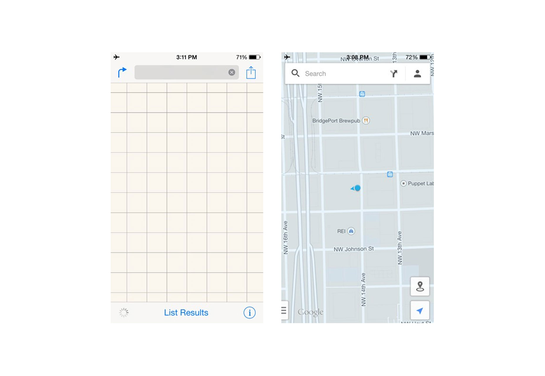
2. Design For Each Native Mobile Platform
A huge factor in making your app’s mobile UX shine is its UI. Today, most developers want to distribute their apps on multiple platforms. As you plan your app for multiple platforms, keep in mind that each platform has it's own visual language—a distinct set of conventions and styles which should be followed. For example, there are global elements, such as a status bar and header, which appear on all the pages of your design. The difference between the two platforms seems quite insignificant—slightly different size, different title text alignment (on Android, the text is left aligned, whereas for iOS it’s centred) and fonts (Roboto on Android, San Francisco on iOS), but you shouldn’t change any of these settings if you want the app to feel native.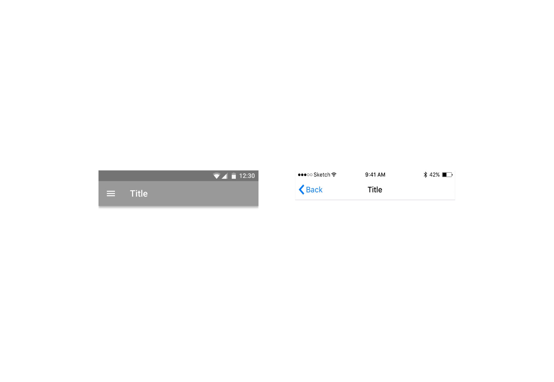 The same goes for buttons and other controls—radio buttons, check boxes, fields, switches—all functional components should give a native feel. If you replicate elements from one platform to another, you risk compromising the user experience and conversion. The differences are small enough for you to progress with one design, but these subtle differences are essential for a native look.
 If you want to customise user interface elements in your app, you should customise carefully according to your branding—and not according to the conventions of a different platform.
3. Nothing in Your App Should Be a Dead-end
Designing a UX is designing for flow and flow is, in most cases, about moving forward to accomplish a goal. You should avoid creating dead-end pages in your apps because dead-ends create confusion, block users on their way to the goal and lead to additional and unnecessary actions. Take an error-state screen from Spotify as an example. It simply doesn’t help users understand the context and doesn’t help them find the answer to the question: “What can I do about it?”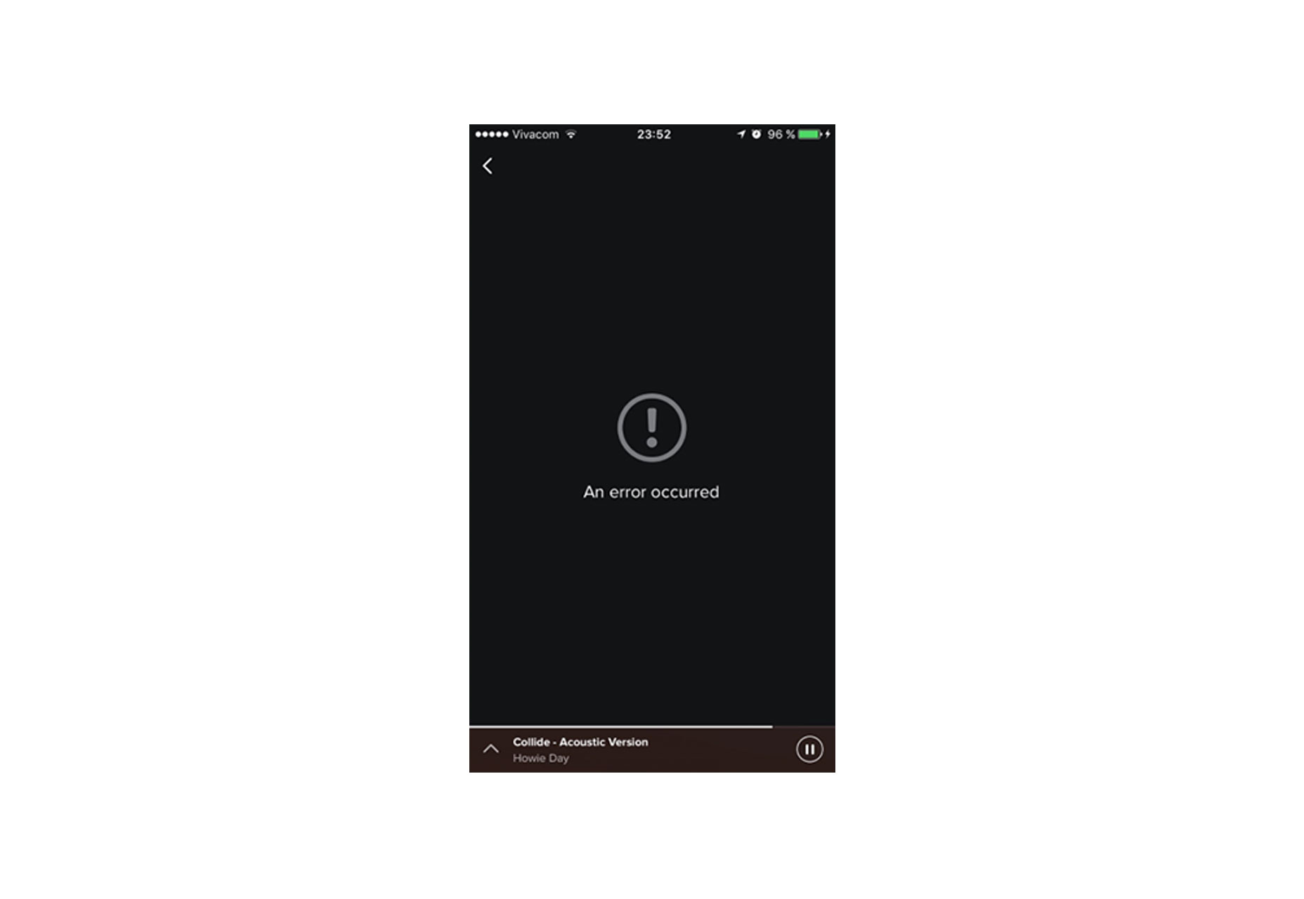
4. Don’t Replicate the Web Experience to Apps
Users expect certain interaction patterns and interface elements in mobile apps. What we design on the web often feels awkward in a mobile app—not necessary because something is wrong, but because it’s simply different from what our users expect to see. One common example is using text with underlined links, which are strongly associated with web pages. Below is an example of sign-in form from TD Bank app for iOS. It definitely feels like they design for mobile web, not a mobile app: links are underlined, and there’s even a copyright notice in the UI. Apps use buttons, not links.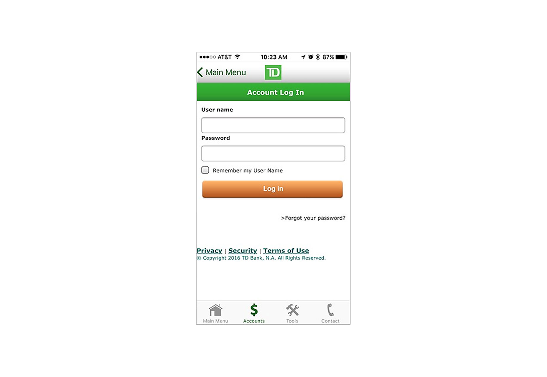
5. Don’t Interrupt Users with Requests For Rate the App
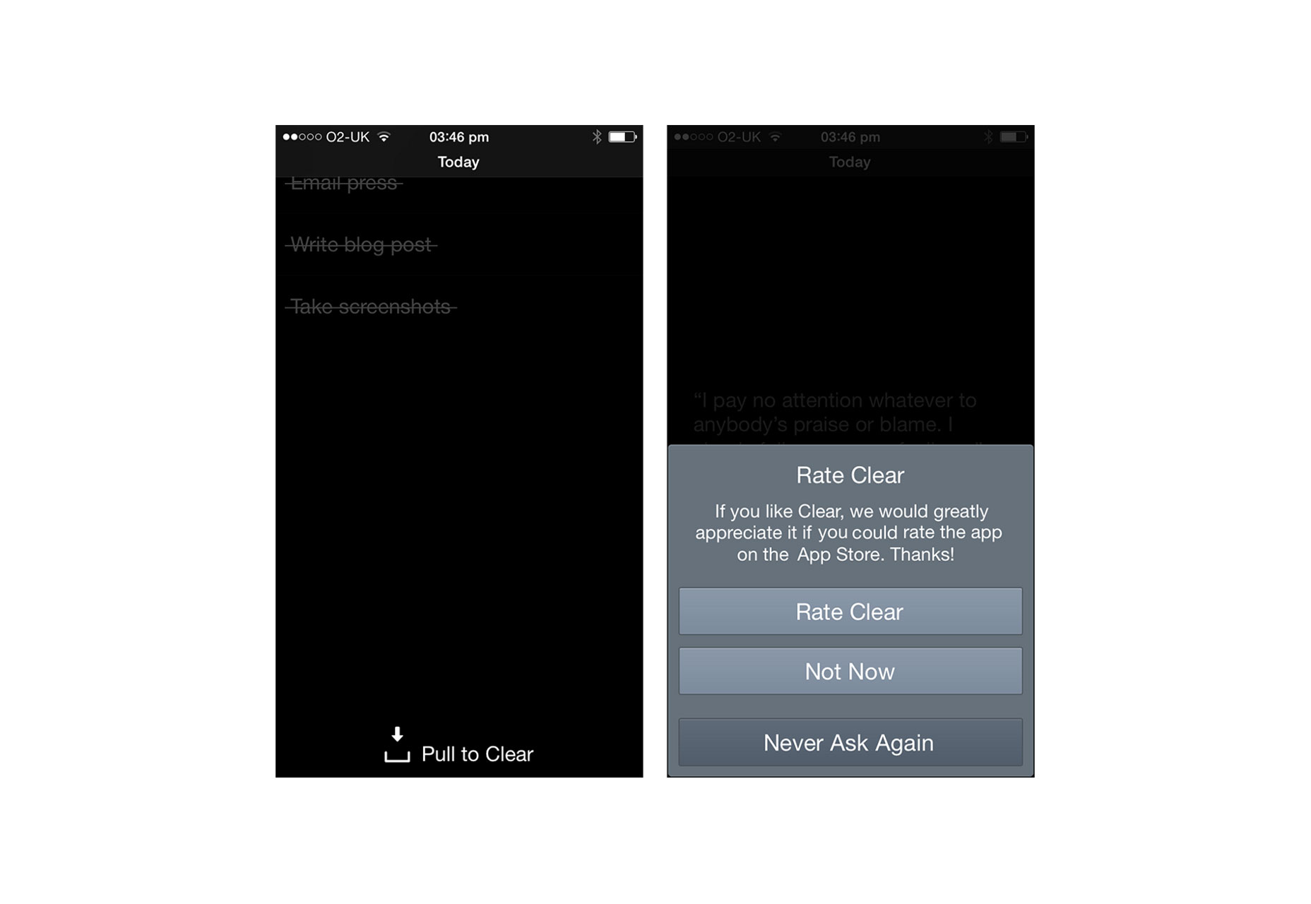
No one really wants to be interrupted, much less for something useless while they’re in the middle of something important. Despite that, quite often apps interrupt users by prompting them to leave a review. The worst of all is when this dialogue interrupts users in the middle of the task or right after the app launched.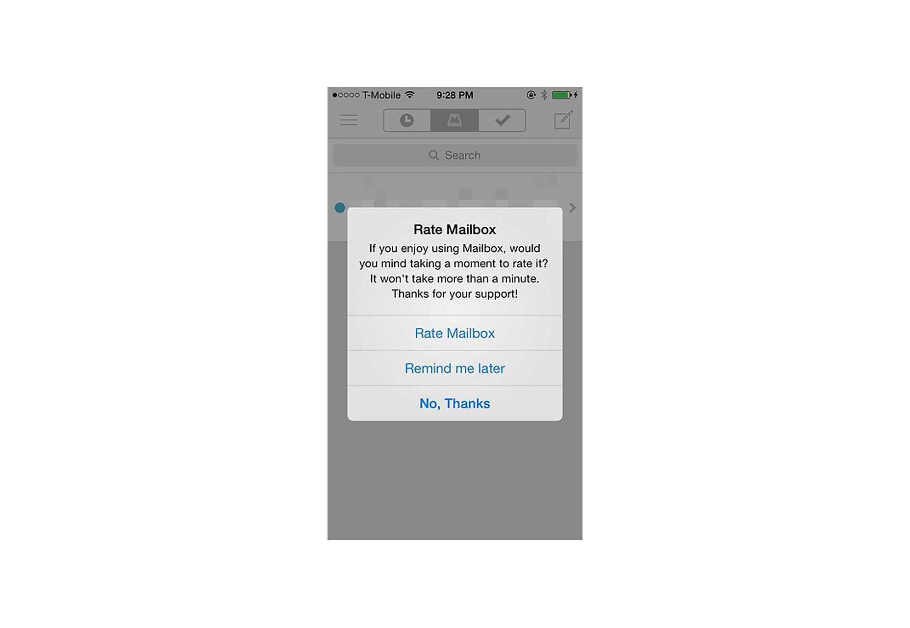 You should avoid interrupting users to ask them to rate your app if they’ve only recently downloaded it, or only used it a few times. There’s nothing wrong in asking for a review, but remember that you want to give your users a great experience first. Wait until they prove to be repeat users and find a moment in your app that’s the least intrusive. Clear, a to-do app for iOS is a good example: it shows “Rate the app” dialogue after the user has cleared the remaining tasks from a list. This is a great moment in the app: users are feeling good for having just cleared their todo list and will be more likely to rate the app favourably.
6. Don’t Take Users to the Browser
Keep users in-app at all times. If your app lacks a specific feature or content, try to use an in-app browser; but do not invoke the smartphone browser, or you will cause users to lose their track and not return to the app. This will increase abandonment and reduce conversion.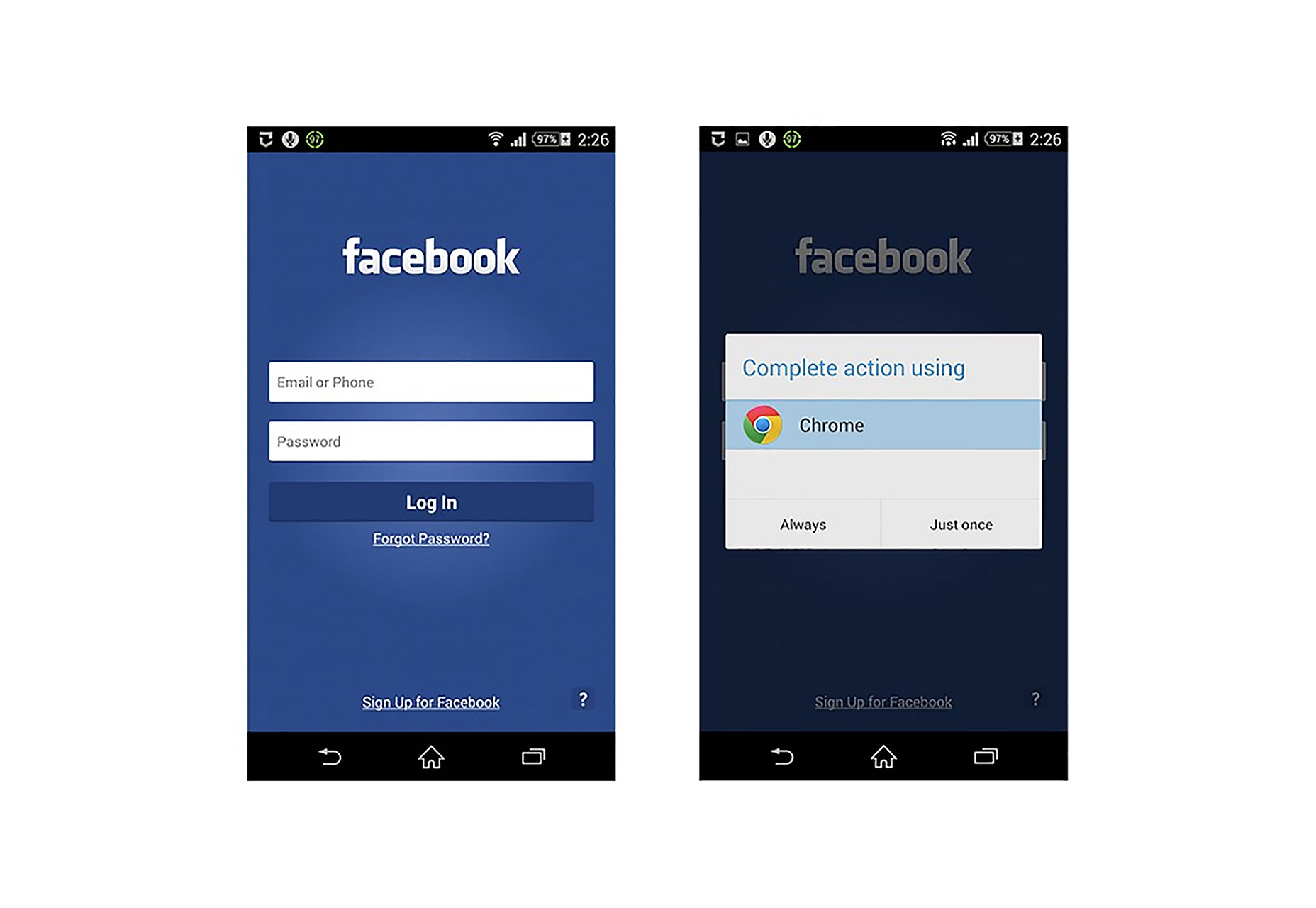 When a user clicks on “Forgot Password?” link in the Facebook app the app prompts the user to launch the browser in order to perform this action.
Nick Babich
Fireart Studio is a design studio passionate about creating beautiful design for startups & leading brands. We pay special attention to nuances all the time to create professional while cool products that will not only meet all expectations, but exceed them.


Read Next

15 Best New Fonts, July 2024
Welcome to our monthly roundup of the best fonts we’ve found online in the last four weeks. This month, there are fewer…
By Ben Moss

20 Best New Websites, July 2024
Welcome to July’s round up of websites to inspire you. This month’s collection ranges from the most stripped-back…

Top 7 WordPress Plugins for 2024: Enhance Your Site's Performance
WordPress is a hands-down favorite of website designers and developers. Renowned for its flexibility and ease of use,…
By WDD Staff

Exciting New Tools for Designers, July 2024
Welcome to this July’s collection of tools, gathered from around the web over the past month. We hope you’ll find…

3 Essential Design Trends, July 2024
Add some summer sizzle to your design projects with trendy website elements. Learn what's trending and how to use these…

15 Best New Fonts, June 2024
Welcome to our roundup of the best new fonts we’ve found online in the last month. This month, there are notably fewer…
By Ben Moss

20 Best New Websites, June 2024
Arranging content in an easily accessible way is the backbone of any user-friendly website. A good website will present…

Exciting New Tools for Designers, June 2024
In this month’s roundup of the best tools for web designers and developers, we’ll explore a range of new and noteworthy…

3 Essential Design Trends, June 2024
Summer is off to a fun start with some highly dramatic website design trends showing up in projects. Let's dive in!

15 Best New Fonts, May 2024
In this month’s edition, there are lots of historically-inspired typefaces, more of the growing trend for French…
By Ben Moss

How to Reduce The Carbon Footprint of Your Website
On average, a web page produces 4.61 grams of CO2 for every page view; for whole sites, that amounts to hundreds of KG…
By Simon Sterne

20 Best New Websites, May 2024
Welcome to May’s compilation of the best sites on the web. This month we’re focused on color for younger humans,…