

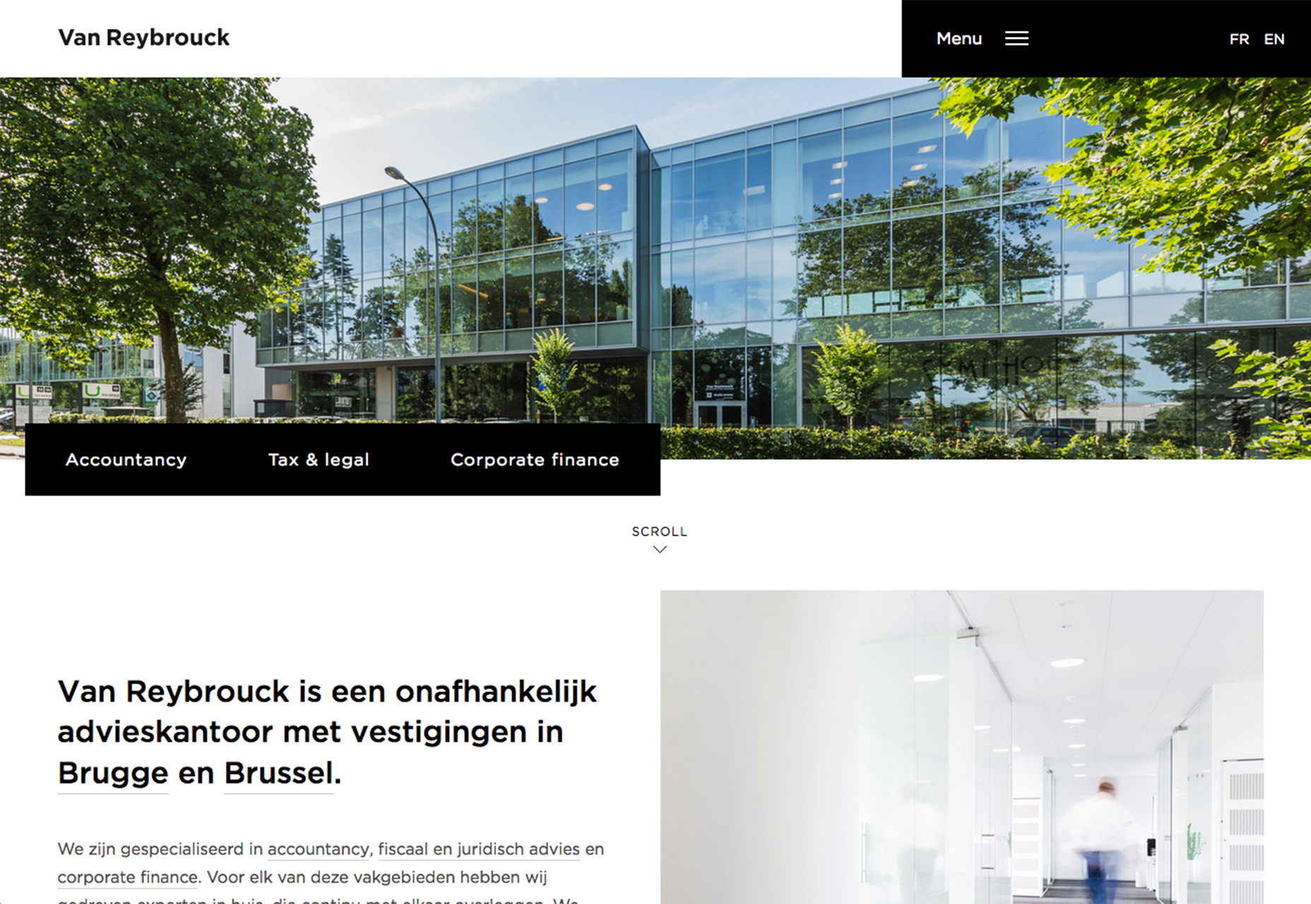
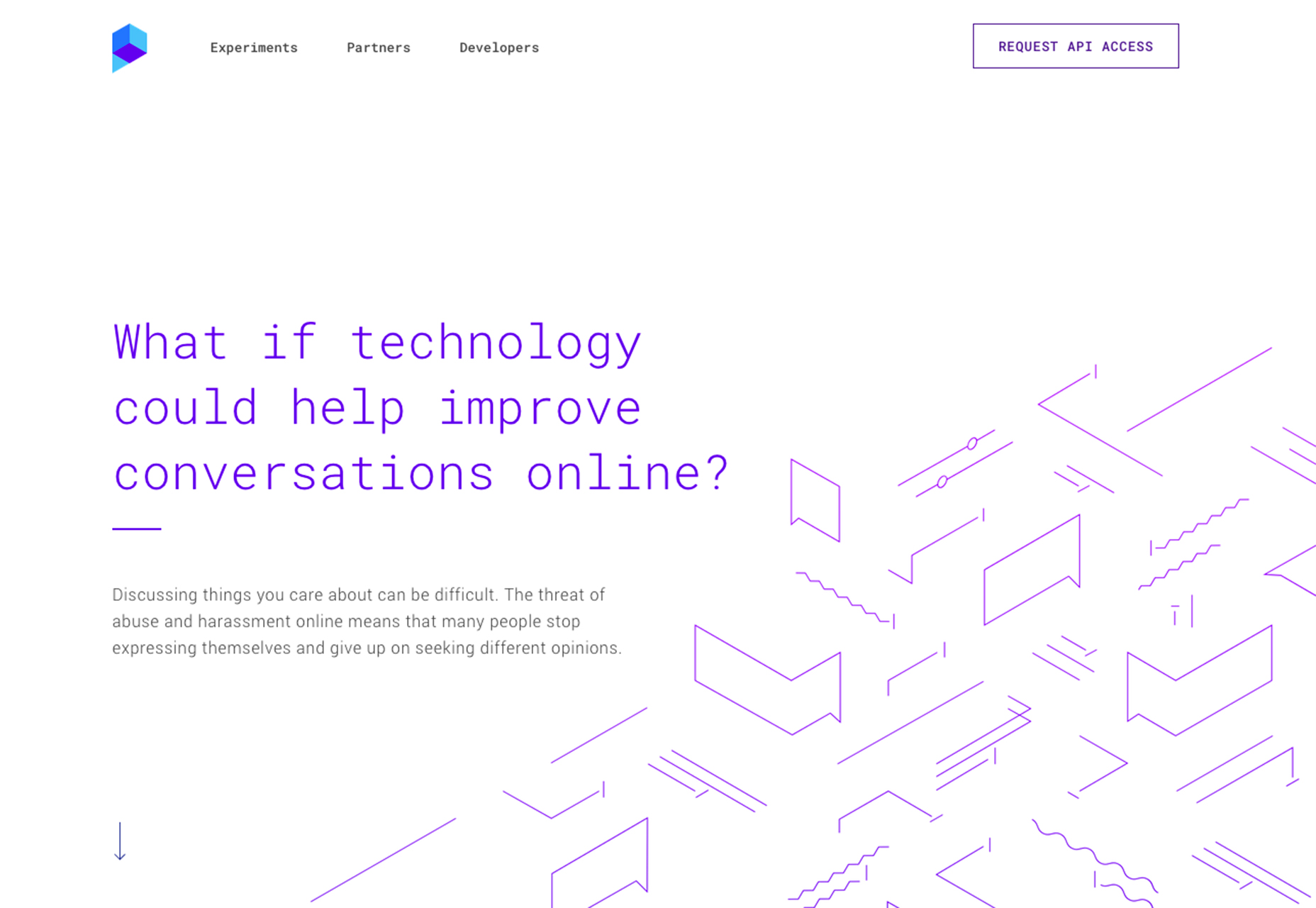
1. Shallow Hero Headers
For a while the trend with hero images have been big, bold images and videos that fill the screen, often from the top of the homepage to right about where the scroll starts. More designs are starting to back off of this oversized image trend for shallower hero images. Much of the design is still the same. Hero headers still include nice images or text with a configuration that’s made to be looked at. But the images are about half as deep. What’s nice about this concept is it helps move other information up on the screen. Body copy and calls to action that aren’t in the hero image appear higher up in the design, giving users something to do or click right away. It can help prevent clutter in the image itself, which can be pretty important if the image is busy or hard to pair with text effectively. This design pattern can also add more whitespace to the overall design, making it feel lighter and easier to navigate. With more minimal styles still popular, this concept might be one of the factors that’s driving this design decision. The toughest part of using a more shallow hero image is cropping. It’s one of those things you’ll want to think about early in the design process, all the way back to when you talk to the photographer about images. Because the shape is not as standard, you might need to explain how you plan to use the image to get a photo or video that will look good with that aspect ratio.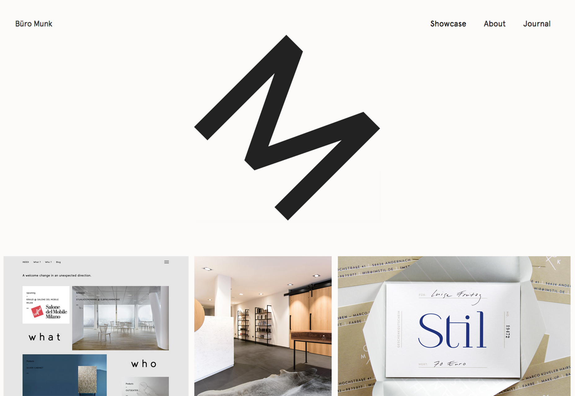
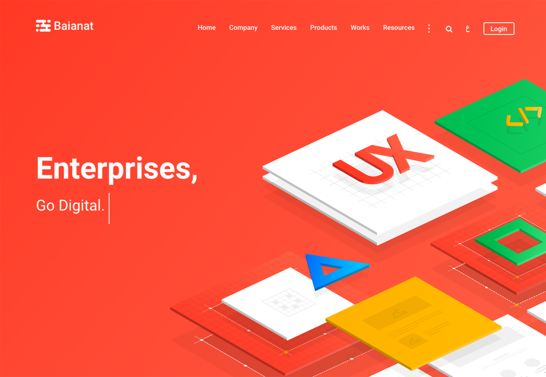
2. Diagonal Corner Layouts
Some trends are just too much fun to ignore. Diagonal corner layouts are one of those concepts. These designs are exemplified by elements that are clustered in one corner of the screen – often the bottom right – and fan out onto the rest of the canvas. Elements are often positioned to look like they are bursting into the design. Diagonal corner layouts provide a different eye tracking pattern for users by creating a focal point at the bottom corner of a design rather than the top left or center and create some depth with the idea of elements that seem to “explode” across the screen. (For an extra kick to the design, consider animating elements to enhance that explosion effect with movement as the user scrolls or hovers over specific elements.) To make the most of these elements, many designs “hide” more elements below the scroll to add that extra element of reality so that parts of the design that you can’t see feel tactile and exist on the scroll. While this type of design pattern doesn’t work with every type of content, it can be a good idea for designs that don’t have a lot of other art and use a lot of user interface elements to draw attention. It can also work for portfolio-style designs or serve as a way to organize many smaller visual elements into a single unit.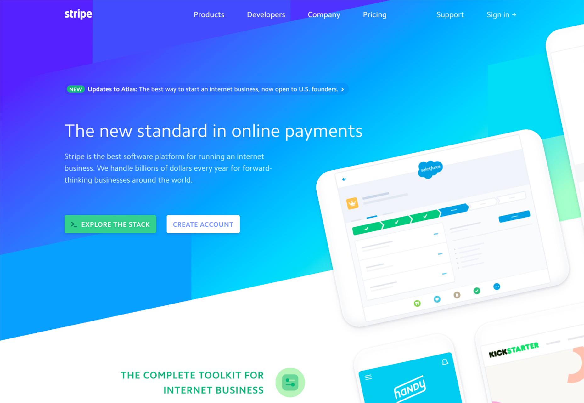
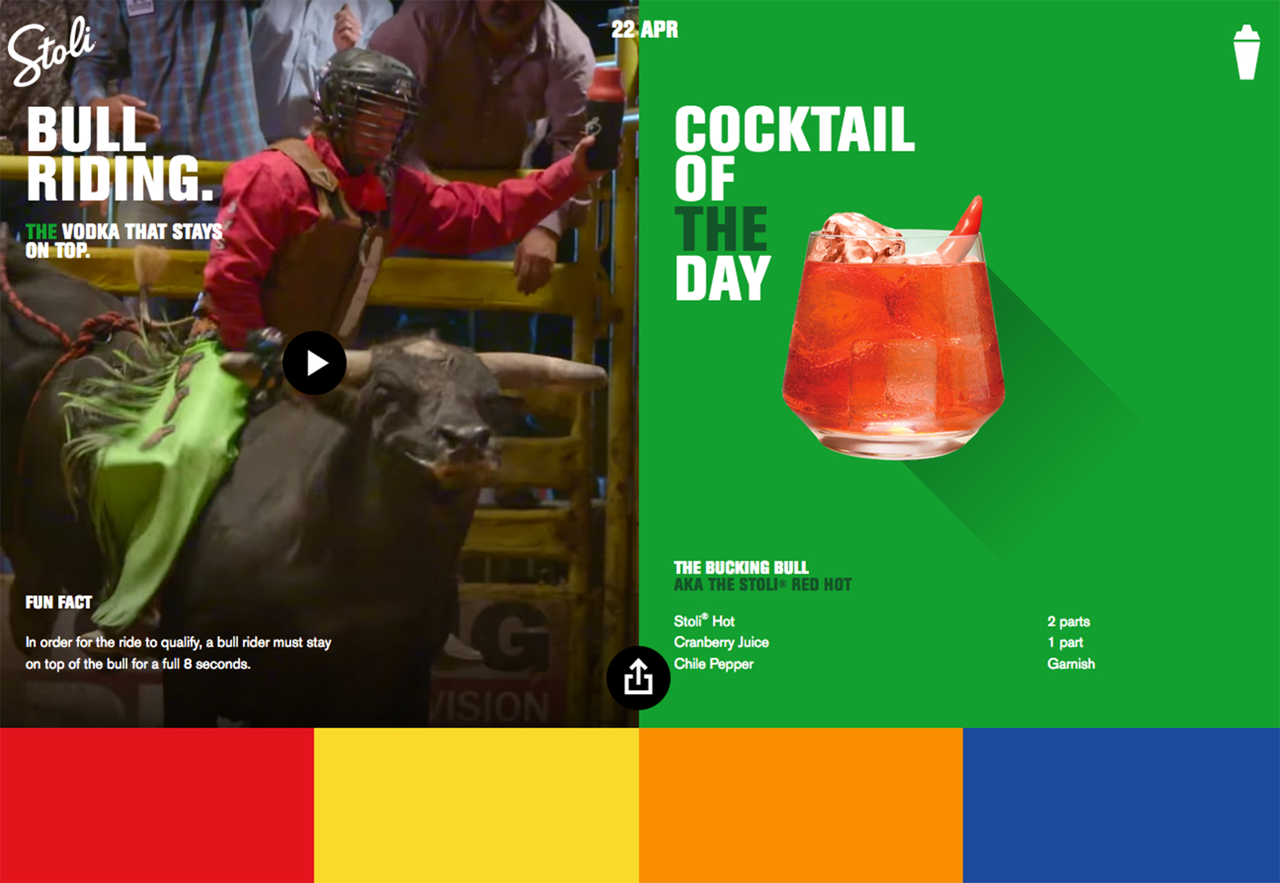
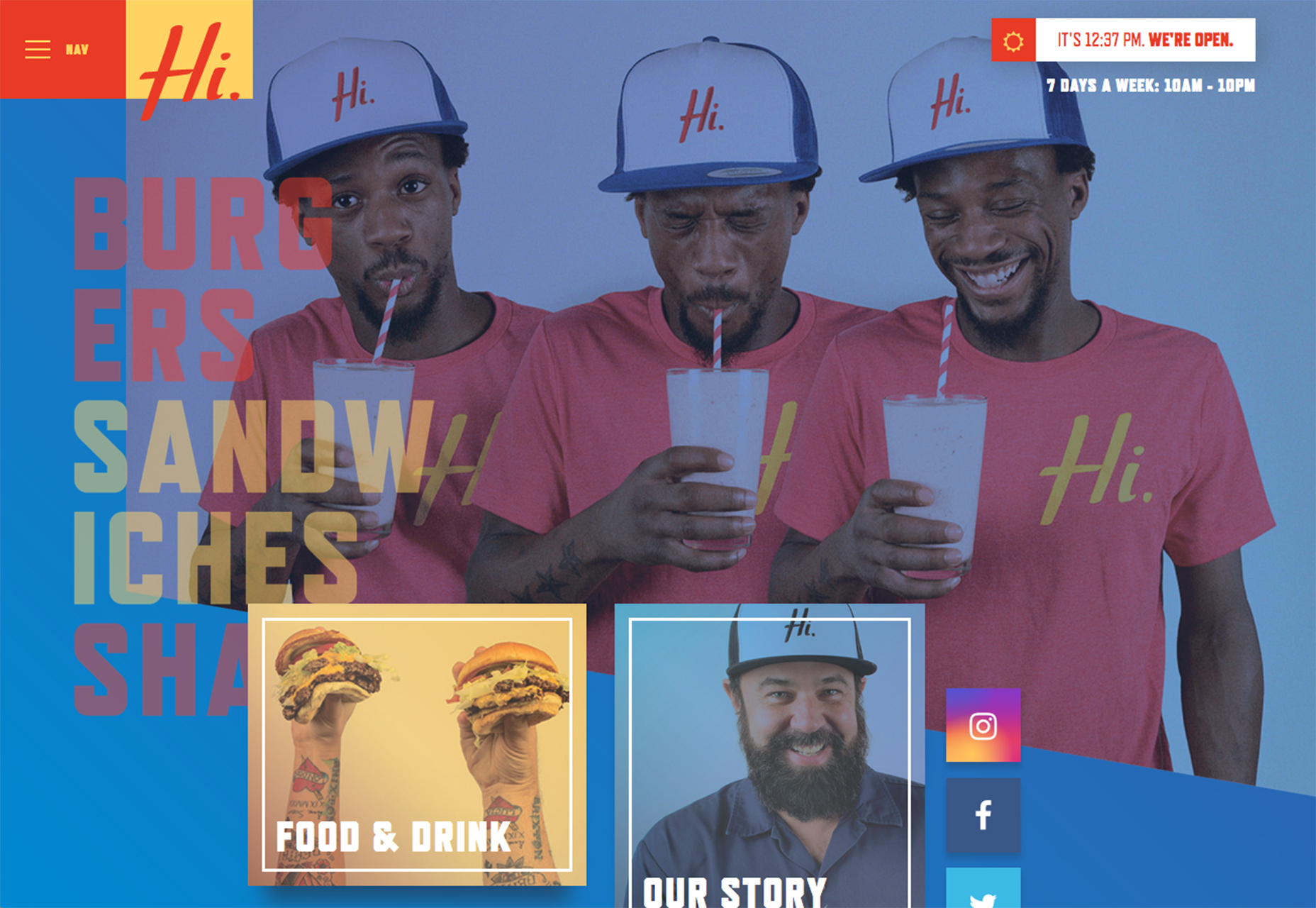
3. This or That Calls to Action
Almost every website design includes some type of call to action. Whether it is a form to fill out, link to click or direction to keep scrolling for more content, the user is prompted to do something. (And they often receive something else as a reward for that effort.) More designs are beginning to pop up with mirroring call to actions, that allow users to make a choice from the homepage as they decide what to do next. The design might look a number of ways, such as the direct would you cheat or not question from Words Hurt to the two-panel option from Stoli to the click-option navigation for the Hi Pointe Drive In. This design style gives users control over what they want to do and see, which can be appealing with the right mix of content and choices. All three examples below do a great job of framing what the user can do and what will happen. (There are also outs if the user makes a wrong choice and needs to go back.) The challenge here is that you need just the right kind of content for this design pattern to work. Some users can be overwhelmed by multiple choices and just want a single call to action with a single choice—complete the action or not. Here, users have twice as many options to consider. To make the most of choices, the content has to be wholly engaging.
Conclusion
Unlike some of the other trends we’ve explored recently, this month’s trends are pure visual elements that you can add to an existing design in the fly. (Although you might come close if you are lucky.) These design schemes rely a little more on planning content and design to match, knowing that you have a certain concept in mind. It takes preplanning and in some cases even requires a little HTML or CSS magic to pull it all together. What trends are you loving (or hating) right now? I’d love to see some of the websites that you are fascinated with. Drop me a link on Twitter; I’d love to hear from you.Carrie Cousins
Carrie Cousins is a freelance writer with more than 10 years of experience in the communications industry, including writing for print and online publications, and design and editing. You can connect with Carrie on Twitter @carriecousins.


Read Next

15 Best New Fonts, July 2024
Welcome to our monthly roundup of the best fonts we’ve found online in the last four weeks. This month, there are fewer…
By Ben Moss

20 Best New Websites, July 2024
Welcome to July’s round up of websites to inspire you. This month’s collection ranges from the most stripped-back…

Top 7 WordPress Plugins for 2024: Enhance Your Site's Performance
WordPress is a hands-down favorite of website designers and developers. Renowned for its flexibility and ease of use,…
By WDD Staff

Exciting New Tools for Designers, July 2024
Welcome to this July’s collection of tools, gathered from around the web over the past month. We hope you’ll find…

3 Essential Design Trends, July 2024
Add some summer sizzle to your design projects with trendy website elements. Learn what's trending and how to use these…

15 Best New Fonts, June 2024
Welcome to our roundup of the best new fonts we’ve found online in the last month. This month, there are notably fewer…
By Ben Moss

20 Best New Websites, June 2024
Arranging content in an easily accessible way is the backbone of any user-friendly website. A good website will present…

Exciting New Tools for Designers, June 2024
In this month’s roundup of the best tools for web designers and developers, we’ll explore a range of new and noteworthy…

3 Essential Design Trends, June 2024
Summer is off to a fun start with some highly dramatic website design trends showing up in projects. Let's dive in!

15 Best New Fonts, May 2024
In this month’s edition, there are lots of historically-inspired typefaces, more of the growing trend for French…
By Ben Moss

How to Reduce The Carbon Footprint of Your Website
On average, a web page produces 4.61 grams of CO2 for every page view; for whole sites, that amounts to hundreds of KG…
By Simon Sterne

20 Best New Websites, May 2024
Welcome to May’s compilation of the best sites on the web. This month we’re focused on color for younger humans,…