

How to Choose a Good Gesture
When it comes to incorporating gestures in your UI it’s essential to know your market and the other apps your target audience may be using. Try to employ the same types of gestures in your app. This way, you aren’t only optimising your UI based on your target market’s behaviour, but also designing a more comfortable approach for users right from the beginning.Teaching Gestures
Gestures are a must in every mobile app but it’s always a challenge to make them obvious for users. Touch interfaces provide many opportunities to use natural gestures like tap, swipe and pinch to get things done, but unlike graphical user interface controls, gesture-based interactions are often hidden from users. So unless users have prior knowledge that a gesture exists, they won’t try. Therefore design for discovery is crucial. You need to be sure you provide the right cues—visual signifiers that help users discover easily how they can interact with an interface.Avoid Tutorials and Walkthroughs During Onboarding
Tutorials and walkthroughs are quite a popular practice for gesture-driven apps. Incorporating tutorials in your app in many cases means showing some instructions to the user to explain the interface. However, a UI tutorial isn’t the most elegant way to explain the core functionality of an app. The major problem with upfront tutorials is that users have to remember all of those new ways of using the app once they get in. Too much information at once might lead to more confusion. For example, the Clear app starts with a mandatory 7-page tutorial and users have to patiently read all the information and try to commit it to their memory. That’s bad design because it requires users to work upfront even before they actually try the app.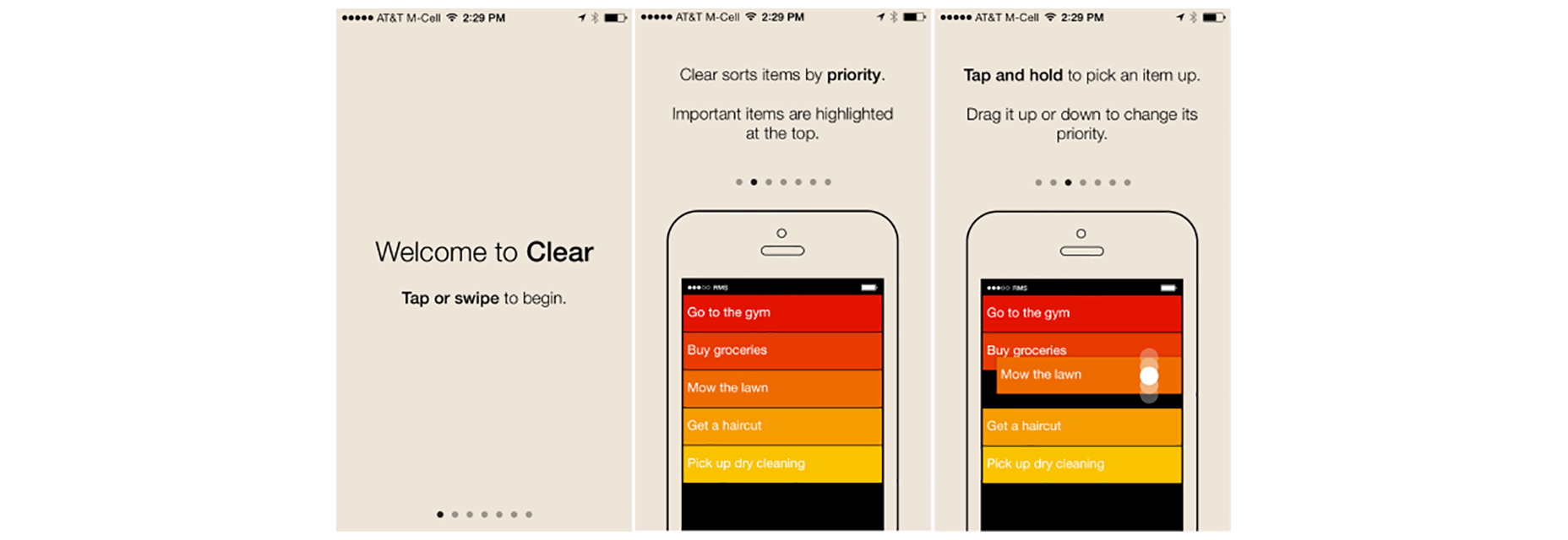
Educate in Context of the Action
When it comes to teaching users to use your UI, I would recommend doing so mainly by educating in the context of the action (when a user actually needs it). In order to teach people a new gesture you have to start slowly. Given some iteration, instructions can be transformed into a more gradual discovery. Use just in time tips and focus on explaining a single interaction rather than trying to explain every possible action in the user interface. Hint at gestures by providing obvious, contextual clues. Below you can see a gesture education screen from the YouTube app for Android. The app has a gesture-based interaction but doesn’t use a tutorial to instruct users. Instead, it uses hints that appear on the first launch for new users, one at a time as the user reaches the relevant section of the app. The technique is based on text commands which prompt users to perform a gesture and describes the result of the interaction with a short and clear description.
Use Animation to Communicate Gestures
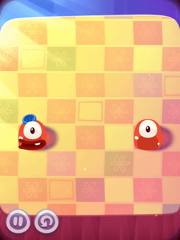
Gestures, usable as they are, would be nothing without animation. As a designer, you can make use of animation to convey information about available actions. For example, in order to make users aware that they can interact with a certain element, you can create a text command right on the interactive element and animate the result of interaction as shown in example below.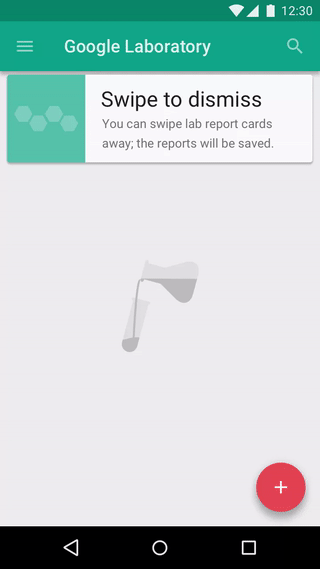 There are three popular techniques to help educate users, based on the use of animation. The first is a hint motion. Hint motion, or animated visual hint, shows a preview of how to interact with an element when performing the action. It aims to create associations between the gesture and the action that it triggers. For example, Pudding Monsters’ game mechanics are based solely on gestures, but they allow users to get the basic idea of what to do without having to guess. Animation conveys information about functionality—a scenario is showcased with animation and it immediately becomes clear to users what to do.
 A second technique is content teases. Content teases are subtle visual clues that indicate what’s possible. An example below demonstrates a content tease for cards—it simply shows that other cards exist behind a current card and this makes it clear that swiping is possible.
 The third and last technique that I would like to mention is affordance. You can give some elements of your UI a high affordance to point users to features in an interface, and use bounces or pulses as an indicator of an available gesture. An example of this technique can be found in Apple iOS. When a user taps the camera icon, the lock screen bounces up, revealing the camera app underneath.

Conclusion
While it’s true that touch gestures are mostly invisible to us, there are a number of design techniques that can give users a peek at what’s possible. Just in time tips, animation cues and content teases are some of the ways hidden gestures can be revealed.Nick Babich
Fireart Studio is a design studio passionate about creating beautiful design for startups & leading brands. We pay special attention to nuances all the time to create professional while cool products that will not only meet all expectations, but exceed them.


Read Next

15 Best New Fonts, July 2024
Welcome to our monthly roundup of the best fonts we’ve found online in the last four weeks. This month, there are fewer…
By Ben Moss

20 Best New Websites, July 2024
Welcome to July’s round up of websites to inspire you. This month’s collection ranges from the most stripped-back…

Top 7 WordPress Plugins for 2024: Enhance Your Site's Performance
WordPress is a hands-down favorite of website designers and developers. Renowned for its flexibility and ease of use,…
By WDD Staff

Exciting New Tools for Designers, July 2024
Welcome to this July’s collection of tools, gathered from around the web over the past month. We hope you’ll find…

3 Essential Design Trends, July 2024
Add some summer sizzle to your design projects with trendy website elements. Learn what's trending and how to use these…

15 Best New Fonts, June 2024
Welcome to our roundup of the best new fonts we’ve found online in the last month. This month, there are notably fewer…
By Ben Moss

20 Best New Websites, June 2024
Arranging content in an easily accessible way is the backbone of any user-friendly website. A good website will present…

Exciting New Tools for Designers, June 2024
In this month’s roundup of the best tools for web designers and developers, we’ll explore a range of new and noteworthy…

3 Essential Design Trends, June 2024
Summer is off to a fun start with some highly dramatic website design trends showing up in projects. Let's dive in!

15 Best New Fonts, May 2024
In this month’s edition, there are lots of historically-inspired typefaces, more of the growing trend for French…
By Ben Moss

How to Reduce The Carbon Footprint of Your Website
On average, a web page produces 4.61 grams of CO2 for every page view; for whole sites, that amounts to hundreds of KG…
By Simon Sterne

20 Best New Websites, May 2024
Welcome to May’s compilation of the best sites on the web. This month we’re focused on color for younger humans,…