

Unconquered
Unconquered is a pretty metal name, and like many a metal band, they include their manifesto on their site. The site, however, touches on post-modern and 90s grunge. Then it slams you in the eyeballs with big, solid type, and striking imagery. You might feel a little bit confused by the time you get to the bottom, but you aren’t likely to forget what you saw.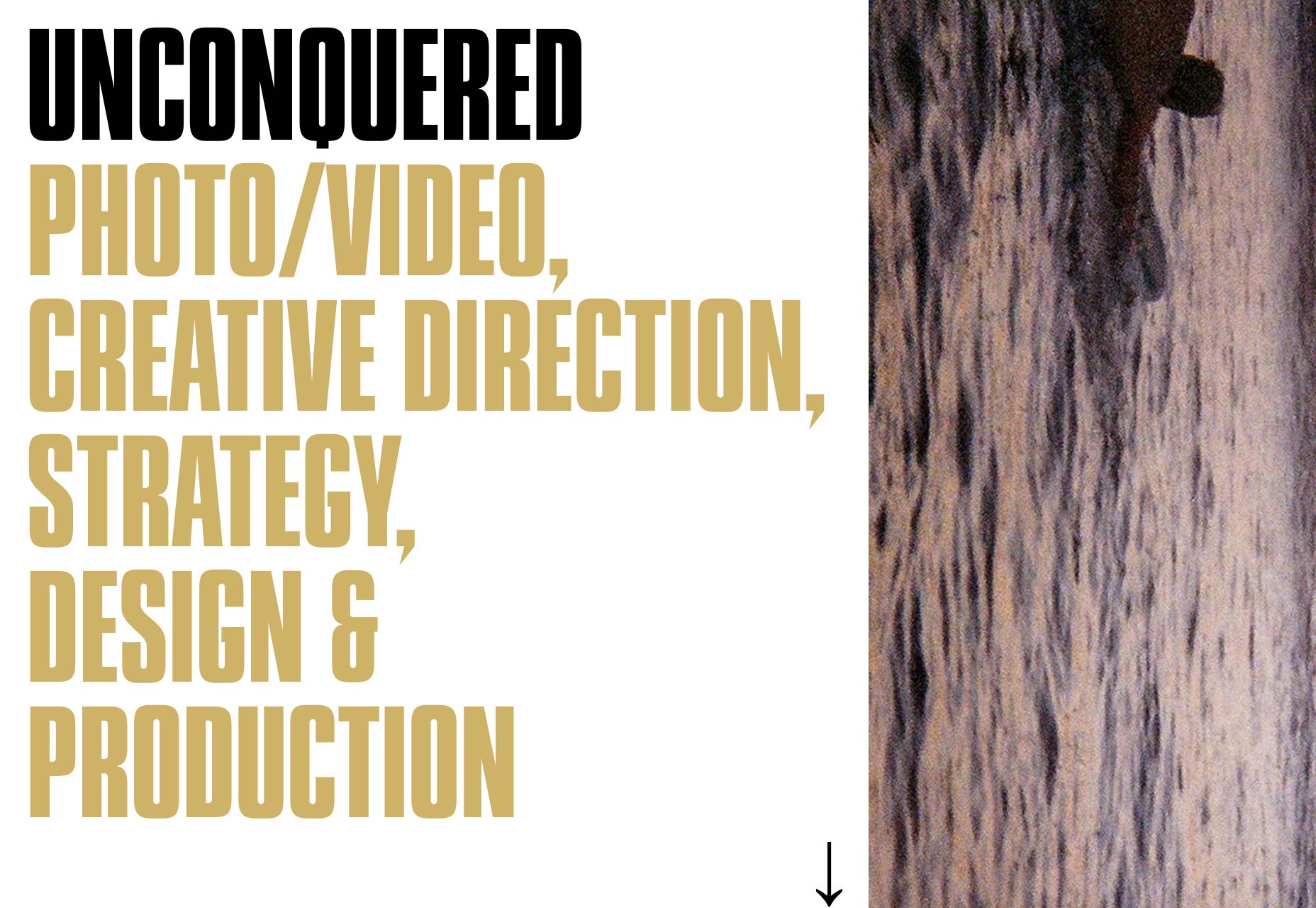
Dilo
Dilo is a film productions company. Where many others opt for the default dark theme, or the usual video background, Dilo has gone all in on color. Every project page has a different color scheme. They also mix up the layouts depending on the project. It might be overcomplicated, but it shows their commitment to art direction in all things.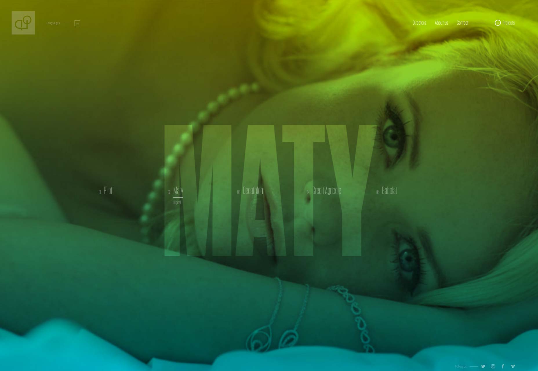
usTwo
usTwo is a veritable cornucopia of design trends with background video and all kinds of layout styles. The two things that really tie the whole design together are the typography and the near-constant onslaught of color. The result is playful-yet-professional look that works for them.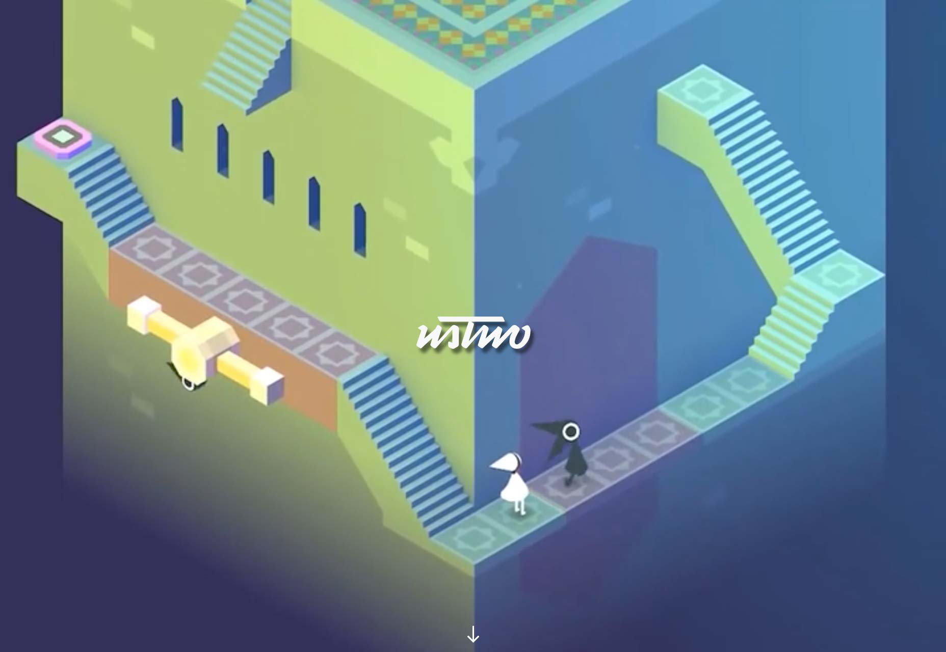
Yorh Ekin
York Ekin’s portfolio is an interesting departure from recent trends. It’s got that classic “corporate elegance” with thin type, and the liberal use of browns, beiges, and a little bit of burnt orange. Man, I haven’t seen a brown site this good since, well, I genuinely can’t remember. It’s strange for a site with such deliberately muted tones to stand out so much, but these are the times we live in. I don’t know if swearing at potential clients in the fine print in the header is the approach I would use, but I respect his candor.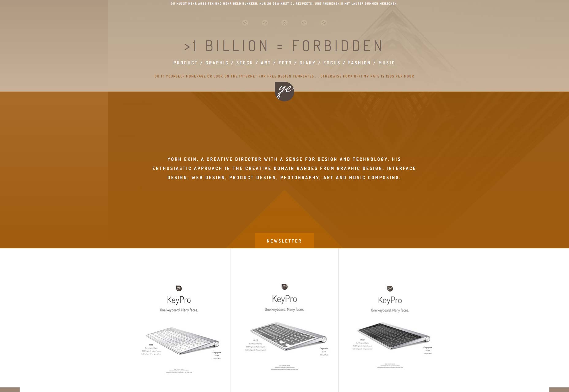
The Soulist
Federico Repetto is just one letter away from me making a Pinocchio joke. His website is an almost perfect representation of the post-modern aesthetic in web design, only a bit more colorful than other examples. This is mostly due to the imagery, but that counts. It’s stylish, it has lots of white space. What’s not to love?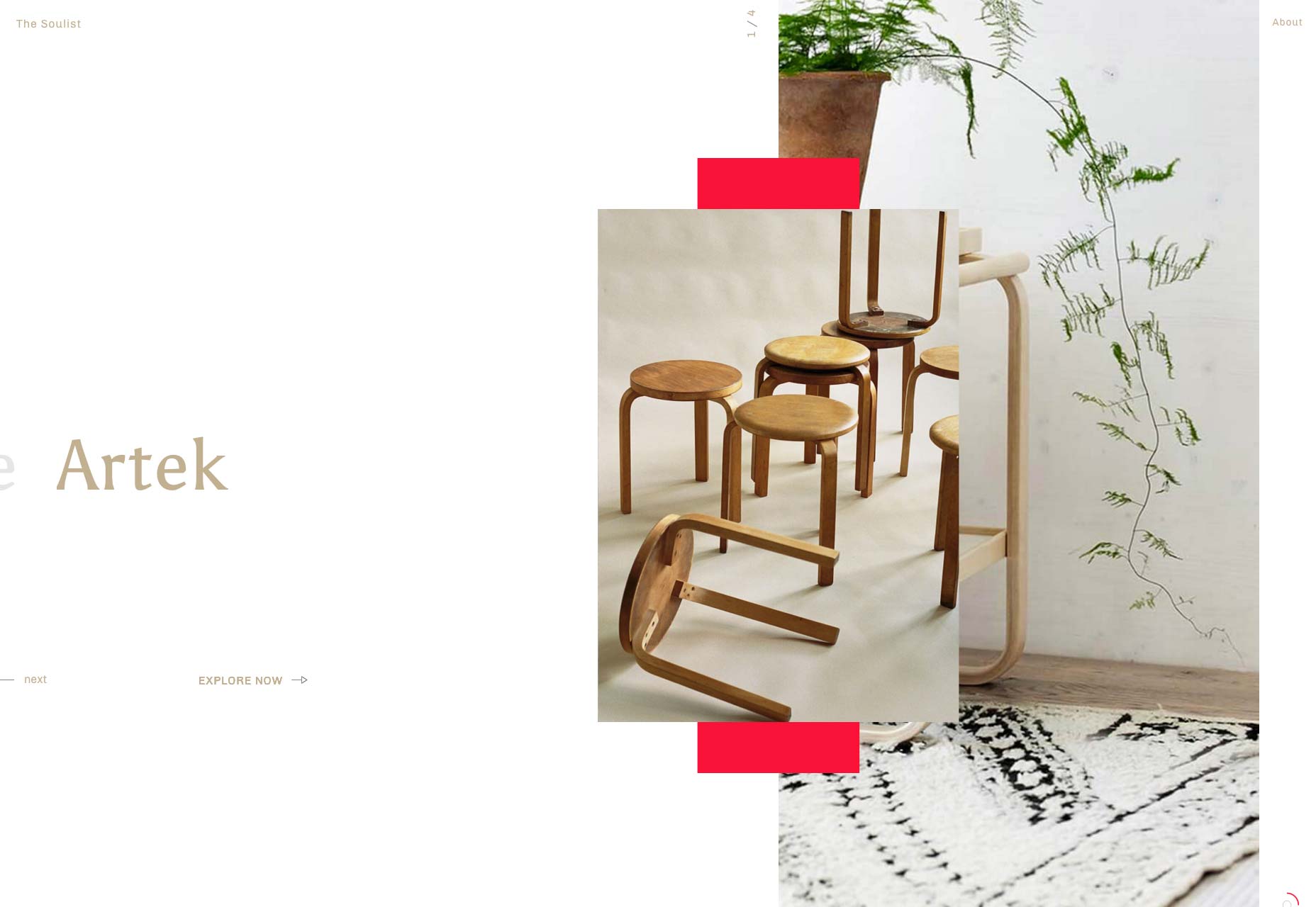
Nahel Moussi
Where the last site was post-modern, this one is almost post-minimal. It starts with a simple horizontal slideshow, and then transitions into case studies that focus almost entirely on the imagery. Text is kept to a bare minimum, but what there there is is beautifully set.
Eien
Eien, on the other hand, uses only typography to make its first impression. There is imagery — you almost can’t have a visual portfolio without it — but there’s a distinct impression of balance. While there aren’t paragraphs upon paragraphs, the text is definitely a part of the story of each design, as opposed to a simple summary. Other than that, it’s a lot of white space, a little animation, and a fairly standard layout. But even so, it’s so well executed, it’s worth a look.
Bleed
Now Bleed really sounds like the name of a metal band. The logo even looks like one. It’s an interesting contrast to the rest of the site’s design, which embraces the collage-like post-minimalism that we’ve seen a bit of. That said, it looks good.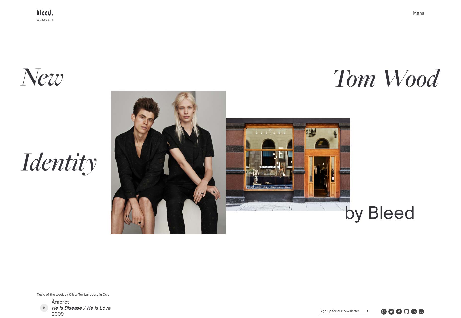
Chaptr
Chaptr brings us some classic minimalism. It’s got white space. it’s got great typography. it’s got huge images all over. It’s here because it looks good, and works well. I’d pay special attention to the way they organize small amounts of text on large screens, and the way they choose their imagery.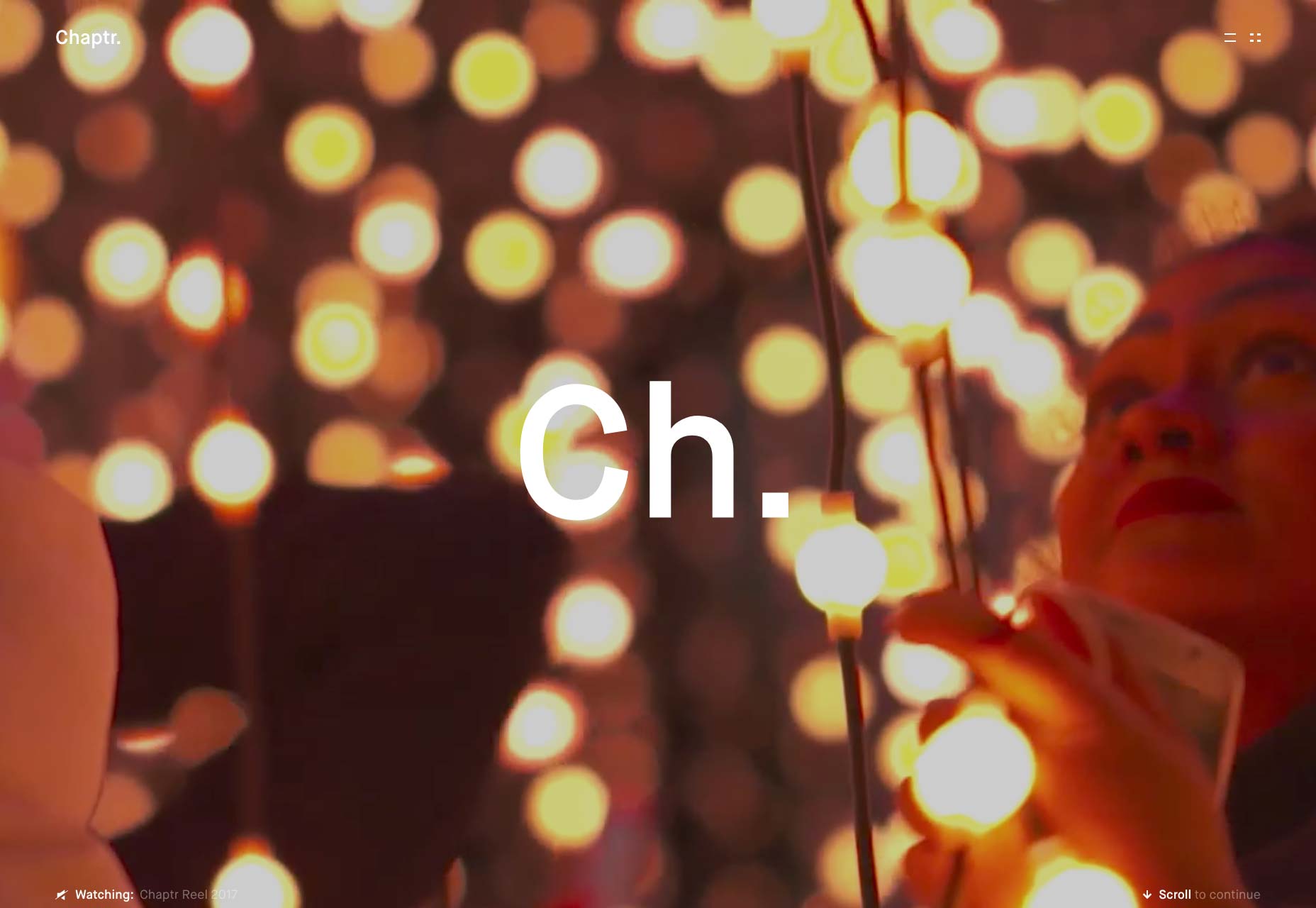
Ruslan Siiz
Ruslan Siiz’s portfolio may engage in some collage-like layout patterns, but the real strength is in the typography. Even with the large empty spaces, the design always feels…full, but never cluttered. And that’s due to the way the designer uses type. It’s a difficult balancing act that Ruslan pulls off well.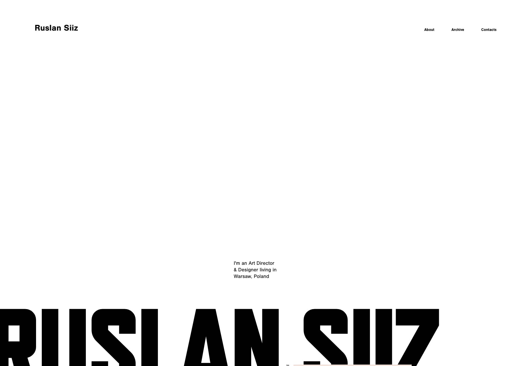
Glitch Paris
Well, the horizontal-slideshow-on-the-home-page thing might become a trend. Glitch Paris is doing it too, and combining it with a bit of video. It’s a simple, but effective strategy. Warning: while there is no audio on the home page, clicking through to a project will start the video immediately.
Orthonormai
Orthonormai is yet another example of post-minimalism, but with color! Give it a look. Frankly, I’m starting to think vibrant color is a drastic improvement to this style of layout.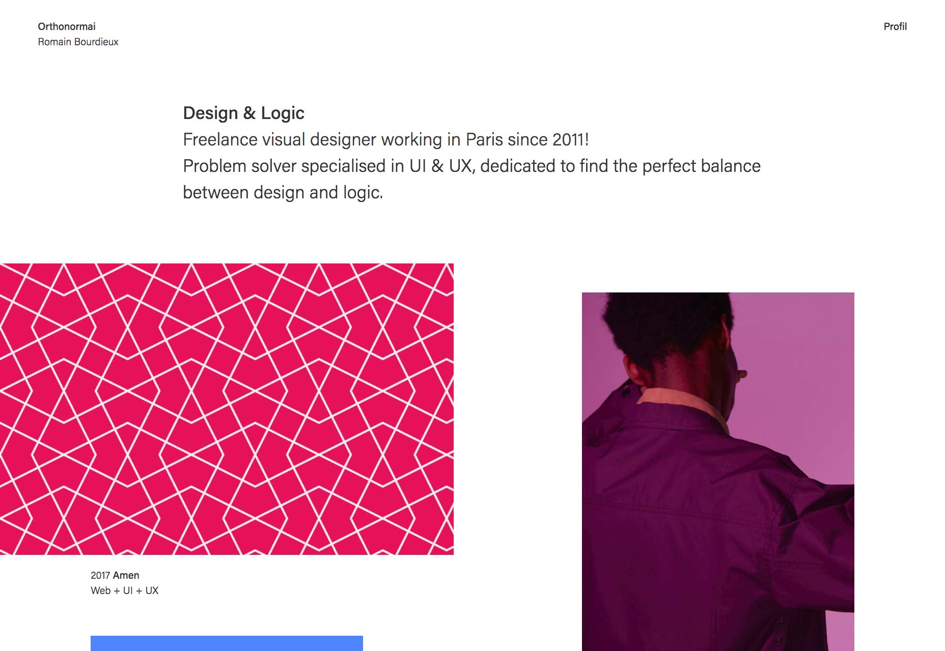
Five & Done
Five & Done is one more Powerpoint-turned-website, and this one experiments with reflections, as well as animation in general. Most of the text is a bit small for a website in this day and age, but overall, it’s a good-looking site. I’m a fan of the art direction they put into it, and the way they change things up depending on the type of content they’re working with.
Yannick Chapron
Yannick Chapron has embraced a trend that we’re actually seeing less of, these days. It’s the Powerpoint portfolio, brought back from near death! I can never recommend these sites as a study in accessibility, but they nearly always have some interesting animation and motion design. This site will be hell on your scroll wheel, but it’s still fun to look through.
Jérémy Levron
Site’s that incorporate playful elements can actually make me overcome my distaste for JS-reliant sites. Jérémy Levron’s portfolio does this by turning the home page into a canvas where anyone can paint. Just click and drag to start. The entire site is a high-contrast monochromatic affair with good type. That would not be enough to set it apart from so many other sites. That home page, though? That does the trick.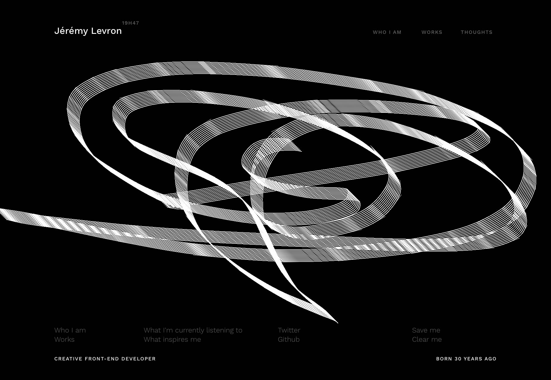
Andy Smiff
This portfolio from Andy Smiff is a good example of a site where the personality is all in the details. The layout won’t win any awards for crossing boundaries, but the use of color to accentuate small elements tells you about the thought and care put into the design as a whole.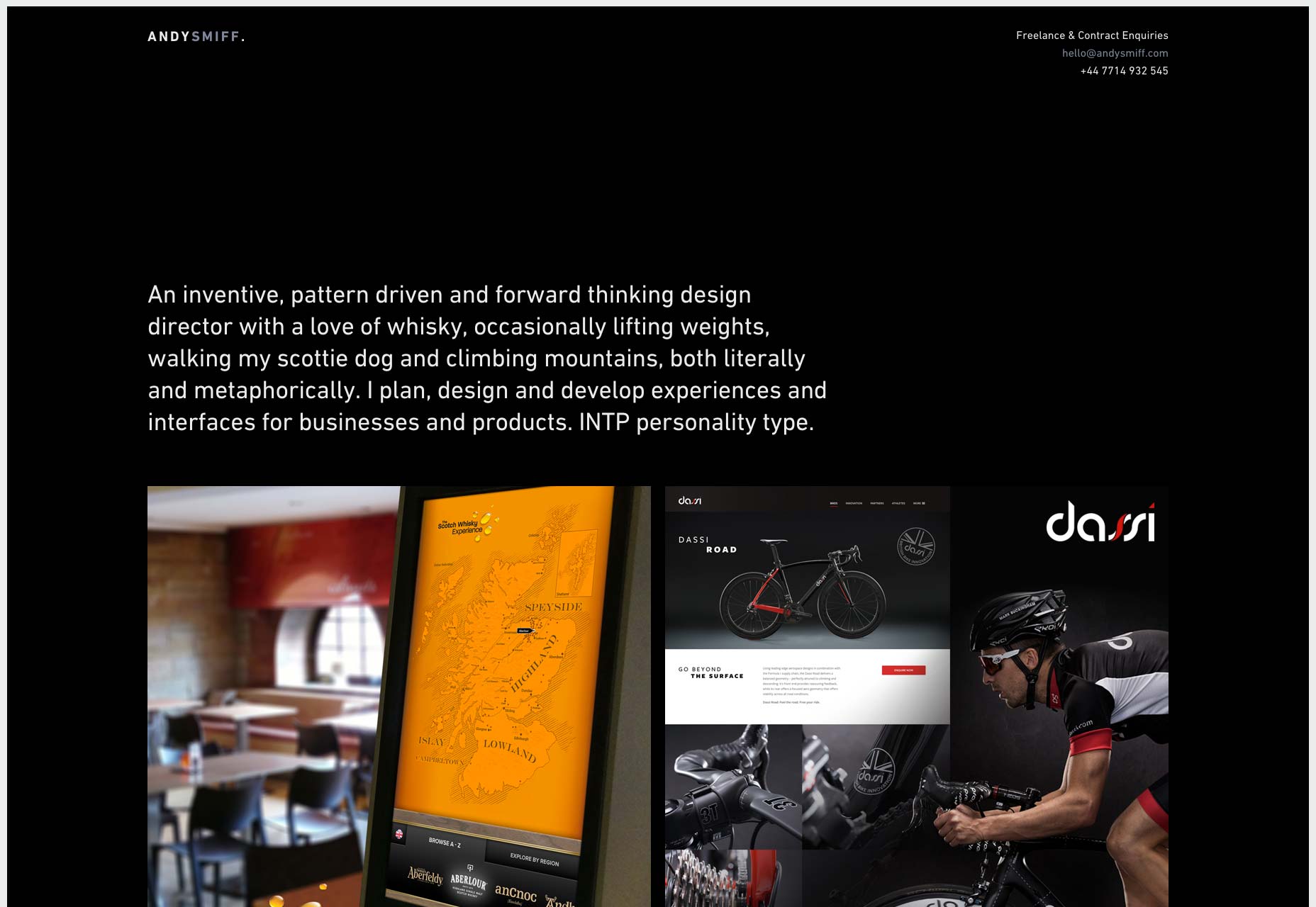
Tom Treadway
Tom Treadway’s site gives us that asymmetrical, elements-overlapping, grid-as-the-background feel that we’ve all come to know and…well, I’m not about to make any assumptions about how you feel. I like the aesthetic well enough, but Tom takes a step further by using intensely-colored imagery. Sure, it’s a filter, but that filter is being used artistically, to establish a theme for his website.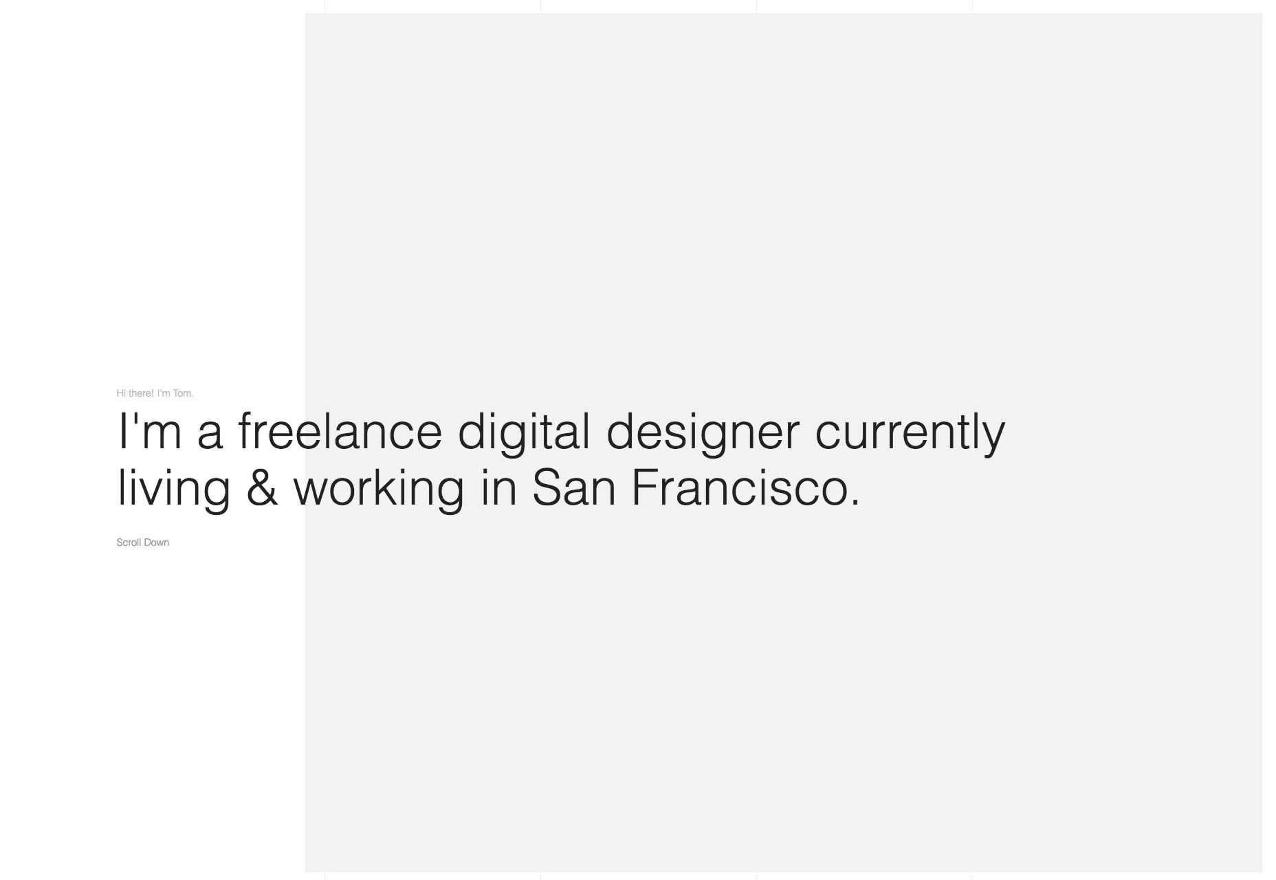
eightweb
If eightweb’s site looks a lot like a WordPress theme, that’s because they specialize in WordPress sites. I mean, where else could you get away with intentionally making a site that screams “WORDPRESS!”, right? I have been slowly developing an admiration for designers that play to their customer’s expectations like this. It’s good for business, and therefore, it’s good design.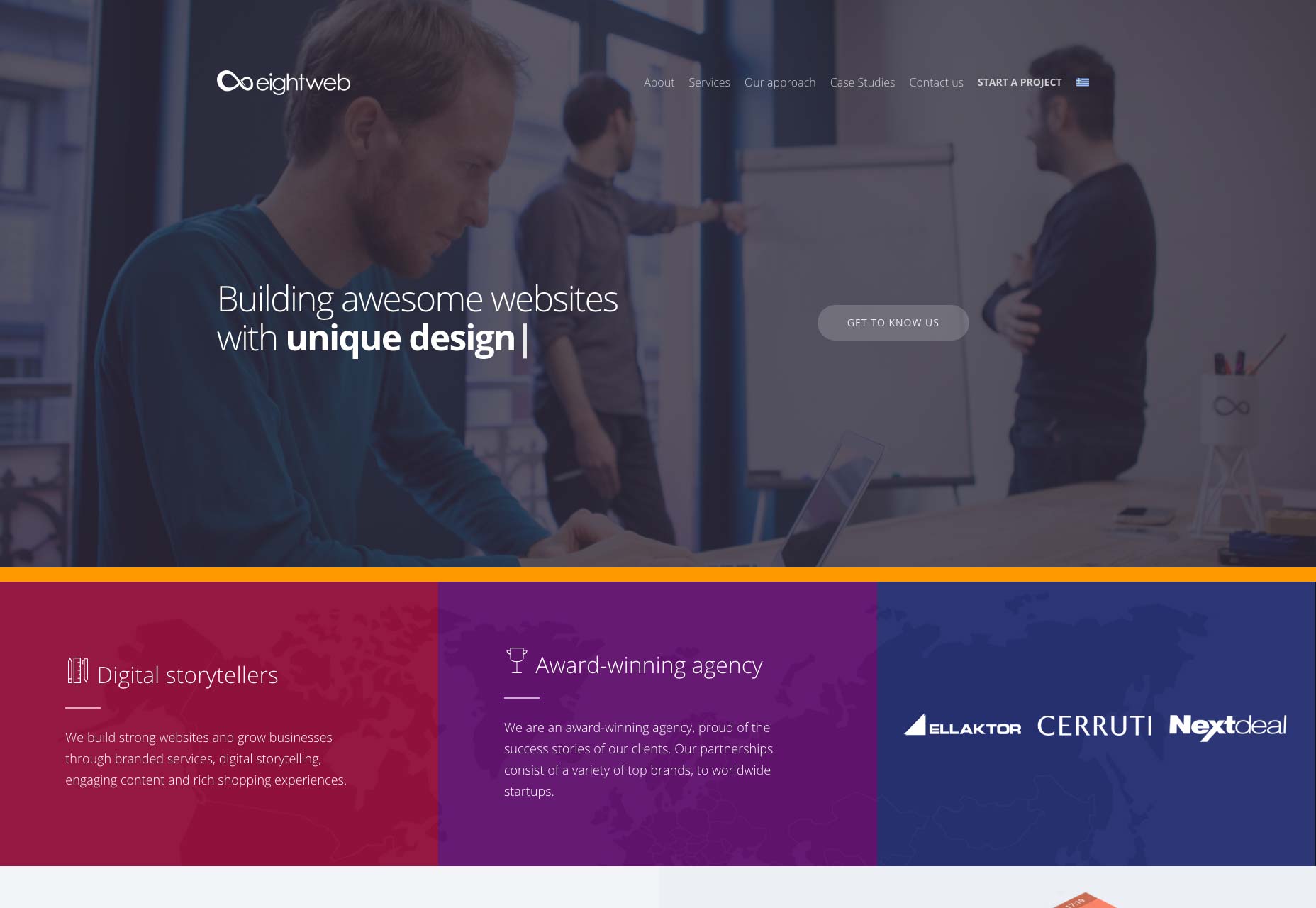
Bureau for Visual Affairs
The Bureau for Visual Affairs isn’t actually as official as it sounds. But the official-sounding name is just the start of a theme. The whole site has that modern minimalist feel, with sans-serif type, and lots of thin borders all around. However, thanks to the liberal use of imagery, and some subtle background video, the design feels a lot more “alive” than many of its counterparts. Yes, I said “subtle background video”.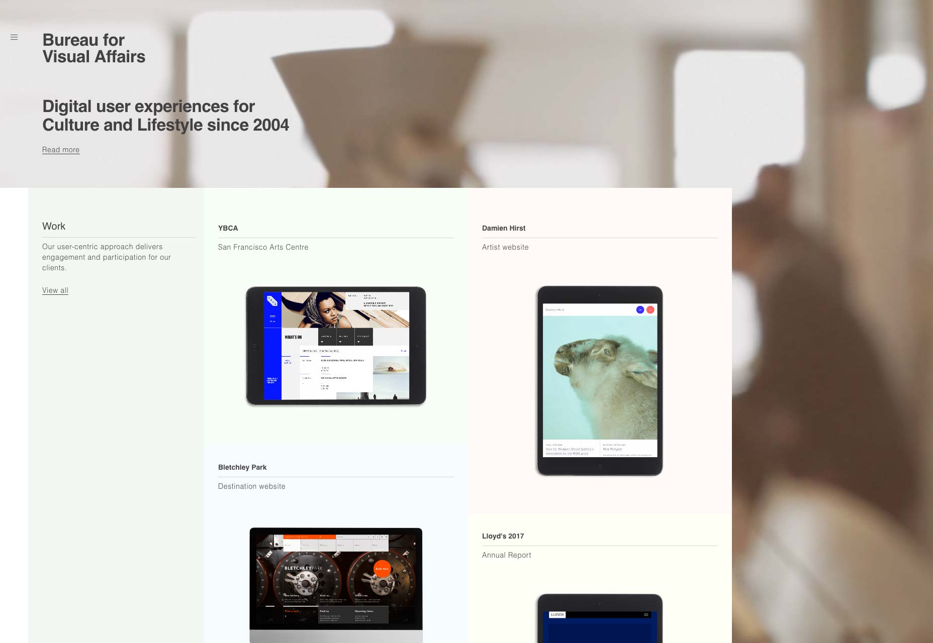
Ezequiel Bruni
Ezequiel Bruni is a web/UX designer, blogger, and aspiring photographer living in Mexico. When he’s not up to his finely-chiselled ears in wire-frames and front-end code, or ranting about the same, he indulges in beer, pizza, fantasy novels, and stand-up comedy.


Read Next

3 Essential Design Trends, May 2024
Integrated navigation elements, interactive typography, and digital overprints are three website design trends making…

How to Write World-Beating Web Content
Writing for the web is different from all other formats. We typically do not read to any real depth on the web; we…
By Louise North

20 Best New Websites, April 2024
Welcome to our sites of the month for April. With some websites, the details make all the difference, while in others,…

Exciting New Tools for Designers, April 2024
Welcome to our April tools collection. There are no practical jokes here, just practical gadgets, services, and apps to…

How Web Designers Can Stay Relevant in the Age of AI
The digital landscape is evolving rapidly. With the advent of AI, every sector is witnessing a revolution, including…
By Louise North

14 Top UX Tools for Designers in 2024
User Experience (UX) is one of the most important fields of design, so it should come as no surprise that there are a…
By Simon Sterne

What Negative Effects Does a Bad Website Design Have On My Business?
Consumer expectations for a responsive, immersive, and visually appealing website experience have never been higher. In…

10+ Best Resources & Tools for Web Designers (2024 update)
Is searching for the best web design tools to suit your needs akin to having a recurring bad dream? Does each…
By WDD Staff

3 Essential Design Trends, April 2024
Ready to jump into some amazing new design ideas for Spring? Our roundup has everything from UX to color trends…

How to Plan Your First Successful Website
Planning a new website can be exciting and — if you’re anything like me — a little daunting. Whether you’re an…
By Simon Sterne

15 Best New Fonts, March 2024
Welcome to March’s edition of our roundup of the best new fonts for designers. This month’s compilation includes…
By Ben Moss

LimeWire Developer APIs Herald a New Era of AI Integration
Generative AI is a fascinating technology. Far from the design killer some people feared, it is an empowering and…
By WDD Staff