This red goes to #FG0000: Wide-Gamut Color with <picture> and Cloudinary

Wide-gamut Screens
For the last 20 years, the display industry has settled on a limited, standard range of colors, called the sRGB gamut. If the lopsided, chopped-off-rainbow-disc below (technical name: the “1931 CIE Chromaticity Diagram”) represents all of the colors that human eyes can see, the sRGB gamut is circumscribed by the little triangle in the middle.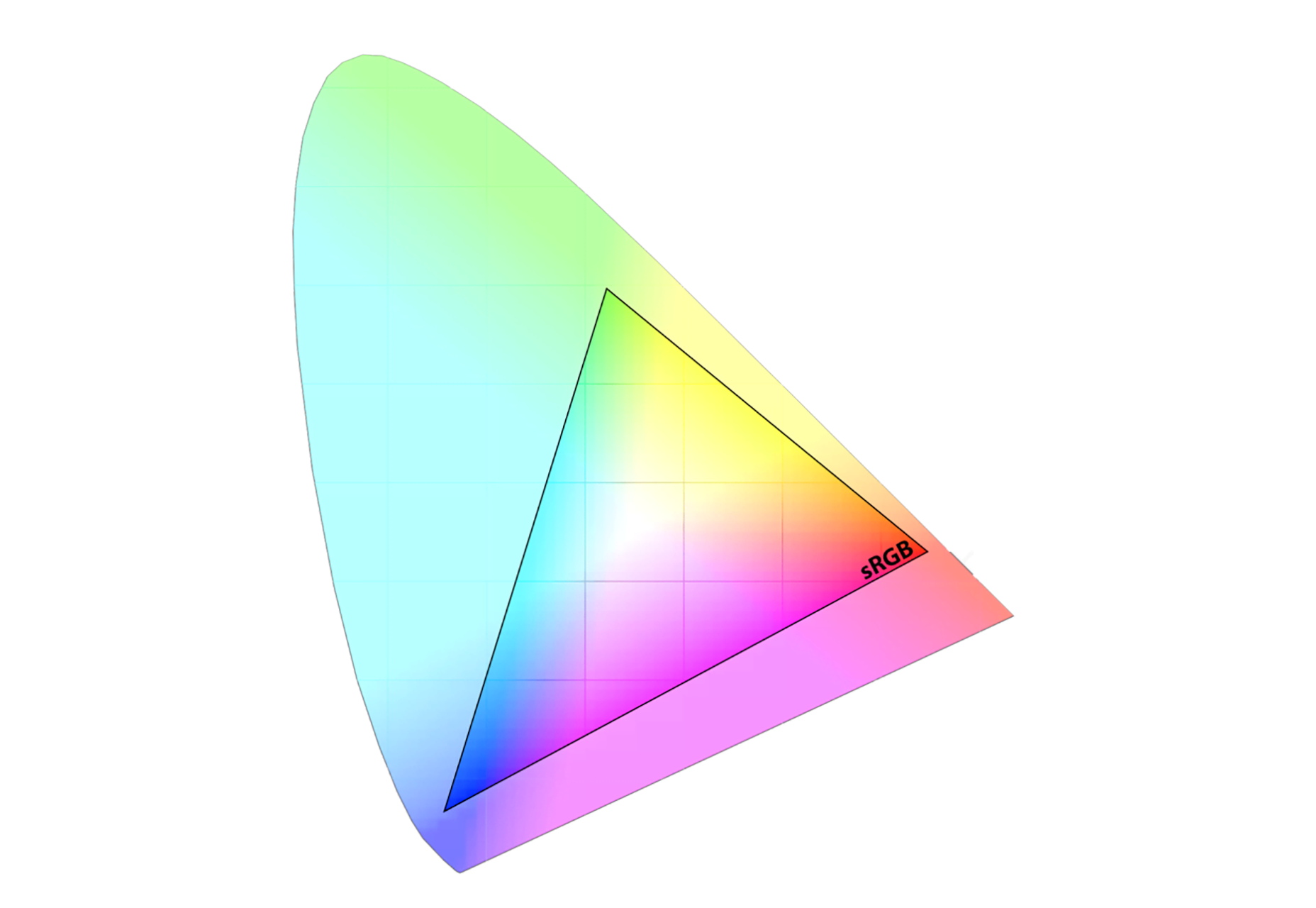 The latest-generation of displays can produce colors outside of sRGB’s limited range. These screens expand the triangle of possibilities out, to what’s called the P3 gamut:
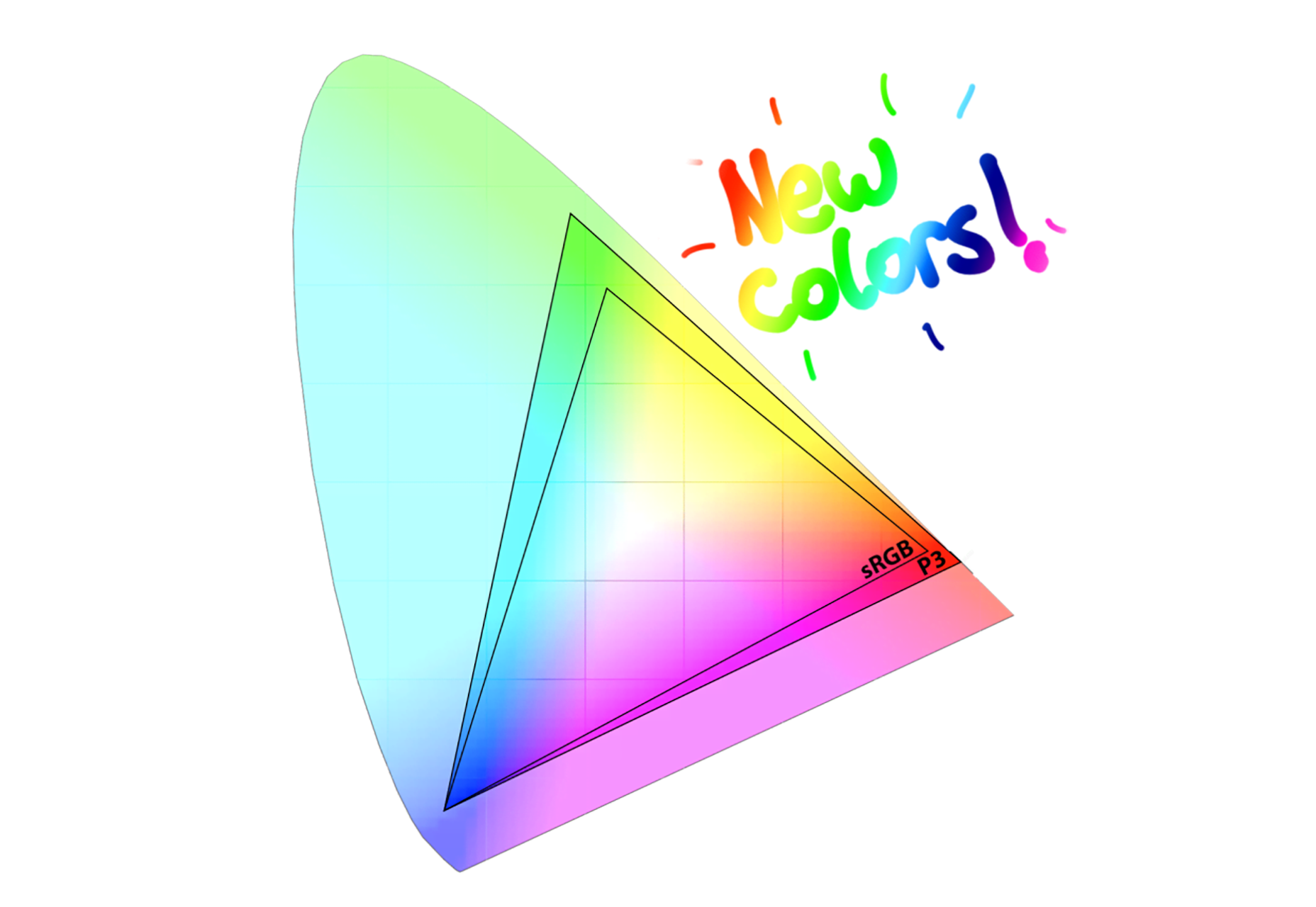 The P3 gamut, compared to sRGB. It’s bigger!
Triangles are one thing and actual photographs are another—for a sense of what this wider range actually looks like in practice, beg, borrow, or steal a wide-gamut display and go check out Craig’s gorgeous example images, or look at this quick example, from yours truly. Basically, if your subject is really saturated (for example: an incandescent sunrise, or bright-green grass) P3 will let your images pop in new and notable ways. But if your image’s palette is more subdued, sRGB already has you covered and you’ll see no visible difference.
So – devices that can display new, more vibrant colors are shipping en masse. How can we take advantage of them, without screwing things up for everybody else?
The P3 gamut, compared to sRGB. It’s bigger!
Triangles are one thing and actual photographs are another—for a sense of what this wider range actually looks like in practice, beg, borrow, or steal a wide-gamut display and go check out Craig’s gorgeous example images, or look at this quick example, from yours truly. Basically, if your subject is really saturated (for example: an incandescent sunrise, or bright-green grass) P3 will let your images pop in new and notable ways. But if your image’s palette is more subdued, sRGB already has you covered and you’ll see no visible difference.
So – devices that can display new, more vibrant colors are shipping en masse. How can we take advantage of them, without screwing things up for everybody else?
Wide-gamut Resources
First, we have to produce files that contain these new colors. Generally, you can do this by making sure that: 1) your camera is capturing– 2) your software is editing– and, crucially, 3) that you’re exporting– in a wide gamut (like P3, Adobe RGB, or Adobe ProPhoto). And don’t forget to embed a color profile. For a detailed tutorial on how to do this with Photoshop, buy Craig’s book! If you’ve got a shiny new iPhone, though, you don’t have to worry about minding your Ps and Qs in obscure preference panes. The iPhone 7 captures, processes, and saves photos in the P3 gamut out-of-the-box.Wide-gamut on the Web
Ok, so let’s say you’ve captured a beautiful sunrise and produced a wide-gamut Jpeg with an embedded profile. Great! How are you going to share that image with the world? Let’s start by marking it up using a single-src <img>: <img src="sunrise-p3.jpg" alt="Oranges and blues" /> In browsers that implement “color management” – browsers that know how to use the image’s embedded profile to map the image’s wide-gamut colors to a device’s particular screen – the sunrise will always look as good as the hardware will allow. It will look good on sRGB-ish screens, and great on wide-gamut displays. But many browsers are not color managed. And in color-unmanaged browsers, the raw color values in our image are painted directly to the screen, without consideration for how the file’s wide profile relates to the display’s limited gamut. This results in a dull image – much worse than if we’d just left well enough alone and exported our image in sRGB:
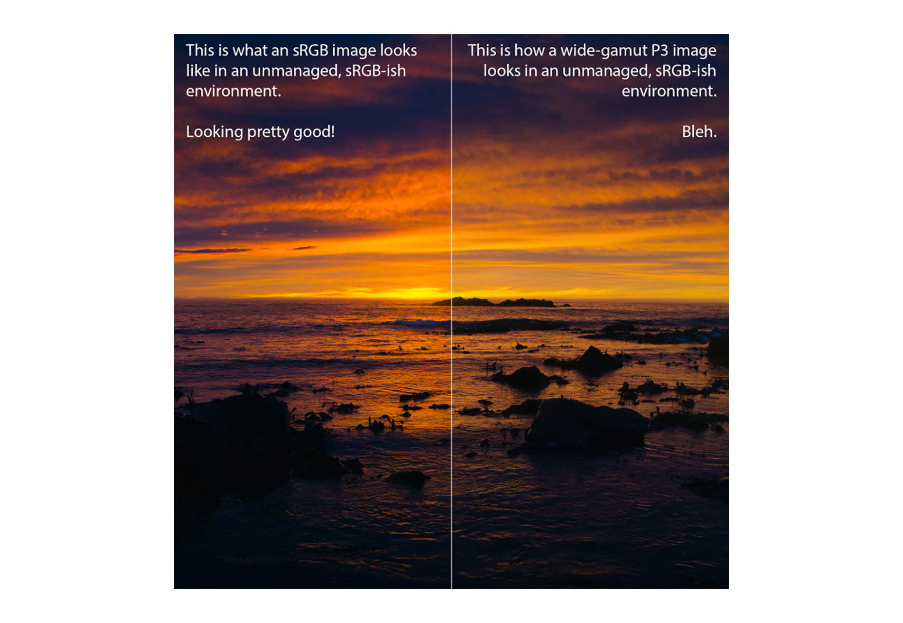 Comparison between a vibrant, sRGB sunrise and a a dull, wide-gamut sunrise on a color-unmanaged display
In color-dumb browsers, wide-gamut images look worse than their narrow-gamut, sRGB counterparts.
What can we do about this sad state of affairs? Unfortunately, there’s no easy way to feature test whether or not a browser is color-managed. But we can ask the browser if a screen’s profile is more sRGB-like or P3-esque, using the brand-new color-gamut media query. If we use this query within a <picture> element, we can make sure that we only send wide-gamut images to wide-gamut screens – and send sRGB images to everybody else:
Comparison between a vibrant, sRGB sunrise and a a dull, wide-gamut sunrise on a color-unmanaged display
In color-dumb browsers, wide-gamut images look worse than their narrow-gamut, sRGB counterparts.
What can we do about this sad state of affairs? Unfortunately, there’s no easy way to feature test whether or not a browser is color-managed. But we can ask the browser if a screen’s profile is more sRGB-like or P3-esque, using the brand-new color-gamut media query. If we use this query within a <picture> element, we can make sure that we only send wide-gamut images to wide-gamut screens – and send sRGB images to everybody else:
<picture>
<source media="(color-gamut: p3)" srcset="sunrise-p3.jpg" />
<img src="sunrise-sRGB.jpg" alt="Oranges and blues" />
</picture>
That, my friends, is a color-adaptive responsive image. Neat!
Responsive Color with Cloudinary
Make no bones about it, creating responsive image assets is tedious. Whether you’re rendering multiple resolutions, crops, formats, or, now, color gamuts – the task of generating alternate versions of your assets is ripe for automation. Enter Cloudinary. Cloudinary’s color-smarts are still evolving, but today, the service has two key features:- If an uploaded image has a color profile, Cloudinary preserves it.
- Cloudinary can convert any image to sRGB using the cs_srgb transformation.
<picture>
<source
media="(color-gamut: p3)"
srcset="https://res.cloudinary.com/eric-cloudinary/image/upload/sunrise.jpg" />
<img
src="https://res.cloudinary.com/eric-cloudinary/image/upload/cs_srgb/sunrise.jpg"
alt="Oranges and blues" />
</picture>
This pattern allows us to generate a single, wide-gamut resource, and deliver it in a way that looks great for some, and good for everybody. ✨☺️??✨
Ready for Anything
As screens begin to evolve along this new axis – becoming more colorful – it’s gratifying to see the techniques and toolchains built to cope with the Retina-revolution so ready to tackle a new challenge. On the ever-evolving, always-diversifying web, adapting bitmap images to varied browsing contexts is a general problem, and responsive image markup patterns – paired with a centralized, automated image-processing back-end like Cloudinary – are here to solve it, no matter the particulars. So – armed with P3, <picture>, and Cloudinary’s cs_srgb – voyage forth bravely into a wider world of color. [-- This is a sponsored post on behalf of Cloudinary --]WDD Staff
WDD staff are proud to be able to bring you this daily blog about web design and development. If there's something you think we should be talking about let us know @DesignerDepot.
Read Next

15 Best New Fonts, July 2024
Welcome to our monthly roundup of the best fonts we’ve found online in the last four weeks. This month, there are fewer…
By Ben Moss

20 Best New Websites, July 2024
Welcome to July’s round up of websites to inspire you. This month’s collection ranges from the most stripped-back…

Top 7 WordPress Plugins for 2024: Enhance Your Site's Performance
WordPress is a hands-down favorite of website designers and developers. Renowned for its flexibility and ease of use,…
By WDD Staff

Exciting New Tools for Designers, July 2024
Welcome to this July’s collection of tools, gathered from around the web over the past month. We hope you’ll find…

3 Essential Design Trends, July 2024
Add some summer sizzle to your design projects with trendy website elements. Learn what's trending and how to use these…

15 Best New Fonts, June 2024
Welcome to our roundup of the best new fonts we’ve found online in the last month. This month, there are notably fewer…
By Ben Moss

20 Best New Websites, June 2024
Arranging content in an easily accessible way is the backbone of any user-friendly website. A good website will present…

Exciting New Tools for Designers, June 2024
In this month’s roundup of the best tools for web designers and developers, we’ll explore a range of new and noteworthy…

3 Essential Design Trends, June 2024
Summer is off to a fun start with some highly dramatic website design trends showing up in projects. Let's dive in!

15 Best New Fonts, May 2024
In this month’s edition, there are lots of historically-inspired typefaces, more of the growing trend for French…
By Ben Moss

How to Reduce The Carbon Footprint of Your Website
On average, a web page produces 4.61 grams of CO2 for every page view; for whole sites, that amounts to hundreds of KG…
By Simon Sterne

20 Best New Websites, May 2024
Welcome to May’s compilation of the best sites on the web. This month we’re focused on color for younger humans,…