

1. Petersham Nurseries
On the Petersham Nurseries website you’ll find a nested vertical navigation. This technique is not something you’ll find very often but it works well on this site. Each main nav link uses an icon in the background to convey the links visually. And the first two links open sub-menus aligned next to the primary menu. These take the place of dropdowns which you typically see on horizontal menus. This site is responsive so at smaller sizes these links disappear behind a hamburger menu. This creates a reasonable divide between desktop users with enough space for vertical links, and mobile users who do better with a horizontal navbar.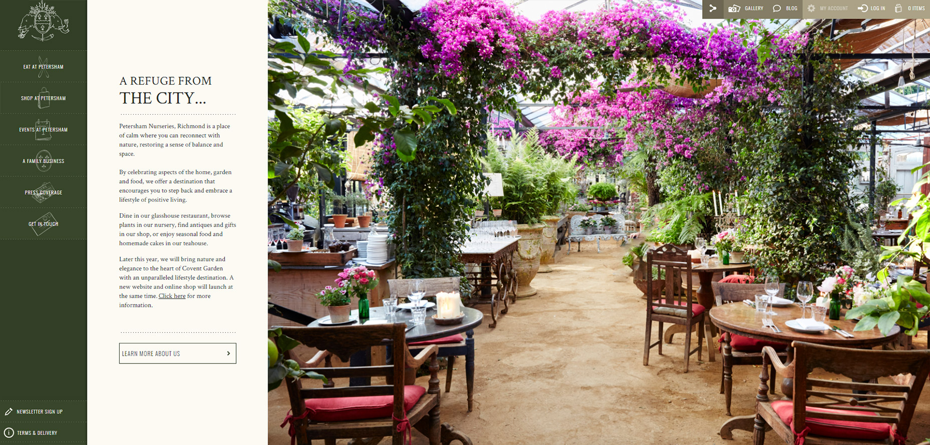
2. Arbor Restaurant
Another very unique example is Arbor Restaurant which has a clean vertical nav with plenty of space between links. The content appears in a sliding container which also aligns vertically next to the navigation. This content style is pretty unique. Most vertical nav sites keep their content aligned with the main page, but in this case you can show/hide the content with ease. It adds a certain flair into the vertical navigation which keeps the page’s momentum flowing down with the content.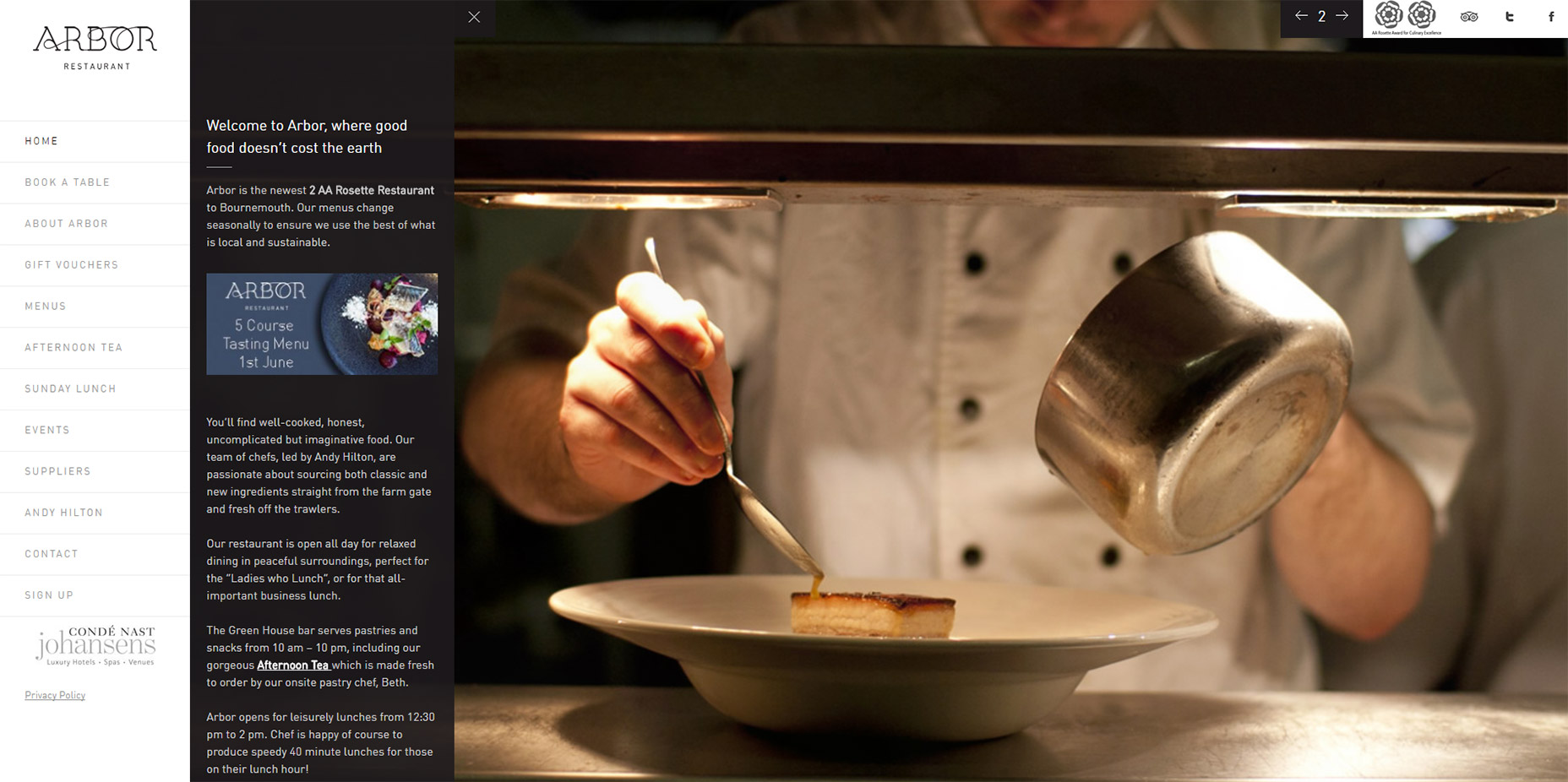
3. Smokey Bones
Smokey Bones has two things going for it: awesome food and a killer website. Every page uses the long vertical navigation fixed to the left-hand side. This is a staple for most websites because the majority of western readers consume content from left to right, and the top-left corner is the traditional place for a site logo. One added feature I like is the menu flyout listing all the restaurant’s dishes. If you click the “menu” link you’ll see how this also works like a sub-menu added vertically. Definitely a cool idea that works well for a small restaurant site.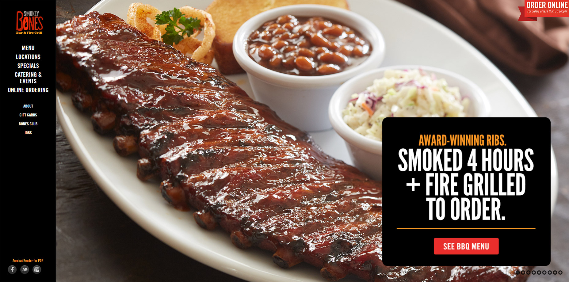
4. Mammoth Media
When you have less content you can get away with more offbeat navigation choices. Mammoth Media is a good example which only has five main pages on their site plus a blog. One specific facet of this navigation is the hidden dropdown feature. If you click the “work” link you’ll get 2 alternative links you can click through. They appear beneath the main link so they take the role of a smaller dropdown. Even on mobile this navigation follows a similar style. It’s proof that when you don’t have too many links you can really push creativity.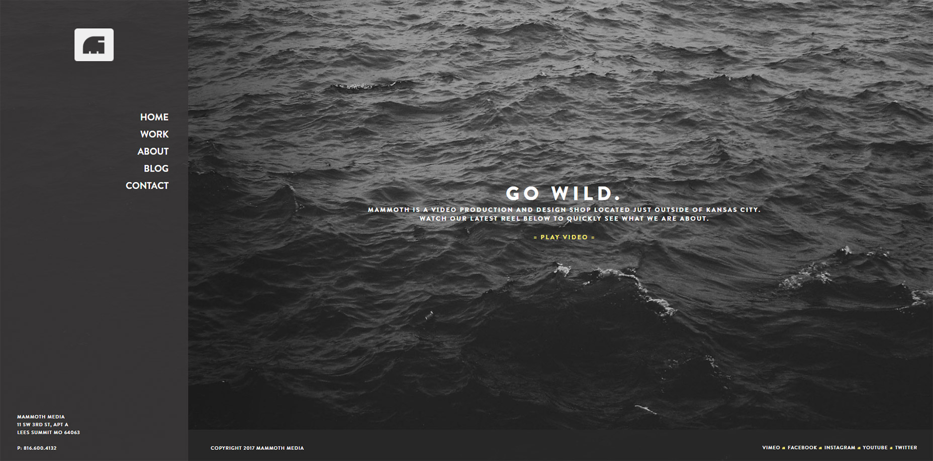
5. Amazon
Everyone and their grandma knows about Amazon. The online retailer has an amazing selection, but they also have a fantastic UI design with vertical nav links on product search pages. Amazon has dozens of categories for every search term. This means they need a way to present refined search features without overcrowding the page. Vertical navigations just make sense because they can tuck away to the side while still being fully accessible. If you’re designing any similar type of filtering nav I definitely recommend studying Amazon’s strategy. They’ve optimized their site to no end so there’s plenty of reason to believe their vertical sorting links work well.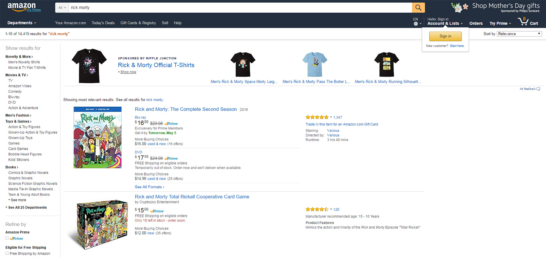
6. Corum
Corum’s website has another clean vertical navigation, with very simple features. All-caps links, dark text, clear hover styles and a strong contrast against the main page. This is one of the biggest aspects when designing vertical navigation. You typically want to create a strong divide between the vertical navigation bar and the page content. In this case it’s done using a lighter background color with the Corum logo near the top. And mobile responsive users instead get a dropdown menu which works well as an alternative for screens that are longer than wider.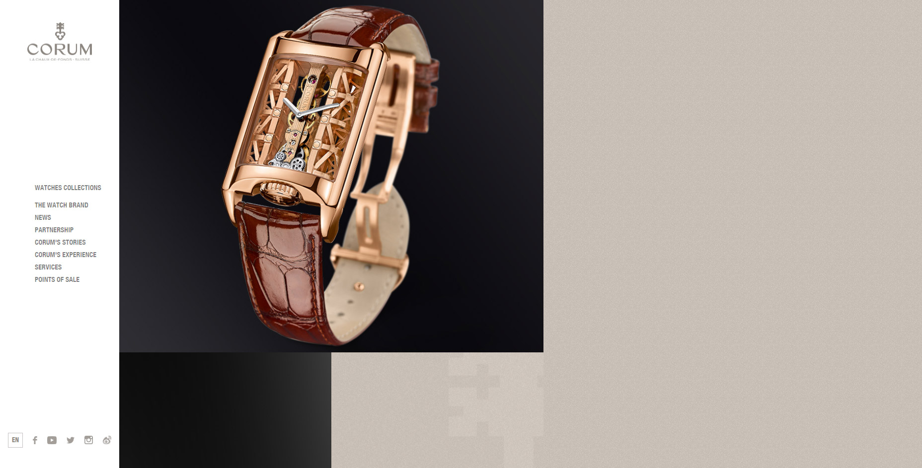
7. Nua Bikes
One of the best ways to use a vertical navigation is with a single page layout. Informational sites like Nua Bikes don’t always need dozens of pages full of content. So with a vertical nav menu it’s far easier to browse through content on a whim using animations and custom page areas. In this case the Nua Bikes nav does blend into the page since it’s directly tied to all the content on that page.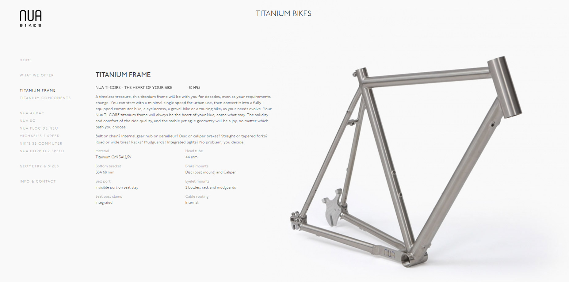
8. Michael Ngo
Another site that follows the single page vertical nav trend is Michael Ngo’s portfolio. It has quite a captivating header image which immediately grabs your attention and draws you in. But the content is the most interesting part since it all works through 3 different links: home, work, and contact. The nav links have their own subtitles too so you can see what they do even at a glance. One thing to note is how the nav stays fixed while scrolling down the page. This keeps all links accessible from any point which is crucial in a smaller vertical menu.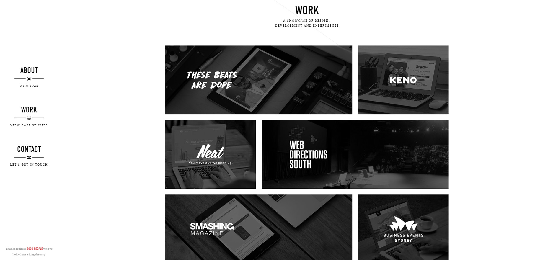
9. Medienstadt.koeln
The German site Medienstadt.koeln has quite a different take on vertical navigation. Their nav remains hidden behind a hamburger menu at all times, but it still spans the entire height of the screen. It also includes more links than just the typical top horizontal nav. This makes sense but can be confusing to some visitors. What I like most about the vertical style is how it stays tucked away even on desktops until needed. Granted there are debates about discoverability issues with hamburger menus. But I think this icon is quickly becoming recognized and this design is an excellent example of a hidden vertical navigation in action.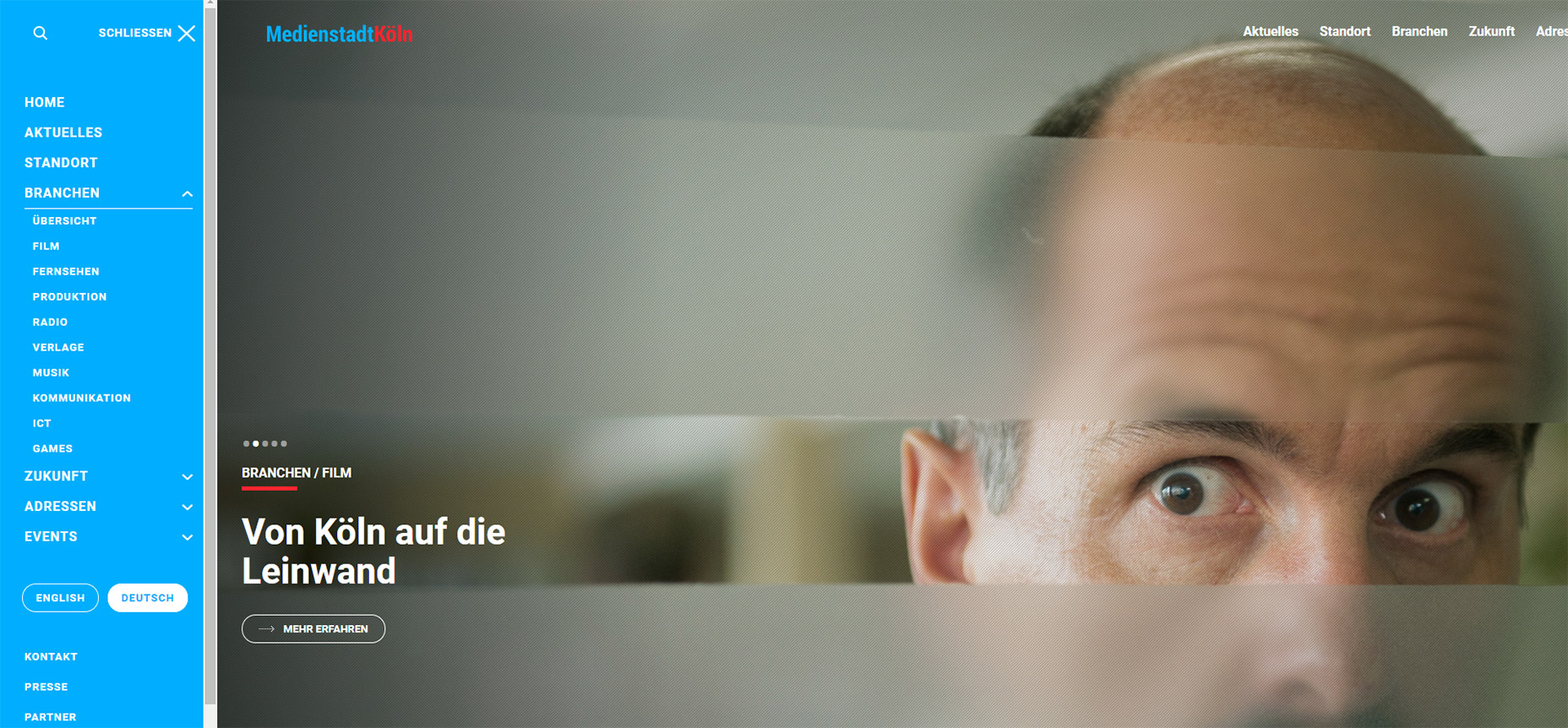
10. The Metrick System
The ad agency Metrick System keeps their navigation simple and to the point. It does follow the vertical style but it’s also much different than all the others in this post. I like the hidden dropdown that only shows extra links when a primary link is clicked. Their “journal” link is a good example. New links appear off to the side and they fade into view with a single click. Mobile users get a similar experience except these sub-menu links appear beneath the main link. But this nav is so small that it can work for pretty much every screen size.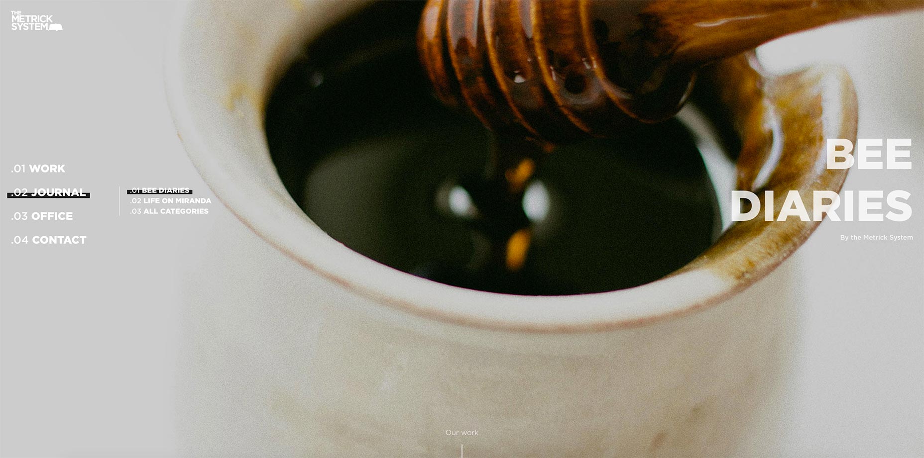
The Wrap Up
Vertical navigation works best on sites that rely on extra screen space. These typically include portfolio sites, restaurants, small businesses, and ecommerce shops. But regardless of the site you can always try to add a vertical navigation into your design. And I hope these examples can get you started with some great ideas for wireframing and mockup design.Jake Rocheleau
Jake is a writer and user experience designer on the web. He publishes articles discussing HTML5/CSS3 and jQuery coding techniques. Find out more on his website or you can follow his updates on Twitter @jakerocheleau


Read Next

15 Best New Fonts, July 2024
Welcome to our monthly roundup of the best fonts we’ve found online in the last four weeks. This month, there are fewer…
By Ben Moss

20 Best New Websites, July 2024
Welcome to July’s round up of websites to inspire you. This month’s collection ranges from the most stripped-back…

Top 7 WordPress Plugins for 2024: Enhance Your Site's Performance
WordPress is a hands-down favorite of website designers and developers. Renowned for its flexibility and ease of use,…
By WDD Staff

Exciting New Tools for Designers, July 2024
Welcome to this July’s collection of tools, gathered from around the web over the past month. We hope you’ll find…

3 Essential Design Trends, July 2024
Add some summer sizzle to your design projects with trendy website elements. Learn what's trending and how to use these…

15 Best New Fonts, June 2024
Welcome to our roundup of the best new fonts we’ve found online in the last month. This month, there are notably fewer…
By Ben Moss

20 Best New Websites, June 2024
Arranging content in an easily accessible way is the backbone of any user-friendly website. A good website will present…

Exciting New Tools for Designers, June 2024
In this month’s roundup of the best tools for web designers and developers, we’ll explore a range of new and noteworthy…

3 Essential Design Trends, June 2024
Summer is off to a fun start with some highly dramatic website design trends showing up in projects. Let's dive in!

15 Best New Fonts, May 2024
In this month’s edition, there are lots of historically-inspired typefaces, more of the growing trend for French…
By Ben Moss

How to Reduce The Carbon Footprint of Your Website
On average, a web page produces 4.61 grams of CO2 for every page view; for whole sites, that amounts to hundreds of KG…
By Simon Sterne

20 Best New Websites, May 2024
Welcome to May’s compilation of the best sites on the web. This month we’re focused on color for younger humans,…