

UI Viking
Our first entry this month is actually from a designer we’ve featured before, only he’s gone and redesigned his portfolio. The inimitable UI Viking brings us a star-studded design that’s just plain loaded with color, personality, and illustrations of a badass viking. In space. In true commitment to the joke, things like "continue reading" buttons on the blog say "Kill This Post" instead. The contact form says, “ODIN OWNS YOU ALL! I’ll respond you ASAP... between robberies and lootings.” Overall, it’s a great-looking site that—despite the inherent simplicity of the layout—is just overflowing with personality. You’ll never mistake it for being anyone else’s work.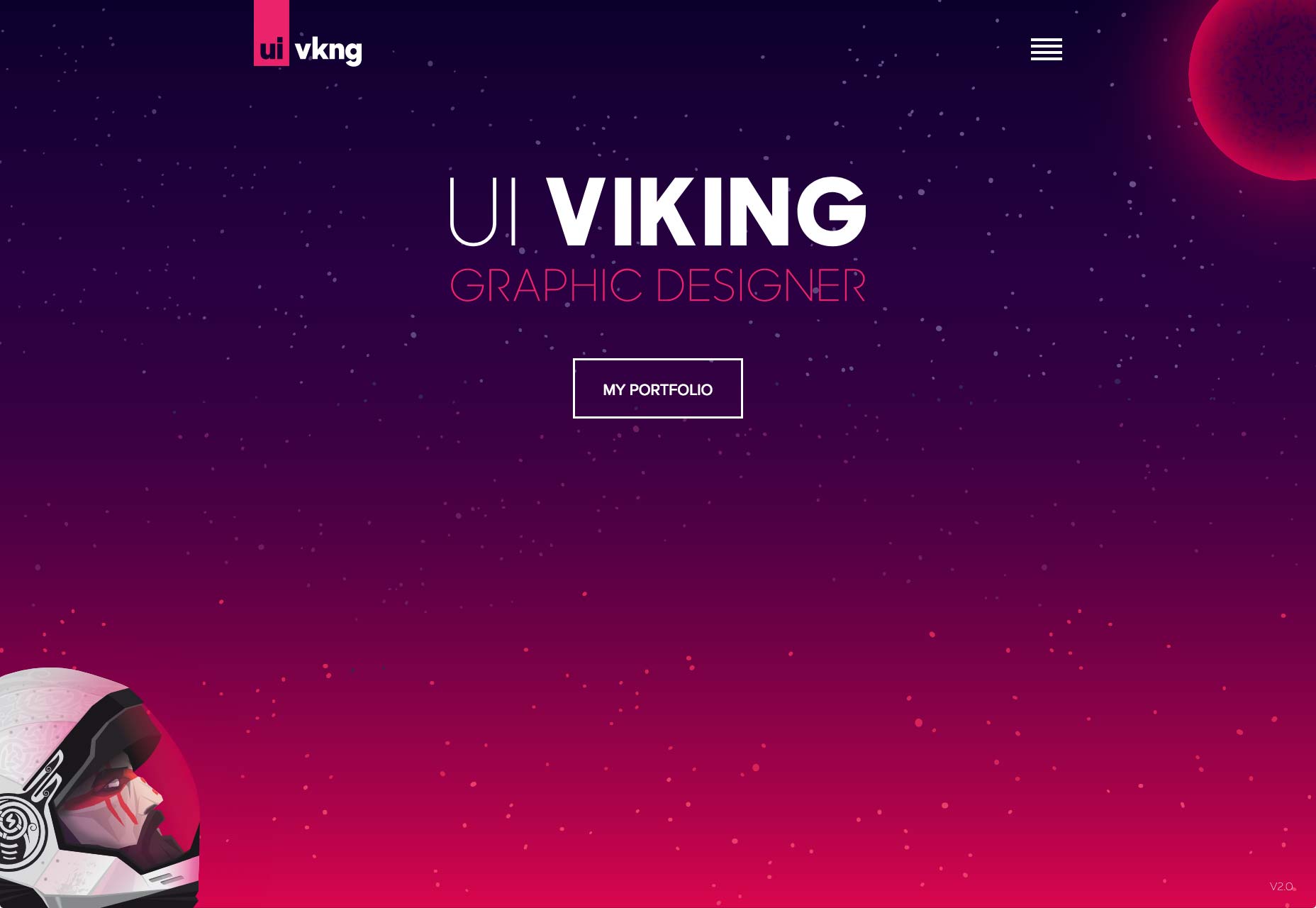
Nick Jones
This is the first time I’ve ever seen a website designed around a golden spiral. Nick Jones’ portfolio is exactly that, and it feels ingenious. Hit the down arrow on your keyboard (or click any of the content cards), and you’ll spiral right on into his site, giving the experience a weird feeling of depth. It’s playful too. Go to the site and hold the up arrow. Just try it out. The whole site is pretty, though the text might be a bit small. It also loses points for not letting me use my scroll wheel to move into the site. I mean, it’s the one kind of site where I might forgive scroll wheel hijacking. On the other hand, it gets massive points for having a more accessible version that is linked to right at the start.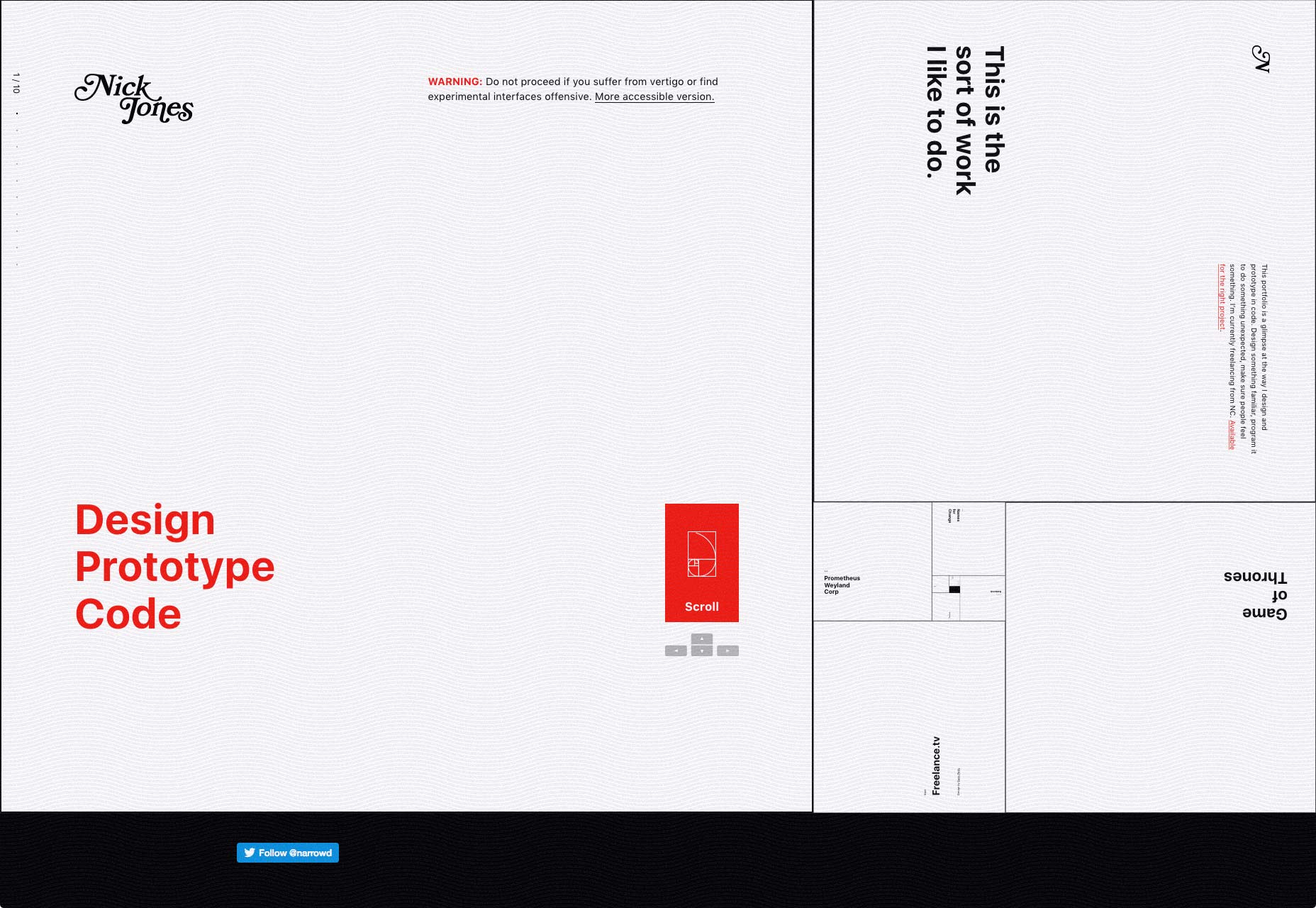
Senthil
Senthil’s portfolio just about makes me nostalgic for the days when everyone wanted their site to look like Apple’s. Oh, this is by no means a rip-off, but the influences are certainly there. It actually reminded me of the beautiful things inherent in this kind of minimalism: the perfectly distributed white space, the type, the focused use of imagery…it’s all there, and it all still works.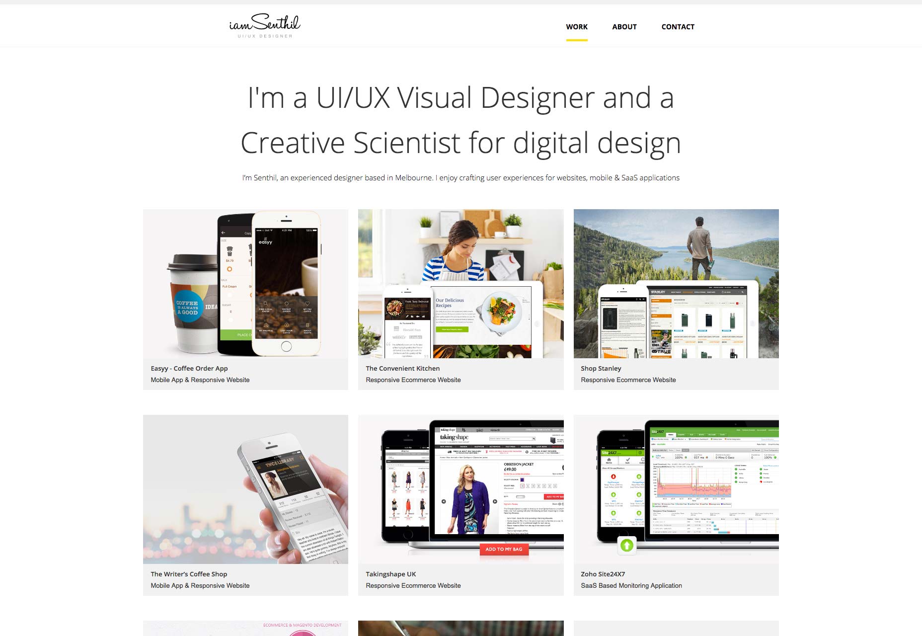
Rick Waalders
Longtime readers of this series will know how I feel about the over-use of animation, and how that can affect accessibility. On the other hand, there’s something to be said for just going all in like Rick Waalders. The site looks good, with solid type, plenty of contrast for the dark layout, nice color palette... oh, and the huge spinning 3D thing that stays with you throughout the whole site. Every element is pretty much animated out the wazoo. In a weird way, it works. I guess if you’re going to create an experience like this, you may as well commit.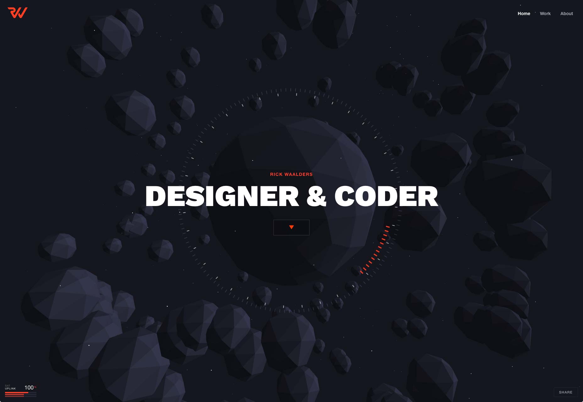
Doberman
Doberman is a design firm that likes to mix things up, apparently. Their use of collage-style layout, color, and typography combined leave me feeling like the site is a mix of post-minimalism and brutalism. It’s not often you see a designer successfully tie two bandwagons together and charge ahead at full speed, but that seems to be what happened here. The clash of styles is surprisingly effective.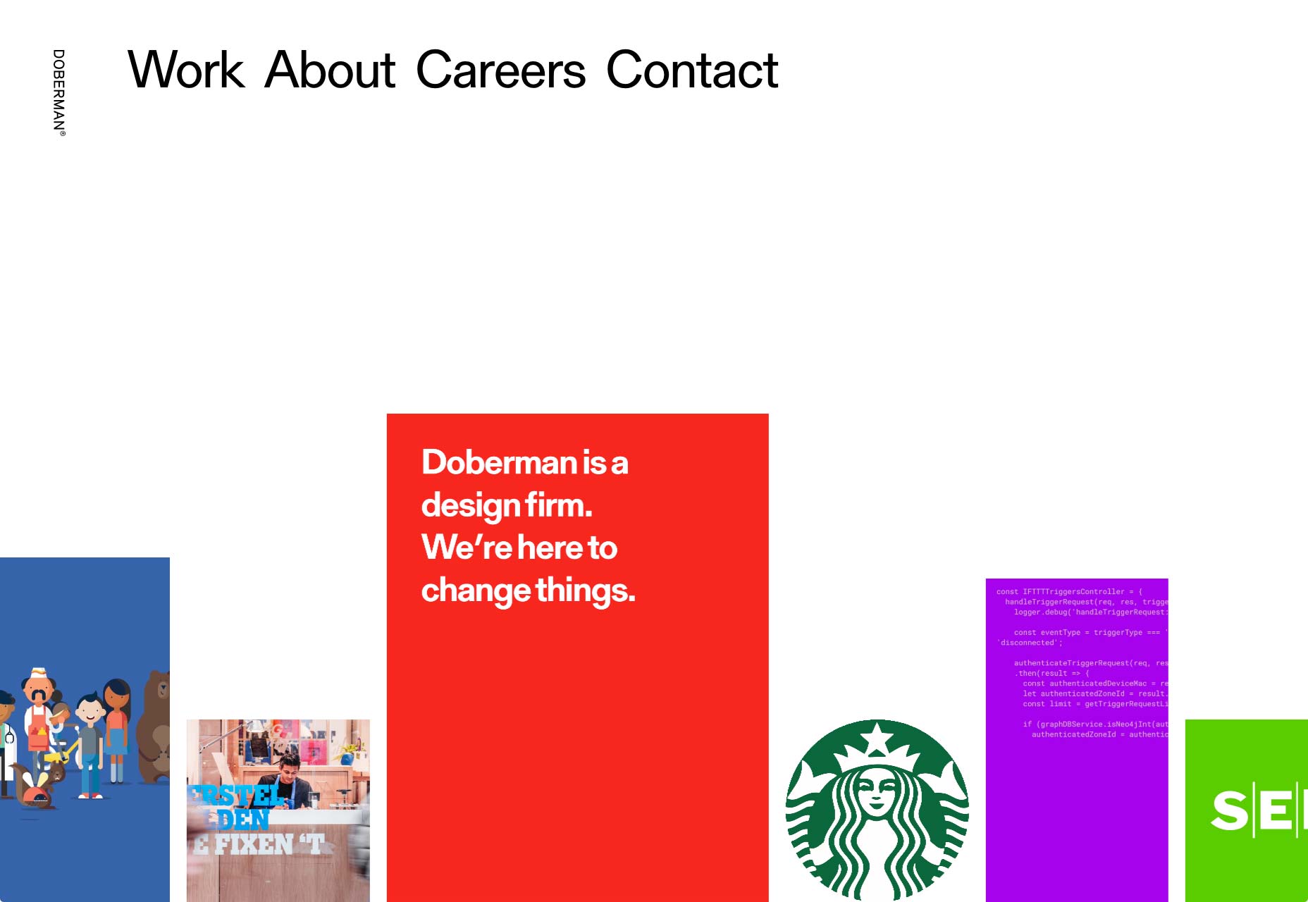
Leszek Juraszczyk
Leszek Juraszczyk’s portfolio is almost aggressively post-minimalist. From the monospaced type to the bare-bones layout, to the near monochrome palette, it hits all the right notes. It also looks refined, and elegant even, with some of the imagery overlapping other elements to give a sense of depth. This is everything ’90s print designers dreamed of when they started designing websites too.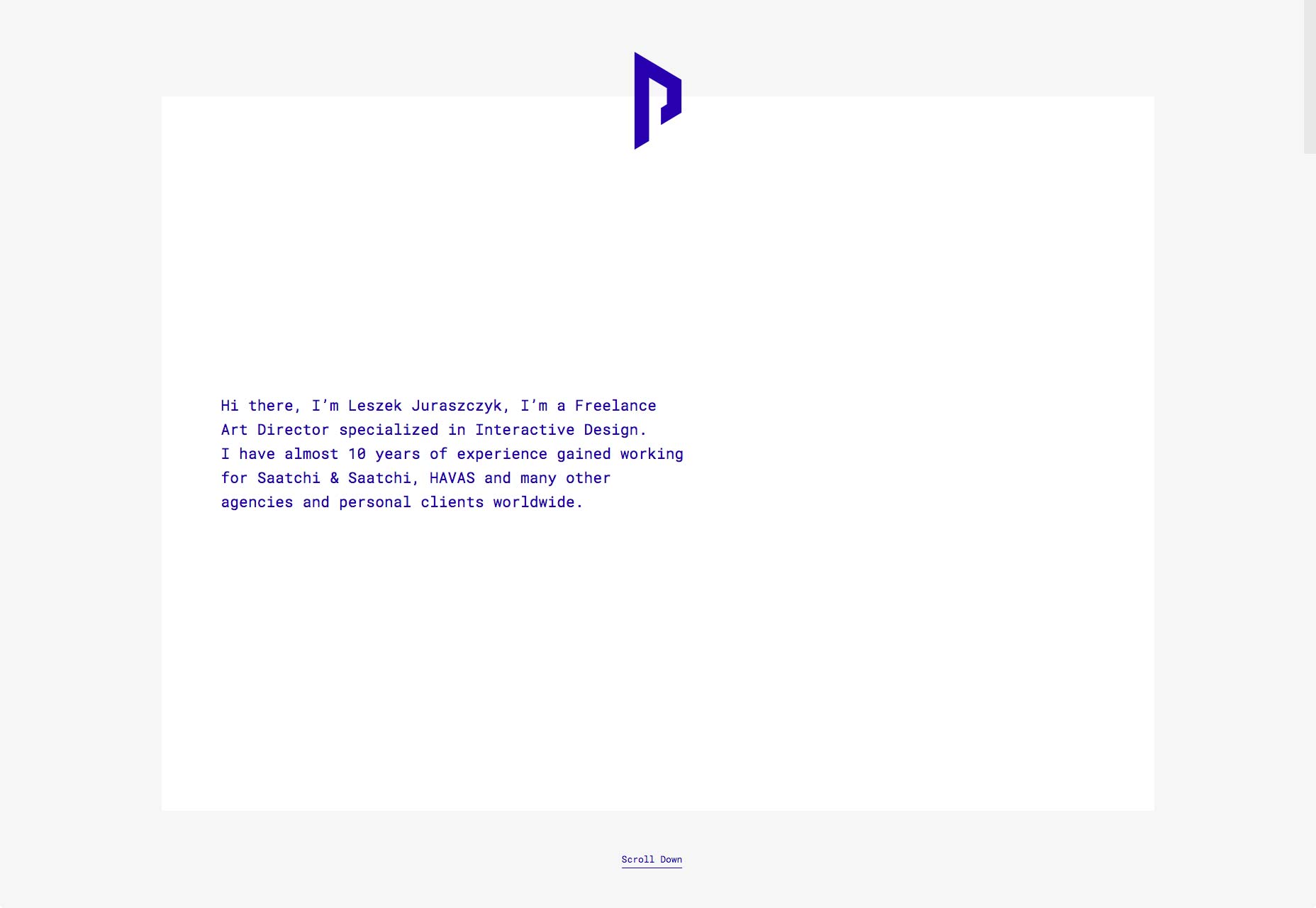
Roger Burkhard
Roger Burkhard has opted for a horizontal layout to showcase his projects in a somewhat brutalist—but still good-looking—design. As this style permeates the rest of his work, it seems appropriate.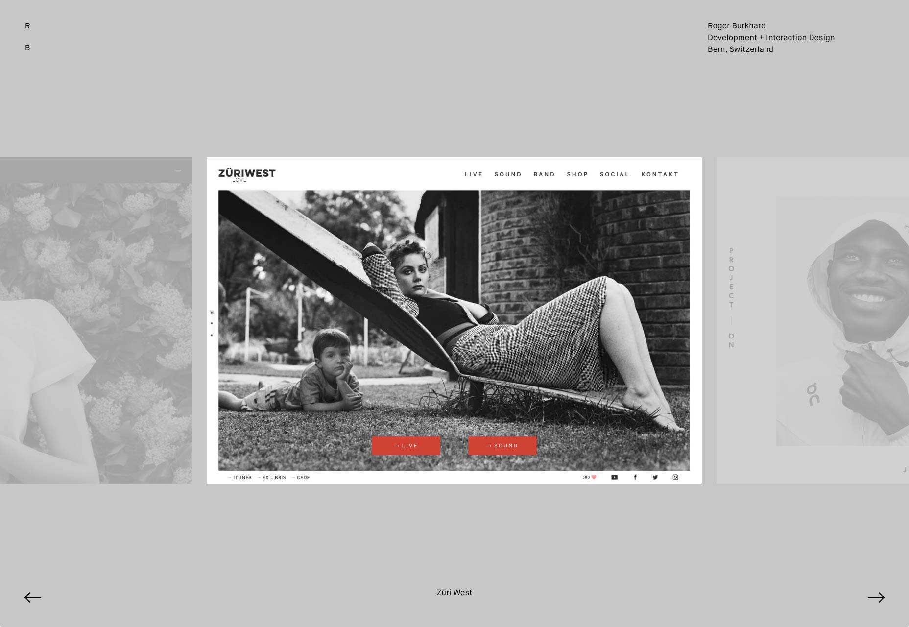
Mario Hugo
People involved in the arts seem to adore masonry layouts and serif-laden type. Mario Hugo is no exception. It’s a fairly simple site whose only concession to flashiness is the fact that the gallery thumbnails rotate when you hover over them. For all that, it’s well-made and just plain pleasant to look at. Part of that is the organization. Part of it is the focus on putting the art front and center.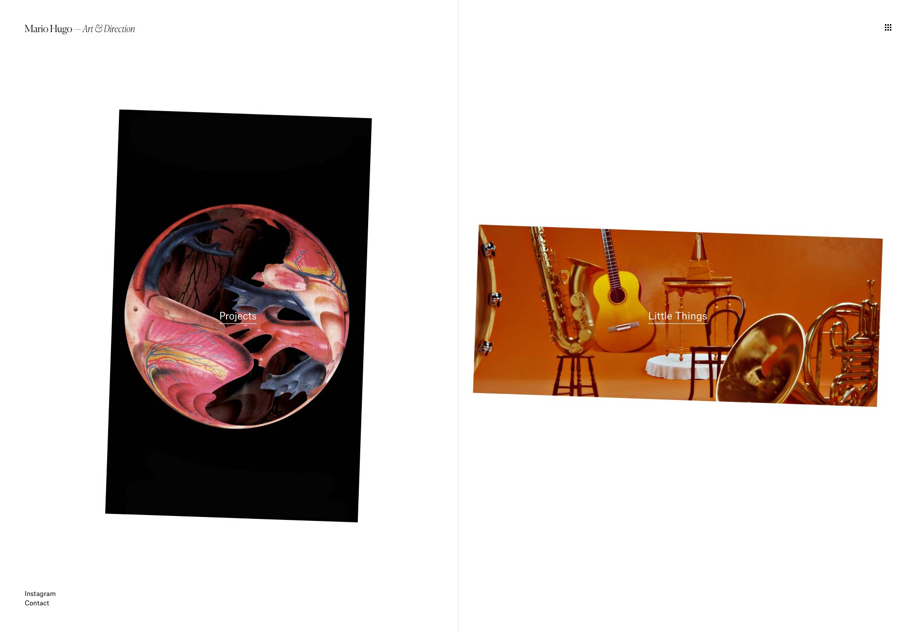
Chris Biron
Chris Biron’s portfolio believes in keeping it simple. no really, it says that on the home page. The rest of the design lives up to the promise, with a simple, minimalist layout. The site is stylistically separated from others by skewed text, and slight ripple effect when you hover over images. All in all, it’s well done, if occasionally reminiscent of WordArt.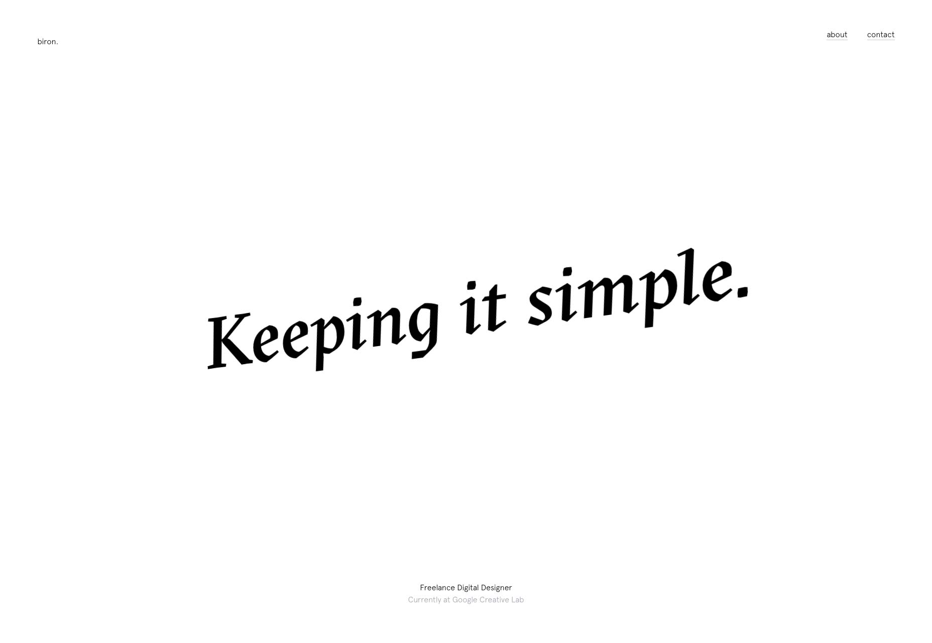
dn&co.
dn&co. puts the work front-and center, with just the slightest hint of brutalism hiding around the literal edges of the design. And between the images in the case study. Well, it’s either brutalism or post-minimalism, and I’m having a hard time telling the difference at this point.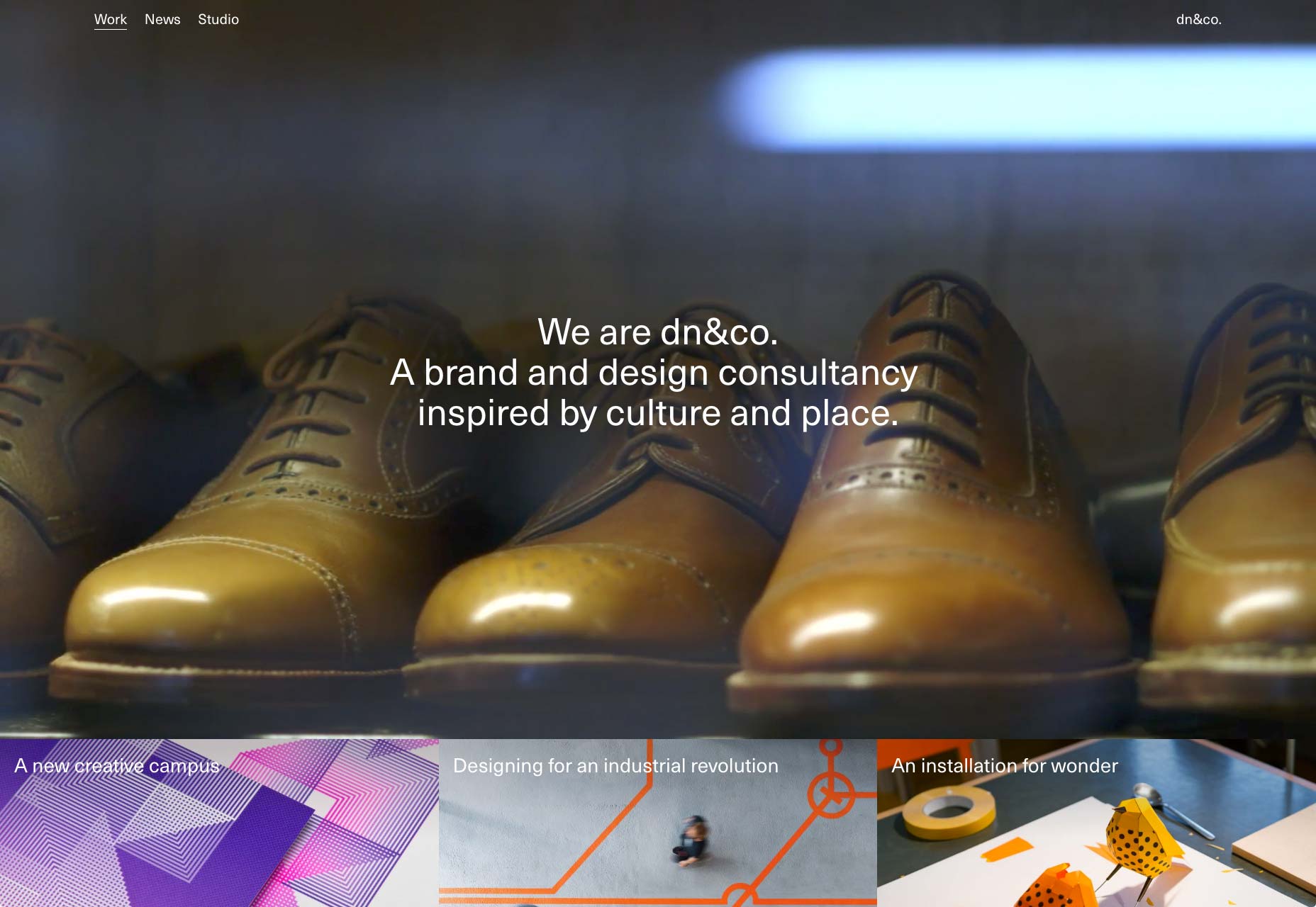
Cole Townsend
Cole Townsend’s portfolio reads a lot more like a resume, and studiously avoids using images. Always a bold choice, as you have to rely on the user’s willingness to click through links. That said, the text is very beautifully laid out, so I enjoyed this one nonetheless.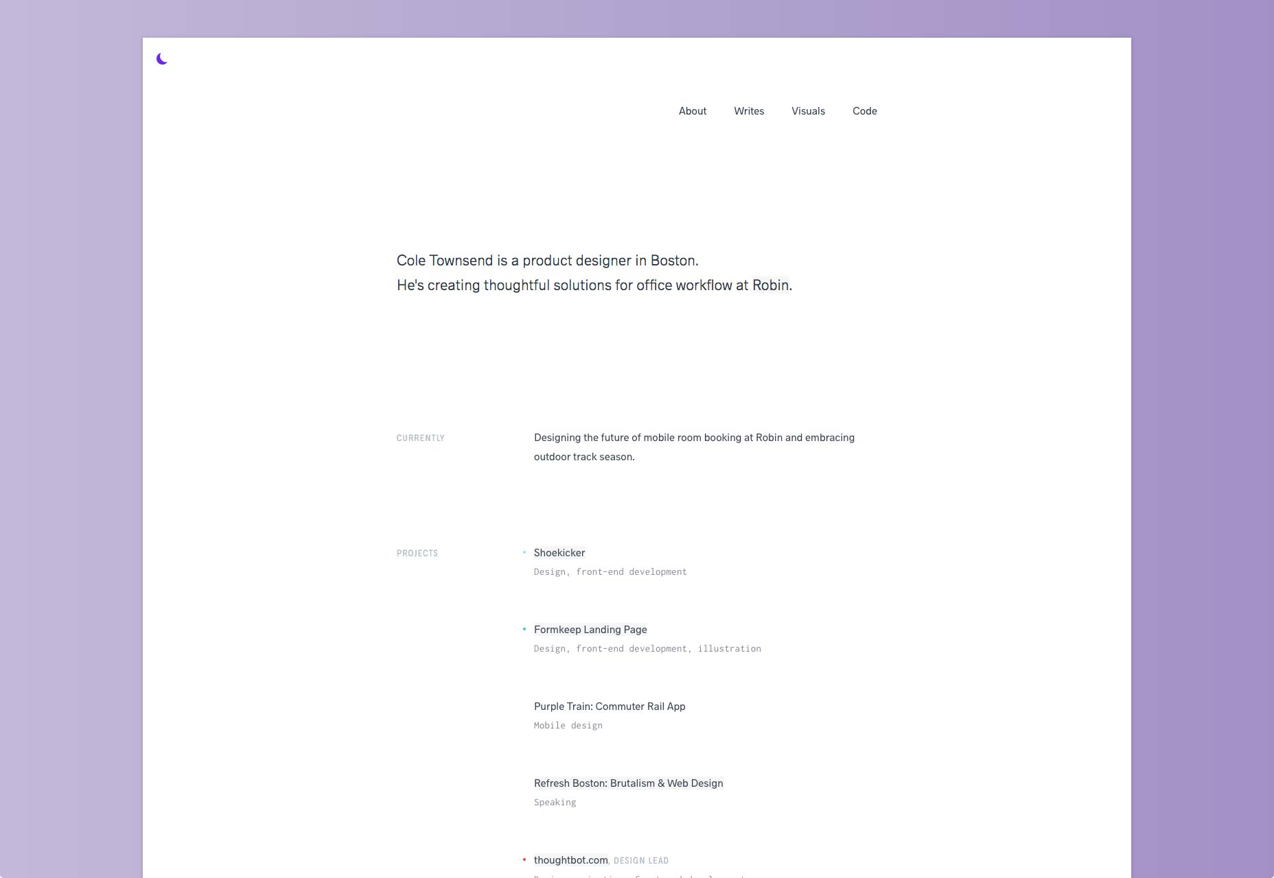
Kennard Lilly
This is certainly one of the more colorful portfolio entries this month. The use of a painting as the background gives the site an unforgettable style, even if it sometimes makes the text hard to read. This is toned down when you click on a portfolio piece, but you still get the sense that "vibrant artsy stuff is going down" all throughout the site.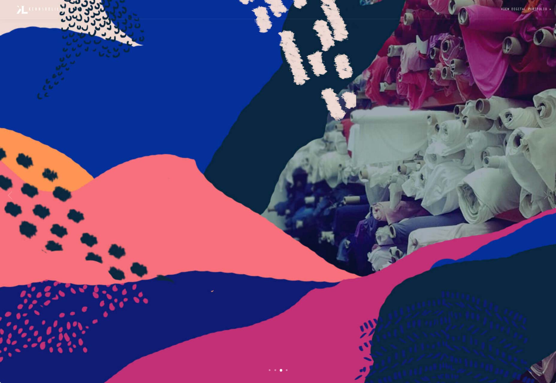
Julia Chistiakova
Julia Chistiakova’s site is every bit as colorful as her illustration and web design work. It also uses simple gallery that makes use of modal windows to present each case study. Despite its simplicity, it’s highly stylized, and just plain oozing with personality.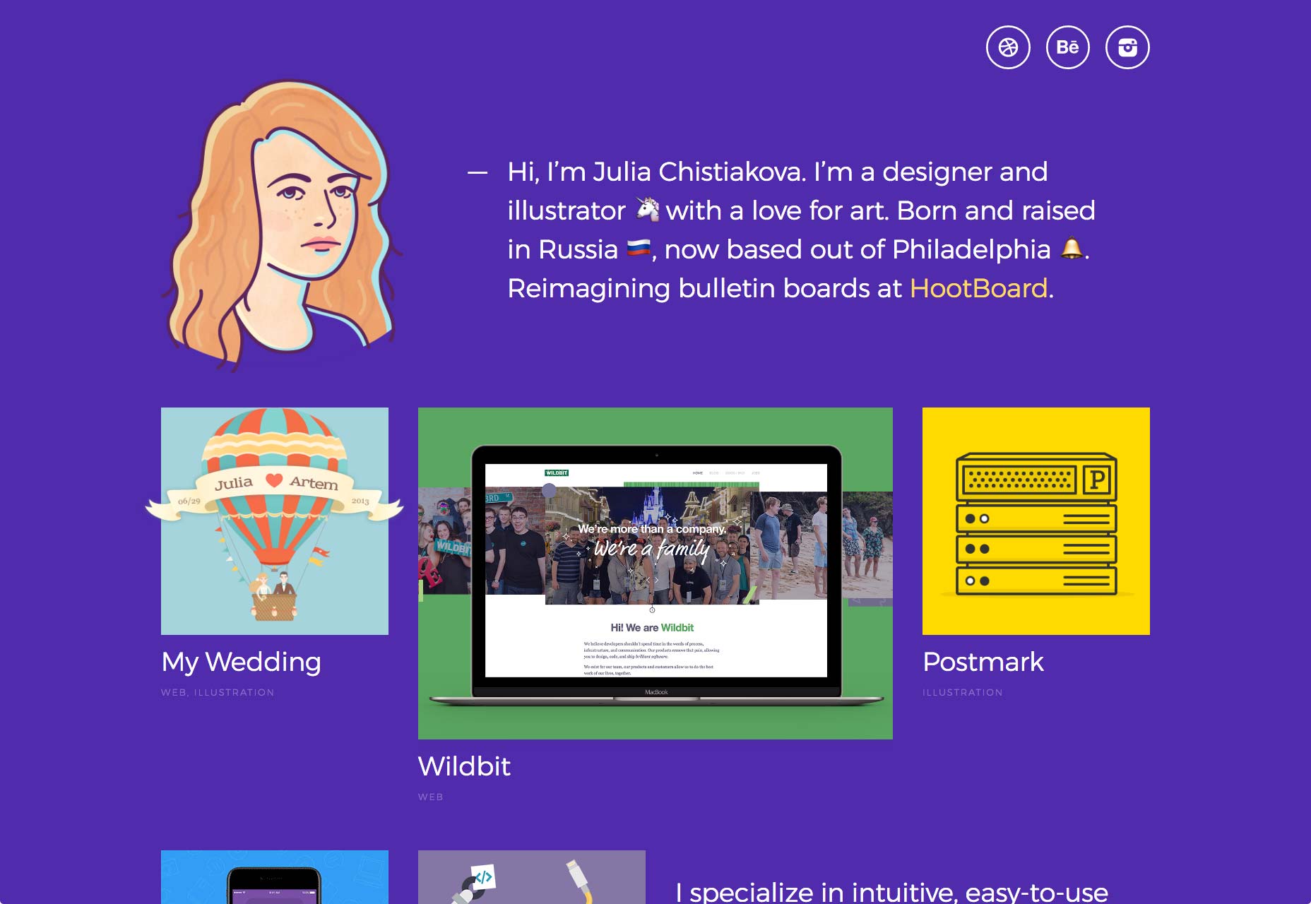
Jack Morgan
Jack Morgan has definitely worked for Google.You can tell the moment you land on his site, because if I didn’t know better, it could be a Google product. It has the same minimalism. It feels a bit like Material design. All the text is set in Roboto. Every div has about ten classes. Yeah, this guy works for Google. His site is a master class in Google-branded design.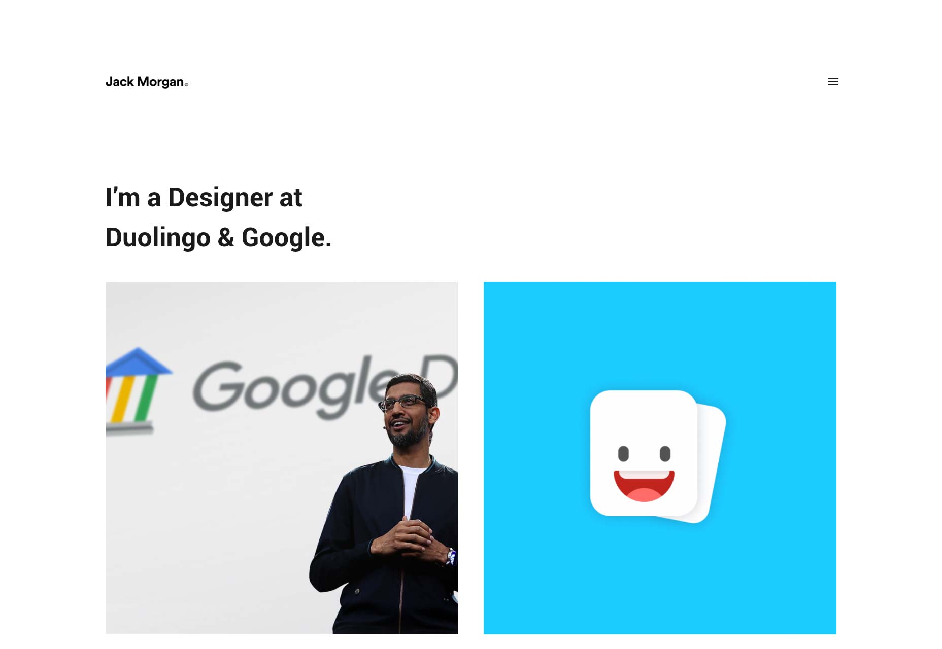
viget
viget marries the familiar portfolio trends we’ve come to know with a distinctly corporate feel. With clients like ESPN, the World Wildlife Foundation, NBC, and more, that makes sense. Corporate is what you want. It never fails to impress me when I find designers who can take designs that seem fairly traditional—and all-purpose and tailor—them to their audience through attention to detail.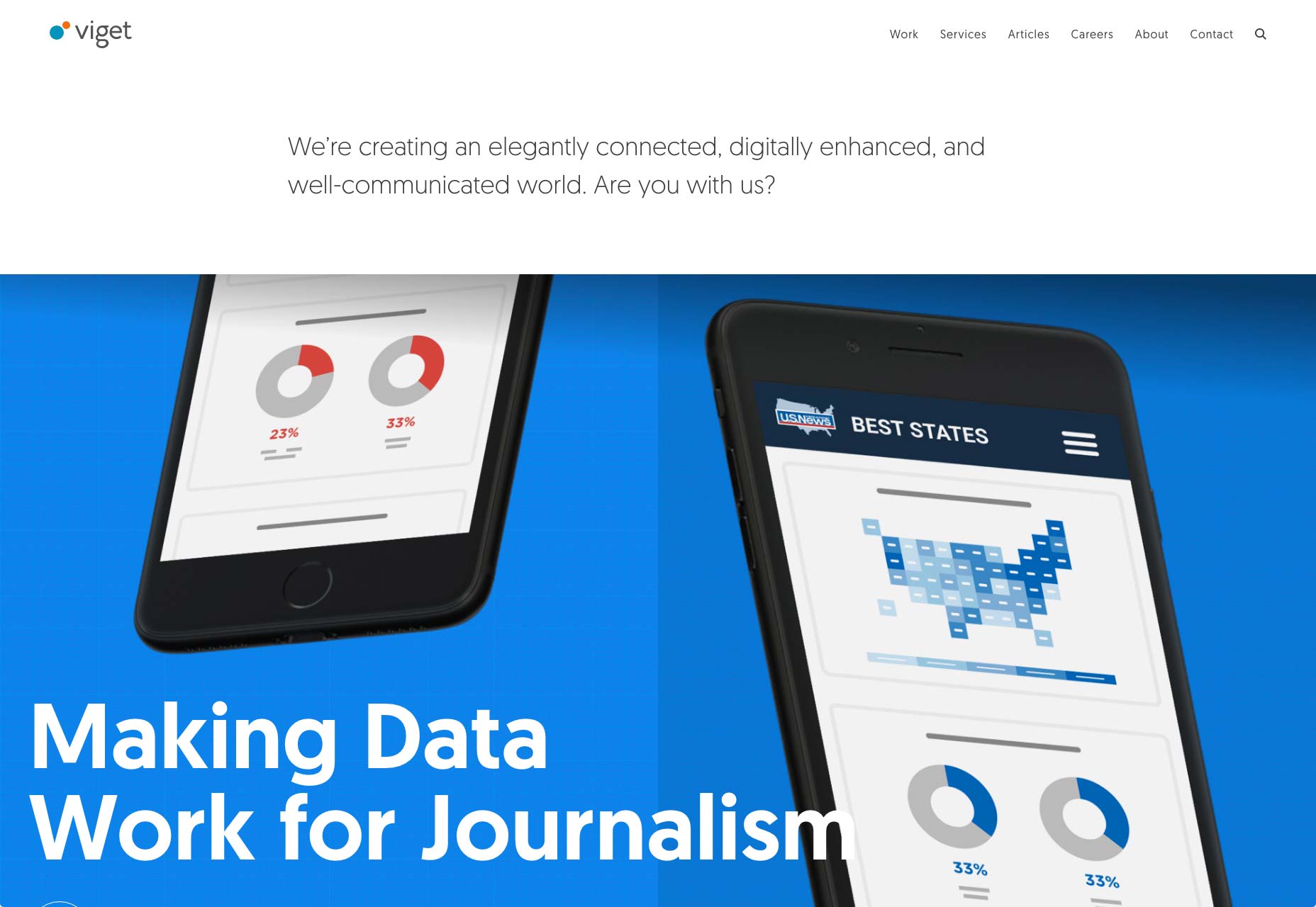
Clement Simon
Want a break from all of the flashy new trends? Have a look at Clement Simon’s portfolio. It’s a simple site with a masonry layout, solid imagery, and elegant typography. And by “elegant typography” I mean the text is a bit too small. That said, scrolling through this site is almost like Zen meditation in comparison to others.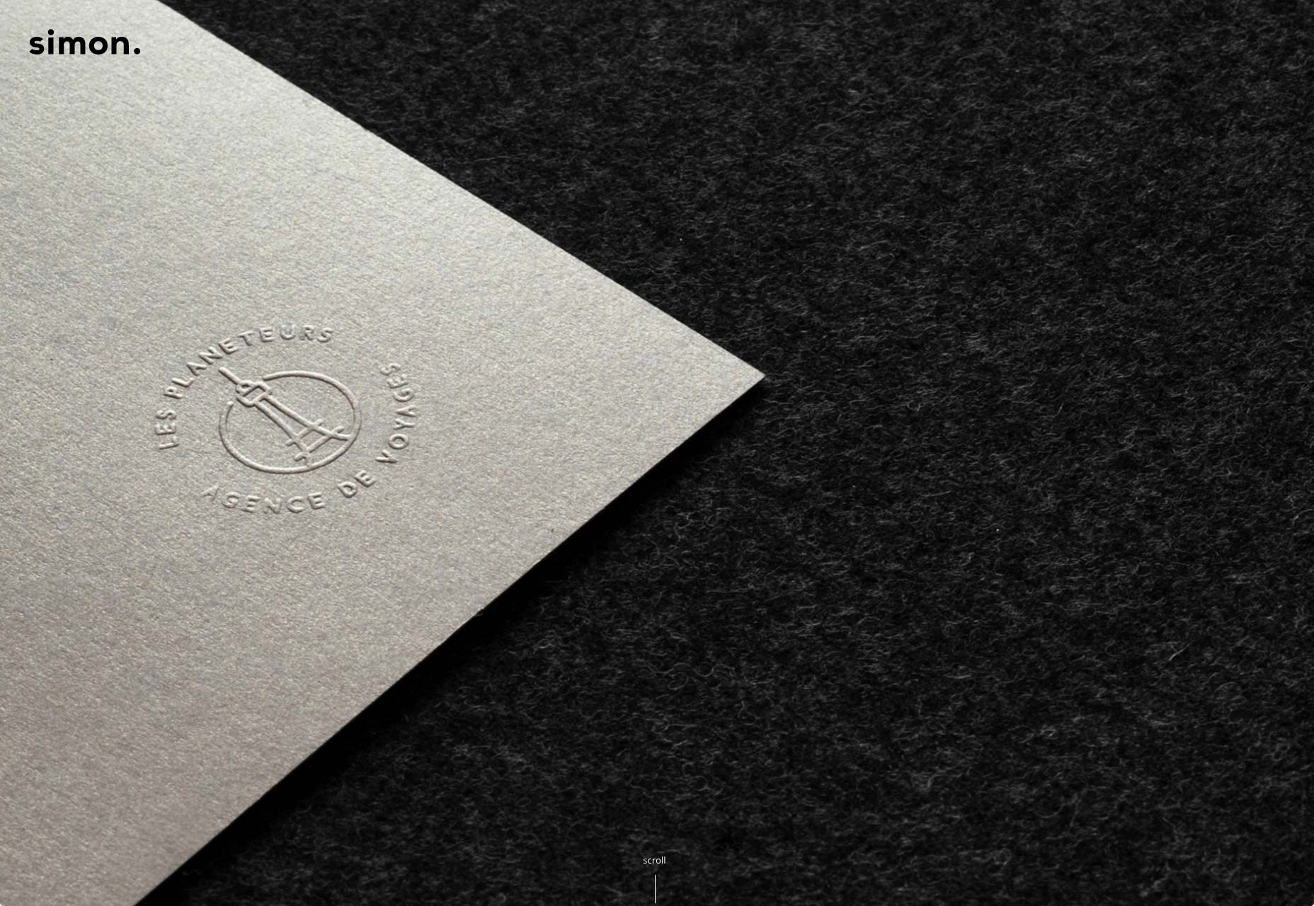
Nik Papic
Nick Papic clearly wants to stick with clients who like reading. Aside from the logos of client’s he’s worked with, there’s nary an image to be found. That said, you probably don’t need an image gallery when you have a resume that reads as well as Nik’s. And I mean that both in terms of typography and content.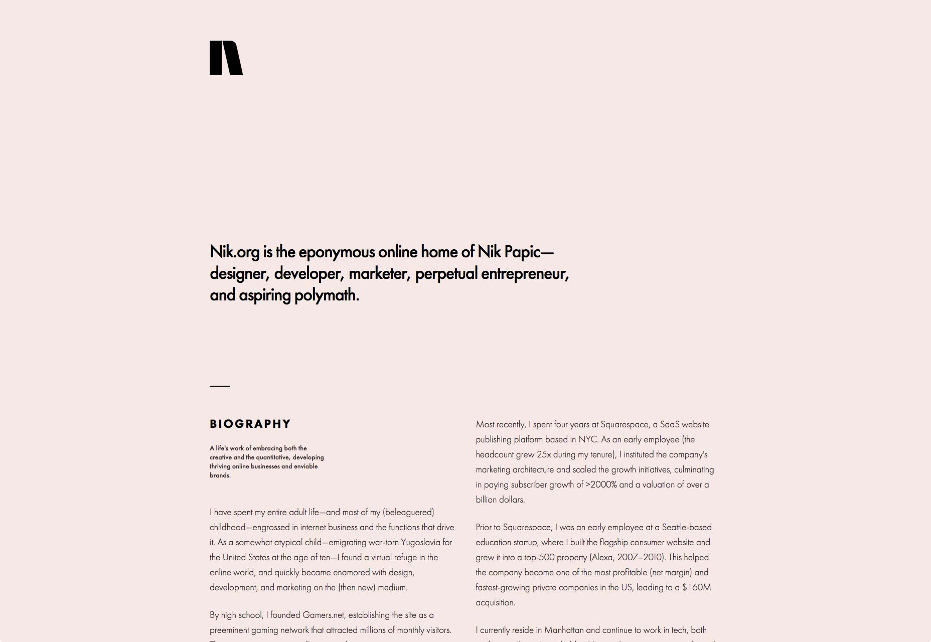
Bukwild
Bukwild uses a lot, and I do mean a lot of background video. However, instead of letting the background video and imagery do all the talking, each has been carefully chosen and edited to fit the theme of the site, which is no surprise, as Bukwild bill themselves as experts in branding. The branding is really what stands out about this site. Every element feels like it was very carefully made to fit together, beyond the normal efforts of designers. It takes a fairly normal site (for professional designers), and turns it into something recognizably theirs, even if it’s a bit hipster-ish.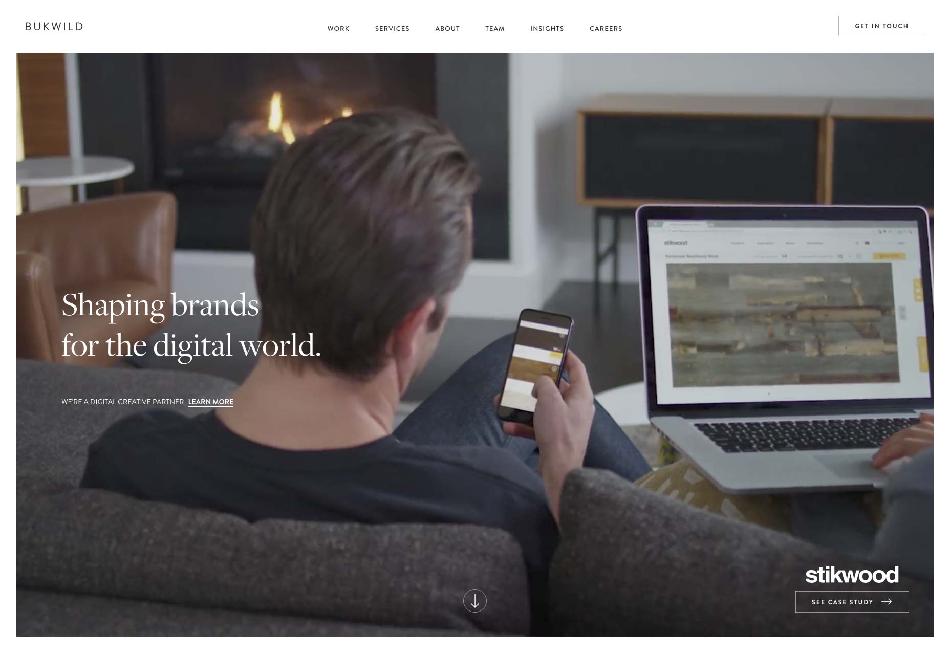
Nicole Saidy
In a world of minimalist sites that are so often monochrome, and super-colorful sites that blind the eyes, it’s nice to see a compromise. Nicole Saidy accomplishes this through using a rainbow of accent colors in very small decorative elements, combined with a sort of pastel gradient for buttons and other larger UI elements. Combined with a design that’s just plain solid overall, and you get a minimalist site that still stands out.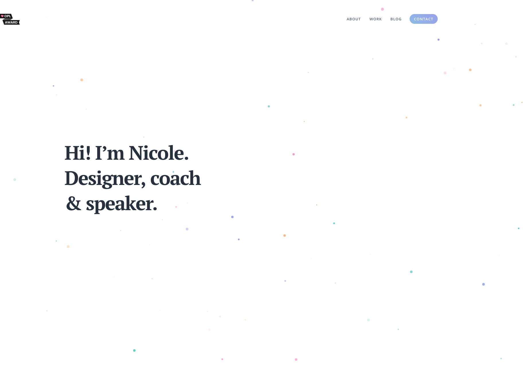
Andrej Cibík
Andrej Cibík’s portfolio is minimalist, and does that thing where a designer forgets to turn off his grid view when he launches the site. I kid. The grid is there for style reasons. Beyond that, the typography on this site stands out as excellent, as do the eye-catching-yet-understated animations, which I love. He also stands out for having a section in his "About" Page that details all of the thing’s he’s bad at. That certainly helps set realistic expectations for the client.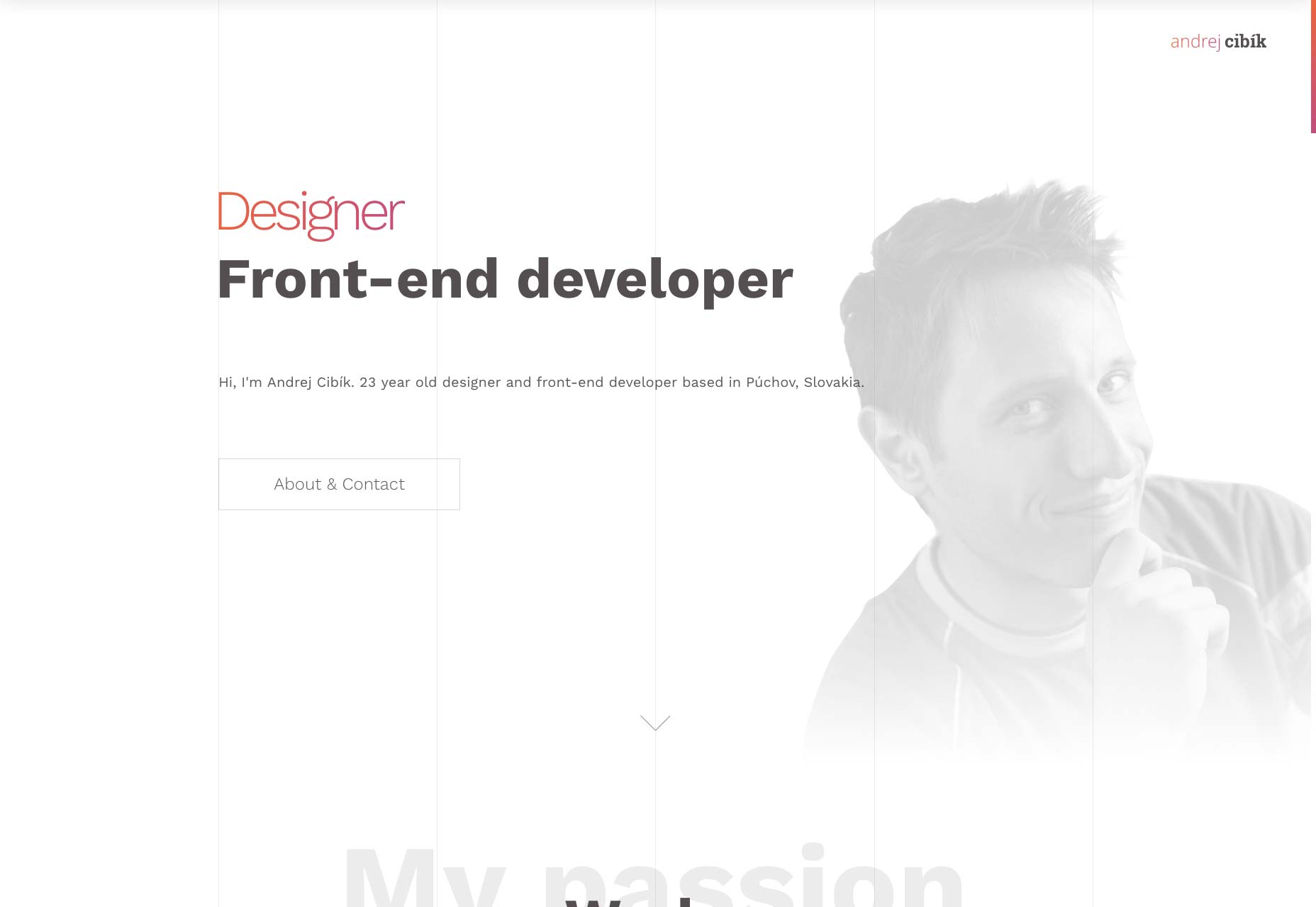
Ezequiel Bruni
Ezequiel Bruni is a web/UX designer, blogger, and aspiring photographer living in Mexico. When he’s not up to his finely-chiselled ears in wire-frames and front-end code, or ranting about the same, he indulges in beer, pizza, fantasy novels, and stand-up comedy.


Read Next

15 Best New Fonts, July 2024
Welcome to our monthly roundup of the best fonts we’ve found online in the last four weeks. This month, there are fewer…
By Ben Moss

20 Best New Websites, July 2024
Welcome to July’s round up of websites to inspire you. This month’s collection ranges from the most stripped-back…

Top 7 WordPress Plugins for 2024: Enhance Your Site's Performance
WordPress is a hands-down favorite of website designers and developers. Renowned for its flexibility and ease of use,…
By WDD Staff

Exciting New Tools for Designers, July 2024
Welcome to this July’s collection of tools, gathered from around the web over the past month. We hope you’ll find…

3 Essential Design Trends, July 2024
Add some summer sizzle to your design projects with trendy website elements. Learn what's trending and how to use these…

15 Best New Fonts, June 2024
Welcome to our roundup of the best new fonts we’ve found online in the last month. This month, there are notably fewer…
By Ben Moss

20 Best New Websites, June 2024
Arranging content in an easily accessible way is the backbone of any user-friendly website. A good website will present…

Exciting New Tools for Designers, June 2024
In this month’s roundup of the best tools for web designers and developers, we’ll explore a range of new and noteworthy…

3 Essential Design Trends, June 2024
Summer is off to a fun start with some highly dramatic website design trends showing up in projects. Let's dive in!

15 Best New Fonts, May 2024
In this month’s edition, there are lots of historically-inspired typefaces, more of the growing trend for French…
By Ben Moss

How to Reduce The Carbon Footprint of Your Website
On average, a web page produces 4.61 grams of CO2 for every page view; for whole sites, that amounts to hundreds of KG…
By Simon Sterne

20 Best New Websites, May 2024
Welcome to May’s compilation of the best sites on the web. This month we’re focused on color for younger humans,…